In this blogpost I would like to focus on the negative aspect of video instructions. When I first started researching about the topic I found a lot of articles stating that video or animated instructions are either equally or even less effective. Let’s take a closer look at why video work instructions might not be the best fit for everyone.
1. Learning Pace:
Video instructions lack the flexibility for users to learn at their own pace. Unlike written or image-based instructions that allow users to pause, rewind, and progress at their convenience, videos dictate the pace of learning. This limitation becomes evident when trying to understand multi-step procedures, as users may struggle to recall earlier steps once they’re halfway through a video. In contrast, static images or animated gifs in a well-designed work instruction allow users to navigate through steps at their own speed, enhancing the learning experience.
2. Scalability and Translations:
Creating a significant amount of video content, especially in different languages, is laborious and time-consuming. Translating or captioning videos adds to the complexity and cost. In contrast, simpler visual mediums like images and gifs are more adaptable and can be easily translated without a significant increase in workload.
3. Difficulty in Updates:
Updating video content can be complex, requiring a lot of editing and attention to detail. Textual or image-based instructions are more flexible, allowing for easier modifications. This flexibility is crucial in dynamic work environments where quick and efficient updates are essential.
4. Complexity in Creation:
Creating video work instructions involves processes like editing or cutting are adding unnecessary complexity. In situations where simplicity and user-friendliness are vital, simpler formats like images and gifs can convey the necessary information effectively without added complication.
5. Dependency on Internet Quality:
A significant drawback of video instructions is their dependency on a stable internet connection. In situations where the internet is not reliable, videos may lag, disrupting the learning experience. Opting for formats less reliant on internet quality, such as images and gifs, ensures a smoother learning process regardless of connection speed.
Conclusion:
In choosing between video and other visual mediums for work instructions, prioritize simplicity, flexibility, and user-friendliness. While videos have their place in instructional design, they might not be the most effective choice for procedural knowledge.
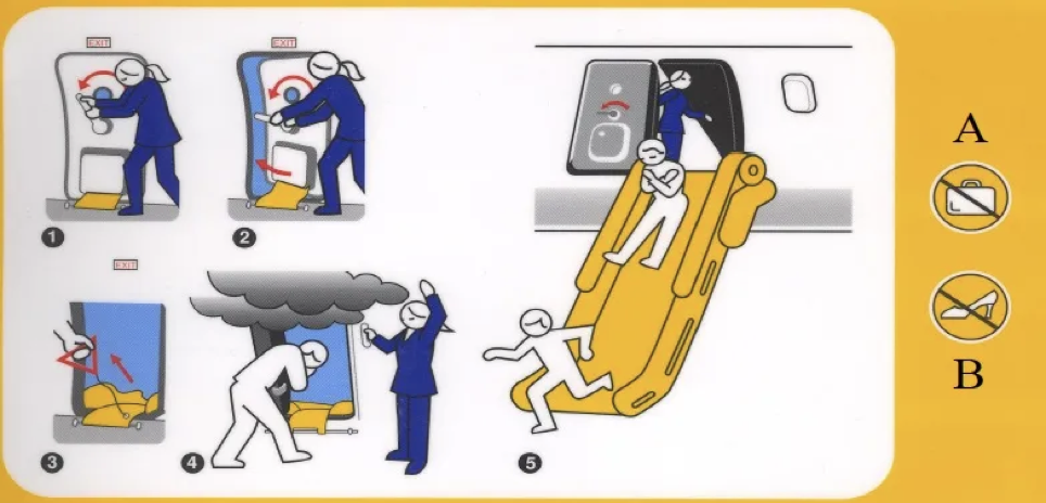
In this blog post I would like to focus on the evolution of safety Intructions on air planes.
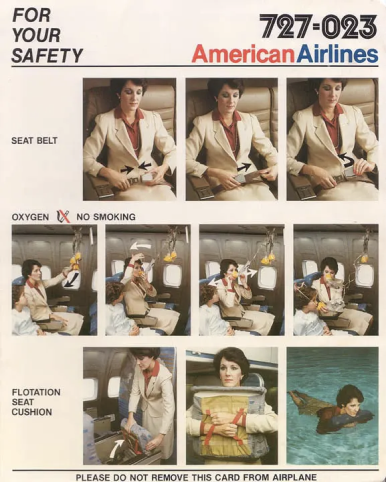
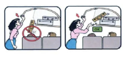
In the past safety instructions only relied on text. This approach, as illustrated by the example of early airplane safety cards, was not only impractical but also potentially dangerous. The transition to illustrations marked a significant improvement, making instructions more accessible. However, illustrations can be prone to misunderstandings without proper context. Research shows that effective illustrations must be well-matched to the text, avoiding excessive details and emphasizing key elements. The role of captions in enhancing understanding becomes apparent, stressing the importance of a balanced approach in visual communication.
Photos vs. Illustrations:
Before illustrations became prevalent on boarding passes, photographs were the norm. Studies reveal that illustrations outperform photographs in conveying information due to their ability to focus attention. The simplicity and clarity of illustrations play a crucial role in their effectiveness.
IKEA is an example of effective illustrated instructions. However if the complexity of instructions increases, videos become more favorable. Explainer videos, in particular, prove invaluable for conveying complex information, as seen in health and safety guidelines.
Four Rules for Creating Effective Instructional Videos:
There are four rules for creating instructional videos. These guidelines serve as a practical framework for content creators to enhance the impact of their visual instructions.
In the 1920s, German psychologists Max Wertheimer, Kurt Koffka, and Wolfgang Kohler formulated the Gestalt Principles with the aim of comprehending how individuals organize and interpret the complex stimuli they encounter visually and auditorily.
Their focus was on unraveling the mystery of how people make sense of seemingly chaotic sensory inputs. To address this, they identified a set of principles that elucidate the innate human tendency to impose order on disorder. Essentially, the mind processes visual and auditory stimuli by perceiving a collection of individual elements as a unified whole.
Gestalt Principles found swift adoption among graphic designers who leveraged them to craft visually appealing designs characterized by strategically placed elements.
Essential to visual design, Gestalt Principles encompass over ten interrelated principles, with some being more commonly applied than others.
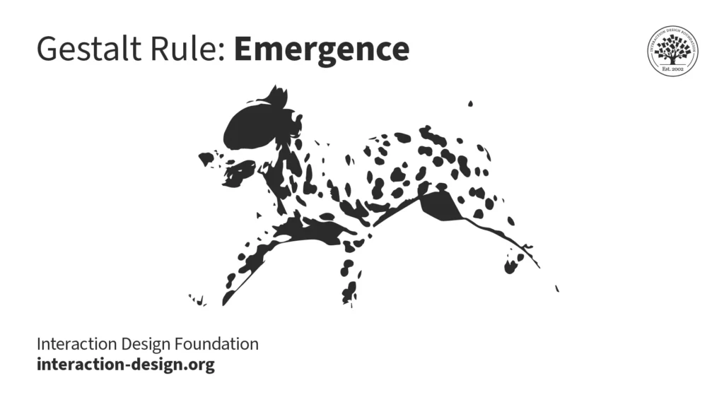
1. Emergence: Central to Gestalt thinking, the principle of emergence reflects our ability to perceive and understand the world without the need for exhaustive analysis of every minute detail. This rapid cognitive processing is crucial for survival, as spending excessive time analyzing our surroundings would have left our ancestors vulnerable to swift attacks from wild animals. We connect the dots and the Dalmatian emerges from the seemingly random scene.
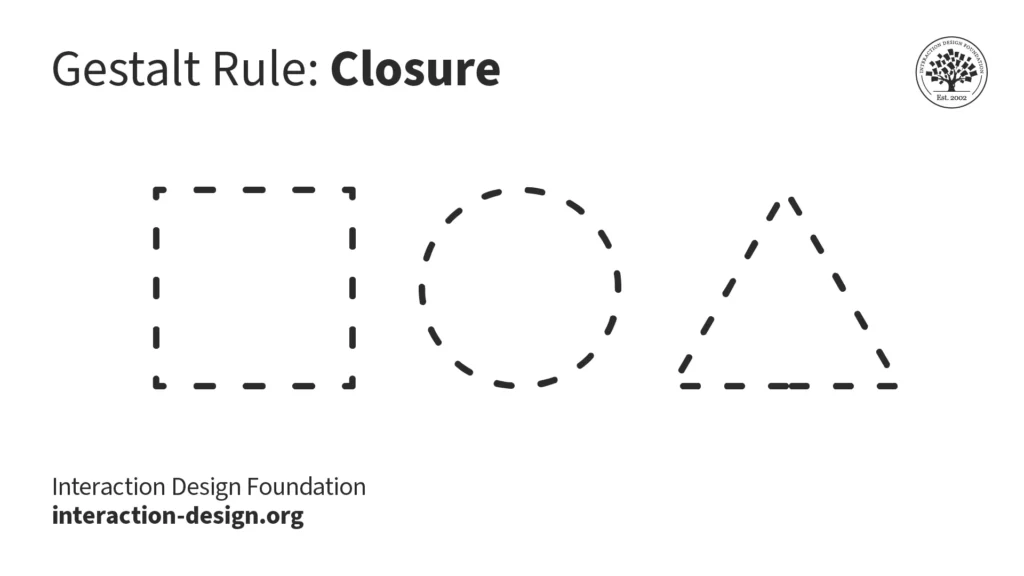
2. Closure: We prefer complete shapes, so we automatically fill the gaps between elements to perceive a complete image. That’s how we can see the whole first. You can use closure creatively to gain users‘ trust and admiration. Users will appreciate it when they see pleasing „wholes“ made from cleverly placed elements like lines, dots, or shapes.
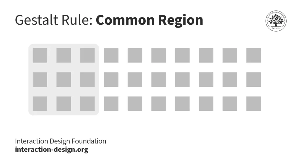
3. Common Region: We categorize elements within a shared enclosed area as a single group. To incorporate this principle into your interfaces, organize related objects together within a defined space to visually indicate their separation from other groups.
4. Continuity or Continuation: The Gestalt principle of continuity asserts that we tend to group elements that appear to form a continuous path in a specific direction. When observing a design, the human eye naturally tracks paths, lines, and curves, favoring a sense of uninterrupted visual flow over disjointed objects. Even when an obstacle conceals the path or visual elements intersect, the human eye persists in following the trajectory.
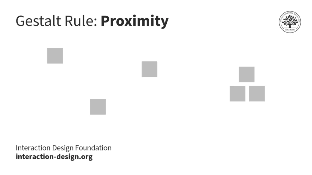
5. Proximity:We categorize elements that are closer together, distinguishing them from those positioned farther apart. When you assemble elements into groups within your design, users perceive them as a cohesive entity on the screen.
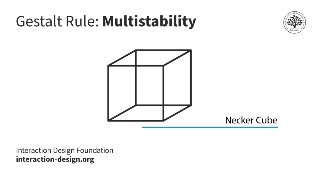
6. Multistability: When images possess ambiguity and offer two or more valid interpretations, we undergo the experience of alternating between these meanings. It’s not possible for us to perceive all the potential versions simultaneously. This phenomenon of transitioning between interpretations is referred to as multistability.
In the Necker cube optical illusion, you can interpret it as a three-dimensional cube with the „front“ face either toward the lower left or the top right. A third interpretation is that intersecting lines create a diamond in the center. Often, when we interpret the image one way, we find it hard to see the other interpretations.
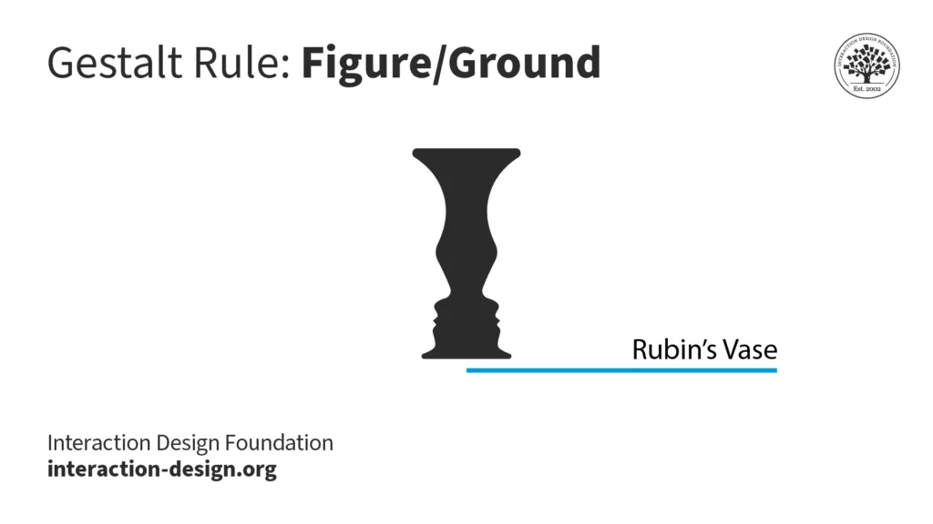
7. Figure/Ground: Our aversion to uncertainty leads us to seek out elements that convey solidity and stability. Except in cases of ambiguity, such as the iconic Rubin’s Vase, our initial perception tends to focus on the foreground of an image. The concept of figure/ground can be applied in various ways, primarily through contrasting elements—like employing light text (figure) against a dark background (ground). Effectively utilizing figure/ground, along with considerations like color theory, aids in guiding users through tasks and reducing cognitive load.
Rubin’s Vase is a classic illustration that demonstrates the principles of figure/ground and multistability. If you consider a white background, you see a black vase in the foreground. And if you consider a black background color, you see two faces looking at each other.
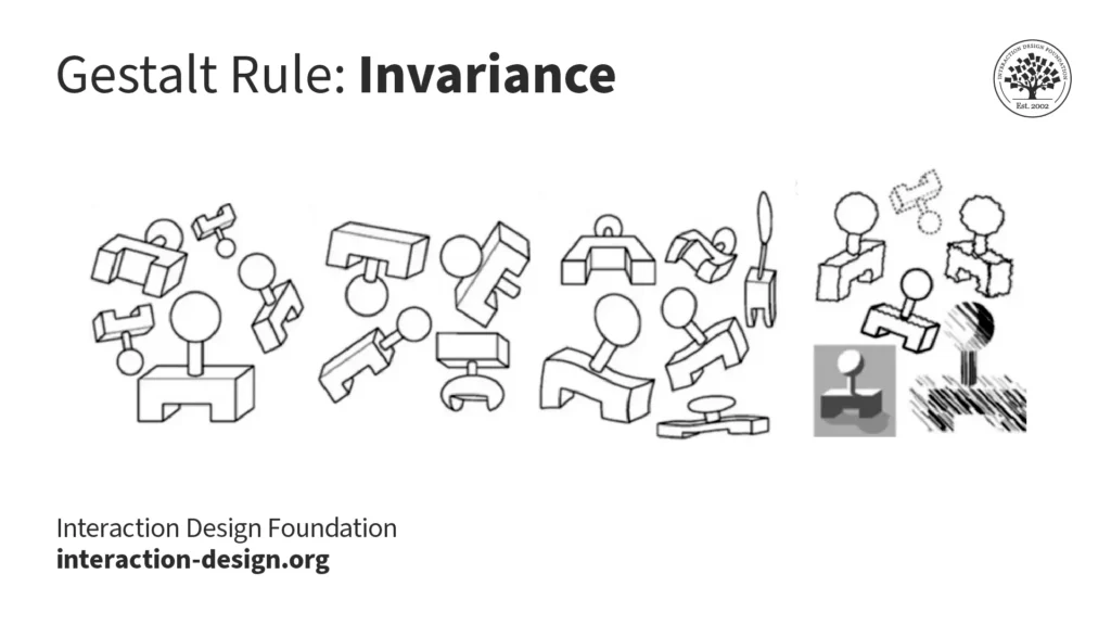
8. Invariance: The Gestalt principle of invariance elucidates our ability to perceive fundamental shapes as unchanged despite undergoing various transformations. These transformations encompass rotations, movements, changes in size, stretching, different lighting conditions, and alterations in parts. This principle plays a pivotal role in facial recognition. Through invariance, we can identify our friends and family members from a distance, different perspectives, or even when they make amusing facial expressions.
9. Pragnanz: Pragnanz captures the human inclination to simplify complexity. In a world where our senses are consistently inundated with stimuli, and our attention and processing capacity are limited, Pragnanz aids us in perceiving order and regularity amidst the visual competition.
When we see the Olympic rings, we see five interlocked rings instead of „C“ and lens shapes. The circles are simpler shapes to process than the C or lens shapes.
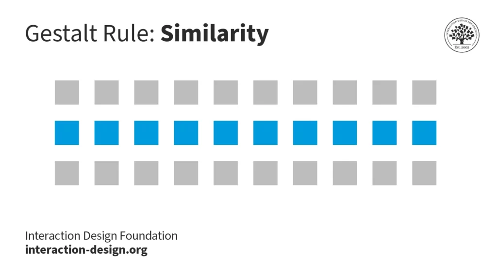
10. Similarity: When items, objects, or elements exhibit shared superficial characteristics, we interpret them as belonging to the same group. The principle of similarity is evident in branding and design system guidelines.
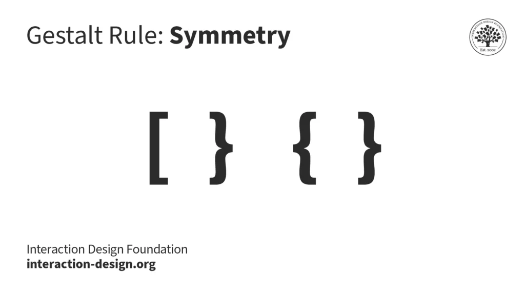
11. Symmetry and Order: Humans tend to see visual elements as grouped when they are arranged symmetrically. The natural world is filled with symmetry (or near symmetry), and our brains tend to favor symmetrical forms. Grid systems that evenly divide the space help designers implement symmetry and order in user interfaces.
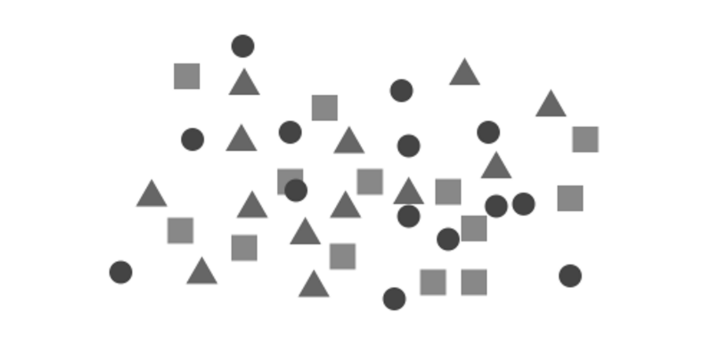
Which of these shapes would you group together? Chances are, you’ll pick the matching square brackets instead of the mismatched curly and square bracket combination.
12. Common Fate: This principle denotes the human inclination to perceive visual elements moving in the same direction or synchronously as part of a group. Movement isn’t limited to actual motion; cues such as arrows or rotation angles can signify the perceived direction of movement among the elements.
Sources: Interaction Design Foundation – IxDF. (2016, August 30). What are the Gestalt Principles?. Interaction Design Foundation – IxDF. https://www.interaction-design.org/literature/topics/gestalt-principles
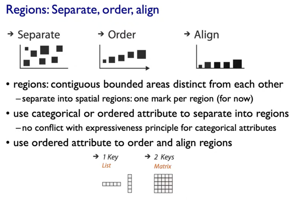
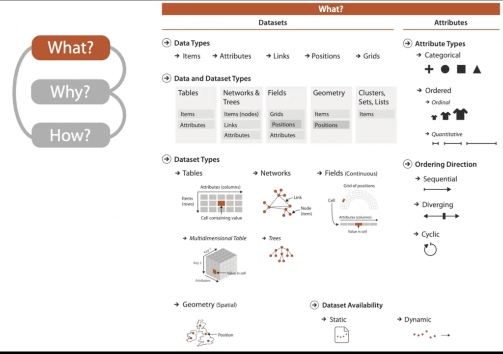
Visual Encoding How to systematically analyze idiom structure?
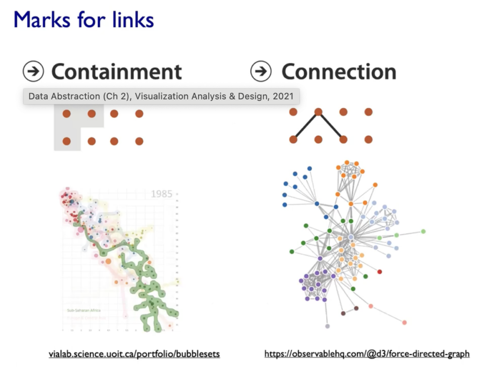
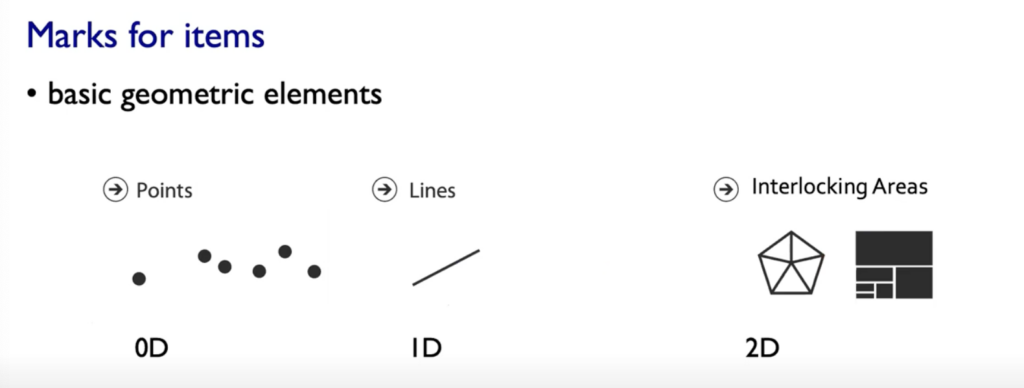
Marks: represent Items or links, basic geometric elements or 3D Marks, can used to represent links (eg. Containment or Connection)
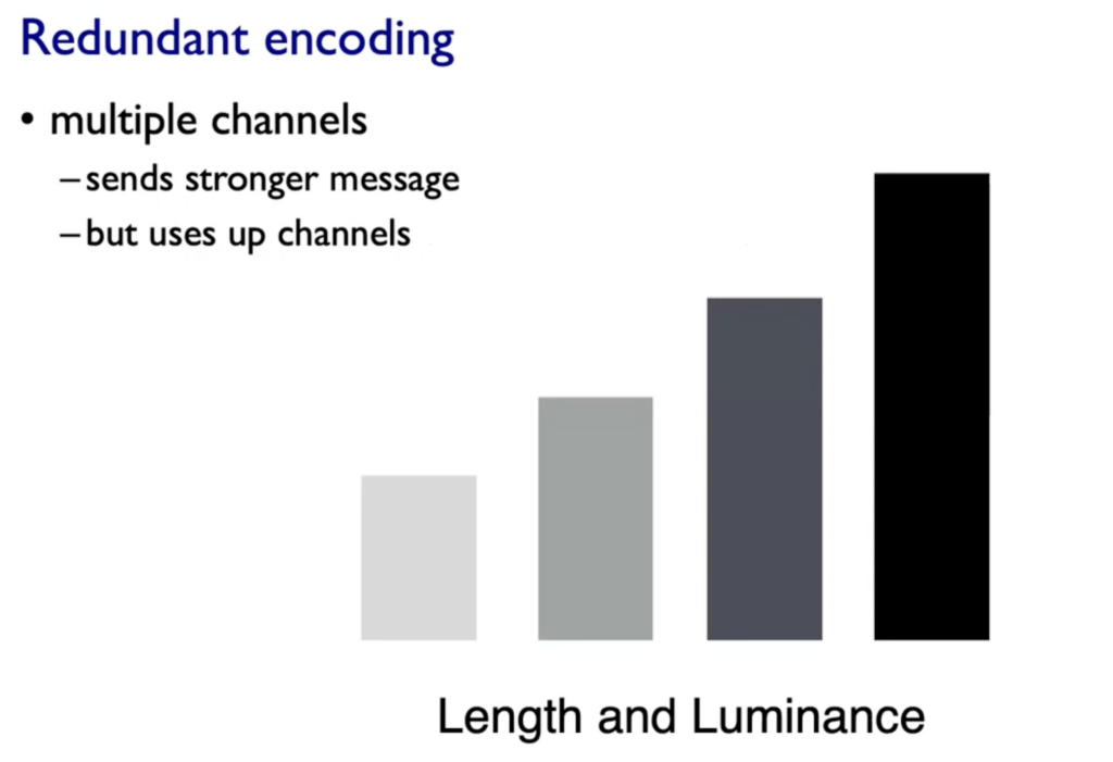
Channels: Change appearance of marks based on attributes
Expressives & Effectiveness: When to use which channels
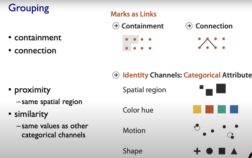
On left side (Magnitude Channels) your brain automatically thinks „how much reder is that or “ and „how much curvier ist that“. The Identity Channels (on the right side of the graphic below) convey Identiy eg. „What color is it“, „What motion is that“.
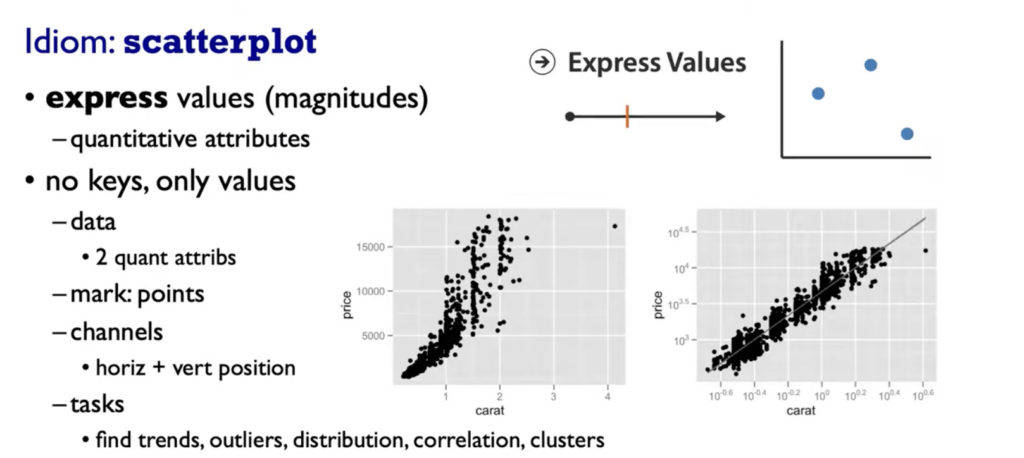
Spatial Postions are ranked really high on both Channels (Identity and Magnitude) and also the grouping of elements.
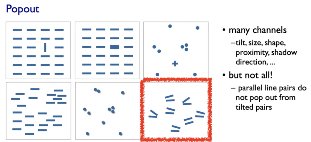
Popouts & Perception
Our visual System is always parallel processing on many individual channels & serial search for (almost all) combinations. The perceptual system mostly operates with relative judgments, not absolute.
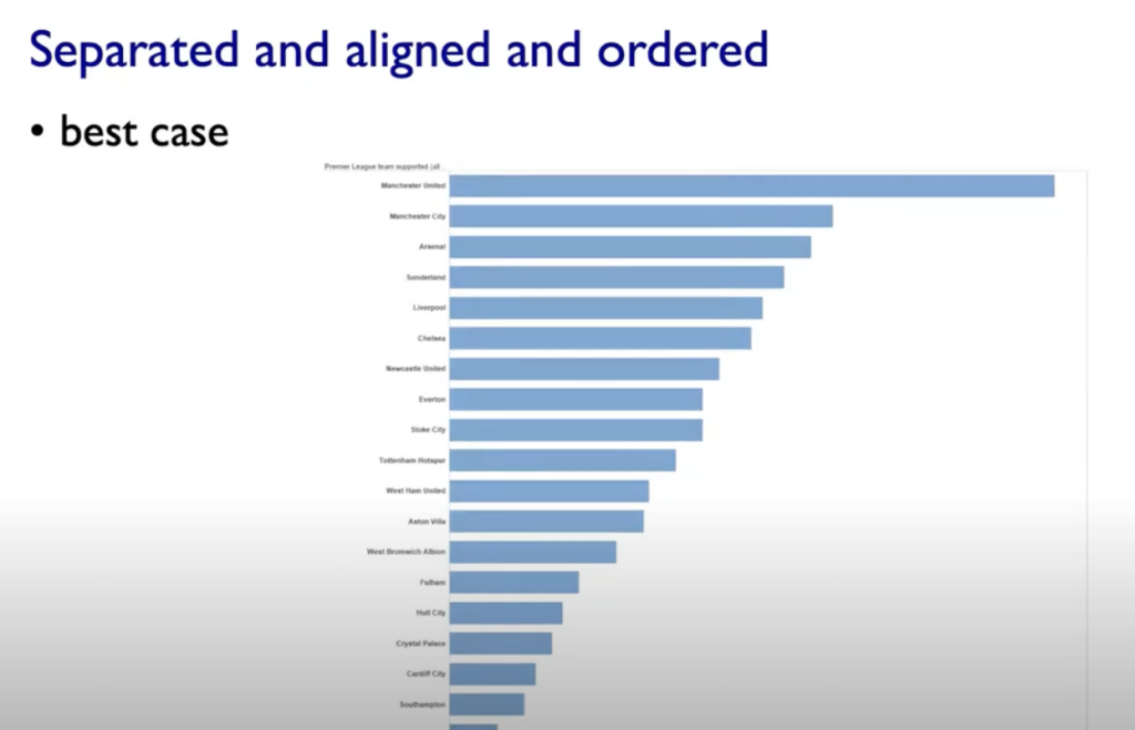
Aligment
Distractors
Distance
Common Scale/Alignment
Rules of Thumb
-unjustified 3D all too common in the news and elsewhere – we don’t really live in 3D; we see in 2.05D (We can’t look through objects, we have to look around and move our body) -perspective distortion: Perspective distortion happens when the size or shape of objects appears different than they actually are, based on the viewer’s position or the focal length of a camera. -unjustified 2D: Especially if reading text is central task -animation: great for choreographed storytelling, great for transitions between two states (Remember: Harder to compare visible item to memory of what you saw; with static side-by-side view you can compare easier) – Overview First, zoom and filter, details on demand (Shneiderman) – Responsiveness is required: 0.1sek perceptual processing(see the mouse), 1sek immediate response (fast response after mouseklick),10sek brief tasks -Function first, form next: Focus on functinoality – Axis: Label them; meaningful & useful title, legends
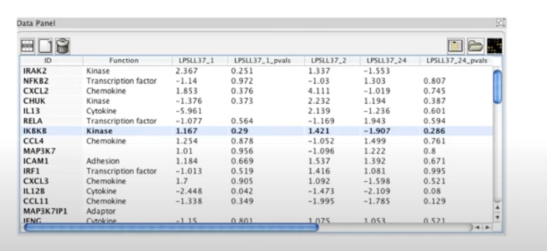
Tables
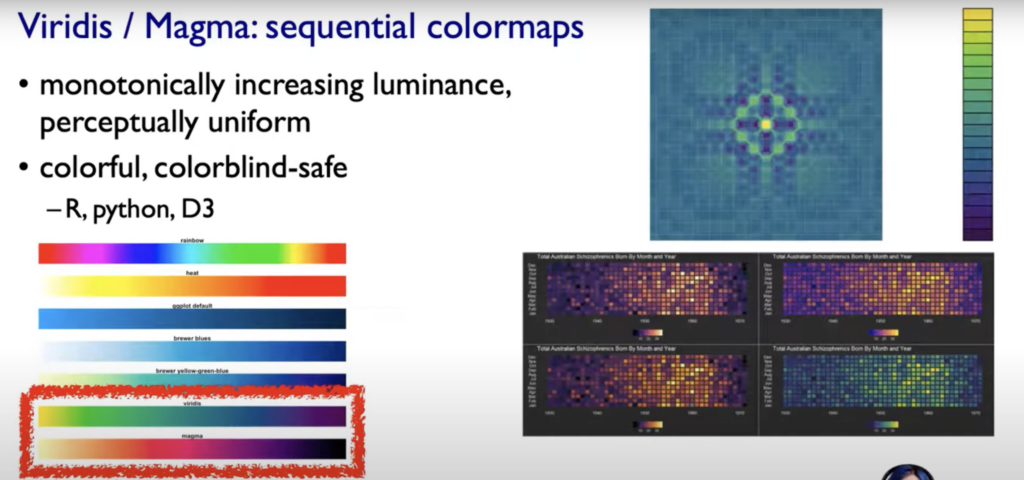
Color in Visualization – Human perception built on relative comparisons – limited number of discriminable bins (Rainbow is a poor default, nonlinear) – make sure it is intrinsic (intrinsic ordering our Perception does e.g Hues, should be linear) – For visual creator: fewer hues, fine structure (multiple hues with monotonically increasing luminance). Eg. Vridis/Magma Colormaps (see below)
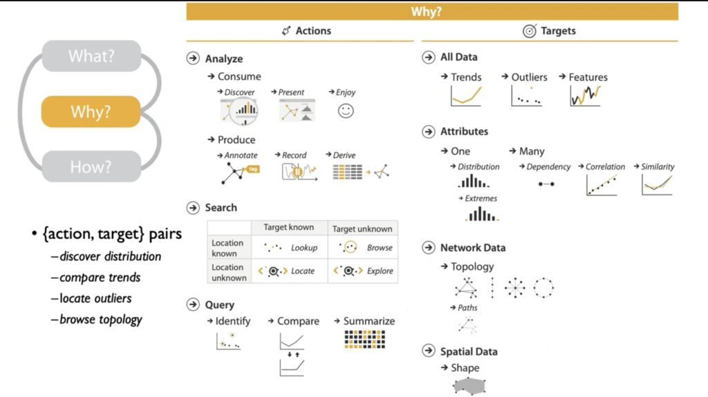
Tamara Munzner says the definition of visualization is: „Computer-based visualization systems provide visual representations of datasets designed to help people carry out tasks more effectively.“
Why? Is It interesting?: Data and People in the same sentence
We do not need visualization when…: A) …fully automatic solution exists B) …fully automatic solution exits and is trusted
Why use external representation?
external representation=replace cognition with perception
Replace cognitive Acts with perceptional acts in order to free up cognition for more interesting higher level questions
Example Table full of Numbers: – Goal is understand some overall structure of those Gene Expression levels – to read a number, remember it, read the next number, remember that, compare to the other……… (We pretty fast would run out of short-term slots storage in our head) -> Cognitive Act that is quite demanding
Versus Replacing the cognition with perception
Why depend on vision?
Human visual system is high-bandwidth channel to brain. Overview possible due to background processing (subjective experience of seeing everything simultaneously, significant processing occurs in parallel and pre-attentively).
Why represent all the data?
Summaries often lose information, details matter. Visualization can confirm expected and find unexpected patterns. Also it asses validity of statistic model.
When we have data we need some real-world meanings (Semantics)
Resources Limitations?
Computational limits
Display limits: 1. pixels are precious & most constrained resource, 2. information density (ratio of space used to encode info vs unused whitespace, tradeoff between clutter and wasting space, find sweet spot between dense and sparse)
Human limits: human time, human memory, human attention (focus- attend)
Why analyze?
Imposes Structure on huge design space: Scaffold to help you think systematically about choices, analyzing existing as stepping stone to designing new, most possibilities ineffective for particular task/data combination
Dataset types
Tips: Figure out your Dataset Typ and understand mental construction (Semantics)
(Cyclic: e.g Seasonal Data or Direction of wind)
HOW TO START:
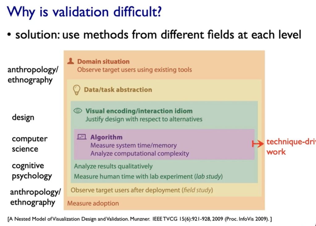
Who Are The Target Users: ?
What is Shown: Data Abstraction
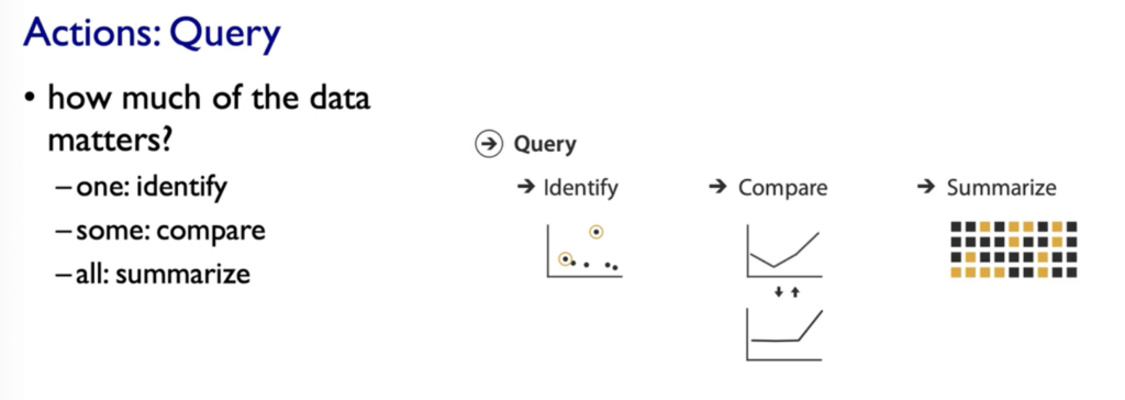
Why is the user looking at it: Task Abstraction
How is it shown: Visual Encoding(how to draw it) & Interaction (how to manipulate) -> Part 2
In this blog post, I want to explore the interesting concept of controlled chaos in design, highlighting the innovative approaches of French studio Parallèle Graphique and Thomas Kurppa, co-founder of Stockholm-based agency Kurppa Hosk. These designers skillfully navigate the delicate balance between order and disorder, transforming seemingly chaotic elements into compelling and purposeful designs. Controlled chaos in design involves the intentional arrangement of different elements to create visually striking compositions that may initially appear disorderly, but ultimately achieve a harmonious and coherent result. I’ll explore how both Parallèle Graphique and Thomas Kurppa achieve this balance, infusing their designs with a unique blend of creativity and structure.
Parallèle Graphique
French design studio Parallèle Graphique is known for its captivating approach, often described as “controlled chaos”. The trio – Marceau Truffaut, Chloé Plassart, and Thomas D’Addario – joined forces after collaborating on BimBaam!, and recognizing the challenges of navigating the design industry individually. Their collective approach, established in 2014, has allowed them to tackle diverse projects ranging from brand identities to web design.
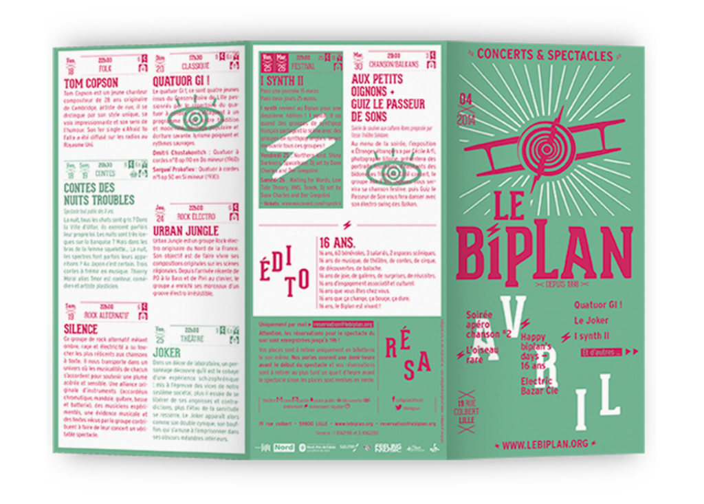
A standout project is the redesigned identity for Le Biplan, a small concert hall in Lille, where they ingeniously adapted to a small budget. The resulting global identity, with a custom typeface and monthly updated trifold brochure, showcases purposeful chaos within dense information.
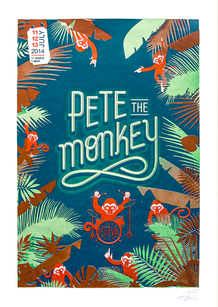
In a different vein, Parallèle Graphique’s work for the Pete the Monkey music festival in Normandy, which supports a Bolivian monkey sanctuary, demonstrates their versatility. The custom font and hand-drawn monkeys, along with silk-screened posters, demonstrate their commitment to high-impact design.
Beyond client projects, their passion for screen printing extends to an online store that offers illustrative screen-printed posters. Each member contributes a unique style, from Truffaut’s heavy metal influences, to Thomas‘ street and pop designs, to Plassart’s feminine touch of ornamentation and stylized lettering.
As the team grows, it is hoped that they will retain their distinctive ability to harmonize disparate elements into purposeful designs and remain calmly centered in the midst of their design storm. This promising trio brings a dynamic and unique perspective to the world of graphic design.1
Thomas Kurppa
Thomas Kurppa, co-founder of Stockholm-based agency Kurppa Hosk, took a unique path to graphic design, first immersing himself in the electronic music scene of the 90s. Kurppa moved from producing electronic music to experimenting with album covers and flyers. This curiosity led him to design school, where he delved into the history of design, especially the modernist influences in underground music.
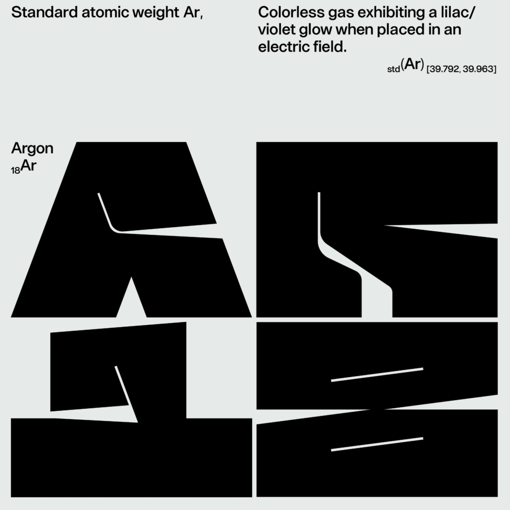
Now running his own agency, Kurppa’s design philosophy is centered on mathematics and geometry, fascinated by the fundamental role of numbers and codes in nature. The interplay between control and chaos defines his bold work, which is particularly evident in his type-centric designs.
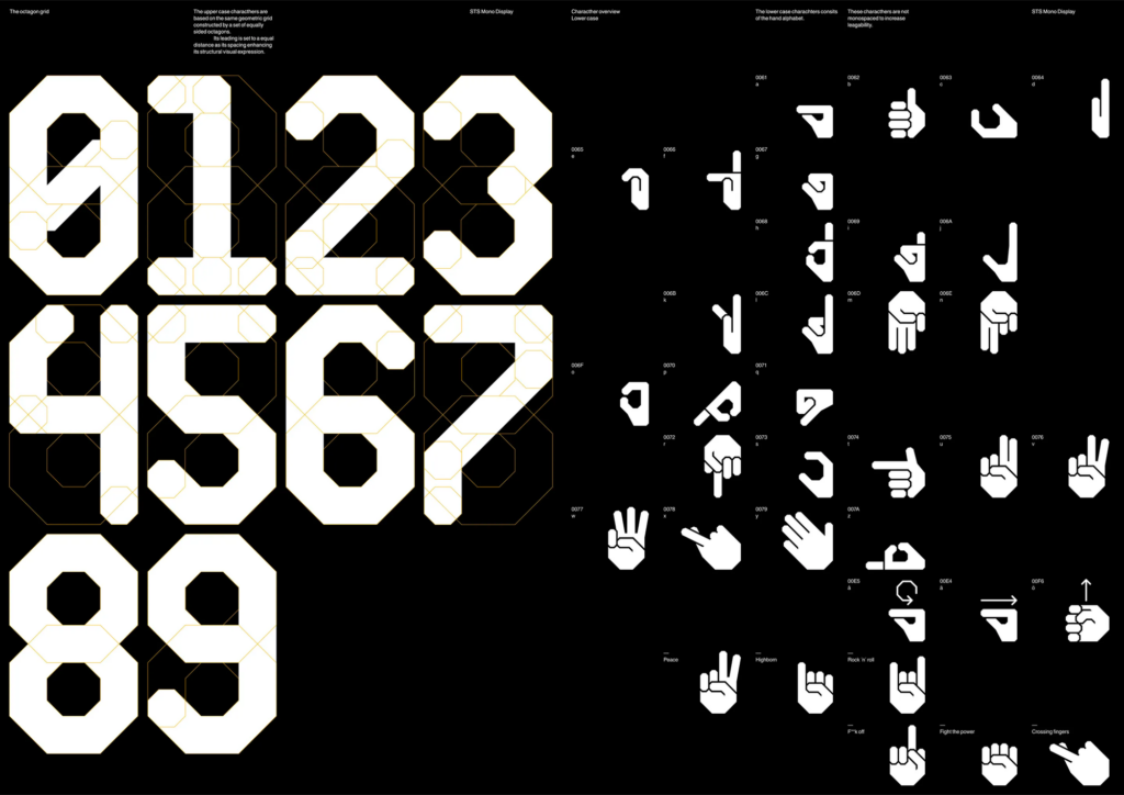
One notable project, „Spread The Sign,“ created in collaboration with Leo Drakenberg, aims to provide a universal platform for sign language. Using a strict geometric system, Kurppa challenges preconceptions about design for the hearing impaired, seeking a playful and unpretentious expression within a solid structure. The design features bold pictograms contrasted with muted information, using a stark black, white and orange palette to create a visually striking and accessible brand for both the target audience and those unfamiliar with hearing impaired culture.
Beyond client projects, Kurppa explores letterforms and type, sharing his experiments on Instagram. This serves as a creative playground, allowing him to stretch ideas without the constraints of formal client briefs. Drawing parallels between letterforms and chair design, Kurppa emphasizes the importance of functionality and the dynamic nature of design. He strives to continually learn and evolve, embracing experimentation as a means of pushing the boundaries of design.2
In this blog entry I want to look into how designs can be organized and how order can prevent a design from looking random. The focus is on the significance of balance in graphic design and methods for achieving it.
Balance in design ensures that elements in a composition are distributed and visually weighted to achieve cohesion and satisfaction. It plays a crucial role in providing stability, structure, and emphasis, contributing to the overall dynamics of a design. This principle aims to arrange visual elements in an aesthetically pleasing manner, not necessarily symmetrically, but in a way that prevents any single element from dominating the design. The goal is to create a unified and naturally pleasing visual experience. There are several forms of balance in graphic design, each with its own advantages and disadvantages. The choice among these types depends on the specific message and mood you are trying to convey.
Symmetrical (Static) Balance
Symmetry, the most common form of balance in design, involves organizing elements equally on either side of a central axis, whether horizontal or vertical. While considered predictable by some, this method is widely appreciated for its visual appeal, providing a sense of organization and harmony on a subconscious level. Despite its perceived predictability, symmetrical balance has endured over time, proving to be one of the most effective ways to create a sense of comfort and solidity on a page.
The key feature of symmetrical balance is the mirroring effect created by the elements on either side of the imaginary line through the center of the design. This mirroring creates a stable visual composition with an even distribution of visual weight. Drawing a straight line through the center in any direction reveals a consistent balance that contributes to an orderly and aesthetically pleasing appearance. While some may find symmetrical balance unexciting, its enduring popularity is a testament to its ability to create a visually stable and comforting design.
In the first image, both sides have the same visual weight, creating a perfectly balanced design. But in the second image, when one side becomes lighter and the other remains dark, the dark side feels heavier. Symmetrical balance is good for clear communication, but it may not make a design interesting. It’s important to find the center of the design and use different techniques to distribute weight evenly on each side.
Asymmetrical (Dynamic) Balance
Asymmetric balance in graphic design occurs when elements have unequal visual weight, adding a dynamic and compelling quality to the composition. Unlike the predictability of static balance, asymmetry sparks viewer engagement by inviting a subconscious search for counterweights, drawing attention to often-neglected areas of the design. Intentional imbalance introduces tension and movement, making it an ideal choice for creative or intricate projects. Striking a delicate balance becomes paramount, allowing one side to carry a noticeable weight while maintaining an overarching sense of balance. This thoughtful interplay not only attracts attention, but also infuses vitality into the design, making Asymmetrical Balance a compelling tool for designers seeking to enhance visual appeal. The greater the asymmetry, the greater the inclination of the viewer to investigate its origin. Individuals will naturally look at such a picture with more attention than usual. However, maintaining a sense of proportion is crucial; an overly eccentric composition may not always be well received.
Radial balance in design involves the arrangement of visual elements that radiate outward from a central point, typically at the center of the composition. Although not as commonly used, this approach offers a distinct advantage by easily capturing attention and establishing a clear focal point, often placed at the center of the design. Achieving radial balance requires placing objects, colors, or textures equidistant from this central point, promoting a symmetrical distribution of visual weight. When multiple axes converge on a single point within a composition, this is known as radial balance. The underlying goal is to draw the viewer’s attention to the central area, creating a sense of cohesion and symmetry within the design. This deliberate arrangement can enhance visual appeal by providing a clear point of emphasis and balance, although it is used less frequently than other balance techniques.
Mosaic balance, also known as crystallographic balance, is a style reminiscent of the chaotic yet harmonious paintings of artists such as Jackson Pollock. In this approach, there are no prominent focal points, and all elements are equally responsible for creating a visually cohesive whole. Despite the initial appearance of visual noise due to the lack of hierarchy, mosaic balance arranges elements in a random or chaotic manner, creating a sense of diversity, complexity, and richness. This type of balance lends itself to designs that aim to present a variety of information or images in a collage or mosaic style. The uniqueness of mosaic balance lies in its ability to create harmony without emphasizing any single element or allowing it to dominate the overall composition.
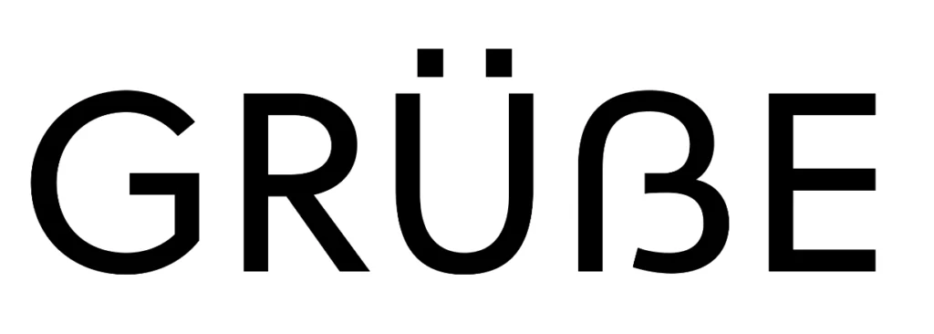
Uppercase Eszett Design Since June 29, 2017, the letter ẞ has become a part of the German orthography. Many type designers warmly welcome this decision and had already incorporated the unofficial character into their font designs even before its official recognition. Now that the character has been formally included in the alphabet, the question of how to design a capital Eszett arises once again. Many designers assume that the ligature for the capital Eszett is exclusively composed of a long „s“ and „z“ (Sulzbacher Form) and tailor their designs for ẞ accordingly. However, the historical origin of the capital Eszett, whether from „s“ and „z,“ from a long „s“ and a round „s,“ or from other combinations, cannot be conclusively answered. Diverse combinations were already in existence in the 7th century.
More relevant than conclusively determining the origin of the ligature is the development of a functional form for this new uppercase letter, focusing on readers in the 21st century. If we place the habits of the reader at the center and aim for a responsible design for use in the 21st century, a derivation of the form from the version with a long „s“ and a round „s“ is clearly preferable. Especially considering international appeal, forms that distinctly incorporate an „s“ shape are convincing.
The development of this new uppercase letter and its stylistic integration into our existing capital alphabet necessitate careful consideration of several key elements. The letter should possess a monumental, uppercase appearance to emphasize its prominence. Simultaneously, it is crucial that it clearly distinguishes itself from other glyphs in the alphabet while maintaining a stylistic connection to ensure overall coherence. Particular attention should be given to its resemblance to the form of the common „ß“ in Antiqua fonts. This not only establishes a visually coherent link but also supports the seamless integration of the new uppercase letter into the overall font style. Additionally, it is essential to incorporate the normal „s“ form into the design for improved identifiability, facilitating a harmonious fit within the existing alphabet. Another significant consideration is the treatment of the left stem as an abstract element. This approach becomes necessary as the familiarity with the long „ſ“ gradually diminishes, and a contemporary, easily recognizable design is sought. By carefully addressing these attributes, a visually appealing and functionally integrated design for the new uppercase letter can be achieved.
When examining the basic structure of Capitalis Monumentalis, which serves as the origin of our contemporary uppercase letters, it becomes apparent that Roman letters are both distinct from each other and, at the same time, exhibit a stylistic coherence. This duality defines their quality and underlies their usage for over 2000 years.
When introducing a new character, it must stand out from all others. In the case of the capital Eszett, the reading habits of readers play a crucial role. A resemblance to the common „ß“ facilitates recognition – reading type designers should align with these habits for optimal legibility.
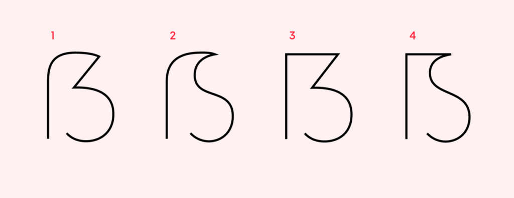
Four Primary Constructions Typography experts have crafted various forms of the Eszett, resulting in four primary constructions of the uppercase Eszett: „Dresden“ (1) and „Leipzig“ (2) as per Andreas Stötzner, and „Frankfurt“ (3) and „Berlin“ (4) according to Adam Twardoch.
The German typographer Ralph Herrmann has highlighted that the most prevalent construction for the capital form of the Eszett is the number 1 variant. Distinguishing features include the aperture at the bottom and a diagonal in the upper right part. The lower part is frequently rounded, although some Eszett forms may present this section as an angle or with a serif.
When embarking on the creation of an extended language set, the fundamental set of characters and letters is typically already crafted. Therefore, in the graphic rendering of the Eszett, attention can be directed towards the established forms of the letters F, S, Z, B, and the numeral 3.
The proportions of the uppercase Eszett are generally wider than those of the letter B by approximately 10-15%. Although not a strict requirement, it is more crucial to consider the proportions of the overall font and align the design accordingly.
To assess the outcome, one can print the text containing the Eszett and carefully examine its appearance within the complete set of characters. This aids in understanding how the character‘s shape integrates into the overall aesthetic of the font concerning width and form. According to Karen Cheng in „Designing Type,“ making cuts and serifs in the terminals of S, 3, and Eszetts identical is suggested, but it is not obligatory in typeface creation. For instance, in sans-serif fonts, terminal cuts can be straight.
Unsuccessful examples of the eszett form are usually read as B.
Typographers hold differing opinions on the design of the verbal Eszett. While the Dresden (1) variant is the most commonly used form, many critics argue that it bears too strong a resemblance to the characteristics of the numeral 3. The sharp-edged diagonal consistently harks back to the historical roots of the Sulzbacher Form (ligature of long „s“ + „z“). Instead, there is a preference for adopting the Antiqua approach of long „s“ + „s“ and emphasizing the uppercase S in the uppercase Eszett. For non-native German speakers, associating the Leipzig (2) and Berlin (4) forms with a distinct S-form would be more intuitive.
The Luxury Spirit Packaging industry is witnessing unprecedented growth, driven by the surge in craft spirits and changing preferences among millennials. Valued at $154 billion in 2020, the North American spirits market is projected to grow at a 7.7% Compound Annual Growth Rate (CAGR) until 2028, largely attributed to millennials‘ inclination towards premium spirits. Craft spirits, experiencing a 10.4% market growth, have become significant players, with over 2,500 distilleries in the U.S. Local liquor stores now showcase a plethora of craft spirits with vibrant labels, marking a diverse market from mocktails to celebrity-branded spirits. Notable successes include George Clooney’s Casamigos, selling for $1 billion, and Bob Dylan’s Heaven’s Door Spirits.
Essential spirits packaging:
The success of a liquor brand hinges significantly on its spirits packaging, as the modern market seeks not only high-quality products but those that exude luxury and class. Typically, as the price of a spirit rises, particularly in the $30-$40 range, it adopts more specialized packaging to impart a premium feel. Achieving this sense of luxury is often realized through two primary structural designs – folding cartons and rigid set-up boxes. Folding cartons offer versatility, allowing for customized shapes and sizes, providing an ideal canvas for decorative finishes and elements, and ensuring accelerated speed-to-market. In contrast, rigid set-up boxes, crafted from high-quality chipboard, convey luxury and sturdiness, making them suitable for brands requiring structurally sound packaging with an elegant presentation. Such boxes are commonly employed for promotional items and packaging featuring interactive elements. To embody luxury in packaging, adherence to essential practices is crucial, especially during three pivotal phases where the packaging must stand out.
Product Launch:
Launching a product marks its debut to the public, underscoring the critical importance of making a compelling first impression. A standout, on-brand, and luxurious packaging design is indispensable for a successful product launch. It is crucial to define your brand identity before entering the market and seamlessly convey it through your packaging. In the high-end spirit industry, consumers are attracted to heritage and storytelling. Thus, integrating your brand narrative into the packaging fosters a connection with your target audience. Utilize exotic substrates, dramatic effects, and other captivating elements to attract and engage consumers during this pivotal launch phase.
Limited edition:
In limited editions, packaging is pivotal, conveying the uniqueness, story, and value for the premium price. Rabbit Hole’s Founder’s Collection series showcases this approach, featuring sequential numbering, a specialty bottle design, and a linen-textured sash tribute on the rigid box. The packaging, adorned with soft-touch coating, hot foil stamping, and the founder’s signature embossing, exemplifies meticulous attention to detail in limited edition presentation.
Holiday edition:
The holiday season presents an opportune time to elevate your packaging with added luxury. Crafting exclusive value-added packaging that complements the spirit of gift-giving is ideal during this festive time. Complete holiday packaging should embrace festive colors like reds, greens, blues, and golds. The allure of gift-ready packaging, coupled with its convenience for last-minute shoppers, makes it highly appealing to consumers. Holiday and gift-ready packaging often incorporate embossing, foil effects, and special coatings to evoke the holiday ambiance and captivate consumers.
Foils and Metallics:
Foils and metallics are a perfect way to accentuate specific elements of your product, potentially enticing new consumers away from their usual choices. Hot and cold foil stamping, offering an intense metalized look, imparts a luxurious and high-quality feel to your packaging. Alternatively, metallic inks, applied earlier in the printing process, provide a subtler yet unique shine, suitable for finely detailed packaging.
Vintage Packaging:
Vintage and nostalgia-inspired packaging is a prevailing trend shaping the industry, as brands tap into the charm of the past to distinguish themselves. Incorporating simple and traditional elements, like color schemes or old-fashioned fonts, resonates with consumers seeking a nostalgic escape from the technology-driven era. Often presented as limited editions, these vintage designs serve to enhance sales.
Standing out in the packaging industry:
To stand out in the expanding spirits market, a distinctive and innovative packaging approach is essential. Beginning with a creative structural design, options like rigid set-up boxes, premium folding cartons, and promotional packaging set brands apart. Utilizing 3D printing and extensive prototyping enhances the inventiveness of the design. Incorporating unique closures adds an interactive element to the packaging, creating a memorable unboxing experience. Whether aiming for interactivity or a touch of mysticism with concealed features, such closures contribute to a standout spirit packaging.
Special effects:
Specialty effects play a pivotal role in the success of spirits packaging, captivating consumers and positioning the product as a luxury item. Utilizing finishes like metallic inks, hot and cold foil stamping, embossing/debossing, holographic foils, and various coatings enhances the visual appeal. Incorporating exterior effects such as magnetic closures and exotic substrates further elevates packaging, offering a diverse range of textures and finishes.
Color Cosistency:
Color consistency is crucial for brand identity, ensuring that the chosen color remains uniform across different products and promotional items. Rigid boxes are the preferred choice for collections and collector’s items, providing durability and a luxurious presentation. Windows are essential for showcasing the product, exemplified by Jim Beam Black’s packaging that allows a glimpse of the extra-aged bourbon and accompanying whiskey glasses.
Duty-free packaging presents an opportunity for distinction, with exclusive designs catering to last-minute tax-exempt purchases. Themed packaging, whether tied to a movie franchise or seasonal themes, proves effective in standing out in a crowded market. Sustainable packaging aligns with the growing environmental consciousness of consumers, attracting a wider audience through the use of recyclable materials.
Experiential marketing and packaging go hand in hand for spirits, with Casamigos Tequila serving as an exemplary case. Its bold packaging, reflecting the colors of the agave plant, complements the brand’s commitment to delivering the best-tasting and smoothest tequila, exemplifying the cultural experience associated with genuine tequila.
In conclusion, embracing innovative specialty effects, ensuring color consistency, utilizing durable packaging solutions, incorporating windows for product visibility, designing duty-free exclusives, exploring themed packaging, adopting sustainable practices, and integrating experiential elements can collectively elevate spirits packaging, setting brands apart in a competitive market and enhancing the overall consumer experience.
When designing a lowercase „eszett,“ there are two possible forms: – One is the classic connection of „f“ on the left with the letter „s,“ where the „f“ lacks a crossbar. – The other is the Sulzbacher shape with two semi-ovals on the left, resembling the number 3.
In many typefaces, there is a smooth and continuous connection of the arch of „f“ with the letter „s,“ although some forms exhibit a more noticeable separation between these characters. According to the german typographer Ralf Herrmann, German-speaking readers unfamiliar with typography perceive the „eszett“ as a single letter. Due to this, it is advisable to create a variant with a smooth connection.
Stem Classic typefaces for body text typically maintain an upright style where the stem does not extend below the baseline. This characteristic aids in distinguishing the eszett from the Greek letter beta. However, in italic forms, this rule can be disregarded, as historically, the long s form in italics consistently featured a descender and was indeed long.
Serifs The left serif depicted in the image above is a common feature in many fonts. In modern typography, including this serif is not essential for an eszett, offering the flexibility to omit it to prevent the eszett from resembling an „f.“ However, caution is advised when adding serifs to fonts with a long s. If a serif is incorporated into a long s, it must also be applied to the eszett. This principle works conversely as well: the absence of serifs should be consistent for both characters. It is crucial to prevent confusion between the long s and „f,“ as exemplified below: the long s_t ligature might resemble f_t, but it lacks a serif in both the eszett and the long s characters. Users unfamiliar with historical context could easily misinterpret this ligature for other purposes.
Historical Influence In typefaces with a historical flair, there is the opportunity to explore unique combinations of the long s with „s,“ drawing influence from Fraktur script, which adds a distinctive and unconventional touch to the design.
Sulzbach Form The Sulzbach form of the eszett is characterized by an implicit connection between the long s and the letters „s“ or „z,“ forming what may appear to those unfamiliar with German as a capital B due to the presence of two semi-ovals. When crafting this eszett variant, designers can draw inspiration not only from the combination of „f“ and „s“ but also from the numeral 3.
In this form, it‘s essential that the right semi-ovals of the eszett are identical, contributing to the distinct appearance. The horizontal component should not connect to the stem throughout its length, ensuring a visual separation from the uppercase B. The lower semi-oval can conclude with either a serif or a drop, depending on the stylistic choices of the font being created.
When crafting ligatures, including the eszett, it‘s essential to adhere to the overall logic of the font. In instances where a particular form raises uncertainty, it‘s beneficial to test the character within the context of other characters to evaluate visual compatibility. It‘s crucial to keep in mind that all characters within the font should exhibit harmony, ensuring a visually pleasing experience for the reader when perusing the typed text. This harmonious design approach not only enhances the reader‘s enjoyment but also brings satisfaction to the designer working with the font.