Future Outlook

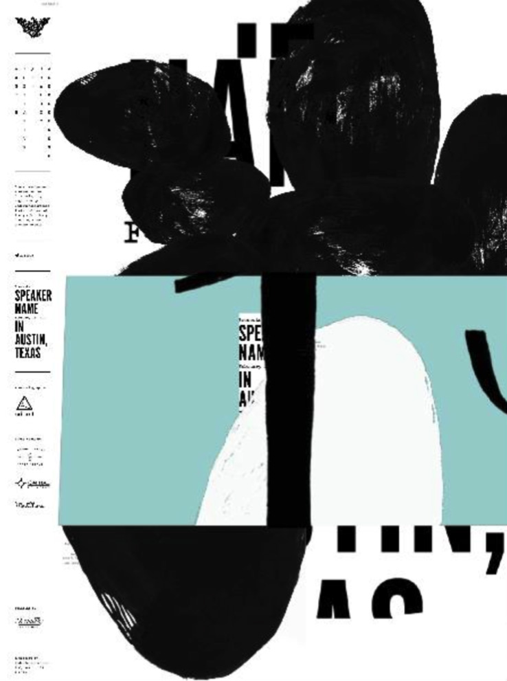
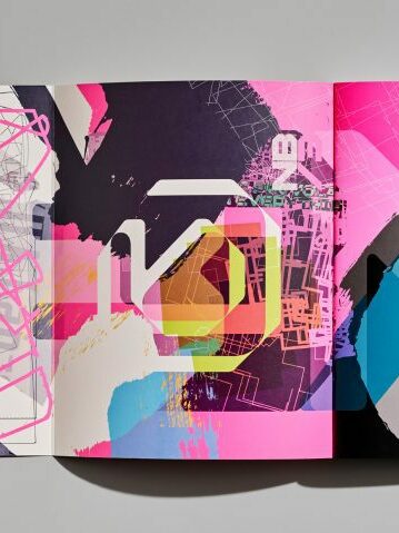
As we look ahead, the importance of imperfect, handmade elements in visual communication are likely to continue growing, offering designers unique opportunities to create authentic and human-centric designs.

While there are many new technologies that are getting more important, such as AI and VR, there is also a countermovement visible, back to analog, and handmade aesthetics. The future of design will be characterized by emerging trends and technologies that will redefine the way designers create and experience visual designs. These emerging technologies include virtual reality (VR), augmented reality (AR), mixed reality (MR), 3D printing, artificial intelligence (AI), and chatbots, among others. By embracing these technologies, designers can create more innovative, efficient, and engaging designs that resonate with users and build trust. 

However, designers must also balance these technological advancements with the growing emphasis on diversity, inclusivity, and authenticity in design, incorporating “imperfect” elements to create designs that are more meaningful, relatable, and impactful. Ultimately, the future of design will be shaped by a harmonious collaboration between human creativity and technological innovation, as designers continue to push the boundaries of what’s possible and create designs that resonate emotionally with users.

https://www.linkedin.com/pulse/future-design-exploring-emerging-trends-technologies-lead-generation

https://www.linkedin.com/pulse/future-graphic-design-exploring-emerging-trends-shaping-mayank-verma

https://www.interaction-design.org/literature/article/how-can-designers-adapt-to-new-technologies-the-future-of-technology-in-design

Several future trends and developments, concerning the shift to imperfect and authenticity, can be anticipated:

  1. Embrace of Eclecticism: The future is expected to witness a further embrace of eclectic design styles, with designers integrating a mix of digital precision and imperfect, handmade elements. This fusion allows for a diverse visual language that captures attention and communicates messages effectively.
  2. Technological Integration: Advancements in technology, such as AI and machine learning, may offer new tools and possibilities for designers to seamlessly integrate handmade elements into digital designs. This synergy can enhance efficiency while preserving the warmth and authenticity of imperfections.
  3. Sustainable Design Practices: There is a growing emphasis on sustainability in design. Handmade and imperfect elements inherently align with sustainable practices, as they often involve a reduction in reliance on purely digital, resource-intensive processes.
  4. Personalized and Story-Driven Design: Designers may increasingly focus on creating personalized and story-driven visual narratives. Imperfections can play a key role in storytelling, helping to evoke emotions, establish connections, and convey the uniqueness of each narrative.
  5. Collaboration Between Analog and Digital Artists: The future may witness more collaboration between traditional artists and digital designers. This synergy allows for the exchange of ideas, techniques, and skills, resulting in visually rich and diverse designs that celebrate both analog and digital elements.
  6. Continued Focus on Human-Centered Design: The importance of human-centered design principles is likely to persist, with designers prioritizing the user experience and incorporating imperfections to enhance relatability, empathy, and a sense of connection.

In navigating these future trends, designers can continue to use imperfect, handmade elements by:

  • Balancing Precision and Imperfection: Striking a balance between digital precision and imperfections ensures that designs remain polished and professional while incorporating a human touch.
  • Experimenting with New Tools: Staying abreast of emerging design tools and technologies allows designers to experiment with novel ways of incorporating handmade elements, pushing the boundaries of visual communication.
  • Storytelling and Emotion: Placing emphasis on storytelling and emotional resonance in designs enables designers to leverage imperfections as powerful tools for conveying authenticity and connecting with audiences.
  • Continuous Learning: Actively seeking inspiration from a variety of sources, attending design events, and collaborating with peers fosters continuous learning. This helps designers stay innovative and adaptive in their approach to incorporating imperfections in design.

By embracing these strategies and staying attuned to evolving design landscapes, designers can navigate the future with creativity and ingenuity, leveraging imperfect, handmade elements to craft designs that are truly unique, authentic, and deeply human.

Research 7: Analyse people´s reaction through comments on Robert Marc Lehmann documentaries

„Nach diesem Video wirst DU dich schämen ein Mensch zu sein.“ Released on 10.11.2023
The video currently has 1.3 million views and 100,000 likes.

The video delves into the real lives of pigs behind the closed doors of what appears to be a decent pig farm with piglet production. I watched the film right when it was released, and from the beginning, tears welled up in my eyes, leaving me frustrated, disgusted, and profoundly sad. Just before the release, there was a trailer for this film by Robert Marc Lehmann, and he received substantial feedback even before unveiling the final product. It was a strategic move to ensure that as many people as possible would watch the video and perhaps reconsider their stance. Personally, it had a profound impact on me. Now, I want to delve into the comments on this video, as it wasn’t just a sad, shocking, and cruel story; it featured very graphic images, showcasing dead piglets, brutal castration, and the dismal life circumstances of these animals. The material was challenging to witness.

Klabauterklaus wrote (summarized): He is a 56-year-old man who loves eating meat and grilling, but he found himself in tears while watching. Since then, he can’t consume any meat and is exploring vegan options. He is watching the film a second time and intends to do so even more, despite the discomfort, because we need to comprehend it and take action. He also expressed great empathy for Samara, who plays a significant role in the documentary – a poignant aspect of the video.

Robert himself emphasized the importance of showcasing Samara and her suffering in the film. Samara started working there to witness the real situation and regularly rescues pigs and piglets from dire circumstances. The aim is to emotionally trigger people to prompt a reconsideration.

Blankpaskal8896: „This should be aired on television without censorship.“

Many people echo the sentiment that it should be broadcast on television during prime time so that a broader audience can see it. Comments on Robert’s videos often come from individuals already within the same ethical mindset. He notes that most of the negative and hateful comments are directed privately to him, rather than being public commentary.

Numerous comments express admiration for Samara and commend her for the emotional toll she endures in her work. People express gratitude for her efforts and wish her the best. Some commenters feel ashamed and pained. Weeks later, there are updates from individuals stating that they have become vegetarians since watching the video and are now advocating for this lifestyle themselves (franusskardinal9954).

Upon scrolling through, it’s apparent that the majority of comments support the message, with people declaring intentions to change their lifestyles due to the disturbing images. Only a few write that it doesn’t bother them or express a dislike for vegans, vowing to continue eating meat (NeoqZx_MTB). The minority of comments against the film’s message are often sarcastic provocations that downplay the deeper meaning behind the content, with doubts about whether they watched the entire nearly 2-hour video.

So even though it is tough material to watch – people think it is important to see it like this so that everybody gets kind of a nudge in the right direction to overthink their behavior. Some even say that without these images people would not reconsider their decisions and they need this cruel images.

Switching gears to another video titled „Exposed: The Dark Secret of Dairy Farms: Mission Milk,“ the overall outcome comprises 870,000 views and 87,000 likes. This video, released on December 6, 2022, is a collaboration with Soko Tierschutz. It showcases cows living in what seems to be good farms, eliciting commentaries similar to those on the pig video. However, as the footage is not as drastic as that depicting pigs, the comments are less intense. Viewers express shock, but not to the same extent, and share the opinion that change is imperative. I recall feeling disgusted when watching this film, especially because many people consider eating meat to be ethically questionable, but the conditions within this sector are not often widely known.

These videos frequently serve as reminders for people to reflect on why they choose a meat-free lifestyle and abstain from other animal products.

In conclusion, videos exposing the harsh realities of animal agriculture wield considerable influence in reshaping public perceptions and prompting meaningful change. The emotional narratives and graphic content featured in these videos serve as powerful catalysts, evoking deep empathy and fostering a collective call to action.

The transformative impact is evident in the numerous heartfelt comments, where individuals express a paradigm shift in their attitudes and commitment to ethical living. Personal stories, like Klabauterklaus’s journey from a meat enthusiast to a vegan advocate, underscore the profound effect these videos have on viewers.

Key figures, such as Samara in the documentary, amplify the emotional connection, driving viewers to reassess their choices and advocate for animal welfare. The virtual forum of comments becomes a platform for shared experiences, gratitude for newfound awareness, and public commitments to positive lifestyle changes.

As these impactful videos gain wider audiences, they play a crucial role in fostering a collective conscience and sparking conversations about the ethical dimensions of our food systems. While the full extent of societal change may take time, the growing viewership and engaged discussions signify a burgeoning movement toward a more compassionate and sustainable future.

Sources: The videos and the comments on there.

Designers who Shaped Graphic Design’s Shift from Digital Precision to Expressive Imperfections

The shift from a focus on digital precision to an appreciation for imperfections in graphic design was influenced by several pioneering graphic designers who embraced a more organic and handcrafted approach. Some notable figures are:

David Carson

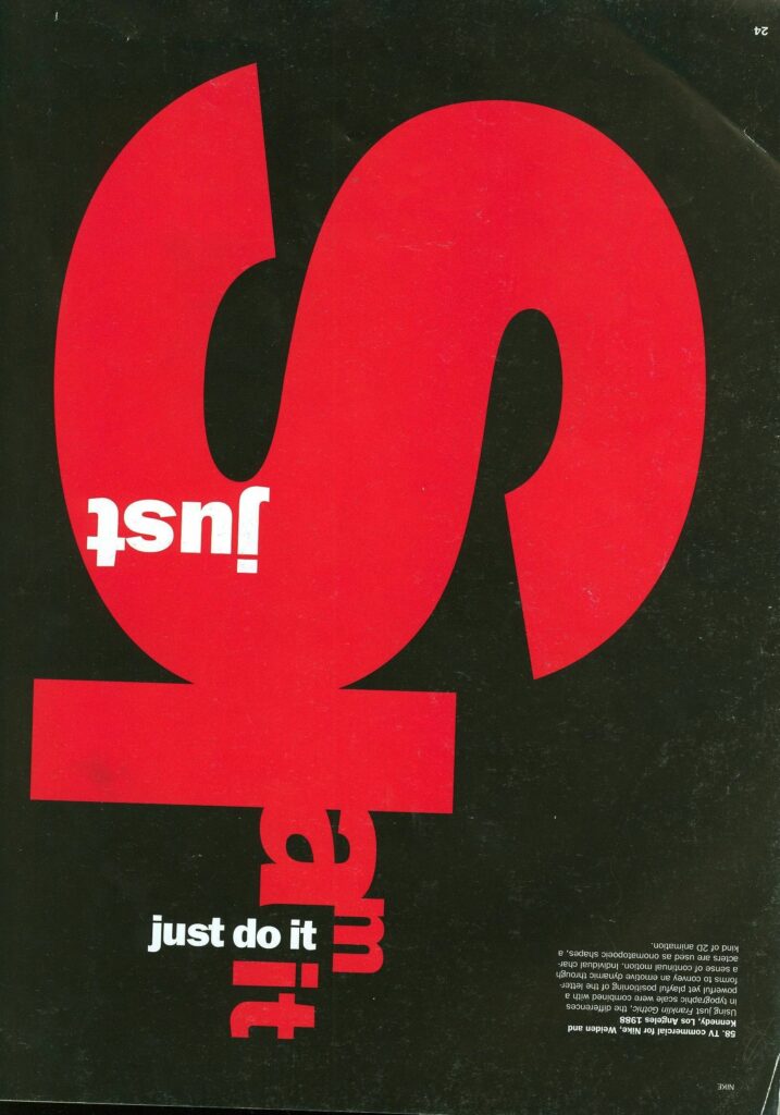
David Carson is a prominent graphic designer known for his unconventional and experimental approach to typography. His groundbreaking work in the 1990s, particularly with the alternative music magazine Ray Gun, challenged the dominance of digital precision and celebrated imperfections. Carson’s work often incorporated irregular layouts, hand-drawn elements, and a disregard for traditional design rules, paving the way for a more playful and expressive approach to design. His innovative and rule-breaking approach to graphic design, characterized by layered imagery, unconventional typefaces, overlapping elements, and a disregard for strict grid-based layouts, aligned closely with the ethos of the grunge movement. Carson’s contributions and innovative design approach remain highly influential in the realm of graphic design, inspiring designers to embrace imperfections and experimentation. Overall, David Carson played a significant role in the shift from a focus on digital precision to an appreciation for imperfections in graphic design, paving the way for a more diverse and expressive approach to design that embraces imperfections and experimentation.

https://graphicdesign90s.com/graphic-design-1990/

https://uxmag.com/articles/an-introduction-to-designing-for-imperfection

https://davidmiranda.us/blog/grunge-graphic-design/

Stefan Sagmeister

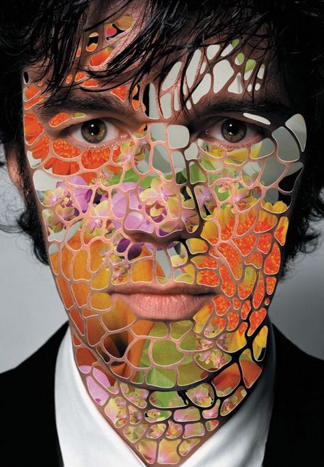
An Austrian-born graphic designer who is recognized for his innovative and expressive designs. Stefan Sagmeister’s work is an excellent example of the shift from digital precision to an appreciation of imperfection in graphic design. Sagmeister often integrates handcrafted elements, playful typography, and imperfections in his work, challenging traditional design norms and embracing a more personal and artistic style. His approach reflects a departure from the strict digital precision that was prevalent in the industry, and his work has played a pivotal role in reshaping the visual language of contemporary graphic design. One example of Sagmeister’s work that fits this topic is his „Things I Have Learned in My Life So Far“ project, which features handcrafted typography and imperfections that add a personal and human touch to the design. Sagmeister’s innovative and expressive designs have contributed significantly to the shift towards appreciating imperfections in graphic design, inspiring a more diverse and expressive approach that celebrates the beauty of imperfection.

https://graphicdesign90s.com/graphic-design-1990/

https://www.mcbw.de/en/magazine/stefan-sagmeister

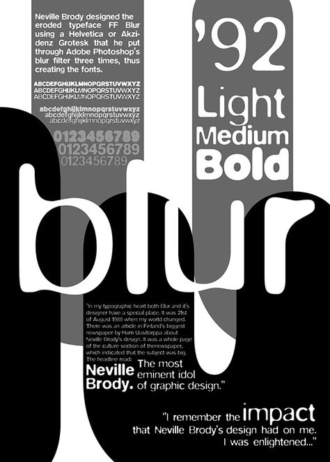
Neville Brody

The work of the British designer Neville Brody often incorporates irregular layouts, hand-drawn elements, and a disregard for traditional design rules, paving the way for a more playful and expressive approach to design. His innovative and rule-breaking approach to graphic design, characterized by layered imagery, unconventional typefaces, overlapping elements, and a disregard for strict grid-based layouts, aligned closely with the ethos of the grunge movement. Brody’s contributions and innovative design approach remain highly influential in the realm of graphic design, inspiring designers to embrace imperfections and experimentation. Neville Brody played a significant role in the shift from a focus on digital precision to an appreciation for imperfections in graphic design, paving the way for a more diverse and expressive approach to design that embraces imperfections and experimentation.

https://www.smashingmagazine.com/2017/03/beauty-imperfection-interface-design/

https://arodes.hesso.ch/record/10049/files/Conrad%20Demian_2021_GRAPHIC_DESIGN_IN_THE_POST_DIGITAL_AGE_d299efb5a0.pdf

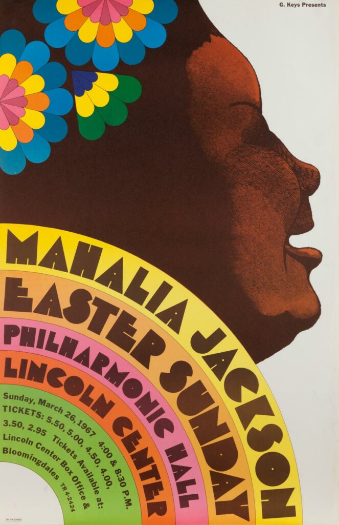
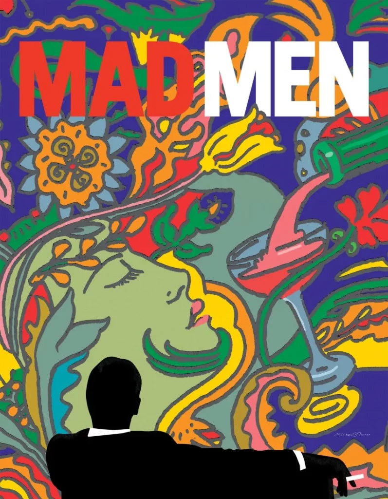
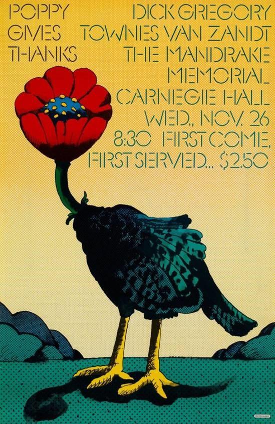
Milton Glaser

Milton Glaser, an American graphic designer, has also made contributions to this movement. Glaser’s work often involved a combination of hand-drawn elements and a distinctive style that embraced imperfections, giving his designs a unique and human touch. His innovative and expressive designs challenged traditional norms, reflecting a departure from the strict digital precision that was prevalent in the industry. Glaser’s influential and iconic „I ♥ NY“ logo, along with his extensive body of work, exemplifies his embrace of imperfections and the human touch in graphic design, ultimately reshaping the visual language of contemporary graphic design.

https://ndion.de/en/milton-glaser-the-subtle-populist/

Paula Scher

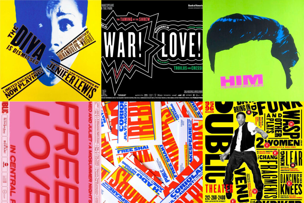
Paula Scher is a contemporary American graphic designer, and painter who co-founded the design firm Pentagram. She has also been a pivotal figure concerning this topic. Scher is Recognized for her bold use of typography and hand-painted elements, her work embodies an imperfect and expressive nature that challenges traditional design norms. Her innovative approach has contributed to a more diverse and expressive form of design, celebrating the beauty of imperfection. Scher’s work has been highly influential in the industry, and some of her most famous designs include the iconic Swatch poster modeled after Swiss designer Herbert Matter’s work, the new identity creation of The Public Theater, and the Citibank logo redesign. Her work reflects the broader trend in the 1990s towards embracing a more vibrant and eclectic aesthetic in graphic design.

https://www.famousgraphicdesigners.org/paula-scher

https://www.pentagram.com/about/paula-scher

https://graphicdesign90s.com/graphic-design-1990/

Successful Color Combinations in Fashion Design #10

In the preceding sections, we delved into the principles of color theory and psychology, universally applicable across various applications and fields. In this final segment, let’s take a closer look at specific examples and proven approaches in the fashion industry.

If you’re involved in this industry, you’re likely familiar with curating a suitable color palette for outfits and fashion. Different fashion design schools have distinct approaches, preferences, guidelines, and focal points. Colors and their combinations often align with seasons, occasions, and cultural preferences.

To master the interplay of colors in fashion, a solid understanding of the foundational principles of color theory and knowledge of the color wheel are indispensable. This foundation allows for adept experimentation and the creation of new designs beyond well-trodden fashion and trend paths.

If you prefer sticking to tried-and-true combinations, the following color pairings will keep you on solid ground:

Gray and Red Tones:
Red tones and berry purples complement all shades of gray, creating an elegant and balanced color mix. Typically, grays serve as the background or primary color, while red tones accentuate and highlight specific elements. This combination blends a neutral and understated color (gray) as the base with a vibrant color (red or purple) for special moments in a fashion piece. The result is a certain luminosity without being overly assertive.

Yellow and Green:
The combination of green and yellow tones is one of the liveliest ways to make your wardrobe stand out, especially in spring or summer. However, it can also serve as a colorful highlight in winter and darker seasons. This combination tends to look good on most skin tones. Pairing a yellow blazer with a green skirt, especially with jeans, creates a standout look. Enhance this look with gold and/or green accessories.

Red and Blue:
Take your favorite jeans and pair them with a red top, and you can be sure to have a successful outfit. Combining blue denim with red clothing is extremely popular, and vibrant reds create an eye-catching effect, complementing the subdued blue of denim. This combination exudes confidence, vitality, and strength, often encountered in the summer months. If introducing a third color, consider neutral, light tones such as white, gray, or light creams.

(Light) Brown Tones and Chestnut or Burgundy:
For a less vibrant but earthy and harmonious color scheme in your wardrobe, brown tones, especially paired with slightly reddish „chestnut,“ work exceptionally well. This combination effortlessly creates a successful autumn outfit. Lighter browns like beige, sand tones, ochre, or cognac blend seamlessly with the slightly darker chestnut. As a possible third color, you can opt for white, light yellows, or soft pink. Exercise some discretion to avoid overloading the outfit. In place of chestnut, burgundy, Bordeaux red, or wine red also pairs wonderfully with soft brown tones.

Pink and White:
Another classic combo in the fashion world is the pairing of pink and white. Especially popular among young women and teens, this combination exudes a charming effect, emphasizing femininity in a playful manner. Large white portions have a calming effect on the human eye, radiating a touch of innocence and purity. To soften the strong contrast of these colors, consider gray tones, soft pink, or ivory as alternatives to white. If pink seems too vibrant, explore related colors such as purple, lilac, or violet.

Sources: https://www.kunstplaza.de/fashion-design/farbenlehre-farbtheorie-styleguides-fashion-design/#Tipps_fuer_die_Zusammenstellung_stimmiger_Farbschemata

Research 6: Robert Marc Lehmann – influencial activist

Robert Marc Lehmann is a marine biologist, scientific diver, and adventurer, as he describes himself on his website. He is also an award-winning photographer and cameraman—on land and underwater. In 2015, he won Photographer of the Year from National Geographic. With his organization „Mission Erde,“ he initiated a significant and influential project—now the organization has a total of six members working on different projects.

Through him, I started to inform myself about animal welfare, the environment, the problems we face, and how we might bring about change. In these years, I could see how he managed to influence many young people to rethink their life decisions and make an effort for a better world. He had professional documentaries on TV, but two years ago, he started a new YouTube channel (he already had a channel before, but it was not too successful) and began streaming after participating in a big livestream with another YouTuber at that time, Fritz Meinecke. In this livestream, they discussed fishing and other topics, generating significant interest and prompting him to explore the opportunity further.

Since then, he streams regularly, reacting to different videos about animals, environmental problems, the survival show „7vs Wild,“ and more. He has also published several documentaries in cooperation with, for example, Wilderness International and Soko Tierschutz, which I already wrote about—and more. Mostly, the films focus on a specific region or animal, addressing the threats and suggesting ways to help. Depending on the topic, you may encounter very cruel images of animal abuse, but with Wilderness International, you also see the beautiful side of our world—he tries to show both, as he said himself, to avoid becoming overwhelmed by the constant exposure to the darker aspects.

Tierschützer Robert Marc Lehmann rescued Turtle rescue in the Philippines
© Robert Marc Lehmann

To be honest, you could write a whole thesis just about him and his work, but I try to focus on him here as a medium, a speaker for animal rights and environmental protection. Through his personality (he is very direct and honest), he has convinced many people to delve into these topics more. To remember the Petition about Fur (over 1.6 million signatures) and the Stop Finning Petition (1.2 million signatures)—through his films, the signatures for these petitions rose immediately after publishing, leading to discussions in the EU Parliament. With his call, many famous German influencers shared the initiative on their channels, contributing to its success.

I watched all these films by myself, and I must say that I had tears in my eyes with all of them. I was ashamed and felt so bad to see how dark humans can be—but he always ends the films in a way that gives hope and shows that there is a chance to do something about it.

So, why is he relevant for my research? He makes documentaries, videos about the topic, and encourages other people to create content about it as well. He is kind of an expert for many people as he receives numerous videos and is asked about different situations—whether they are right and what his opinion is about them. He also gets very emotional and direct about animal rights and has a whole community behind him, following him on every step if he wants—he has a big responsibility because he can influence many people. Many times he consciously uses this power to move them in a specific direction, but he also always emphasizes the importance of staying kind and having respect.

Robert Marc Lehmann nature photographer, cameraman and environmentalist
© Robert Marc Lehmann

Robert Marc Lehmann’s campaigns have had a lot of success, and he has used different methods—he showed the ugly, the beauty, the hope, the cruelty, the best, and the worst. It’s an example where you see that not one way is right, but you have to choose the right method for the right message. And it depends on what you want to achieve. In the next post, I will analyze some of his campaigns more and even get into comments on his videos to show the impact.

Sources:

  • First Youtube Video on New Channel: https://www.youtube.com/watch?v=MsS0b7vidR8&t=18s
  • His Website: https://www.robertmarclehmann.com/en/
  • Mission Erde: https://missionerde.de
  • Geo Article: https://www.geo.de/natur/robert-marc-lehmann–der-einkaufszettel-ist-ein-stimmzettel–30492052.html
  • Year Report 2022: https://missionerde.de/wp-content/uploads/2023/05/Jahresbilanz_2022.pdf
  • This is vegan Article: https://this-is-vegan.com/en/interview-marine-biologist-robert-marc-lehmann-on-saving-the-worlds-oceans/

Planung eines Leitsystems

Was macht ein gutes Leitsystem aus, und worauf sollte man bei der Planung achten?

Funktion und Anforderungen an ein intuitives Leitsystem

Egal ob Beschilderung, Wegweiser oder digitale Lösungen – alle erfüllen denselben Zweck: Sie kennzeichnen Standorte, heißen uns willkommen und führen uns an das Ziel. Ein gutes Leitsystem sollte jedoch nicht nur leiten, sondern auch bestätigen und orientieren. Zusätzlich dazu sollte es zum Wohlbefinden beitragen und Zeit sowie Ressourcen schonen. Die Einhaltung der Sicherheitsstandards, insbesondere der Ö-Norm, ist dabei von oberster Priorität. Das Leitsystem sollte auch barrierefreie Orientierung bieten, einschließlich taktiler Orientierungssysteme und gut lesbarer Schriften.

Verschiedene Arten von Leitsystemen

  1. Klassisches Leitsystem: Umfasst Schilder, Tafeln, Pfeiler, Wandbeschriftungen usw.
  2. Zeichenbasiertes Leitsystem: Nutzt Zeichen für eine leichte Verständlichkeit ohne Sprachen.
  3. Taktiles Leitsystem: Zielgerichtet für sehbehinderte und blinde Menschen, basierend auf Formen.
  4. Digitales Leitsystem / Digital Signage: Interaktive Informationen für eine maßgeschneiderte Zielbegleitung.
  5. Akustisches Leitsystem: Ergänzung zum taktilen Leitsystem, durch elektrische Wegmarkierungen oder akustische Klänge.

Wichtige Punkt: die Barrierefreiheit

Besonders in öffentlichen Gebäuden und großen Unternehmen sollte das Leitsystem für Menschen mit Beeinträchtigungen geeignet sein. Barrierefreie Orientierung, große Schriften und taktile Elemente sind hierbei von entscheidender Bedeutung.

Planung eines durchdachten Leitsystems

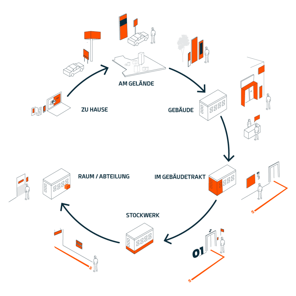
Ein durchdachtes Leitsystem beginnt bereits lange bevor das Areal oder Gebäude betreten wird. Eine klare, übersichtliche Webseite mit einem Lageplan oder Anfahrtsbeschreibung kann dabei unterstützen. Nach der Ankunft sollten Wegweiser, Großwerbeanlagen oder Beschilderungen aus jeder Richtung auf das Gelände hinweisen. Im Inneren des Gebäudes führen verschiedene Komponenten wie Schilder und Stelen weiter zum Ziel.

Wichtige Planungsschritte:

  1. Begehung vor Ort: Klärung der Anforderungen und Herausforderungen in Zusammenarbeit mit dem Kunden.
  2. Konzeptentwicklung & Visualisierung: Entwicklung eines Konzepts unter Berücksichtigung von Kontrasten, lesbaren Schriften und CI-gerechtem Design.
  3. Detailplanung & Freigabe: Vorstellung des Konzepts beim Kunden und Anpassung gemäß den Wünschen.
  4. Produktion & fachgerechte Montage: Fertigung der Komponenten und Montage vor Ort nach Qualitätskontrolle.

Ein durchdachtes Leitsystem erleichtert nicht nur die Orientierung, sondern trägt auch zur positiven Wahrnehmung von Unternehmen oder Einrichtungen bei.

Quelle: https://www.techquadrat.at/2022/03/23/intuitives-leitsystem-step-by-step/

Planung eines Musik Festivals

Die Organisation eines Musikfestivals erfordert nicht nur Leidenschaft für Musik, sondern auch eine durchdachte Planung. Hier sind die wichtigsten Punkte zusammengefasst wie man ein Festival planen soll:

Die Grundlagen

  • Starten mit einem kleinen Event und daraus lernen: Kleine Festivals können ebenso erfolgreich sein, und der Lernprozess ist unbezahlbar.
  • Auswahl eines passenden Genres: Festlegen auf ein Genre und Buchen von Acts, die dazu passen. DJs können die Stimmung, insbesondere in den späten Abendstunden, anheizen.
  • Berücksichtigung des Wetters: Bereithalten einer Schlechtwetter-Alternative, besonders bei Open-Air-Veranstaltungen. Das könnte beispielsweise die Reservierung von Festzelten umfassen.
  • Gestaltung eines Rahmenprogramms: Überlegung eines vielfältigen Rahmenprogramms, das über die Musik hinausgeht. Tanz- oder Sportworkshops sowie Showkünstler können eine willkommene Abwechslung bieten.
  • Versorgung mit Essen und Getränken: Sicherstellen, dass ausreichend Essen und Getränke vorhanden sind, da die meisten Besucher keine eigenen Vorräte mitbringen.
  • Definition von Zielgruppe und Motto: Klarstellung für welche Zielgruppe das Festival gedacht ist und Überlegung eines passenden Mottos. Die grundlegende Idee sollte vor der eigentlichen Planung festgelegt werden.
  • Auswahl der geeigneten Veranstaltungsfläche: Suchen einer Fläche, die den Anforderungen entspricht. Felder eignen sich oft gut, da sie ausreichend Platz bieten und selten von störenden Nachbarn betroffen sind.

Die eigentliche Organisation

Nachdem die Grundlagen feststehen, geht es an die konkrete Planung des Events:

  • Auswahl der Location: Sicherstellen, dass die Location gut erreichbar ist und ausreichend Parkplätze bietet. Einholen aller erforderlichen Genehmigungen, Berücksichtigung einer Schlechtwetter-Alternative und frühzeitige Reservierung.
  • Programmgestaltung: Organisation von Caterern, Auswahl eines Essensmenüs und Buchung von Showacts für zusätzliche Unterhaltung.
  • Plan B für unvorhergesehene Szenarien: Vorbereitung auf alle Eventualitäten, sei es schlechtes Wetter, Absagen von Acts oder Probleme mit der Location.
  • Sicherheit und Hygiene: Engagieren von ausreichend Sicherheitspersonal, Bereitstellen von Flucht- und Notausgängen sowie Einhaltung von Hygienevorschriften. Klärung von Fragen dazu am besten mit dem örtlichen Ordnungsamt.
  • Einbindung von Dienstleistern: Verhandeln von Verträgen mit Catering, Sicherheitspersonal, Showacts und allen Beteiligten. Gründliches Briefen des Personals für einen reibungslosen Ablauf.
  • Abschluss einer Versicherung: Auswahl einer umfassenden Versicherung, die eventuelle Schäden abdeckt.
  • Promotion: Entwicklung einer effektiven Marketingstrategie und gezielte Werbung für das Event.
  • Weitere wichtige Aspekte: Berücksichtigung der Müllentsorgung, Auf- und Abbau, Transport der Gäste und Künstler, eingesetzte Technik, Fotografen und die Abrechnung am Ende der Veranstaltung.

Quelle: https://praxistipps.focus.de/festival-organisieren-das-sollten-sie-beachten_111757

Interessantes Video zur Festival Planung

Eventisierung

Bei meiner Recherche bin ich öfter auf den Begriff Eventisierung gestoßen. In diesem Blogpost gehe ich näher auf diesen Begriff ein und was er für die Musikfestival Branche bedeutet.

Die Eventisierung, als die Kunst, aus gewöhnlichen Ereignissen besonders ansprechende und einprägsame Erlebnisse zu gestalten, prägt immer stärker unsere Gesellschaft. Diese Inszenierung von Ereignissen durchdringt verschiedene Bereiche des gesellschaftlichen Miteinanders, wobei Spaß und Kultur eine entscheidende Rolle spielen. Die subjektive Wahrnehmung von Spaß ist dabei stark von individuellen Standpunkten, Blickwinkeln und Lebenserfahrungen geprägt.

Keine Art von Veranstaltung kann dauerhaft als Institution etabliert werden, was auf eine stetige Veränderung und Anpassung an wechselnde Modeerscheinungen und Trends hindeutet. Die Gesellschaft neigt dazu, sich auf Angebote zu orientieren, die Freude bereiten – wobei der Fokus auf dem aktuellen gewünschten Spaß liegt. Dies führt zu einer Eventisierung des Lebens in der Gegenwartsgesellschaft.

Die Entstehung des Erlebnismarktes markiert einen Wandel in der Alltagsästhetik und eine gemeinschaftliche Interaktion zwischen Erlebnisanbietern und -konsumenten. Diese Interaktion entzieht sich zunehmend der Kontrolle der einzelnen Akteure und beeinflusst tiefgreifend ihre Existenz. Durch das Ausleben individueller Beweggründe verändern die Akteure gemeinsam soziale Strukturen und das alltägliche Schönheitsempfinden.

Mit der Rationalisierung des Erlebens vollzieht sich ein innerer Prozess der Modernisierung. Die systematische Suche nach Erlebnismitteln und -zielen führt zur Entstehung eines Marktes, auf dem Angebot und Nachfrage aufeinandertreffen. Sowohl Anbieter als auch Nachfrager orientieren sich an stabilen Rationalitätstypen. Die Nachfrager definieren ihre Zwecke von außen nach innen, während die Anbieter auf Publikumswirksamkeit abzielen.

Was bedeutet das für Musikfestivals?

Im Kontext von Musikfestivals spiegelt sich die Eventisierung als ein bedeutender Trend wider, der die Veranstaltungsbranche beeinflusst. Musikfestivals gehen über die bloße Präsentation von Live-Musik hinaus und setzen verstärkt auf die Schaffung eines umfassenden Erlebnisses für die Besucher. Die Inszenierung von Musikfestivals umfasst nicht nur die musikalischen Darbietungen, sondern auch zusätzliche Erlebnisse, die Spaß, Kultur und soziale Interaktion fördern.

Die Festivalorganisatoren setzen darauf, den Besuchern mehr als nur musikalische Unterhaltung zu bieten. Hierbei spielen interaktive Installationen, Kunstausstellungen, kulinarische Angebote und andere Aktivitäten eine entscheidende Rolle. Die Eventisierung von Musikfestivals zielt darauf ab, die Teilnehmer stärker in das Geschehen einzubeziehen und eine einprägsame Erfahrung zu schaffen, die über das Konzert hinausgeht. Dieser Ansatz trägt dazu bei, die Bindung der Festivalbesucher an das Event zu intensivieren und schafft eine einzigartige Atmosphäre, die weit über die bloße Musik hinausgeht.

Die Entwicklung des Erlebnismarktes, wie im Artikel beschrieben, findet somit auch in der Festivalwelt Anwendung. Musikfestivals werden nicht nur als Musikveranstaltungen betrachtet, sondern als umfassende Erlebnisse, die unterschiedliche Sinne ansprechen und individuelle Bedürfnisse der Teilnehmer befriedigen. Die Eventisierung von Musikfestivals ist somit ein wesentlicher Aspekt in der gegenwärtigen Gesellschaft, in der das Streben nach einzigartigen und ansprechenden Erlebnissen eine zentrale Rolle spielt.

Quelle: Eventmanagement in der Musikbranche / Bachelorarbeit von D. Sutantyo

Beyond the Bottle: A Cross-Cultural Study of Drinking Habits

Drinking Culture:

Scientific literature categorizes communities based on their attitude toward alcoholic beverages. Austria falls into a category with a determined drinking culture where many daily life occasions are closely linked to alcohol consumption. Considering the local drinking habits and cultural aspects is essential in choosing packaging for card drinking games to establish an authentic connection.

• Alcohol-Prohibitive Cultures: These include Islamic countries and communities where a general alcohol ban is in place, allowing alcohol only for medicinal purposes.

Alcohol-Exceptional Cultures: Cultures that permit alcohol consumption only on clearly defined, rare occasions and in limited quantities. The Jewish culture falls into this category.

Alcohol-Permissive Cultures: These cultures allow alcohol consumption on specific occasions. There is a distinction between cultures where alcohol is a daily beverage, for example, consumed with meals in smaller quantities (such as Spain, Italy, Greece, and France), and cultures where alcohol is primarily consumed on weekends and during festivities, often in larger quantities, as seen in Scandinavia.

Alcohol-Determined Cultures: In these cultures, many everyday events are closely linked to alcohol consumption, such as birthdays, weddings, baptisms, funerals, corporate events, etc. Moderate drunkenness is accepted within certain limits. Wagner includes Germany, Austria, Switzerland, and the Netherlands in this category.

Alcohol-Excessive Cultures: These cultures consider alcohol consumption as a norm, and the state of intoxication is viewed as a sign of masculinity, strength, generosity, etc. Predominantly, high-proof alcoholic beverages are consumed. Wagner associates many Slavic countries with this category.

Link to original text

Drinking Games and Their History: 

Drinking games have a rich history, dating back to ancient Greece with games like Kottabos. From Renaissance-era drinking ships to modern games like Beer Pong, diverse types of games offer various packaging design possibilities based on their randomness, skill requirements, or truth-or-dare elements.

https://de.wikipedia.org/wiki/Trinkspiel

Card drinking games are consistently popular, requiring minimal accessories. Most card games traditionally come in flip-top packaging.

Examples of card drinking games:

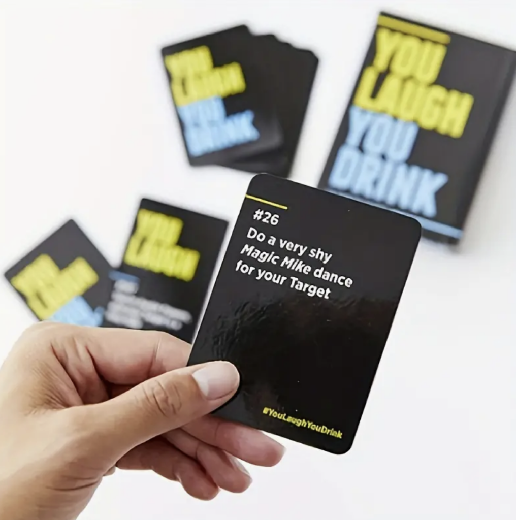
You Laugh You Drink: A game designed for those who struggle to maintain a serious face. The card set features humorous prompts that induce laughter and drinking actions. When it’s your turn, follow the card’s instructions without holding back. Can you keep a straight face when someone performs emotional breakdown dance moves or suddenly engages in parkour around you? The package includes one card set in flip-top packaging.

You Laugh You Drink – Party Game

  1. Cards Against Humanity: Each player receives ten white cards. The player who last relieved themselves becomes the „Card Czar“ and starts by drawing a black card, reading its contents. All other players choose the card from their ten that they find most fitting (politically incorrect, inappropriate, gross, offensive, or simply super funny) and submit it covertly to the Card Czar. The Czar reads all selected variations and decides the winner for that round. Simple, right? Even easy to follow when not completely sober. Cards Against Humanity is perfect for a fun evening with friends, family, and/or alcohol.

Cards Against Humanity Rules

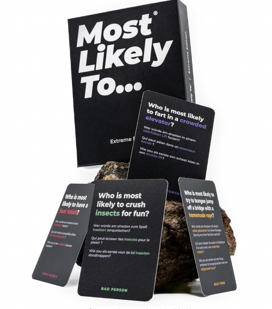
  1. Most Likely To: Featuring 220 funny and outrageous questions, this game is for those who don’t take themselves too seriously. With four card categories—Dirty Secrets, Wild Times, Bad Person, and Cringe—players tap into unspoken truths. The simple rules involve pointing out who in the room is most likely to do or experience what the card describes. From Christmas and birthday parties to New Year’s, graduations, bachelorette parties, and festivals, these cards are a must for any lively event.

Most Likely To – Extreme Party Card Game

Packaging for card drinking games varies, including rectangular boxes, robust metal tins, transparent plastic containers, fabric bags, or cylindrical tubes. Some games combine other items like drinking glasses, dice, or accessories, offering a complete package. The choice of packaging often aligns with the game concept, style, and aesthetic preferences of the target audience. It is crucial that the packaging not only serves its functional purpose but also reflects the theme and character of the card drinking game.

Color Psychology – Colors and Their Effects #9

Colors evoke moods and emotions, a recognition that dates back to Goethe, as mentioned earlier. Surrounding this realization, an entire profession has emerged, and color psychology has become an integral part of design and marketing.

Colors have the power to elicit various reactions and associations in people, often independent of individual experiences. Emotions wield more influence than rational thoughts based on facts and figures. Therefore, the impact of colors is extensively harnessed in everyday economic activities.

Several universally accepted insights and rules have been established regarding the psychological effects of colors:

Yellow:
Yellow is a bright, luminous color that radiates optimism, enlightenment, and joy. Shades of golden yellow promise a positive future. Yellow stands out from surrounding colors and draws the viewer’s attention. This color provides energy and fosters positive thoughts. Additionally, it stimulates mental processes, activates the nervous system, enhances memory, and has an invigorating effect on communication.

Green:
Green, omnipresent in nature, is perhaps the most widespread color in our lives. Found abundantly in nature, it is one of the most favored colors among people, making it ideal for background and interior design. Green has calming and soothing effects on the mind and body, supporting mental and physical relaxation. It is effective against depression, anxiety, and nervousness, conveying a sense of renewal, self-control, and harmony. Green also promotes self-esteem, dignity, stability, endurance, a sense of duty, authority, and autonomy.

Blue:
Blue symbolizes trustworthiness, reliability, and commitment. As the color of the sky and seas, it is perceived as a constant force in our lives. Blue is known for its calming effect and can even lower the viewer’s pulse. It has a tranquil and cool effect, strengthens intuition, and promotes calmness, contentment, equilibrium, thoughtfulness, and a sense of connection.

Violet:
Violet or purple embodies the interplay of stimulating red and calming blue. It carries a touch of mystique, mystery, and spirituality. Simultaneously, violet exudes a sense of royalty and regality. This color is particularly popular among creative individuals, eccentric personalities, and young girls. It has an activating and stimulating effect, soothing both the body and mind, evoking a sensual, spiritual touch, and enhancing creativity.

Pink:
Pink is vibrant, lively, youthful, cheeky, and reflects great joy. Bright pink can generate the same energy as red tones, appearing sensual and passionate without the aggressiveness of bright red. By adding more white, the color becomes softer while retaining its sensuality. These shades are excellent for romantic occasions, stimulating and energizing, potentially increasing blood pressure and accelerating heartbeat and breathing. Pink encourages empathy, sensitivity, fascination, charm, and devotion.

Red:
No other color is as laden with emotions and personal associations as red. It is highly activating, stimulating, and generates a considerable amount of energy in the viewer. The strategic use of red is effective in capturing attention. Red is unequivocally a signaling color and symbolizes love and passion. It is highly activating, exudes a high level of strength and energy, can increase blood pressure, accelerate heartbeat and breathing, and fosters confidence, strength, vitality, passion, activity, dynamism, competition, and eroticism. Red imparts a sense of protection against fears and uncertainties.

Orange:
Orange, a close relative of red, elicits a wide range of thoughts and feelings in the viewer, either strong fondness or distinct aversion. It is less commonly met with indifference compared to other colors. Bright orange exudes joy and fun, radiating warm energy. It inspires activity, stimulates appetite, and encourages sociability.

White:
White symbolizes purity, innocence, and neutrality. White doves, for instance, represent peace. Doctors consciously wear white coats, and the classic wedding dress is white. White clears the mind, encourages order, has a soothing and peace-inducing effect, and aids in new beginnings.

Gray:
Gray is the color of intellect, wisdom, and knowledge. It is perceived as stable, classic, smooth, dignified, and cultivated. Gray is associated with conservative power, conveying authority, and serves as a neutral background color in designs. It can, however, lead to uncertainty, raise expectations, and promote neutrality, detachment, indifference, ambiguity, and seclusion.

Black:
Black carries a strong impact and primarily symbolizes authority. Excessive use of black can overwhelm the viewer. Black is the absolute absence of light, representing emptiness and darkness. When used in conjunction with other colors, black can enhance their brilliance, making it a preferred choice in small doses. In fashion, black holds a special place, signifying classic elegance. It makes the wearer appear slimmer, more refined, and sophisticated, making it highly popular in clothing choices. Black imparts elegance to the wearer and a sense of inconspicuousness, symbolizes emptiness and infinity, creates a mysterious atmosphere, nurtures hope for new possibilities, and fosters determination and/or rebellion.

Sources:
https://www.verywellmind.com/the-color-psychology-of-yellow-2795823
https://www.verywellmind.com/color-psychology-green-2795817
https://www.verywellmind.com/the-color-psychology-of-blue-2795815
https://www.verywellmind.com/the-color-psychology-of-purple-2795820
https://www.verywellmind.com/the-color-psychology-of-pink-2795819
https://www.verywellmind.com/the-color-psychology-of-red-2795821
https://www.verywellmind.com/the-color-psychology-of-orange-2795818
https://www.verywellmind.com/color-psychology-white-2795822
https://www.verywellmind.com/the-color-psychology-of-black-2795814
https://www.kunstplaza.de/fashion-design/farbenlehre-farbtheorie-styleguides-fashion-design/#Tipps_fuer_die_Zusammenstellung_stimmiger_Farbschemata