In this blog entry I want to look into how designs can be organized and how order can prevent a design from looking random. The focus is on the significance of balance in graphic design and methods for achieving it.
Balance in design ensures that elements in a composition are distributed and visually weighted to achieve cohesion and satisfaction. It plays a crucial role in providing stability, structure, and emphasis, contributing to the overall dynamics of a design. This principle aims to arrange visual elements in an aesthetically pleasing manner, not necessarily symmetrically, but in a way that prevents any single element from dominating the design. The goal is to create a unified and naturally pleasing visual experience. There are several forms of balance in graphic design, each with its own advantages and disadvantages. The choice among these types depends on the specific message and mood you are trying to convey.
Symmetrical (Static) Balance
Symmetry, the most common form of balance in design, involves organizing elements equally on either side of a central axis, whether horizontal or vertical. While considered predictable by some, this method is widely appreciated for its visual appeal, providing a sense of organization and harmony on a subconscious level. Despite its perceived predictability, symmetrical balance has endured over time, proving to be one of the most effective ways to create a sense of comfort and solidity on a page.
The key feature of symmetrical balance is the mirroring effect created by the elements on either side of the imaginary line through the center of the design. This mirroring creates a stable visual composition with an even distribution of visual weight. Drawing a straight line through the center in any direction reveals a consistent balance that contributes to an orderly and aesthetically pleasing appearance. While some may find symmetrical balance unexciting, its enduring popularity is a testament to its ability to create a visually stable and comforting design.


In the first image, both sides have the same visual weight, creating a perfectly balanced design. But in the second image, when one side becomes lighter and the other remains dark, the dark side feels heavier. Symmetrical balance is good for clear communication, but it may not make a design interesting. It’s important to find the center of the design and use different techniques to distribute weight evenly on each side.
Asymmetrical (Dynamic) Balance
Asymmetric balance in graphic design occurs when elements have unequal visual weight, adding a dynamic and compelling quality to the composition. Unlike the predictability of static balance, asymmetry sparks viewer engagement by inviting a subconscious search for counterweights, drawing attention to often-neglected areas of the design. Intentional imbalance introduces tension and movement, making it an ideal choice for creative or intricate projects. Striking a delicate balance becomes paramount, allowing one side to carry a noticeable weight while maintaining an overarching sense of balance. This thoughtful interplay not only attracts attention, but also infuses vitality into the design, making Asymmetrical Balance a compelling tool for designers seeking to enhance visual appeal. The greater the asymmetry, the greater the inclination of the viewer to investigate its origin. Individuals will naturally look at such a picture with more attention than usual. However, maintaining a sense of proportion is crucial; an overly eccentric composition may not always be well received.


Image source: https://254-online.com/balance-principle-design/
Radial Balance
Radial balance in design involves the arrangement of visual elements that radiate outward from a central point, typically at the center of the composition. Although not as commonly used, this approach offers a distinct advantage by easily capturing attention and establishing a clear focal point, often placed at the center of the design. Achieving radial balance requires placing objects, colors, or textures equidistant from this central point, promoting a symmetrical distribution of visual weight. When multiple axes converge on a single point within a composition, this is known as radial balance. The underlying goal is to draw the viewer’s attention to the central area, creating a sense of cohesion and symmetry within the design. This deliberate arrangement can enhance visual appeal by providing a clear point of emphasis and balance, although it is used less frequently than other balance techniques.

Image source: https://medium.com/outcrowd/balance-in-composition-how-to-balance-design-185afda003d7
Mosaic Balance
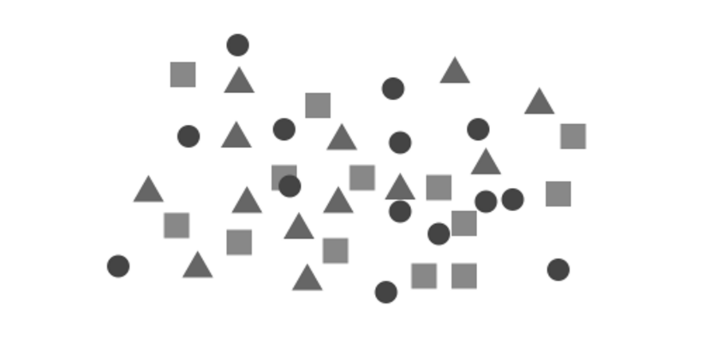
Mosaic balance, also known as crystallographic balance, is a style reminiscent of the chaotic yet harmonious paintings of artists such as Jackson Pollock. In this approach, there are no prominent focal points, and all elements are equally responsible for creating a visually cohesive whole. Despite the initial appearance of visual noise due to the lack of hierarchy, mosaic balance arranges elements in a random or chaotic manner, creating a sense of diversity, complexity, and richness. This type of balance lends itself to designs that aim to present a variety of information or images in a collage or mosaic style. The uniqueness of mosaic balance lies in its ability to create harmony without emphasizing any single element or allowing it to dominate the overall composition.

Image source: https://www.smashingmagazine.com/2015/06/design-principles-compositional-balance-symmetry-asymmetry/
Sources:
https://medium.com/outcrowd/balance-in-composition-how-to-balance-design-185afda003d7