09. Facial Shapes in Visuals – Part 02

From the Middle Ages through the Renaissance towards Modernity

Altar Frontal from La Seu d’Urgell, 12th Century

Medieval art reflects how humans defined their place in a world dominated by the Church and Christian doctrine. In the depiction of the 12 apostles on the altar frontal from La Seu d’Urgell, all faces are schematic and geometric, lacking individual features. This uniformity mirrors the medieval worldview, where individual fulfillment was insignificant compared to one’s service to the Church and God. There is no attempt at realism here; faces lack shadows and half-tones, and the apostles‘ proportions are distorted, emphasizing the religious symbolism over physical accuracy.

The apostles are shown in profile, all gazing toward Christ, the central figure who alone faces the viewer. The use of halos around each apostle’s head, defined by simple black outlines, underscores their spiritual dedication, rather than their individuality. The overall composition is repetitive and geometric, indicating that what is depicted is not the physical world but an inner, religious vision shaped by faith. It is a reflection of a non-scientific worldview, where spiritual meaning took precedence over material representation.

The Renaissance: A Turn Towards Realism
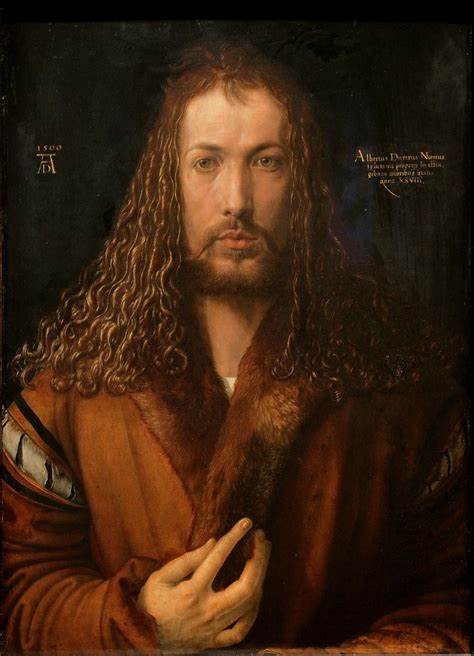
Albrecht Dürer – Self-Portrait in Fur Coat, 1500

„So I, Albrecht Dürer from Nuremberg, painted myself with true colors at the age of 29.“

— Albrecht Dürer, 1500

In the Renaissance, the dominance of Christian ideology waned, giving way to humanism and a revival of scientific thought that had been developed in antiquity but suppressed throughout the Middle Ages. This intellectual shift is evident in Renaissance art, where artists began to seek fulfillment not in divine service, but within themselves as individuals.

Albrecht Dürer’s self-portrait is a prime example of this transformation. In his 1500 Self-Portrait in Fur Coat, Dürer places himself at the center of the composition, directly facing the viewer in a manner reminiscent of how only Christ was depicted in medieval art. His hand gesture, echoing a blessing (Segensgruß), suggests that Dürer saw himself as a secondary creator, echoing divine creativity, yet still acknowledging his faith.

This portrait, however, also serves as self-promotion, revealing Dürer’s awareness of his role as an artist. Artists of the Renaissance no longer viewed themselves as mere craftsmen but as creators of genius, capable of divine-like mastery. Dürer’s portrait is rendered with meticulous realism, with details like the fine shading of his face and individual eyelashes bringing his likeness to life. The dark background ensures that his features stand out, emphasizing the importance of the individual, a stark contrast to medieval depictions of faceless collectives.

Modernity: A Shift Away from RealismArt Nouveau and Early Abstraction

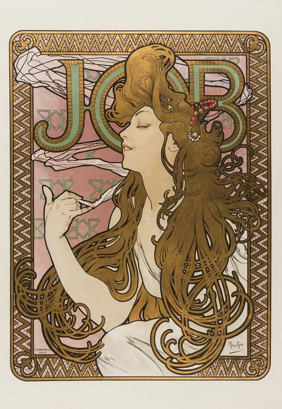
By the turn of the 20th century, the focus shifted once again, this time away from the realism of the Renaissance. The Art Nouveau period, which can be seen as a transitional phase toward modern art, mixed elements of realism with abstraction. A prime example of this transition is Alphonse Mucha’s 1896 poster for cigarettes. While the face still retains realistic details like shading and form, the thick black contour separating it from the decorative, repetitive background introduces a stylization that moves away from pure realism.

Similarly, Koloman Moser’s cover for Ver Sacrum (1899) maintains accurate proportions and realistic shading but simplifies these into harsh contrasts, with minimal use of half-tones. The curvilinear forms of the hair, intertwined with decorative flowers, exemplify the playful and ornamental spirit of the period.

The Viennese Secession and the Move Towards Geometry

1902. Koloman Moser. AT. Poster
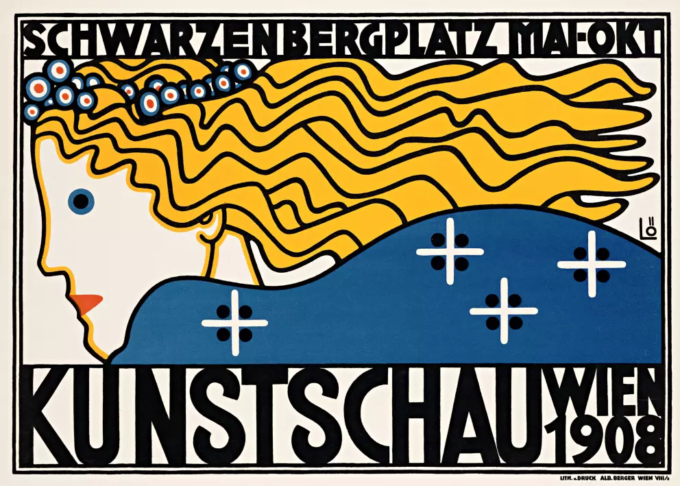
1908. Berthold Löffler. AT. Poster

By the time of the Viennese Secession, this decorative playfulness evolved further. Artists like Koloman Moser and Berthold Löffler reduced natural, curvy forms into more geometric shapes, creating precise patterns where individual features were often subsumed into the overall design. Faces, rather than standing out from their surroundings, became part of a larger repetitive composition. This move towards abstraction signified an increasing detachment from the realistic portrayal of the individual, favoring a more symbolic and decorative interpretation of human figures.

Bauhaus and the Essence of FormOskar Schlemmer’s Bauhaus Influence

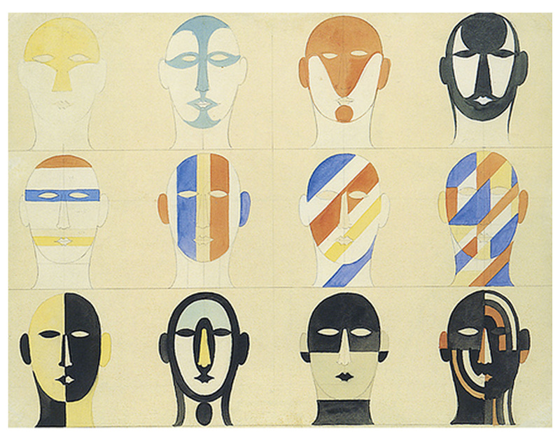
1922. Oskar Schlemmer. DE.

“Schlemmer played with primary shapes and the human form, reducing faces to their core elements in a conscious and minimalist approach.”

— Eric Roinestad

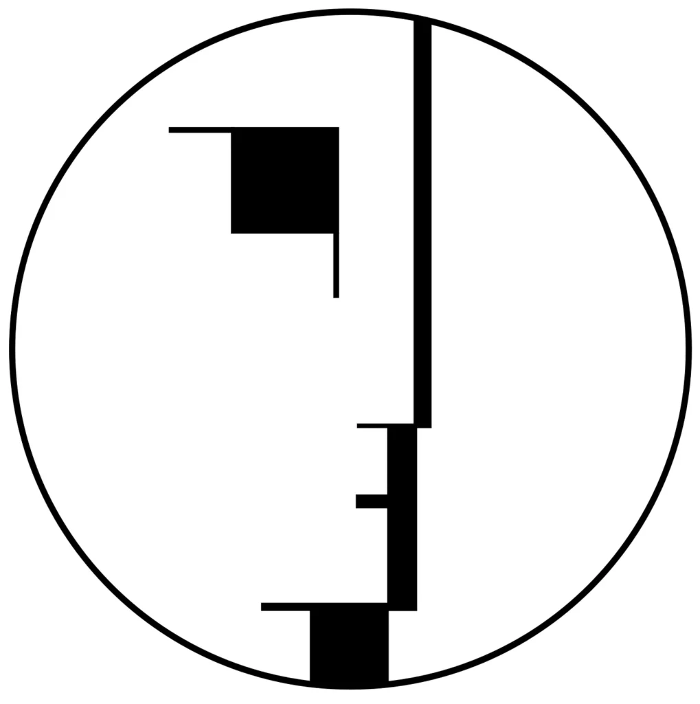
The Bauhaus, one of the most iconic movements of modern art, pushed the abstraction seen in Art Nouveau and the Viennese Secession to its logical extreme. Oskar Schlemmer, a key figure in the movement, explored the reduction of human forms to their most basic geometric elements. His minimalist compositions maintained expressive power despite their simplicity, demonstrating how even the most reduced forms could evoke emotion and meaning.

In this period, artists like Schlemmer moved away from depicting realistic likenesses, instead opting for simplified forms that reflected a more abstract understanding of human identity. By reducing faces to their core elements, modern artists like Schlemmer reconnected with the early abstraction seen in prehistoric cave paintings, though now with a fully conscious understanding of artistic creation.

Conclusion: The Cyclical Nature of Art

Throughout art history, two parallel processes have unfolded: the pursuit of realism and the search for internal images that express individual interpretation. From the abstract and symbolic art of the Middle Ages to the hyper-realism of the Renaissance and the abstraction of the modern era, these artistic movements reveal humankind’s ongoing exploration of identity and existence. Both approaches—realism and abstraction—are valuable and essential in understanding the complex evolution of human self-perception.

Sources:
Altar frontal from La Seu d’Urgell or of the Apostles. Museu Nacional d’Art de Catalunya, Barcelona. Accessed October 10, 2024. https://youtu.be/L2T2vXjr3Tw?feature=shared.

Tuschka, Alexandra. “Albrecht Dürer – Selbstbildnis im Pelzrock.” The Art Inspector, 2023.
https://www.the-artinspector.de/post/albrecht-dürer-selbstbildnis-im-pelzrock.

Peasley, Aaron. “The Legacy of Oskar Schlemmer.” The Present Tense, 2018.
https://present-tense.thefutureperfect.com/articles/oskar-schlemmer.

Müller, Jens. The History of Graphic Design. Juli.

Images:

Albrecht Dürer, Self-Portrait in Fur Coat, 1500, oil on panel, 67.1 x 48.9 cm, Alte Pinakothek, Munich,
https://www.the-artinspector.de/post/albrecht-dürer-selbstbildnis-im-pelzrock.
https://artchallenge.world/gallery/it/35

Altar Frontal from La Seu d’Urgell, 12th Century. Web Resource, accessed October 10, 2024. https://sc26c7b0z32465y9232634112bda93d66.s3.amazonaws.com/web/index.html?js=26w4871135j64224887828910428182/a26w4p325n5e3t3499910558b7fedb9_ca.json.

Alphonse Mucha, La Belle Époque, poster, 1896, CZ/FR, accessed October 10, 2024,
https://clarkfineart.com/artists-catalog/la-belle-epoque/.

Moser, Koloman. Magazine Cover. 1899. AT. Accessed October 10, 2024.
https://www.posterlounge.it/p/514808.html.

Schlemmer, Oskar. 1922. DE. Accessed October 10, 2024.
https://it.pinterest.com/pin/913245630674485931/.
https://it.pinterest.com/pin/452822937503839795/.

VARK learning style model

In the dynamic landscape of education, acknowledging and accommodating diverse learning preferences is crucial for effective teaching. If I want to bring an abstract topic such as Philosophy closer to a broader mass, I have to understand how people learn new things and which models exist. One prominent model for understanding these preferences is the VARK learning style model by Fleming, which identifies four distinct learning modes: visual (V), aural (A), read/write (R), and kinesthetic (K).

Short Overview of all Types

Visual Learners (V): Learn best by seeing graphic displays such as charts, diagrams, illustrations, handouts, and videos. They care about beauty and aesthetics, need to see information to appreciate it better, and pay close attention to body language.

Auditory Aural Learners (A): Learn best by hearing information. They tend to get a great deal out of lectures and are good at remembering things they are told. They prefer group discussions, lectures, Podcasts, and talking things through or talking out loud, as well as talking to oneself when studying.

Reading and Writing Learners (R): This type of learner prefers information that is displayed as words and text. They learn with manuals, reports, essays, and assignments. Also, they prefer working with PowerPoint, the internet, lists, diaries, dictionaries, thesauri, quotations, and words.

Kinesthetic Learners (K): Learn best by touching and doing. Hands-on experience is very important for that learning type. They prefer experiences, examples, practice or simulation, demonstrations, case studies, practice & applications. The key is the reality or concrete nature of the example. If it can be grasped, held, tasted, felt, it is considered experienced. They enjoy applied activities such as painting, cooking, mechanics, sports, and woodworking.

VARK Questionnaire Study

This study aimed to explore the learning preferences of first-year undergraduate medical students using the VARK questionnaire version 7.1.

Methodology:
Permission was obtained to distribute the 16-point multiple-choice VARK questionnaire to the targeted student cohort. The results were then analyzed to unveil patterns in learning preferences.

Key Findings:
Out of the respondents, 86.8% demonstrated multimodal learning preferences, indicating a combination of two or more styles. In contrast, 13.8% exhibited unimodal preferences, with kinesthetic being the highest at 7.7%. Notably, there were no participants identified as visual unimodal learners.

The most prevalent preferences were found in the bimodal category, with AK (33%) and AR (16.5%) being the highest percentages. Additionally, the ARK trimodal preference was observed in 8.9% of the participants.

Total individual scores in each category revealed auditory (A) and kinesthetic (K) preferences as the highest, while the visual mode (V) scored the lowest overall. No significant differences in preferences were observed between genders.

Conclusion:
This study emphasizes the diverse learning preferences among medical students, highlighting the necessity for educators to tailor their teaching methods accordingly. The findings suggest a departure from traditional, teacher-centric lecture methods towards a more interactive, student-centric multimodal approach. Implementing various modes of information presentation is essential to capture the attention and maintain the motivation of students with varying learning styles. This shift aligns with the evolving landscape of education and promotes an inclusive and effective learning environment.

sources:
Prithishkumar IJ, Michael SA. Understanding your student: using the VARK model. J Postgrad Med. 2014 Apr-Jun;60(2):183-6. doi: 10.4103/0022-3859.132337. PMID: 24823519.

thinkdev. (2022, February 5). VARK Styles of Learning [Video]. YouTube. https://www.youtube.com/watch?v=FBqtJJt_EZo

08. Facial Shapes in Visuals – Part 01

Throughout the History of Art and Design – Cave Paintings

In this stage of my research, I aim to examine how humans have depicted facial shapes throughout the history of art and design. By analyzing these depictions, we gain insight into how humanity has viewed itself through different artistic methods, techniques, and focal points. A key observation is the varying degrees of abstraction in facial features, which decrease in detail until the Renaissance and then increase again during the Modern period.

Paleolithic Cave Art: Sego Canyon

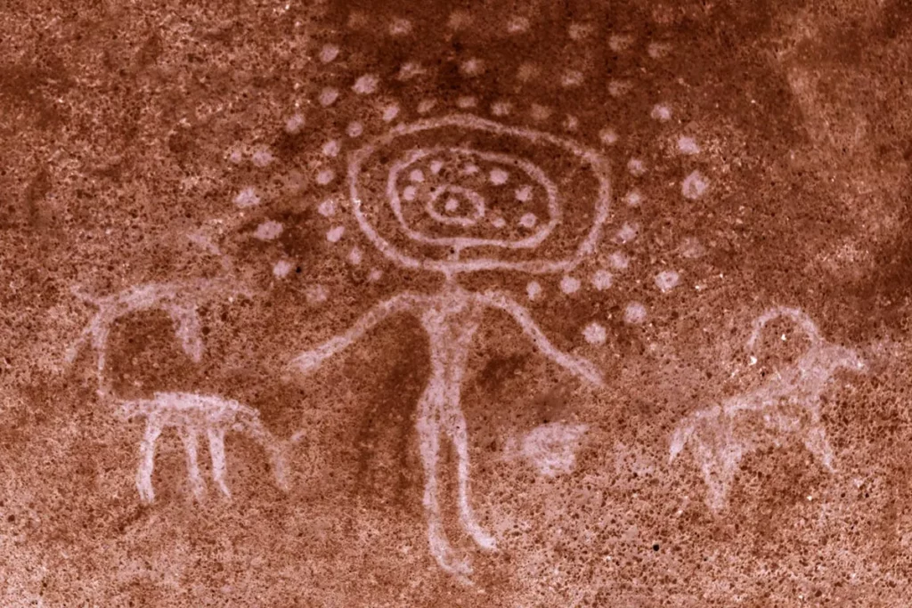
One of the oldest examples of human depiction comes from a cave in Sego Canyon, dating back to approximately 27,000 BC in the Paleolithic Era. The facial figure depicted in this artwork has an abstract, alien-like appearance, sparking much speculation regarding its meaning and origin. What stands out is the use of simple geometric shapes, resulting in a highly graphical and symmetrical style that displays both purity and abstraction. Despite the lack of clear interpretation, this ancient art reflects the early human desire to represent and understand themselves.

Wandjina Sky Beings: Aboriginal Rock Art

Another significant example of ancient facial depiction is the Wandjina Sky Beings found in the Kimberley region of northwestern Australia. These figures are part of a cultural tradition that dates back more than 60,000 years (Gillan, 2021). According to Australian Aboriginal legends, the Wandjinas were „supreme spirit beings“ and creators of both the land and its people. The Wandjinas are depicted with white, mouthless faces, large black eyes, and halos around their heads.

The stylized depiction of these beings has led to various interpretations, from human representations to owls or even extraterrestrial beings. Like the Sego Canyon drawings, the Wandjina art exhibits a distinct, character-rich style that focuses on the face, reflecting early humans‘ fascination with the mysteries of existence and the potential creators of life. While the exact motives behind these depictions remain unclear, it is evident that painting faces helped early humans reflect on their origins and purpose.

Egyptian Art and Hieroglyphs

Hieroglyphs, dating back more than 5,200 years, played a critical role in ancient Egyptian society, particularly in recording royal achievements and fulfilling religious functions. Human faces in hieroglyphs are typically shown in profile and are highly stylized, with few individual traits. Gods, such as Horus, are often depicted with a human body and the head of an animal, like a falcon.

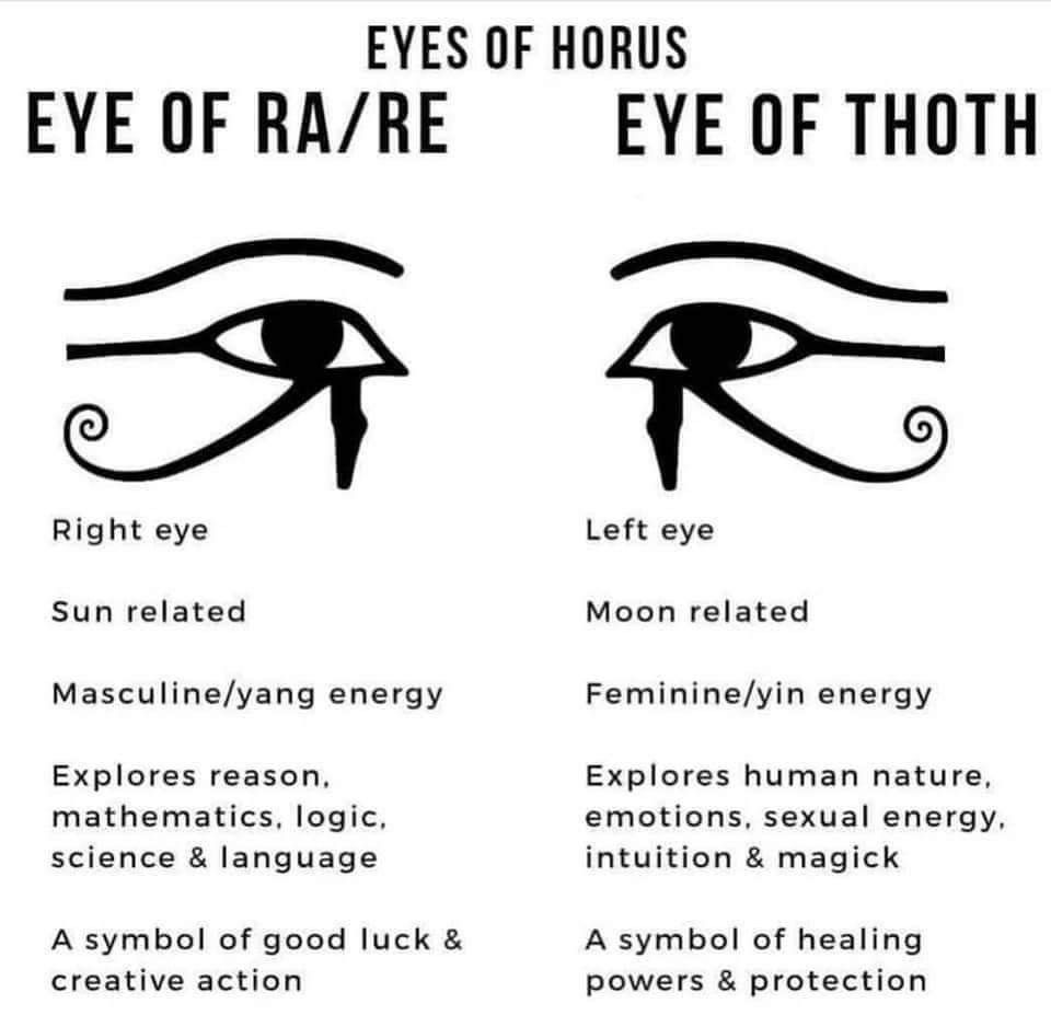
One notable aspect of Egyptian hieroglyphic art is the depiction of eyes. Even though faces are shown in profile, the eyes are always depicted from a frontal view. This deliberate artistic choice reflects the symbolic importance of the eye in Egyptian culture. The left eye, known as the Eye of Horus, represents the moon and carries yin energy, while the right eye, known as the Eye of Ra, symbolizes the sun and yang energy. These dual meanings highlight the complex interplay between visual representation and spiritual significance in ancient Egypt.

Eyes in Modern Graphic Design

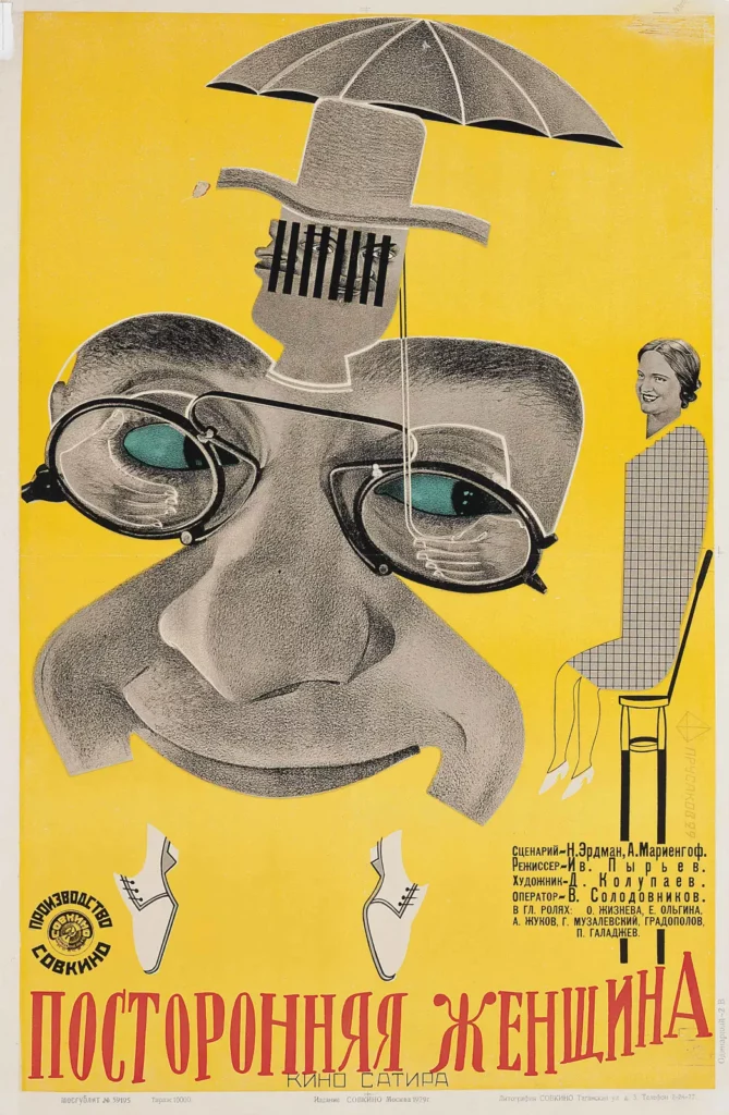
It is said that eyes are the windows of the soul. Because they have such a high symbolic meaning and speak to us on a deeper emotional level, they fulfil the same function in modern graphic design as they did in the depictions of the human eye in ancient hieroglyphs. Here are a few examples of poster designs of the modern period where the eye is the central element and focus of the composition drawing the attention of the viewer automatically towards it. The posters are all from different stylistic directions, years and countries, but still they all distinguish themselves and communicate effectively due to the element of the human eye.

Sofie Neudecker, 27. 01. 2024

Sources:
Porter, Kathy, and the Gray Guardians. „If Paintings Were Photos, What Would Cave People Photos Show? Aliens!“ 2015–2021. https://www.grayguardians.com/if-paintings-were-photos-what-would-cave-people-photos-show-aliens/.

Gillan, Joanna. „The Mysterious Aboriginal Rock Art of the Wandjina Sky Beings.“ Ancient Origins: Reconstructing the Story of Humanity’s Past. November 2021.
https://www.ancient-origins.net/human-origins-folklore/wandjina-rock-art-00701

Hill, Bryan. „Egyptian Hieroglyphs: The Language of the Gods.“ Ancient Origins: Reconstructing the Story of Humanity’s Past. August 2020.
https://www.ancient-origins.net/artifacts-ancient-writings/egyptian-hieroglyphs-002990

„The Egyptian Eye.“ Egyptian History. January 2021.
https://egyptian-history.com/en-it/blogs/egyptian-symbols/eye-of-egypt
Book. History of Graphic Design. 1890 – Today. Taschen. Jens Müller, Julius Wiedemann.

Images:
Gallery Retro. „Photo Et Cinéma.“ Gallery Retro, n.d. Accessed October 18, 2024. https://www.galleryretro.com/shop-art-prints/p/photo-et-cinema.

„Jean and Ernst A. Heiniger during the Shooting of the Cinemascope Film ‚Grand Canyon‘.“ Art Blart, n.d. Accessed October 18, 2024. https://artblart.com/tag/jean-and-ernst-a-heiniger-during-the-shooting-of-the-cinemasope-film-grand-canyon/.

Easy Multi Display. „The Evolution of Advertising.“ Easy Multi Display, n.d. Accessed October 18, 2024. https://easymultidisplay.com/the-evolution-of-advertising.

Pinterest. „Soviet Constructivism Poster by Nikita Kalinichenko.“ Pinterest, n.d. Accessed October 18, 2024. https://it.pinterest.com/pin/537617274273623264/.

Design Is Fine. „Willi Petzold. Poster Design for Exhibition, 1920s.“ Design Is Fine. History Is Mine, n.d. Accessed October 18, 2024. https://www.design-is-fine.org/post/62177693240/willi-petzold-poster-design-for-exhibition.

Designing Chaos – Navigating Chaos

In this blog entry I will explore the use of chaos in graphic design and look at projects that incorporate chaos as a central theme in the design process. I will delve into the stories behind the disorder that shapes modern design, from strategic visual identity design to the current trend of chaotic maximalism.

Navigating Chaos – Creating Visual Identity by Using Chaos Theory

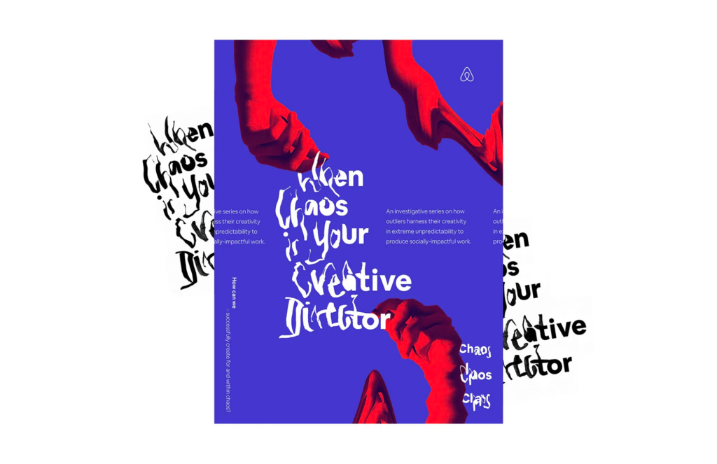
In the journey to create the visual identity for the second season of Airbnb Design Talks, chaos took center stage, challenging designer Meredith Schomburg to unravel the complexities of disorder in the design process. Given the paradoxical task of designing a system around chaos, Schomburg was quickly captivated by her initial ideas. However, she soon realized the need to navigate the chaotic nature of the design process and avoid letting the allure of the initial concept overshadow the depth that comes from exploring different creative directions.

The first design attempt resulted in a visually chaotic collage. Utilizing basic Photoshop filters distorted images, and the suggested event materials displayed the speaker’s name written in nearly illegible handwriting. The aim was to generate visual chaos through the amalgamation of random elements on a page. While it showcased the theme, it lacked the inherent order that the season was meant to celebrate. Schomburg emphasizes the challenge of resisting the rush to implement the first idea, as it can limit the exploration of alternative concepts and hinder the creative process.

By highlighting the chaos within the design journey, Schomburg emphasizes the importance of giving meaning to the design process. She encourages intentional storytelling within the art direction, ensuring that each concept is guided by principles and defining characteristics that promote clarity and authenticity in the narratives presented. At the second attempt she designed everything to fit the story, showing that even though it seemed chaotic at first, there were hidden patterns underneath – making the refined concept more organized than the random initial direction.

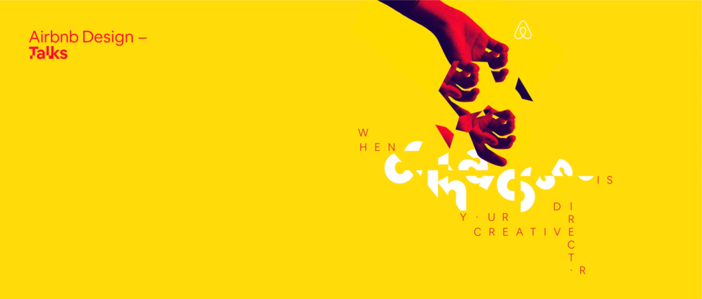
As the project evolved, the team delved into chaos theory and uncovered the presence of underlying patterns within apparent randomness. This revelation inspired a refined concept in which every design element was meticulously aligned with Chaos Theory, revealing order within perceived chaos. The color scheme was a more vibrant adaptation of Airbnb’s brand colors. Pictures, although fragmented and scattered on the page, were arranged based on a collection of geometric fractals inspired by the visual patterns of Chaos Theory in nature.

In conclusion, the case study highlights the importance of navigating the chaotic design process, slowing down to explore alternative concepts, and bringing intentional meaning to the creative journey. It encourages designers to embrace chaos, allowing for a more deliberate and purposeful approach to creating authentic and impactful visual identities.1

Chaotic Maximalism – Design Trend for Gen Z

In the ever-evolving world of design trends, the concept of chaotic maximalism has emerged, challenging the traditional norms and boundaries of graphic design. Unlike the minimalist preferences of Millennials, Gen Z’s rejection of set rules has paved the way for a trend that embraces an explosion of color, pattern, and visual elements – chaotic maximalism.

Emerging from the postmodern movement as a reaction to the rigid principles of modernism, chaotic maximalism celebrates diversity and individual expression by incorporating elements from different styles, eras, and cultures. This trend defies conventional design rules, opting for an overwhelming abundance of visual elements, including vibrant colors, playful patterns, collage, and meticulous attention to detail.

In the Chaotic Maximalism trend, designers blend diverse influences from different historical and contemporary eras, resulting in a collision of creative styles. Vibrant color schemes with clashing hues and surprising combinations attract attention, while playful patterns, collages and layering create visually dense and intricate designs.

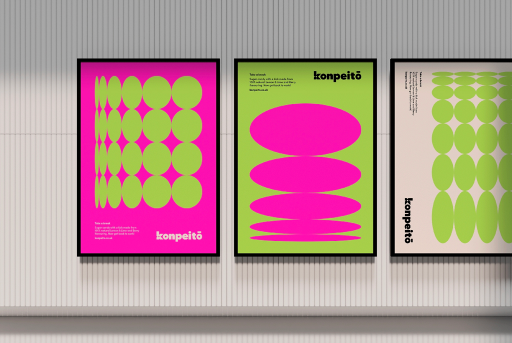
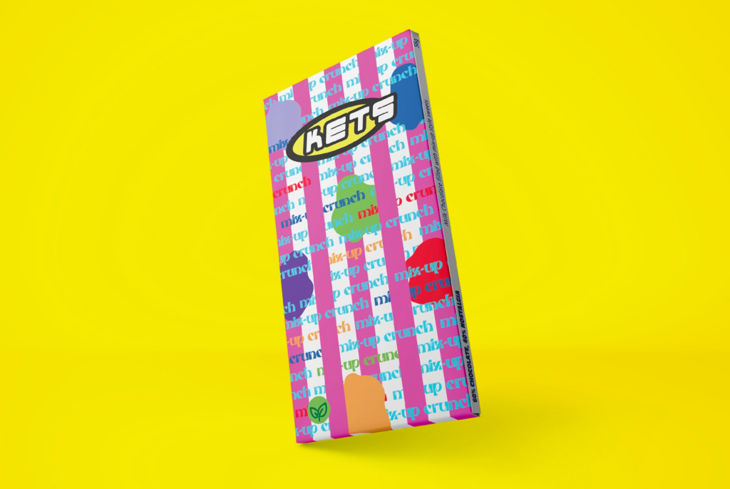
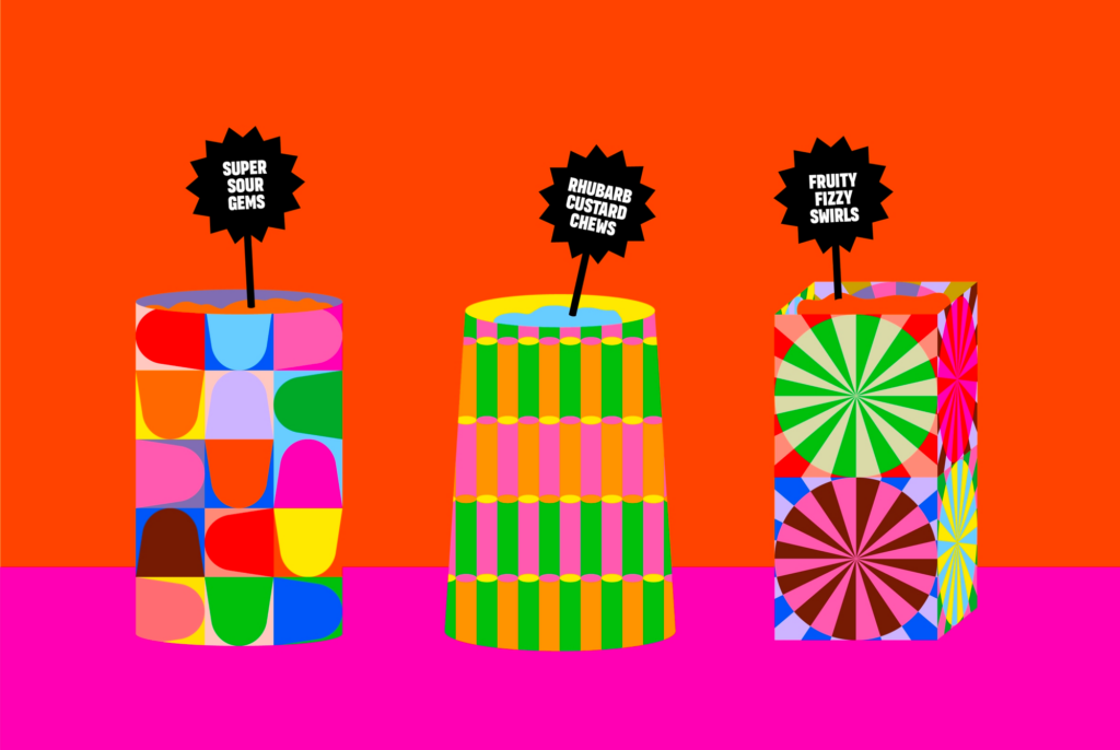
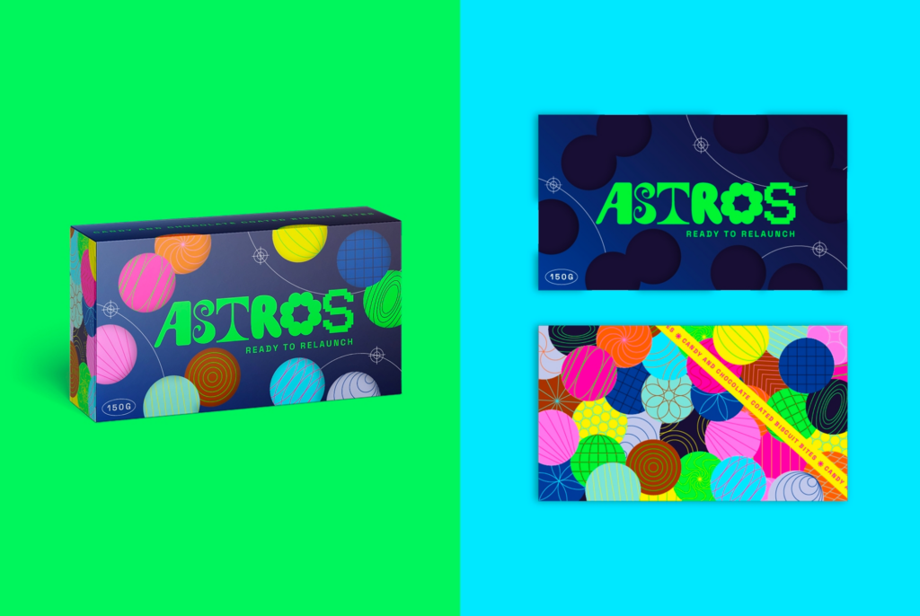
The article of JUMP Brand Communications Agency showcases the design team’s exploration of chaotic maximalism through a creative brief focused on candy packaging, presenting striking examples of their work.

Konpeitō

Inspired by Studio Ghibli, Hannah Jauneika contrasts chaotic maximalism with serene scenes, using a vibrant color palette and incorporating the star shape of konpeitō.

Mix-Up Crunch

Tapping into childhood nostalgia, Alana Whenary’s Y2K-style design integrates vibrant colors and playful elements from classic TV shows like Scooby-Doo.

Candyland

Gemma Turnbull envisions Candyland as a fantasy pick ’n‘ mix emporium, incorporating vibrant patterns inspired by traditional sweet bags.

Astros

Laura Haverson’s Astros concept draws inspiration from outer space, creating a collective solar system that aligns seamlessly with chaotic maximalism. 2


Invention, it must be humbly admitted, does not consist in creating out of void, but out of chaos.

– Mary Shelley

Sources:

  1. https://airbnb.design/designed-chaos/ ↩︎
  2. https://www.wesayhowhigh.com/blog/article/graphic-design-trends-2023-chaotic-maximalism-candy-packaging ↩︎

Research 9: Animal Welfare, Advertising and Children – and more social media comments.

In the landscape of advertising, capturing the attention of young minds requires finesse and responsibility. As marketers strive to create engaging content for children, a delicate balance must be maintained between fostering creativity and ensuring the well-being of our youngest consumers. In this age of heightened awareness, the advertising industry is challenged not only to captivate but also to instill positive values.

One crucial aspect of this delicate equilibrium is navigating the use of images, especially those with the potential to inflict harm or discomfort. It is important to look beyond the scope of traditional concerns to encompass a realm where the innocence of childhood intersects with the advocacy for animal rights.

In accordance with the guidelines set forth by Werberat Austria, advertisements directed at children must adhere to a set of principles designed to protect their physical, psychological, and moral well-being. The evolving landscape has brought forth considerations that extend beyond the immediate impact on children, reaching into realms where the imagery of animal abuse is brought to the fore. How do such distressing visuals fit into the narrative of responsible advertising for children? Children are not able to distinguish and how to interact with animals – they need to learn it. But if they see images from slaughter houses or where animals are abused and tortured . it is hard to say which impact this has on them. Soko Tierschutz showed once a clip where some adults very harshly abused a cow and punched her – then you see some children outside this little box shouting and also participating to punch the cow with long sticks. Children learn through imitating their parents and other people – so there might be some children who could be triggered to have such a behavior as well when they see how animals are abused. And on the other side you will have a lot of traumatised children from seeing this content.

Under the post where they show the video with men abusing a cow and children participating a lot of people commented. From how frustrated and shocked they are to that they cannot watch is as it would never get out of their head again – everything is there. Some are also hoping that the children are getting help and can leave this family – there is an ongoing court case against the adults on this farm as well. When you look through the comments on their posts there are always a few in between who ask how Soko Tierschutz can even look at stuff like this again and again – they say that they cannot watch the content anymore – with videos where you get a content warning for sensitive content – but they support the cause.

Information from the ASA about how to work with images of animals in advertising

When featuring animals in marketing, it’s crucial to avoid overly graphic or distressing imagery. Charities advocating for animal welfare may use such content, but the Advertising Standards Authority (ASA) weighs the cause against potential distress. For targeted campaigns, like PETA’s email to its subscribers, warnings and specific audiences can make distressing content acceptable. However, broad or untargeted use of such imagery is likely deemed unacceptable.

Marketers using humor with animals should ensure hazardous scenarios are clearly fictitious, avoiding any implication of harm to animals. The key is to balance the promotion of important causes with responsible and sensitive content, considering the audience and context to make ethical advertising decisions.

Shock Advertising – Exploiting Animal Cruelty

Experiences and stimuli that evoke emotions tend to be more memorable than neutral events (Paz, Pelletier, Bauer, & Pare, 2006). Negative images have a stronger impact on humans than positive ones (Vermeulen & Odendaal, 1993), leading advertisers to utilize such images of animals to trigger emotional reactions and provoke behavioral responses in consumers. Animal shelters often adopt this practice, incorporating images of abused animals in their adoption advertisements. Conversely, positive emotions like loyalty, friendliness, and human-pet attachment are strategically employed in advertisements to foster a connection with consumers. These emotions, associated with relationships, are anticipated to drive viewers to purchase the product or service that might otherwise go unnoticed in a store.

Sources:

https://www.werberat.at/kinder.aspx

https://www.t-online.de/leben/familie/erziehung/id_63146218/tierquaelerei-durch-kinder-was-dahinter-steckt.html

https://www.chicco.de/elternratgeber/artikel/spielen/lernen-durch-nachahmung-kinder-imitieren-erwachsene.html

https://www.chicco.de/elternratgeber/artikel/spielen/lernen-durch-nachahmung-kinder-imitieren-erwachsene.html

https://www.instagram.com/p/C1zC9plKpvi/

https://www.asa.org.uk/advice-online/animals.html

https://tap-a-gain.com/example-of-shock-advertising/

https://huichawaii.org/assets/stone_sherril_the_psychology_of_using_animals_in_advertising_ahs2014.pdf

Static vs Dynamic Instructions

In this last blog post I would like to explore the advantages and disadvantages of both approaches, shedding light on when to use each method to optimize user understanding.

Advantages of Animated/Video Instructions:

  • Motor Skill Learning: Animated instructions excel in teaching motor skills, leveraging the mirror-neuron system for enhanced comprehension. Activities like folding origami or tying knots benefit from dynamic visualizations.
  • User Control: Giving users control over the pace of instruction, with features like pause, replay, or speed adjustment, provides a personalized learning experience.
  • Step-by-Step Comprehension: Complex procedures are better broken down into smaller, sequential parts in animated instructions, aiding in step-by-step comprehension.

Disadvantages of Animated/Video Instructions:

  • Effectiveness in Highly Complex Topics: Animated instructions may be less effective when dealing with intricate and complicated subjects, such as understanding weather maps. Static instructions may prove more suitable for conveying detailed information.
  • Potential Cognitive Overload: Without proper segmentation and clarity, animated instructions might overwhelm users, leading to cognitive overload and reduced understanding.
  • Varied Effectiveness: Studies show mixed results regarding the effectiveness of animated instructions compared to static ones. Factors such as design, content, and user preferences play a crucial role.

When to Choose Illustrated Instructions:

  • Highly Complex Topics: For subjects that require detailed analysis and where each element holds significance, illustrated instructions can provide a clearer and more focused presentation.
  • Varied Learning Preferences: Some users may prefer still images and text over dynamic visuals. Offering both options caters to diverse learning styles.
  • Printed Manuals: In scenarios where physical manuals are preferred or necessary, illustrated instructions maintain relevance.

When to Choose Animated/Video Instructions:

  • Motor Skill Acquisition: Tasks involving physical actions or manipulations benefit from animated instructions, leveraging the mirror-neuron system for effective learning.
  • Interactive Learning: Animated instructions allow for interactive elements, enhancing engagement and knowledge retention. Users can actively participate in the learning process.
  • User Engagement: In scenarios where maintaining user interest is crucial, animated instructions can captivate attention and deliver information in an engaging manner.

Conclusion:

In instructional design, the choice between illustrated and animated instructions depends on the nature of the content, the complexity of the subject matter, and the preferences of the target audience. By understanding the strengths and weaknesses of each approach, instructional designers can craft effective learning experiences that cater to diverse needs and optimize user comprehension. Whether opting for the clarity of still images or the dynamism of animations, the key lies in aligning the chosen medium with the instructional goals and the special characteristics of the learning material.

Ikea's manual makeover by Francisco GyG on Dribbble

How to Use Randomness in Graphic Design Processes

In graphic design, the mix of order and chaos is interesting and exciting. From abstract design to interactive user experiences, the strategic use of randomness has the power to captivate and engage audiences by adding an element of surprise, chaos, and energy to visual compositions. In this blog entry, I will explore how designers can use randomness and chaos to create creative and interesting graphic design projects. In researching this topic, I wanted to get some ideas from the concept of randomness in graphic design and explore its role in creating visually compelling and dynamic designs. To gain insight into the potential of randomness to enhance rich and innovative user experiences, I explored how randomness can be used as a design resource. I also investigated the incorporation of randomness into the composition of artwork, with a focus on its contribution to the creation of unexpected and surprising outcomes.

Randomness in Abstract Design

Abstract design is an art style that breaks away from traditional forms and embraces free-flowing and organic elements. It creates beauty through unexpected combinations of colors, lines, and shapes, and can be seen in various mediums such as painting, printmaking, and digital art. In digital art, randomness emerges as artists use algorithms and code to generate unpredictable patterns and shapes. Too much structure can make abstract design boring and predictable, so finding the right balance is crucial to creating engaging and effective artwork. As an example from one of my previous blog posts, Jackson Pollock, often called the „Father of Abstract Expressionism,“ provides a notable example of randomness in abstract design. His famous drip paintings from the mid-1940s feature random drips and splashes of paint, resulting in a chaotic and energetic composition. Incorporating random elements adds depth and complexity to the artwork, making it more engaging and dynamic. 1

Randomness as a Resource for Design

The research paper „Randomness as a resource for design“ argues that randomness can be used as an innovative design resource for supporting rich and novel user experiences. Randomness in design does not follow any rule, method, direction, or pattern. If a project calls for randomness, it is best to start with materials that are conducive to spontaneity. Designing with type requires adept handling of the hierarchy, refining and designing the display elements for focal emphasis and also refining the quiet details. Random compositions exhibit visual qualities that are not patterned, aligned, or horizontal. Instead, they tend toward compositions that exhibit overlapping, cropping, angling, and textures. This approach allows for the creation of a dynamic and fresh composition.2

Randomness in the Composition of Artwork

The use of randomness in the composition of artwork has been a subject of interest for many artists. Great artwork requires great attention by the artist. Even so, many artists acknowledge that randomness and spontaneity also play a role in great works. Some visual arts have also utilized randomness, and programmatic artwork may provide an interesting way forward. Not only is it easy to introduce randomness at any point in the composition, but the randomness itself can be controlled in many ways. Furthermore, random experiments can be rapidly replayed. This allows the artist to observe the outcome and take an iterative approach. In some ways, the artist is merely setting up a perfect environment to discover great works of chance.

In his article Tyler Hobbs talks about how artists use randomness in their art to make unique and interesting creations. In his conclusion, understanding and purposefully using randomness can help create special works of art.

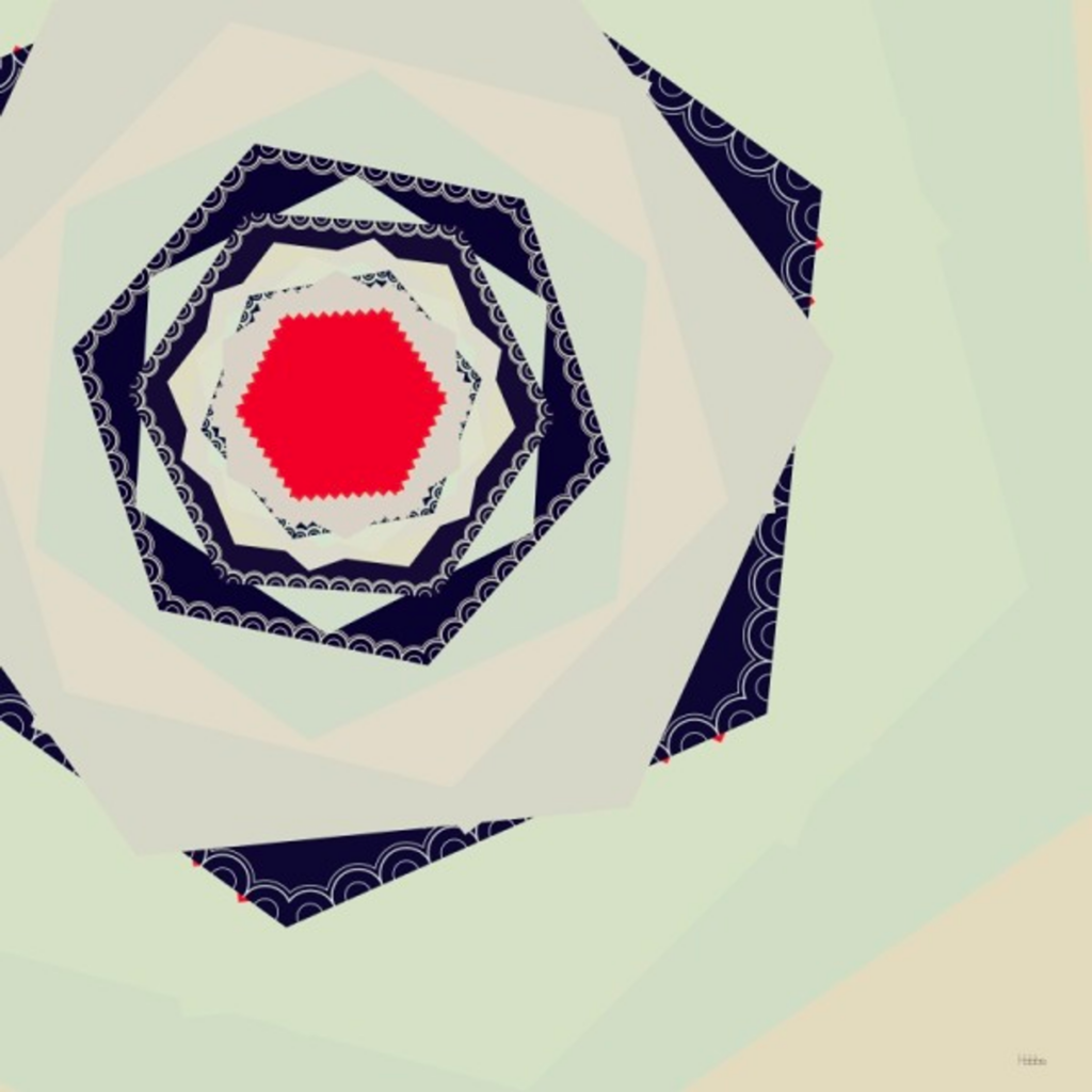
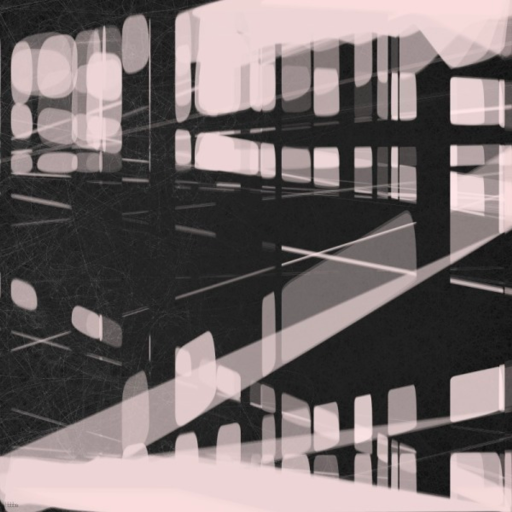
How artists use randomness varies. Some carefully control every part, creating polished works (Figure 1), while others intentionally leave things imperfect and spontaneous, adding a touch of chance (Figure 2).

Figure 1
Figure 2

Hobbs also suggests that a type of art called programmatic artwork, seen in things like Sol LeWitt’s wall drawings, is a good way to explore randomness. It allows artists to add randomness at different points and control it. It also allows them to quickly try out different random ideas to see what works best.

In Hobbs’ own work he talks about, the Quilt and Continuity series, randomness is an important part. In the Quilt series (Image 1), a random starting point guides each new layer, and in the Continuity series (Image 2), semi-random shapes and layers are influenced by a chosen point. 3

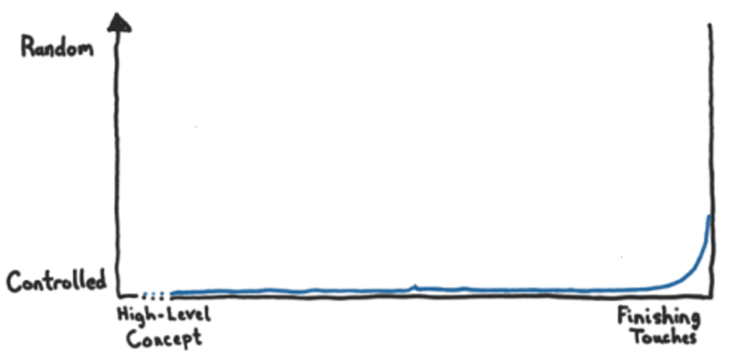
The randomness scale for these series shows a lot of variation, like the following Figure shows.

Conclusion

In conclusion, the strategic use of randomness in graphic design projects, particularly in abstract design, as a resource for design, and in the composition of artwork, can lead to visually compelling and dynamic outcomes. By embracing randomness as a creative tool, designers and artists can infuse their work with a sense of dynamism, playfulness, and innovation, ultimately creating designs that resonate with audiences on a deeper level.


Sources:

  1. https://blog.designs.ai/2023/02/10/exploring-the-world-of-abstract-design-tips-and-techniques-for-designers/ ↩︎
  2. Tuck Wah Leong, Frank Vetere, and Steve Howard. 2006. Randomness as a resource for design. In Proceedings of the 6th conference on Designing Interactive systems (DIS ’06). Association for Computing Machinery, New York, NY, USA, 132–139. https://doi.org/10.1145/1142405.1142428 ↩︎
  3. https://tylerxhobbs.com/essays/2014/randomness-in-the-composition-of-artwork ↩︎

Guidelines for effective Instructions

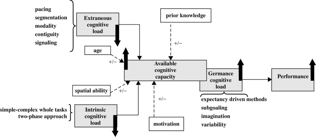
In this blogpost I would like to focus on the topic of cognitive load and how it can be used to optimize cognitive capacity in animated instructions. Three sets of design guidelines emerge from this research.

Guidelines to Tame Complexity

Decrease intrinsic cognitive load

(How hard a task is for your brain to handle without considering external factors)

  • Sequence of simple-to-complex whole tasks: Start with animated models that demand the integration of basic skills and knowledge. Gradually increase complexity, like transitioning from a pin code of four numbers to six.
  • Pretraining: Introduce isolated components before animated interactions. For instance, familiarize learners with key terms before immersing them in an animated model.

Guidelines to Sidestep Obstacles

Decrease extraneous cognitive load

(The mental effort caused by unnecessary or irrelevant information during a task)

  • Pacing: Empower learners to control the tempo of the animated model. Features like pause, play, or slider bars provide flexibility.
  • Segmentation: Divide animated models into meaningful segments, aligning with critical parts of a procedure or process.
  • Modality principle: Present textual explanations in spoken format within animated models.
  • Contiguity principle: Ensure textual explanations are presented consistently in time or space within the animated model.
  • Signaling or cueing: Integrate cues to guide attention and prevent unnecessary visual searches.

Guidelines to Boost Engagement

Increase germane cognitive load

(The mental effort related to meaningful learning and understanding of new information during a task)

  • Expectancy-driven methods: Prompt learners to predict the next steps in a process within animated models.
  • Subgoaling: Encourage learners to group coherent steps into meaningful subgoals.
  • Imagination: Stimulate learners to imagine procedures and concepts presented in animated models.
  • Variability: Present problems that vary in relevant features, keeping learners engaged and adaptable.

In summary, these guidelines provide an overall framework for creating impactful animated models. It serves as a roadmap for designers to balance complexity, user engagement, and cognitive load. Following these principles can elevate animated models from simple visuals to effective tools for comprehension building an intersection of cognition and creativity.

Sources:

https://journals.sagepub.com/doi/abs/10.3102/0034654308320320

https://www.skillcast.com/blog/instructional-design-best-practices

Research 8: Advertising restrictions and prohibitations and how expectations and reality do not meet all the time in adverts

So in between all of this analysis I thought that it would be important to look into the regulations for advertising. In the ever-evolving landscape of advertising, the pursuit of capturing attention often leads marketers to the edge of creativity and controversy. Provocative advertisements, designed to provoke strong reactions, have become a common tool in the advertiser’s arsenal. However, as the quest for attention intensifies, so does the need to delineate the boundaries between what’s attention-grabbing and what crosses ethical lines.

This blog post delves into the intricate world of advertising restrictions, exploring the fine line between captivating content and potential ethical pitfalls. In the pursuit of getting the attention, how much is allowed for animal abuse. As we have social media and classic media where the topic is communicated differently.

The first thing that pops up when you search for regulations in advertising for animal welfare is about the ban for adverts for torture breeding traits. It was started in September 2022. Animals which cannot breath properly due to overbreeding, have no hair or are in pain with every move. „Qualzucht“ refers to breeding practices that prioritize certain physical traits at the expense of the animal’s health and well-being. This may involve selecting for exaggerated features that can lead to severe health problems or discomfort. Often they are breed like that because people prefer the look – and so they also were used a lot in advertisements which led to people wanting these specific kind of animals themselves. Due to health issues a lot of them get into shelters when the people don´t want to pay the high fees at the vet anymore – a decision to get this animal which could be influenced by such adverts. So here we see that not showing something in adverts may help to reduce the buying decisions.

Directly connected to animals there is in the orf-regulations:

„§ Section 13 includes commercial communication. The advertising ban in para. 4 has been extended (to include the area of devices intended for tobacco products and related products for consumption).
As in the AMG, the protection of animals in advertising for the marketing of medicinal products and therapeutic treatment has also been included here.“

And in the audiovisual Media Services Act:

„§ Section 34 para. 2 Commercial communication relating to medicinal products, medical devices and therapeutic treatments must not harm animals.“

A lot of regulations are including health and nutrition, alcohol, tabac and the protection of minors. But in my topic it would also be important to know what are the limits in advertising – not directly for animals. But some organisations use cruel images and videos with disturbing content which is mainly streamed on social media (slowly the documentaries are finding their way into television) – what are the regulations for content like this? On a google support questions they write that in their payed adverts they do not want (which is kind of the same for many other platforms):

Examples of content that we may consider violent or shocking:

  • Vulgar language
  • Violent language
  • Discriminatory terms or images
  • Cruel images
  • Explicit depiction or description of injuries caused by violence
  • gratuitous depiction of bodily fluids or excrement
  • Advertising that may shock or cause fear
  • Advertising in which sensitive events are marketed

We consider the following content in video ads to be shocking:

  • Violent or repulsive images that may have a shocking or disturbing effect on viewers and may show, for example, the following:
  • Blood splatter
  • bodily fluids
  • Human or animal remains
  • Explicit depiction of the consequences of an act of violence
  • Images of violence or blood at the center of a video scene
  • The violence depicted in the video is realistic if it is posted in a dramatic context
  • Other factors include perspective, focus and clarity of the images.

So with this criterias the campagins from Soko Tierschutz would never be allowes to be payed adverts. As I know they sometimes blurr scenes but I also could already watch some really disturbing content on their channel – which was never a paid advert. On the one hand it would be important for specific topics to show the reality as a lot of people still are not aware of what is going on. Most know that not everything is going the right way but they do not know how bad it actually is. In a paper about a press conference March 2023 they presented a study on how people see the current situation and which expectations they have when specific terms are used in slogans or on products.

Just a short exerpt from that:

  1. Consumer Expectations: Consumers expect a strong connection to Austria for products labeled „Made in Austria,“ especially in terms of raw materials and manufacturing. Regional products are expected to have ingredients and processing within a limited distance, usually within Austria.
  2. Importance of Animal Welfare: Animal welfare is crucial for almost 88% of respondents, encompassing factors like proper animal housing, stress-free slaughter, ethical feeding, outdoor access, and short transports.
  3. Discrepancy Between Expectations and Reality: The survey indicates a misalignment between consumer expectations and the actual content of products. Advertising, especially concerning origin and regional claims, can be potentially misleading, necessitating a balance between marketing and truth.
  4. Advertising Impact on Perception: Advertising, especially using terms like „Made in Austria,“ influences consumer perceptions. For instance, consumers expect higher quality and less contamination in plant-based foods and better animal welfare in animal products when associated with Austria.
  5. Challenges in Regional Definitions: Consumers value regional products but struggle with clear definitions. The term „regional“ lacks legal or food book definitions, creating uncertainties in consumer understanding. However, nearly all respondents expect at least Austrian origin for products labeled as „regional.“
  6. Desire for Clear Labeling and Regulations: Consumers demand more transparent and truthful advertising. The AK (Arbeiterkammer) proposes several measures, including binding animal welfare labels, supplementing origin labels with animal welfare standards, defining „regional,“ a new quality label law, and effective controls by food authorities.

In conclusion, the survey highlights the need for clearer regulations, transparent advertising, and effective controls to align consumer expectations with reality, particularly regarding the origin and welfare standards of products in Austria. So as we see people get are dazzled and influenced by special expressions in advertising. The question is whether it becomes legitimate in a way to use cruel material for advertising to show the reality and to shake people awake. And also there are organisations which say that the adverts where animals are happy and outside doesn´t show the reality and so it is kind of false advertising as well – but there is no an effective legal remedy.

Sources: https://www.konsumentenfragen.at/konsumentenfragen/GesundheitUmweltundTierschutz/Gesundheit_und_Umwelt/Werbeverbot_fuer_Tiere_mit_Qualzuchtmerkmalen.html

https://broschuerenservice.sozialministerium.at/Home/Download?publicationId=633&attachmentName=Qualzuchtverbot_in_der_Werbung_pdfUA.pdf

https://wien.arbeiterkammer.at/interessenvertretung/konsument/Presseunterlage_20230327.pdf

https://vgt.at/presse/news/2022/news20220421ff.php

https://www.wko.at/oe/information-consulting/werbung-marktkommunikation/werbebeschraenkungen-und-verbote-in-medien

https://support.google.com/youtube/answer/6362085?hl=de

https://wien.arbeiterkammer.at/interessenvertretung/konsument/Presseunterlage_20230327.pdf

https://vgt.at/presse/news/2022/news20220421ff.php

Unlocking Universal Understanding – Designing Instructions without words

Traditionally assembly instructions have been conveyed through manuals filled with text and illustrations. However, in the global landscape, designing assembly instructions without words becomes essential for a universal understanding.

Visual communication has emerged as a game-changer in assembly instructions. It serves as a universal language, breaking down language barriers and catering to a diverse audience. Here are some reasons why designing assembly instructions without words is gaining popularity:

1. Increased Clarity and Accuracy:

Visual communication excels in conveying complex information with clarity. Step-by-step visual guides can seamlessly communicate the assembly process, making it more accessible for users to comprehend and follow. Crucial points and potential errors can be highlighted through images, contributing to a more accurate assembly process.

2. Time and Cost Savings:

Translation of text-based instructions into multiple languages is both time-consuming and expensive. Designing assembly instructions without words eliminates the need for translation, saving both time and money.

3. Improved User Experience:

People inherently learn better through images and visual aids. The use of images in assembly instructions enhances the overall user experience by reducing frustration and errors. Visual communication creates a more user-friendly environment, making the assembly process not just efficient but also enjoyable.

Examples of Successful Implementation:

There are a lot of companies which have successfully adopted a wordless approach to their assembly instructions, showcasing the power of visual communication:

IKEA Furniture Assembly:

IKEA, known for its flat-packed furniture, employs simple illustrations instead of text-based instructions. The result is an efficient and enjoyable assembly process that caters to a global customer base.

LEGO Building Instructions:

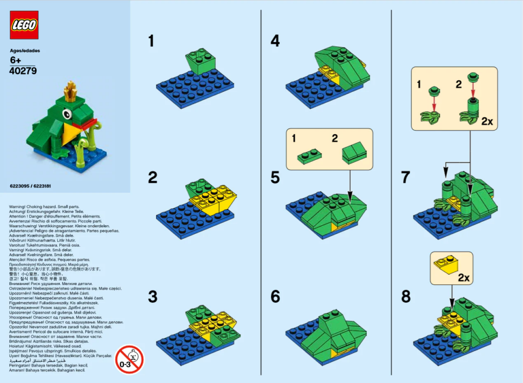
Lego’s wordless instructions cater to its diverse audience, including children. Step-by-step visual guides make the building process enjoyable for users of all ages.

Dyson Vacuum Cleaner Assembly:

Dyson utilizes simple visual guides for the assembly of its vacuum cleaners. The approach aligns with the company’s minimalist design philosophy.

Methods to Design Wordless Assembly Instructions:

To delve into the realm of assembly instructions without words, various methods and tools can be employed:

When crafting assembly instructions without words, various methods and tools come into play. One approach is sketching, where visual instructions are hand-sketched, offering flexibility in design and simplicity without the need for specialized software. Alternatively, vector graphics software like Adobe Illustrator is employed, providing the means to create precise illustrations and diagrams—ideal for technical illustrations with the added benefits of versatility and easy editing. Another option is utilizing flowchart software such as Lucidchart or Visio, which allows the creation of step-by-step diagrams, offering clear and easy-to-follow visual representations of the assembly process. For those seeking dynamic and engaging instructions, animation software like Adobe After Effects or Blender comes into play.

In conclusion, the shift towards designing assembly instructions without words is a powerful move towards universal understanding. Visual communication enhances clarity, saves time and costs, and elevates the overall user experience. Companies like IKEA, LEGO, and Dyson exemplify the success of this approach.

https://graphics.stanford.edu/papers/assembly_instructions/assembly.pdf

https://www.cadasio.com/post/designing-assembly-instructions-without-words