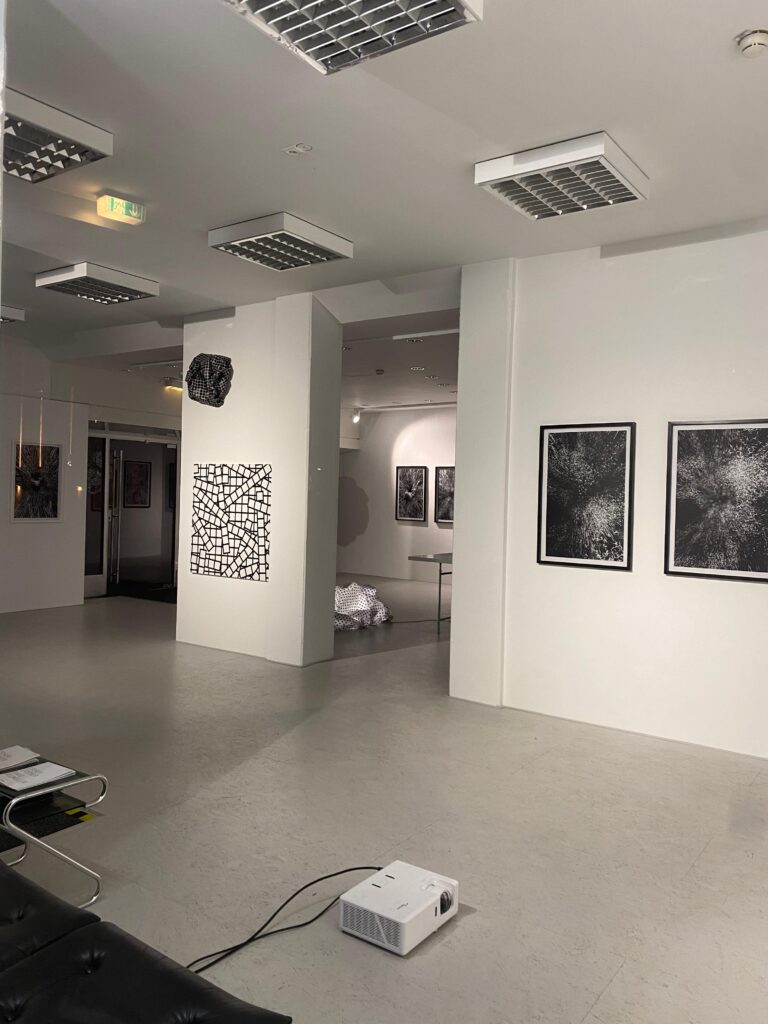
Research 16: International Design Week Part 3 – Paper Collages and RISO

After the digital exploration of the topics, we used paper collaging on the last day. We worked quickly, making rough cutouts and thoughtfully combining them. We were instructed to cut everything beyond just the outline and to think out of the box. The exercise was also for us to work faster on developing ides and connecting visual material with out message without searching for the perfect image on the web for ages.

For the first collage, I created another version of the Faroe Islands topic. The teachers provided printed materials related to our topics, ensuring everyone found something useful. I also printed some of my previous slogans and typographic choices. Initially, I was very detailed and took a long time, but I soon got the hang of it and worked faster.

We combined all the black-and-white cutouts and roughly glued them onto white A3 paper. We then used these collages on the RISO. We scanned them directly to make masters and printed many copies of each design. During this process, Lars took some previously printed designs and overprinted them with another student’s design, which was not intended to be combined. This approach yielded very interesting results. Some elements matched well, as all the topics were problematic, and some slogans or images were reusable. In the end, we had one copy of the original design and nearly 200 different posters with various combinations.

My first work was for the topic of faroe islands and the whale hunting. This collage was an abstract visual showing a whale being stabbed. There are also some versions where it was combined with other designs randomly.

I also made a collage for the pig farm topic and the AMA-Gütesiegel. I used their slogan and created a graphic symbolizing the pain pigs endure, featuring a cut-open pig and a brain functioning as its inner organs. This collage used 2-3 images per layer, unlike the first one, which was built from various cutouts. Unfortunately there was no original left of this design after the whole printing process. But there is a version with the AXI Draw in the end.

Lastly, I made a collage on the controversy of zoos. I found a fitting slogan and created a symbol combining human faces and barbed wire. On another layer, I used a zebra and cut out stripes from a different pattern to form a cage.

As a final step, we used a tool called the AXI Draw, which can draw on top of printed materials. Some of us used it to rewrite slogans or add details on top of the layered RISO prints. This experimental approach was a refreshing change, allowing us to work more roughly and try new techniques.

This workflow was very inspiring and something new for me as you really have to trust also the process and it is something besides just looking in a screen the whole time. Also the RISO printing makes the end result more haptic and analog than if you just would scan the designs and rework it digital. So you get the overlay from the RISO with little happy accidents and it is way more authentic.

Research 15: International Design Week Part 2 – Digital Posters

Triggerwarning! If you don´t want to see maybe disturbing images of animals – please do not read this post further because I am using images from pigs which are in horrible conditions.


Concept 1: Pig Farms and Gütesiegel

My first design addresses the misleading information consumers receive through various certificates on products, combined with the frequent revelations of poor animal conditions on farms. These farms are often certified under the AMA-Gütesiegel. Despite numerous scandals, AMA claims these issues are beyond their responsibility, which clearly isn’t the case. The AMA-Gütesiegel does not propose better conditions than existing EU regulations; it simply aims to give consumers a false sense of security when buying Austrian meat. Although some farms are suspended from AMA, proper controls would prevent these issues from arising in the first place.

The first approach was to take their seal and rework the typography a litte bit to make it from Gütesiegel to Lügesiegel. Just a small detail thats powerful in its message.

With that I build two different designs for the poster. One is more graphic and the other one uses real life images. To highlight how two faced the campaign of AMA is, I decided to use AMA’s advertisement and rework it. I utilized their graphics, modified the text, and incorporated new images to achieve the desired effect. So here are my two versions for this topic – which the AMA Ad would be the chosen one of this for the presentation.


Concept 2: Whale Hunting on the Faroe Islands

The next topic I explored was whale hunting in the Faroe Islands, a cruel and unnecessary practice today. Pods of whales are chased to the shore with speed boats and brutally slaughtered. Despite no longer relying on whale meal, the practice continues with global buyers and some locals clinging to tradition. In 2023 alone, over 800 whales and dolphins were killed. Organizations like Sea Shepherd are on-site, documenting these events and try to stop it with petitions and more people are against it luckily.

Initially, I planned to create a modern travel poster-style design, but it felt too editorial. But the slogan „Welcome to the red sea“ stayed in my head. I shifted to a 50s-70s style inspired by Cassandre, known for his impressive posters. Due to time constraints, I couldn’t create my own illustrations, so I used Photoshop to edit images to fit this style. After much trial and error, I produced a compelling poster with interesting fonts. Here are my different versions for this topic.

Different approaches to this design style. First i edited the image heavily and then I played with the colors further and typography. On the first glance the blue/green version could look like a pretty image but then you see the details and what the bright red should symbolize.

This workflow showed my how individual the approaches can be to visualize such topics – you can use well known techniques and styles and use their main features to get a strong visual. That´s something that I will definitely be something I will explore further in this case. The next post will be about how I am using the same topics and also some same visual graphics in a completely different style and technique.

Experimenting with Colors #17

Mixing Cyan and Magenta

Cyan, which is created by mixing blue and green, when combined with magenta, yields shades of red. Initially, the mixture may appear as a cool, bluish-red tone, but as more magenta is added, the color deepens into richer shades of red. Depending on the proportions of cyan and magenta used, the resulting red can range from vibrant and intense to deeper and more burgundy-like. Experimenting with different ratios of cyan and magenta allows for the creation of a diverse range of red hues.

Experimenting with Colors #16

Mixing Magenta and Yellow

Magenta, a color derived from red and blue, when mixed with yellow, produces a vibrant range of red-orange hues. Initially, the combination may result in a vivid reddish-orange tone, but as more yellow is introduced, the color becomes brighter and more reminiscent of tangerines or sunset hues. Adjusting the ratio of magenta to yellow allows for control over the intensity and warmth of the resulting red-orange color.

Experimenting with Colors #15

Mixing Red and Yellow

Mixing red and yellow together yields shades of orange. Initially, the mixture may appear as a bright vermilion hue, but as more yellow is added, the color transitions to warmer tones of orange. Depending on the proportions of red and yellow used, the resulting orange can range from vivid and fiery to softer and more subdued. Experimentation with different ratios of red and yellow allows for the creation of a spectrum of orange shades.

Experimenting with Colors #14

Since I’ve decided to delve deeper into the color red, I’ve conducted a few experiments on color mixing with the color red.

Mixing Red and Blue

When mixing red and blue together, you’ll observe a gradual transition from the original colors to shades of purple. As more blue is added, the resulting color becomes cooler and tends towards violet. Conversely, adding more red will warm up the mixture, producing deeper shades of magenta. Through experimentation with different ratios of red and blue, you can achieve various tones of purple, ranging from vibrant violets to rich magentas.

Research 14: International Design Week Part 1

The last few days, we had the International Design Week, during which we could choose from different workshops covering various topics led by designers from diverse backgrounds. On one hand, I wanted to dive deeper into Blender and expand my skill set, but I was also interested in the last workshop titled “Doubt is not an option,” conducted by Roger Walk and Lars Harmsen. The topic aligned closely with my area of interest, so I felt it would complement my project perfectly. The workshop focused on the loss of trust in media and politics, examining the difficulty in discerning fake news from factual information today. Within the first few minutes of their presentation, I knew it would provide a fresh perspective for my project.

Initially, we examined various works across different fields, ranging from spreading fake news to satirical posters about politicians. We observed a variety of design styles and approaches to visualizing the topic. Following that, we conducted our own research on headlines and current issues to use as inspiration for our designs. During our research, we discovered a range of contemporary and problematic topics rather than strictly focusing on fake news. I explored topics related to animal welfare, Instagram’s efforts to hide political content, and the concerning fact that women fear men more than bears. A strong headline based on these themes would form the foundation for our later poster design.

After a discussion, we delved deeper into the visual representation of our topics. I explored animal welfare through articles from Soko Tierschutz on the conditions of pig farms today. I combined this with the misleading use of the AMA Gütesiegel and other certifications on products, which often suggest a good quality of life for the animals but, in reality, mislead consumers. I began to visualize how I could depict this, perhaps by placing the AMA Gütesiegel on images showcasing the harsh conditions pigs endure or contrasting reality with how it is portrayed. Lars and Roger’s initial slides also introduced various options, such as simple illustrations or manipulating images with processing, which would suit the topic’s style. I also considered the issue of zoos, particularly the controversy surrounding Zoo Magdeburg and its handling of monkeys.

Over the weekend, I decided to focus solely on animal welfare topics, as I felt most confident in that area. Political topics required more in-depth research before creating such controversial posters. I also investigated the issue of whale hunting in the Faroe Islands, which was happening again during that period. This island, southeast of Iceland, historically depended on whale hunting for sustenance and survival; however, today, it has become a brutal practice that results in the mass slaughter of protected whales in Europe. The phrases “Sea turns red” or “Welcome to the red sea” resonated with me. While the picturesque Faroe Islands evoke thoughts of vacation, the reality is far more disturbing due to the bloody whale hunts. Thus, I envisioned creating a tourism-style poster to highlight this disparity.

After the research and topic exploration we started on monday with the first designs and visual concepts digitally. In the following post I will go deeper into this process and show my designs.

13 | Design Constructions For The Uppercase Eszett

4 possible design skeletons

1. Dresden (soft + hard features)
2. Leipzig (soft + soft features) both by Andreas Stötzner
3. Frankfurt (hard + hard features)
4. Berlin (hard + soft features) both by Adam Twardoch

1.  Dresden Skeleton

According to the German type designer Ralph Herrmann the Dresden skeleton is the most common construction. The Dresden design approach is characterized by several distinct features. Notably, it serves as a capitalized form of the lowercase character „ß“ and features a diagonal stroke at the upper right, distinguishing it from the letter „B“. One of its characteristic features is the aperture at the bottom, typically rounded in most designs. This aperture provides balance and legibility to the character. However, variations exist where this part of the character may be drawn with an angle or a serif, adding unique stylistic elements to the design.

Additionally, the diagonal stroke in the upper right part of the „Dresden“ character adds further visual interest and differentiation from similar-looking letters. It contributes to the overall distinctiveness and clarity of the character.

Considering these features, it‘s crucial to ensure that the „Dresden“ character maintains a width that is 10–15% wider than the letter „B“ to achieve optimal balance when used alongside other uppercase letters in text.

When a type designer embarks on creating an extended language set, they typically start with a foundation of basic characters and letters that are already rendered. This allows them to focus on the nuances of specific characters, such as the eszett. Graphically, when drawing an eszett, designers often reference the forms of other letters in the font, such as F, S, Z, B, and even the number 3. This helps maintain consistency in the overall design aesthetic. While it‘s commonly advised that the proportions of the capital ß be wider than those of the letter B by about 10-15%, this isn‘t always a strict rule. Instead, designers prioritize the proportions of the entire font and adjust accordingly. The construction of the eszett combines soft features from the bow of the letter S with hard features from the diagonal of the letter Z and its acute angle at the top right. This blend creates a unique visual identity for the character.

Testing the result involves printing text containing the eszett and examining how it integrates with the overall character set. This allows designers to assess the character‘s width and shape in relation to the rest of the font. Karen Cheng, in „Designing Type,“ suggests making cuts and serifs in the terminals of letters like S, 3, and eszetts identical, but this isn‘t mandatory in typeface creation. For instance, in sans-serif fonts, terminal cuts can be straight rather than curved. Ultimately, creating a cohesive and visually pleasing font involves balancing various design elements while maintaining readability and aesthetic consistency across the character set.

2. Leipzig Skeleton

This Eszett form by Andreas Stötzner exhibits a soft, rounded skeleton reminiscent of the Dresden form, characterized by a smooth transition from stem to bowl, reminiscent of historical round „s“. It combines elements from both the letter forms F and S, offering a unique and visually striking design aspect. Notably, the incorporation of a clearly visible S as the right part of the Capital Sharp S adds to its distinctiveness. While this variant may not be widely utilized, it complements typefaces with a more calligraphic appearance, introducing an intriguing design element without introducing ambiguity issues.

A more recent design approach, stemming from the Leipzig Skeleton, has given rise to the Zehlendorf Skeleton by Martin Wenzel and Jürgen Huber. Departing from the conventional wide and uniform S-curve, this variant opts for a tight, narrow S-curve. This nuanced adjustment creates additional whitespace within the broader character, enhancing its clarity and ensuring a clearer distinction from the letter B. This design strategy underscores the evolution and adaptability of Eszett forms, demonstrating a commitment to both legibility and aesthetic appeal within contemporary typography.

3. Franktfurt Skeleton

This Eszett skeleton by Adam Twardoch closely resembles the Dresden Skeleton. The only difference lies in the clear corner used as the transition from stem to bowl. Many designers think, that such an arc of the Dresden skeleton on the top left doesn’t work well within the Latin uppercase letters. So, to avoid this “lowercase look”, it is suggested to draw the top left of the Capital Sharp S as a corner. Compared to other Eszett options, this Skeleton appears much harder. Composed of the letter combinations F, Z, 3, and B, it lacks both soft curves and S-shapes. Consequently, this angular Eszett option aligns well with geometric typefaces. Moreover, this construction method finds particular favor with serif fonts. Here, an additional serif can be strategically placed at the stem, ensuring that the capital letter maintains proportional harmony with the other uppercase characters.

4. Berlin Skeleton

This design approach by Adam Twardoch builds upon the angular concept of a majuscule eszett once again. In order to seamlessly integrate the Berlin Skeleton into uppercase text, it eschews a rounded transition from stem to bowl in favor of a sharp corner on the top left of the letter. This architectural decision imbues the character with a larger appearance and reduces the likelihood of confusion with a lowercase letter. The design merges elements of the letters F and S, incorporating a more or less pronounced S-curve as well.

By employing this technique, Twardoch achieves a balance between legibility and aesthetic cohesion within uppercase letterforms. The distinct corner at the transition point adds visual weight to the character, making it stand out more prominently within text. Furthermore, the incorporation of both F and S characteristics ensures a harmonious integration of the Berlin Skeleton into various typefaces, contributing to its versatility and applicability across different design contexts.

LINKS:

https://typetype.org/blog/ligatures-in-fonts-creating-eszetts

https://typography.guru/journal/capital-sharp-s-designs

https://typetype.org/blog/ligatures-in-fonts-creating-eszetts

http://cinga.ch/eszett/#top

12 Preparing for my first Experiment: Exploring Origami Instructions

As I transition into the experimentation phase of my research, I’m eager to dive into the world of instructional design with a hands-on approach. My first experiment will focus on comparing illustrated and animated instructions, with origami as the chosen task. Why origami? According to my research, motor skills are easier to learn with animated instructions, thanks to a concept called mirror neurons.

Mirror Neurons

Mirror neurons are special cells in our brains that fire both when we perform an action ourselves and when we see someone else perform the same action. This mirroring effect helps us learn and understand motor skills more effectively, making animated instructions particularly suitable for tasks like origami. Also origami is a simple yet versatile art form that only requires a piece of paper to get started. With its various folds of different difficulties, it offers the perfect canvas for my experiment.

Origami

Before diving into the experiment, I want to take a moment to explore what origami is and its history. Origami is the Japanese art of paper folding, derived from two words: „ori“ meaning folding and „kami“ meaning paper. It dates back to the 17th century and has since evolved into a globally recognized form of artistic expression and education.

Choosing the right fold

Now onto the task of finding suitable instructions for my experiment. I want instructions that strike a balance between complexity and accessibility. They shouldn’t be too simple, as I want to challenge participants and observe potential differences between illustrated and animated instructions. However, they also shouldn’t be overly difficult, as I want participants to be able to complete them with some practice. Additionally they should contain one tricky step to see how participants fare with each type of instruction.

Origami Duck

To ensure the quality of my experiment, I’ve decided to test out several instructions on my own before selecting the final ones. This hands-on approach will help me choose the difficulty level and identify any potential issues or struggles. After some time I settled on an instruction about an origami duck which has the right level of difficulty for beginners.

Ultimately my goal is to design a set of instructions that will provide valuable insights into the effectiveness of illustrated versus animated instruction methods. With my plans in place I’m excited to embark on this journey of experimentation.

Sources:

https://www.psychologicalscience.org/observer/mirror-neurons-how-we-reflect-on-behavior

https://study.com/academy/lesson/history-of-origami.html#:~:text=The art of paper folding was popularized in Japan, but,to decorate temples and shrines.

https://origami.me

sRGB #13

sRGB stands for „Standard Red Green Blue“ and refers to a standardized color space that is widely used in many applications and devices. Originally developed for use in digital displays and web graphics, sRGB is now a widely accepted standard for color representation in various applications and devices.

The sRGB color space defines a limited palette of colors that can typically be displayed and processed by most computer monitors, digital cameras, printers, and web browsers. It was designed to ensure consistent and predictable color reproduction across different devices and to ensure that images and graphics appear similar regardless of where they are viewed.

Compared to larger color spaces such as Adobe RGB or DCI-P3, sRGB covers a smaller range of hues. However, it is sufficient for most everyday applications and provides good color accuracy and consistency.

sRGB is often used as the standard color space for displaying content on the web. When creating images or graphics for the web, it is common to save them in the sRGB color space to ensure they are correctly displayed by most web browsers.

It is important to note that color reproduction in sRGB can also depend on the calibration of the screen or printer. Accurate color calibration and profiling of devices are necessary to ensure that colors in the sRGB color space are accurately reproduced.

Source: https://www.prad.de/lexikon/srgb/