Uppercase Eszett Design
Since June 29, 2017, the letter ẞ has become a part of the German orthography. Many type designers warmly welcome this decision and had already incorporated the unofficial character into their font designs even before its official recognition. Now that the character has been formally included in the alphabet, the question of how to design a capital Eszett arises once again. Many designers assume that the ligature for the capital Eszett is exclusively composed of a long „s“ and „z“ (Sulzbacher Form) and tailor their designs for ẞ accordingly. However, the historical origin of the capital Eszett, whether from „s“ and „z,“ from a long „s“ and a round „s,“ or from other combinations, cannot be conclusively answered. Diverse combinations were already in existence in the 7th century.
More relevant than conclusively determining the origin of the ligature is the development of a functional form for this new uppercase letter, focusing on readers in the 21st century. If we place the habits of the reader at the center and aim for a responsible design for use in the 21st century, a derivation of the form from the version with a long „s“ and a round „s“ is clearly preferable. Especially considering international appeal, forms that distinctly incorporate an „s“ shape are convincing.
The development of this new uppercase letter and its stylistic integration into our existing capital alphabet necessitate careful consideration of several key elements. The letter should possess a monumental, uppercase appearance to emphasize its prominence. Simultaneously, it is crucial that it clearly distinguishes itself from other glyphs in the alphabet while maintaining a stylistic connection to ensure overall coherence. Particular attention should be given to its resemblance to the form of the common „ß“ in Antiqua fonts. This not only establishes a visually coherent link but also supports the seamless integration of the new uppercase letter into the overall font style. Additionally, it is essential to incorporate the normal „s“ form into the design for improved identifiability, facilitating a harmonious fit within the existing alphabet. Another significant consideration is the treatment of the left stem as an abstract element. This approach becomes necessary as the familiarity with the long „ſ“ gradually diminishes, and a contemporary, easily recognizable design is sought. By carefully addressing these attributes, a visually appealing and functionally integrated design for the new uppercase letter can be achieved.
When examining the basic structure of Capitalis Monumentalis, which serves as the origin of our contemporary uppercase letters, it becomes apparent that Roman letters are both distinct from each other and, at the same time, exhibit a stylistic coherence. This duality defines their quality and underlies their usage for over 2000 years.
When introducing a new character, it must stand out from all others. In the case of the capital Eszett, the reading habits of readers play a crucial role. A resemblance to the common „ß“ facilitates recognition – reading type designers should align with these habits for optimal legibility.
Four Primary Constructions
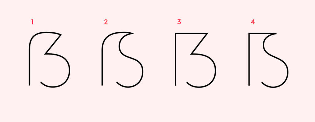
Typography experts have crafted various forms of the Eszett, resulting in four primary constructions of the uppercase Eszett: „Dresden“ (1) and „Leipzig“ (2) as per Andreas Stötzner, and „Frankfurt“ (3) and „Berlin“ (4) according to Adam Twardoch.

The German typographer Ralph Herrmann has highlighted that the most prevalent construction for the capital form of the Eszett is the number 1 variant. Distinguishing features include the aperture at the bottom and a diagonal in the upper right part. The lower part is frequently rounded, although some Eszett forms may present this section as an angle or with a serif.
When embarking on the creation of an extended language set, the fundamental set of characters and letters is typically already crafted. Therefore, in the graphic rendering of the Eszett, attention can be directed towards the established forms of the letters F, S, Z, B, and the numeral 3.
The proportions of the uppercase Eszett are generally wider than those of the letter B by approximately 10-15%. Although not a strict requirement, it is more crucial to consider the proportions of the overall font and align the design accordingly.
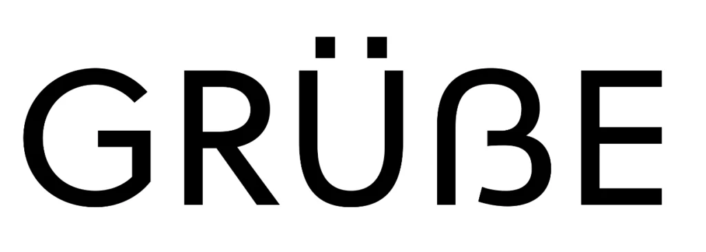
To assess the outcome, one can print the text containing the Eszett and carefully examine its appearance within the complete set of characters. This aids in understanding how the character‘s shape integrates into the overall aesthetic of the font concerning width and form. According to Karen Cheng in „Designing Type,“ making cuts and serifs in the terminals of S, 3, and Eszetts identical is suggested, but it is not obligatory in typeface creation. For instance, in sans-serif fonts, terminal cuts can be straight.

Unsuccessful examples of the eszett form are usually read as B.

Typographers hold differing opinions on the design of the verbal Eszett. While the Dresden (1) variant is the most commonly used form, many critics argue that it bears too strong a resemblance to the characteristics of the numeral 3. The sharp-edged diagonal consistently harks back to the historical roots of the Sulzbacher Form (ligature of long „s“ + „z“). Instead, there is a preference for adopting the Antiqua approach of long „s“ + „s“ and emphasizing the uppercase S in the uppercase Eszett. For non-native German speakers, associating the Leipzig (2) and Berlin (4) forms with a distinct S-form would be more intuitive.
Typeface Examples

Links
https://finaltype.de/de/themen/versal-scharf-s#historische-betrachtung
https://typetype.org/blog/ligatures-in-fonts-creating-eszetts/
https://finaltype.de/de/themen/versal-scharf-s#historische-betrachtung