Visual Encoding
How to systematically analyze idiom structure?
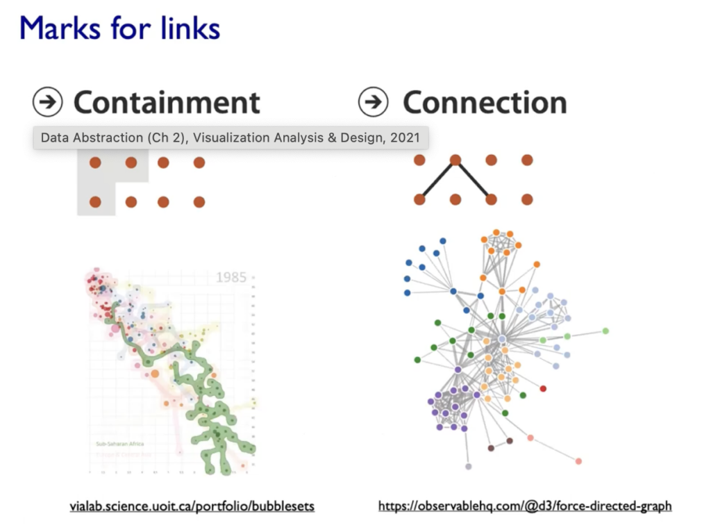
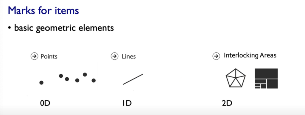
- Marks: represent Items or links, basic geometric elements or 3D Marks, can used to represent links (eg. Containment or Connection)
- Channels: Change appearance of marks based on attributes

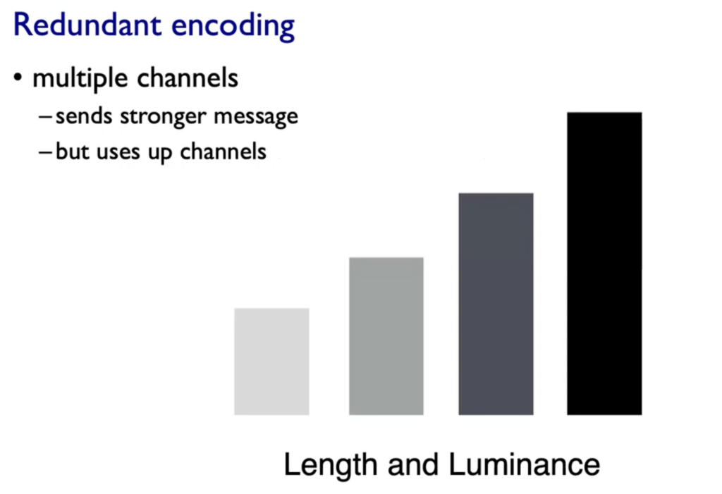
Expressives & Effectiveness: When to use which channels
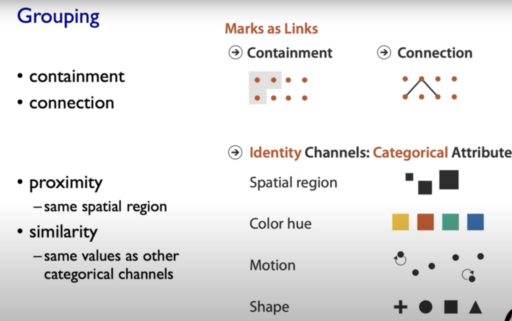
On left side (Magnitude Channels) your brain automatically thinks „how much reder is that or “ and „how much curvier ist that“. The Identity Channels (on the right side of the graphic below) convey Identiy eg. „What color is it“, „What motion is that“.

Spatial Postions are ranked really high on both Channels (Identity and Magnitude) and also the grouping of elements.
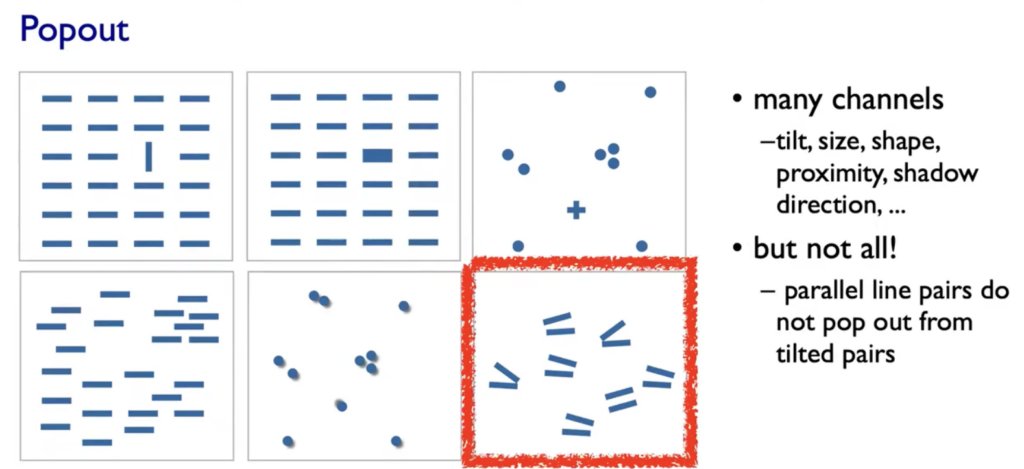
Popouts & Perception
Our visual System is always parallel processing on many individual channels & serial search for (almost all) combinations. The perceptual system mostly operates with relative judgments, not absolute.
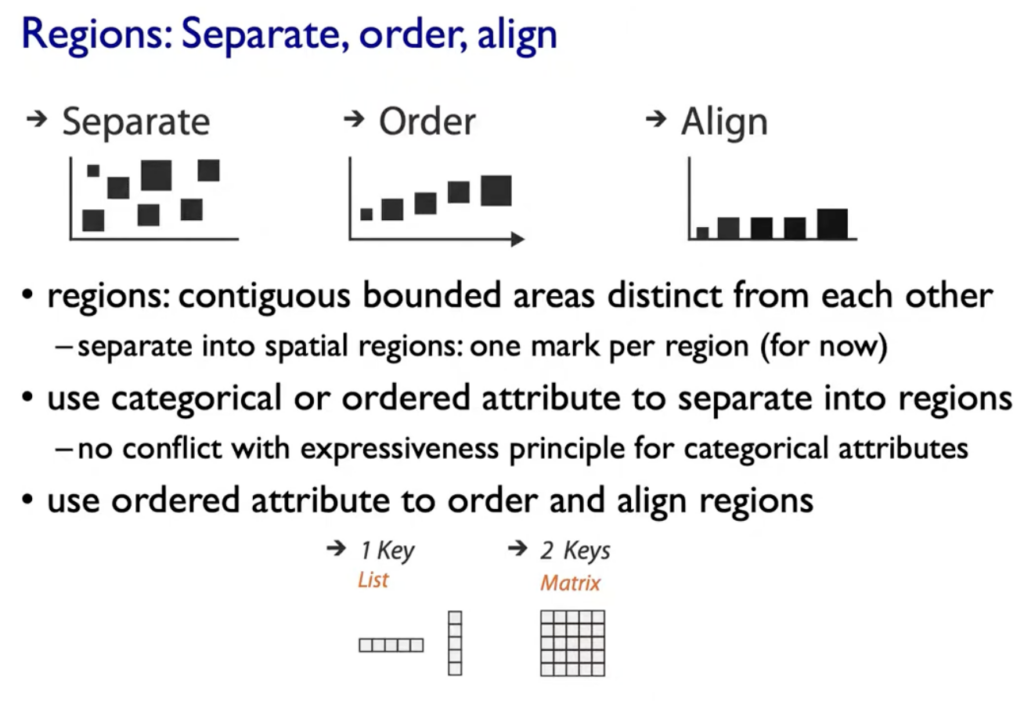
- Aligment
- Distractors
- Distance
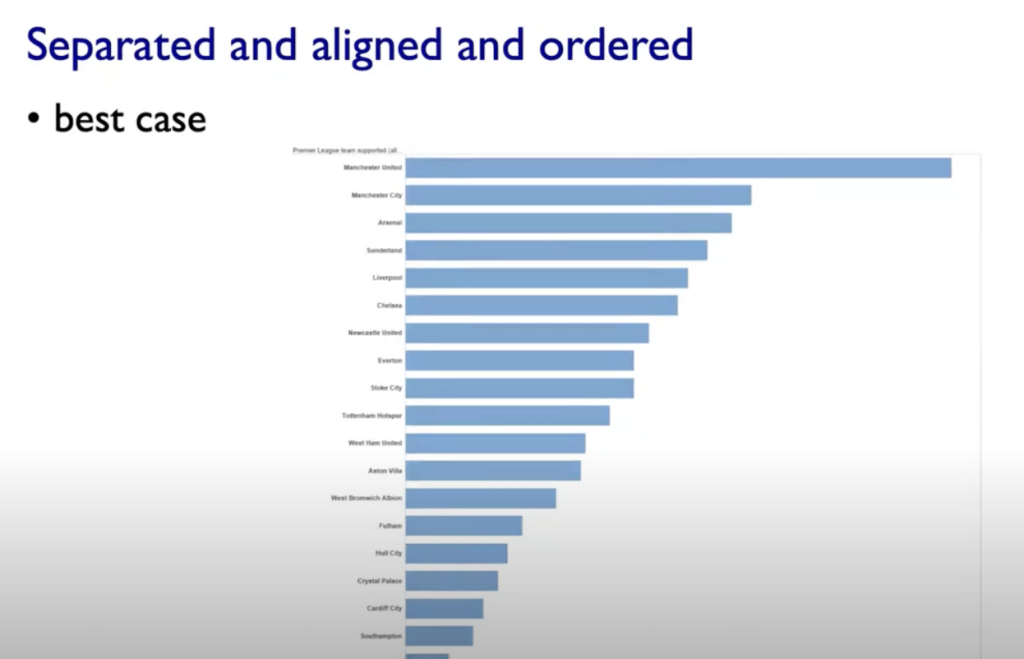
- Common Scale/Alignment

Rules of Thumb
-unjustified 3D all too common in the news and elsewhere
– we don’t really live in 3D; we see in 2.05D (We can’t look through objects, we have to look around and move our body)
-perspective distortion: Perspective distortion happens when the size or shape of objects appears different than they actually are, based on the viewer’s position or the focal length of a camera.
-unjustified 2D: Especially if reading text is central task
-animation: great for choreographed storytelling, great for transitions between two states (Remember: Harder to compare visible item to memory of what you saw; with static side-by-side view you can compare easier)
– Overview First, zoom and filter, details on demand (Shneiderman)
– Responsiveness is required: 0.1sek perceptual processing(see the mouse), 1sek immediate response (fast response after mouseklick),10sek brief tasks
-Function first, form next: Focus on functinoality
– Axis: Label them; meaningful & useful title, legends
Tables
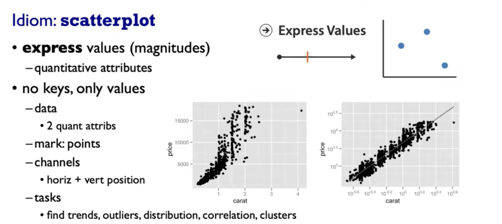



Color in Visualization
– Human perception built on relative comparisons
– limited number of discriminable bins (Rainbow is a poor default, nonlinear)
– make sure it is intrinsic (intrinsic ordering our Perception does e.g Hues, should be linear)
– For visual creator: fewer hues, fine structure (multiple hues with monotonically increasing luminance). Eg. Vridis/Magma Colormaps (see below)


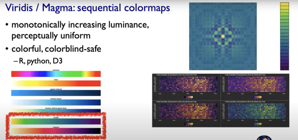
Source:
Tamara Munzner. (2021, 06. November). Visualization Analysis and Design, 2021, All Lectures[Video]. YouTube. https://www.youtube.com/watch?v=KCqgErJbeXY