Randomness in Art

Many artists base their work on randomness and spontaneity, which often makes the end result surprising and fresh, while the process itself is adventurous and inspiring for the artist. As a next step in my research, I explored some artists in whose work randomness appeared.

Jackson Pollock (1912-1956)

Abstract painting is abstract. It confronts you. There was a reviewer a while back who wrote that my pictures didn’t have any beginning or any end. He didn’t mean it as a compliment, but it was.

Jackson Pollock

Jackson Pollock, the renowned American artist, is closely associated with the concept of randomness in art. Using his self-developed „drip painting“ technique, he elevated the act of painting itself to the center of his artistic pursuits.1 By intentionally dripping and splashing paint onto the canvas, he forged unpredictable patterns that allowed for the unscripted manifestation of color and texture. It’s also worth noting that throughout his artistic process, his canvases were typically laid horizontally on the floor rather than upright on an easel. In addition, the tool he used, whether a brush or other tool, rarely made direct contact with the surface of the canvas.

However, anyone attempting to recreate a Pollock-esque composition soon realizes that the technique requires concentration, intention, and a technical understanding of how paint moves, splatters, and adheres to the canvas. It requires an understanding of the unique texture of paint and its response to gravity. Every flick of Pollock’s wrist as he applied paint to the canvas demonstrated precision. Despite the appearance of complete randomness, there was nothing arbitrary or accidental about each spill and splash.2

Number 5, 1948 by Jackson Pollock | Image source: jackson-pollock.org

Sol LeWitt (1928-2007)

LeWitt, a pioneer of minimalism and conceptual art, often employed random algorithms and guidelines in the creation of his artworks. He was a strong believer in minimalism, so much so that most of his famous works weren’t made by him. Instead of selling regular paintings on canvas, he sold „codes“ or procedures with clear instructions. A draftsman would follow these instructions, but his own skill and judgment were key in determining how the final artwork would look. This is exemplified in „Wall Drawing #85,“ where other artists followed a straightforward set of instructions that are open to personal interpretation, producing results that are consistently distinctive and unexpected. These instructions were: “A wall is divided into four horizontal parts. In the top row are four equal divisions, each with lines in a different direction. In the second row, six double combinations; in the third row, four triple combinations; in the bottom row, all four combinations superimposed.”3

Wall Drawing #85, 1971 first drawn by Sol LeWitt | Image source: https://massmoca.org/event/walldrawing85/

An other example is the “Wall Drawing #289”. Instructions: „A 6-inch (15 cm) grid covering each of the four black walls. White lines to points on the grids. Fourth wall: twenty-four lines from the center, twelve lines from the midpoint of each of the sides, twelve lines from each corner.“4
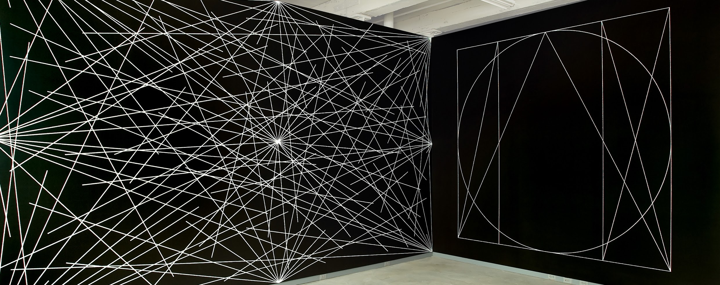
Wall Drawing #289, 1976, first drawn by Jo Watanabe | Image source:https://massmoca.org/event/walldrawing289/

Jean (Hans) Arp (1886–1966)

Artists of the Dada movement, such as Arp, turned away from the conventional and embraced randomness, chance, and spontaneity as essential elements of their art. Arp’s abstract forms reflect the randomness found in nature. Arp liked Taoist ideas about going with the flow and finding harmony in opposites. He felt that artists should be like messengers for nature, letting go of control and letting chance guide their creativity. This approach, he thought, provided a sense of liberation and artistic freedom.5 In his „Collage According to the Laws of Chance“, he dropped pieces of paper onto the canvas and glued them down where they landed, letting chance shape the work.6
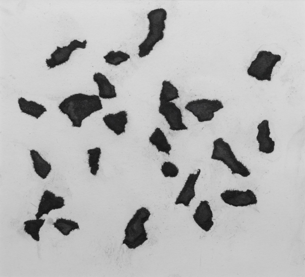
According to the Laws of Chance,1933, Jean Arp | Image source: https://www.tate.org.uk/art/artworks/arp-according-to-the-laws-of-chance-t05005

  1. https://muvesz.ma/a-veletlen-szerepe-a-kreativ-folyamatban-a-muveszet-mint-inspiracio-es-spontaneitas/ ↩︎
  2. https://www.artdex.com/myth-genius-jackson-pollock/ ↩︎
  3. https://generativelandscapes.wordpress.com/2014/08/14/procedural-art-sol-lewitt-example-3-1/ ↩︎
  4. https://massmoca.org/event/walldrawing289/ ↩︎
  5. https://expressivemonkey.com/element-of-chance-2/ ↩︎
  6. https://www.tate.org.uk/art/artworks/arp-according-to-the-laws-of-chance-t05005 ↩︎
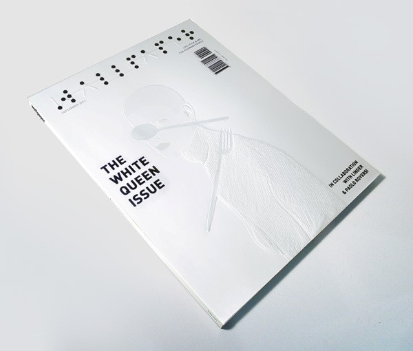
01/ Introduction: Importance of tactile design elements in visual communication

The growth of technology has transformed the way we interact with our surroundings. Digital items have become an essential part of our daily life. However, as technology’s use grows, so does the demand for a more engaging and memorable user experience. One method is to incorporate tactile features into the design of digital products.

Touch is one of the five senses and has a significant impact on how we perceive and experience the environment. The skin is the largest organ in the human body and is highly sensitive to pressure, temperature, and texture. Designers may create a more engaging user experience by incorporating these triggers into the design of digital products. The texture of a design can greatly influence how the user perceives it. A rough surface, for example, may express a sense of stability and dependability, whereas a smooth surface may convey a sense of beauty and refinement.

This blog will examinate how tactile communication can strategically be used to convey a successfull and effective message. The primary goal is to uncover the subtle ways in which tactile aspects can be intelligently included into visual design, encouraging a stronger connection and understanding between the message sender and receiver. We want to learn how to effectively use elements like texture and touch to support the visual success of messaging. The tactile component of design has the power to communicate a variety of qualities and influence how a customer feels about a product or company in general. By finding what works best, we can create a foundation for making visual messages that people will remember and respond to in different situations.

Sources:

  1. Leng X, Zhou X, Wang S, Xiang Y. Can visual language convey tactile experience? A study of the tactile compensation effect of visual language for online products. Front Psychol. 2022 Dec 19;13:1034872. doi: 10.3389/fpsyg.2022.1034872. PMID: 36600710; PMCID: PMC9807036.
  2. Jones, L. A. (2011). Tactile communication systems. Enhancing Performance for Action and Perception – Multisensory Integration, Neuroplasticity and Neuroprosthetics, Part II, 113–128. doi:10.1016/b978-0-444-53355-5.00008-7 
  3. A visual and tactile graphic design experiment: ‘Touch Project’, Parinda Sakdanaraseth (https://in-touch-digital.com/2020/03/12/a-visual-and-tactile-graphic-design-experiment-touch-project/ )
  4. Analysis on Tactile Field in Current Graphic Vision Design, Qi Wang, Huifang Li (file:///C:/Users/Korisnik/Downloads/12059.pdf )
  5. Liu, S., & Li, S. (2023). Analysis on the Use of Visual Touch and Emotional Creation in Brand Image Design. Highlights in Art and Design, 4(1), 39–41. Retrieved from https://drpress.org/ojs/index.php/hiaad/article/view/11659

01. Proportions within Faces

Generalized Distributions and Ratios in the Human Face

No two faces are identical, and each face has its own specific characteristics and unique proportions. For this reason, our face is a significant part of our identity as human beings. However, the „individual characteristics“ of all faces can be simplified and „integrated into a basic structure“ (Marina Fridman, 2023). The following five reference points are used to assist learners in the process of portrait drawing. Additionally, they provide interesting insights into the general proportions commonly found in human faces:

Even though these elements might seem obvious, it is important to point them out because they often „become lost in the complexities of the face.“ Luckily, once they have been consciously noticed, they are very easy to remember. However, one must remain aware that every face is different, and these elements should be seen as guidelines rather than fixed rules in portrait drawing. Our understanding of proportions should never make us „lazy in our observation of the model.“ Always double-check with your subject, as these guidelines are not universally applicable.

Observations by Leonardo da Vinci

Leonardo da Vinci, one of the „greatest portrait artists“ (Juhi Kulkarni, 2007-23) of the Renaissance, created „thousands of drawings about anatomy.“ In his many notes, accompanied by explanatory drawings, he provides valuable insights into using proportions in portrait drawing.

To draw a head in which the features and agree with the turn and bend of the head, pursue this method. You know that the eyes, eyebrows, nostrils, corners of the mouth, and sides of the chin, the jaws, cheeks, ears and all the parts of the face are squarely and straight set up on the face.

Leonardo da vinci

This quote shows that da Vinci was well aware of the fact that all faces have something in common and seem to follow a general scheme.

In full face there are of 11 types. These are equal, take in the middle, train in the middle, with the tip thick, and at the root narrow or narrow at the tip and wide at the root full stop with nostrils wide or narrow high or low and the opening wide or hidden by the point. And you will find an equal variety in the other details, which things you must draw from nature and fix them in your mind, or else when you have to draw a face by heart carry with you a little book in which you have noted such features and when you have cast a glance at the face of a person you wish to draw you can look, in private which nose or mouth is most alike or there make a little mark to recognise it again at home.

Despite his adherence to general anatomical schemes, Leonardo da Vinci was highly aware of the unique and individual variations among people. His exceptional eye and keen perception allowed him to distinguish individual peculiarities from broader concepts. This ability is evident in the detailed categorisations he made in his notebooks, which later enabled him to draw portraits from memory. Here are a few examples of the insights he recorded:

The distance from the attachment of one ear to the other ear is equal to that from the meeting of eyebrows, to the chin and then find the width of the amount is equal to the length of the parting of the lips to the bottom of the chin.

The cut or the depression below the lower lip of the mouth is halfway between the bottom of the nose and the bottom of the chin.

From the eyebrow to the junction of the lip with the chin and the angles off the jaw where the ear joins the temple will be a perfect square. And each side by itself is half the head.

Studying Leonardo’s notes and sketches is deeply inspiring because he not only captures the nuances he perceives in nature but also connects them to broader, universal concepts. His work reveals that, while each individual is unique, there are underlying similarities that unite us all.

Sources:

Marina Fridman. „5 Proportions of the Face to Use During Your Next Portrait Drawing.“ The Drawing Source. Last modified 2023. https://www.thedrawingsource.com/proportions-of-the-face.html.

Juhi Kulkarni. „Leonardo da Vinci on Portrait Drawing.“ Anatomy Masterclass. Last modified 2023. https://anatomymasterclass.com/news/leonardo-da-vinci-on-portrait-drawing.

01 Brainstorming: Handmade Design

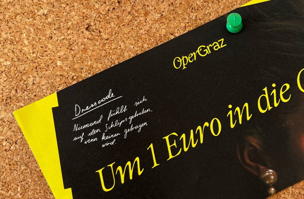
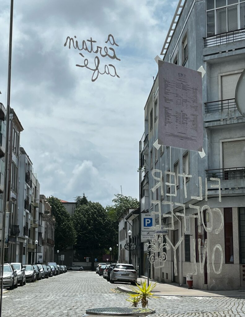
Imperfect and handmade-looking design can be found in a lot of places. I noticed it for example as handwritten menus on the windows of cafes; as scribbled illustrations on websites or as logos; as handwritten annotations on flyers or posters; quirky stamps; and there is even a tattoo trend that seems to lean towards imperfect sketches instead of clean lines or realistic depictions.

This leads to some questions: what is so fascinating about visuals that have a handmade and analog quality to them when there are easier and more accurate ways to create visuals by using computerprogramms?
Could this be seen as kind of a counter-movement to artificially generated and machine made visuals that represent our quickly changing world?

And is this an actual trend that can be statistically proven, like the vinyl revival, or is it a style of design that has always been around with a steady popularity?

How important is the exclusivity-factor, and the „one-of-a-kind“ quality of this design-style? Does it matter if it is actually handmade or is the effect the same if they just seem that way? This could even be applied to analog photography, because for example there are many popular editing-presets that transform a digital picture into one that has analog-looking flaws like light leaks and therefore make it seem more personal and individualistic.
The consumer can then more easily imagine the process of how the flaw and therefore how the image was created in comparison to a flawless digital-looking picture. It’s the same for using handwriting instead of a font. How important is this factor for the appeal of handmade design?
Basically: what effects can handmade visuals create that differently produced ones cannot?

From a more design-focused and less of a social-lens it could be interesting to look at different ways of creating these handmade visuals. What are possible techniques that can be used? And with which other design styles are they combinable? Should handmade design elements be used sparingly only for accents, or can they dominate a design while it still remains balanced and functional?
How important is the level of perfectionism. How messy and imperfect can the designs get before they are not taken seriously anymore? And can the designs be too perfect and therefore not be recognized as actually handmade?

And lastly how could this trend evolve further?

02 | Historical Development of the Letter „ß“

Origin of the „ß“

The development of the „Eszett“ (ß) in the German script is historically conditioned and closely linked to changes in the German language and writing. The letter „ß“ has its origins in the Fraktur scripts of the Middle Ages. During the course of the Germanic sound shift, which spanned several centuries, a fusion of the „Long s“ with the letter „z“ took place starting from the 14th century.

This process continued in the Antiqua script in the 15th century. During this time, the „Long s“ merged with the „Round s“ to form what we now know as the „Eszett“ (ß). This development led to the formation of a position-dependent allograph or ligature, indicating the use of the „Sharp s.“ Thus, the „Eszett“ or „Sharp s“ emerged as an independent letter in the German alphabet.

The precise interpretation of the allography, specifically the evolution from „sz“ to „ß“ in Gothic scripts and from „ss“ in Antiqua scripts, remains a subject of scholarly debate. In linguistics, an allograph refers to one of various possible spellings or graphic representations of a specific character. This particularly applies to cases where different spellings represent the same phoneme, expressing the same linguistic sound – for example, „oe“ to „ö“ or „ss“ or „sz“ to „ß.“

The development of the ligature „ß“ (Eszett, Sharp s) based on the „Wilhelm-Klingspor-Schrift“ by Rudolf Koch (1876–1934). On the left are the two „s“ (Long s „ſ“ and Round s „s“) of a Fraktur script. On the right are the ligatures for „tz“ and „ß.“ The prevailing view is that in Fraktur scripts, the ligature „ß“ evolved from „ſz,“ while in Antiqua scripts, it originated from „ſs.“

In Southern Germany and Austria, the symbol „ß“ is predominantly referred to as the „Sharp s,“ while in Central and Northern Germany, it is more commonly known as the „Eszett.“ This phenomenon has led to the hypothesis that, in all likelihood, regions with a traditionally Catholic background (such as Bavaria and Austria) derive the term primarily from the monastic (humanistic) Antiqua tradition. On the other hand, regions with a traditionally Protestant background (such as Schleswig-Holstein or Lower Saxony) may tend to associate the term more with the role of Fraktur in the Reformation, including scripts like Schwabacher and Luther Fraktur.

The spelling reform of 1996 and the correct usage

With the invention of the printing press in the 15th century, the independent letter „ß“ finally emerged. However, this letter was only present in lowercase form since, both then and until today, there were no German words starting with „ß.“ As a result, there seemed to be no need for an uppercase version. Many centuries have passed, and „ß“ continues to be a part of the German language. Nevertheless, using „ß“ is not straightforward, as there are numerous exceptions and rules surrounding its usage.

In older texts, the letter „ß“ is used much more frequently. This tendency is particularly observed in the older generation. This is because a German spelling reform came into effect in 1996, significantly altering the spelling of words with the „s“ sound. Although this reform took place a while ago, older individuals might not have fully adapted to the new spelling for „ß.“ The most noticeable change was that many words that were previously spelled with „ß“ are now written with a double „ss.“ In older texts, you may encounter words like „daß,“ „Kuß,“ or „Abschluß.“

The rules for the letter „ß“ according to the spelling rules of 1996 state that it is used when the vowel (vowel sound) is pronounced long, for example: „Floß“ (raft), „Spaß“ (fun), „Maßstab“ (yardstick). The „ß“ thus lengthens the vowel. Additionally, „ß“ is used after a long umlaut (ä, ö, ü), for example: „Füße“ (feet), „Gefäß“ (vessel), „süß“ (sweet). The „ß“ is also employed when it follows a diphthong (double vowels like eu, ei, au, etc.), for example: „heißen“ (to be called), „Gießkanne“ (watering can), „Schweiß“ (sweat). If a word ends with a diphthong followed by a hard „s,“ it is always spelled with „s“ and never with „ß,“ for instance: „Eis“ (ice), „sneeze,“ „go out.“

Links

https://www.typolexikon.de/eszett-scharfes-s/#Fussnote-12359-2-3


Topic Exploration

Showcasing complex topics with illustrations vs animated illustrations

Illustrations and animations are highly effective tools for communicating complex issues. They provide visual representations of abstract concepts and enhance understanding in a number of ways. Firstly, illustrations and animations provide greater clarity. They visualise ideas and processes that are difficult to explain in words. Secondly, they can help us to concentrate better on the material. Moving images and colorful representations are more appealing and interesting to the human eye. Thirdly, they offer the opportunity to present complex processes step by step.

The main research question could be: when explaining complex topics, is it better to use still pictures or moving animations? Take for example instructions on building furniture – would a picture that doesn’t move be more helpful, or a small animation that shows 1 step of the instruction in motion?

Another question could be to figure out the benefits of both approaches and understand when they each show their strengths.

Motion Graphics in Branding

Motion Graphics play a crucial role in branding and have become an important tool in the visual identity of companies. These animated graphics combine design, animation, and brand strategy to convey messages in an effective and engaging way. An essential aspect of Motion Graphics in branding is their ability to dynamically present the brand’s personality and values. Through smooth animations, stylish transitions, and appealing movements, brands can highlight their unique selling proposition (USP) and innovation.

Questions may arise like what measurable factors contribute to the effectiveness of Motion Graphics in conveying brand personality and values or how does Motion Graphics in Branding influence consumer behavior and brand loyalty?

Readability vs legibility in effective communication

The readability of typography is a fundamental aspect of graphic design and font creation. There are two essential elements to this topic: Legibility and Readability.

Legibility refers to the ability to clearly distinguish letters, characters, and fonts from one another.

Readability, on the other hand, describes the ability to read text fluently and comprehensibly. This includes the arrangement of text blocks, line spacing, paragraph structure, and consideration of context. High readability ensures that readers can effortlessly understand the text, without being hindered by unnecessary obstacles such as overly tight lines or unusual line breaks.

A main research question could be: How do different typographic elements impact the legibility and readability of text, and what role do they play in enhancing effective communication?

The relevance of guidance systems at music festivals, and some other topics

I haven’t yet decided on which topic I’m going to choose but my favorite so far is the topic about music festivals.

1) The relevance of infographics and guidance systems at music festivals 

Infographics and guidance systems play a crucial role at music festivals. These visual aids not only serve to inform visitors about the line-up and venues, but also create an atmosphere of expectation and orientation. In this context, infographics and wayfinding systems are essential tools for providing festival-goers with an optimal experience while ensuring the smooth running of the event. 

-> Compare and analyze festivals

Sources:

Thinius, Jochen/ Untiedt Jan: Events – Erlebnismarketing für alle Sinne. Springer Fachmedien Wiesbaden GmbH: 2016

Uebele, Andreas: Orientierungssysteme und Signaletik. Verlag Hermann Schmidt 2006

Robertson, Andy: The Creative Design Planning Process for Music Festivals. In: https://www.festivalpro.com/festival-management/1928/news/2022/5/31/The-Creative-Design-Planning-Process-for-Music-Festivals.html (zuletzt aufgerufen: 16.10.23) 

2) The future of out-of-home advertising

In a world where people are increasingly mobile and at the same time surrounded by a flood of digital information, OOH advertising needs to be more creative and innovative than ever. From personalized and interactive ads to the integration of augmented reality and a focus on sustainability, OOH advertising will need to adapt in the coming years.

Sources:

What Is The Future Of Out Of Home (OOH) & Digital Out Of Home (DOOH) Advertising? In: https://identityglobal.com/what-is-the-future-of-out-of-home-ooh-digital-out-of-home-dooh-advertising/

N., Ivan: The Future of Out-Of-Home (OOH) Advertising is Digital: Google Reveals New Innovations for Display & Video 360. In: https://www.linkedin.com/pulse/future-out-of-home-ooh-advertising-digital-google-reveals-nemorin/

Tovey, Kate: Five trends that will define Out-of-Home in 2023. https://newdigitalage.co/dooh/five-trends-that-will-define-out-of-home-in-2023/

3) Can anyone be a graphic designer these days?

Programs like Canva offer tools and templates that allow people without extensive design knowledge to create appealing graphics. These programs are able to automate and simplify many basic design tasks. This raises the question of whether these programs will eventually replace the job of a graphic designer.

-> a comparison and analysis of Graphic Designer and „Canva“ Designer

Sources:

Lupton, Ellen/ Phillips, Jennifer Cole: Graphic Design. The New Basics. Abrams & Chronicle Books: 2015

Williams, Robin: Non-Designer‘s Design Book. Pearson Education Limited: 2014

Waquas D.: Canva designer vs Graphics designer: Understand the difference. In: 

https://www.linkedin.com/pulse/canva-designer-vs-graphics-understand-difference-waqas-d-/ (zuletzt aufgerufen: 16.10.23) 

01// Initial ideas and research

Initial Ideas

  • Linguistic Accessibility

Linguistic accessibility goes far beyond the simple translation of words. It is about ensuring that people, regardless of their mother tongue or level of language proficiency, can fully understand and interact with the information presented. In order to ensure greater ac­cessibility, I could explore different ways to make con­tent universally understandable. For instance, I could research how to complement written language with other forms of communication, such as images and icons in addition to translations in the mainly used languages, to make the information more comprehen­sible even to those with a low level in the language in question.

  •  Communicating Science

In the age of digital information, the main challenge is how to ensure the accuracy and relevance of infor­mation, especially when it comes to important con­cepts such as scientific texts. The role of the designer becomes crucial in facilitating communication that is accurate, engaging but not superficial. In a world where a myriad of information is available at the click of a button, how can we highlight what is truly im­portant and reliable? How can we filter and consume information responsibly, avoiding the temptation to swallow content that is often irrelevant or, even worse, false?

  • Merging Editorial with Digital experiences (I chose to focus on this topic)

During my studies, I worked on some editorial projects, but I have been equally fascinated by web design. These two interests led me to reflect: which one will prevail in the modern world? However, I believe that both have their own unique characteristics: paper gives us a sensory experience (tactile sensation, aro­ma of the paper, textures) that can’t be replaced by a screen. At the same time on the web, we have different possibilities, like watching moving images or connect­ing to other people. While often analogue and digital are compared my question of research is how are the two experiences are already merged? And what could be other possibil­ities of merging them?

Why I am interested

My studies have immersed me deeply in the world of publishing and typography, but some initial studies in the field of web design have interested me greatly.

How can Editorial experiences be merged with digital ones? Some examples.

Qr code

We already see the integration of digital into paper with tools like the QR code. From a single symbol printed on paper, one can access websites.

Sharing on social media

The two worlds meet in the experience of many readers indirectly. For example, I could read a novel, share my thoughts on Twitter, do a review on Amazon and search for a video explanation on YouTube on parts I did not understand.

Augmented Reality Publishing 

This method introduces an exciting way to enhance printed media while preserving the charm of physical objects. Smartphone apps bring printed materials to life, offering highly interactive experiences. Through Augmented Reality (AR) technology, readers can watch videos, listen to audio, or access additional information by pointing their mobile cameras at pictures. Major companies like The New Yorker, Disney, and Volkswagen have embraced AR in their print marketing campaigns.

Some Examples

Christoph Niemann augmented reality in The Newyorker magazine: https://www.christophniemann.com/detail/virtual-reality/

Augmented reality used by Disney, which developed a virtual character app for drawing: https://la.disneyresearch.com/publication/live-texturing-of-augmented-reality-characters/

Artivive, an app which makes the possibility of using augmented reality easier: https://artivive.com/

Next steps

  • Research other possibilities to merge editorial and digital experiences.
  • Research designers who worked with this topic.

Index: Structure of my Research Process

How I want to Continue with the Exploration of my Topic

In this research process, I aim to examine facial shapes from various perspectives and delve deeper into studies across a wide range of diverse scientific fields. There is an abundance of material available, and many fascinating discoveries have already been made about human faces. However, much of this evidence seems to exist in isolation. My goal is to bring these important insights together, combine them effectively, and place them within the broader context of design and art. I want to emphasize the significance of my findings in the field of creative studies and establish a bridge between rational scientific evidence and its relevance in the creative process. To achieve this, I have outlined the following list of subtopics I plan to explore in the coming weeks. Initially, I intend to focus on scientific research in the field of perception psychology. As my research progresses, I will further explore the areas of art and design to assess the relevance and connections of my earlier findings within these fields.

  1. Proportions within Faces
  2. Face Perception
  3. Facial Emotion Recognition
  4. Problems in Face Recognition
  5. Facial Beauty
  6. The Power of Makeup
  7. Child Scheme
  8. Facial Shapes in Visuals 01
  9. Facials Shapes in Visuals 02
  10. Digital Face Detection

Image Sources:

Marie Claire Maison. „Bruno Munari Portrait.“ Bruno Munari. Marie Claire Maison. Marie Claire, n.d. https://www.marieclaire.fr/maison/bruno-munari,1143186.asp.

Mondoblog. „Image of Bruno Munari.“ Bruno Munari, My Favourite Italian Genius. Mondoblog, November 9, 2010. https://mondo-blogo.blogspot.com/2010/11/bruno-munari-my-favorite-italian-genius.html.

Colomer, Carlos. „Image of Bruno Munari.“ Bruno Munari: Una Vida de Arte y Diseño. Graffica, September 20, 2023. https://graffica.info/bruno-munari-una-vida-de-arte-y-diseno/.

Casati Gallery. „Image of Bruno Munari.“ Bruno Munari: Italian Artist, Writer, and Graphic Designer. Last updated June 24, 2020. https://www.casatigallery.com/designers/bruno-munari/.

Design and Research #1

Colour theory and the effect of colours on human perception:

The focus of this topic is on the psychological and emotional effect that different colours have on people. Various colour theories such as those of Goethe or Wassily Kandinsky can be integrated into this context.
The link between colour theory and marketing is another key area. This includes examining how colours are used in advertising and marketing and how different industries use colours to create their brand identity.
A central aspect is the role of colour in products and packaging. The aim here is to understand how the choice of colours influences consumer behaviour and how colours influence consumers‘ purchasing decisions.
The perception of colours and their influence on consumer behaviour are closely linked. Research in this area could include how colours are perceived by consumers and how this perception in turn influences behaviour. Experiments could, for example, investigate the effects of colours on willingness to buy, product evaluations and brand loyalty.
Cultural differences are another important factor. Researchers could investigate how the meaning of colours varies in different cultures and how this influences consumer behaviour.
Neuromarketing offers an exciting perspective to explore the effects of colour on the brain and consumer behaviour. This could include measuring brain responses to coloured advertisements and product images.
The work should also address practical applications and offer recommendations for companies and marketers on how to use colour effectively in their brand strategy and advertising.

The research methods used in the study should be described in a separate section, from experiments and surveys to possible neuromarketing techniques or qualitative research.

Basics of colour theory:
An introduction to the basics of colour theory, including colour wheels, colour contrasts and colour harmonies.

Psychological effects of colour:
Analysis of the psychological and emotional effects of colours on human perception and mood, including research findings and studies on colour psychology ->

Colour design in visual media:
The study of how colours are used in various visual media, such as web design, graphic design and film, to convey messages and create moods

INFLUENCE OF COLOURS

  • COLOUR RED
  • IN CHILDREN’S BOOKS

Origins of colour management: from early printing technology to digitalisation and the role of colour standards such as Pantone:

Examining the origins of colour management from the early days of printing technology to the digital era with a focus on the importance of colour standards such as Pantone.
The development of colour management from the early days of printing technology to the current digital era will be examined. The focus will be on the role of colour standards such as Pantone in this process.
It will also examine historical developments in colour management that have had a far-reaching impact on the printing industry and visual communication. Particular attention will be paid to the innovations and standards that have revolutionised the use of colour. Pantone will be considered as a guideline for uniform colour reproduction and communication.
The work aims to provide an insight into the technologies and processes that have been developed over time to reproduce and manage colour. Historical milestones are highlighted as well as modern digital tools and practices in colour management.