01 // Topic identification

In my first blog post, I would like to present and roughly explain my three proposed topics. Before I started looking for topics, I decided on design areas from communication design that particularly interest me. I chose the areas of typography, packaging design and branding. At the end of the blog post, I will present my current favorite and describe it.


Topic 1: The role of fonts in the visual identity of brands.

This topic looks at the importance of typography in shaping the visual identities of brands. In exploring this topic, I will examine how choosing the right fonts has a significant impact on the perception and success of a brand. In addition to the aspects of font choice in branding, the influences on brand personality, target group appeal and brand recognition will also be examined. Possible challenges and opportunities in this area are also analyzed.

Bibliography and references:

_Typography Essentials: 100 Design Principles for Working with Type“ von Ina Saltz

_Thinking with Type: A Critical Guide for Designers, Writers, Editors, and Students von Ellen Lupton

_Brand Bible: The Complete Guide to Building, Designing, and Sustaining Brands von Debbie Millman

_Visuelle Kommunikation als strategisches Instrument der Marken- und Unternehmenskommunikation von Alexander Berzler

_Understanding Role of Fonts in Linking Brand Identity to Brand Perception von Vikas Singla & Nidhi Sharma

_Visual branding: A guide to designing visual identity von Ly Dang

Topic 2: Recycling and upcycling in packaging design: sustainable approaches to packaging solutions.

This topic examines the increasing importance of recycling and upcycling in the design of sustainable packaging solutions. The importance of environmental protection and sustainability, also in design, is continuously increasing. In my thesis, I will examine the concept of recycling and upcycling in packaging design and explore practical approaches to environmentally friendly packaging solutions. There will also be a focus on the creative redesign of packaging materials, material selection, ecological impact and the influence on brand communication. My work aims to get closer to the goal of sustainable packaging design for a sustainable future.

Bibliography and references:

_Designing Sustainable Packaging von Scott Boylston

_Sustainable Packaging von Dr. Subramanian Senthilkannan Muthu

_Sustainable packaging design: A holistic methodology for packaging design von Erik Svanes, Hanne Møller, Marit Kvalvåg Pettersen, Hanne Larsen

_Consumer response to sustainable packaging design von Nigel D. Steenis

_Sustainable packaging as a tool for global sustainable development von Natalia Kozik

_Packaging Sustainability von Wendy Jedlička

Topic 3: Multi-sensory branding: How all the senses can be used to create a brand experience.

This topic looks at the world of multi-sensory branding and how all the senses can be used in the design of a holistic brand experience. As our attention span is limited by the increasing digital world, the use of the senses for brands is becoming more important. This thesis will look at the integration of different elements in brand communication and design. The thesis aims to find out how companies can appeal to the senses of their target group to build strong emotional connections to their brands and intensify the brand experience.

Bibliography and references:

_Brand Sense: Warum wir starke Marken fühlen, riechen, schmecken, hören und sehen können von Martin Lindstrom

_Sensory Marketing: Research on the Sensuality of Products von Aradhna Krishna

_Brand Seduction: How Neuroscience Can Help Marketers Build Memorable Brands von Daryl Weber

_Sensory Marketing – A review and research agenda von Ruchi Garg, Rachna Bhatia, Ritu Chhikara, Aakanksha Kataria

_The impact of sensory branding (five senses) on consumer von Saffer Uddin

_Sensory Branding von Alirezaeslambolchi & Shimafarhadi und Seyed Erfan Alhosseini Hamedani


I chose the first topic for my research in the first semester. However, I have decided to focus not only on typography but on branding in general. So for my further research, I would like to look at the following topic: The role of branding and its influence on the visual identity of brands.

In my research, I will examine the multifaceted design of the visual identity of brands, taking into account a holistic branding approach. The focus is not only on the font but also on various elements that together shape the perception and success of a brand. In addition to a comprehensive consideration of branding, the influences on brand personality, target group appeal and brand recognition are explored in detail. The work also highlights possible challenges and opportunities in the context of branding to provide a holistic insight into the complex aspects of visual brand design.
Intro: Facial Shapes

The Effect of Humanisation and the Appearance of Facial Shapes in the Field of Design.

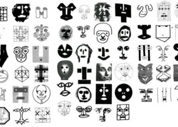
Throughout the history of graphic design, facial features have consistently reappeared as a significant element. Although the context and degree of abstraction have varied across different historical periods, it is clear that shapes resembling the human face have a distinctive character that particularly appeals to us. Faces are a rich source of information, providing insights into identity, state of mind, emotions, intentions, and other interpersonal factors (PubMed Central, July 2020). The phenomenon of „facial pareidolia,“ where our brains detect patterns, especially faces, in inanimate objects (Ouellette, Jennifer, 2021), is another intriguing aspect worth exploring.

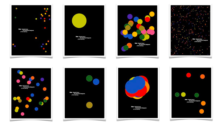
Next my research, I intend to delve into the psychology of perception to gain a deeper understanding of how humans cognitively and emotionally perceive and interpret different kinds of faces. With this knowledge, I will analyse the design of notable modern and contemporary visual works on a more profound level. As starting points, I will examine creatives like Bruno Munari, who included “25 loose colored cards centered around the theme of faces” (Exile Book) in his book Design as Art, and Paul Rand’s works, like his logos designed for Esquire magazine in 1938 and the pictorial version for IBM in 1988. My goal is to understand how graphic designers utilise the humanisation of their work to communicate messages more effectively within their specific historical contexts. Ultimately, I aim to conduct experiments that will culminate in the production of my own creative work, incorporating elements of the human face.

Publications by Bruno Munari
Logos with Facial Elements by Paul Rand

Sources:

Munari, Bruno. Design as Art. London: Penguin Books, 1966.

Oruc, Ipek, Benjamin Balas, and Michael Landy. “Face Perception: A Brief Journey Through Recent Discoveries and Current Directions.” Vision Research 157 (April 2019): 1–9. https://www.ncbi.nlm.nih.gov/pmc/articles/PMC7371014/.

Ouellette, Jennifer. “Faces, Faces, Faces Everywhere: Our Brains ‘Read’ Expressions of Illusory Faces in Things Just Like Real Faces.” arsTechnica. July 13, 2021. https://arstechnica.com/science/2021/07/our-brains-read-expressions-of-illusory-faces-in-things-just-like-real-faces/.

Images:

„Look into My Eyes.“ Corraini Edizioni. Accessed November 11, 2023. https://corraini.com/en/look-into-my-eyes.html.

„Variazioni sul Tema del Viso Umano“ Corraini Edizioni. Accessed November 11, 2023. https://corraini.com/en/variazioni-sul-tema-del-viso-umano.html

Paul Rand’s Logos with Facial Elements:

Doe, Jane. Logo with facial features designed by Paul Rand in 1938. 2024. In Wade Thompson: Son of Sons Reflects Paul Rand’s Influence and the Current State of Design, by Wade Thompson. Burnaway. November 11, 2023. https://burnaway.org/magazine/wade-thompson-son-sons-reflects-paul-rands-influence-current-state-design/.

Quito, Anne. “How to Design an Enduring Logo: Lessons from IBM and Paul Rand.” Quartz. July 23, 2015. https://qz.com/461040/how-to-design-an-enduring-logo-lessons-from-ibm-and-paul-rand.

Topic Exploration

Randomness and (grid) systems in graphic design

Grid systems are often used as an important design principle in the field of graphic design and typography. One frequently used variant of this is the golden ratio. This harmonious proportion, which is found in many natural forms and works of art, is often perceived as aesthetically pleasing. Research on the golden ratio in graphic design and typography focuses on how this proportion can be used to improve visual aesthetics, promote balance in designs and enhance the impact of messages. Questions can be asked such as: Does a design created using the golden ratio work better and is a design that is intentionally not created this way perceived as less effective?

In contrast to using grid systems, one can also use randomness. You take a blank sheet of paper and start designing without any helpful grids to help with the aesthetic arrangement of visual elements. Here, research could investigate how randomized design is perceived. Are there differences between designs with human-generated randomness and computer-generated randomness?

Nature can also stand as a common aspect of the two themes: Golden ratio is often discovered in shapes in nature and random events are also easily found in nature.

Useful literature for further research:

____________

Face as an element in graphic design

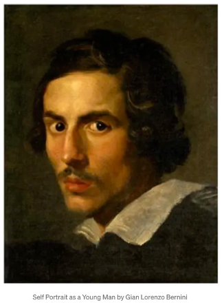
The face is one of the first recognizable symbols that children draw and create. They are fascinated by facial expressions and draw their first portraits, emphasizing faces over bodies, especially the eyes. Before children can read words, they develop a visual vocabulary to understand faces. Portraits and their expressions are an early method of communicating stories. A portrait is more than a drawing of facial features; it also shows and conveys personality. ‚Theory of Mind‘ is the scientific term for ’sympatheia,‘ denoting the ability to see oneself in another and experience what they experience. People also recognize faces in everyday objects where they do not exist.1

Visual communication is widespread in our world: emojis and emoticons often replace written language. Miklós Kiss’s project ‚Emograms‘ is a response to the development of mobile and computer-based communication. In a time when we often rely on emojis and icons instead of words, Kiss reintroduces lost words into these symbols. Thus, Emograms were created, establishing a connection between lost expressions and modern communication.2

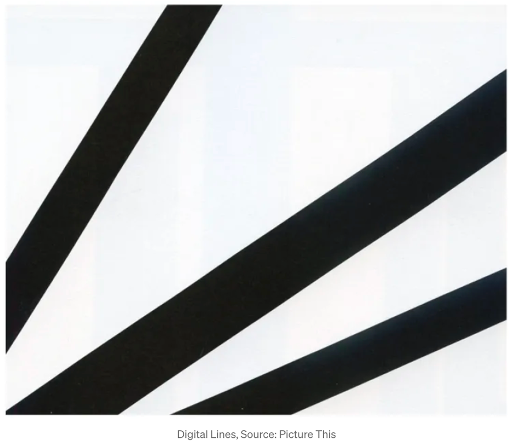
As an example, individual facial features, especially their shapes, can have effects as visual elements in design: in the field of print design, one can depict the expressiveness of the mouth using typography. By integrating mouth-inspired shapes and elements into the letters of their typography, a unique personality and visual expressiveness can be imparted.3 But even with simpler geometric shapes, facial expressions can be replicated: Molly Bang’s book ‚Picture This‘ demonstrates how abstract design principles in art can tell human stories. Diagonal lines in portraits, such as slanted glances or facial expressions, indicate movement and tension in the image.1 The research on this topic aims to determine the effects of using face-like elements in graphic design (such as branding, typography, and posters) and how to apply them correctly.

____________

Optical illusion in graphic design

Op art was a style of visual art in the 1960s, but still has an impact on visual design and graphic design today. The use of optical illusions and illusions influence how people perceive and understand visual information. But how can they be used in graphic design and especially in areas such as branding? Optical illusions have different types and can be created by numerous methods.4 Through the targeted use of visual tricks, designers can direct attention, evoke emotions and reinforce messages.

Research can also investigate the psychological and cognitive processes behind human perception. Physiological illusions are created by excessive stimulation of the eyes and brain, such as the ‚afterimage illusion‘, which continues to create visible images after the original has disappeared. Cognitive illusions are based on unconscious inferences of the brain and include ambiguity illusions, paradox illusions, distortion illusions and fictional illusions. Optical illusion can also be used to create the illusion of movement: this gives the impression of movement in static images, as in the ‚rotating snake‘ illusion. Research into these illusions allows us not only to better understand human perception, but also to develop innovative design strategies that can push the boundaries of visual representation.

____________

Literature:

  1. https://catherineannemoore.medium.com/facial-expression-as-key-to-narrative-portraiture-6c1dd2e7655f ↩︎
  2. https://emograms.medium.com/story-of-emograms-30333e65a6c ↩︎
  3. https://mmg-1.com/the-power-of-the-mouth-communicating-beyond-words-in-graphic-design-and-filmed-presentations/ ↩︎
  4. https://www.creativereview.co.uk/optical-illusions-design-book/ ↩︎

Food Graphic Design

Abstract: Branding the Table. A Visual Guide to Culinary Delights

Topic 1

My idea is to combine the principles of graphic design and visual communication with food design.

The research could explore the theoretical aspects of graphics in food design.

How Infographics in relation to the food sector look like and how graphic design and visual elements are used in the food industry to create brand identity, influence food perceptions and appeal to customers. 

Some points to pick up on:

o Definition and importance of graphic design in the food sector

o Historical development and trends

o The role of visual communication in the food industry

o Color design and color psychology

o Cultural differences in food presentation

o Advertising and marketing in the food sector

o Visualization of food

o Influence of food representations on perception

Love Brands

Abstract: Love Brands. Between Love and Authenticity.

The Synergy of Graphic Design and Brand Engagement.

Topic 2

The aim is to discuss the various aspects of Love Brands and their connection to Brand Authenticity. 

Brand authenticity, the genuineness and credibility of a brand, has been identified as key for the development of love brands. Authentic brands can create customer loyalty and emotional connections with clients. 

Some points that can be taken up:

o Redesigning the brand image

o Emotional design for products

o Development of branding campaigns

o Design of in-store experiences

o Rebranding strategy

o Social media campaigns

o Brand identity and visual design

o Brand communication

These are the topics I would like to deal with, but for my research this semester I am choosing topic 1.

01 | Brief Introduction

The typographic representation of the german sharp S (ß)

As a graphic and type designer, throughout my university career, I’ve repeatedly observed that the sharp S (ß) in the German language and typography represents a fascinating yet often overlooked dimension. I’m particularly intrigued by the historical origins of this phonetic ligature and how it has evolved both in lowercase (minuscule) and uppercase (majuscule) forms over the years. My aim is not only to comprehend the past and present of the ß but also to understand its potential implications for the future of typography in the German-speaking world.

The historical development of the ß is a captivating chapter as it finds its roots in ancient manuscripts and printed works. The changes in its typographic representation over the years, the spelling reform of 1996, and the contentious debates about its abolition are all part of this fascinating heritage.

Another aspect I’m delving into pertains to the technical challenges posed by the digital era. Integrating the uppercase sharp S (ß) into digital fonts, typesetting systems, and commonly used software presents us with unique issues that I intend to explore. This includes investigating the technical standards for the correct uppercase usage of the ß. This leads me to considerations of legibility and the challenges of the uppercase ß in an international context, especially when it comes to names and units, which can lead to misunderstandings.

Lastly, I aim to present design approaches that type designers can employ for the successful integration of the uppercase sharp S into their projects. This includes case studies of typographers who have already successfully utilized the uppercase ß.

Useful Links:

https://www.typolexikon.de/eszett-scharfes-s/

https://www.lucasfonts.com/learn/1E9E

https://finaltype.de/de/themen/versal-scharf-s#historische-betrachtung

https://www.typografie.info/3/wiki.html/v/grosses-eszett/

https://typefacts.com/blog/das-grosse-eszett

#01 A brief introduction

Organic Shapes

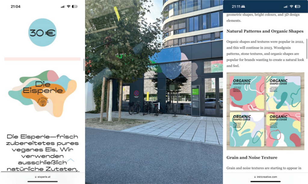
As a graphic designer who is always on the lookout for new branding and trends, I have noticed a huge upsurge in organic shapes in recent years, which is clearly different from previous trends. I wonder what effect organic shapes have on people, why they are trending right now and why they alternate with geometric shapes. I’m interested in what messages organic shapes, as well as design elements inspired by nature, convey and how brands can use them for themselves.

In this context, the term „biomimicry“ also plays a crucial role – learning from and being inspired by nature to solve human problems, in my case, design problems. So my research will also include what connections can be found between these issues. For this reason, I would like to look into this topic in order to understand why these motifs are so widespread and what influence they have on peoples perceptions.


Useful links I’ve found so far

https://biomimicry.org/what-is-biomimicry/

https://medium.muz.li/biomimicry-in-design-takeaways-for-a-designer-8e2c537b7a78?gi=5a8164d83447

https://www.atlanticbt.com/insights/biomimicry-digital-design/

https://99designs.de/blog/design-tipps/bedeutung-von-formen/

https://alphaefficiency.com/organic-shapes-design

https://cr8consultancy.com/unveiling-shape-psychology-in-logo-design/


Some pictures 🙂

Topic Exploration

Topic 1

Perfectly Imperfect: The integration of analog elements into digital designs and illustrations and their impact on authenticity and trust

The connection between digital precision and analog imperfection

Provides an opportunity to explore the creative connection between digital precision and analog imperfection, with a focus on the emotional resonance and trust such designs can create. 

Much is lost through the exclusive use of digital tools in design. Computers make everything super accurate and perfect: straight lines, right angles, perfectly colored surfaces, …personal touch, authenticity, personality, character that comes from handmade does not exist. Is also deliberately added in digital: E.g. script fonts or handwritten-looking fonts, paper and cardboard textures, textures in general, folds and creases, wear and tear, grain. Why are we doing this? Do these imperfections make a design more empathic or trustworthy?

Digital precision: Analysis of digital design and its characteristics, which are geared towards precision and perfection. What are the advantages of digital precision and why is it often preferred nowadays?

Analog elements: Examine various analog elements that can be incorporated into digital designs, including textures, paper and cardboard, handwritten fonts, folds, creases and wear and tear. Why do designers deliberately add these elements? How are they used?

Authenticity and personality: The importance of authenticity and personality in visual communication. How can analog elements help to give the design a personal touch and character?

Emotional resonance: How can imperfect, handmade elements in digital designs trigger emotional resonance in the viewer? What emotions and connections can these imperfections create?

Building trust: Can the integration of analog elements build trust with viewers? Can these imperfections convey a sense of honesty and humanity?

Practical applications: Examples from various fields such as graphic design, web design, book illustration and branding where the analogization of digital designs has been successfully applied.

Future trends and developments: Speculation on the future importance of it in visual communication and how designers can continue to use it to create unique, authentic and human designs.

Topic 2

Influence and impact of social media on creativity and graphic design

Originality & authenticity, imitation, comparison, imposter syndrome, motivation

Constant comparison with other designers. Thinking you are not good enough (Imposter syndrome). Are posts from others inspiration or pressure to perform?

Stealing ideas, copying, no originality or authenticity, very trendy and fast-moving design – often reduced to just looking good (social media is often all about appearance), whether a design works well and fulfills its purpose is pushed into the background.

The influence and effects of social media on graphic design are manifold and include both positive and negative aspects.

Originality and authenticity: The importance of uniqueness and authenticity has increased through social media in graphic design. Designers strive to create visual content that is unique and reflects the personality of their project. This emphasis on uniqueness supports creative expression as designers strive to discover and develop their own artistic identity.

Constant comparison with other designers: A challenging dynamic in the world of graphic design on social media is the constant comparison with other designers. Designers can tend to be critical of themselves and often struggle with Imposter Syndrome, where they believe they are not good enough and their output is inferior to that of others. Posts from other designers can serve as inspiration but can also be pressure to perform. This can even lead to the countless pieces of work circulating on social media having a demotivating effect. It is important to find a healthy balance between these two influences.

Stealing ideas and imitation: The fast-paced nature of social media has led to a certain superficiality in design. Designers can be tempted to copy ideas and trends rather than develop original concepts. This can lead to a lack of originality and authenticity. 

Trend orientation and external focus: Social media platforms tend to pay a lot of attention to visual content. Therefore, many designers focus on creating designs that are visually appealing and in line with the current trend. This can lead to the functionality and fulfillment of the actual purpose of a design taking a back seat. It is often forgotten that a design should not only look good, but also fulfill its intended purpose.

Topic 3

Illustration to simplify communication

Improving communication and accessibility through visual support

Image superiority effect: Image has a faster, more emotional and therefore more intensive effect than pure text. Easily accessible, easy to understand, self-explanatory, confidence-building, better memorization and retention. Faster understanding of information, instructions, etc.

Illustrative, easily accessible navigation support for websites etc. Confidence and identification-building for people with disabilities such as intellectual impairments, dementia, poor language skills, poor digital skills, etc.

Use for online processes, for example: Online shopping, orders, e-banking, bookings, forms, … But also things in everyday life, for example package inserts for medication, making important information recognizable at a glance, as support for text. Cooking recipes, building instructions for furniture, etc. Helpful for „normal“ people but especially for older or impaired people

Illustrations play a crucial role in simplifying communication, especially in the digital age. To deepen understanding of the many ways that illustrations can improve communication and make it more accessible. Could also provide recommendations for designers, companies and organizations on how to use illustrations effectively to increase the accessibility and comprehensibility of their messages.

The image superiority effect: How illustrations can use the image superiority effect to convey information faster and more emotionally than text alone. This can create a deeper and more intense connection between sender and receiver.

Easy-to-understand communication: Illustrations can make information easily accessible and understandable by visualizing complicated concepts. This makes content self-explanatory and easier to remember.

Accessibility and trust building: How illustrations can help people with intellectual impairments, dementia, limited language skills and limited digital skills. 

Use in different areas: Illustrations can be used in different areas of life, such as online shopping, ordering, e-banking, bookings and forms. They can also be useful in everyday life, for example on package inserts for medicines or in cooking recipes.

Improved accessibility on the Internet: Importance of illustrative and accessible navigation aids on websites to ensure an accessible online experience. This is particularly important for people with disabilities.

Support for older people: Relevance of illustrations for older people who can benefit from clear, visual communication. Older people are often less familiar with digital technologies and can benefit from simple and image-based communication.

Practical examples and case studies: Research practical examples and case studies where illustrations have been successfully used to simplify communication. (Perhaps areas such as: Healthcare, education, technology and everyday life)

Research 1: Topic Exploration

Environment and wildlife protection

Strong words/pictures – sweet illustrations. Which is the right way?
Animal welfare and environmental protection are issues that are very close to my heart. They are important topics that concern us all and also affect us. This makes it even more important to find the right way to communicate to others. Communication design should visualize and make it understandable, it should draw attention – which is exactly what the environment and animals need, as they have no voice themselves. I would like to look at the different strategies for campaigns of this kind. Does shock therapy like the awful images on cigarette packs work or is it better to work with hopeful illustrations and images to show what we need to protect? We live in a time of extremes, where activism for a good cause can quickly go in the wrong direction and miss its target. Also, these are all issues that rely heavily on donations and often there is no money for decent campaigns unless someone agrees to do it on a voluntary basis.

First I will take a deeper look at Wilderness International and https://www.soko-tierschutz.org as they show both sides. The one organisation works a lot with mesmerizing images and high quality footage from forests and jungles and try to convince you to donate and so they can preserve more forests. Whereas SokoTierschutz shows brutal images and the horrible life of abused animals. They both have their different strategies and I want to see how well they work.

Important: The opinion about these topics is not relevant in this context – it is just about how different strategies are used and how they work.

My alternative topics would be the color blue or streetsigns and typo/adverts in traffic.

Different Topic Exploration

Topic 1:

Enhancing Understanding of Philosophical Concepts and Scientific Research through Visual Representation

In this topic, I could delve into how visual representations, such as infographics, posters, and illustrations, can help make complex philosophical concepts and scientific research more understandable for the general population. This could be exemplified using specific cases like Boxbreathing, Nietzsche’s Nihilism, swarm behavior, and more. I would analyze how the use of such visual representations contributes to improving comprehension. Additionally, I could explore the influence of platforms like Visualize Value and how they effectively visualize these concepts. Final product could be a guide: making complex content understandable

Example: explanation of a wormhole

The Telegraph. (2014, 03. November). Science behind Interstellar explained: what actually is a wormhole? [Video]. YouTube. https://youtu.be/jwxdsDP5nO4

Example: Visualize Value

Nov 15, 2022 by Jack Butcher (2019). Visualize Value. https://doi.org/10.1177/15270025000010030486

Topic 2:

The Evolution of Graphic Design in the Fashion Industry: Influence and Significance

For this topic, I could investigate the role of graphic design in the fashion world and its impact on the industry’s development. This would encompass tracking historical developments in graphic design within the fashion sector and how they manifest in editorial work, social media, and merchandising. I might also analyze prominent designers and brands that stand out in the fashion industry due to exceptional graphic design, and investigate how these design principles affect brand perception and success

Topic 3:

How can meditative art in graphic design help promote mindfulness and inner calm, and what effects does visual meditation have on emotional wellbeing and cognitive performance?

Visual implementation: posters, analysis of apps such as Calm/Headspace and analysis of Monet’s Water Lillies, analysis of how different layout or color can create calm or restlessness.
Area of research: meditation (origins, historical), artists who have also seen mediation as useful, meditation and performance enhancement