From digital precision to analog imperfection

The exploration of the interplay between digital precision and analog imperfection offers a unique opportunity to unravel the unfolding creative dynamic. This exploration places a special emphasis on understanding the emotional resonance and trust that can be achieved through designs that seamlessly blend the best of both worlds.


The Dilemma of Digital Precision:

In the field of design, the exclusive use of digital tools has its price. Computers are characterized by accuracy and perfection —straight lines, right angles, flawlessly colored surfaces. However, this perfection often sacrifices the personal touch, authenticity, and character in handmade creations. Interestingly, designers consciously incorporate analog elements into digital designs, such as script fonts, paper textures, folds, and wear and tear. This raises a question: Do these imperfections enhance empathy and trust in a design?

Current Graphic Design Trends:

If you look at current trends in graphic design, you can see a conscious effort to counteract the constraints of digital perfection imposed by computer-based work. Designers are opting against pristine surfaces, straight lines, and right angles. Instead, there is a deliberate move towards infusing designs with an analog feel, embracing imperfections and irregularities.

The Analog Touch:

A closer look at the deliberate addition of analog elements – fonts, handwritten aesthetics, paper textures, folds and wear – reveals an effort to bring warmth and personality into digital designs. This shift away from clinical precision aims to add a human touch to creations and promote authenticity and character.

Questioning the Motivation:

Why do designers choose to build imperfections into digital designs? The pursuit of empathy, trust and authenticity seems to be the reason for this deliberate deviation from digital perfection. Incorporating analog elements is a strategic decision to appeal to human emotions and create a genuine connection with the viewer.

Conclusion:

Combining analog elements with digital creations becomes a useful way to build authenticity and trust. Designers use imperfections and analog styles on purpose to create a more understanding and relatable visual style. In today’s design trends, blending digital precision with analog imperfections shows a commitment to genuine and human-focused visual communication

Sources:

https://utilitiesone.com/analog-communication-embracing-imperfections-in-a-digital-world#anchor-0

https://www.madewithover.com/blog/gritty-gradients-make-great-graphics

03. Facial Emotion Recognition

The Detection of Emotions through Facial Expressions

The ability to read and interpret facial expressions is crucial for understanding others, as it allows us to „anticipate other people’s most likely next actions“ (Julle-Daniere, 2019). In the 1970s, Paul Ekman and his colleagues demonstrated this universality by showing photographs of Western faces portraying one of the six primary emotions to an isolated tribe in Papua New Guinea. Their research confirmed that these essential facial expressions—anger, fear, happiness, disgust, sadness, and surprise—are recognized cross-culturally. These six primary emotions are „innate and universal“ to all humans, while secondary emotions tend to be more influenced by cultural factors and lack the „prototypical, universal facial expressions“ of primary emotions. Unlike primary emotions, which can often be assessed through physiological changes like an elevated heartbeat, detecting secondary emotions relies solely on self-reporting from the individual.

In 1938, Brunswik and Reiter conducted notable research on the general perception of facial expressions. They created a „graphic, schematized normal human face“ (American Psychological Association, 2023), where proportions could be systematically altered, such as eye width, forehead height, mouth position, and nose length. By showing 189 different variations of this face to 10 subjects, who then „rank-ordered their preferences,“ the researchers identified seven pairs of opposite judgments. These pairs include:

  • Happy-Sad
  • Young-Old
  • Good-Bad
  • Symmetric-Asymmetric
  • Beautiful-Ugly
  • Intelligent-Unintelligent

These impressions highlight the most common ways people perceive facial features and represent an early effort to categorize emotions by associating them with specific facial configurations.

Minimal schematic faces with varying proportions.

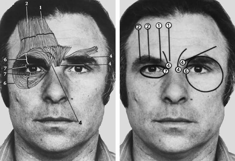
To enhance the precision of this categorization, Ekman and Friesen developed the Facial Action Coding System (FACS) in 1978. This method is based on a detailed analysis of the „anatomical basis of facial movement“ (American Psychological Association, 2023) and enables researchers to describe any facial movement in terms of specific „anatomically based action units“ (AUs). The system captures „subtle differences in appearance resulting from various muscle actions,“ providing a comprehensive tool for analyzing „visually discernible facial movements.“

Different examples of the system’s Action Units.
Indication of active muscles within a specific Action Unit.

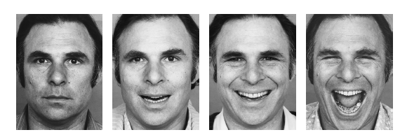
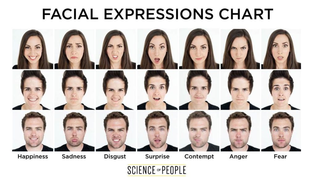
Today, the study of microexpressions has garnered significant attention. Microexpressions are defined as „very brief, involuntary facial expressions that humans make when experiencing an emotion“ and typically last between 0.5 and 4.0 seconds (Van Edwards, 2023). First discovered by Isaac Haggard and Dr. Paul Ekman, these fleeting expressions are considered impossible to fake. Various microexpression training programs have since emerged, promoting face decoding as „one of the best people skills you can have.“ Ekman identified seven key facial expressions—surprise, fear, disgust, anger, happiness, sadness, and contempt—as universally recognizable. Learning to interpret these microexpressions can be incredibly useful for understanding the emotions of those around us.

Different kinds of microexpressions.

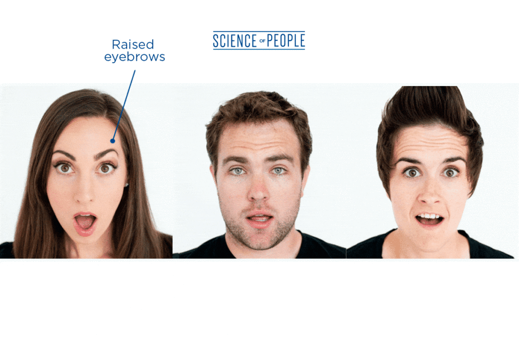
The example of surprise

  • For example, the expression of surprise involves several specific facial cues:
  • Raised and curved eyebrows
  • Stretched skin below the brow
  • Horizontal wrinkles across the forehead
  • Widely opened eyelids with the white of the eyes visible above and below the iris
  • A dropped jaw with parted teeth, but without tension or stretching of the mouth

Such indicators are not only valuable for understanding emotions but also for practical applications. For instance, when someone is attracted to you, they may give a brief „eyebrow flash,“ a quick raise of the eyebrows. Conversely, detecting contempt—where one side of the mouth is slightly raised—might help avoid conflicts in personal or professional relationships, such as preventing a divorce or work termination.

In conclusion, learning to read microexpressions is a valuable skill that is both „easy to learn and extremely useful in both professional and social life.

Sofie Neudecker, 27.11.2023

Sources.

The Faces of Emotions: Are they Universally or Culturally Varied? Psychology Today. Julle-Daniere, Eglantine, 2019. https://www.psychologytoday.com/us/blog/talking-emotion/201909/the-faces-emotions

Facial Action Coding System. Ekman, P., & Friesen, W. V. (1978). American Psychological Association, 2023. https://psycnet.apa.org/doiLanding?doi=10.1037%2Ft27734-000

Facial Action Coding System. PaulEkmanGroup, 2023. https://www.paulekman.com/facial-action-coding-system
http://system/#:~:text=The%20Facial%20Action%20Coding%20System%20%28FACS%29%20is%20a,components%20of%20muscle%20movement%2C%20called%20Action%20Units%20%28AUs%29.

Brunswik, E., & Reiter, L. (1938). Eindrucks-Charaktere Schematischer Gesichter (Impression Characteristics of Schematized Faces). Zeitschrift für angewandte Psychologie und Charakterkunde, 142, 67-134. American Psychological Association, 2023.
https://psycnet.apa.org/record/1939-02434-001

The Definitive Guide to Reading Microexpressions (Facial Expressions). Body Language. Science of People. Vanessa Van Edwards, 2023.
https://www.scienceofpeople.com/microexpressions/

Digital and Traditional Marketing: An Overview

Before venturing further into the topics of this research, here is a short overview of some of the different aspects of digital and traditional marketing, to establish core representation of said concepts in real world.

Digital Marketing:

Digital marketing encompasses a broad range of online strategies and channels aimed at promoting products, services, or brands. In the digital age, businesses leverage various platforms and technologies to connect with their target audience. Key components of digital marketing include:

Social Media Marketing (SMM): Utilizing platforms like Facebook, Instagram, Twitter, and LinkedIn to engage with audiences, build brand awareness, and promote products or services.

Search Engine Optimization (SEO): Optimizing online content to improve visibility in search engine results, thereby increasing organic traffic to websites.

Content Marketing: Creating and distributing valuable and relevant content to attract and retain a defined audience, fostering brand loyalty and customer engagement.

Email Marketing: Sending targeted messages and promotions directly to a subscriber’s inbox, often used to nurture leads, announce product launches, or provide exclusive offers.

Pay-Per-Click (PPC) Advertising: Placing ads on search engines or other platforms where advertisers pay a fee only when their ad is clicked, driving traffic to their website.

Influencer Marketing: Collaborating with influencers or individuals with a significant online following to promote products or services to their audience.

Affiliate Marketing: Partnering with affiliates who promote a company’s products and earn a commission for each sale generated through their marketing efforts.

Online Public Relations (PR): Managing and enhancing the online reputation of a brand through strategic communication and interaction with the digital community. [ 1 ]

Traditional Marketing:

Traditional marketing involves the use of offline methods to reach and engage with an audience. While digital marketing has become increasingly prevalent, traditional marketing still plays a crucial role in the overall marketing mix. Key components of traditional marketing include:

Print Advertising: Placing ads in newspapers, magazines, brochures, or other printed materials to reach a targeted audience.

Broadcast Advertising: Utilizing television and radio commercials to convey marketing messages to a wide audience.

Direct Mail: Sending physical promotional materials, such as postcards or catalogs, directly to potential customers‘ mailboxes.

Outdoor Advertising: Displaying ads on billboards, buses, or other public spaces to capture the attention of passersby.

Telemarketing: Directly contacting potential customers via phone calls to promote products or services.

Event Marketing: Hosting or participating in events, trade shows, or sponsorships to promote products and engage with the target audience in person.

Public Relations (PR): Managing the reputation of a brand through media relations, press releases, and other communication channels. [ 2 ]

While digital and traditional marketing operate in distinct spaces, an integrated approach that strategically combines elements from both can often yield the most effective results in reaching a diverse and engaged audience.

Links:
[ 1 ] https://mailchimp.com/marketing-glossary/digital-marketing/
[ 2 ] https://smemark.com/what-traditional-marketing/

Navigating the Digital Era: Exploring the Viability of Traditional Advertising Amidst the Digital Clutter

In an era dominated by data-driven online platforms, e-commerce, and the ever-expanding digital landscape, the question arises regarding the symbiotic potential of traditional advertising alongside its digital counterparts. The traditional advertising, seemingly on decline, perhaps now presents an opportunity to enhance the relationship building between brands and their customers [ 1 ]. The prevalent digital clutter is fueling the need to explore how the strengths of traditional marketing can complement and enhance the personalized engagement and yearning for customer experience sought in the digital age.

Amid the annoyance with saturation induced by digital clutter, traditional marketing emerges as a potential complement, capable of fostering enduring connections between brands and consumers. This research postulates that, like digital marketing, traditional marketing can tread a fine line between feeling impersonal and spammy or, conversely, establishing a deep and lasting connection. The critical distinction lies in the personalized effort invested by brands. While digital marketing has the capacity to feel impersonal, studies indicate that when brands invest in tailored digital marketing efforts, there is a proven increase in sales [ 2 ]. Traditional marketing has, hypothetically, a potential to support these efforts and leave a more indelible impression.

This exploration prompts several key inquiries. Firstly, how can innovative strategies be employed to harmonize the strengths of traditional marketing with the reach and efficiency of digital marketing, especially in the context of pervasive digitization? Secondly, how can advancements in technology, such as synthetic media, like Augmented Reality (AR) or Artificial Intelligence (AI), be leveraged to seamlessly integrate digital and traditional forms of advertising, enhancing the personalized engagement sought by modern consumers [ 3 ]?

The research aims to investigate the synergies between digital and traditional marketing efforts, recognizing that the combination of the two could offer a unique avenue for connecting with contemporary audiences. Considering the potential longevity and impact of traditional advertising, in contrast to the often transient nature of digital messages, presents an intriguing avenue for exploration. Furthermore, an analysis of the environmental impact, comparing the carbon footprint of printed media to that of digital media, seeks to shed light on the sustainability aspect of advertising.

In essence, this research postulates that amid the current paradigm of digital saturation, a harmonious relationship between traditional and digital advertising holds all the potential, providing an avenue for contemplation, exploration, and experimentation. By examining the intersection of traditional and digital forms of marketing, and considering the impact of innovative technologies like AR or AI, this research aims to delineate the opportunities for marketers in navigating the evolving landscape of advertising in the digital age.

Links:
[ 1 ] https://hbr.org/2022/04/why-marketers-are-returning-to-traditional-advertising
[ 2 ] https://www.directsellingnews.com/2018/11/01/digital-doesnt-have-to-be-impersonal/
[ 3 ] https://link.springer.com/article/10.1007/s11002-021-09573-9

Food Graphic Design

Branding the Table. A Visual Guide to Culinary Delights

Definition and Importance of Graphic Design in the Food Industry

Definition:

Designers take a comprehensive approach to tackle design challenges, expanding the project’s horizons and offering innovative solutions that affect various aspects simultaneously, including production, packaging, and marketing. Their holistic approach leads to the creation of tools that actively engage all involved parties. Moreover, designers possess the skill set to oversee the product development process, fostering collaboration among experts from different disciplines. By playing a pivotal role in integrating diverse knowledge domains, designers enable large food corporations to introduce innovations that not only cater to genuine consumer needs but also make a positive societal impact while ensuring sustained profitability and growth.

Foods serve as fascinating materials for designers due to their close ties to everyday cultural practices, engaging all human senses. The intrinsic regional, seasonal, and perishable nature of foodstuffs poses an intriguing challenge for designers, compelling them to establish connections between consumers and the realms of agriculture, trade, and food processing techniques.The contributions of designers in food development processes are multifaceted, ranging from broadening project scopes to shaping tools that foster engagement, facilitating seamless cooperation among team members, and integrating specialized expertise.1

Importance and Connection to the Food Industry:

Each year, a multitude of new food products enter the market, yet a staggering 95% face failure. This highlights the substantial role played by packaging, marketing, and advertising in brand introduction and consumer preferences. A study by MeadWestvaco titled „Packaging Matters“ revealed that packaging alone drives 36% of purchase decisions, surpassing the influence of TV ads, online reviews, and recommendations from friends.

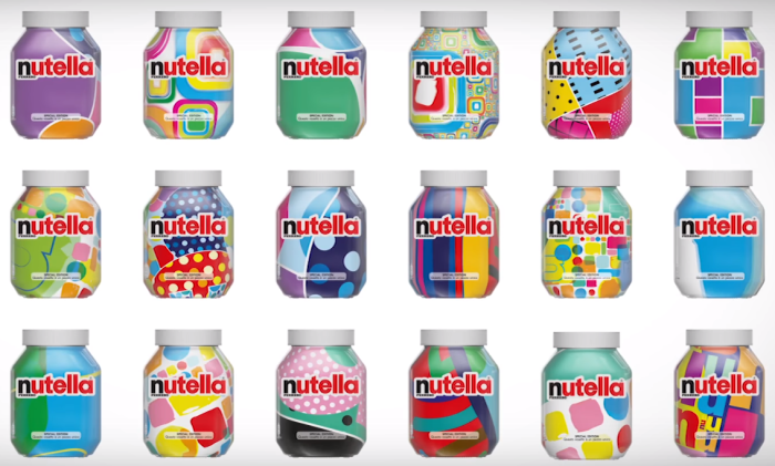
An exemplary case illustrating the power of design was witnessed in Nutella’s 2017 campaign, featuring seven million distinct versions of the product’s graphic identity. This campaign resulted in an astounding success, with all items selling out within a remarkably short span of just one month.

The credibility of good design resonates with consumers, fostering trust and reliability. Incorporating storytelling elements into food packaging crafts compelling narratives that trace the journey of the product from its origin on the farm to its presence on the consumer’s table. This narrative-driven approach ensures that packaging effectively fulfills its fundamental roles: informing consumers about the product, guiding them on functionality, and demonstrating its inherent value.

Consumers often extend their perception of a product’s quality and appeal to the packaging itself, a phenomenon termed „sensation transference.“ Furthermore, color choice significantly impacts consumers‘ perceptions of the product.

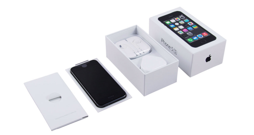
In the league of innovators, companies like Apple have redefined packaging as an art form, attracting a niche community of ‚unboxers‘ who specialize in unpacking and showcasing packages.

Thorough research into demographics and target audiences serves as a cornerstone, aligning design elements with the values and aspirations of the intended consumers. Thus, creating a harmonious linkage between packaging design, graphics, and the brand itself, underlining the significance of employing meticulous market research, as witnessed in the initial stages of logo creation.

Developing an experiential packaging design, reminiscent of the careful craftsmanship and attention to detail found in brands like Apple, elevates the consumer experience, making the unboxing process a delightful and engaging journey.2

In essence, the fusion of graphic design with the culinary world not only amplifies brand appeal but also serves as a powerful tool to connect consumers with the narrative of food, transforming the mundane act of unboxing into an immersive experience and revolutionizing the way we perceive, interact, and ultimately savor what lies within.

Quelle:

  1. https://www.researchgate.net/publication/308828593_What_design_can_bring_to_the_food_industry/link/5ba767a5299bf13e60464b85/download
  2. https://www.fooddive.com/news/why-good-design-can-make-or-break-your-food-and-beverage-business/523696/

02. Face Perception

How do We Perceive Faces?
Is Face Detection Innate?

Functional Specialisation

The recognition of faces is “crucial to social interactions” (Duchaine and Yovel 2008), and several scientific studies indicate that a “number of separate processes,” some of which are “specialized for faces,” are involved in this recognition. Cognitive experiments have shown that “faces are represented in a more holistic manner than other objects.” This is supported by neuropsychological studies that have identified a “number of regions in the central visual pathway” which are preferentially activated when we see a shape resembling a face. Different strategies that process various types of information are applied within these areas. The shape of individual facial features, the spacing between inner facial features, and the global structure of the face are all processed separately (i.e., holistic information; Maurer et al., 2002; Piepers and Robbins, 2012). Some of these areas even consist “entirely of face-selective neurons,” and damage or failure within them can lead to face recognition deficits such as “prosopagnosia.”

Neural Specialisation

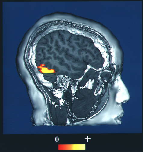
The exact localization of brain areas involved in face recognition has been a subject of debate within the scientific community. While the fusiform face area (FFA) has historically been considered “the most selective face area” (Rossion 2015), lesion studies suggest that the “lateral part of the right inferior occipital cortex,” also known as the occipital face area, may actually be more critical. This region is noted for having the “largest overlap of lesions causing prosopagnosia” (Bouvier & Engel 2006) and is also where electrical stimulation can induce transient prosopagnosia (Jonas et al. 2012). However, it is important to note that these “labeled clusters” may be arranged differently across individual brains.

A computer-enhanced fMRI scan of a person who has been asked to look at faces.

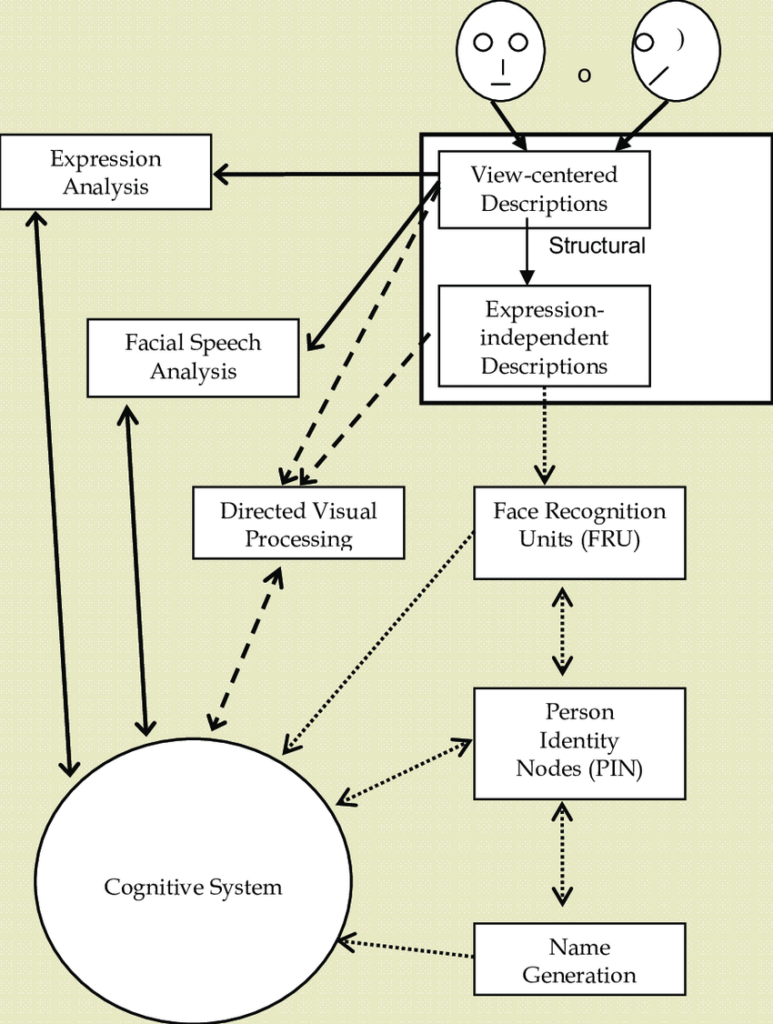
In 1986, Bruce and Young developed an information processing model of face recognition that distinguishes “several different components in the complex skill of facial processing” (McCarthy and Warrington 1990). This model includes a “range of dissociations in face processing skills” that operate in parallel after the initial common step of visual analysis. The model differentiates “directed visual processing,” or “face detection,” which involves the ability to perceive that a certain visual stimulus is a face, from components such as “facial speech analysis,” which includes expression analysis and lip reading, and “face recognition,” the “capacity to recognize whether a face is familiar” (Simoni and Di Giorgio 2019).

Bruce and Young’s
(1986) Face
Processing Model

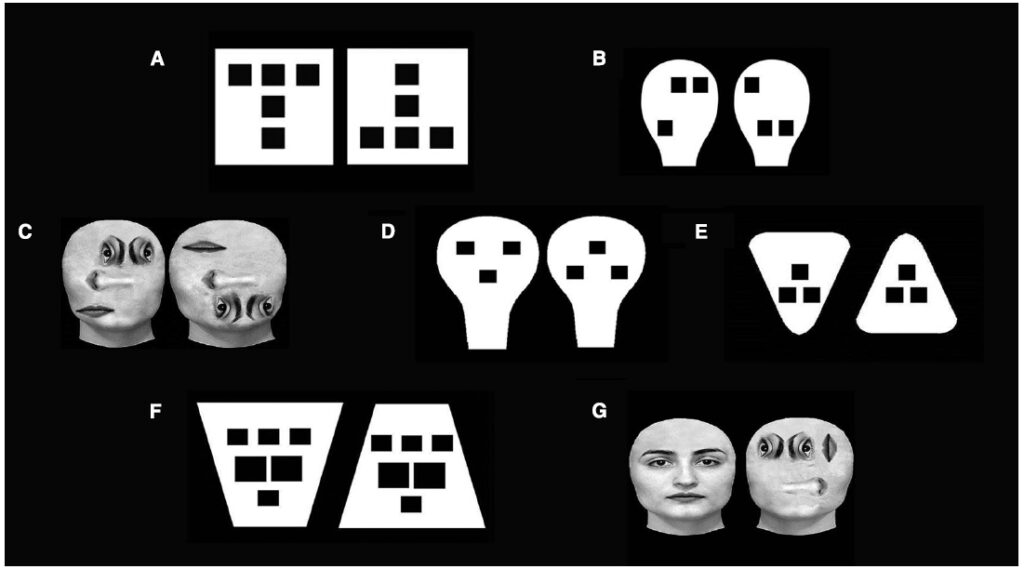
In this post, I intend to focus on face detection; the other parallel processes will be explored in more detail in subsequent articles. Therefore, I will briefly examine its mechanisms and investigate whether it is innate by considering the distinction between “inborn predispositions and developmental changes” (Simoni and Di Giorgio 2015) throughout the developmental process. Several studies conducted in a research lab in Padova have detected a preference for “up-down asymmetry” in newborns. This preference was observed not only with “face-like stimuli” but also with “real faces in which the geometry of the face was disrupted.” Additionally, it was found that newborns tend to look longer at congruent patterns. Congruency, defined as “the presence of a corresponding relationship between the shape and orientation of the contour and the spatial disposition of the inner features,” is particularly prevalent in facial shapes.

Figure 1. Examples of stimuli employed by to test the role of general structural properties in face preference.

To conclude, the preference for faces at birth might be explained by a “collection of preferred structural and configural properties.” However, the question of how and when faces become special stimuli and begin to be processed differently from other objects remains unresolved. The “presence of some domain-relevant biases at birth” appears to be sufficient to guide the “gradual and progressive structural and functional specialization” that develops later in childhood, influenced by the experiences an infant has in its species-specific environment.

Sources:

Duchaine, B., and G. Yovel. „Face Perception and Processing in Early Infancy: Inborn Predispositions and Developmental Changes.“ In The Senses: A Comprehensive Reference, Vol. 2. Academic Press, 2008. https://www.sciencedirect.com/science/article/abs/pii/B9780123708809003340.

Roisson, B. „Brain Mapping.“ In Reference Module in Neuroscience and Biobehavioral Psychology: An Encyclopedic Reference, Vol. 2. Academic Press, 2015. https://www.sciencedirect.com/science/article/abs/pii/B9780123970251000373.

McCarthy, Rosaleen A., and Elizabeth K. Warrington. Cognitive Neuropsychology: A Clinical Introduction. Academic Press, 1990. https://www.sciencedirect.com/science/article/abs/pii/B9780124818453500060.

Simon, Francesca, and Elisa di Giorgio. „Face Perception and Processing in Early Infancy: Inborn Predispositions and Developmental Changes.“ Frontiers in Psychology, Section Perception Science, Vol. 6 (2015). https://www.frontiersin.org/articles/10.3389/fpsyg.2015.00969/full.

Images:

Shamash, Philip. “Image for ‘Instinct and Learning: Two Sides of the Same Coin.’” Sainsbury Wellcome Centre Blog. September 10, 2020. https://www.sainsburywellcome.org/web/blog/instinct-and-learning-two-sides-same-coin.

„Fusiform Face Area and Face Recognition.“ Wikipedia. Accessed August 23, 2024. https://en.wikipedia.org/wiki/Prosopagnosia#/media/File:Fusiform_face_area_face_recognition.jpg.

„Diagram Illustrating a Functional Model for Face Processing.“ ResearchGate. Accessed August 23, 2024. https://www.researchgate.net/figure/A-two-dimensional-box-and-arrow-diagram-for-illustrating-a-functional-model-for-face_fig2_221917426.

Christoph Biemann’s 43-minute lecture on „How to explain complex topics in an easily understandable way“ :

A Summary by Hannah Milchrahm

Christoph Biemann is a German author, director and actor. He is one of the presenters of the TV show „Sendung mit der Maus“ and one of the experts on the quiz show „Frag doch mal die Maus“.
To explain complex topics in a way that is easy to understand, Christoph Biemann emphasizes several key points:

  1. Start where understanding already exists and „pick up“ the audience by incorporating familiar elements (e.g. Sendung mit der Maus wanted to teach children about Chernobyl. To „pick up“ the children, they began the episode with a reference to a playground and said: „Unfortunately, you can no longer play on this playground“ (because the playground was in Chernobyl). The children were immediately picked up with what they „knew“ and became attentive.
  2. Take the audience on a journey by telling a story and asking the right questions. Use mirror neurons to evoke empathy and use heroes to shape the story.
  3. Pay attention to dramaturgy and use analogies to make complex concepts more accessible.
  4. Recognize that people, especially children, are naturally open to learning.
  5. It is essential to familiarize yourself thoroughly with the subject in order to explain it well and simply. A deep understanding of the subject matter is a prerequisite.
  6. Ask yourself what can be left out and what is crucial to get the main message of the topic across.

Hydrogen drive explained simply (KLUG – Klimawandel und Gesundheit. , 2022, 24:40–25:50).


Personal insight that I gained from Mr. Biemann’s lecture

If I want to present a complex topic in a simple and understandable visual way, I have to be a professional in the field. Because you should be so well versed in the subject that you can explain it well (and simply) so that even children can understand it.
My problem: very complex (scientific) concepts that were originally planned automatically fall out of my list (unless the level of complexity is not too high) & I will most likely go for a topic that is less science-based and more philosophy-based. In this regard, I have already thrown myself into the first philosophical doctrine, Stoicism.

Another aspect emphasized by this lecture is that in order to make complex topics simpler and easier to understand, one should make use of simple elements (see above, explanation of hydrogen propulsion using simple means). In terms of design, this means: Icons & simple graphics


KLUG – Klimawandel und Gesundheit. (2022, 02. Juni). 5. PHA #5 Transformative Kommunikation II: „Wie erkläre ich komplexe Themen leicht verständlich?“[Video]. YouTube. https://www.youtube.com/watch?v=KCqgErJbeXY

03 | Changes in the Typographic Representation of „ß“ Over Time

Languages which use letters based on the latin alphabet are set in two separate alphabets: uppercase and lowercase. We set text usually either in mixed-case or in uppercase/small cap letters. At any time we can switch between the two without touching the content of the text. This however, is not possible in Austria and Germany where the lowercase alphabet consists of 30 letters (Basic latin + ä, ö, ü, ß), but the uppercase alphabet has just 29 letters (Basic latin + Ä, Ö, Ü). Until the 1940s German was usually set in blackletter and such texts were never set in uppercase, because of the wide and decorated design of these uppercase letters. And since there is also not a single word that starts with an ß (Eszett), there was simply no need to have an uppercase version. The sharp „ß“ traditionally did not have a specific uppercase form. Typically, in uppercase writing, „SS“ was used instead. But this has turned around. Today, we hardly set German text or names in blackletter and the use of uppercase/small caps is still popular for various reasons. So there is an obvious gap in the German alphabet.

A design for a capital Eszett by the font foundry “Schelter & Giesecke”  (1912)

The existence of this gap was acknowledged a long time ago. In 1903 a commission of German, Austrian and Swiss printers and font foundries announced that the letter ß should also be included in any non-blackletter typefaces. A capital version was also discussed but the commission could not agree on one design at this time. So it became common practice to replace the letter ß with SS or SZ in uppercase text. This however was never meant as a real solution to this problem. In 1919 the German Duden explained:

“The use of two letters for one phoneme is just an interims solution, that must be stopped, once a proper letter for the capital ß has been designed.”

The typographic society of that era yearned for a standardization of the capital „ß“, but the topic couldn’t reach a broader audience. Historically, there was no universally accepted uppercase form for the sharp „ß.“ Experiments in this direction were individual efforts by typographers who faced the challenge of translating the characteristic elements of the lowercase „ß“ into larger forms. This often involved the curved arch and round shape of the lowercase „ß.“ However, these experiments were not standardized and did not gain broad acceptance. Each typesetter tended to find their own creative solution, leading to a variety of experimental forms. Some attempted to retain the rounded character of the lowercase „ß,“ while others flattened the arch or made other adjustments.

Capital Eszett on a German orthography book from 1965

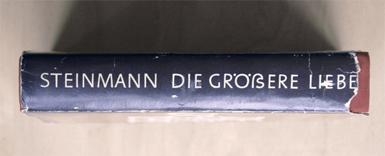
A novel using a Capital Eszett, printed in 1971

Creative Experiments by Renowned Typesetters in the 20th Century

Wilhelm Deffke, a renowned German graphic designer, created the „Deutsche Anzeigenschrift“ in the 1920s, a typeface that included an uppercase form for the sharp „ß.“ Deffke aimed to transfer the elegant line work of the lowercase „ß“ to uppercase letters. While his approach showcased creative innovation, this specific form did not gain widespread use. Deffke was known for his modern and experimental designs in the interwar period.

Rudolf Koch, an exceptional calligrapher and type designer, experimented with various forms of the sharp „ß“ in uppercase during the 1920s and 1930s. Koch’s designs demonstrated calligraphic approaches as he sought to translate the aesthetics of the lowercase „ß“ to uppercase. Despite his artistic efforts, his experiments did not achieve broad acceptance.

Paul Renner, the creator of the famous „Futura“ typeface, also attempted to develop an uppercase form for the „ß.“ In some variations of his typeface, elements of the sharp „ß“ were incorporated into uppercase letters. Renner, a pioneer in modern typographic design, was known for his efforts towards a clear and geometric typographic aesthetic.

Eduard Ege, a typesetter, ventured to establish an uppercase form for the „ß“ during the Weimar Republic. However, his efforts remained largely unnoticed and had minimal impact on the typographic practices of his time.

These designers were trailblazers in their quest for a coherent typographic language, attempting to transfer the nuances of the sharp „ß“ to uppercase letters. Although their experiments did not achieve the widespread acceptance they may have hoped for, they nonetheless contributed to the development and diversity of type design.

Links

https://typography.guru/journal/germanys-new-character/

https://www.typografie.info/3/wiki.html/v/grosses-eszett/

Research 2: Wilderness International → Show what we have and give hope

For the entry in this topic I want to start with analysing Wilderness International.

What is Wilderness International?

It consists of three different non profit organisations with departments in Germany, Canada (founded in 2008) and since 2019 also in Peru. Their main goal is to safe and protect as much intact forests (especially wilderness) as possible. The working method is to legally and securely buying the forest (from forestry corporations, private individuals, various companies, and mining speculators) and so they can assure that it can´t be destroyed. This works by having locals who guard the wilderness on the spot. So they protect the land and the animals which live there.

How does it actually work?

Wilderness International gathers donations through abonnements options, through campaigns etc. A donation of 1€ equals 1m2 of land. They also cooperate with companies so companies can compensate their CO2 Footprint with saving forest by donating themselves or using WI as a partner so customers safe land through purchases. After the purchase one gets a certificate with images from aerial view to show the exact spot they bought.

About the brand and visual communication?

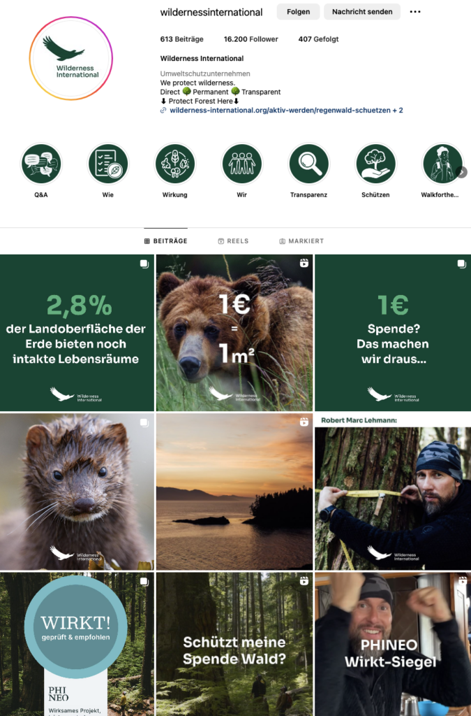
Their branding and online presence is focused on being hopeful, transparent and trustworthy. Their main color is green which makes totally sense with forests and environment as their main focus. But instead of making another generic environmentally friendly and not so “pretty” brand they established a very reputable branding for their mission by now.They work with a lot of visuals – they try to make texts short and just give the important information. It´s all about giving hope and inform transparently but also easy understandable. Everything is supported by illustrations in a playful way or by stunning photographs and videos. Over the years they gathered a lot of talented and well known wildlife photographers for their cause who know how to depict the nature to get people to understand the importance and beauty of nature.

Wilderness International Logo
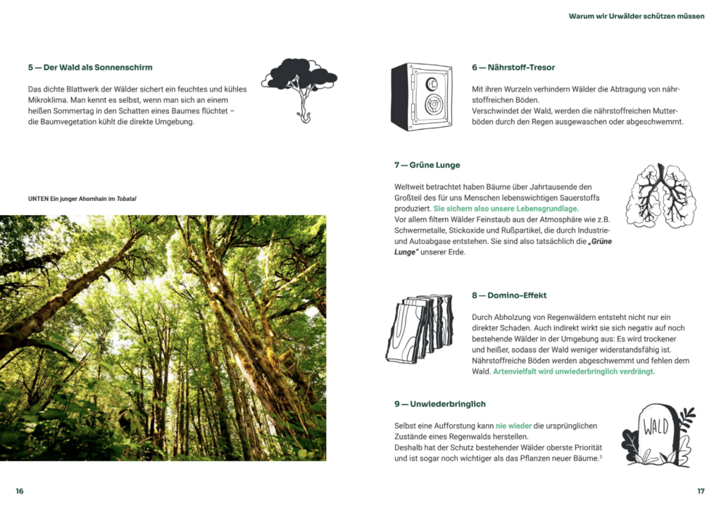
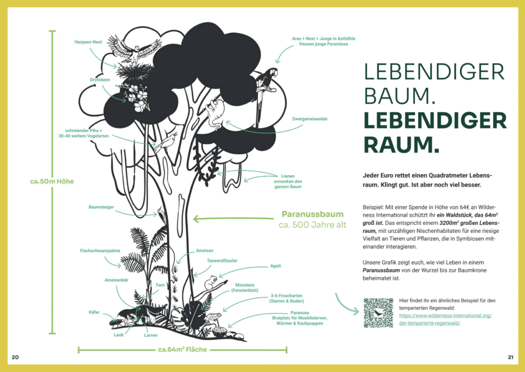
Page from Wilderness International Report

Their own visual communication contains not much of the sad and ugly sides of forest destruction – these sides of the problem are more shown through people on the internet who may have an own online presence and educate about the cruel things happening according nature and wildlife. Wilderness International just works with the bright side of the problem – their solution and how it will affect the future. Their language is very positive and clear. It´s not too emotional just enough to let the people get the feeling of „yes I did that – I made an positive impact“.

Instagram Page of Wilderness International

Wilderness International and Robert Marc Lehmann (Mission Erde)

I for myself can say I discovered them through Robert Marc Lehmann – a very big german animal and environmentalist (just a short description cause he is way more than that). He cooperated already with Wilderness International for a long time where with every purchase in his shop you got one m2 of the wilderness.

Then they made a film as Robert is also making impressing films about nature and animals about the forest in Peru as well as Canada where they showed how the documentation of the forest and work on the sport is done. They showed the land and local animals – they showed exactly how the drone is documenting the whole land and how they gather the data to make the certificates and so on later. It was all about evoking hope and show how beautiful these piece of land is. To encourage people and to raise donations. Robert has build a big community of mostly young people through Youtube and Social Media in general where he creates awareness for the environment and wildlife – the campaign was directed to this community called “Mission Erde” – his own foundation. To date (22.11.2023) 19.436 people made a donation and safed about 74 hectar forest in Peru just through this film. In the entire Mission Erde could safe 240.343 m2 with his book, the different campaigns and so on.

Image from Robert Marc Lehmann from the „Secret Forest“ in Peru

My conclusion

Their strategy is working really well. They have a big network already after 15 years of their mission. Social Media and promotions from other influencers got a lot of people to donate and support. One the one hand it is very attractive cause you can do something for a good cause with just 1€ already but on the other hand the visual communication is a big player with getting people to donate. People get happy feelings and feel good by supporting them – they leave Wilderness International with a positive impression and may come back later as well and donate again. Another point is their very transparent communication. With their visual language (the playful illustrations & stunning nature photography) they make a big impact on the viewer and they manage to explain such an important and complex topic in a short amount of time as people prefer this than doing a lot of deep research. Their brand looks trustworthy so the people do not need much to be convinced. It´s not about showing all that is going wrong – it´s rather about how the current situation is looking and how we can make a change which protects our future.

I also found a very interesting paper about „Ist Werbung für ein Produkt Naturschutz überhaupt möglich?“ – I will go deeper into this in another blog cause this one is already very long but just from the first few sentences I can make a good connection to Wilderness International. They say that it is highly important to make advertisment for the conservation of nat

Sources:

Color models #2

RGB system (light colors):
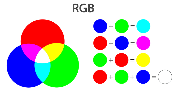
In the RGB system, colors are defined by their proportions of red, green and blue. White is created by adding these color values (all to 255), black by zero. With 256 levels per color value, the system enables the definition of over 16 million colors.

CMYK system:
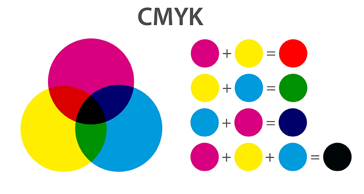
The CMYK system is based on the primary colors cyan, magenta, yellow and black. The color values are between 0% and 100%. No color corresponds to 0%, while 100% represents the maximum amount of color. Black is achieved by mixing 100% CMY or pure black.

HSB system:
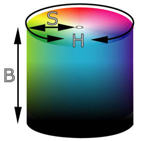
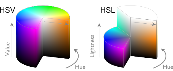
In the HSB system, hue, saturation and brightness are defined. The hue lies between 0° and 360° on the color wheel. Saturation describes purity and luminosity (0% for light gray, 100% for saturated colors). Brightness indicates the black opacity, from 0% (black) to 100% (saturated color).

HSL-System:
Ähnlich dem HSB-System definiert das HSL-System Farbton, Sättigung und Farbhelligkeit. Es ist eng mit dem HSB-System verwandt.

Lab system:
Lab colors are device-independent and are defined by luminance, a-component (green to red) and b-component (blue to yellow). White has a luminance of 100, black of 0. The color components range from -128 to 127. A gray is created with both color values = 0.

Pantone system:
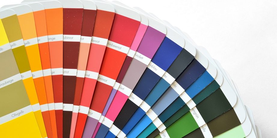
Pantone is a professional tool for the printing sector with over 3000 process colors as CMYK combinations. The „Pantone Matching System“ offers 1114 spot colors, which also include brightening and clouding after black.

HKS system:
The HKS system is a standard for spot colors with 120 solid colors, similar to the Pantone Matching System. It uses color fans and color charts for color definition.

RAL system:
RAL colors are marketed by RAL gGmbH under „RAL Classic“ and „RAL Design“. With 1898 shades, it is a standard in construction technology, each color has a four-digit number. The name is derived from the Reichs-Ausschuss für Lieferbedingungen, founded in 1925 to rationalize the German economy.

Sources:
https://br24.com/wp-content/uploads/Br24_Blog_RGBvsCYMK_RGBColours.jpg
http://www.win-seminar.de/adobe/hsb-farbmodell.php
https://wisotop.de/hsv-und-hsl-farbmodell.php
https://www.researchgate.net/publication/329555404_Trends_in_the_development_of_the_colorimetric_systems_after_1830
https://pakfactory.com/blog/what-is-pantone-color-matching-system/
https://www.hein.eu/lexikon/hks-farbtabelle-uebersicht