The German alphabet is the alphabet used for writing the German language. It is employed in Germany, Austria, Switzerland, Liechtenstein, and Luxembourg, as well as in countries with German-speaking minorities such as Belgium (Eupen and Malmedy), Denmark (Northern Schleswig), Italy (South Tyrol), and Poland (Upper Silesia). The German alphabet consists of the 26 basic letters of the Latin alphabet, which are also used in many other languages:
A, B, C, D, E, F, G, H, I, J, K, L, M, N, O, P, Q, R, S, T, U, V, W, X, Y, Z.
In addition to these letters, the German language has three umlauts: Ä, Ö, Ü. These umlauts are considered distinct letters and are often viewed as variations of the letters A, O, and U, respectively, each marked with two dots above. The Eszett (ß) is another characteristic feature of the German alphabet and is used in most of the mentioned countries.
Extension of the German alphabet
The use of the Eszett (ß) outside of Germany and Austria varies depending on the specific linguistic and orthographic conventions of each region.
Belgium (Eupen and Malmedy): In the German-speaking communities of Eupen and Malmedy in Belgium, the Eszett (ß) is generally used, as the spelling follows German standards. Belgium has both Dutch and French language communities, and the German-speaking community has its own linguistic regulations.
Denmark (Northern Schleswig): In Northern Schleswig, there is a German minority in Denmark. The use of the Eszett here may depend on personal preference and the linguistic habits of the community. Some individuals may use the Eszett, while others might prefer to write „ss.“
Italy (South Tyrol): In South Tyrol, there is a German-speaking minority within the predominantly Italian-speaking population. The use of the Eszett may depend on individual preferences and the influence of Italian spelling. In official documents and publications targeting the German-speaking community, the Eszett is likely to be used.
Poland (Upper Silesia): In Upper Silesia, there is a German-speaking minority. The use of the Eszett can also vary here. Some people might use it in accordance with German spelling rules, while others may be more inclined to use „ss.“
Phonetics of „ß“
The pronunciation of the German language refers to the phonetics and phonology of the standard German language. It is not uniform everywhere because German is a pluricentric language with various varieties that largely coincide in their pronunciation. The character ẞ (uppercase) or ß (lowercase) is a letter of the German alphabet. It is referred to as „Eszett,“ sharp S, or Scharf-S, colloquially also known as „double-S,“ „humpback-S,“ „backpack-S,“ „threefold-S,“ or sometimes misleadingly as „ringel-S,“ which usually refers to another S variant.
The ß is used for the phonetic representation of the voiceless s sound [s]. It is the only letter of the Latin script that is exclusively used today for writing German languages and their dialects, such as in the standardized spelling of Standard German and in some spellings of Low German, as well as historically in some Sorbian writings. Additionally, in medieval and early modern texts, ß serves as an abbreviation for the currency Schilling, and „ßo“ represents the counting measure Schock.
Leitsysteme sind mehr als nur Wegweiser. Sie sind integraler Bestandteil unserer städtischen Infrastruktur und tragen dazu bei, den Verkehrsfluss zu optimieren, die Sicherheit zu gewährleisten und die Effizienz in verschiedenen Bereichen zu steigern. Von Fußgängerüberwegen über Verkehrsschilder bis hin zu digitalen Anzeigen – Leitsysteme nehmen viele Formen an und dienen einem gemeinsamen Zweck: die Orientierung zu erleichtern.
Die Evolution der Leitsysteme
Die Geschichte der Leitsysteme reicht weit zurück. Frühe Formen von Wegweisern und Markierungen finden sich in antiken Zivilisationen, die Wege und Straßen für Handel und Kommunikation entwickelten. Mit dem Fortschreiten der Technologie haben sich Leitsysteme jedoch weiterentwickelt. Heute integrieren sie digitale Elemente wie LED-Anzeigen, interaktive Karten und sogar Augmented Reality, um den Nutzern eine noch präzisere und benutzerfreundlichere Navigation zu ermöglichen.
Leitsysteme im städtischen Raum
Im städtischen Raum sind Leitsysteme besonders wichtig, um den Verkehrsfluss zu regeln und die Sicherheit der Bürger zu gewährleisten. Verkehrszeichen, Ampeln, Fahrbahnmarkierungen und Fußgängerüberwege sind entscheidende Elemente, um den reibungslosen Ablauf im Straßenverkehr sicherzustellen. Studien zeigen, dass gut gestaltete Leitsysteme nicht nur die Verkehrssicherheit verbessern, sondern auch den Verkehrsfluss optimieren und somit zu einer effizienteren Nutzung der städtischen Infrastruktur beitragen.
Die Rolle von Technologie in modernen Leitsystemen
Moderne Leitsysteme profitieren zunehmend von den Fortschritten in der Technologie. Smarte Städte setzen auf vernetzte Systeme, die Echtzeitinformationen liefern und sich an die sich ändernden Bedürfnisse anpassen können. Mobile Apps, GPS und intelligente Verkehrsmanagement-Systeme ermöglichen es den Menschen, nicht nur in der Stadt, sondern auch in Gebäuden, Flughäfen und anderen öffentlichen Räumen leichter den Weg zu finden.
Herausforderungen und zukünftige Entwicklungen
Trotz der Fortschritte gibt es weiterhin Herausforderungen bei der Gestaltung effektiver Leitsysteme. Die Integration verschiedener Systeme, die Barrierefreiheit und die Berücksichtigung von Umweltaspekten sind nur einige der aktuellen Anliegen. Die Zukunft der Leitsysteme wird wahrscheinlich durch weitere technologische Innovationen geprägt sein, die eine nahtlose und personalisierte Navigation ermöglichen.
Quellen:
Smith, J. (2018). The Evolution of Wayfinding Systems in Urban Environments. Journal of Urban Technology
Müller, A., & Fischer, F. (2020). Smart Cities: Turning Urban Challenges into Opportunities through the Integration of Digital Technologies.
Color Psychology in Food Design Impactful Palette Choices for Menus and Restaurant Ambiance
The selection of colors for a restaurant, including the design of the menu, holds significant importance. Often referred to as „chromatics,“ color influences the subconscious reactions of customers, affecting their emotions, behavior, and visual perception.
Red Color: It stimulates energy and passion, enhancing appetite by increasing heart rate and nerve impulses, signaling readiness for a meal and stimulating neurons. Many fast-food chains employ red in their logos, as it’s associated with tender meats, sweets, or strawberries.
Blue Color: Conservative brands often opt for blue, as it exudes security and trust. However, for restaurants, it might suppress appetite and hunger, rendering it less suitable. Initially considered unappetizing, the success of blue M&M’s changed perceptions. Nonetheless, blue often triggers associations with spoiled foods, although it can be suitable for low-calorie or weight-reducing food items.
Yellow Color: Known for its cheerful and uplifting characteristics, yellow might convey a sense of affordability. However, in the food industry, it can be linked to naivety or lack of sophistication.
Green Color: Associated with healthy, vegetarian, and fresh foods, green also evokes notions of nature and relaxation. Starbucks incorporates green in its logo, aiming to encourage relaxation and sitting down.
Pink Color: In the food domain, pink often suggests sweetness or even pork. It’s commonly used for feminine-oriented packaging.
Black Color: Menu developer Gregg Rapp suggests that black ink on white paper provides the highest contrast, ensuring legibility on menus. The simplicity of black and white in a logo emits sophistication. Absence of color exudes a chic aura. While black-colored foods might not be popular, certain items like squid ink pasta, charred ends, black licorice, Kalamata olives, and specific alcoholic beverages like Jack Daniels or black rum are acceptable.
Gray-Silver Color: Foods aren’t usually naturally gray, but when utilized, they’re often combined with accent colors to create an attractive contrast. Gray tea packaging, for instance, adds an earthy aesthetic, signaling natural ingredients. Dishes presented on stone-like plates often evoke a certain allure.
On the other hand, silver, signifying class and cleanliness, is reminiscent of stainless-steel countertops. Tin packaging and silver bottles signify hygiene and cleanliness.
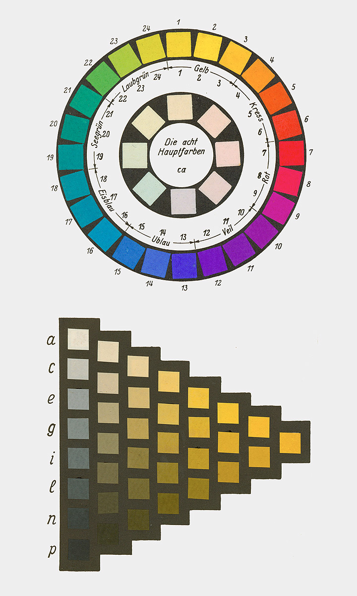
Chemist and Nobel laureate Wilhelm Ostwald addressed the „Normalfarbenfrage“ (normal color question) by developing a color order system. This system took the form of a double cone, capturing all body colors as colorful phenomena regardless of their material composition. Ostwald colored this order representatively with 2400 colors in the large version and 680 colors in the small version. Each color, given its specific place in Ostwald’s system, is referred to as a „color norm.“
Ostwald utilized vibrant, though often not lightfast, coal-tar dyes for his system, particularly deeming them suitable for school use. The Munich Academy professor Max Doerner and his group expressed concerns about the quality of painting materials, striving to set quality standards for pigments and dyes. However, this endeavor did not lead to a definitive solution.
Heinrich Trillich’s „Deutsche Farbenbuch,“ published from 1923 onwards, attempted to establish quality standards. In its second volume in 1925, it dedicated a section specifically to artist colors, expressing reservations about Ostwald’s advocacy for initially lightfast coal-tar dyes and the abstract color norm labeling that obscured the material character of the color.
Ostwald actively promoted his color theory through publications, lectures, workshops, and his Unesma publishing house, which distributed books, color atlases, and educational materials. Industries, including Günther Wagner with an official license from Ostwald, adopted his ideas, producing school paint sets. Winsor & Newton and Reeves in England also created school paint sets based on Ostwald’s principles.
Ostwald’s color theory introduced a new color theory, influenced by Ewald Hering, featuring four „primordial colors“: Yellow, Red, Green, and Blue. Hering defined these as psychologically neutral colors, and Ostwald incorporated them into his color circle, though deviations existed from Hering’s psychological primordial colors.
Ostwald actively promoted his color theory in schools, publishing a specially tailored „Farbschule“ (color school) in 1920. The „Kleinchen“ paint set, aligned with his color system, was central to this educational initiative. The set included 12 color pills, with 8 considered „main colors.“ Ostwald, aware of compromises in his color choices, emphasized the need for corrections to achieve the correct Ostwald color circle. Despite his disregard for lightfastness, Ostwald highlighted the distinction between dye and color.
Ostwald’s push into schools had a significant impact, generating extensive public discussions about his color theory in the early 1920s. Both critics and advocates, especially among art educators like R. Dorias, H. Hensinger, Martin Schaller, and Max Bühler, engaged in debates, presentations, and publications promoting or questioning Ostwald’s ideas.
The industry joined the trend, offering numerous school paint sets labeled with Ostwald’s name. Günther Wagner, the authorized distributor, explicitly emphasized the authenticity of its products, facing competition from unauthorized sets with Ostwald labels.
With Ostwald’s influence, the schools transitioned from the traditional three-color theory (Yellow, Red, Blue) to the four-color theory (Yellow, Red, Blue, Green). Ostwald’s compromises in pigment choices to achieve extensive color mixing capabilities required corrections for specific color areas.
Ostwald’s venture into schools left a lasting impact, leading to a shift in color theory education and influencing the production of art supplies in the early 1920s.
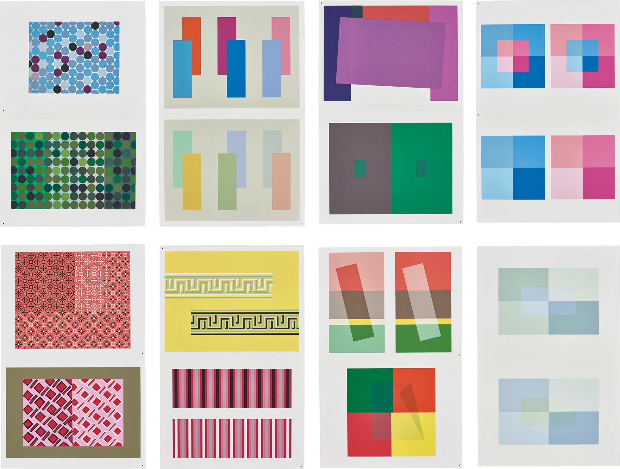
Josef Albers‘ book, „Interaction of Color,“ delves into the nuances of black and white, exploring them not just in terms of value but also in hue. The text challenges the simplistic view of white being just white and black being merely black, emphasizing that their specificity emerges when juxtaposed with similar forms or other colors.
Albers intricately addresses the conditionality of color, highlighting how it exists in our imagination and can be subject to interpretation. The book questions whether color’s meaning is relative to specific situations and underscores the interactive nature of color. Albers emphasizes that color is not passive; instead, it requires active engagement and purposeful activation through group reasoning.
Transparency emerges as a crucial concept in „Interaction of Color.“ When two colors mix transparently, the result is a new color, distinct from the blend of the original two. Albers stresses the importance of considering color for both its value and saturation, particularly in the context of a specific place. Group perception, according to Albers, can activate colors and imbue them with purpose within a given space.
In the context of societal issues, such as the tragic murder of George Floyd by the Minneapolis Police, Albers’s insights resonate. The book’s emphasis on avoiding negative judgments of color aligns with the call to recognize and confront biases. Albers encourages us to challenge notions of „taste“ and reject the labeling of any color as distasteful or „ugly.“ The overarching goal is to understand that color gains clarity in context, standing next to another color to reveal its value. This understanding extends beyond individual perceptions, fostering collaboration and trust in establishing a consensus that transcends personal limits.
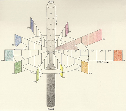
Munsell aimed to systematically account for each attribute of color through organized visual steps. He introduced 100 steps for hue, based on five primary and five intermediate colors. Munsell structured his system with ten units of value and an open-scale named „Chroma,“ resembling saturation. The resulting three-dimensional system can be visualized as a color tree. Among various attempts to construct color systems, Munsell’s approach, founded on „perceptual equidistance,“ achieved widespread success.
Initially proposing a subtle color sphere influenced by N. O. Rood’s „Modern Chromatics,“ Munsell later realized its geometric symmetry inadequacy for representing perceived color relationships. His efforts culminated in the 1915 publication of the „Color Atlas,“ presenting a naturally grown order organized around a central vertical gray axis, also known as the „color tree.“
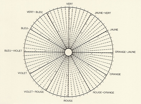
Munsell built his system on a ten-part circle, arranging colors at equal intervals and selecting opposites that mix to produce neutral gray (the Principle of Compensativity). The color tones of hand-painted chips were aligned based on three variables in Munsell’s unique nomenclature: „Hue“ (color tone), „Value“ (brightness index), and „Chroma“ (saturation levels). Each color was characterized by the symbolic H/V/C triplet. Munsell developed the entire system through color wheel mixtures, trusting his eyes‘ judgment.
The vertical Value scale divided the range between Black and White into ten steps, determined using a self-constructed photometer. Munsell calibrated the steps by considering the square root of the measured reflected intensity, deviating from linear changes in reflection. Munsell selected samples of Red (R), Yellow (Y), Green (G), Blue (B), and Purple (P) that appeared equidistant from each other and from a gray of the same value. These became the fundamental hues of his system, supplemented by five mixtures, arranged in a circle around a neutral gray. Chroma values were arbitrarily assigned to all ten main colors and their mixtures, with an open-ended scale reaching values up to 12 or 14, depending on color intensity.
Munsell’s color wheel featured a total of 40 hues, resulting from subdividing the original five hue intervals into 10, 20, and 40 segments, ensuring perceptual equidistance. The unconventional color names are also listed.
A new edition of the „Color Atlas,“ titled „Munsell Book of Color,“ emerged in 1929 after Munsell’s death, and it is the version still in use today. In 1942, the „American Standards“ organization recommended its application for specifying surface colors. The Munsell notation was refined in connection with the „Optical Society of America,“ known as „renotation.“
This material standardization was crucial, allowing the translation of all other color systems into Munsell’s framework using standard physical methods. Modern color researchers express the desire for Munsell to reconstruct his system with contemporary color measurement tools, potentially combining his sensitive color evaluation with valence metrics, a uniquely German term referring to the contribution of a color stimulus to the effect of a mixture. Munsell’s reliance on color wheel mixtures was adjusted to minimize systematic deviations from modern valence metrics.
What are some examples of analogue elements in graphic design?
The following examples and techniques can add a unique and personal touch to a design, making it stand out from purely digital creations.
Handmade designs: These designs are created using traditional tools such as pens, pencils, and brushes, allowing for a more personal touch and unique style.
Vintage fading: Digital mediums can emulate analog looks, such as vintage fading, but handmade designs can capture the authentic feel of these styles.
Hand-drawn elements: Hand-drawn elements can add a sense of warmth and personality to a design, making it feel more human and less sterile.
Collaborative work: In some cases, designers may work together on a project, using a mix of analog and digital tools to create a unique and cohesive design.
Experimentation: Analog design allows designers to explore different techniques and methods, such as cutting, reordering, and composing elements in a way that might not be possible digitally.
Physical interfaces: Designers can create physical interfaces using traditional materials like paper, cardboard, and wood, which can offer a more tactile and personal experience for users.
Mixed media: Combining analog and digital elements can create a rich and layered design, allowing designers to take advantage of the strengths of both worlds.
What are the benefits of using analogue design in graphic design?
There are several benefits of using analogue design in graphic design, which can help designers create unique and engaging designs that stand out from purely digital creations. These benefits include:
Personal touch: Handmade designs and hand-drawn elements can add a personal touch to a design, making it feel more unique and less sterile.
Creative potential: Analog design can inspire creativity by forcing designers to work within limitations and think outside the box.
Authenticity: Analog design can capture an authentic look and feel that is difficult to replicate digitally.
Tangible experience: Analog design allows designers to work with physical materials, providing a tactile experience that can be lacking in digital design.
Different perspective: Working with analog tools can provide a different perspective and help designers break out of creative ruts. This could also result in leading to more innovative and engaging designs or user experiences.
Resilience: Analog design has endured despite the rise of digital design, indicating that it still has value and relevance in the industry.
Nostalgia and familiarity: Analogue elements can evoke a sense of nostalgia and familiarity, making the user experience more approachable and human.
Timelessness: Analogue design elements can be timeless, as they rely heavily on nostalgia and aesthetics from previous eras, making them less likely to go out of style
Imperfections and blemishes: Analogue design can incorporate imperfections and blemishes, which can make the design feel more authentic and less sterile.
Simplicity: Analogue design often seeks to create a simpler layout, which can make the user experience more focused and less cluttered
Do analogue design elements evoke more trust than digital elements?
There is no specific information on whether analogue design elements in graphic design evoke more trust than digital elements. Whether an individual thinks of something as trustworthy or not is very subjective and therefore depends on the context and the target audience. Some individuals may associate analogue elements with authenticity, craftsmanship, and a human touch, which could enhance trust. However, others may perceive digital elements as more reliable and modern, leading to a different trust perception. Ultimately, the trust evoked by design elements, whether analogue or digital, is influenced by various factors, including the specific design, the brand, and the preferences of the audience.
What are possible challenges or disadvantages of using analog elements?
Error-prone design cycles: Analog design can involve more variables and factors to consider, making it more difficult to design and debug.
Unpredictable aging models: Analog devices deal with higher temperature, voltage swings, and electric currents, which means design engineers have to manage thermal stress. When the standards for longevity are high and aging models are unpredictable, engineers have to manage all the variables well.
Cost and complexity: Analog design can be more complex and expensive compared to digital design.
Limitations: Analog design can be limiting in terms of physical surface area, and what can be done within the page is constrained only by the stroke of a pen.
Talent shortage: There is a talent shortage in the analog design space, making it difficult to find skilled designers.
In the 15th century, during the Renaissance, Leonardo da Vinci attempted to systematize the variety of colors. He based his approach on an arrangement of four „primary colors“: Yellow, Green, Blue, and Red. Da Vinci’s notes on art and painting, exploring color harmony, position him as one of the founders of color theory.
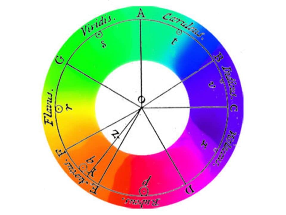
Isaac Newton furthered da Vinci’s theories in the early 18th century. Newton passed white light through a glass prism, discovering that it broke down into colors, similar to a rainbow. These colors, known as spectral colors, formed the basis of his color circle. According to Newton, Red, Green, and Blue are the primary colors, combining to create White. In Newton’s color theory, Black represents the absence of light.
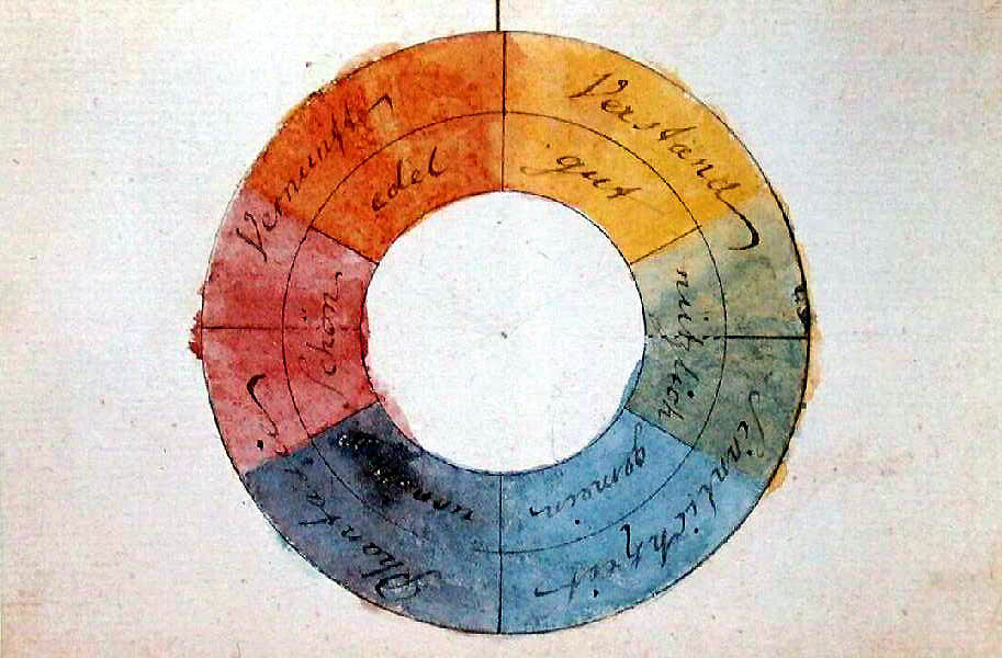
Goethe’s color theory 1800
Goethe’s color theory is based on an elemental, polar opposition of light and dark. He explains colors as boundary phenomena between light and darkness. Yellow lies at the boundary of brightness („first at light“), and blue at the boundary of darkness („first at darkness“). The blue of the sky arises from the ancient Greek concept of turbidity, as atmosphere, through a transparent medium, the air, against the darkness of space. According to Goethe, colors arise from the mixture of light and darkness, in the semi-darkness. However, consistently implementing this idea means that the addition of spectral colors could never result in white light, leading to Goethe’s disagreement with Newton.
Goethe’s color theory starts with only two pure colors. He emphasizes that purple cannot be mixed from other colors. Therefore, he takes yellow, blue, and red as pure paint colors. After observing a color, our eye produces the complementary color (successive contrast), prompting Goethe to represent these color pairs diametrically opposite each other in a circle. He also assumes a progression of colors towards purple, placing purple at the top of the circle. Consequently, green, as the complementary color and counterpart, is at the bottom. Blue is to the left of green, and yellow to the right, which, when mixed, produce green. Yellow-red is between yellow and purple, and blue-red is between blue and purple.
The part of his color circle transitioning from yellow to red is seen by Goethe as the positive side, while the other half towards blue is the negative side. He associates yellow with effect, light, brightness, power, warmth, proximity, and repulsion, and blue with deprivation, shadow, darkness, weakness, cold, distance, and attraction. Goethe’s main intention was to determine the „sensory-moral effect“ of each color „on the sense of sight (…) and through its mediation on the soul.“ He sees color „as conscious contents of sensory qualities,“ emphasizing the psychological impact of colors:
Colors on the positive side „are lively, vibrant, and aspiring.“
Yellow appears „magnificent and noble, creating a warm and comfortable impression.“
Colors on the negative side „contribute to a restless, soft, and yearning sensation,“ and
blue „gives us a feeling of cold.“
Goethe’s work had a lasting impact on color theory, although it faced rejection at times, mainly due to the physical aspects that align with a holistic classical-natural scientific worldview, contrasting with Newton’s mathematical-scientific approach. The historical overview of color theory and especially Goethe’s texts on the psychological effects of colors continue to influence thought today. From a contemporary perspective, Goethe’s and Newton’s color theories arise from two incompatible worldviews and must be considered side by side and in historical context.
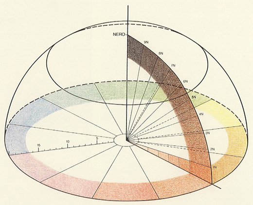
Chevreul constructed a 72-part color circle, featuring three primary colors—Red, Yellow, and Blue—along with three primary mixtures—Orange, Green, and Violet, and six additional secondary mixtures. The resulting sectors are divided into five zones, and each radius is segmented into 20 sections, representing various brightness levels. Here, for the first time, we encounter the active role of the brain in color perception, suggesting that colors are, in a sense, actions of the world within our minds.
During Chevreul’s search for a practical color organization for textile production, he delved into the laws of color contrasts. His 72-part color circle defines shades through changes in a color’s intensity towards white (higher intensity) or black (weaker intensity), with ten possible steps according to Chevreul.
Within Chevreul’s color circle, you find three subtractive primary colors (Red, Yellow, and Blue), three secondary colors (primary mixtures Orange, Green, and Violet), and six secondary mixtures. The resulting sectors are grouped into five zones, and each radius is divided into 20 sections, indicating different brightness levels. The notation reflects the proportions of colors; for instance, 9B/1C means 9/10 Black and 1/10 of the corresponding color.
With the hemisphere, Chevreul attempts a physical representation of colors in space. The axis of Black serves as a ray exploring various intensity levels.
Chevreul believed that the multitude of color tones and their harmony could be defined through numerical relationships. His aim was to provide artists using colored materials with a comprehensive tool. Despite the influence of harmony theories, such as „Harmonie d’analogues“ (Harmony of Analogy) and „Harmonie de contraste“ (Harmony of Contrast), Chevreul could not identify a law of color harmony. It simply does not exist.
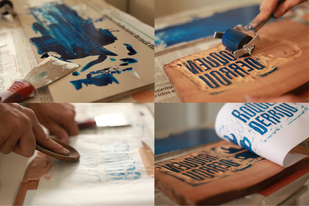
To delve deeper into the topic, I looked at some examples of handmade designs that I found online. Among others I found a Logo-Design that was handcrafted as a wooden stamp and therefore has a recognizably handmade and imperfect look to it. I also found the branding for a food brand, which includes a hand drawn Logo typeface as well as an imperfect circle as a logo element and I found a typeface, where the letters are hand embroidered. This again leads to the question of when handmade gets too much and is therefore hard for the recipient to decode.
During this research I noticed that this handmade design was often part of a Corporate Design and used specifically for branding. I consider this to be one way of limiting my topic to something fitting for a thesis, but for now I want to explore this design-style in a broader sense. Especially since I know that a lot of old, analog media are currently experiencing a revival, like analog-photography and vinyl, I think there are a lot of different aspects to explore here.
I also noticed that the brands using this design-style, where mainly smaller and produce handmade products themselves, which made me think about big brands that use a handmade design style. For now, I could only think of stüssy. Even though a lot of big brands such as Disney or Ray Ban use hand lettering, the logos have been cleaned up on a computer so well, that they don’t have this feeling of real handwriting anymore. This is interesting, especially because the Disney Logo Font is inspired by the autograph of Walt Disney.
I was also still wondering since I started to deal with this topic if it really is a trend. Since trends happen quickly, I looked for articles instead of scientific proof first and found a lot of magazine-type texts online, saying that not only hand drawn illustrations are a current graphic design trend this year, but also natural-looking design as well as references to traditional media with visible imperfections. (e.g.: https://www.adobe.com/express/learn/blog/graphic-design-trends). Therefore I find it interesting how this trend will evolve further.
With this third post, I present other ways of merging editorial and digital experiences. This time, the researched methods are innovations, that are still not used widely.
Conductive Ink Conductive Ink is a printed object which conducts electricity. For example, this technology is used in packaging. A code made of conductive ink is applied to the product package, either printed on it or embedded within it, situated beneath or within the graphic inks. To activate this conductive ink, customers simply need to touch the package or product with their mobile device while holding it. A reader can in this way access digital content of any kind, including videos, music, or web pages, simply by touching a link on a book’s page. [1]
Clickable Paper Clickable Paper™ represents an interactive printing solution utilizing image recognition software to link physical prints with digital content. It enables the inclusion of up to six links on any printable material, connecting to various rich media outcomes such as websites, videos, and e-commerce portals for each link. Additionally, it allows mobile devices to perform actions like initiating a phone call, accessing a map, or sending an email or tweet. [2]
Fujitsu’s FingerLink This innovative technology allows you to use your fingers to operate a scanner and projector, serving as a link between digital and analogue technologies to interact with printed information. [3]
Near Field Communication (NFC) Tags: NFC tags embedded in printed materials can enable a seamless connection between the physical and digital realms. Users can tap their NFC-enabled devices on the printed material to access additional content, links, or interactive experiences. This technology is used, for instance, in contactless payments. [4]
With this second post, I present other commonly used ways of merging editorial and digital experiences. Each of them is also accompanied by some examples of well-known magazines.
Additional contents online Magazines are extending their editorial reach by offering complementary content online. This could include exclusive interviews, behind-the-scenes footage, or multimedia elements that enhance the reader’s understanding of the articles. Some magazines also use apps where this content can be reached more easily. To connect the paper version to this additional content often QR codes are used, or it is simply written to check out the website.
The New Yorker For instance, The New Yorker, an American magazine, provides a blend of print and digital experiences with its online articles, multimedia content, and podcasts. It has a well-developed mobile app that offers a user-friendly interface for readers on the go. [1]
Social media Integration I already mentioned the role of social media and how people share what they think about what they read there. However, this time I researched more about how some magazines use social media to engage with their readers. Social media can help create a sense of community around the magazine brand. Readers can share their favourite articles, comment on posts, and participate in discussions, fostering a more interactive and social reading experience. Moreover, the magazine can reach a wider audience by choosing captivating social media content.
The National Geographic For example, National Geographic, a magazine about travel exploration and science, uses different platforms to engage the readers in different ways. It uses Instagram, which features beautiful photographs, short video clips, and engaging captions. On Twitter, National Geographic maintains an active presence by sharing real-time updates and facts. Through Facebook National Geographic encourages followers to share their travel experiences and thoughts on articles. Through Snapchat short documentaries are shown. Finally, National Geographic runs interactive campaigns on TikTok. These may include challenges related to conservation efforts, photography skills, or cultural exploration, encouraging users to engage creatively with the magazine’s content. [2]
Scanning-text apps Another way in our everyday life in which editorial and digital experiences are merged is through OCR technology to recognize and extract text from images, enabling various applications in document digitization, data extraction, and text analysis. One example of this is Google Lens. This is an external tool but it can be used together with printed text to translate it or to recognize images. Moreover, if you take photos of a book it can be recognized and Google Lens can show you reviews and summaries. [3]
Guidance systems are the invisible hands that steer us in the right direction, offering a sense of security and assurance. In various domains, from healthcare to festivals, these systems play a crucial role in enhancing efficiency, safety, and overall user experience. Whether it‘s the GPS in our cars, the navigation apps on our smartphones, or the sophisticated algorithms guiding spacecraft, these systems have become integral to our modern existence.
Optimizing Festival Experience:
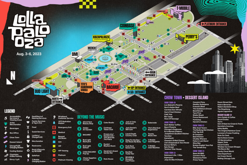
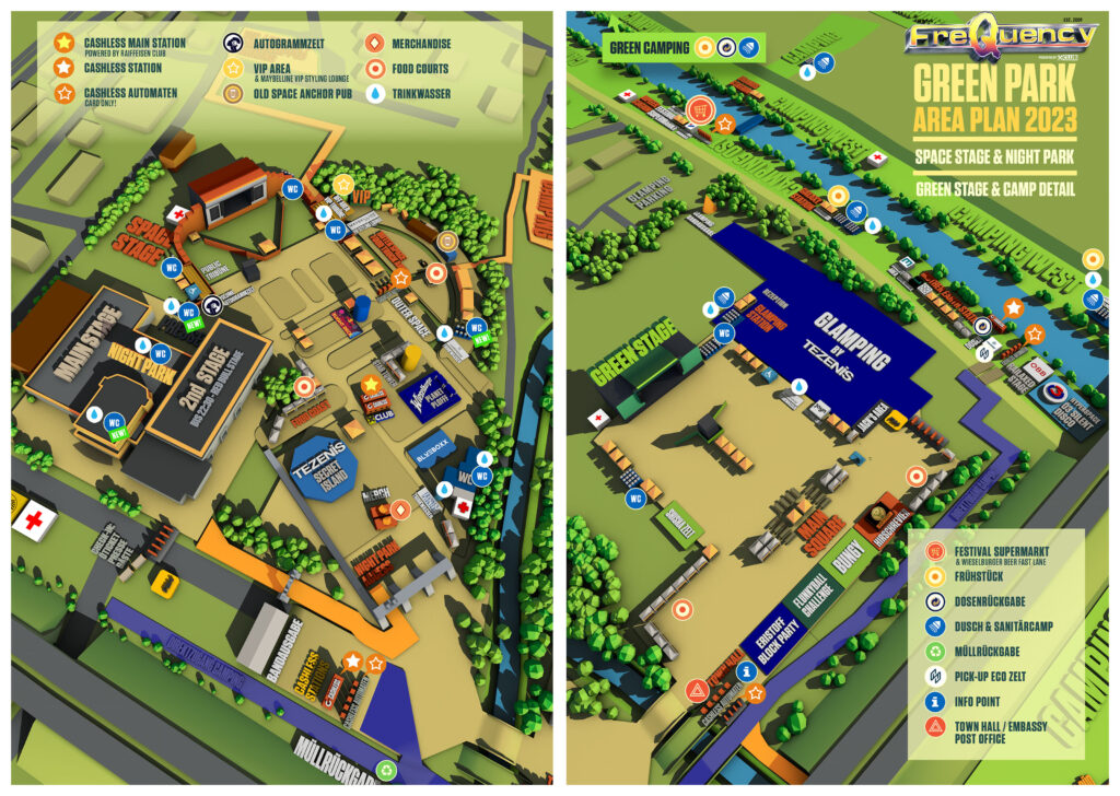
Guidance systems enhance the experience of festivals by helping attendees effortlessly navigate through the festival grounds. The festival locations are often the size of small towns. For five days, the entire life of the visitors takes place on this one site. As the location is new and unfamiliar, visitors don‘t know their way around at first. Whether it‘s locating stages, food stalls, or restrooms.
A well-designed guidance system ensures that festival visitors can focus on enjoying the music and festivities rather than getting lost in the crowd.
Why are Guidance Systems so nessesary at music festivals?
Safety First:
Large crowds and dynamic environments can sometimes pose safety concerns. Guidance systems contribute to the safety of attendees by providing real-time information about emergency exits, medical facilities, and assembly points. In case of an unforeseen situation, quick and accurate navigation can be a lifesaver.
Area Plan of Lollapaloza and Frequency festival
Customized Festival Journeys:
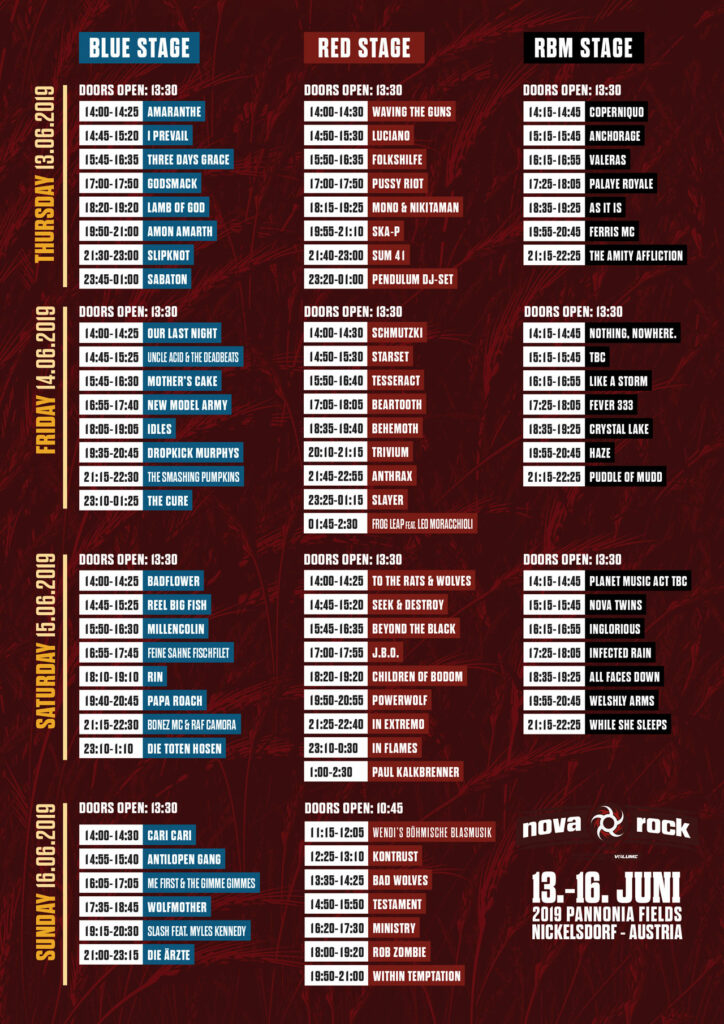
Music festivals offer diverse lineups with stages hosting performances simultaneously. Guidance systems can be personalized, allowing attendees to create their own schedules and receive real-time directions to their preferred acts. This customization adds a layer of personalization to the festival experience, ensuring that attendees make the most of their time.
Line Up/ Timetable Nova Rock
Interactive Engagement:
Modern guidance systems are not just about providing directions; they are interactive tools that engage festival-goers. Augmented reality features, interactive maps, and gamified elements can turn the navigation process into an enjoyable part of the overall festival experience.
Environmental Considerations:
With an increasing focus on sustainability, guidance systems at music festivals can also play a role in promoting eco-friendly practices. By highlighting eco-conscious areas or trying to reduce waste (instead of print using a festival app) these systems contribute to a greener festival footprint. For example the Frequency Festival has a so-called Green Team, which encourages festival visitors to recycle their waste. This promotion is also part of the guidance system of this festival.
Green Team and Green Camping Frequency Festival
Next steps:
The basics of guidance systems. How are they made, what should they look like and how can they help create a great festival experience.
future and trends in guidance systems.
challenges at music festivals, understanding the festival environment