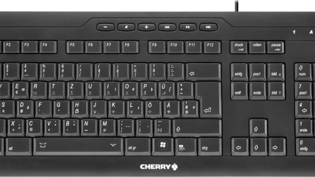
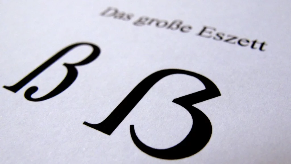
Cumbersome Key Combinations The placement of the letter „ß“ on German computer keyboards is neither practical nor convenient. It resides at the top of the numeric row, sharing space with dollar and paragraph symbols, patiently waiting to be acknowledged. However, inputting „ß“ on computer keyboards requires a bit of finger acrobatics. When typing uppercase letters on the screen, the Shift key is typically held down while pressing the corresponding letter. However, attempting to type the uppercase „ß“ often results in a large question mark. What seems like a straightforward key combination turns out to be a minor challenge, prompting users to seek alternatives.
Windows Computers: On Windows computers, typing the uppercase „ß“ involves cumbersome key combinations: Alt Gr, Shift, and the „ß“ key, or for those who prefer complexity, holding down the Alt key and typing 7, 8, 3, and 8 on the numeric keypad. However, this method depends on the selected font supporting the uppercase „ß,“ which is not the case for all fonts.
MacBooks: For Mac users, there is no specific key combination; they must replace certain character combinations with the uppercase „ẞ“ or copy and paste the glyph from the internet. If you frequently need the uppercase „ẞ,“ you can enable symbol and text replacement in system settings under „Language & Text > Text“ and assign a key combination for the uppercase „ẞ.“ For example, you can set the character string „!!S“ to be replaced by the uppercase „ẞ.“
Smartphones: Smartphone users can press and hold the „s“ or „S“ key to access a variety of alternative glyphs, including both lowercase and uppercase „ß,“ which can then be selected.
DIN Standard There is indeed a possibility that the ‚ß‘ could find its place on a different key, similar to the Euro symbol on ‚E‘ or the ‚@‘ on ‚Q‘. This promising solution is outlined in the DIN Standard 2137 titled „Keyboards for Data and Text Input.“ The standard is collaboratively developed by the German Institute for Standardization (DIN), involving representatives from the business sector, research, and user communities. While not mandatory, most companies adhere to this standard. Even the typically independent designers at Apple seldom make fundamental changes to key assignments. In some instances, they might, at most, relocate the ‚@‘ from ‚Q‘ to ‚L‘ or replace the Alt Gr key with the Option key.
DIN Standard 2137 defines three standard keyboard layouts for the German region: T1, T2, and T3. T1 represents the layout of a typical German keyboard, which most people have likely used at some point. T2 and T3 are essentially similar but offer an extended range of special characters, albeit potentially leading to a certain level of complexity.
For the uppercase ‚ß,‘ a T2 keyboard is sufficient, created using Alt Gr and H. Currently, only the manufacturer Cherry from Auerbach in the Upper Palatinate offers such a device in the T2 version, denoted as the Europe keyboard (G85-23100). It covers most European languages based on the Latin alphabet.
Keyboard manufacturers are eagerly anticipating an update to the DIN Standard for keyboard standards. Presently, the Committee for Ergonomics and the Committee for Information Technology and Applications at DIN are jointly working on a solution for the ‚ß‘ problem. However, it is likely to take several more weeks before this solution is finalized. According to recent information, consideration is being given to replacing the degree symbol (°), a small superscript circle, with the uppercase ‚ß.‘ This would mean placing the uppercase ‚ß‘ on the left edge of the numeric row next to ‚1,‘ while the lowercase ‚ß‘ remains on the right edge next to ‚0.‘
Nevertheless, it appears unlikely that an additional key specifically for ‚ß‘ will be added, despite the simultaneous inclusion of keys that are rarely or never used by most users, such as the „Scroll Lock“ key. The decision to forgo a dedicated key could be driven by the desire to limit keyboard complexity and ensure user-friendliness is not compromised by an excessive number of keys.
The Introduction of the Uppercase Eszett in the Unicode Standard After the initial proposal by Andreas Stötzner was rejected in 2004, the debate on including the uppercase sharp „ß“ continued. In 2005, the Council for German Orthography acknowledged the issue and recognized the need for a solution. However, the Council emphasized that an initiative from the writing community, particularly typographers, was necessary to establish an alternative representation for the uppercase „ß.“
In this context, on April 27, 2007, the German Institute for Standardization (DIN) submitted a renewed proposal for the inclusion of the uppercase Eszett as „LATIN CAPITAL LETTER SHARP S“ to the Unicode Consortium. Germany was represented by members of the DIN-NIA 29.01 (Coded Character Sets) during the relevant session. In the 50th meeting of the International Organization for Standardization (ISO) and the International Electrotechnical Commission (IEC) Working Group from April 23 to 27, 2007, it was finally decided that the uppercase Eszett should be assigned the code point U+1E9E in the Unicode Standard, following this proposal.
The decision was implemented, and on April 4, 2008, the uppercase sharp „ß“ was officially included in Unicode Standard Version 5.1. It was assigned the code point U+1E9E, marking a significant advancement in supporting German orthography and typography.
The inclusion of the uppercase „ß“ in the Unicode Standard greatly facilitated its accurate representation in digital texts and typesetting systems, becoming a crucial element in digital font design for the German language.
Technical Details Glyphe: ẞ Unicode: U+1E9E Unicode-Bezeichnung: LATIN CAPITAL LETTER SHARP S HTML (dezimal): &-#-7-8-3-8;
Understanding Chaos Theory: Small Actions, Big Effects
Chaos theory is a complex mathematical concept that seeks to comprehend the profound impact of small actions. Some believe it elucidates random occurrences, particularly in finance or weather prediction. Despite initial predictability, chaotic systems eventually manifest as unpredictable.1
Found in mechanics and mathematics, chaos theory explores seemingly random behavior governed by deterministic laws. The term „deterministic chaos“ encapsulates the paradoxical connection between randomness and predictability. Traditionally, randomness was perceived as apparent and linked to the world’s complexity. Recent studies reveal that even seemingly simple systems can behave unpredictably due to extreme sensitivity to initial conditions.2
In chaos theory, the evolution of systems undergoes unexpected shifts from order to disorder. This nonlinear system explores connections in seemingly random events, focusing on rules governing nuances, sensitivities, and unpredictable changes.
Patterns Across Scales
Introduced by mathematician B. B. Mandelbrot in 1975, fractal geometry emphasizes self-similar patterns across different scales. Despite appearing irregular, fractals share some similarity with the overall pattern. Their repeating pattern across scales aids in creating hidden order models and rules, utilized in mathematical graph theory for graphics.
Chaos in Graphic Design: The Art of Unpredictability
Chaos theory, exploring complex and unpredictable systems, influences graphic design through nonlinear graphics created with computers. Chaos graphics redesign text, images, and colors in two or three-dimensional space, leading to ever-changing visuals due to the unpredictable design process.
Designers learn to create using different shapes and ideas, like breakup, gradient, radiation, and duplication. Rules follow a certain pattern and are organized in a specific space, appearing somewhat disorderly in chaotic areas. Technical support enables designers to create fractal forms. Famous buildings like the Bird’s Nest and Water Cube in Beijing exemplify chaotic graphics, appearing disorderly yet constructed with scientific calculations.
Chaos in Design Thinking
Design creativity, a non-linear and chaotic storm of thoughts, involves a constant collision of innovative sparks. Chaos graphics blend logical, associative, divergent, and reverse thinking, resulting in unexpectedly beautiful outcomes. When designers adapt, think unconventionally, draw insights, and use exaggeration and transformation, their designs are filled with inspiration, uniqueness, and creativity.
Abstract and Concrete Chaos Graphics
Analyzing chaotic graphic design rules reveals two types: abstract chaos graphics and concrete chaos graphics. Designers can create different styles through stacking, separating, intersecting, mutually cutting, and combining functions by reorganizing graphics, changing scales, transforming dimensions, and playing with colors.3
Chen, Shouming: Application of Chaos theory in creative graphic design. In: 2011 IEEE 2nd International Conference on Computing. Control and Industrial Engineering, Wuhan, China, 2011, pp. 302-305, doi: 10.1109/CCIENG.2011.6008018. ↩︎
The Lüscher Color Test, developed by Swiss psychologist Max Lüscher in 1947, assesses the mental and physical state of an individual, determining their performance, resilience, and communicative tendencies through color choices. It claims to contribute to genuine well-being and can influence preferences, including fashion choices.
Here are the key points about the test:
Online Availability: The test is available online, but users should note that browser displays may not precisely replicate the original colors due to fine shading differences.
Psychological Insights: By selecting colors, individuals can uncover personal conflicts, revealing 34 partly unconscious personality aspects. Color choices offer honest insights, avoiding potential distortions present in questionnaire responses.
Test Evaluation: The test results provide indications of personality assessment and comprehensive recommendations for avoiding future stressors.
Max Lüscher: Max Lüscher, currently residing in Lucerne, is a philosopher and psychologist who integrated his passion for colors into his work. His color test finds applications in clinical diagnostics and various industries.
Color Psychology: Lüscher associates basic orientations with colors, such as Blue for contentment and connection, Green for self-esteem and inner control, Red for confidence and drive, and Yellow for unfolding potential and future expectations.
Test Administration: Depending on the context, the test may involve eight to 73 color cards. It’s crucial to interpret results as reflections of the current emotional state, not as fixed personality traits.
Procedure: Test-takers view colors under good lighting, and the browser should ideally provide accurate color representation. Participants should neutrally accept colors without imagining more vibrant shades.
Card Arrangement: The participant arranges cards in a sequence based on personal preference, ranking from the favorite card on the left to the least favorite on the outer right. After flipping the cards, the numbers on the back are noted.
Interpretation: The resulting number combinations correspond to a brief evaluative text, available in associated literature or supplementary online materials.
The Lüscher Color Test is valuable for decisions involving color, offering insights into one’s emotional state and preferences.
„Hard Edge“ is an art movement closely related to Concrete Art, primarily developed in North America. It represents an evolution of color field painting, distinguishing itself by sharply defined edges between color fields, eliminating transitional areas. In essence, it emerged as an offshoot of color field painting, with the critical distinction lying in the clear separation of colors without any gradients. To illustrate, consider a Hard Edge work by Ellsworth Kelly and a color field painting by Mark Rothko.
Originating in the late 1940s, the movement’s roots can be traced to artists like Barnett Newman, Ad Reinhardt, Mark Rothko, and Clyfford Still, who laid the foundation for color field painting. Departing from the gestural and expressive brushstrokes of action painters, they arranged monochromatic color fields on the canvas. In the 1950s, Hard Edge developed as a direct successor to color field painting.
The term „Hard Edge,“ coined by art critic Jules Langsner in the late 1950s, emphasizes the defining feature of this style—sharply delineated contour lines between color fields. Within these fields, one often observes simple geometric shapes, highlighting the affinity with geometric and Concrete Art. Similar to color field painting, Hard Edge emphasizes the flatness of executed color fields, with a noticeable absence of visible brushstrokes. Consequently, the artist’s personal touch is rarely discernible.
Notable figures in the Hard Edge movement during its zenith in the late 1950s and the 1960s include American painters Al Held, Ellsworth Kelly, Kenneth Noland, and Frank Stella. Many of these artists were featured in the influential exhibition „Post Painterly Abstraction,“ curated by Clement Greenberg in 1964 at the Los Angeles County Museum. This association often leads to the classification of Hard Edge as a variant of Post Painterly Abstraction.
Color Field Painting
Color Field Painting emerged in the United States around 1948 and is characterized by paintings featuring monochromatic color fields arranged within the picture space. Key figures in this art movement include Barnett Newman, Mark Rothko, Ad Reinhardt, and Clyfford Still. The central mechanism of these paintings is often associated with the concept of the sublime, aiming to evoke feelings of meditation and transcendence. Artists, particularly Barnett Newman, designed their works to be viewed from a close standpoint, encouraging contemplative immersion in the artwork. Newman, in his essay „The Sublime is now“ (1948), also reflected on the theoretical aspects of the sublime.
Considered part of Abstract Expressionism, Color Field Painting, like Action Painting, is regarded as an expression of the New York School. Despite apparent differences, such as the absence of defined backgrounds and the use of large formats, both styles share features like the principle of hierarchical „All over.“
Within Color Field Painting, artists approached their work differently. For instance, Mark Rothko placed softly delineated color fields on monochromatic backgrounds, creating an inherent sense of movement. In contrast, Barnett Newman used clearly defined color fields in his paintings. Newman’s series „Who’s Afraid of Red, Yellow and Blue I-IV“ (1966-70) became iconic in the Color Field genre. Ad Reinhardt’s „Black Paintings,“ created between 1954 and 1967, pushed the boundaries of perceptibility of color and form values.
Two significant exhibitions played a role in positioning Color Field Painting: Clement Greenberg’s curated exhibition „Post Painterly Abstraction“ in 1964 and the 1965 exhibition that brought together painters like Gene Davis, Thomas (Tom) Downing, Morris Louis, Howard Mehring, Kenneth Noland, and Paul Reed, collectively known as the „Washington Color Painters.“
Color Field Painting flourished in the 1950s and 1960s, exerting a significant influence on subsequent art movements, including Hard Edge, Signalism, and Minimal Art.
Digital Innovations in Alcohol Marketing: Connecting with Consumers
In an era marked by the rise of microbreweries, distilleries, and online shopping, alcohol brands seek data-driven insights and detailed audience personas for effective digital marketing. From compelling storytelling to harnessing social media, influencers, and content marketing, these brands aim to amplify their voice and connect with consumers more deeply.
Alcohol holds a significant place in social and professional gatherings, with research indicating a high percentage of adults having consumed alcohol at some point in their lives. Despite strict advertising regulations, the alcohol industry remains at the forefront of branding and digital outreach efforts.
Understanding industry regulations is vital for reaching a wider audience. With data-driven insights and well-defined audience personas, alcohol brands can implement systems to convert more customers, especially in today’s competitive market marked by the proliferation of microbreweries and distilleries.
The alcohol consumption landscape has evolved, with a significant increase in online shopping and a changing societal culture surrounding alcohol. Subscription boxes in the alcohol industry, like Flaviar and Winc, have reshaped how younger generations interact with alcoholic products. Additionally, preferences for generic brands over name brands underscore the importance of integrating digital strategies into marketing campaigns to stand out amidst competition.
For distilleries, breweries, and alcohol brands, packaging and label design play crucial roles in standing out on crowded shelves. Managing brand reputation, leveraging stories, and resonating with audiences through content syndication are essential for long-term connections.
The aesthetics of the bottle have become pivotal, with manufacturers focusing on packaging that appeals to consumers, promoting smaller servings and supporting social causes. Direct-to-consumer sales have gained prominence, offering accessibility to a wider market and potential consumers unfamiliar with specific branded products.
Social media serves as a valuable tool for alcohol marketing, enabling brands to engage with consumers and create B2C connections. Effective strategies include focusing on lifestyle aspects rather than solely on drinking, offering exclusive access, and engaging with user comments and questions.
Content marketing has become integral for alcohol brands, allowing them to sell unique experiences and stories. Rather than just pushing products, these brands employ social media posts, blogs, influencer articles, and more to resonate with their target audiences, ultimately aiming for higher conversion rates.
The Influence of packaging Design Perceived Quality of Alcohol
Research reveals packaging significantly shapes consumer perceptions of alcoholic beverages, notably in color, bottle shape, and label design. However, limited research examines how these factors interact. In a saturated market like craft breweries, distinction is crucial. A study on beer packaging found label color and bottle type greatly influenced consumer evaluations, favoring a combination of „Bomber“ bottle shape and warm-colored labels for maximum preference. The Bomber shape associated with premium quality and warm colors linked to positive sensory expectations.
Current Trends in Alcohol Categories
Beer Packaging Design: The craft beer movement’s creativity remains prominent, mostly altering can designs for boldness or sophistication. However, the industry might be facing a saturation point with cosmic and vibrant designs, necessitating on-shelf testing.
Hard Ciders and Fermented Drinks: Fruit brews diversify choices, challenging traditional hard apple cider sales. While apple cider sales have declined, there’s anticipation for a revival due to its historical significance.
Liquor: Storytelling dominates liquor packaging. Brands strive for sophistication and nostalgia to create timeless allure, with successful outcomes like WhistlePig’s 22% revenue increase.
Infused Seltzers: These captured market shares during lockdowns, providing at-home mixed drink experiences. Although bars are reopening, their popularity might persist due to practicality.
Wine: Despite Barefoot Wines’ disruptive entry, minimal changes in wine packaging have occurred. Sustainable packaging is gaining traction among eco-conscious consumers.
Mini Alcohol Bottles: Once convenience store staples, these single-serve options expanded due to the pandemic. They can now be part of personalized experiences or meal kits, offering varied mixology options.
Alcohol Packaging Strategies
Envisioning Experiences: Packaging should align with customer experiences at bars, restaurants, and retail stores. Brand success often hinges on social acceptance in social environments.
Understanding Retailers: Alcohol packaging needs to adapt to specific retail environments to stand out. Simulating buying experiences aids in gauging competitive edge.
Private Label and Direct-to-Consumer Approaches: Brands can leverage expertise to become private-label sources or explore direct-to-consumer models for profitability.
Sustainable Packaging: Despite consumer interest in eco-friendly options, it doesn’t always translate to brand loyalty. Testing for purchase drivers, like sustainability, is essential.
Mixed Drink Recipes: Providing consumers with mixed drink recipes enhances their experience. Including QR codes for online recipes can further engage customers and increase product appeal.
The Impact of Packaging Design in Neuromarketing
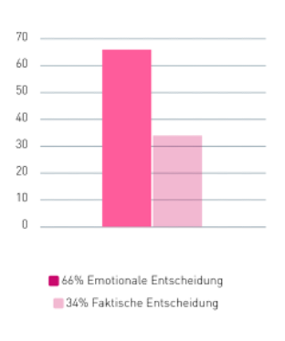
According to neuromarketing, most decisions, including purchasing, are made unconsciously and emotionally. When packaging design resonates with consumers‘ intuitive autopilot, success is nearly assured.
Unconscious Decision-Making: Neuromarketing emphasizes that a majority of decisions, especially purchases, occur unconsciously and emotionally. A well-designed packaging appeals to consumers‘ intuitive autopilot, enhancing success.
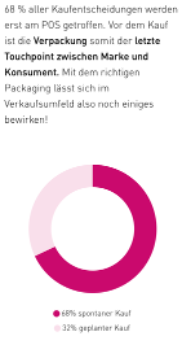
Final Touchpoint at the Point of Sale: About 68% of purchase decisions are made at the point of sale (POS). Packaging becomes the last connection between the brand and consumers before purchase. Effective packaging design can significantly influence sales in this environment.
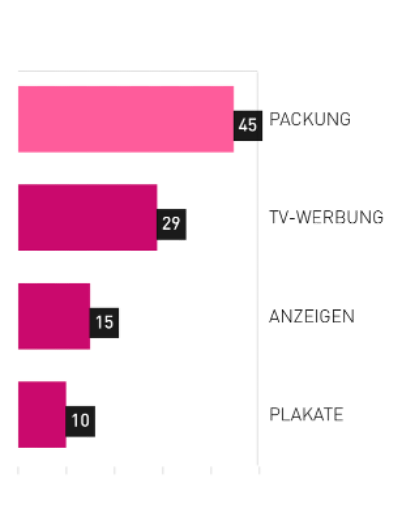
Building Brand Loyalty: Packaging stands out as a powerful tool to generate substantial brand loyalty. Despite relatively low costs, packaging carries extensive reach, connecting with consumers even within their homes.
In diesem Beitrag habe ich einen Blick auf die verschiedenen Typen von Leitsystemen geworfen, die bei Musikfestivals eingesetzt werden.
Statische Leitsysteme
Statische Leitsysteme bilden das Rückgrat der Wegweisung auf Festivals. Hierzu gehören:
Schilder und Beschilderung
Traditionelle Schilder mit klaren Piktogrammen und Hinweisen sind unverzichtbar. Sie informieren über Bühnen, Essensstände, Toiletten und andere wichtige Punkte. Gut gestaltete Schilder können die Orientierung verbessern und so zu einem reibungslosen Ablauf beitragen.
Bodenmarkierungen
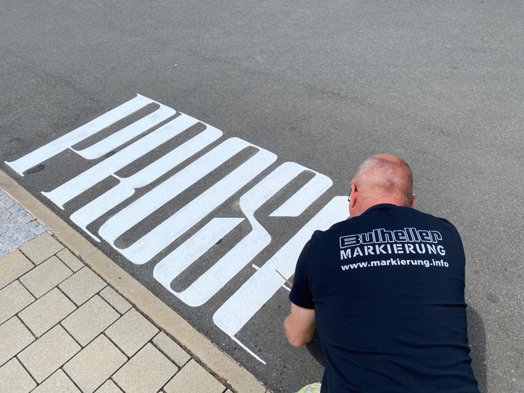
Bodenmarkierungen sind besonders effektiv, um Besucherströme zu lenken. Helle, gut sichtbare Markierungen können helfen, Engpässe zu vermeiden und den Verkehrsfluss zu optimieren.
Dynamische Leitsysteme
Dynamische Leitsysteme nutzen moderne Technologien, um flexibel auf Veränderungen zu reagieren:
Einsatz von digitalen Anzeigen
Große Bildschirme oder LED-Anzeigen können dynamisch Informationen anzeigen, wie z.B. Änderungen im Programm oder Hinweise auf besondere Events. Diese Systeme ermöglichen eine schnelle Aktualisierung von Informationen.
Festival Apps
Die Apps bieten eine gute Übersicht über das gesamte Festival. Geländepläne, Timetables und aktuelle Informationen (zB. Zeitplan Verschiebungen, Gewitterwarnungen) werden sofort auf dem Handy angezeit.
Mobile Leitelemente
Mobile Leitelemente wie Fahnen oder Ballons können je nach Bedarf verschoben werden, um Besucherströme zu lenken oder auf besondere Bereiche hinzuweisen. Diese Flexibilität ist besonders bei unerwarteten Ereignissen wichtig.
In der Praxis setzen viele Festivals auf eine Kombination aus statischen und dynamischen Leitsystemen, um eine optimale Navigationsstruktur zu schaffen.
Lighting design is integral to setting the mood in any dining space. Designers consider not only the functionality of lighting but also its psychological impact. Ambient lighting creates a welcoming atmosphere regardless of the time of day, while functional lighting ensures customers and staff can perform tasks comfortably. Accent lighting is strategically used to highlight specific areas, creating visual interest. The psychology behind lighting doesn’t stop at functionality; it influences dining behavior. Bright lighting in fast-food establishments aims to prompt quicker eating and turnover, whereas softer, warmer lighting in fine dining restaurants encourages relaxation, leading patrons to linger, order more courses, and perhaps another bottle of wine. The interplay between lighting and human psychology significantly shapes the dining experience.
Seating Strategies: Restaurant Chairs and Furniture
Furniture plays a pivotal role in dictating customer behavior. In fine dining establishments, the emphasis is on comfort and support to encourage patrons to savor their meals, promoting a relaxed and leisurely dining experience. Contrarily, fast-food or high-turnover restaurants prioritize different seating strategies to accommodate quick dining and turnover. Effective seating arrangements involve a balance of table sizes to accommodate various party sizes, ensuring comfort while maximizing space utility. The psychology of furniture design influences not only the dining duration but also the overall customer satisfaction and comfort level.
The Art of Colors: Color Psychology in Restaurant Design
Color psychology profoundly impacts the ambiance and emotional responses within a restaurant. Warm colors like reds, oranges, and yellows are known to stimulate energy levels and appetites, potentially increasing food consumption. Conversely, cooler tones like greens evoke feelings of healthiness, relaxation, and sometimes, in combination with certain lighting, can even encourage a slower pace of eating. Designers leverage these color associations to craft specific atmospheres that align with the restaurant’s theme or cuisine, aiming to influence diners‘ emotional experiences and perceptions.
Crafting Food Concepts: The Psychology of Menu Design
Menu design involves a complex interplay of psychology and aesthetics. It encompasses aligning the menu with the restaurant’s brand, emphasizing dish descriptions that evoke sensory experiences and highlight ingredients to entice customers. Psychological aspects extend to the menu layout, font choices, and even pricing presentation. A well-designed menu engages customers through storytelling elements, provides relevant information through a glossary, and strategically avoids common design pitfalls, such as unreadability or an excessive emphasis on prices. Properly executed menu design not only guides customer behavior but also reinforces the restaurant’s identity and influences purchasing decisions.
Avoiding Common Mistakes:
Overemphasis on Prices: Arranging prices in a column might lead customers to focus solely on the price rather than the dish description or quality.
Monotonous Design: Employing the same graphic design for all menu items can result in a lack of distinction among dishes, potentially affecting sales potential.
Poor Salesmanship: Neglecting to highlight specific items through graphics, fonts, or illustrations might reduce the restaurant’s influence on customer choices.
Incongruent Design: Creating a menu that doesn’t align with the restaurant’s décor or personality could create a disconnect in customer perception.
Size and Layout Issues: Oversized menus may be cumbersome, impacting the overall dining experience negatively.
In contrast to the analysis about Wilderness International – this time I will take a look at Soko Tierschutz. A non-profit association in germany. First to say is that this blog will not go into the moral and ethnic side of this topic – it only looks on the advertising and design of communication for protection of wildlife / animals and nature.
What is Soko Tierschutz?
On their own website they write this: „
SOKO Tierschutz is independent and strictly non-partisan. We want to restore the word animal welfare to its original meaning, which has been watered down beyond recognition by the large organizations. Animal welfare means protection from death, pain and fear. The clear consequence is the implementation of animal rights and a vegan lifestyle. To achieve this, we go where animals suffer. … We show the reality behind the walls and fences. Our tactic is investigative research, our aim is to uncover the truth about animal husbandry and its consequences for the environment and the consumer. We distance ourselves from all violence against living beings and objects, hate speech and contempt for humanity. The enforcement of animal rights is only possible in a peaceful democratic way, taking into account the rights of all living beings.“1
So they are no extremistic organisation or some kind of this – but they use the real footage from all their investigations to portrait the criminal offenses or moral injustice which is happening. Since Friedrich Mülln founded Soko Tierschutz in 2021 they could already close 14 slaughter houses and 4 animal testing laboratories which where obviously operating with illegal standards and brutal cruelty. They investigate and make professional research which is used in court to close these companies. But in addition they also have uncovered many more animal abusers in different cases.
What are their working methods?
They have the expertise and give people the information to make their own decision. Especially with slaughter houses it´s kind of a problem, as people know that animals have to die so that there is meat to buy – but a normal customer doesn´t see how it is done and how often it is done in a far more cruel way as it would have to. They show what is happening and how often it is not like we assume. I for my part already thought everybody knows that
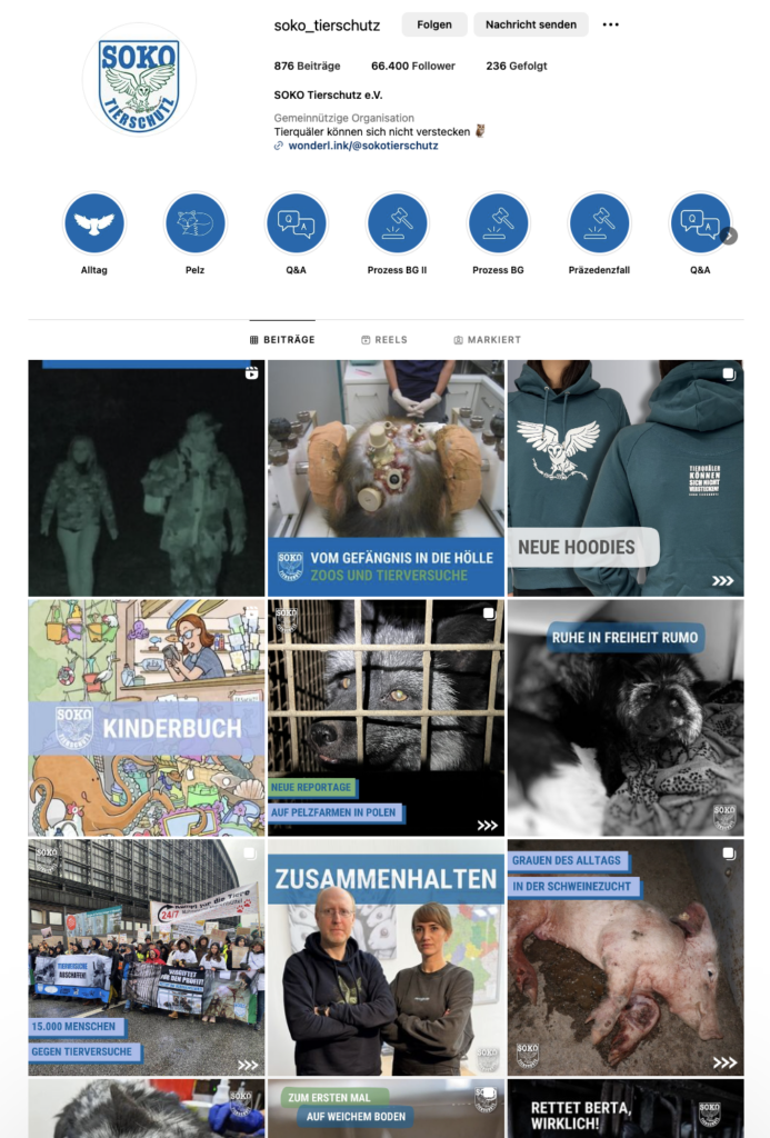
That is their instagram: I won´t put in more images as they might be disturbing to some people and you can go on their website or social media yourself if you want to see how it looks:
Vision Identity
They work with a very formal an striking graphic language. The message is the main focus – there are no fancy graphics to distract from the message. Their logo looks like a batch kind of from military – as they are also often times working in a kind of an undercover unit style with military equipment to get into the industries and document everything.
Mission Milch
Also here Robert Marc Lehmann plays a role. Same as with Wilderness International I discovered Soko Tierschutz through him. They made a campaing together to show the cruelty of the milk industry. They made an undercover investigation and broke into some farms. It is to show what has to happen so we have milk products and to open the eyes of the consumer to make the „right“ decision.
At Soko Tierschutz it´s not about cute animals and pretty pictures – it´s about showing the reality working with facts and so convince people to rethink what they consume. The industry doesn´t show these parts as they want you to buy their products – obviously.
So how can someone measure if this is the right strategy?
It´s not that simple to say it´s a good and the right strategy. But they are successful with what they do. Especially since they are more cooperating with well known people like Robert to get a broader target group.
Itten was a Swiss painter and art educator associated with the Zurich School of Concrete Art. In addition to considering the physical-chemical aspects, Itten emphasized psycho-physical perception in his work.
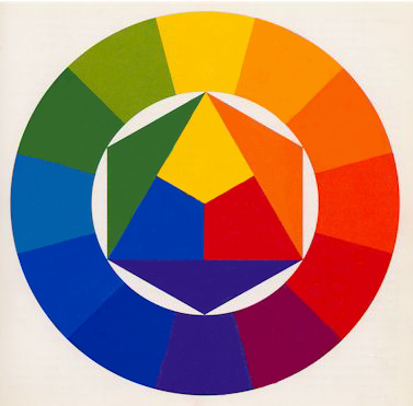
One notable contribution by Itten is his construction of the color wheel:
He starts with an equilateral triangle featuring primary colors (Yellow at the top, Blue bottom left, Red bottom right), with their mixtures (Yellow with Blue = Green, Blue with Red = Violet, Red with Yellow = Orange) forming the vertices of a hexagon.
Outside this hexagon, he draws a circle with twelve equal sectors. Each sector is filled with the colors located at the vertices of the hexagon.
The resulting empty sectors are then filled with tertiary colors, created by mixing a primary color with a secondary color.
Yellow and Orange = Yellow-Orange
Red and Orange = Red-Orange
Red and Violet = Red-Violet
Blue and Violet = Blue-Violet
Blue and Green = Blue-Green
Yellow and Green = Yellow-Green
Johannes Itten’s color wheel represents a systematic and harmonious organization of colors based on both physical and psycho-physical principles.
According to Johannes Itten’s teachings, there are seven different colour contrasts in the world of colour:
Color-in-Itself Contrast
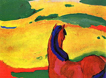
The „Color-in-Itself Contrast“ refers to the impact of pure, highly intense colors of the first order such as Yellow, Red, Blue, White, and Black. Itten emphasizes that the use of mixed colors diminishes the clarity and effectiveness of this type of contrast.
The more mixed colors are involved, the weaker the distinctiveness of the contrast. However, when employed strategically, this type of contrast can achieve strong visual impact and long-range visibility. Specific color intensity can convey signaling or indicative meaning.
Itten states, „The effect occurs when pure colors are used in a colorful composition. White and black can enhance the lively effect.“
For example, a carmine-red spot on a Prussian-blue background and a vermilion-red spot on a yellow background will both be perceived as „Red.“ Initially, we perceive the color itself without differentiating between the specific shades of red.
Franz Marc: Horse in landscape, 1910
Light-Dark Contrast
The „Light-Dark Contrast“ is a technique used to evaluate color, encompassing hue, brightness, and saturation. The specific brightness value of a color allows for certain color statements, achieving a spatial effect, or shifting and balancing visual weights. This effect is particularly significant in achieving aerial perspective (sfumato) or in the impact of architectural elements in a landscape.
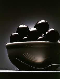
Compositions built on the Light-Dark Contrast exhibit a noticeable use of a limited color palette with strong tonal variations. Bright tones of objects are embedded in a dark environment, creating a highly sculptural effect. The three-dimensionality is achieved by anchoring the brighter tones and highlights to the foreground, while the darker shadows are tied to the background.
Temperature sensation
The concept of temperature sensation in color may seem absurd at first, but it underscores the interconnectedness of various sensory perceptions. Research indicates that the color tone of workspaces, particularly in the blue-green range, can result in a perceived temperature difference of up to 4 degrees Celsius compared to rooms with a red-orange tint. Participants felt the blue-green room, with an interior temperature of 15 degrees Celsius, as cold, while the same individuals found an orange-red room cold only at 11-12 degrees.
Scientifically, this phenomenon suggests that the color blue-green dampens the impulse of organic circulation, while its counterpart, red-orange, stimulates this activity. In the Western cultural context, it is generally accepted that blue appears cold, while the adjacent group of yellow-orange-red appears warm. However, these classifications are relative, and there can be warm blues and cold reds within their respective color families.
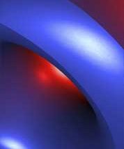
The most significant contrast is achieved with the colors red-orange (warm) and blue-green (cold). Itten notes that all other colors can appear warm or cold depending on their contrast with warmer or colder tones. The Cold-Warm contrast denotes a temperature difference, where a pink spot on an orange or Prussian blue background may appear „cool“ or „warm“ depending on the context.
Complementary Contrast:
Itten emphasizes in his color wheel that complementary colors stand opposite each other. When placed side by side, complementary colors enhance each other’s brightness, while when mixed together, they neutralize to create gray-black.
For Itten, the complementary contrast forms the basis of harmonious design because it establishes a perfect balance in the eye.
Each complementary color pair also possesses its unique characteristic:
Yellow – Violet
shows an extreme light-dark contrast
Red-orange – blue-green
shows the strongest cold-warm contrast
Red – green
of equal brightness and equal light values.
Complementary contrast
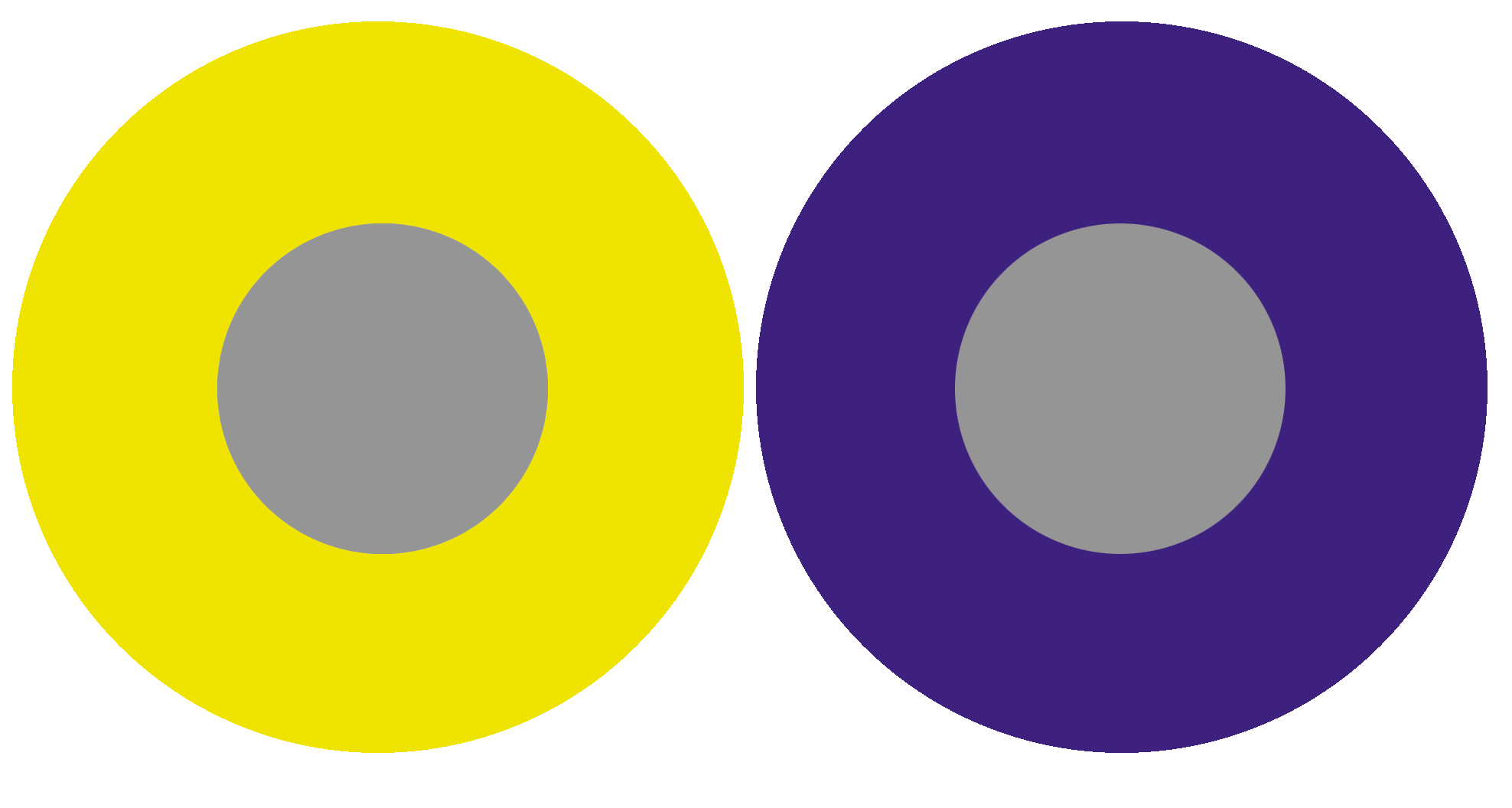
Its effect is based on the complementary contrast, where each pure color physiologically demands its complementary color. If this color is not present, the eye simultaneously generates the complementary color. This fact demonstrates that the fundamental law of colorful harmony inherently includes the fulfillment of the complementary law.
The simultaneously generated color thus arises as a color sensation in the viewer’s eye and is not physically present. Simultaneous effect occurs not only between gray and a pure color but also between pure colors that are not precisely complementary.
„The reality of a color is not always identical to its effect.“
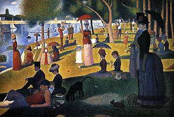
Goethe commented on simultaneous contrast as follows: „The simultaneous contrast makes the color suitable for aesthetic use.“ A significant exception in the realm of simultaneous contrast is the „Bezold Effect,“ according to Matthaei.
Georges Seurat: „Un dimanche apra’s-midi a’ l’Ile de la Grande Jatte”, (1884-1886)
Color quality
The term „color quality“ in Itten’s view refers to the purity and saturation of color. He describes the quality contrast as the opposition between saturated, vibrant colors and dull, muted colors. Prismatic colors, created through the refraction of white light, exhibit the highest saturation and brilliance. Colors can be muted in four different ways: brightened by white, darkened by black, neutralized by gray, and broken into a dark gray-black by adding the corresponding complementary color.
Color – Non-color Contrast = Intensity Contrast
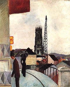
„It consists of the contrast between vibrant and dull colors. Dimming can occur with black, white, gray, or complementary colors.“ A subdued red appears „brown“ against vermilion red, but on a gray background, it appears „red.“ This contrast occurs as the color purity decreases from a vibrant color to a non-color. A pure red is more intense than a pure green. Mixed colors lose intensity. The addition of black (dark) and white (light) produces light and dark-muted colors.
August Macke: Fribourg Cathedral in Switzerland, 1914
Quantity Contrast
The Quantity Contrast refers to the size ratio of two or more differently sized color areas, in relation to light value and area size. Goethe has established the following approximate values for light values:
Yellow: Orange: Red: Violet: Blue: Green
behave like: 9: 8: 6: 3: 4: 6 The values for complementary color pairs are: Yellow: Violet = 9: 3 = 3: 1 Orange: Blue = 8: 4 = 2: 1 Red: Green = 6: 6 = 1: 1
If these light values are transformed into harmonious area sizes, the light value numbers must be used reciprocally. The three times stronger yellow must therefore occupy an area three times smaller than the complementary violet.
The Harmonic Area Sizes of primary and secondary colors are as follows: Yellow: Orange: Red: Violet: Blue: Green
behave like: 3: 4: 6: 9: 8: 6
or: Yellow: Orange = 3: 4 Yellow: Red = 3: 6 Yellow: Violet = 3: 9 Yellow: Blue = 3: 8 Yellow: Red: Blue = 3: 6: 8 Orange: Violet: Green = 3: 9: 6
breaking with white makes the color character colder breaking with black loses the radiant character, colors appear pale and paralyzed breaking with gray neutralizes and dulls the colors. They become lighter or darker, but in any case, dimmer adding the complementary color, the tonal values then lie between the two colors.
let’s dive into the captivating world of gamification and why it’s like the ultimate power-up for our creative minds.
What’s Gamification Anyway?
Think of gamification as sprinkling a bit of game magic into everyday tasks. It’s like turning your to-do list into a quest, and each completed task is a victory! So, why should we, the creative minds, care about this game-infused design?
Fueling Creativity with Playful Challenges
You know that awesome feeling when you conquer a difficult level in a game? Gamification brings that feeling into our design process. Challenges and quests make the creative journey more exciting. Whether it’s tackling a tricky design problem or experimenting with new tools, gamification turns it into a fun, leveling-up experience.
Points, Badges, and Creative Glory
Imagine earning points and badges for unleashing your creative prowess. It’s like earning cool rewards for being the design wizard you are! Gamification lets us celebrate our achievements, big or small, and turns our creative milestones into badges of honor.
Competition? Bring It On!
Gamification adds a pinch of friendly competition to the mix. It’s not about defeating others but challenging ourselves to reach new heights. Competing against our own creative limits keeps the juices flowing and the ideas popping.
Learning Through Play
Who says learning has to be boring? Gamification makes learning an adventure. Whether it’s mastering a new design tool or exploring the latest trends, turning it into a game keeps our minds engaged. It’s like leveling up our skills while having a blast!
Creativity + Collaboration = Power Duo
Ever thought of turning a group project into a quest with your creative colleges ? Gamification fosters teamwork and collaboration. Imagine a design journey where every team member contributes, earns rewards, and together, you conquer creative challenges. Teamwork makes the creative dream work!
In Conclusion: Game On, Creative Minds!
So, design enthusiasts, let’s embrace the power of gamification. It’s not just about pixels and vectors; it’s about turning our creative journey into an epic adventure. Points, badges, challenges – they’re not just game elements; they’re the keys to unlocking our creative potential.
Ready to hit that „Start Game“ button on your next design project? Game on, creative minds – let the design quest begin! 🚀🎨