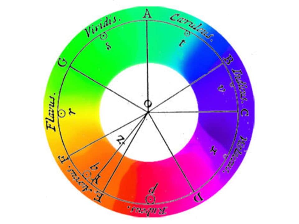
In the 15th century, during the Renaissance, Leonardo da Vinci attempted to systematize the variety of colors. He based his approach on an arrangement of four „primary colors“: Yellow, Green, Blue, and Red. Da Vinci’s notes on art and painting, exploring color harmony, position him as one of the founders of color theory.
Isaac Newton furthered da Vinci’s theories in the early 18th century. Newton passed white light through a glass prism, discovering that it broke down into colors, similar to a rainbow. These colors, known as spectral colors, formed the basis of his color circle. According to Newton, Red, Green, and Blue are the primary colors, combining to create White. In Newton’s color theory, Black represents the absence of light.

Goethe’s color theory 1800
Goethe’s color theory is based on an elemental, polar opposition of light and dark. He explains colors as boundary phenomena between light and darkness. Yellow lies at the boundary of brightness („first at light“), and blue at the boundary of darkness („first at darkness“). The blue of the sky arises from the ancient Greek concept of turbidity, as atmosphere, through a transparent medium, the air, against the darkness of space. According to Goethe, colors arise from the mixture of light and darkness, in the semi-darkness. However, consistently implementing this idea means that the addition of spectral colors could never result in white light, leading to Goethe’s disagreement with Newton.
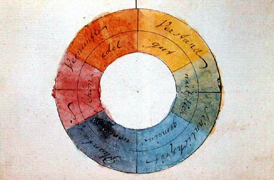
Goethe’s color theory starts with only two pure colors. He emphasizes that purple cannot be mixed from other colors. Therefore, he takes yellow, blue, and red as pure paint colors. After observing a color, our eye produces the complementary color (successive contrast), prompting Goethe to represent these color pairs diametrically opposite each other in a circle. He also assumes a progression of colors towards purple, placing purple at the top of the circle. Consequently, green, as the complementary color and counterpart, is at the bottom. Blue is to the left of green, and yellow to the right, which, when mixed, produce green. Yellow-red is between yellow and purple, and blue-red is between blue and purple.
The part of his color circle transitioning from yellow to red is seen by Goethe as the positive side, while the other half towards blue is the negative side. He associates yellow with effect, light, brightness, power, warmth, proximity, and repulsion, and blue with deprivation, shadow, darkness, weakness, cold, distance, and attraction. Goethe’s main intention was to determine the „sensory-moral effect“ of each color „on the sense of sight (…) and through its mediation on the soul.“ He sees color „as conscious contents of sensory qualities,“ emphasizing the psychological impact of colors:
- Colors on the positive side „are lively, vibrant, and aspiring.“
- Yellow appears „magnificent and noble, creating a warm and comfortable impression.“
- Colors on the negative side „contribute to a restless, soft, and yearning sensation,“ and
- blue „gives us a feeling of cold.“
Goethe’s work had a lasting impact on color theory, although it faced rejection at times, mainly due to the physical aspects that align with a holistic classical-natural scientific worldview, contrasting with Newton’s mathematical-scientific approach. The historical overview of color theory and especially Goethe’s texts on the psychological effects of colors continue to influence thought today. From a contemporary perspective, Goethe’s and Newton’s color theories arise from two incompatible worldviews and must be considered side by side and in historical context.

Sources:
https://lehrerfortbildung-bw.de/st_digital/medienkompetenz/gestaltung-farbe/systeme/goethe/
https://www.derkrammer.at/goethes-farbenlehre-die-theorie-von-der-wirkung-der-farbe/
Chevreul’s law of simultaneous contrasts 1839
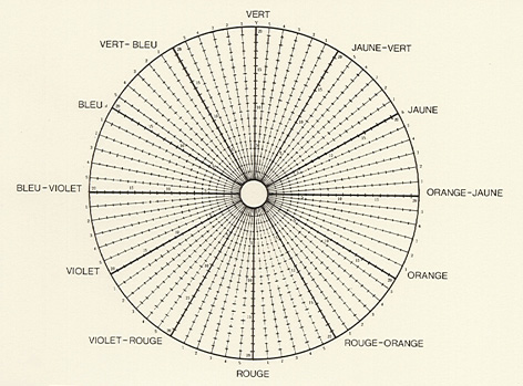
Chevreul constructed a 72-part color circle, featuring three primary colors—Red, Yellow, and Blue—along with three primary mixtures—Orange, Green, and Violet, and six additional secondary mixtures. The resulting sectors are divided into five zones, and each radius is segmented into 20 sections, representing various brightness levels. Here, for the first time, we encounter the active role of the brain in color perception, suggesting that colors are, in a sense, actions of the world within our minds.
During Chevreul’s search for a practical color organization for textile production, he delved into the laws of color contrasts. His 72-part color circle defines shades through changes in a color’s intensity towards white (higher intensity) or black (weaker intensity), with ten possible steps according to Chevreul.
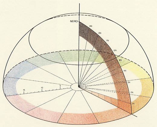
Within Chevreul’s color circle, you find three subtractive primary colors (Red, Yellow, and Blue), three secondary colors (primary mixtures Orange, Green, and Violet), and six secondary mixtures. The resulting sectors are grouped into five zones, and each radius is divided into 20 sections, indicating different brightness levels. The notation reflects the proportions of colors; for instance, 9B/1C means 9/10 Black and 1/10 of the corresponding color.
With the hemisphere, Chevreul attempts a physical representation of colors in space. The axis of Black serves as a ray exploring various intensity levels.
Chevreul believed that the multitude of color tones and their harmony could be defined through numerical relationships. His aim was to provide artists using colored materials with a comprehensive tool. Despite the influence of harmony theories, such as „Harmonie d’analogues“ (Harmony of Analogy) and „Harmonie de contraste“ (Harmony of Contrast), Chevreul could not identify a law of color harmony. It simply does not exist.


