In the preceding sections, we delved into the principles of color theory and psychology, universally applicable across various applications and fields. In this final segment, let’s take a closer look at specific examples and proven approaches in the fashion industry.
If you’re involved in this industry, you’re likely familiar with curating a suitable color palette for outfits and fashion. Different fashion design schools have distinct approaches, preferences, guidelines, and focal points. Colors and their combinations often align with seasons, occasions, and cultural preferences.
To master the interplay of colors in fashion, a solid understanding of the foundational principles of color theory and knowledge of the color wheel are indispensable. This foundation allows for adept experimentation and the creation of new designs beyond well-trodden fashion and trend paths.
If you prefer sticking to tried-and-true combinations, the following color pairings will keep you on solid ground:
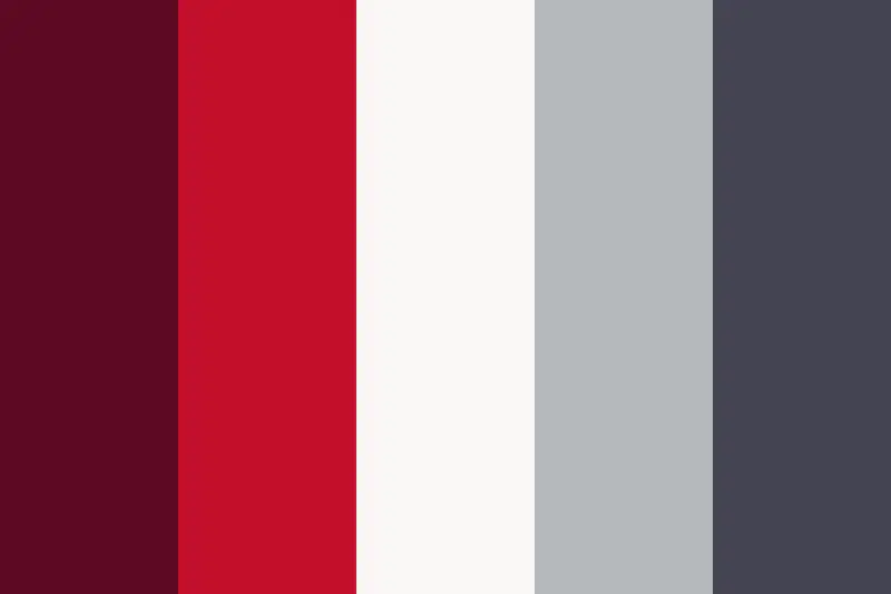
Gray and Red Tones:
Red tones and berry purples complement all shades of gray, creating an elegant and balanced color mix. Typically, grays serve as the background or primary color, while red tones accentuate and highlight specific elements. This combination blends a neutral and understated color (gray) as the base with a vibrant color (red or purple) for special moments in a fashion piece. The result is a certain luminosity without being overly assertive.
Yellow and Green:
The combination of green and yellow tones is one of the liveliest ways to make your wardrobe stand out, especially in spring or summer. However, it can also serve as a colorful highlight in winter and darker seasons. This combination tends to look good on most skin tones. Pairing a yellow blazer with a green skirt, especially with jeans, creates a standout look. Enhance this look with gold and/or green accessories.

Red and Blue:
Take your favorite jeans and pair them with a red top, and you can be sure to have a successful outfit. Combining blue denim with red clothing is extremely popular, and vibrant reds create an eye-catching effect, complementing the subdued blue of denim. This combination exudes confidence, vitality, and strength, often encountered in the summer months. If introducing a third color, consider neutral, light tones such as white, gray, or light creams.

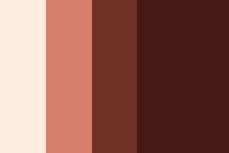
(Light) Brown Tones and Chestnut or Burgundy:
For a less vibrant but earthy and harmonious color scheme in your wardrobe, brown tones, especially paired with slightly reddish „chestnut,“ work exceptionally well. This combination effortlessly creates a successful autumn outfit. Lighter browns like beige, sand tones, ochre, or cognac blend seamlessly with the slightly darker chestnut. As a possible third color, you can opt for white, light yellows, or soft pink. Exercise some discretion to avoid overloading the outfit. In place of chestnut, burgundy, Bordeaux red, or wine red also pairs wonderfully with soft brown tones.
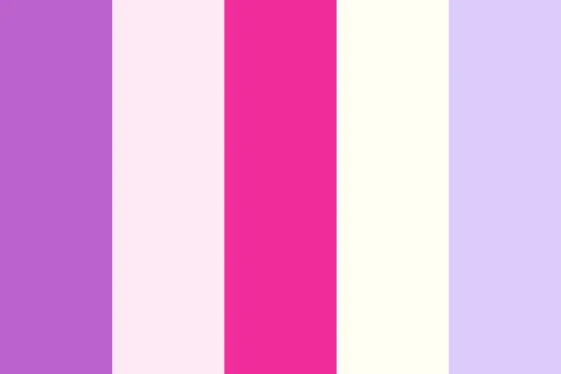
Pink and White:
Another classic combo in the fashion world is the pairing of pink and white. Especially popular among young women and teens, this combination exudes a charming effect, emphasizing femininity in a playful manner. Large white portions have a calming effect on the human eye, radiating a touch of innocence and purity. To soften the strong contrast of these colors, consider gray tones, soft pink, or ivory as alternatives to white. If pink seems too vibrant, explore related colors such as purple, lilac, or violet.
Sources: https://www.kunstplaza.de/fashion-design/farbenlehre-farbtheorie-styleguides-fashion-design/#Tipps_fuer_die_Zusammenstellung_stimmiger_Farbschemata