3. Inspirationsquellen für experimentelles Webdesign

Inspirationsquellen sind wichtig für meine Recherche. Aus diesem Grund will ich noch einmal tiefer in das Thema eintauchen, um keine Möglichkeit zu verpassen, ein paar der besten Websites gesehen zu haben.

1. Innovative Design-Websites und Galerien

Awwwards: Diese Plattform zeichnet nicht nur die besten Webdesigns aus, sondern bietet auch eine spezielle Kategorie für experimentelle Websites. Die vorgestellten Designs sind oft avantgardistisch und setzen neue Maßstäbe in der Branche.

CSS Design Awards: Neben der Auszeichnung herausragender Webdesigns bietet CSS Design Awards auch eine Sammlung von experimentellen Websites, die durch ihre Kreativität und Innovation hervorstechen.

SiteInspire: Diese Galerie kuratiert eine Vielzahl von Designs, darunter viele experimentelle und unkonventionelle Ansätze, die als Inspirationsquelle dienen können.

2. Design-Blogs und Online-Magazine

Codrops: Codrops bietet eine Fülle von Tutorials und Artikeln zu innovativen Webtechniken und experimentellen Designs. Die „Playground“-Sektion ist besonders nützlich, um neue Ideen und Techniken zu entdecken.

Smashing Magazine: Neben umfassenden Ressourcen zu allgemeinen Webdesign-Praktiken bietet Smashing Magazine auch Artikel und Fallstudien zu experimentellem Design und fortschrittlichen Webtechniken.

Creative Bloq: Creative Bloq veröffentlicht regelmäßig Artikel über die neuesten Trends im Webdesign, einschließlich experimenteller Ansätze und innovativer Projekte.

3. Konferenzen und Workshops

OFFF: Durch die OFFF konnte ich viele Eindrücke und Inspiration gewinnen.

4. Soziale Medien und Online-Communities

Dribbble und Behance: Beide Plattformen haben Kategorien und Sammlungen, die sich speziell auf experimentelles Webdesign konzentrieren.

Reddit: Subreddits wie r/web_design, r/webdev und r/Frontend bieten eine Plattform für Diskussionen und den Austausch von experimentellen Webdesign-Projekten und -Techniken.

16 User Test-1

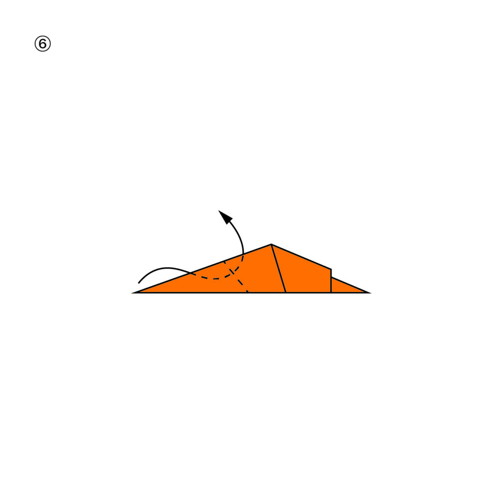
With the instructional design complete, it’s time to start testing. My prediction is that step number 6 might pose a challenge, as it’s one of the more difficult steps in the instruction. To investigate, I will have my test user go through the instruction, and if she encounters any problems and can’t proceed, I’ll show her the animated version of the step to see if it clarifies the process.

Personal Data of Test User

  • Gender: Female
  • Age: 23

My first test user already has some experience with origami. She mentioned that she often folds cranes or looks up new instructions when she’s bored, suggesting she might be more skilled than other test participants.

Testing the Static Instructions

I tested the static instructions with her and recorded the time she needed to complete the task.

  • Time Spent: 2 minutes 17 seconds

After completing the task, I had a talk with her. She didn’t encounter any problems with the static instructions but noted that others who have never done origami might struggle with step 6.

As you can see in the picture Fold 6 can be quite tricky because you have to fold the head of the duck inwards and not just over the body like some might assume.

Reflections and Insights

The first test provided valuable insights:

  1. Experience Matters: The test user’s familiarity with origami likely contributed to her smooth completion of the instructions. This underscores the importance of considering the participant’s skill level in my analysis.
  2. Step 6 Concerns: Despite not facing issues herself, the user acknowledged that step 6 could be problematic for beginners. This aligns with my prediction and highlights the need to pay close attention to this step in future tests.
  3. Potential of Animated Instructions: Although the static instructions were sufficient for this experienced user, the real test will be to see how beginners fare and whether the animated instructions can bridge any gaps in understanding.

Origami Duck of Test User-1

2. Aktuelle Trends und Entwicklungen

Entwicklungen passieren im UI/UX Design rasant. Um dies zusammenzufassen, wird eine umfassendere Recherche notwendig sein. Um jedoch auf ein paar Trends und Entwicklungen einzugehen, habe ich mir drei, meiner Meinung nach, besonders relevante und auffällige Elemente herausgesucht, auf welche ich näher eingehen möchte. Zu der Erklärung, habe ich außerdem jeweils ein Best Practice Beispiel beigefügt.

Neumorphismus/Flat Design 2.0:

  • Dieser Stil kombiniert Skeuomorphismus* und Flat Design, um weiche, realistische Elemente mit minimalistischem Touch zu schaffen. Es verwendet subtile Schatten und Highlights, um Tiefe zu erzeugen.
  • Ein moderner Ansatz, der reale Materialien und Texturen verwendet, um digitale Elemente natürlicher und greifbarer zu machen, jedoch mit einer saubereren und weniger überladenen Ästhetik als der traditionelle Skeuomorphismus*.

Beispiel: https://www.cartier.com/en-fr/watchesandwonders (sound on!)

Micro-Interactions:

  • Kleine Animationen oder visuelle Effekte, die auftreten, wenn ein Nutzer eine bestimmte Aktion ausführt. Diese verbessern das Nutzererlebnis, indem sie visuelles Feedback und Freude an der Interaktion bieten.

Beispiel: https://gsap.com

Meiner Meinung nach ist die gesamte Website ein Best-Practice-Beispiel für Mikrointeraktionen. Man findet keinen Teil, der nicht in irgendeiner Weise animiert und damit für den Benutzer:in viel spannender gemacht wurde. Besonders die Buttons sind mir hier ins Auge gesprungen.

3D Elements and Immersive Experiences:

  • Die Verwendung von 3D-Grafiken und -Elementen wird häufiger, insbesondere in E-Commerce-Websites und -Apps, um Produkte realistischer und ansprechender darzustellen.
  • AR- und VR-Technologien bieten immersive Erlebnisse und werden zunehmend in Bereichen wie E-Commerce, Bildung und Unterhaltung eingesetzt. UI/UX-Designer experimentieren mit 3D-Elementen und räumlicher Interaktion

Beispiel: https://toyfight.co

*Skeuomorphismus ist ein Designkonzept, bei dem digitale oder virtuelle Objekte so gestaltet werden, dass sie reale, physische Gegenstände nachahmen. Das Ziel des Skeuomorphismus ist es, Benutzerfreundlichkeit und Vertrautheit zu schaffen, indem bekannte visuelle und haptische Elemente in das digitale Design integriert werden.

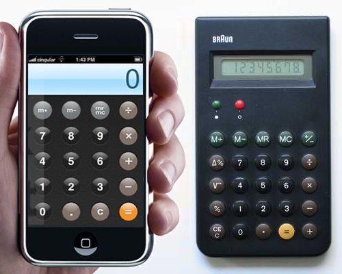
Während Skeuomorphismus in den letzten Jahren weniger populär geworden ist, erlebt er in abgewandelter Form ein Comeback. Der sogenannte Neumorphismus kombiniert Elemente von Skeuomorphismus und Flat Design, um moderne, minimalistische, aber dennoch realistisch wirkende Benutzeroberflächen zu schaffen. Dies zeigt, dass der Einfluss des Skeuomorphismus weiterhin spürbar ist, auch wenn er sich weiterentwickelt hat.

Beispiel: Apple iPhone Taschenrechner inspiriert von Taschenrechner Braun ET66 gestaltet von Dieter Rams

Ursprünglicher iPhone Taschenrechner vs. Braun ET66

Erkenntnisse

Ich habe mir alle Best Practice Beispiele am Desktop, sowie in der Mobilen Variante angesehen. Während am Desktop sehr viel Wert auf Mikrointeraktionen, sowie Animationen gesetzt wurde, sieht dies auf Mobile sehr viel anders aus. Hier steht nämlich die klare Informationsvermittlung im Vordergrund. Auch wenn es einige animierte Elemente gibt, sind die Websites hier viel simpler aufgebaut und machen auf mich den Eindruck einer “abgespeckten” Version der Desktop Versionen.

Außerdem spielt musikalische Untermalung bzw. Sounddesign im allgemeinen eine sehr große Rolle. Bei fast allen Best Practice Websites, welche ich gefunden habe ist es möglich, Sound zuzuschalten.

Weitere Links

https://www.wired.com/2007/07/iphones-design

https://cedroweb3.ai

15 Research Question Development

In another lecture we were tasked with finding a research question to our topic and think about different complexities that might occur on our planned project. Overall my project explores the optimal design of instructional materials, focusing on illustrated, animated, and video instructions. The central problem I aim to address is determining the most effective format for teaching motor skills.

Primary Research Question

My primary research question could be:

„Are animated instructions alone superior for motor skill learning, or does a combination of illustrated and video instructions yield better results?“

To answer this, I will investigate the efficiency, clarity, and learner preference for each type of instructional design. The ultimate goal is to provide evidence-based recommendations for creating the most effective instructional materials for motor skill education.

Complexities in the Project

After a recent discussion with a colleague, I’ve identified several complexities in my project that need careful consideration:

  1. Varied Skill Levels: One significant challenge is that people have different levels of skill with their hands, which could impact the results of experiments involving tasks like origami folding or knot tying. To account for this, I need to consider a diverse group of participants with varying skill levels.
  2. Interdisciplinary Perspectives: To find the best ways to teach motor skills, I must explore different viewpoints from fields such as education and psychology. This will help in understanding the cognitive and behavioral aspects of learning motor skills and how instructional materials can be optimized accordingly.
  3. Learner Preferences: Individual preferences play a crucial role in learning. Some learners might favor illustrated instructions for their simplicity and ease of reference, while others might prefer the dynamic and detailed nature of video or animated instructions. Balancing these preferences and determining which method provides the most overall benefit will be key.

20 | Interview: Person with an Eszett (ẞ) in Their Name

For my Des&Res project, I conducted an interview with my study friend Ramona Groß to shed light on her everyday experiences and challenges related to the „ß“ character in her surname. The conversation focused on the difficulties posed by the „ß“ in various contexts, such as filling out forms, creating email addresses, and using electronic systems. Ramona shared her insights on how the „ß“ often leads to misunderstandings and how she sometimes has to resort to using „ss“ instead.

T: Tina Zopf
R: Ramona Groß

T: Wie oft haben Sie aufgrund des Buchstabens „ß“ in Ihrem Namen Probleme oder Missverständnisse
R: Öfter, gerade wenn es um Dokumente geht. Beim Ausfüllen von Formularen, wo man mit Druckschrift schreiben soll oder bei E-Mail-Adressen.

T: Hatten Sie jemals Schwierigkeiten, offizielle Dokumente oder Formulare auszufüllen, weil Ihr Name ein „ß“ enthält?
R: Ja, meist weiche ich dann auf das „ss“ aus, aber es kommt bei der Kommunikation dann schon auch zu Missverständnissen.

T: Haben Sie bewusst das „ß“ in Ihrem Namen auf „ss“ geändert, um Probleme bei E-Mails oder Formularen zu vermeiden?
R: Nein, ich benutze immer das ß.

T: Stört es Sie, wenn Ihr Name falsch geschrieben wird?
R: Ja, besonders bei wichtigen Dokumenten, wie Zeugnissen empfinde ich das als sehr störend.

T: Haben Sie schon einmal erlebt, dass Ihr Name aufgrund des „ß“ in Ihrem Pass oder Ausweis falsch geschrieben wurde? 
R: Nein

T: Würden Sie es begrüßen, wenn der Großbuchstabe „ẞ“ in in offiziellen Dokumenten und digitalen Plattformen unterstützt wird?
R: Ja, besonders in amtlichen Dokumenten wäre es von Vorteil.

T: Haben Sie jemals erlebt, dass ein elektronisches System (z.B. eine Buchungsplattform oder ein Online-Shop) das „ß“ in Ihrem Namen nicht akzeptiert hat?
R: Ja, gerade bei internationalen Websites/Bestellungen. Da wandle ich auch gerne die Adresse mit XY Straße in „ss“ um.

T: Welche Rolle spielt die typografische Unterstützung des „ß“ in Ihrer Entscheidungsfindung bei der Auswahl von Schriftarten?
R: Je nach Projekt. Wenn mein Nachname mit drin vorkommen soll, bevorzuge ich eine Schriftart mit Unterstützung des ß.

T: Haben Sie beim grafischen Gestalten schon einmal festgestellt, dass der Buchstabe „ß“ in bestimmten Schriftarten fehlt?
Ja, meistens leider die schönen artsy Schriften oder die free trials. 

18 // Experiment 2.2: Effect of illustration (evaluation)

I interviewed a total of three people. The results for the questions already published in the last post are:

  1. First impression
    Illustration packaging: all three respondents found the design of the packaging with the illustration aesthetically pleasing and modern.
    Photography packaging: this packaging was perceived as familiar and traditional.
  2. Design description
    The illustration packaging was described as stylish, appealing and professional.
    The photographic packaging was described as classic and reliable, although less modern.
  3. Preference
    All three respondents found the illustration packaging nicer.
    Despite this preference, they would rather choose the photographic packaging.
  4. Purchase decision
    The quick recognition value and the familiarity of the packaging with the photography were the main reasons for the purchase decision in favor of this packaging.
  5. Illustration vs. photography
    The illustration packaging evoked feelings of creativity and freshness, while the photography packaging evoked associations of authenticity and trust.
  6. Responsiveness and professionalism
    All three respondents found the illustration appealing and professional.
  7. Clarity and comprehensibility
    Two of the three respondents found the illustration packaging clearer and easier to understand.
    One person found the packaging with the photograph easier to interpret.
  8. Content recognition
    Most respondents found it easy to recognize the content of the product from the photograph, while the illustration was slightly more abstract.


Summary:

All found the illustration aesthetically pleasing, but trusted the photography more because of its recognition value. The illustration evoked feelings of creativity, while the photograph evoked associations of authenticity. Participants found the illustration appealing and professional. The clarity of the packaging was divided, but the photographic packaging was easier to interpret. Most recognized the contents of the product more easily from the photograph. Familiarity and recognition influenced the purchase decision more than aesthetic appeal.

17 // 2.1: Effect of illustration

For my second experiment, I chose a food product from the supermarket. I chose Spar olive oil because in this experiment I wanted to find out how a simple design with illustrations compares to a typical food packaging with photographs.

To do this, I used existing olive oil branding from the internet to create a simpler packaging including an olive illustration.

In a short, personal survey, I would like to find out what effect both types of packaging have and which one is more likely to be chosen.

Questions for a personal conversation:

  1. What is your first impression of the two packages?
  2. How would you describe the design of the packaging (e.g. modern, traditional, appealing, boring)?
  3. Which of the two packagings do you like better? Why?
  4. Which packaging would you be more likely to reach for if you were in the supermarket? Why?
  5. Which packaging appeals to you more: the one with the illustration or the one with the photograph?
  6. Why do you prefer illustrations/photographs on packaging?
  7. What feelings or associations does the packaging with the illustration evoke in you?
  8. Do you find the illustration appealing and professional?
  9. Do you think that the packaging with the illustration is clearer and easier to understand than the packaging with the photograph?
  10. How easy is it for you to recognize the contents of the product from the illustration/photography?

14 The Process of Creating the Instructions

For the design of the instructional materials for my origami experiment, I focused on ensuring clarity and ease of understanding without relying on words. The goal was also not to make them look perfect but rather a quick approach to start testing with small experiments. Here is a look into the process and considerations that went into designing both the static and animated instructions.

Instructional Design Considerations

To make the instructions universally understandable, I used the following visual strategies:

  • Color Coding: The paper’s front side is shown in white, and the backside in orange. This distinction helps users follow the folds more easily.
  • Outlines and Creases: The paper always has a black outline to define its shape. Creases from previous folds are shown in grey, while creases needed for the current fold are illustrated with dotted lines.
  • Depth Indication: In later stages, a darker orange shade is used to show depth, making complex steps clearer.

Creating the Static Instructions

For the static instructions, I used Adobe Illustrator. For visual aid, arrows were added to guide users through the folding process, enhancing understanding at each step. Each fold is depicted clearly, with emphasis on the transition from one step to the next, ensuring that users can follow along without confusion.

Creating the Animated Instructions

The files for the animated instructions were prepared in Illustrator and segmented into different layers to prepare them for animation. These layers were then imported into After Effects for animation. Unlike the static version, no arrows were used. Instead, the animation relied on the movement of the paper to convey the steps, allowing users to follow the folding process through motion.

Ready for Testing

I am now prepared to test the instructions effectiveness. The next step is to gather feedback and observe how users interact with each type of instruction, aiming to find insights into the strengths and weaknesses of static versus dynamic instructional methods.

Cultural representation biases

I proceeded with the experimentation to see how AI models represent different cultures.

The images generated by Stable Diffusion always have one factor in common: the people depicted are wearing traditional clothing and/or accessories. Although this may reflect a collective (stereotypical) imagery, in reality people belonging to certain cultures are not always like that, particularly in today’s globalized and cosmopolitan world.

Results of the prompt „Represent a native American“:

Results of the prompt „Represents a person of African descent“:

It is interesting to note that although I used neutral terms, the two prompts generated only male representations in the first case, and only female representations in the second.

Update: Summary and Q&A

My project focuses on packaging design in the food and beverage industry, specifically regarding alcoholic beverages. The key questions are what factors influence a consumer’s decision to purchase alcohol and how packaging can impact this decision. My concern is that packaging is often discarded or designed without care, lacking added value or real utility. However, what if the packaging itself could become an integral part of the product? What if, through new technologies such as augmented reality (AR), consumers could interact with the bottle or packaging? Alternatively, what if we took a traditional approach and genuinely invested effort in the design of the cardboard packaging?

Q&A

  1. Breadth – Alternative Perspectives:
    • Consider if alcohol packaging is overly romanticized and if future designs will shift towards minimalism, similar to cigarette packaging. This ties into the marketing aspect.
  2. Depth – Challenges:
    • The primary challenge is deciding between using augmented reality (AR) technology or traditional, material-focused designs. Additional challenges include unfamiliarity with AR, ensuring sustainability, and addressing the critical nature of advertising alcoholic products without romanticizing them.
  3. Accuracy – Testing Methods:
    • Use focus groups with limited prior knowledge to test reactions at various stages. Additionally, seek insights and validation from experts like Lipptisch.
  4. Precision – Detailed Exploration:
    • Provide a detailed comparison of the benefits and drawbacks of AR technology versus traditional material-focused packaging designs.
  5. Relevance – Problem-Solving:
    • Each approach addresses different aspects of the issue, offering a comprehensive understanding that helps in problem-solving.
  6. Central Idea:
    • Focus on integrating interactive elements, such as a drinking game, within the packaging.
  7. Vested Interest:
    • There is a significant interest in how romanticized marketing influences consumer behavior.