16 // Experiment 1.3: Effect of typography (evaluation)

My survey produced the following results:

General questions about typography

  1. Which logo appeals to you the most?
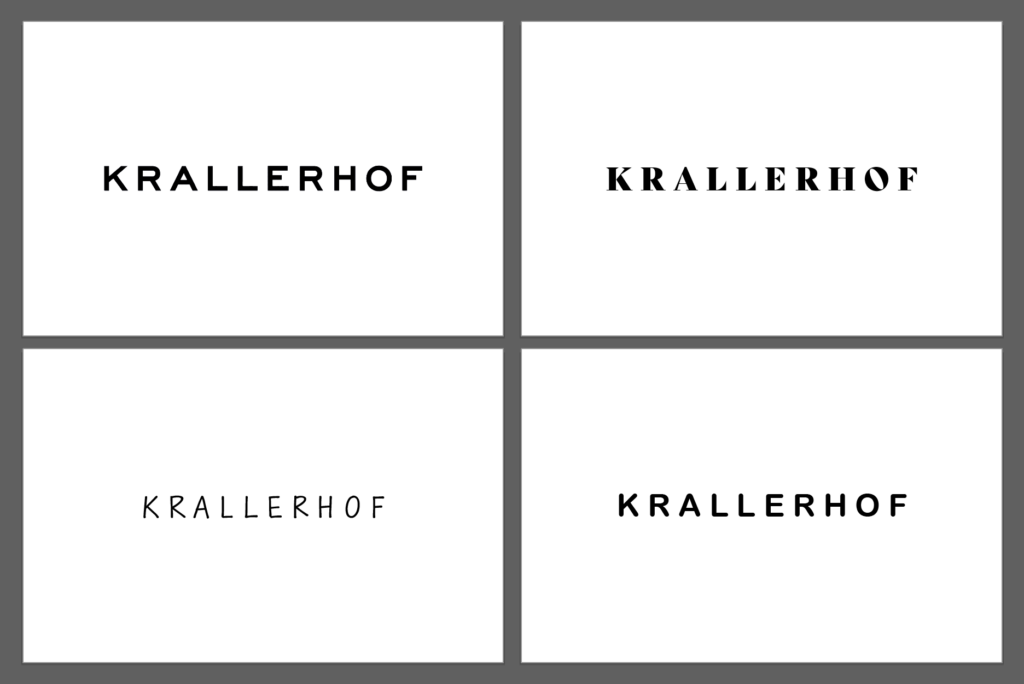
    The original logo (Sans Serif) was preferred by most participants, which could be due to its clear and modern design.
  2. How professional does each logo variant look?
    Original logo (Sans Serif): Scored an average of 4.5 out of 5. It was rated as the most professional.
    Serif font: Averaged 3.8 out of 5 points. It was perceived as professional but more traditional.
    Rounded Sans Serif: An average of 3.5 out of 5 points. This variant was perceived as friendly and modern, but slightly less professional.
    Handwriting: Average 2.9 out of 5 points. Handwriting was considered the least professional, but personal and inviting.
  3. What emotions does each logo variant evoke in you?
    Original logo (Sans Serif): Trustworthy, modern, professional.
    Serif font: Traditional, elegant, sophisticated.
    Handwriting: Personal, friendly, individual.
    Rounded Sans Serif: Modern, friendly, accessible.

Specific questions about typography

  1. In your opinion, which logo best conveys the brand of an upscale hotel?
    The original logo (Sans Serif) was seen by the majority as the logo that best conveys the brand of an upscale hotel.
  2. Which logo do you find most inviting?
    The rounded Sans Serif was perceived as the most inviting, closely followed by the original logo.
  3. Which logo variant looks the most modern?
    The original logo (Sans Serif) and the rounded sans serif were seen as the most modern variants.
  4. Which logo variant looks the most traditional?
    The serif font was rated as the most traditional variant.

General questions about color

  1. Has your perception of the logo changed with the addition of colors?
    About 70% of participants stated that their perception has not changed.
  2. If so, how did the perception change?
    Those who did notice a change mentioned that the colors made the logo appear more vibrant and inviting.

Specific questions about color

  1. Which color logo appeals to you the most?
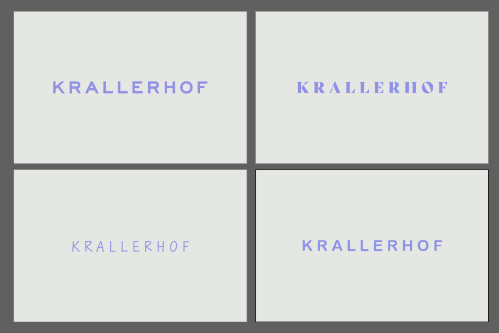
    The original logo (Sans Serif) in color was again the most preferred.
  2. How professional does each color logo variation look?
    Original colored logo (Sans Serif): Scored an average of 4.5 out of 5. It was still rated as the most professional.
    Serif font in color: Averaged 3.8 out of 5 points.
    Rounded Sans Serif in color: Average 3.5 out of 5 points.
    Handwriting in color: Average 2.9 out of 5 points.
  3. What emotions does each color logo variant trigger in you?
    The colored logos triggered similar emotions as their black and white counterparts, but an added sense of vibrancy was often mentioned.
  4. In your opinion, which color logo best conveys the brand of an upscale hotel?
    Mostly the original colored logo (Sans Serif).
  5. Which color logo do you find most inviting?
    The rounded Sans Serif in color was perceived as the most inviting, followed by the original logo.
  6. Which logo variant looks the most modern?
    The original colored logo (Sans Serif) and the rounded Sans Serif were seen as the most modern variants.
  7. Which logo variant looks the most traditional?
    The colored serif font was rated as the most traditional variant.


Summary:

The survey shows that the original logo (Sans Serif) performed best in both black and white and in color and was perceived as professional, modern and trustworthy. The use of color did not result in a significant change in perception for most participants. The serif font was perceived as traditional, while the rounded Sans Serif was perceived as inviting and modern. Handwriting scored lowest in terms of professionalism, but was rated as personal and friendly.
Job representation biases

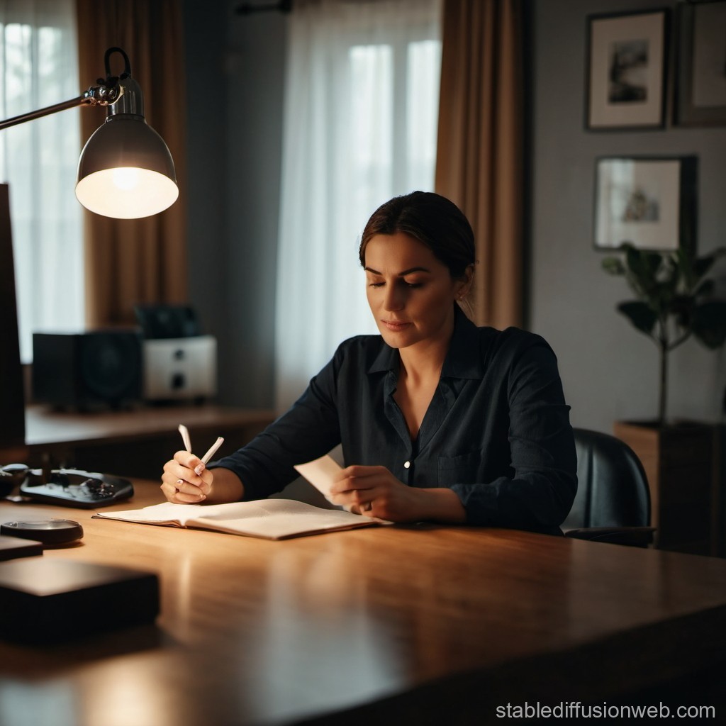
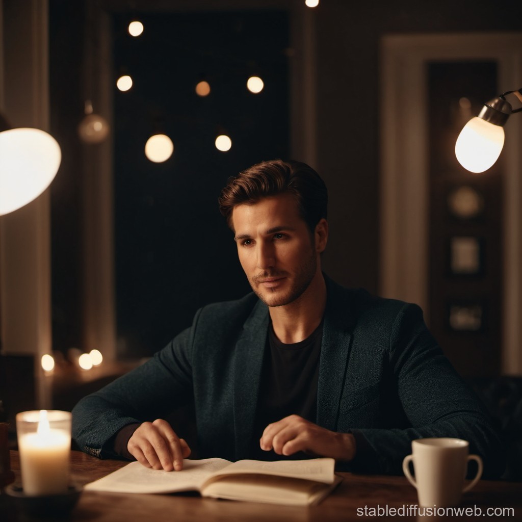
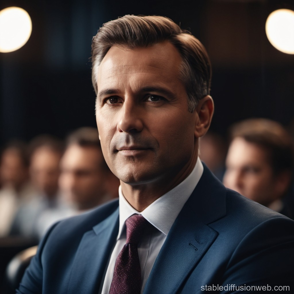
I began my experimentation on the topic of professional representation. Using Stable Diffusion, I provided AI with two prompts:

1. “Represent the CEO of a company”

2. “Represent a person who does not work but is dedicated only to household management.”

I chose these prompts because they refer to gender stereotypes in the professional field. For each prompt I generated 3 images.

The first prompt generated 3 images of a white man.

The second prompt generated 1 image of a white woman and 2 images of a white man. 

In this case I was surprised because I expected the representations to be only of women, since my prompt was intended to refer to the stereotype of the housewife. 

(I highlighted the skin color of the subjects to show how people of color tend not to be represented, as evidenced by numerous studies and data I found at the beginning of my research.)

Applications of Augmented Reality

AR has been used for several years in the entertainment industry, including sports broadcasts, video games, and mobile games. However, it is gradually being adopted in other industries as well. Many manufacturers are already testing this technology by incorporating it into packaging. Similar to QR codes, AR makes various content visible through the use of VR (virtual reality) glasses and apps.

The possibilities for manufacturers are limitless: creative packaging for young audiences that comes to life with VR glasses, smart apps that show how a hair color will look on a customer, interactive point-of-sale (POS) displays that reveal additional product information, and even virtual tutorials for proper product usage. Shoppers can scan a graphic in-store with their smartphone or tablet to trigger the corresponding content. This allows manufacturers to demonstrate product usage or present it in 3D on the packaging.

This form of POS advertising is particularly popular with the highly coveted Generation X and Generation Z. AR seamlessly blends products with marketing, creating a more immersive and lasting shopping experience.

Advantages of Augmented Reality Packaging:

  • High visibility in retail (brand experience)
  • Added value for customers (aiding in purchase decisions)
  • Better differentiation from competitors
  • No damage to the packaging (customers can see inside the packaging virtually without opening it)
  • Targeted information without additional printing (customer and usage instructions can be displayed in visual forms such as 3D holograms, images, audio, videos, etc.)
  • More creative freedom in packaging design
  • High entertainment value (e.g., games for children, messages from brand ambassadors, etc.)
  • High level of personalization (e.g., through personalized apps)

AR JACKDANIELS Packaging :https://www.youtube.com/watch?v=fTgawFAEN0U

Proper Labeling of Packaged Goods

When packaging food, proper labeling of „packaged goods“ is essential, in contrast to „loose goods.“ Labeling requirements are governed by Regulation (EU) No. 1169/2011 (FIC). Generally, this obligation applies to packaged foods, with exceptions for items packaged upon consumer request or pre-packaged for immediate sale, except for allergen information.

Labels must be affixed directly to the packaging or on an attached label, and they must be visible, legible, durable, and easily understandable. A minimum font size of 1.2 mm is required.

Key Labeling Elements:

  • Name of the food
  • List of ingredients (including QUID)
  • Name and address of the producer
  • Net quantity
  • Minimum durability or use-by date
  • Storage conditions
  • Lot or batch number
  • Instructions for use (if needed)
  • Alcohol content (for beverages)
  • Packaging in a protective atmosphere statement
  • Nutritional information (with some exceptions)
  • Allergen information must be highlighted in the ingredients list. For loose goods, allergen information can be given in writing or orally.

Written allergen information can be provided in menus or near the product. Oral information must be provided by a trained staff member, with a notice posted visibly. Online allergen training is available at: www.allergene-schulung.at.

Sample labels reviewed by the Austrian Agency for Health and Food Safety (AGES) are available as templates. These can be tailored to specific recipes and preparations. Sample labels are available at the Chambers of Agriculture and at www.gutesvombauernhof.at.

Quelle: https://www.wko.at/oe/handel/lebensmittelhandel/kennzeichnung

15 // Experiment 1.2: Effect of typography

To test my first experiment, I created a short online survey. The respondents were asked the following questions in addition to the images I posted in the last blog post:

General questions about typography

  • Which logo appeals to you the most? (selection)
  • Please rate how professional each logo variant looks. (Scale from 1 to 5, where 1 = not professional and 5 = very professional)
  • What emotions does each logo variant evoke in you? (open question)

Specific questions on typography

  • In your opinion, which logo best conveys the brand of an upscale hotel? (selection)
  • Which logo do you find most inviting? (selection)
  • Which logo variant looks the most modern? (selection)
  • Which logo variant looks the most traditional? (selection)

General questions about color

  • Has the addition of color changed your perception of the logo? (Yes/No)
  • If yes, how has the perception changed? (open question)

Specific questions about the color

  • Which color logo appeals to you the most? (selection)
  • Please rate how professional each color logo variant looks. (Scale from 1 to 5, where 1 = not professional and 5 = very professional)
  • What emotions does each color logo variant trigger in you? (open question)
  • In your opinion, which color logo best conveys the brand of an upscale hotel? (selection)
  • Which color logo seems most inviting to you? (selection)
  • Which logo variant looks the most modern? (selection)
  • Which logo variant looks the most traditional? (selection)

The results will be announced in the next blog post.

Event Marketing with Augmented Reality

In the competitive landscape of the events industry, creating standout displays is crucial for attracting attendees and maximizing return on investment. As traditional methods become increasingly saturated, Augmented Reality (AR) emerges as a potent tool for transforming exhibition stands into engaging, immersive experiences. By incorporating AR, event marketers can drive traffic, enhance brand visibility, and ultimately secure sales.

The Impact of AR on Event Marketing

AR overlays digital content—such as text, images, and 3D models—onto the physical environment, creating a blended reality that is accessible through mobile devices or headsets. Unlike Virtual Reality (VR), which immerses users in a completely digital world, AR enhances the real world, making it more immersive and engaging. With advancements in tools like Apple’s ARKit and Google’s ARCore, businesses are increasingly exploring AR’s potential across various industries, including event marketing.

Creating Memorable Experiences

At events, eye-catching stands are essential for attracting attendees. However, when every display competes for attention with bright colors and flashy designs, it becomes challenging to stand out. AR provides a solution by transforming static displays into dynamic, interactive experiences. This technology allows event marketers to create memorable interactions that leave a lasting impression on attendees.

Practical Applications of AR in Event Marketing

Product and Service Demonstrations

AR can revolutionize how products and services are showcased at events. For example, companies with large-scale products that are difficult to transport can use AR to create full-scale demonstrations within their exhibition space. Attendees can interact with AR models, exploring different features, styles, and colors in a 360-degree view. This interactive approach not only captures attention but also facilitates on-the-spot conversions by linking AR experiences to checkout pages.

Visualizing Business Processes

Many companies use events to highlight their business processes, often through static displays and brochures. AR can bring these processes to life by turning each step into an interactive hub with text, images, and videos. This immersive experience ensures that attendees remember the brand long after the event, increasing the likelihood of follow-up sales inquiries.

Gamification and Lead Generation

AR can enhance engagement through gamified experiences, such as scavenger hunts or interactive challenges. By incorporating AR games into event booths, marketers can attract attendees and collect valuable contact information. This approach not only boosts foot traffic but also creates a fun and memorable experience that strengthens brand connections.

Benefits of AR in Events

AR offers several advantages for event marketing, including:

  • Higher ROI: Interactive AR experiences can significantly increase return on investment by engaging attendees more effectively than traditional methods.
  • Data Collection: AR experiences can gather first-party data on user behavior and preferences, providing valuable insights for future marketing strategies.
  • Cost Efficiency: AR reduces the need for physical displays and materials, cutting down on transportation and setup costs while allowing for easy updates and reuse across multiple events.
  • Enhanced Engagement: AR’s immersive nature leads to higher engagement rates, making attendees more likely to remember and interact with the brand.

Case Studies and Examples

Several brands have successfully integrated AR into their event marketing strategies:

  • Rondo Heat Battery: An AR visualization tool allowed attendees to see inside a heat battery, transforming a static metal box into an engaging educational experience.
  • Amazon Prime Video: At the Emmy Awards, AR gamification encouraged attendees to explore the exhibit and unlock details about physical sets, enhancing engagement and traffic flow.
  • London Fashion Week: Custom AR filters allowed remote users to participate in the event, providing an inclusive platform for creative expression.

Future Trends and Opportunities

The adoption of AR in event marketing is poised for significant growth. The number of AR-compatible devices is expected to increase from 1 billion in 2023 to 1.5 billion by 2027. As AR technology evolves, it will offer even more innovative ways to engage audiences and enhance event experiences. The integration of AI with AR could further personalize interactions, creating even more immersive and impactful experiences.

Side Quest – AR in Data Visualisation?

Augmented Reality is transforming various fields by overlaying digital information onto the physical world. One area where AR holds significant potential is data visualization. But does it make sense to adopt AR for this purpose? Let’s explore the benefits and challenges of using AR in data visualization design.

The Promise of AR in Data Visualization

Enhanced Spatial Understanding: AR leverages our innate ability to navigate and understand three-dimensional (3D) spaces. By presenting data in 3D, AR can help users better comprehend complex relationships and patterns that might be difficult to discern in two-dimensional (2D) visualizations. For instance, in geographical data, visualizing terrain and spatial distributions in 3D can provide more intuitive insights.

Interactive and Engaging Experiences: One of the key advantages of AR is its ability to create immersive and interactive experiences. Users can interact with data visualizations using gestures, touch, and even voice commands. This interactivity can make data exploration more engaging and accessible, encouraging users to delve deeper into the data.

Collaboration and Communication: AR facilitates collaborative data analysis by allowing multiple users to view and interact with the same data visualization simultaneously. This shared experience can enhance communication and decision-making processes, as team members can discuss and manipulate data in real-time, leading to more informed insights and strategies.

Contextual Data Presentation: AR can integrate data visualizations into the physical environment, providing contextually relevant information. For example, in a manufacturing plant, AR could overlay performance metrics and maintenance data directly onto machinery, enabling workers to make informed decisions without having to switch between different screens or devices.

Challenges and Considerations

Usability and Readability: Despite its potential, AR faces challenges in usability and readability. 3D visualizations can sometimes be harder to interpret than their 2D counterparts, especially for users who are not accustomed to navigating 3D spaces. Ensuring that AR data visualizations are intuitive and easy to understand is crucial for their effective adoption.

Technological Limitations: AR technology is still evolving, and there are limitations to consider. Accurate object detection, stable tracking, and seamless integration of virtual elements into the real world are critical for effective AR experiences. Inconsistent performance or technical glitches can hinder the user experience and reduce the reliability of AR visualizations.

Cost and Accessibility: Developing AR applications can be costly, requiring specialized skills and tools. Additionally, not all users may have access to AR-enabled devices. Ensuring that AR data visualizations are accessible to a wide audience is a challenge that needs to be addressed for broader adoption.

Data Privacy and Security: Integrating AR with data visualization also raises concerns about data privacy and security. Ensuring that sensitive information is protected and that users‘ privacy is respected is paramount, especially in fields such as healthcare or finance where data security is critical.

Future Prospects Despite these challenges, the future of AR in data visualization looks promising. As AR technology continues to advance, we can expect improvements in usability, accuracy, and accessibility. Innovations such as improved object recognition, more intuitive interaction methods, and better integration with existing data analytics tools will drive the adoption of AR for data visualization.

AR has the potential to revolutionize data visualization by providing enhanced spatial understanding, interactive experiences, and contextual data presentation. However, overcoming challenges related to usability, technology, cost, and data privacy is crucial for realizing this potential.

Auswertung meiner Umfrage

Hier der Link zur Umfrage (Falls jemand noch Zeit und Lust hat):
https://docs.google.com/forms/d/e/1FAIpQLSfiz6uK5lL0Rui8cIGVH9-rGO_3MWOYYZDZ2FXvMVXPXW5q2w/viewform?usp=sf_link

Auswertung:

Alter und Geschlecht:

  • Verschiedene Altersgruppen und Geschlechter sind vertreten.

Bildungsstand:

  • Bachelor-Abschluss und Master-Abschluss sind die häufigsten Bildungsabschlüsse.

Berufsstatus:

  • Viele Befragte sind Schüler/Studenten oder Selbstständige.

Wohnort:

  • Die Mehrheit der Befragten lebt in der Stadt.

Nutzung sozialer Medien:

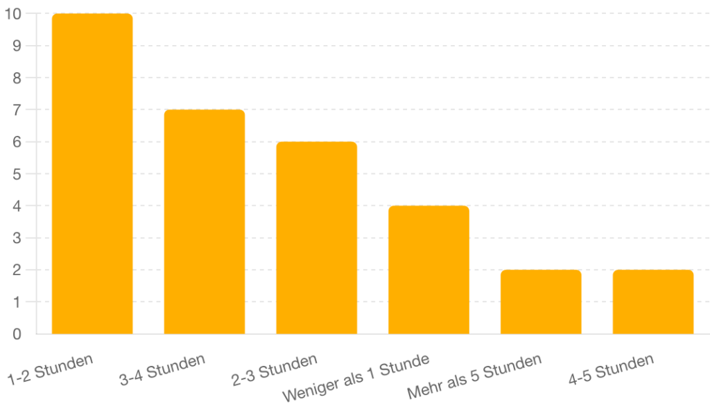
  • Die Nutzung variiert von weniger als einer Stunde bis zu mehr als fünf Stunden täglich.

Einstellung gegenüber Online-Shopping:

  • Einige kaufen regelmäßig online ein, während andere gelegentlich online einkaufen und stationäre Geschäfte bevorzugen.

Interesse an neuen Technologien und digitalen Innovationen:

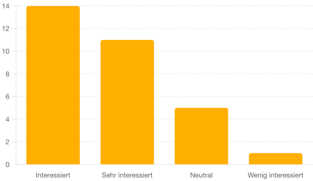
  • Unterschiede im Interesse, von stark interessiert bis weniger interessiert.

Meinung zu Maßnahmen von Unternehmen gegen Energieverbrauch und Umweltverschmutzung:

  • Mehrheitlich befürworten Maßnahmen in gewissem Maße oder auf jeden Fall.

Wichtigkeit von Umwelt- und Nachhaltigkeitsthemen:

  • Viele Befragte legen großen Wert auf diese Themen.

Demografische Verteilung

  1. Alter der Befragten:
    • Die Altersgruppen sind breit gefächert, wobei die meisten Befragten 24 Jahre alt sind.
  2. Geschlecht:
    • Die Mehrheit der Befragten ist weiblich (74.2%).
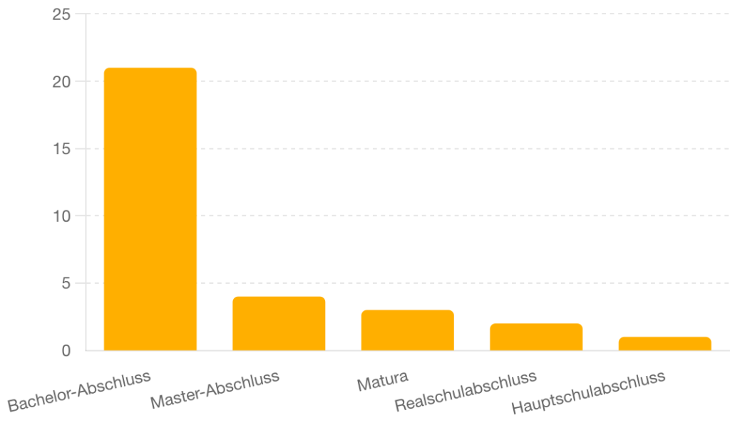
  3. Bildungsstand:
    • Die meisten Befragten haben einen Bachelor-Abschluss (67.7%).
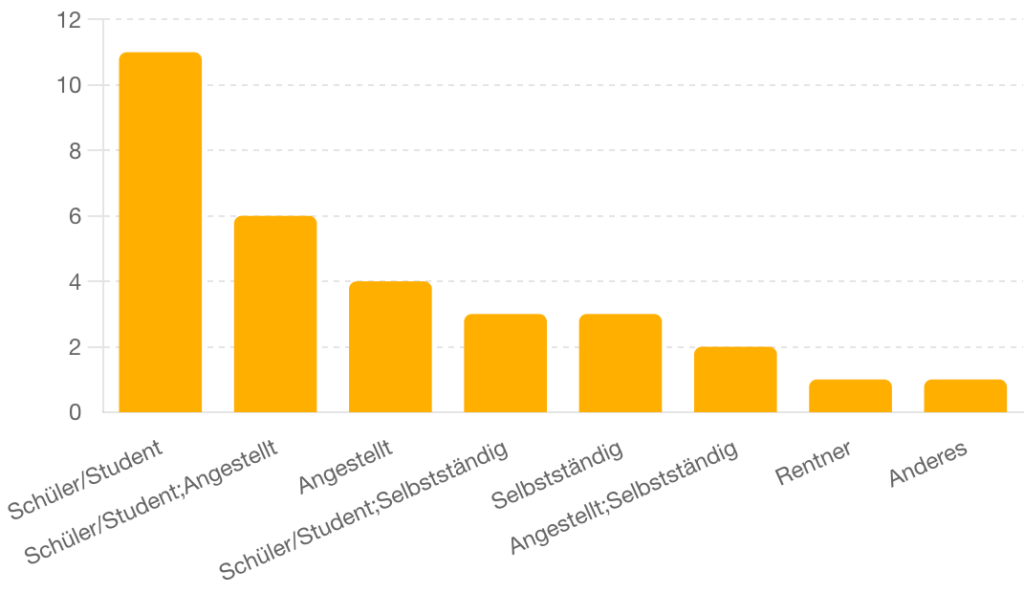
  4. Berufsstatus:
    • Die häufigsten Berufsstatus sind Schüler/Student (35.5%) und Selbstständig (19.4%).
  5. Wohnort:
    • Die Mehrheit der Befragten lebt in der Stadt (74.2%).

Nutzung Sozialer Medien

  • Die tägliche Nutzung variiert stark, wobei die meisten Befragten 1-2 Stunden pro Tag auf sozialen Medien verbringen.

Einstellung gegenüber Online-Shopping

  • Ein großer Teil der Befragten kauft regelmäßig oder gelegentlich online ein, viele bevorzugen aber immer noch den stationären Handel.

Interesse an neuen Technologien und digitalen Innovationen

  • Das Interesse an neuen Technologien ist unterschiedlich, aber viele Befragte zeigen starkes Interesse.

Wichtigkeit von Umwelt- und Nachhaltigkeitsthemen

  • Umwelt- und Nachhaltigkeitsthemen sind für viele Befragte sehr wichtig.

Empfehlungen für Unternehmen

  • Die Mehrheit der Befragten ist der Meinung, dass Unternehmen Maßnahmen zur Reduzierung des Energieverbrauchs und der Umweltverschmutzung ergreifen sollten.

Diese Ergebnisse geben einen guten Überblick über die Ansichten und Gewohnheiten der Befragten und können genutzt werden, um gezielte Maßnahmen oder weitere Untersuchungen durchzuführen.

Analysieren und Gegenüberstellen von Kartenspielen

Um ein besseres Verständnis von Designs bei Brett- und Kartenspielen zu erlagen, habe ich mir die Aufgabe gesetzt zwei beliebte Kartenspiele zu vergleichen. Ich habe mich für den Klassiker Uno, sowie für Exploding Kittens entschieden. Obwohl beide Spiele auf den ersten Blick simpel erscheinen, steckt hinter jedem eine durchdachte Designstrategie, die sie so einzigartig macht.

Exploding Kittens: Kreatives Chaos

Exploding Kittens ist ein relativ neues Kartenspiel, das durch seine ungewöhnliche und humorvolle Gestaltung sofort ins Auge fällt. Das Design dieses Spiels dreht sich stark um den Humor und die Kreativität. Die Karten sind mit skurrilen und witzigen Illustrationen versehen, die von der bekannten Comic-Website The Oatmeal stammen. Dieser Stil spricht vor allem jüngere Spieler und solche mit einem Sinn für absurden Humor an.

Die Spieltechnik ist ebenfalls sehr besonders. Das Spiel dreht sich um das Vermeiden der „Exploding Kitten“-Karte, was ein gewisses Maß an strategischem Denken und Glück erfordert. Es gibt eine Vielzahl von Aktionskarten, die den Spielern verschiedene Möglichkeiten bieten, das Spiel zu beeinflussen und die Explosionsgefahr zu vermeiden. Diese Dynamik sowie die lustigen Characters sorgen für ein aufregendes und oft unvorhersehbares Spielerlebnis.

Uno: Klassische Einfachheit

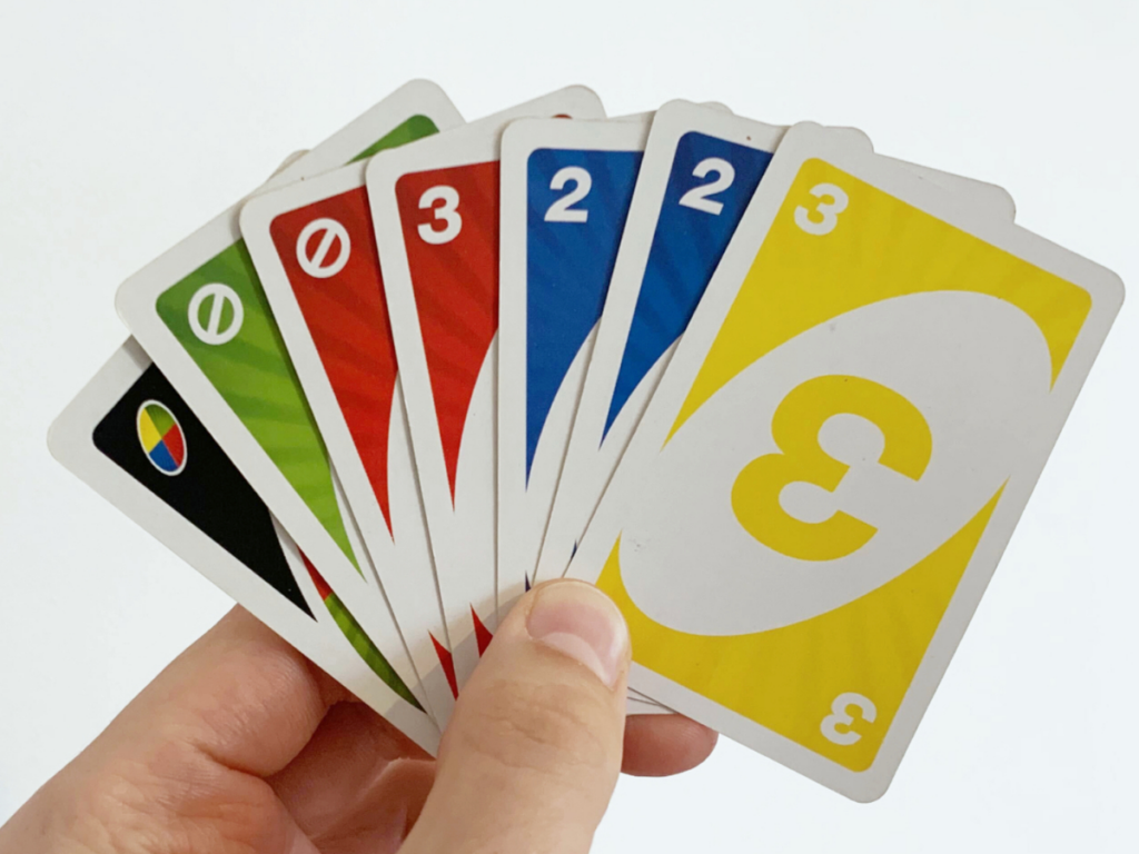
Im Gegensatz dazu steht Uno, ein Klassiker unter den Kartenspielen, der schon seit Jahrzehnten gespielt wird. Das Design von Uno ist viel schlichter und funktionaler. Die Karten sind farblich codiert und nummeriert, was das Spiel besonders zugänglich und leicht verständlich macht. Diese Einfachheit macht Uno zu einem idealen Spiel für alle Altersgruppen und sorgt dafür, dass es schnell gelernt und gespielt werden kann.

Die Spielmechanik von Uno ist einfach, aber effektiv. Ziel ist es, als Erster alle seine Karten loszuwerden, indem man sie farblich oder numerisch auf passende Karten ablegt. Diese straightforward Regelstruktur macht Uno zu einem zeitlosen Spiel, das immer wieder für Unterhaltung sorgt, ohne dass es einer großen Erklärung bedarf.

Gemeinsamkeiten und Unterschiede

Beide Spiele setzen auf ein Kartendesign, das das Spielerlebnis entscheidend prägt. Exploding Kittens nutzt Humor und skurrile Illustrationen, um eine besondere Atmosphäre zu schaffen, während Uno auf einfache, klare Designs setzt, um die Zugänglichkeit und den Spielspaß zu maximieren.

Die Komplexität der Spielmechaniken unterscheidet sich ebenfalls. Exploding Kittens bietet eine größere Vielfalt an strategischen Möglichkeiten, während Uno durch seine Einfachheit und Schnelligkeit besticht. Beide Spiele haben ihre Vorzüge und richten sich an unterschiedliche Zielgruppen. Exploding Kittens ist ideal für Spieler, die den Humor und die strategische Tiefe mögen, während Uno perfekt für schnelle und unkomplizierte Spielrunden geeignet ist.

14 // Experiment 1.1: Effect of typography

My first experiment deals with the effect of typography in branding. I chose an existing hotel branding for this. As I am inspired by the work of Moodley, an agency from Graz, I looked there for suitable branding and finally found what I was looking for.

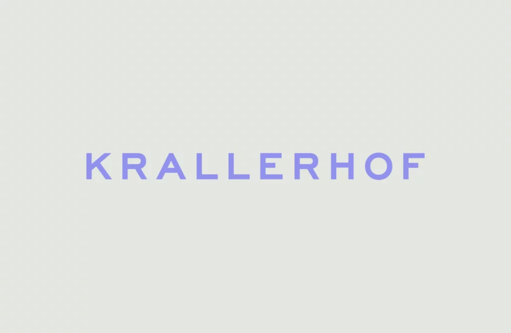
I decided on the new branding for the Krallerhof. The Krallerhof has been around since 1956 and Moodley has helped the family hotel to reposition itself on the market with a new brand strategy and a revised corporate identity.

For the experiment, I added three further variants to the existing logo. I made sure to only change the font. No other objects were added. The original logo uses a sans serif font. For the other variants, I therefore opted for a font with serifs, a handwritten font and a rounded sans serif. I made sure that the spacing is similar for all variants and that a logo is not judged differently because of this factor.

In the next step, I present the different variants to a few people and ask them about certain parameters. This is intended to provide conclusions about the perception of a logo and thus about the brand identity without knowledge of the company. In the first step, the interviewees are presented with a black and white variant. In the next step, the variant with the original colors follows in order to determine whether a change in perception occurs.