14/ An experiment with materials I have at home

This is as experiment about combining photography with everyday materials.

For the first experiment, I wanted to limit myself so I decided to only use materials that I can find at my place. Since I’m still not sure how exactly I’m going to approach this topic – I wanted to push myself to be as creative as possible with the limited materials. I used old photographs.

I chose to work with thread first. Having tried sewing last year, I have a personal connection to it. I used white thread to mimic the fluffiness in the image. When I made a few stitches on the photograph, I was immediatelly drawn to touch it, which I took as a positive sign. I put the thread on the place on the photography where the “flower” is because that seemed logical. This material was easy to work with. In the next experiments with thread I would like to try sewing on the place that don’t have a connection with the thread so I can focus more on creating a feeling of the entire photography.

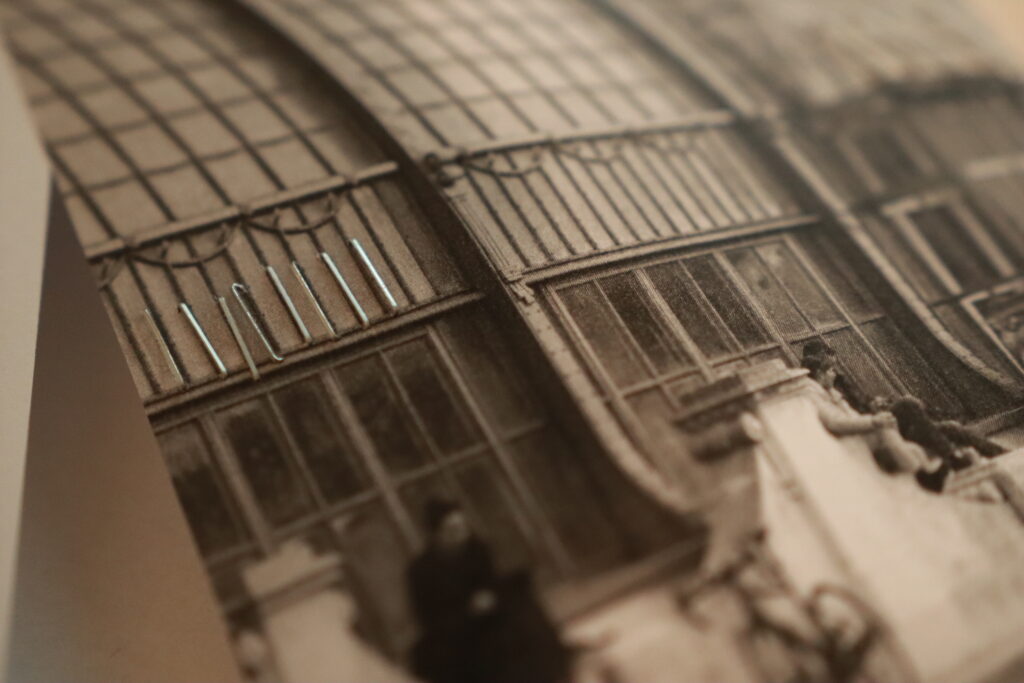
The next material I used was staples. I chose a photograph featuring a metal structure for this experiment. Staples proved to be particularly interesting due to the thin paper of the photograph. When touched, the staples move, creating an engaging user experience. Additionally, the sharp edges of the staples on the back of the photo added an intriguing tactile element. The negative side is that my stapler is small so it is not possible to staple in the middle of the photo.
The next idea was to use a needle to create small holes in the photo. I selected an image of a tree by the seaside because it conveys a sense of tranquility and windiness. I used the holes to represent the wind. This technique was somewhat challenging because I wasn’t sure where to place the holes. Since the photograph is very minimalistic, the holes became quite visible, and I’m not sure if this was the best technique to use.

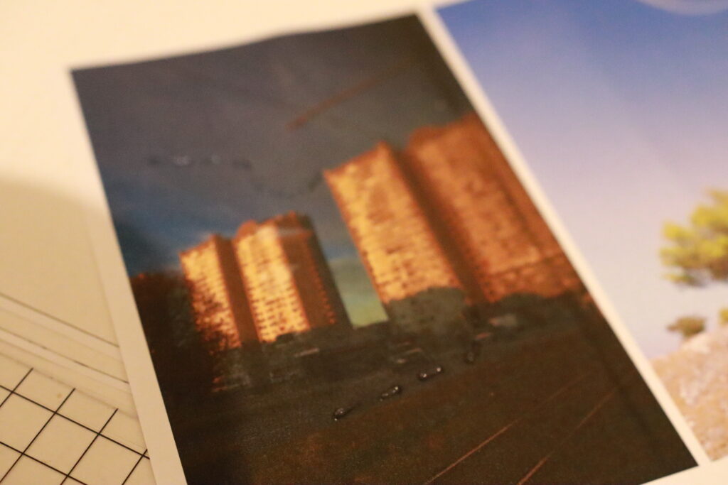
The last technique was using glue. I chose an photography that was taken from a tram so it has reflections in it which is why it made sense to use a transparent material. However, I faced the same issue as with the needle holes—I wasn’t sure where to apply the glue. The shapes created by the glue dominate the picture, and I would prefer something more subtle.
Overall, I think this experiment was a success because I learned that I prefer subtle tactile experience especially when it is surprising and it doesn’t take over the photography – which I think is the main point of my project.


Next Step – Allgemeine Umfrage zum Thema Spiele

Als nächsten Schritt habe ich mir das Ziel gesetzt mit einer Umfrage zu starten, welche allgemeine Fragen zum Thema Brett- und Kartenspiele behandelt. Hier erhoffe ich mir eine gute gesamt Übersicht zu erlangen um in den weitern Schritten selbst Design Experimente durchführen zu können. 
Die Umfrage umfasst folgende Punkte:

1. Wie oft spielst du Brett- oder Kartenspiele?

  • A) Täglich
  • B) Wöchentlich
  • C) Monatlich
  • D) Selten
  • E) Nie

2. Welche der folgenden Spielarten bevorzugst du?

  • A) Strategie- und Taktikspiele
  • B) Partyspiele
  • C) Familien- und Kinderspiele
  • D) Kooperative Spiele
  • E) Kartenspiele
  • F) Abenteuerspiele

3. Welche der folgenden Design-Elemente sind dir bei Brett- und Kartenspielen am wichtigsten? (Mehrfachauswahl möglich)

  • A) Grafiken und Illustrationen
  • B) Qualität der Spielmaterialien
  • C) Verpackung und Box-Design
  • D) Spielanleitung und Regelwerk
  • E) Thema und Story des Spiels
  • F) Spielmechanik und -balance
  • G) Innovatives und einzigartiges Design

4. Wie wichtig ist das Design eines Spiels für deinen Kaufentscheid?

  • A) Sehr wichtig
  • B) Wichtig
  • C) Neutral
  • D) Weniger wichtig
  • E) Unwichtig

5. Beeinflusst die Gestaltung der Spielbox deine Entscheidung, ein Spiel zu kaufen?

  • A) Ja, stark
  • B) Ja, ein wenig
  • C) Neutral
  • D) Nein, kaum
  • E) Nein, gar nicht

6. Wie wichtig ist die Qualität der Spielmaterialien für dich?

  • A) Sehr wichtig
  • B) Wichtig
  • C) Neutral
  • D) Weniger wichtig
  • E) Unwichtig

7. Welche dieser Elemente erhöhen für dich den Wiederspielwert eines Spiels? (Mehrfachauswahl möglich)

  • A) Vielfältige Strategien und Spielweisen
  • B) Hohe Interaktion zwischen den Spielern
  • C) Erweiterungen und zusätzliche Inhalte
  • D) Kurze Spieldauer
  • E) Langfristige Spielentwicklung und -progression
  • F) Zufällige Ereignisse und Variabilität

8. Wie wichtig ist dir die Spielmechanik im Vergleich zum Design?

  • A) Spielmechanik ist viel wichtiger als Design
  • B) Spielmechanik ist etwas wichtiger als Design
  • C) Beide sind gleich wichtig
  • D) Design ist etwas wichtiger als Spielmechanik
  • E) Design ist viel wichtiger als Spielmechanik

9. Kaufst du eher Spiele von bekannten Designern oder Verlagen?

  • A) Ja, immer
  • B) Oft
  • C) Manchmal
  • D) Selten
  • E) Nie

10. Wie informierst du dich vor dem Kauf eines neuen Spiels? (Mehrfachauswahl möglich)

  • A) Rezensionen und Bewertungen online
  • B) Empfehlungen von Freunden oder Familie
  • C) Soziale Medien und Foren
  • D) Spielemessen und Events
  • E) YouTube und andere Video-Plattformen
  • F) Zeitschriften und Magazine

11. Welches Design-Element könnte dich davon abhalten, ein Spiel zu kaufen?

  • A) Schlechte Grafik oder Illustrationen
  • B) Minderwertige Materialien
  • C) Unübersichtliche oder unattraktive Verpackung
  • D) Kompliziertes oder schlecht geschriebenes Regelwerk
  • E) Uninteressantes Thema oder Story
  • F) Mangelnde Innovation oder Originalität

12. Nenne ein oder mehrere Spiele die dir besonders gut gefallen und warum?

20 // Experiment 3.2: Book about branding (evaluation)

The survey included different age groups, including a young person, a master’s student and an adult aged 50.

Young person:

The person found the idea of a book that can be read from both sides very exciting and innovative. The opinion was that the cover design was modern and appealing, especially the choice of colors and typography stood out. The dual reading option was immediately understood and it was expressed that the book would definitely be bought due to the unusual cover. The section dealing with rebranding was particularly interesting as it was believed that this could be applied to personal projects.

Master’s student:

This person was also enthusiastic about the idea and thought the concept was original and practical. The cover design left a professional impression, particularly liking the clean lines and structured arrangement of the elements. The double reading option was also immediately understood and it was expressed that this would be a book that would definitely be bought, especially because of the unique design. It was suggested that the cover could perhaps be made a little more interactive, possibly with an AR application. In terms of content, the person was more interested in the part dealing with starting a new business, as the plan was to create a startup after graduation.

Adult person:

A person aged 50 also found the idea of a book that could be read from both sides very interesting and creative. The cover design was perceived as attractive and professional, and the clarity and organization were particularly appealing. The dual reading option was understandable, even if there was some skepticism at first. It was expressed that such a book would be considered because of the cover, especially if information on branding was specifically sought. One suggestion for improvement was to perhaps place a short instruction or explanation directly on the cover to make the double reading option even clearer. In terms of content, the person was more interested in the section dealing with rebranding, as they had already had experience with brand management and development in their professional career.


Summary:

To summarize, this experiment not only provided new perspectives on branding, but also demonstrated the importance of thoughtful and appealing design for a product’s first impression and usability. The different age groups provided valuable feedback that will help to further refine the book concept and adapt it to the needs of the target groups.

Experiment 1 – Step 2: Random Shapes

In the next step of my first experiment, I tried to randomly create and generate different shapes. First, I researched what options I had for this step: I looked at existing shape generating programs and also tried to create something with AI using Adobe Firefly.

Random Shape Generators

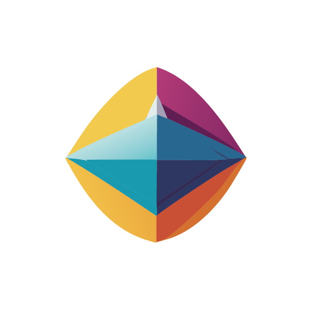
The first random shape generator I tried is the website https://randomgen.eu/random-shape-generator/. Here the user has the possibility to choose from different categories: simple, complex, composed, geometric and special shapes. The most interesting category for me was „special“, where the generator creates unique 2D shapes by placing random points on a curve and filling the enclosed areas with gradients.

Adobe Firefly

In my experiment, the shapes I created with Adobe Firefly are more complex than the previous shapes. Even though I wrote in the prompt that the shape should be simple and minimalistic, it still looks quite complex. Also, if I add the word „random“ in the prompt, Firefly creates shapes with some kind of texture, which I thought was an interesting result.

19 // Experiment 3.1: Book about branding

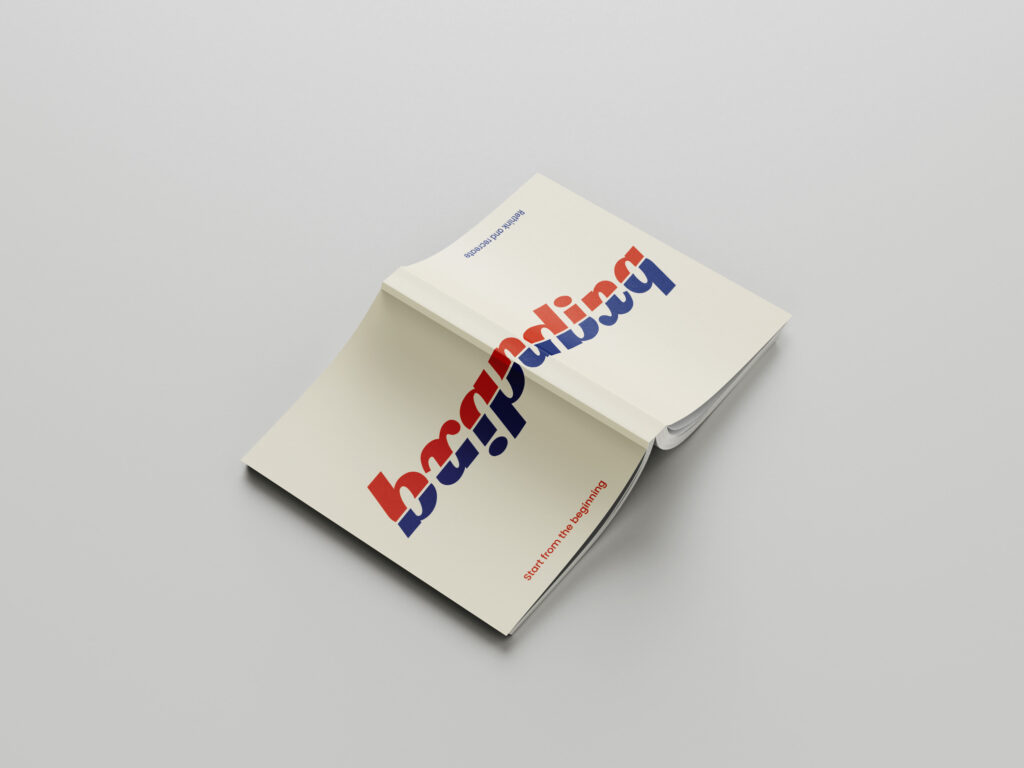
For the third experiment, I have designed a book that can be read from both sides. One side is aimed at people who are starting a new company and want to develop branding from scratch. This part is very conceptual and analytical, especially at the beginning, as values and goals have to be defined first. However, if you read the book from the other side, it is more about how an existing branding can be revised and which aspects are important for successful branding in 2024.

I designed the cover of the book for this experiment. I made sure that the reader quickly understands from the design that this is not an ordinary book, but one that can be read from both sides. The cover is designed in such a way that it conveys the dual reading option at first glance and makes the reader curious to explore the book in both directions.

For my survey, I printed out the cover and folded it around an existing book. In order to better understand the project and be able to empathize with it, I explained the project and its function at the beginning of the survey. In the survey, I wanted to find out how the idea and the design were received by the target group.

I asked the following questions:

  1. What do you think of the idea of a book that can be read from both sides?
  2. What is your first impression of the cover design?
  3. Which elements of the cover particularly catch your eye?
  4. How understandable do you find the double reading option at first glance?
  5. Would you buy such a book based on the cover?
  6. What improvements would you suggest for the cover design?
  7. Which aspects of the book’s content (starting a business vs. rebranding) interest you more and why?

17 User Test-2

With another participant ready, I continued testing the effectiveness of my static and animated origami instructions. As predicted, step number 6 was anticipated to be challenging, and I was prepared to provide the animated version if the participant encountered difficulties.

Personal Data of Test User

  • Gender: Female
  • Age: 52

Test User 2 had no previous experience with origami. This made her an ideal candidate to test the clarity and accessibility of the instructions, especially for beginners.

Testing the Static Instructions

I observed and timed Test User 2 as she followed the static instructions.

  • Time Spent: 3 minutes 54 seconds

Challenges and Observations

As predicted, she encountered difficulties with step 6:

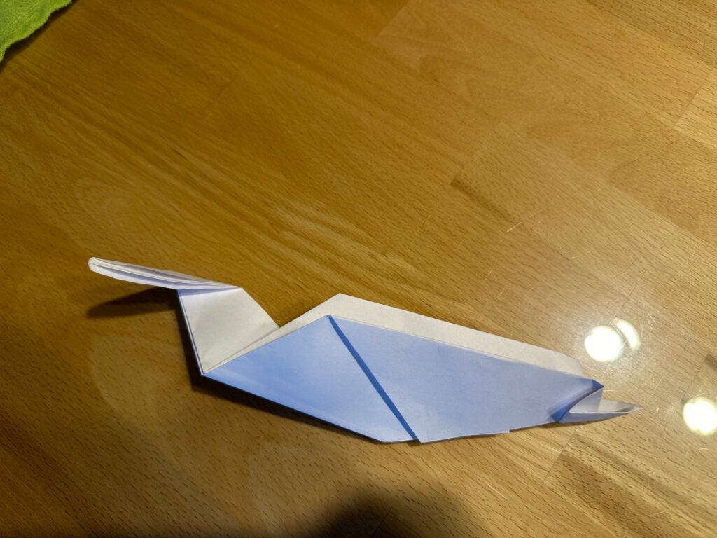
  • Step 6 Issue: She incorrectly folded the head of the duck over the body instead of inward. After pointing out that her fold was not correct, she admitted she didn’t know how to proceed.
  • Solution: I showed her the animated version of step 6. Upon viewing the animation, she understood the correct fold and was able to complete the origami instruction correctly.

Another problem came up at step 5:

  • Step 5 Issue: She initially folded the duck in half in the wrong direction but quickly realized her mistake and corrected it.

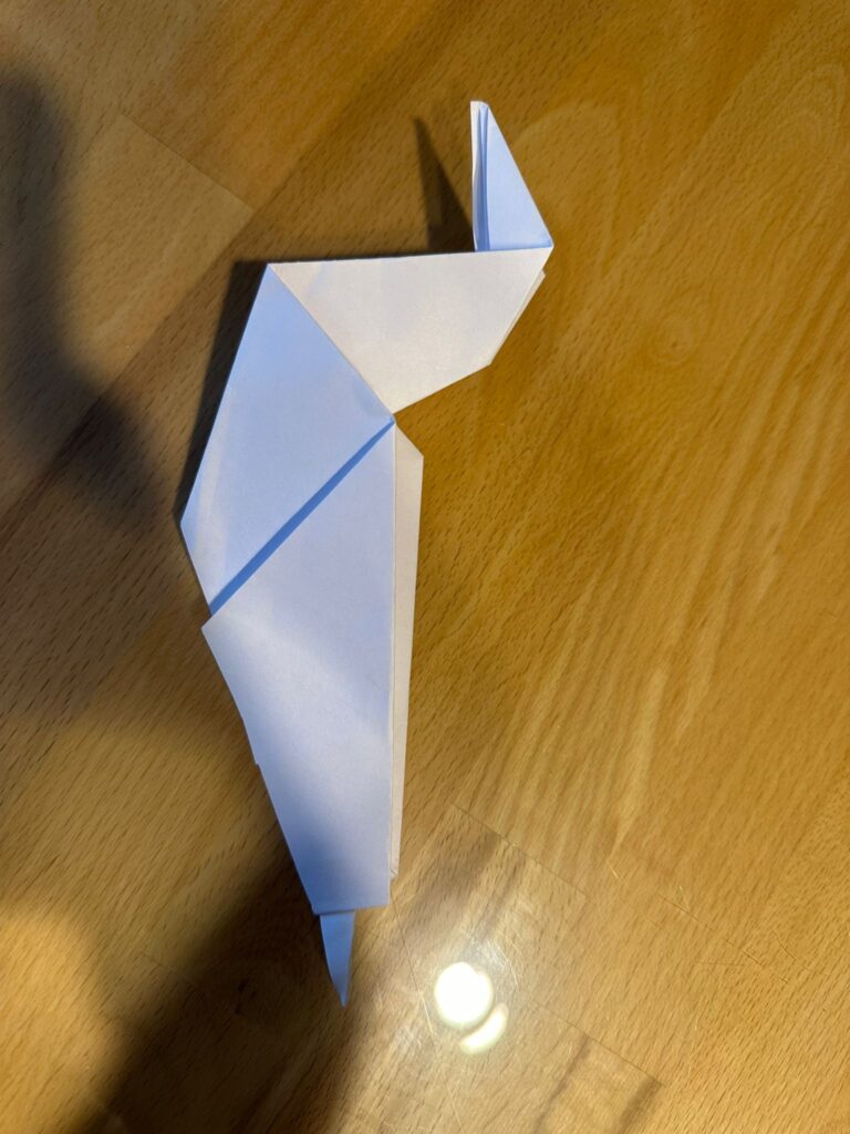
The origami duck when folded incorrectly at step 6

The origami duck folded correctly after I showed the animated step

Reflections and Insights

The second test provided additional valuable insights:

  1. Impact of Experience: Unlike the first participant, User 2 had no prior origami experience, which significantly impacted her ability to follow the static instructions, particularly at the more complex steps.
  2. Effectiveness of Animated Instructions: The animated instruction for step 6 proved crucial in helping the participant understand and complete the fold correctly. This supports the hypothesis that animated instructions can clarify difficult steps.
  3. Additional Complexities: The mistake at step 5, despite being corrected quickly, indicates that even seemingly straightforward steps can cause confusion. This suggests a need for ensuring clarity at every stage of the instructions.

Interpretation of Survey Results: Analog Imperfections in Digital Design

Demographic Insights

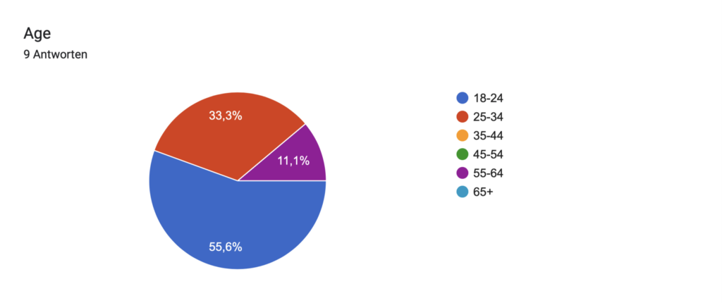
Age:

  • The majority of participants are in the 18-24 age range (55.6%).
  • Other age groups include 25-34 (33.3%) and 55-64 (11.1%).

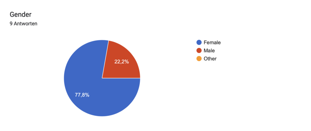
Gender:

  • Mainly female respondents (77.8%).
  • Male respondents account for 22.2%.

Design Involvement

Design Engagement:

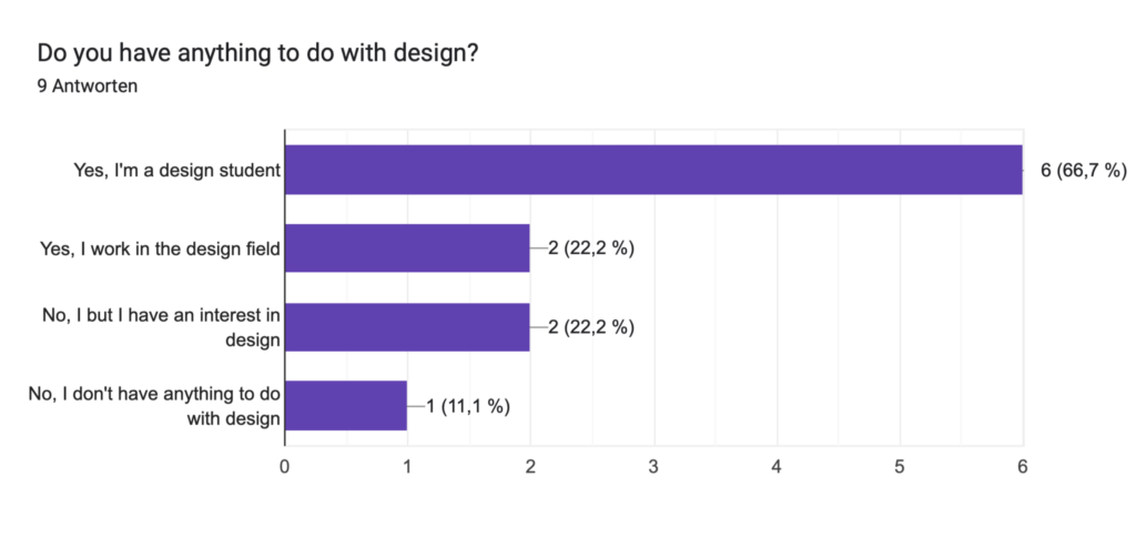
  • Most participants are design students (66.7%).
  • Some work in the design field (22.2%) or have an interest in design (22.2%).
  • A minority have no involvement in design (11.1%).

Design Fields:

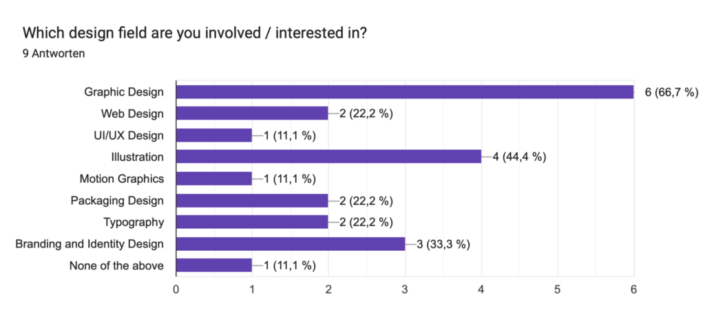
  • Most participants are involved or interested in graphic design (66.7%).
  • Other fields include illustration (44.4%), web design (22.2%), packaging design (22.2%), typography (22.2%), brand and identity design (33.3%), motion graphics (11.1%), and UX/UI (11.1%).
  • A small portion are not involved in any of these fields (11.1%).

Use of Textures in Design

Texture Usage:

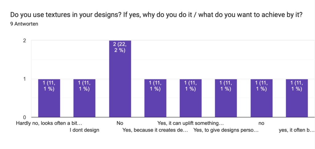
  • A third of the participants do not use textures in their designs (33.3%).
  • Some do not design at all (11.1%).
  • A few avoid textures because they find it looks „crafty“ (11.1%).
  • Others use textures to create depth and structure (11.1%), uplift boring designs (11.1%), add a personal touch and balance digital perfection (11.1%), and bring digital designs to life (11.1%).

Benefits of Textures:

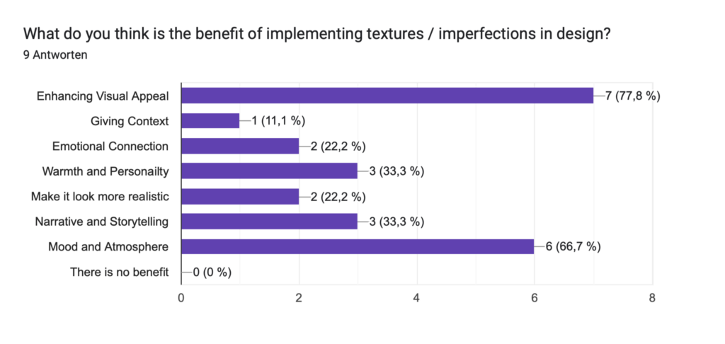
  • Most participants believe textures enhance visual appeal (77.8%).
  • Other perceived benefits include giving context (11.1%), emotional connection (22.2%), warmth and personality (33.3%), making designs look more realistic (22.2%), narrative and storytelling (33.3%), and enhancing mood and atmosphere (66.7%).
  • No participants felt there were no benefits to using textures.

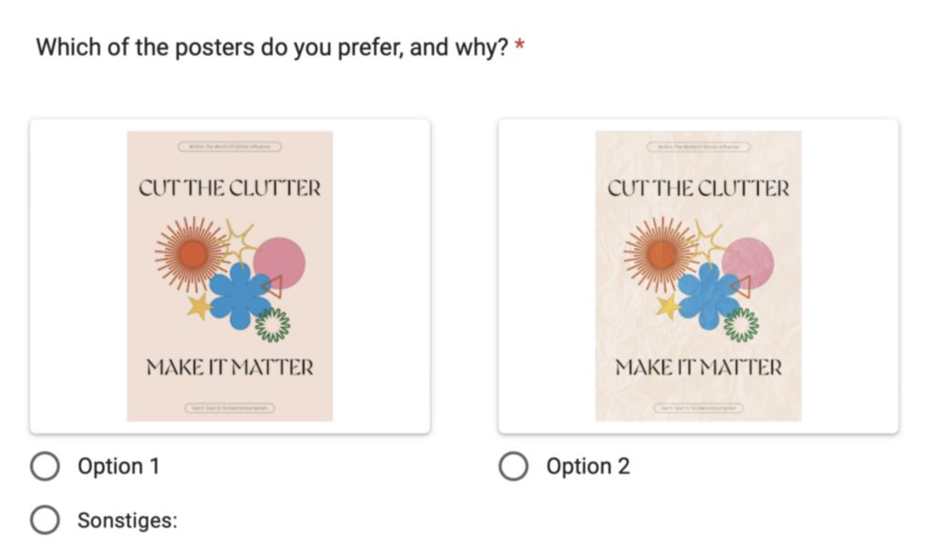
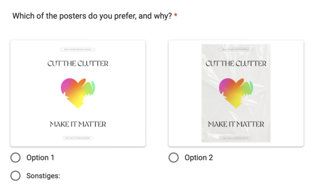
Preferences in Poster Design

Poster Preference 1/2:

  • Option 1 is preferred by 44.4% (noted for its clarity and minimalist design).
  • Option 2 is preferred by 33.3%.

Poster Preference 2/2:

  • Option 1 is preferred by 22.2%.
  • Option 2 is preferred by 77.8%.

Emotional Responses to Textures

Texture 1/3 Emotions:

  • Responses varied widely, including feelings of clumsiness, roughness, calmness, frustration, and more.
  • Textures reminded participants of various things such as everyday life, exam preparation, bedcovers, and public posters.

Texture 2/3 Emotions:

  • Emotions included anger, natural warmth, interest, freshness, frustration, and edginess.
  • Textures reminded participants of things like baking projects, landscapes, aged materials, and bakery bags.

Texture 3/3 Emotions:

  • Emotions included bubbly softness, coldness, modernity, curiosity, and artificial feelings.
  • Applications suggested were related to posters, flyers, and industrial contexts, with some references to climate crisis and packaging.

Conclusion

The survey results show a strong preference for designs with analog textures and imperfections among young, female design students and enthusiasts. These textures are valued for their ability to enhance visual appeal, create emotional connections, and contribute to mood and atmosphere. Preferences in poster design show a mix of minimalist and richly textured styles, suggesting that the context and application of the design play significant roles in determining its appeal. The varied emotional responses to different textures highlight the diverse ways in which textures can impact the perception and effectiveness of a design.

16. Size of facial elements and horizontal distance between the eyes

Introduction

In this new series of images, I have experimented with varying the distances between the eyes and altering the sizes of the eyes and mouth. These modifications aim to delve deeper into how facial proportions affect our perceptions of personality traits. Each image will be evaluated by a test group, who will rank them based on criteria such as approachability, expressiveness, likability, credibility, and intelligence. Through this process, I hope to gain a more nuanced understanding of the visual cues that influence our judgments of others.

Conclusion

Building on the insights from the previous study on vertical facial distances, this research further emphasizes the importance of facial proportions in shaping perceptions. The findings can offer designers valuable guidelines for creating more engaging and relatable visual content. In areas such as branding, character design, and user interface development, understanding how changes in eye distance and mouth size impact perceived traits can enhance the effectiveness of visual communication. By recognizing these subtle yet powerful influences, designers can craft visuals that resonate more deeply with their audience, ultimately leading to more successful and impactful designs.

15. Vertical Distances

Introduction

My next step was to create a series of images in which the vertical distances between the eyes, nose, and mouth are different. I want to show these images to a test group and have them rank the images based on criteria such as friendliness, attractiveness, competence, intelligence, and trustworthiness. Ultimately, I aim to determine if certain characteristics are generally associated with specific facial features. However, I must emphasize that my findings will be based on general perceptions and are not scientifically validated. These associations can be incorrect, and a person’s personality may differ significantly from the impressions suggested by their unique facial proportions.

Conclusion

Despite the limitations of my research, it can still provide valuable insights for designers. Understanding the general perceptions associated with different facial proportions can help designers create more effective and appealing visual content. For instance, in marketing and advertising, knowing which facial features are commonly linked to trustworthiness or competence can guide the selection of images that evoke the desired response from the target audience. Additionally, this research can inform character design in fields such as animation, gaming, and branding, where conveying specific personality traits through visual cues is crucial. While the findings are based on general perceptions and are not scientifically validated, they offer a useful starting point for exploring how subtle changes in facial features can influence human perception.

Survey & Results: Analog Imperfections in Digital Design: A Preference Study

This survey explores how the incorporation of textures and analog imperfections influences the appeal and emotional impact of digital designs. You’ll be shown pairs of designs—one with analog elements and one without—and asked to share your thoughts and preferences.

Up until now nine people participated in this survey. This included people from the design field, as well as people who are just interested in design, or people who have nothing to do with design.

Age:

18-24: 55,6%

25-34: 33,3%

55-64: 11,1%

Gender:

Female: 77,8%

Male: 22,2%

Do you have anything to do with design?

Yes, I am a design student: 66,7%

Yes, I am working in the design field: 22,2%

No, but I have an interest in design: 22,2%

No, I don’t have anything to with design: 11,1%

Which design field are you involved / interested in? (multiple answers possible)

Graphic Design: 6 votes

Web Design: 2 votes

UX/UI: 1 vote

Illustration: 4 votes

Motion Graphics: 1 vote

Packaging Design : 2 votes

Typography: 2 votes

Brand ad identity design: 3 votes

None of the above: 1 vote

Do you use textures in your designs? If yes, why do you do it / what do you want to achieve by it?

„no“: 33,3%

„no, I don’t design“: 11,1%

„Hardly no, looks often a bit crafty“: 11,1%

„yes, because it creates depth and structure“: 11,1%

„yes, it can uplift something boring and make it more interesting“: 11,1%

„yes, to give designs personal touch and balance the digital perfection“: 11,1%

„yes, it often brings digital designs to life somehow“: 11,1%

What do you think is the benefit of implementing textures / imperfections in design?

Enhancing Visual Appeal: 77,8%

Giving Context: 11,1%

Emotional Connection: 22,2%

Warmth and Personailty: 33,3%

Make it look more realistic: 22,2%

Narrative and Storytelling: 33,3%

Mood and Atmosphere: 66,7%

There is no benefit: 0%

1/2: Which of the posters do you prefer, and why? 

Option 1: 44,4%

(one person wrote „option 1 is my fave, it is clearer and more minimalist“)

Option 2: 33,3%

2/2: Which of the posters do you prefer, and why? 

Option 1: 22,2%

Option 2: 77,8%

1/3: What emotions each texture makes you feel? You can also describe what they remind you off / where you think they could be applied etc… (9 Answers):

  • Clumsy
  • Applied for poster design, rough look, cold
  • Reminds me of everyday life:)
  • Calmness, but somehow it triggers me that it is not symmetrical
  • Preperation for exams or presentations (cheat sheet)
  • Bedcover, sleeping, dreaming / used / space
  • Bad handling of paper (not on purpose)
  • Handmade aspect
  • A poster or flyer, it makes me think of a poster on the street or on a public transport somehow as if someone left it there or lost it

2/3: What emotions each texture makes you feel? You can also describe what they remind you off / where you think they could be applied etc… (9 Answers):

  • Angry
  • Crumbly, natural, warmth
  • Like the contrast looks interesting
  • Freshness, reminds me of baking, maybe because of the color? could be nicely used for a project with food
  • Frustration
  • Landscape, aged, light and shadow, in motion, birds perspective, airy
  • Texture vibe (on purpose)
  • Very rough, edgy
  • That’s too much texture for my taste, idk where i would use it, but it reminds me of a bakery bag the one you your sandwich comes in

3/3: What emotions each texture makes you feel? You can also describe what they remind you off / where you think they could be applied etc… (9 Answers):

  • Bubbly soft feeling
  • Cold, modern, edgy, glossy
  • Almost has a wet look, futuristic
  • Curious, because it is „wrapped“ / „packed“
  • Awaiting a package
  • Artificial, slippery, don‘t like it
  • Modern
  • In context of Clima crisis
  • Maybe also for a poster or for a flyer, it looks packaged and has more of an „industrial“ vibe if that makes sense