07. Child Scheme

How do Humans Perceive Cuteness?

Definition of the Baby Schema (Kindchenschema)

The term baby schema (or Kindchenschema) refers to a specific set of facial features commonly found in human and animal infants, including a large head, a round face, a high forehead, large eyes, and a small nose and mouth. These features trigger an „innate releasing mechanism“ for caregiving behaviors and emotional responsiveness (Frontiers, 2014). This response is crucial for survival, as it encourages nurturing behavior toward infants. Neuroimaging studies show that the baby schema activates brain areas associated with caregiving, increasing attention, protective behavior, and reducing the likelihood of aggression.

Is the Visual Preference of Baby Schema Innate?

Studies show that adults tend to spend more time looking at infant faces than adult faces, and they prefer „cuter“ infants over less cute ones. This visual preference appears early in development. In one study, even children spent more time viewing images with stronger baby schema features than those with weaker ones. However, some research suggests that sensitivity to baby-like traits develops gradually. While adults rated infant faces higher in cuteness, children gave similar ratings to both infants and adults who still retained some infantile features.

Participants tend to focus their gaze on three main areas of the face—particularly the eyes, nose, and mouth—once they detect baby schema traits.

These are the three main areas of the human face participants focus their gaze on after detecting the baby scheme within the features.

Cuteness Perception Across Species

Interestingly, the perception of cuteness is not limited to human infants. It extends to other species as well. Images of pets, such as dogs and cats, can evoke similar responses. However, studies show differences in gaze allocation; for example, humans focus less on the mouths of animals compared to human faces. This is because humans are less attuned to interpreting emotional cues from the mouths of non-human species. For humans, the mouth plays a crucial role in communication and language comprehension.

Pet ownership does not necessarily enhance the ability to read emotional cues from animals, but it does increase „cuteness sensitivity.“ Pets often retain juvenile features throughout their lives, both in appearance and behavior, which naturally attracts humans. This is why even cartoon characters or stuffed animals designed with infantile traits can trigger similar caregiving responses. The bond between humans and their pets often mirrors the parent-child relationship, reinforcing the emotional connection.

Summary of the Study

The concept of baby schema was initially proposed as a set of infantile traits that attract human attention and elicit caregiving behaviors. A study funded by the European Science Foundation demonstrated these effects by presenting participants with 120 manipulated color photographs showing varying degrees of baby schema features. Participants consistently rated images with more pronounced infantile traits as cuter and spent more time looking at them.
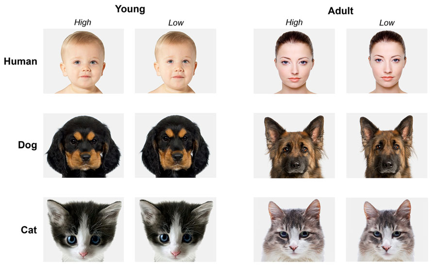
While adults tend to have a heightened sensitivity to baby-like features, the attraction to such traits emerges early in childhood. Overall, facial appearance strongly influences perceptions of cuteness and attractiveness, reflecting a deep-seated human interest in infants and a motivation to care for them.

Sofie Neudecker, 31. 12. 2023

Sorces:

„Baby schema in human and animal faces induces cuteness perception and gaze allocation in children.“ Developmental Psychology. Frontiers in Psychology, May 2014. Frontiers Article.

„Kindchenschema: Why do we find Babies so cute?“ Science ABC, July 2020. YouTube Video.

Cognitive Load Theory

I decided to focus on the topic „Learning through static images vs animated graphics“. In this blog entry I would like to focus on Cognitive Load Theory. Understanding CLT is like having a map for learning. As we delve into the world of static and animated images, CLT gives us a solid foundation. It tells us how our minds handle information, pointing out where things might get tricky and where we can make learning smoother. By keeping CLT in mind, we can design learning experiences that are just right—neither too overwhelming nor too bland.

Developed by Sweller, CLT sees our minds as natural information processors. Helps us unterstand how we absorb, process, and remember information, making it a good starting point for exploring the differences between learning from static and animated images.

There are 5 basic principles of CLT:

1. Long-term Memory and the Information Store Principle:

Most of what we do relies on the vast library in our brains called Long-Term Memory (LTM). It’s like our personal information storehouse, driving actions like problem-solving based on what we’ve learned before.

2. Schema Theory and the Borrowing and Reorganizing Principle:

How do we fill up this memory bank? CLT suggests we borrow from others by imitating, listening, or reading. Schemas, mental structures that help us organize information, play a big role in this process.

3. Problem Solving and the Randomness as Genesis Principle:

When we can’t borrow knowledge, we turn to problem-solving. Trying out new things and seeing what works becomes a source of fresh understanding.

4. Working Memory and the Narrow Limits of Change Principle:

Our working memory handles new information, but there’s a catch—it can only juggle a few new things at once. Trying to process too much at once leads to a mental traffic jam.

5. Relations Between Long-term and Working Memory and the Environmental Organizing and Linking Principle:

This principle helps transfer organized information from our long-term memory to our working memory, making it easier for us to function in our surroundings. It’s like upgrading information from storage to the front of our minds.

Cognitive Load Theory provides valuable insights into the workings of the human mind during learning. It’s a tool that helps us make sense of the learning journey. Whether we’re dealing with static images or animated ones, understanding how our brains process information is key. 

Sources:

https://www.researchgate.net/publication/220495654_Instructional_animations_can_be_superior_to_static_when_learning_human_motor_skills
https://www.structural-learning.com/post/cognitive-load-theory-a-teachers-guide

Why do designers incorporate handmade, imperfect elements like texture, folds, tears, grains, handmade typography… into graphic designs?

Designers incorporate handmade, imperfect elements such as texture, folds, tears, grains and handmade typography into graphic design for a number of reasons:

Handmade elements build a relationship with the viewer based on trust and shared experience, as imperfections are natural, human and signifiers of a narrative that reveals how an object was made.

The recent shift in design trends towards a more raw and natural aesthetic is accelerating as people increasingly embrace the imperfections in everyday things, recognising that the roughness and uniqueness of these elements is what makes them special.

Sometimes it’s the imperfections that make a design truly memorable, as they can evoke surprise, delight or empathy in users, adding a human touch and authenticity to designs that resonate emotionally with users.

Precise geometric lines illustrate objects that are artificial and technological, whereas curvy, imperfect lines can represent more natural and organic forms, creating a more authentic and relatable aesthetic that resonates with people.

Integrating analogue elements into digital platforms can enhance the user experience and foster a sense of nostalgia as it helps us appreciate imperfection and process, celebrating the beauty of imperfection in a digital age and rediscovering the timeless appeal of authenticity.

In summary, designers are integrating handmade, imperfect elements into graphic design to create designs that are more meaningful, relatable and impactful, ultimately fostering empathy and trust with their audiences.

Sources:

https://www.creativebloq.com/future-handmade-design-5132895

https://bootcamp.uxdesign.cc/embracing-imperfection-64a57d3f6372?source=rss——-1

https://elements.envato.com/learn/back-to-basics-organic-graphic-design-trends

https://utilitiesone.com/analog-communication-embracing-imperfections-in-a-digital-world

06. The Power of Makeup

The Science behind Makeup Obsession

Before discussing the power of makeup, it is important to clarify that this article focuses on women and their use of makeup. While there is growing acceptance of men using makeup to enhance or alter their appearance, women remain the predominant group using it daily. This imbalance reflects a historical development in which societal beauty standards have pressured women to appear more appealing, often to meet the preferences of men. Though this dynamic has its roots in sexism, it continues to shape how makeup is perceived and used today. Therefore, understanding the link between gender identity and makeup—still strongly associated with femininity—is crucial for fully appreciating its societal impact.

While these points warrant deeper exploration, they fall outside the primary scope of this article, which focuses on the connection between makeup and facial structure. Nevertheless, keeping these broader issues in mind provides important context for understanding makeup’s role in contemporary beauty standards.

The Transformative Power of Makeup

Makeup has the power to alter or emphasize a person’s natural appearance. According to research, approximately „44 percent of American women do not like to leave their homes without makeup“ (Van Edwards, 2023). The reasons women wear makeup are multifaceted, but they primarily revolve around two key motivations: camouflage—to appear less noticeable and reduce anxiety—and seduction—to become more attractive, feel confident, and appear more socially assertive. Some studies suggest that women who wear makeup are often „driven by fear“ of being treated differently without it, as well as early societal pressures for success. The Association for Psychological Science states that „attractive people are treated more favorably in every area of life,“ which adds to the incentive for using makeup to enhance success.

Characteristics of Attractive Female Faces

  1. Color Contrast Around the Eyes and Lips
    Women naturally have darker lips and areas around their eyes, which our brains interpret as signs of femininity. This contrast is often heightened with the application of lipsticks and eye shadows, making the face appear more defined and attractive.

Symmetry and Facial Balance
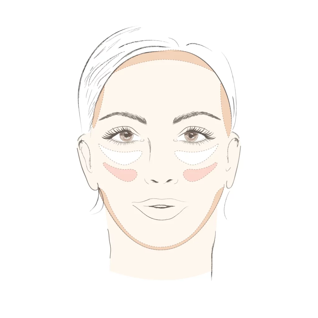
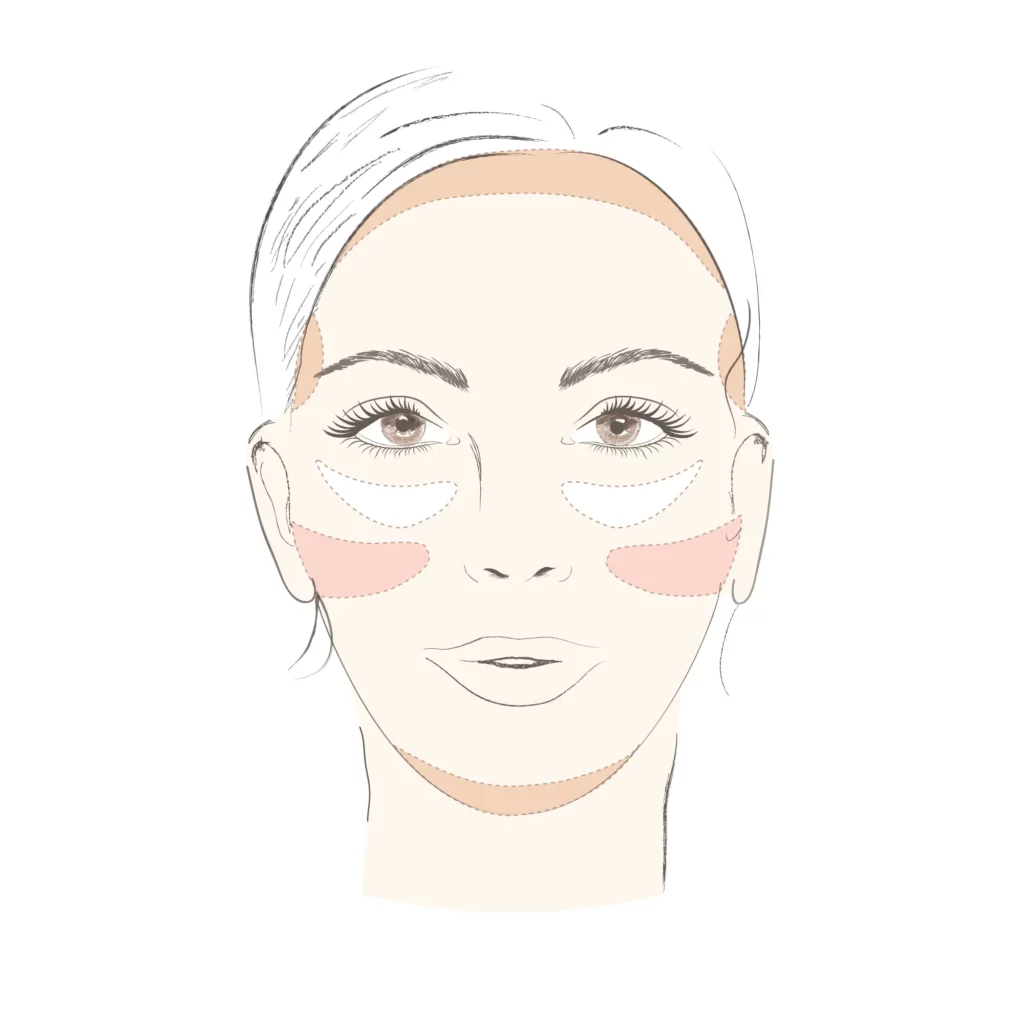
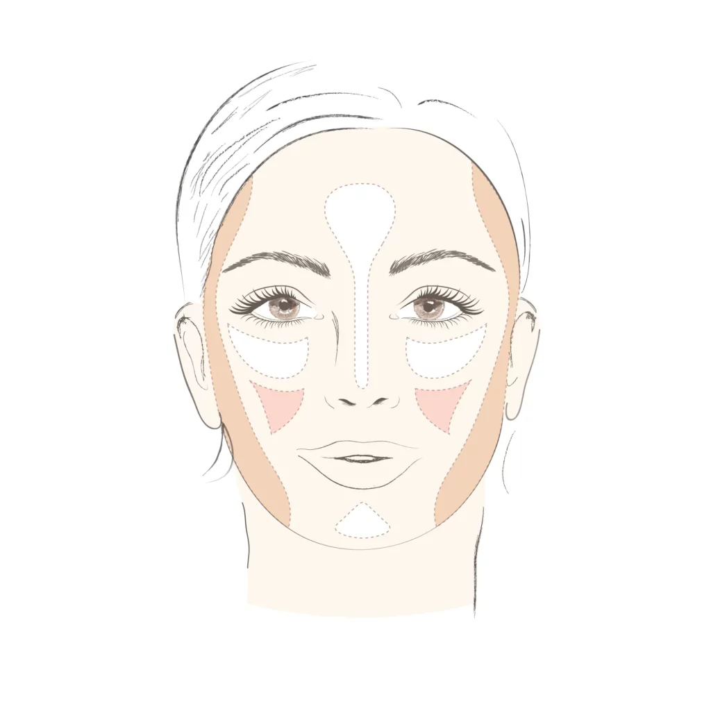
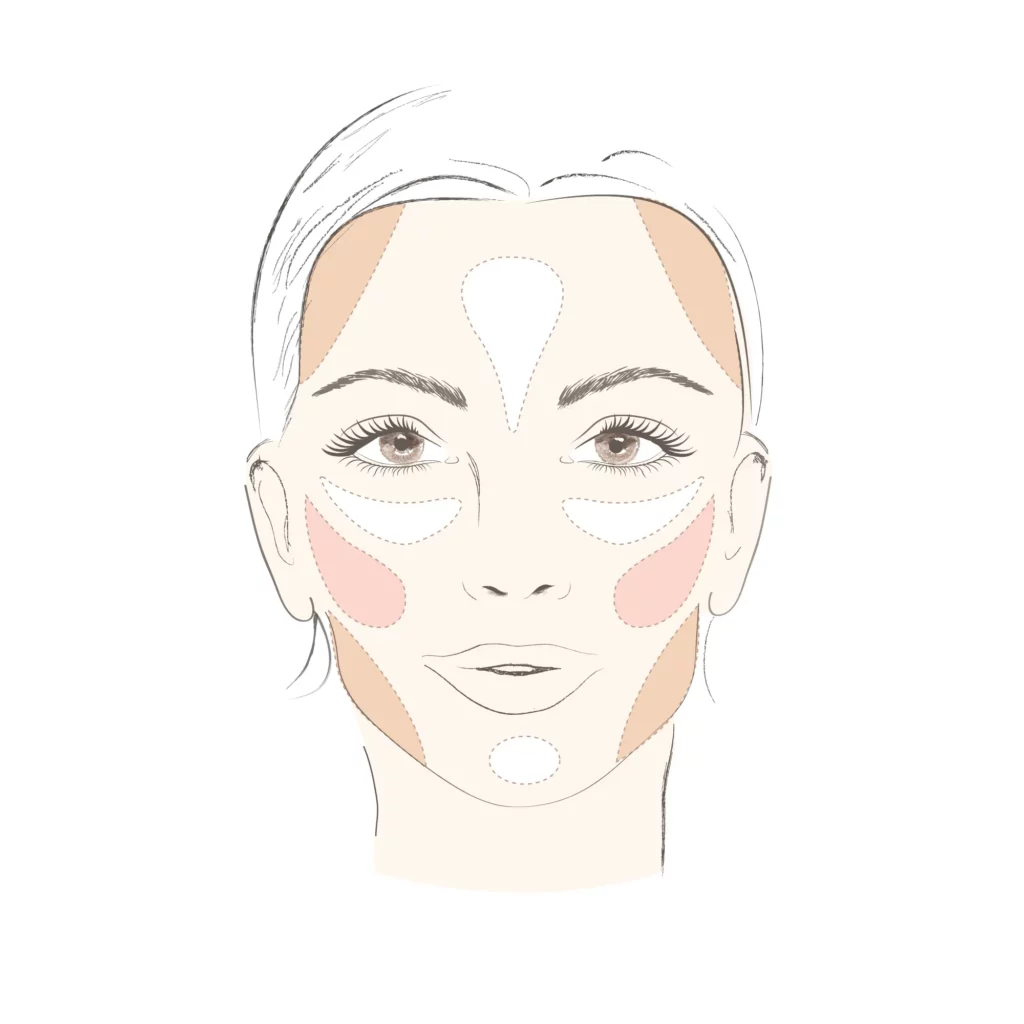
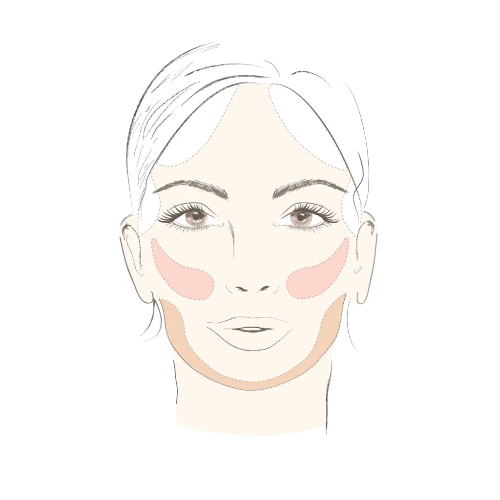
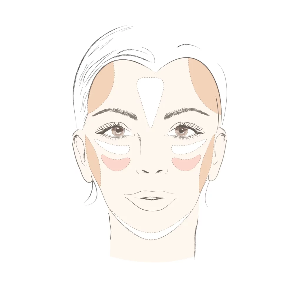
Symmetry plays a significant role in how attractiveness is perceived. Even when humans cannot consciously detect symmetry, the brain tends to prefer it. Makeup helps to even out skin tone and balance features through contouring, eyeliner, and lipliner. This process highlights a person’s facial shape and structure, making them appear more symmetrical and appealing. Makeup application can vary based on the face’s outer shape, with each type—oval, round, square, triangular, or heart-shaped—requiring different contouring strategies to bring out individual features.

Clear and Even Skin
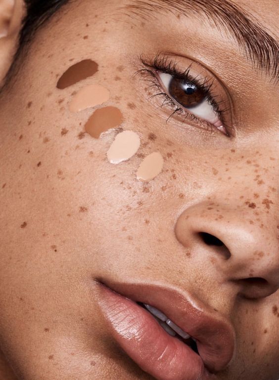
Foundation has a significant impact on how women are perceived. Studies have found that women who wear foundation at work tend to enjoy „higher earnings and promotion potential.“ For those dealing with acne or other skin imperfections, using concealer and foundation can help even out their complexion, though it is equally important to let the skin breathe and remove makeup regularly.

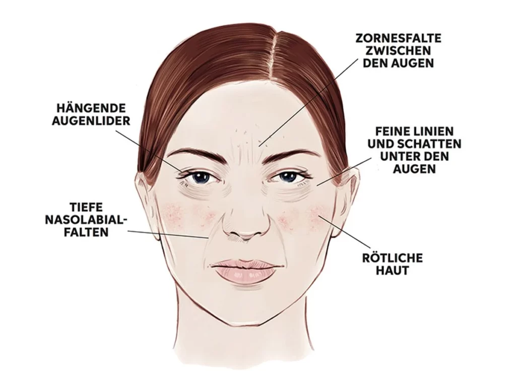
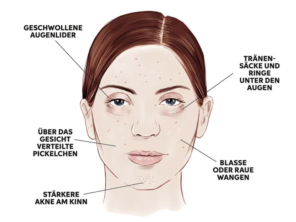
Skin Mapping and Inner Health

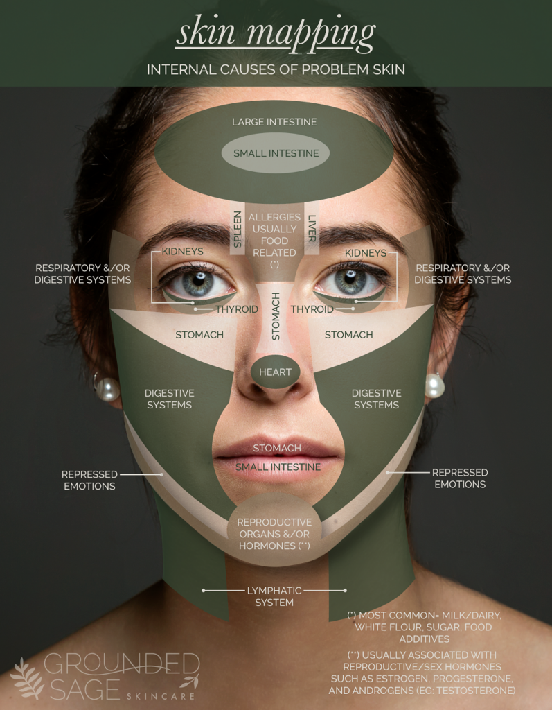
Certain areas of the face can reflect imbalances in the body, according to traditional Chinese medicine and Ayurvedic practices. This technique, known as „skin mapping,“ links specific skin issues with internal health problems. Here are the primary areas of the face and their corresponding health concerns:

  • Forehead: Spots and blackheads around the temples can indicate issues with the spleen or brain.
  • Cheeks: Redness or inflammation may be linked to high histamine levels or excessive sugar and gluten consumption.
  • Nose: Redness, blackheads, and dry skin can reflect digestive issues such as IBS.
  • Mouth: Cracked lips or acne around the mouth may point to imbalances in the intestines or hormonal issues like PCOS.
  • Jawline: Blackheads and changes in skin texture around the jaw are often related to gallbladder issues or high testosterone.

Dietary Imbalances and Intolerances

Research has shown that dietary choices such as excessive sugar, alcohol, gluten, and dairy can trigger a chain reaction in the body, affecting the skin’s appearance. These foods can disrupt gut health, causing specific skin problems to arise in certain areas of the face.

For instance:

  • Alcohol: Known to cause puffiness and broken capillaries, resulting in visible effects on the skin.
  • Gluten: May lead to skin flare-ups and contribute to inflammation, particularly around the cheeks and jawline.
  • Milk: Linked to acne and clogged pores, especially in sensitive individuals.
  • Sugar: Associated with breakouts and premature aging due to its inflammatory effects.

In addition to pure skin those three enhancements have the largest effect when it comes to facial beauty:

1. Blush: it makes you look healthier and slightly aroused
2. Mascara, eye shadow, eye liner: women with more color variations around their eyes look younger and more attractive
3. Lipstick: a higher color contrast around the mouth has a similar effect

Makeup and Social Relationships

Makeup not only affects physical appearance but also plays a role in how women are perceived by others and how they form relationships. Studies show that makeup can influence how women perceive other women. For example, women wearing makeup are often seen as more dominant, which may enhance their career prospects. However, bold or heavy makeup can also spark jealousy, with women viewing heavily made-up individuals as more promiscuous or competitive. Friendships often form more quickly between women who wear similar styles of makeup, indicating that makeup signals shared values or priorities.

Interestingly, men’s reactions to makeup differ significantly. While bold makeup might give the impression of a woman being open to casual relationships, studies suggest that men respond more positively to moderate makeup, which they associate with friendliness and approachability. The social psychology of makeup reveals that the way it is applied can influence everything from career advancement to dating prospects.

Subtlety is Key

While makeup holds significant power, studies suggest that subtle application tends to yield the best results. Women who wear moderate amounts of makeup are perceived as more likeable, trustworthy, and competent. Ultimately, each individual should choose the amount of makeup that makes them feel the most confident. Whether someone prefers a natural look or enjoys bold, expressive makeup, it is important that their choices reflect their personality. Men should also feel free to embrace makeup if it enhances their confidence and self-expression.

Conclusion

The science behind makeup reveals that it is not just a superficial tool but a powerful way to influence how we are perceived by ourselves and others. By enhancing certain facial features, makeup can boost confidence, improve social interactions, and even impact career success. However, as with any tool of self-expression, the most important consideration is how it makes the individual feel—empowered, confident, and true to themselves.

Sofie Neudecker, December 28, 2023

Sources:

Van Edwards, Vanessa. „Why Do Women Wear Makeup? The Science Behind Makeup Obsession.“ Science of People, 2023. https://www.scienceofpeople.com/makeup/.

Iredale, Jane. „Das Geheimnis des Contourings. Mit Unserer Anleitung Ganz Leicht.“ The Skincare Makeup, 2023. https://www.janeiredale.de/contouring-leicht-gemacht/.

Ferencak, Kelsey. „Face Mapping Can Tell You What’s Really Behind Your Skin Dilemmas.“ Body + Soul, March 2020. http://desres23.designandcommunication.net/wp-admin/post.php?post=2110&action=edit.

Sonnentag, Barbara. „An Ihrem Gesicht Erkennen Sie, Ob Sie zu Viel Zucker, Alkohol Oder Gluten Konsumieren.“ Freundin, October 2022. https://www.freundin.de/lifestyle-gesicht-zucker-alkohol-gluten-erkennen.

Images:

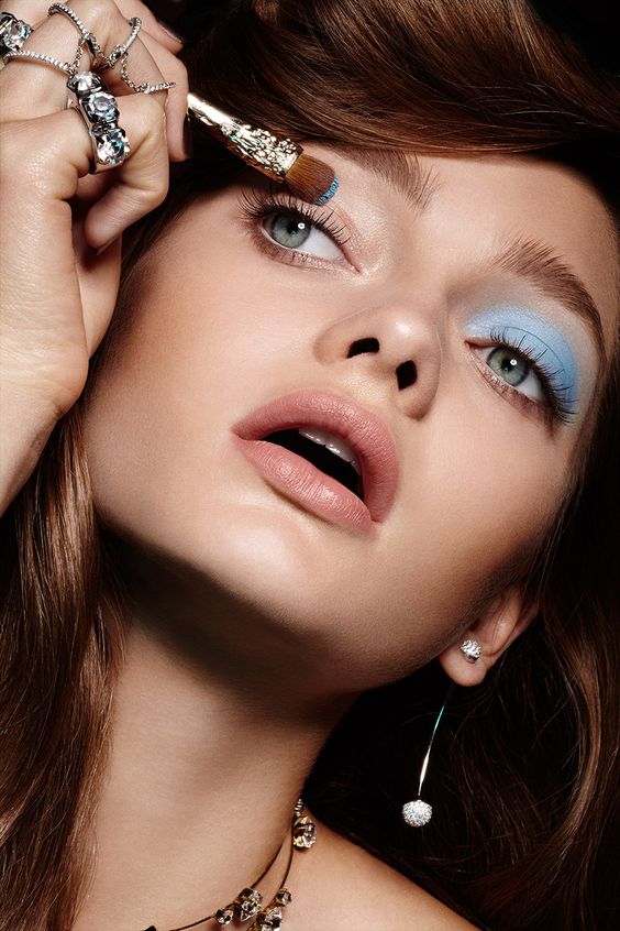
„Image of Makeup Brushes and Accessories.“ „Pinceaux et Accessoires,“ Artistpar Marilyn. https://www.artistparmarilyn.com/collections/pinceaux-et-accessoires (accessed October 4, 2024).

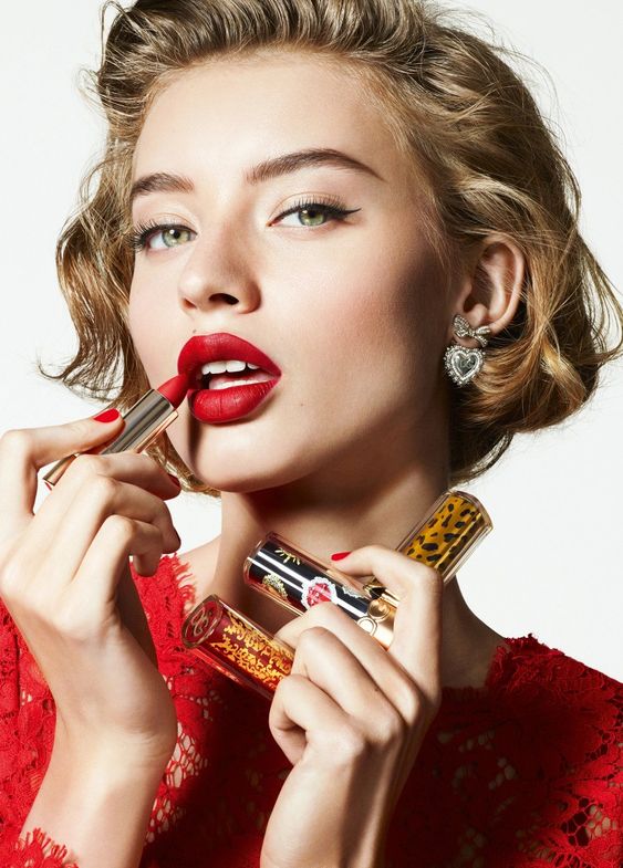
Dolce & Gabbana Beauty. „02 Roses The Only One Matte Lipstick Cap.“ Ounass. Accessed October 4, 2024.
https://en-saudi.ounass.com/shop-dolce-gabbana-beauty-02-roses-the-only-one-matte-lipstick-cap-for-women-214878075_0.html.

Bryan Bantry. „Makeup.“ Bryan Bantry Agency. Accessed October 4, 2024.
https://www.bryanbantry.com/makeup.

Grounded Sage. „Acne Face Map.“ Grounded Sage, accessed October 4, 2024.
https://site.groundedsage.com/acne-face-map/.

The Illusions in Randomness

In my research, I have tended to ask the questions „What makes randomness feel and look random?“ and „Can randomness be seen as not random?“ In this blog entry, I will explore the clustering illusion and the illusion of randomness.

The Clustering Illusion

When looking at clouds, it becomes clear how easily recognizable shapes such as people, animals, or objects appear. Called the „clustering illusion,“ this is the human tendency to perceive patterns in random data. Our evolutionary development has honed our ability to identify specific objects, including faces, potential threats in shadows, and familiar objects. Once the brain becomes adept at recognizing certain patterns, it tends to see them everywhere.1

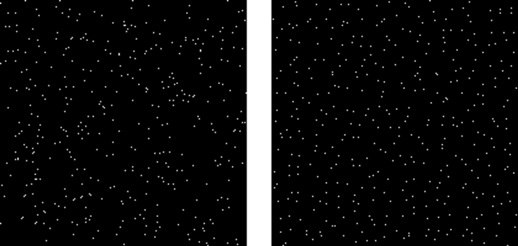
The clustering illusion extends beyond earthly observations to illustrate the human tendency to see random events as more orderly or uniform than they really are. A pertinent example is the perception of stars in the night sky, where certain areas appear densely populated while others appear empty. This illusion arises from the tendency to assign a physical explanation to this non-random distribution, despite the fact that the positions of the stars are inherently random.

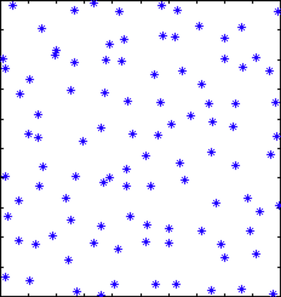
The left image below shows an example of a truly random star field, while the right image shows a manually generated star field that appears too uniform to be realistic, but is more in line with human expectations of randomness. In the example on the right, each star is randomly positioned within its own 20 × 20 pixel square, resulting in a more uniform but unrealistic result.2

Image source: https://tomroelandts.com/articles/the-clustering-illusion

The Illusion of Randomness

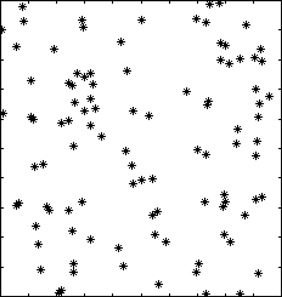
Richard A. Muller illustrates the illusion of randomness by generating two sets of star patterns. Using a computer, he first creates a plot with completely random locations, resulting in a seemingly uneven distribution of stars. To counteract this perception, Muller then divides the space into 100 smaller boxes and randomly places a star in each box, creating a more uniform appearance. Surprisingly, when asked which pattern looks more random, most people choose the second plot, which is actually the non-random one. The uniform distribution makes it look more random, challenging our intuitive understanding of randomness in seemingly clustered patterns. Muller emphasizes that truly random patterns can appear clustered, leading to the need to make them more uniform to convey a sense of randomness, as in many depictions of stars in artwork.3

Image source: https://muller.lbl.gov/teaching/Physics10/old physics 10/chapters (old)/4-Randomness.htm

What makes randomness feel and look random?

Understanding randomness can be challenging because of the limitations of our intuition. Asan example, consider the image below, with three sets of 132 points representing the nests of Patagonian seabirds, the nest sites of ant colony, and randomly generated coordinates.

Image source: https://behavioralscientist.org/yates-expect-unexpected-why-randomness-doesnt-feel-random-sense-patterns/

Identifying the truly uniform random distribution can be difficult, as our perception of randomness tends to lean toward well-spaced arrangements. Surprisingly, the leftmost image with uniformly distributed points is often perceived as less random than the other two images, which represent the locations of ant and seabird nests. This cognitive bias led to research into metrics that objectively determine spatial randomness, removing human perception from the equation. While our brains may struggle with randomness, recognizing it is crucial in various situations. This finding not only challenges our preconceived notions, but also underscores the importance of using objective metrics to reveal the true nature of randomness in spatial patterns.4


Sources

  1. https://medium.com/@nexy.io/clustering-illusion-1055023fec59 ↩︎
  2. https://tomroelandts.com/articles/the-clustering-illusion ↩︎
  3. https://muller.lbl.gov/teaching/Physics10/old physics 10/chapters (old)/4-Randomness.htm ↩︎
  4. https://behavioralscientist.org/yates-expect-unexpected-why-randomness-doesnt-feel-random-sense-patterns/ ↩︎

Color models #7

NCS-Farbmodell (Natural Color System, 1979)

The Natural Color System (NCS) is a color system that originated from the Hering-Johansson theory and was realized in the form of a color atlas by Hesselgren in 1953. Subsequently, in 1972, Hård, Sivik, and Tonnquist further developed the NCS, which became a Swedish standard in 1979.

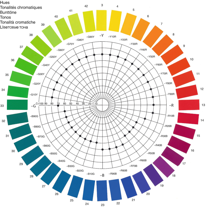
The foundational concept of the NCS revolves around Hering’s idea of six elementary color perceptions: white (W), black (S), yellow (Y), red (R), blue (B), and green (G), with all other color perceptions having varying degrees of relation to these six. In the NCS, each color is defined by its similarity to these six elementary colors [4].

Notably, a color cannot be similar to more than two hues simultaneously. For instance, yellow and blue, as well as red and green, are mutually exclusive. The NCS chromaticness (c) is determined by the sum of color variables, while its hue (F) is determined by their ratio.
Colors in the NCS are denoted as sc-F, where s represents blackness, c represents chromaticness (linked to saturation), and F represents the hue of the color. The s and c values, both comprising two digits, are written without space and are separated from F by a hyphen. For example, in the notation 2040-G40Y, the hue is intermediary between green (G) and yellow (Y) in a ratio of 40 to 60.
The geometric representation of the NCS is a symmetric double cone with white and black at the vertices. The other four primary hues are positioned on the circle of full colors, forming corners of a square that touches this circle (refer to Figs. 4, 5, and 6). This geometric configuration mirrors that of the Ostwald system.

Coloroid System

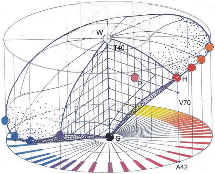
The Coloroid System, developed at Budapest Polytechnical University by Nemcsics and first published in 1975, is a color system that focuses on surface colors illuminated by daylight and perceived by individuals with normal color vision. It is built upon harmonic color differences that aim to approximate aesthetic uniformity. Recognized as a Hungarian standard since 2002, Coloroid has semipolar coordinates representing color points in a linear circular cylinder. These coordinates include the angular coordinate denoting hue (A), radial coordinate representing saturation (T), and vertical axial coordinate indicating luminosity (V).

In the Coloroid system, absolute white (W) and absolute black (S) are positioned at the upper and lower limits of the color space, respectively. White corresponds to the color of a surface illuminated by CIE D65 beam distribution, while black represents a surface perfectly absorbing light. Coloroid limit colors, forming a closed curve within the color space, are the most saturated colors on the Coloroid cylinder. The system also includes 48 Coloroid basic colors, characterized by integer numbers and evenly distributed on the CIE 1931 diagram.

Coloroid color planes are defined by the achromatic axis, with each plane having the same hue and dominant wavelength. Delimited by the neutral axis and Coloroid delimiting curves, these planes determine the shape of surfaces for each hue. Coloroid basic hues, corresponding to basic colors, are organized into 48 sections. Saturation (T), lightness (V), and hue (A) values define the color in the Coloroid system, with notation expressed as hue–saturation–lightness (A–T–V), such as 13-22-56.

Notably, Coloroid saturation quantifies a surface color’s saturation, measured on a scale close to aesthetic uniformity. Lightness denotes the distance from absolute black on a graduated scale, while hue indicates the color’s position within 48 sections based on dominant wavelength. The system’s geometric representation is a regular symmetric double cone, providing a comprehensive framework for defining and categorizing surface colors.

Küppers’ Atlas and Rhombohedric Color System

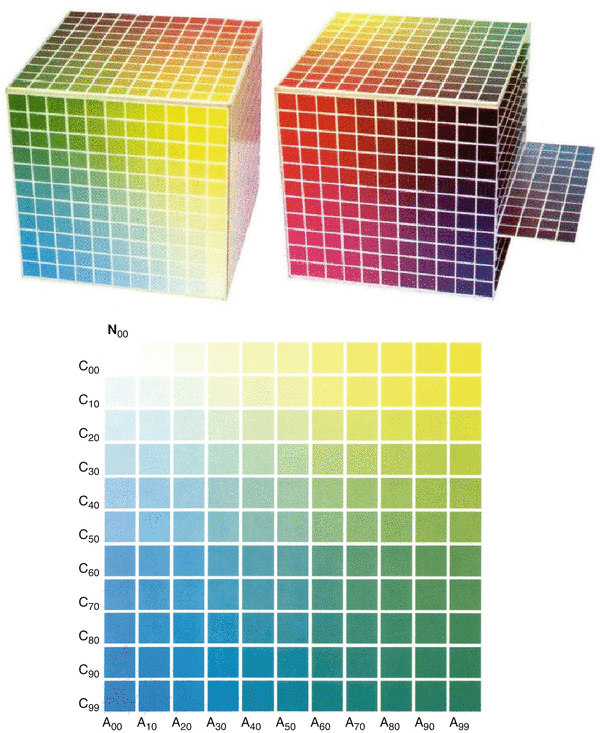
The German engineer Harald Küppers has introduced an atlas designed specifically for the graphic arts and printing industry, encompassing more than 5,500 nuances. The color samples in this atlas are generated through the four-color printing technique, blending transparent dyes—yellow, magenta, cyan, and black—alongside the white background of the paper.

The gradations of these mixtures are quantified in percentages, directly corresponding to the proportion of surface covered by each dye. This notation serves not only to distinguish different nuances but also functions as a formula for color reproduction. The variations are denoted by 10% differences between individual samples and between consecutive color charts.

The published color charts are categorized into five series, with three being characterized as achromatic mixtures due to the inclusion of black, and the remaining two designated as chromatic mixtures with exclusive interventions of yellow, magenta, and cyan. In the initial three series, black is incrementally added to a mixture of two chromatic dyes, maintained at a consistent 10% variation throughout the entire series and from one chart to another. In the fourth series, yellow is successively introduced to a fixed mixture of two chromatic dyes (magenta and cyan). Series 1–4 consist of 11 charts, representing 0%, 10%, 20%, 30%, 40%, 50%, 60%, 70%, 80%, 90%, and 99% of the dye added to the fixed binary mixture. The fifth series includes two additional charts: one featuring yellow-cyan mixtures and 99% magenta, and the other with yellow-magenta mixtures and 99% cyan.

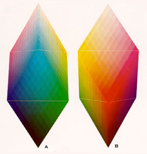
Küppers also represents his system in a three-dimensional space, visualized either as a cube or with a rhombohedric shape, comprising an upper tetrahedron, a central octahedron, and a lower tetrahedron. In the rhombohedric model, white is positioned at the upper vertex of the upper tetrahedron, housing the three subtractive primaries—yellow, magenta, and cyan—in its base. This base also serves as one of the faces of the central octahedron. The lower triangular face of the octahedron features the three colors resulting from the mixture of subtractive primaries in pairs: green (yellow with cyan), red (yellow with magenta), and blue (cyan with magenta). This face is, in turn, shared with the lower tetrahedron, where black is situated at the lower vertex.

Sources: Nemcsics, A. & Caivano, J. L. (2015). Color order systems. In Springer eBooks (S. 1–16). https://doi.org/10.1007/978-3-642-27851-8_232-7

Randomness and Computers: Does True Randomness Exist?

In this blog entry, I would like to explore how computer-generated randomness actually works and whether true randomness exists.

Randomness has a long history, as evidenced by practices such as the drawing of lots from a helmet described already in the ancient Greek epic poem Iliad. In 17th-century discussions that predate Newton, the distinction between events perceived as unpredictable and those that are truly random was recognized in the exploration of the relationship between chance, cause, and necessity. This philosophical inquiry led to metaphysical questions about human agency. Although contemporary scientific consensus defines randomness as a sequence without repetition, bias, or pattern, our beliefs about chance, cause, and effect often clash with empirical realities (Lostritto, 2015).

Randomness, a concept deeply embedded in both the natural and digital worlds, takes on unique dimensions when encountered in the controlled environment of a computer. In this exploration, we delve into the intricacies of true randomness and pseudorandomness, examining their implications, applications, and the underlying mechanisms that drive their generation.

True random numbers

In the field of computing, achieving true randomness is an elusive goal. True random numbers, unlike their deterministic counterparts, result from unpredictable physical processes such as radioactive decay, atmospheric fluctuations, or electrical noise. These numbers, which have no discernible pattern, provide a level of unpredictability that is critical in fields such as cryptography and simulation. Unlike pseudorandom numbers, which follow a repeatable sequence based on a seed value, true random numbers offer an inherent unpredictability that adds a layer of security and authenticity to various computational processes (Owais, 2023).

Pseudo-random numbers

While the deterministic nature of computers creates a challenge in generating true randomness, pseudorandomness steps in to fill the need for unpredictability. Pseudorandom numbers are generated by a series of mathematical operations initiated by a seed value. Despite being called „random“, these numbers are actually predictable – a property rooted in the repeatability of the mathematical operations (Lostritto, 2015). Commonly used in everyday computing, pseudorandom numbers play a role in simulations, randomized algorithms, and various applications where a semblance of randomness is required (Owais, 2023). Understanding the balance between predictability and randomness in the pseudorandom domain is critical to optimizing algorithms and ensuring the reliability of computational results.

In 1946, John von Neumann and Stanislaw Ulam used ENIAC to create the first pseudorandom number using an algorithm called the middle square method. This method involves selecting a „seed“, a truly random number, and performing calculations by multiplying it by itself, taking the middle of the result, and repeating the process. However, the randomness of these pseudo-random numbers is tied to the initial seed, resulting in a predictable sequence if the same seed is chosen. The length of the repeating pattern, called the period, depends on the length of the seed. Despite their predictability, pseudorandom numbers serve the practical purpose of providing the randomness necessary to generate unpredictable sequences. The complexity of the seed affects the unpredictability of the sequence, with a more complex seed leading to a more unpredictable result, though still within practical limits (Owais, 2023).

Generative art and randomness

Generative art is a creative approach that uses randomness in code to varying degrees. Whether prominently featured or subtly integrated, randomness plays a crucial role in shaping these works of art. In essence, generative art is created through programming, incorporating random elements that result in unique visual outputs each time the program is runned. By giving up control and allowing random forces to influence the creative process, generative art brings a dynamic and ever-changing quality to visual expression (Ferraro, 2021).

Generative artist Jared Tarbell highlights the importance of randomness in programming, emphasizing that the execution of a program is typically predictable. By introducing randomness into the creative process, artists can experience unexpected results, fostering a sense of surprise even for the creator. Tarbell suggests that embracing randomness allows for unpredictable outcomes that may not be achievable through controlled efforts, similar to the spontaneity found in contact improvisation, a dance form in which performers respond to the environment presented to them, resulting in sequences unattainable through deliberate planning (Ferraro, 2021).

Examples for artworks using computer generated randomness

Vera Molnár: Interruptions

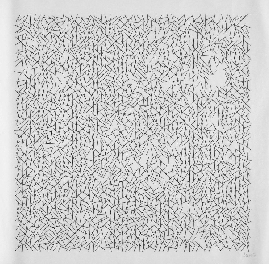
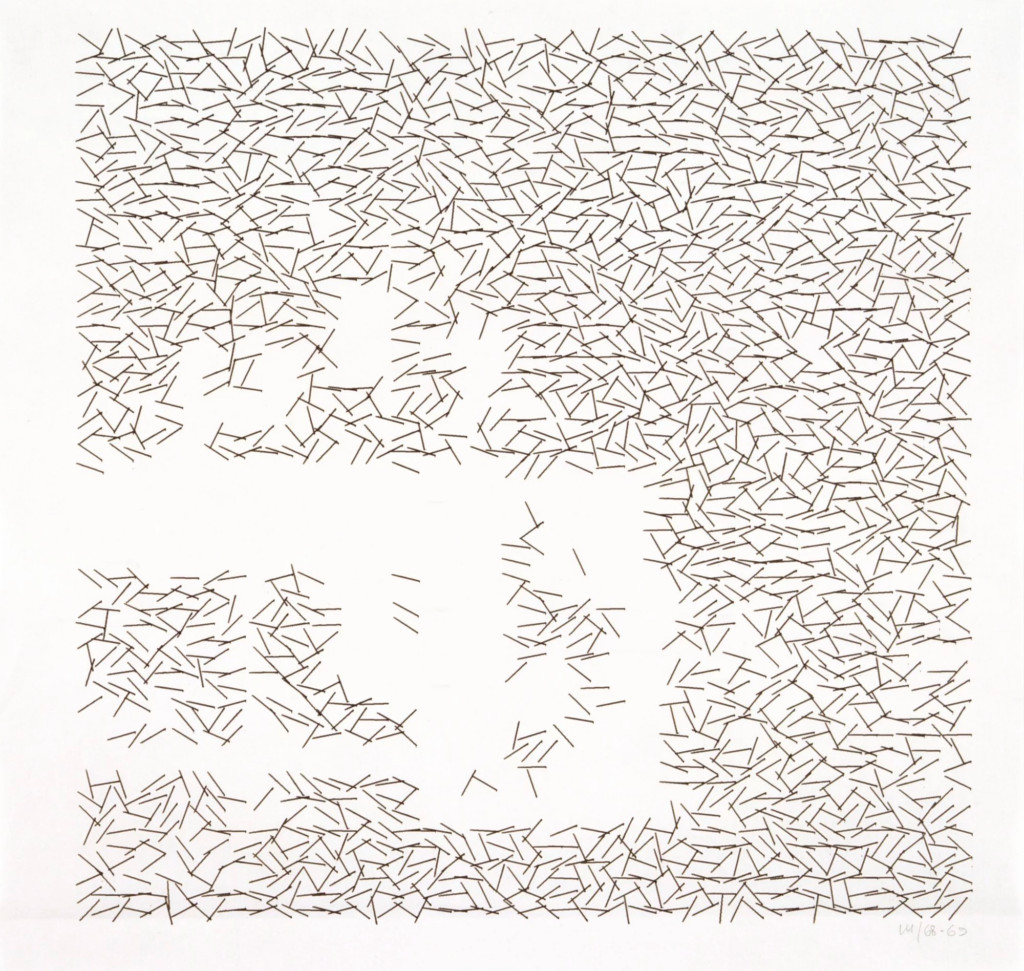
In this collection, the artist, Vera Molnár, begins with a grid filled with straight lines of equal length. The lines are randomly rotated, creating an intricate pattern that suggests various forces disrupting a regular structure. In addition, the artist introduces „interruptions“ by randomly erasing sections of certain lines, creating voids that are shaped by both the missing parts and the surrounding elements. (src: https://dam.org/museum/artists_ui/artists/molnar-vera/interruptions/ )

Jared S Tarbell: Truchet Tile Multiscale

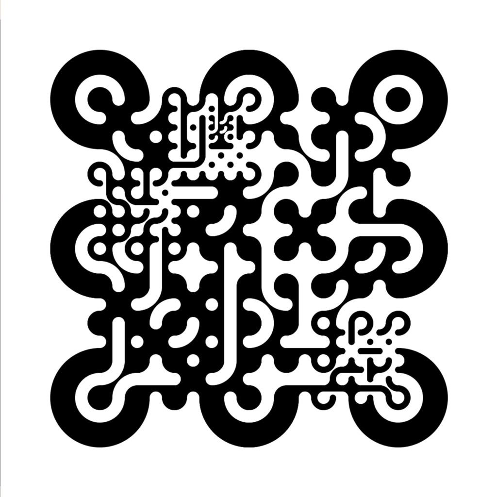
In this series, the artist begins with Truchet tiles, square design elements arranged in a grid with random rotations. The sketch adds a layer of complexity by incorporating tiles at different scales. The entire composition is made up of black and white ellipses, with arcs formed by multiple ellipses rotated around a radius. Notably, this tile set scales seamlessly with no visible seams, creating a unique and visually appealing pattern. (src: https://www.infinite.center/2021/01/25/truchet-tile-multiscale/ )


On this website you can see more generative artworks where randomness plays a key role: https://www.lerandom.art/


Sources:

Lostritto, Carl (2015): The Value of Randomness in Art and Design. In: https://www.fastcompany.com/3052333/the-value-of-randomness-in-art-and-design

Owais, Mohd (2023): Random Numbers Generators: How computers think randomly? In: https://medium.com/@mohammdowais/how-computers-think-randomly-80fa37183949

Ferraro, Marc (2021): Random Rules — Why you should check out generative art. In: https://marc-ferraro.medium.com/random-rules-why-you-should-check-out-generative-art-61948b54da87

DAM: Interruptions (1968-1969) In: https://dam.org/museum/artists_ui/artists/molnar-vera/interruptions/

Tarbell, Jared S. (2021): Truchet Tile Multiscale. In: https://www.infinite.center/2021/01/25/truchet-tile-multiscale/


05. Facial Beauty

The Golden Ratio: Mathematics and Human Beauty

The golden ratio is also known as : 1. 618, divine proportion, extreme and mean ratio, golden mean or golden section.

In mathematics, the golden ratio, approximately equal to 1.618, is often denoted by the Greek letter ϕ or τ (Carlson, 2023). It represents the ratio of a line segment cut into two parts such that the ratio of the whole segment to the longer part is the same as the ratio of the longer part to the shorter one. This concept dates back to ancient Greece, where Euclid referred to it as the „extreme and mean ratio“ in Elements.

In modern algebra, the golden ratio is represented by the equation (x + 1)/x = x/1, where the shorter segment is one unit and the longer segment is x units. Rearranging this equation yields the quadratic equation x² – x – 1 = 0, with the positive solution x = (1 + √5)/2, which is the golden ratio.

Phi in the Human Face

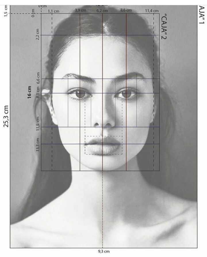
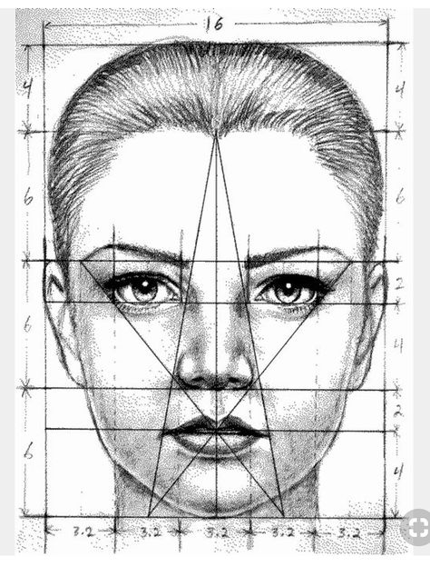
The golden ratio appears frequently in the human face, providing insight into the design of facial features. According to Meisner (2012), the head forms a golden rectangle, with the eyes positioned near its midpoint. Furthermore, the mouth and nose are located at golden sections of the distance between the eyes and the bottom of the chin.

This principle can also be applied to a side profile. Similar golden proportions can be found when examining the face from different perspectives, highlighting how this mathematical ratio plays a role in facial structure.

The similar principles and proportions of the golden ratio can be discovered if we change our perspective and look at a profile of a face from the side view.

Human Beauty and the Divine Proportion

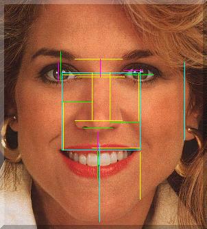
Numerous studies have linked the golden ratio to perceptions of beauty. A 2009 university study on attractiveness demonstrated that faces deemed particularly beautiful had more numerous, even proportions closely aligned with the golden ratio. In the following example, a „golden ruler“ is applied to an attractive face, showcasing the key ratios.

  • The blue line forms a perfect square encompassing the pupils and the outer corners of the mouth.
  • The golden section of the blue line defines several features, including the nose, nostrils, and upper lip, as well as key points on the ear.
  • The yellow line, a golden section of the blue line, delineates the nose’s width, the distance between the eyes and eyebrows, and the space from the pupils to the nose tip.
  • The green line, a golden section of the yellow line, marks the width of the eye and the distance from the lashes to the eyebrow.
  • The magenta line, a golden section of the green line, defines the distance from the upper lip to the nose and other dimensions of the eyes.

Phi and the Teeth

Phi can also be found in the proportions of teeth. For example, the ratio of the width of the first tooth to the second tooth is equal to phi. Similarly, the width of the smile relative to the third tooth also corresponds to phi proportions.

Variations and Other Factors in Beauty

It’s crucial to note that these observations do not imply that all beautiful faces conform to a strict set of golden ratio proportions. There are „endless variations in beauty that are as unique as each individual.“ Moreover, a positive attitude can enhance beauty, as more elements of phi appear in our faces when we smile. Interestingly, symmetry, often considered a hallmark of beauty, does not always equate to attractiveness. Perfectly symmetrical faces can appear unnatural, while small imperfections and subtle variations in the arrangement of golden proportions often enhance a person’s appeal.

For instance, many of the proportions in Angelina Jolie’s face adhere to the golden ratio. However, her unique beauty lies in the small imperfections and individual differences that set her apart. A perfectly proportional face might appear more ordinary, lacking the complexity that makes her face captivating.

For instance, many of the proportions in Angelina Jolie’s face adhere to the golden ratio. However, her unique beauty lies in the small imperfections and individual differences that set her apart. A perfectly proportional face might appear more ordinary, lacking the complexity that makes her face captivating.

The Benefits of Being Attractive

Numerous studies suggest that attractive individuals receive „unfair, beneficial treatment“ in various aspects of life, such as business, school, and social interactions (Holmes Place, 2023). The advantages of beauty are observed across cultures, as certain facial features are universally deemed attractive. A University of New Mexico study found that „beauty and symmetry are related to intelligence,“ which can lead to better career prospects, higher incomes, and greater persuasive power.

However, some research indicates that highly attractive people may also face specific challenges. For instance, a study found that attractive individuals may be at a disadvantage in job interviews when the decision-makers are of the same sex (Dean, July 2022). Additionally, attractive people can experience social rejection from their same-sex peers and may be overlooked as romantic partners due to fears of rejection. Despite these drawbacks, the positive benefits of attractiveness typically outweigh the negatives, contributing to the continuous growth of the beauty and plastic surgery industries.

For more on the universal appeal of beauty and the benefits of being attractive, watch this video here.

What is Beauty?

Ultimately, we must ask ourselves whether the golden ratio is the sole criterion for defining beauty. The Cambridge Dictionary (2023) provides multiple definitions of beauty, including „the quality of being pleasing and attractive, especially to look at“ and „the business of making people look attractive, using makeup, treatments, etc.“ However, beauty can also be viewed beyond physical appearance. For instance, beauty can be „something that is an excellent example of its type,“ which can include a person’s character, skills, or personality traits. This broader understanding reminds us that beauty is subjective and personal—everyone can feel beautiful in their own unique way.

Sofie Neudecker, 27. 12. 2023

Sources:

Carlson, Stephan C. „Golden Ratio.“ Encyclopedia Britannica, Science and Tech, November 2023. https://www.britannica.com/science/golden-ratio.

Meisner, Gary. „The Human Face and the Golden Ratio.“ The Golden Number, May 2012.
https://www.goldennumber.net/face/.

Cambridge Dictionary. „Meaning of Beauty in Essential English Dictionary.“ Cambridge Dictionary, 2023. https://dictionary.cambridge.org/us/dictionary/english/beauty.

Holmes Place. „The Benefits of Being Beautiful: Does Looking Good Help You Get Ahead?“ Holmes Place, 2023. https://www.holmesplace.com/en/en/blog/lifestyle/looking-good-helps-you-get-ahead#:~:text=Looking%20Good%20In%20men%2C%20a%20strong%20jaw%3B%20in,healthier%2C%20wealthier%2C%20more%20socially%20dominant%20and%20more%20trustworthy.

Dean, Jeremy. „5 Disadvantages of Being Beautiful (Plus 5 Advantages).“ PsyBlog: Attractiveness, July 2022. https://www.spring.org.uk/2022/07/disadvantages-of-being-beautiful.php.

„Zwischen Botox und Body Positivity: Ist Schönheit Universell?“ Der Roter Faden, ZDF Info Dokus & Reportagen, March 2020. https://www.youtube.com/watch?v=2Q1v_Gmgu54.

04. Problems in Face Recognition

Prosopagnosia: The Disease of „Face Blindness“

Prosopagnosia, commonly known as „face blindness,“ is a neurological condition that prevents the brain from recognizing faces or facial expressions. According to the Cleveland Clinic (2023), even though people with this condition have normal vision, their brains are impaired in processing and recalling faces. This often leads to significant challenges in everyday life, making it difficult for individuals to recognize coworkers, friends, and even close family members.

Prosopagnosia is part of a broader family of disorders known as agnosias, which interfere with how the brain interprets sensory information. While most cases are acquired through brain damage, there are also congenital forms of the condition, caused by genetic factors. Research suggests that around 2.5% of the population has some degree of prosopagnosia, and for many, it becomes a source of anxiety, often prompting them to avoid social situations.

Symptoms and Causes of Prosopagnosia

There are two main forms of prosopagnosia, each with its own distinct symptoms:

  • Apperceptive Prosopagnosia: Individuals have trouble recognizing a person’s facial expression or interpreting non-verbal cues, like gestures.
  • Associative Prosopagnosia: Affected individuals cannot recognize familiar faces, though they may identify people by other characteristics such as voice or movement.

Acquired prosopagnosia often results from brain injuries or conditions like Alzheimer’s disease, brain tumors, dementia, traumatic brain injury, stroke, or carbon monoxide poisoning. Congenital prosopagnosia, though less understood, has been linked to specific genetic mutations, some inherited, while others occur spontaneously. There is also some speculation that prosopagnosia may be connected to autism spectrum disorder, though more research is needed to confirm this relationship.

Living with Prosopagnosia: A Personal Story

In a revealing video, 16-year-old Hannah, who is one of the 2 million people in Germany affected by face blindness, shares how she navigates daily life with this condition. The video offers a glimpse into the coping strategies she and her mother, who is also affected, have developed to recognize people and manage social situations.

(Watch the video here: Galileo Lunch Break: Mein Leben als Gesichtsblinde)

Management and Treatment

While cases of acquired prosopagnosia may sometimes be treated through medications or surgery, congenital prosopagnosia has no cure. However, rehabilitation programs help individuals develop compensatory techniques. These include:

  • Perceptual training: Encouraging patients to recognize individuals by focusing on distinct features, such as eye shape or hairline.
  • Expression recognition: Particularly helpful for those with apperceptive prosopagnosia, this training helps patients identify facial emotions.
  • Coping strategies: Learning to rely on voice, context, or other cues to identify people.

Though prosopagnosia is permanent, these strategies can greatly enhance social interactions and allow individuals to lead more fulfilling lives.

Emotion Recognition in People with Autism

Face recognition issues extend beyond prosopagnosia. People with autism spectrum disorder (ASD) often struggle with recognizing emotions and social cues, which can hinder their ability to interact effectively. As Dantas and do Nascimento (2022) noted, these deficiencies stem from an inability to interpret facial expressions and other non-verbal communication.

Given that improved emotional recognition can significantly enhance social skills, researchers have developed various tools to help individuals with autism. For example, Dantas and do Nascimento’s computer-based game helps people with ASD identify and express basic emotions. This is just one of many innovative programs designed to improve emotional recognition, with many options tailored specifically for children.

Emotional Learning for Children with Autism

Neurotypical children can usually recognize basic facial expressions by the age of three to four months. However, children with autism often face challenges interpreting emotions throughout their childhood. Research shows, though, that with the right support, autistic children can improve their ability to recognize and label emotions. Structured activities play a crucial role in this learning process.

Here are eight effective steps to teach emotional recognition to children with autism:

  1. Choose age-appropriate activities.
  2. Focus on one emotion at a time.
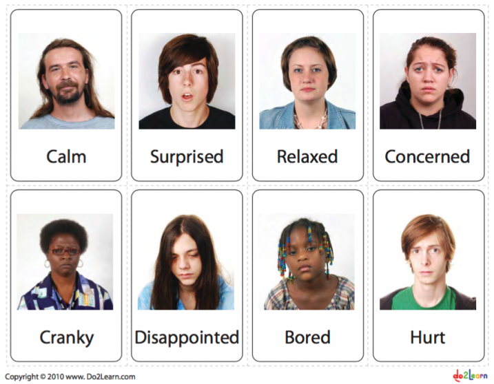
  3. Use visual aids, such as cards and pictures.
  4. Make learning fun and engaging.
  5. Incorporate a variety of visuals to help the child generalize emotion recognition.
  6. Use visual stories and children’s books to label emotions.
  7. Take learning outdoors for real-world context.
  8. Encourage the child to name emotions independently.

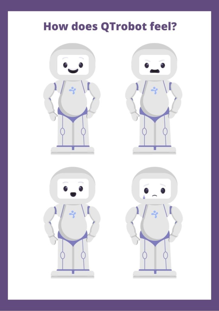
(Watch a demonstration here: QTrobot teaching emotion recognition to children with autism)

QTrobot teaching emotion recognition to children with autism.

Conclusion: The Impact of Face Recognition Deficits

Prosopagnosia and autism demonstrate the profound effects that deficits in facial and emotional recognition can have on people’s daily lives. While these conditions present significant challenges, the right support, training programs, and innovative tools offer hope. With structured learning and coping strategies, individuals affected by face recognition issues can improve their abilities and lead more successful, socially fulfilling lives.

Sofie Neudecker, 26. 12. 2023

Sources:

Cleveland Clinic. „Prosopagnosia (Face Blindness).“ Cleveland Clinic, 2023. https://my.clevelandclinic.org/health/diseases/23412-prosopagnosia-face-blindness.

Galileo Lunch Break. „Mein Leben als Gesichtsblinde.“ YouTube video, 2016. https://youtu.be/bDGTKQAKHKY.

Dantas, A. C., and M. Z. do Nascimento. „Face Emotions: Improving Emotional Skills in Individuals with Autism.“ Multimedia Tools and Applications 81, no. 8 (2022): 11263–11287. https://doi.org/10.1007/s11042-022-12810-6.

LuxAI. „How to Teach Emotion Recognition and Labelling to Children with Autism.“ LuxAI, 2023. https://luxai.com/blog/emotion-recognition-for-autism/.

QTrobot Teaching. „QTrobot Teaching Emotion Recognition to Children with Autism.“ YouTube video, 2019. https://youtu.be/rCLmOQJlkyo.