Introduction After the sixth post, the research on existing projects seemed relevant enough to continue further. Also here, different projects will be presented by focusing on how the digital realm encounters paper in these cases.
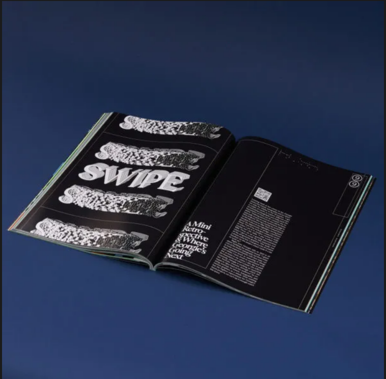
TYPE01 Magazine TYPE01 Magazine is a publication which seamlessly merges analog and digital realms, offering readers a unique experience by integrating moving images into seemingly static pages. This innovation is made possible through the use of QR code technology, allowing users to interact with the content and access specific animations. The magazine features bold graphics, oversized typography, and captivating visuals, with the second issue exploring the world of kinetic type and its intersection with technology. The lenticular split cover, designed by Hamburg-based artist Giang Nguyen (Gydient), adds an extra layer of dynamism, creating an illusion of motion when viewed from different angles. TYPE01 Magazine embraces the ongoing transformation of print, proving that it is far from obsolete and continues to adapt to contemporary trends.
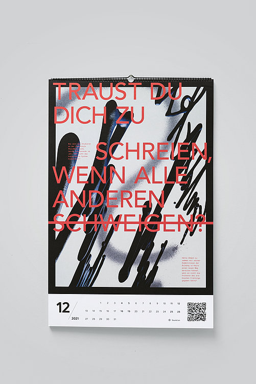
Change of perspective In celebration of RheinMain University of Applied Sciences‘ 50th anniversary, 27 Communication Design students crafted a unique calendar titled „Change of Perspective.“ This calendar, featuring augmented reality elements, creatively represents the university’s diverse facets through visually translated interview quotes. The project received acclaim from the jury for its innovative design, seamless execution, and the engaging three-dimensional movement of illustrations, offering viewers an interactive and playful exploration of perspectives beyond the university context.
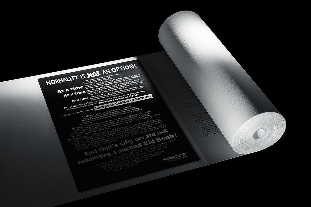
Bewerbungsbuch Kulturhauptstadt While this book does not connect paper to devices, it tries to translate into paper the online scrolling. Hannover’s second application book for the Capital of Culture 2025 title showcases a poetic design. The 100 pages are ingeniously assembled into a 21-meter-long scroll, featuring a manifesto, diverse texts, and numerous illustrations, some reaching up to two meters in size. This unique design seamlessly merges the traditional book medium with the benefits of digital, allowing users to enjoy endless reading and effortlessly view images and graphics, akin to reading from a tablet, all protected by a striking orange capsule.
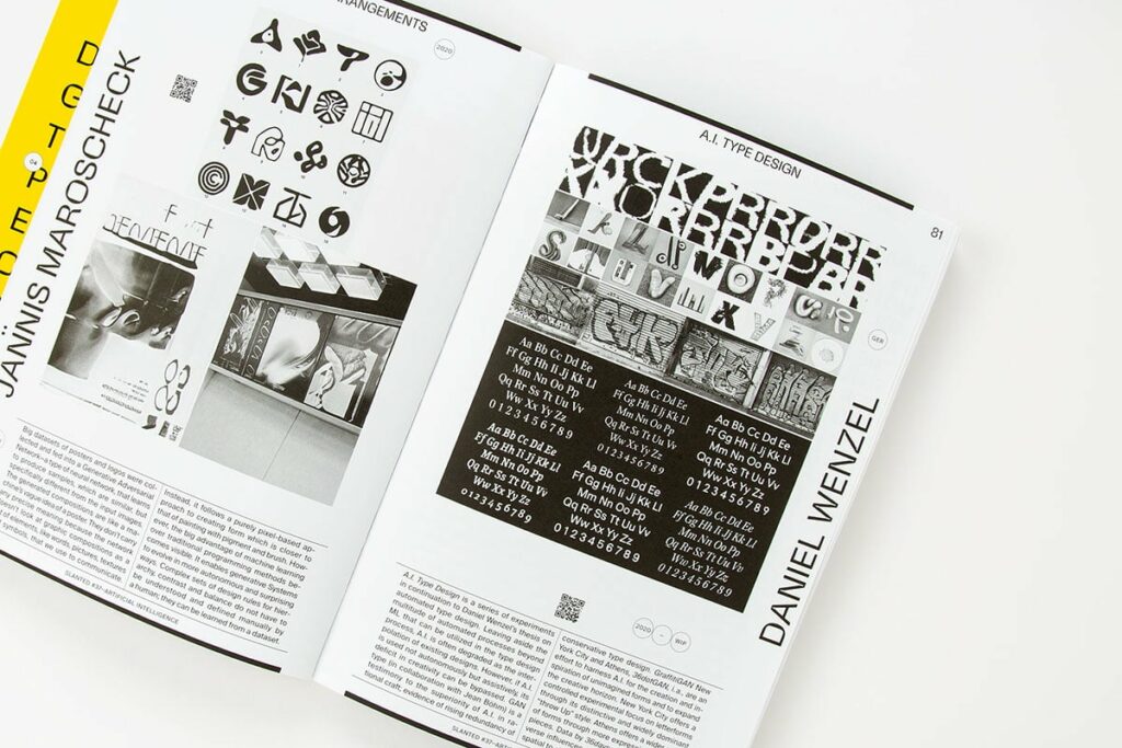
SLANTED Magazine 37 – AI While this magazine does not focus on connecting digital and paper, it shows how AI can contribute in different creative fields, such as creation of images and typefaces.
This article delves into the work of artists and designers, showcasing their unique perspectives and contributions to the connections between the editorial and digital realm.
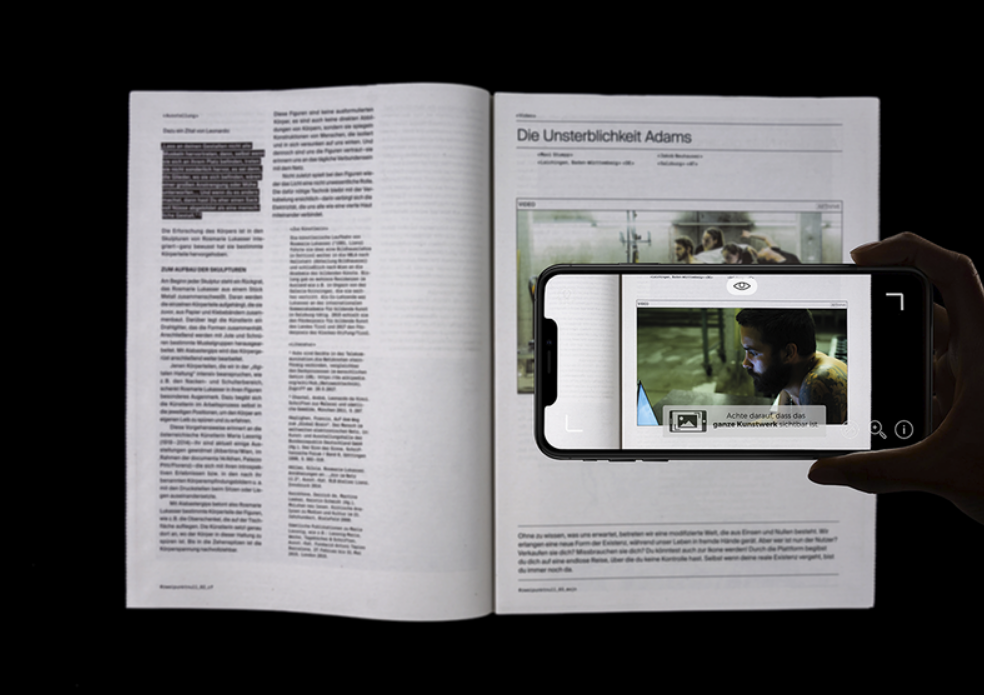
2.0 – Diskurse aus der digitalen Welt One interesting master thesis project connected to the themes of editorial design and digital is “2.0 – Diskurse aus der digitalen Welt” by Daniel Huber, a student at the KUNSTUNIVERSITÄT LINZ 2.0. This a free, interdisciplinary publication focusing on discourses from the digital world, with its inaugural issue dedicated to the theme of ‚Virtuality and Immortality.‘ The printed magazine is enriched with digital layers, allowing readers to interact and expand upon existing discourses, bridging the gap between print and the digital realm. The project’s objective is to illuminate rapidly changing societal and social realities, creating a network that fosters the manifestation of ideas, encourages contemplation, sparks artistic potential, and promotes creativity and exchange. An interesting feature of the publication is that readers can contribute to discourses on a connected website by typing the assigned hashtag on the page. Moreover, people can interact with the content by scanning photos with an app and watching the connected videos. (1)
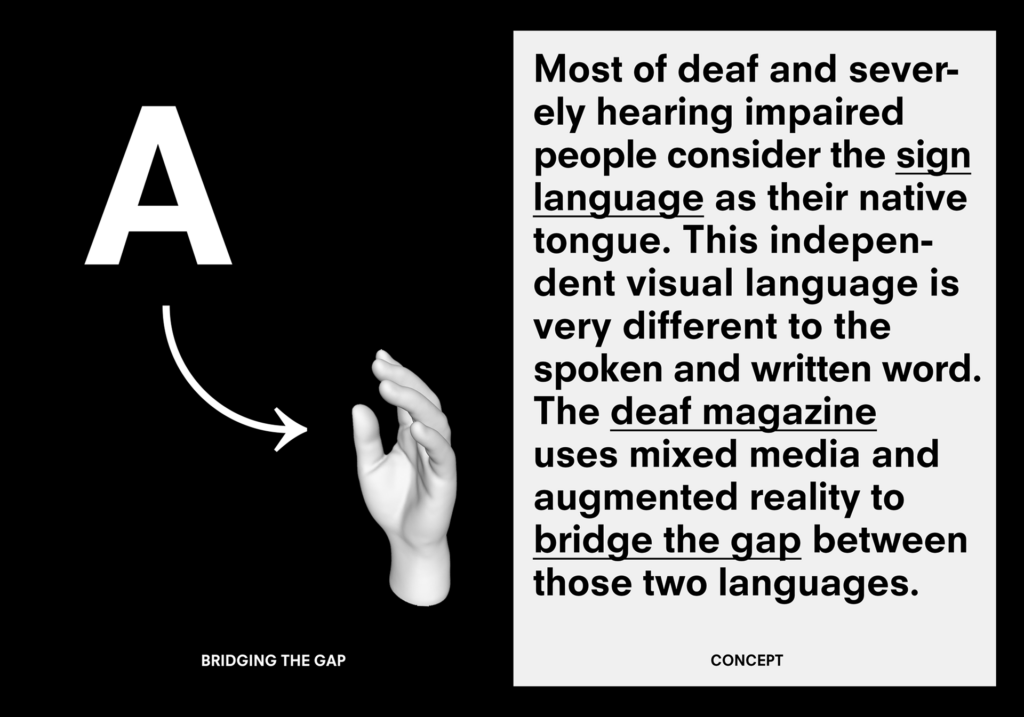
Deaf Magazine Another interesting project which merges editorial and digital is the “Deaf Magazine”, this project was led by Alexandros Michalakopoulos and Andreas Ruhe from the Morphoria Design Collective and it is winner of the Red Dot Award. In this case the union of digital with editorial is done to guarantee accessibility. DEAF MAGAZINE is a lifestyle and society magazine centered around German Sign Language culture, originating from empirical work at the University of Applied Sciences in Düsseldorf. Integrating text, image, and video through multimedia technology, the magazine facilitates a stress-free consumption of complex information for the deaf and hearing-impaired by bridging the gap between written text and sign language. (2)
Adrianne Phebey – 56917 Another book which uses a device to enhance the print is “Adrianne Phebey – 56917”.In this case, the publication is interactive by bringing the images to life by simply scanning them. This project was exhibited at the OXO Tower, Bargehouse in London in July 2017 and here it was displayed as it was an installation, where the printed book and a tablet to scan the book are shown together to the audience. Exploring the narrative of amateur female boxer Adrianne Phebey, the interactive publication ‚Adrianne Phebey – 56917‘ delves into her endeavours. It seeks to celebrate her story, analyse physical and psychological rituals, and navigate the dynamics of competing within a predominantly male-dominated field. (3)
In this blog entry I would like to focus on effective learning through animations. Even though learning with animations might sound like a perfect method, there are some facts to be aware of. Animations, despite their charm, come with a tricky trait that’s often overlooked. Animations are fleeting, like a passing breeze. This transitory nature can cause a bit of a memory challenge, especially when dealing with complex new stuff.
Animations don’t stick around for long in our memory unless we make a conscious effort to remember them. This can make it tough for learners when trying to grasp new, complicated information presented in animated form. Juggling current and past details for a full understanding can be quite a challenge.
Static vs. Animated
Now, think of static images like pictures. You can go back to them as many times as you want, like flipping through pages in a book. But animations don’t let you do that easily. This flexibility with static images might make them a better choice, reducing the memory challenge and making learning smoother.
A Peek into Human Evolution
Delving more into our learning journey, a fascinating revelation emerges—the human brain may have evolved a specialized memory mechanism tailored for animations, particularly those depicting human movement. This mechanism acts as a cognitive tool, facilitating understanding and learning through imitation—an innate ability akin to the way we observe and mimic others.
Neuroscience and the Mirror-Neuron System
The field of neuroscience offers valuable insights, notably the discovery of the mirror-neuron system. The mirror-neuron system shows that our brains light up in similar ways when we watch someone do something as when we do it ourselves. It’s as if our brains engage in a dance, enhancing our capacity to comprehend and replicate actions demonstrated in animations.
Exploring how animations, human movement, and memory connect helps us see that animations can be really helpful for learning certain things. If we understand how our minds work, we can make learning better by finding a good balance between fast animations and our natural way of learning by watching and copying.
So, to sum it up, learning with animations is like an exciting and varied world. Knowing about the difficulties and good things helps us use animations well, making learning more enjoyable and helping us understand things in new ways.
In examining the distinctive features of both traditional paper and digital interfaces, the question arises: why not fully embrace the digital realm? After focusing on the advantages brought by paper it is interesting to explore the specific advantages that digital platforms offer.
Connectivity Unlike static paper, digital platforms enable users to engage with content in real-time. Features like hyperlinks, multimedia elements and instant updates provide a more immersive encounter with information.
Accessibility Unlike traditional paper, digital platforms offer accessibility features that are helpful to a diverse audience. Customizable text sizes, font styles, and colour schemes empower users to tailor their reading experience based on individual preferences and accessibility needs. Moreover, digital interfaces allow for the integration of assistive technologies, such as screen readers and voice commands, offering an inclusive environment for individuals with visual, auditory, or motor impairments. (1)
Endless Contents One of the advantages of digital content is its limitless content. Users can carry vast amounts of information in a single device, eliminating the need for physical storage or transport. This ease of access allows users to access content whenever and wherever, breaking free from the constraints of a fixed physical medium.
Collaborative Capabilities Digital platforms facilitate collaboration, allowing users to share, edit, and comment on content in real-time. This collaborative aspect enhances communication, making it an invaluable tool for work, education, and creative projects. Paper, in contrast, often requires physical presence for collaborative efforts, limiting its potential in today’s globally connected world.
Adaptability and Customization Digital content is highly adaptable and customizable to individual preferences. Not only the user can decide manually how to customize the content, but also algorithms help target specific content for each user’s preferences. (2)
Conclusion In conclusion, while traditional paper offers unique sensory experiences, the advantages of digital platforms are many. Following this post, I will look at how projects are able to connect the qualities of digital with the ones of paper.
I have previously discussed the distinctive qualities and characteristics of both digital tools and paper. Paper offers a unique sensory experience that cannot be replicated by a screen. Simultaneously, the digital realm provides diverse opportunities, such as viewing dynamic images and connecting with others. In this instance, my focus is to delve deeper into the specific attributes that paper provides, which technology lacks. What key characteristics set paper apart?
Tactile and Olfactory Experience Paper provides a tactile experience that engages the sense of touch. The physicality of turning pages, feeling the texture, and holding a tangible object can contribute to a richer sensory experience that is absent in digital interfaces. Moreover, the olfactory experience is unique to paper. The smell of ink, paper, or any other materials used in printing can evoke memories and add another layer to the reading or viewing experience.
Personal archives Physical books serve as personal archives due to the traces readers leave behind. This includes fingerprints, annotations, inserted objects, and more. These physical imprints can offer insights into a reader’s habits, emotions, and personal history.
Accessibility Paper is widely accessible, and you don’t need any special devices or electricity to use it. This makes it a reliable medium, especially in situations where technology may not be readily available or reliable. Digital interfaces can present challenges for individuals with certain physical or cognitive disabilities. Paper, with its tactile nature, maybe more accessible to people with visual impairments, motor skill challenges, or cognitive differences. Braille, large print, or other adaptations can be easily applied to paper documents.
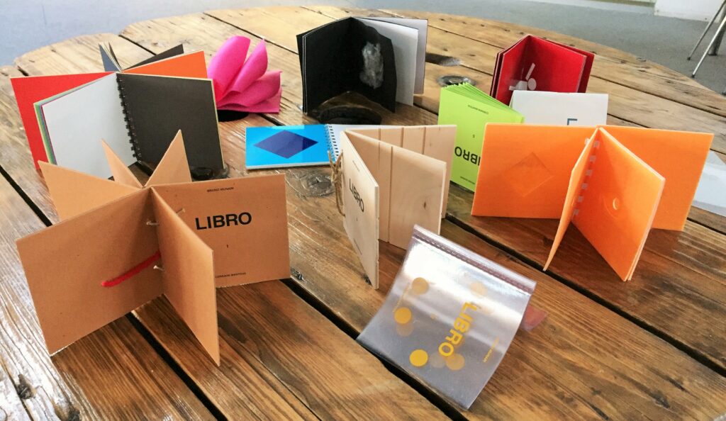
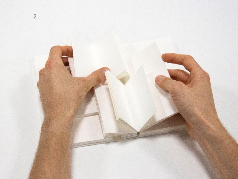
Some Examples Many are the projects through which the tactility in print is enhanced. Bruno Munari, a pioneering Italian artist and designer, explored innovative concepts in the realm of children’s literature with his pre-books, or „prelibri.“ These unique creations sought to engage children in a tactile and interactive manner, introducing them to the sensory experience of books. Munari’s pre-books experimented with various materials, textures, and shapes, fostering a hands-on exploration that went beyond traditional storytelling.
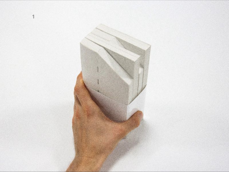
In a contemporary context, a project by the student Boris Sidokhin showcases a similar spirit of experimentation and interaction. He reflects on the tactality of the book and experiments with different materials. (1)
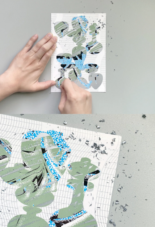
Furthermore, graphic designer Yuna Kim, as featured in an article (2), employed scratch cards as a medium, enhancing the tactality of the object. Kim’s work with scratch cards demonstrates an innovative fusion of technology and traditional materials, creating a multisensory experience.
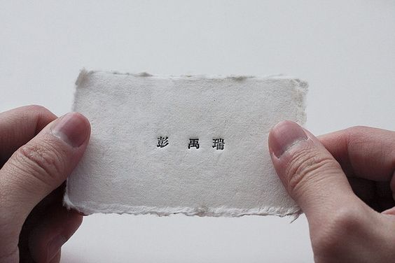
Wabi-sabi is a Japanese aesthetic concept that emphasizes the beauty of imperfection, impermanence and modesty. It is based on the idea that there is a special beauty in things that are outdated, incomplete or even flawed. The term is made up of two main concepts:
Wabi (侘): This part refers to simplicity, modesty and the beauty of imperfection. It can also mean a certain roughness or simplicity in relation to the surroundings or things.
Sabi (寂): Sabi represents the age, patina or dignity that objects develop over time. It is the beauty that emerges from the passing of time and use.
Together, wabi-sabi emphasizes the beauty in the inconspicuous, the transience of things and the acceptance of imperfections. It can be applied to different areas of life, from art and design to philosophies of life. Wabi-Sabi encourages us to appreciate the simplicity and naturalness in things rather than striving for perfection.
How can this concept be applied to graphic design, how can it be expressed?
In art and design, Wabi-Sabi is manifested through organic shapes, natural materials, and the acceptance of natural processes. It is about creating art and design that acknowledge the passing of time and the beauty of imperfection. For example, a designer might choose to incorporate the natural grain of wood, rather than painting over it. Or an artist may leave rough brush strokes visible, rather than smoothing them out.
The beauty of Wabi-Sabi design lies in its ability to create a profound connection between an object and its observer. It encourages us to see the beauty in everyday objects and settings that we might otherwise overlook.
In the fast-paced world of digital graphic design, we’re surrounded by amazing tools that make our work efficient and precise. The advantages of our digital tools are clear – efficiency and speed, precision and consistency, collaborations across the globe, and endless creative options. But in the midst of this digital workflow, something seems to be missing or to be lost in the digital process. The hands-on, personal touch of traditional design isn’t really there. It’s a challenge to bring in that human element – the imperfections and quirks that give designs character. Striking the right balance between the digital perks and the warmth of handmade touches becomes the key to creating designs that not only look good but also feel uniquely human.
In graphic design, the use of wabi-sabi refers to the integration of elements that embody the principles of simplicity, modesty and imperfection. Here are some ways to incorporate aspects of wabi-sari in graphic design:
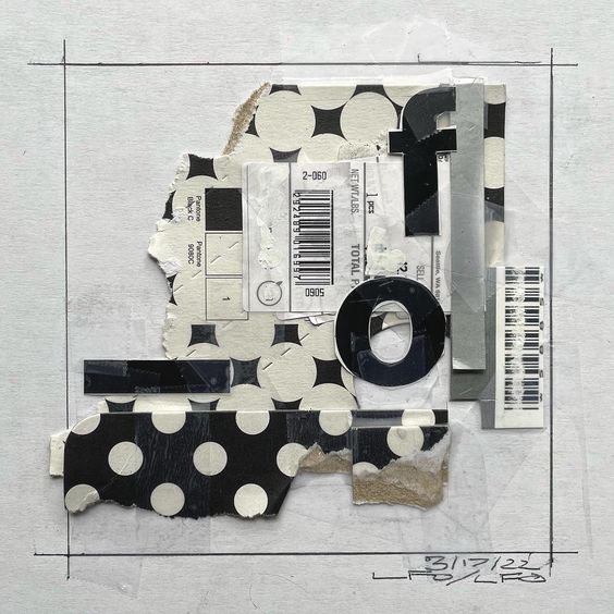
Imperfection: Graphic design can deliberately include imperfections, be it in texture, lines or the arrangement of elements. This can help to integrate a natural and human dimension into the design.
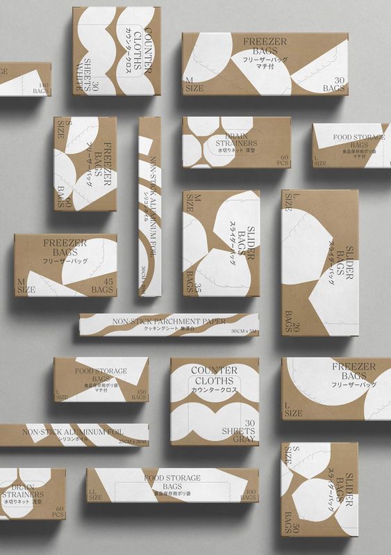
Simplicity and modesty: Wabi-sabi in graphic design often emphasizes a humble aesthetic. This means that the design is not overloaded and is reduced to the essentials. Clean lines, simple shapes and a limited color palette could be part of this approach. The use of empty space or white space creates a calm and open atmosphere and gives more meaning to the few elements present.
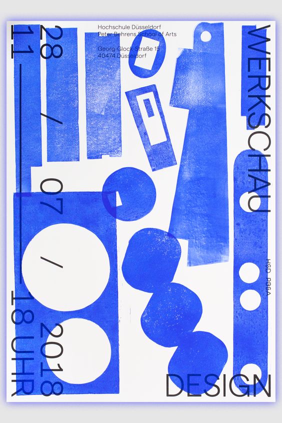
Transience: To emphasize the impression of transience and change, worn textures, faded colors, alternative printing techniques or other visual clues to the influence of time can be used.
The choice of materials and textures can also play an important role. Natural materials or those that age and develop patina over time could be integrated into the design.
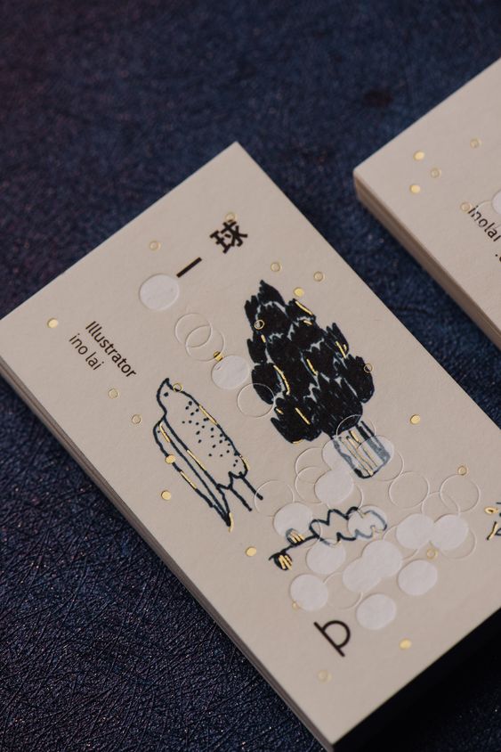
Handcrafted elements: The use of hand-drawn or handmade elements emphasizes the appreciation for craftsmanship and individuality and gives design a personal and unique touch.
Understanding the fundamentals of color theory prompts the practical application of these principles. Design initiatives and artistic projects commonly commence with the assembly or curation of a harmonious color combination, termed a color scheme.
In scenarios where one or two colors are predetermined based on brand or product considerations, the objective becomes the creation of a 3-5 color palette that resonates seamlessly. This process necessitates a systematic approach, considering that certain color combinations inherently appear more harmonious than others, irrespective of individual preferences.
Several methodologies can be employed:
Contextual Consideration: Always factor in the context of color perception, acknowledging that colors manifest differently in contrast to various backgrounds. The pairing of green with white differs significantly from its pairing with dark blue or black.
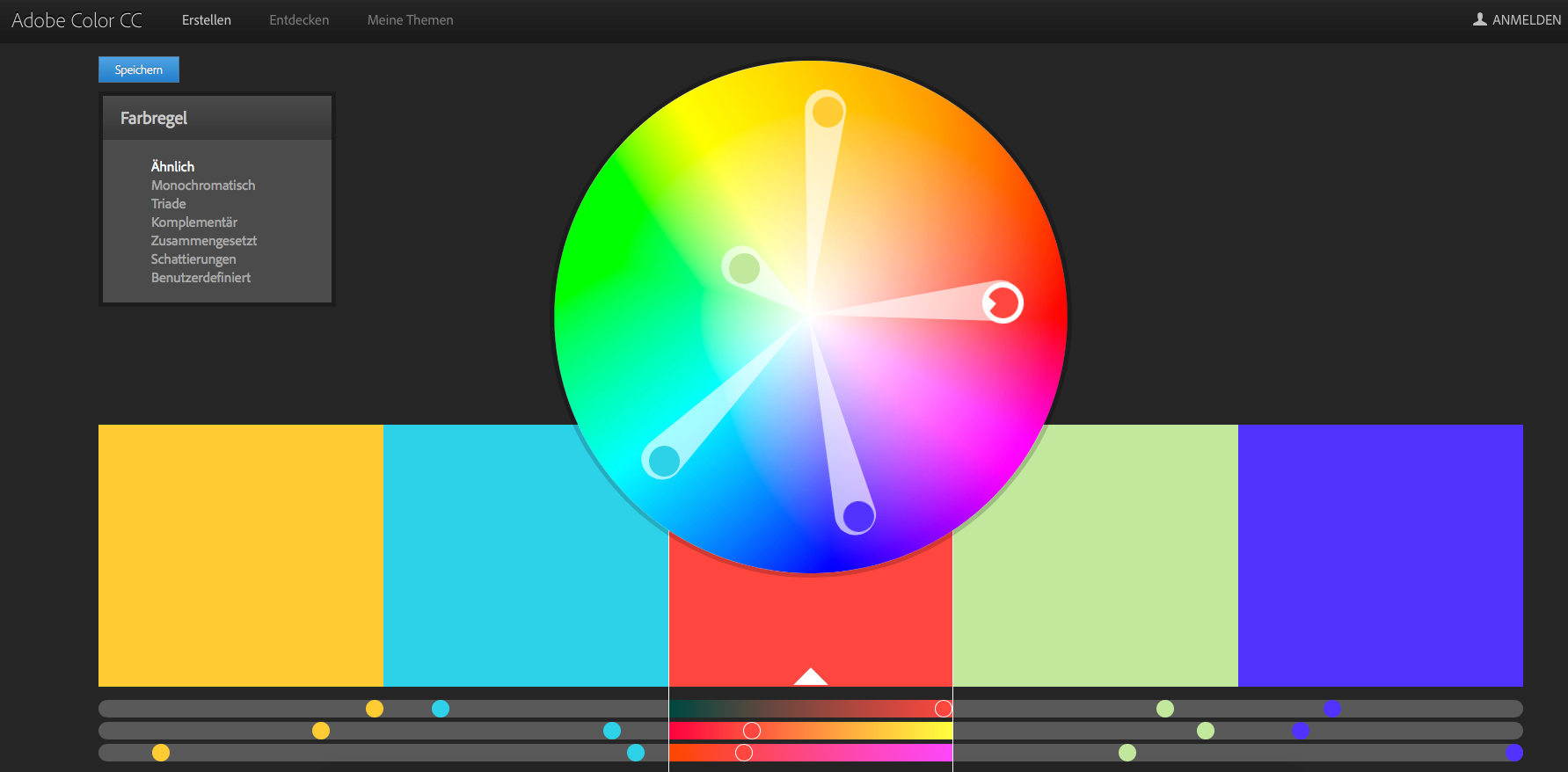
Analogous Color Selection: Begin with a primary color and select two additional colors positioned adjacently on the color wheel. Extending the palette to include more colors involves stepping outward to the next neighbors of the two outer colors. Analogous palettes are characterized by subdued contrasts and are generally suited for softer, pastel, and low-contrast compositions.
Complementary Color Selection: Select colors positioned diametrically opposite each other on the color wheel. Adjusting the intensity of these complementary colors can mitigate the high-contrast effect. Exercise caution with this method, as it tends to produce pronounced contrasts. It is often advisable to emphasize one color in the design, utilizing the complementary color as a subtle accent to prevent overwhelming visuals.
Monochromatic Color Scheme: Utilize various shades or variations of a single hue, incorporating black and/or white. Despite lacking stark color contrasts, monochromatic schemes project cleanliness, uniformity, and harmony. This approach is apt for designs where subtlety and supportiveness take precedence over grabbing attention.
Triadic Color Scheme: Opt for three colors evenly distributed on the color wheel. These colors are equidistant from each other and can be identified by drawing rays from the center of the circle. Refinement involves considering the ratio during application, such as using a light color for backgrounds and a dark one for prominent elements.
Split-Complementary Contrast: Choose a dominant color and select two directly adjacent complementary colors. While this scheme offers a nuanced palette compared to the traditional complementary selection, it maintains a rich contrast and may require careful coordination for optimal results. Use this approach judiciously, especially after gaining experience in creating color palettes.
Personal Approach – Beyond Guidelines: With experience, explore unconventional approaches. While pre-existing color palettes based on established principles are available, don’t hesitate to forge new paths. Initiate with a color of choice and experiment with combinations. Allow time for reflection, fine-tune as necessary, and observe the resonance of palettes. Over time, individuals familiar with this domain develop an intuition for harmonious color selections.
An observation from my recent blog post is that designs that are perceived as well spaced and balanced are less likely to be immediately recognized as random. Human perception tends to associate randomness with more chaotic or irregular arrangements, and when elements are evenly spaced or exhibit a sense of order, they may not conform to our typical expectations of randomness. Therefore, well-balanced and organized designs are often not immediately perceived as random because of this cognitive bias.
In the first part of exploring how designs can be organized and how order can help for a design not to look random, I would like to research a bit of the basics of grid systems.
What are Grid Systems?
A grid system in graphic design is like an invisible framework of vertical and horizontal lines. These lines help organize and control where text and images go on a page, creating a structured layout. People may call it different names like standard size systems, program layout, or scale layout design, but it’s all about arranging things neatly on a page.1
In his book Grid Systems in Graphic Design, Josef Müller-Brockmann discusses the use of the grid as an organizing system that reflects a designer’s constructive and forward-thinking mindset. It embodies a professional ethos that strives for clarity, functionality, and aesthetics akin to mathematical thinking. Constructive design that adheres to formal principles contributes to the larger culture and influences societal tastes. Working with the grid is a commitment to universal laws, systematization, objectivity, and the integration of color, form, and material. It reflects a positive, forward-looking attitude and emphasizes the importance of education and a constructive approach to creative work. Each visual creation reflects the designer’s character, knowledge, skills, and mentality. (Müller-Brockmann 1996, p. 10) 2
A baseline grid consists of evenly spaced horizontal lines that guide the placement of text, and is often used with column grids to ensure uniform alignment of text lines across a page.
Column Grid
This grid divides a page into vertical fields, aligning objects to these divisions. It’s commonly used in newspapers and magazines to organize layout designs.
Modular Grid
A modular grid, an extension of the column grid, adds rows to create modules that guide layout decisions. It’s often used in magazines and corporate reports.
Manuscript Grid
A manuscript grid, often used in classic books, is a simple one-column grid that dictates the placement of text on a page. It’s traditional, and facing pages in these books typically mirror each other in layout.
Pixel Grid
A pixel grid is a microscopic grid of millions of pixels on digital screens. When designers zoom in on a Photoshop document, they might see this grid, allowing them to edit images pixel by pixel.
Hierarchical Grid
A hierarchical grid is a flexible grid designed to meet specific content needs. It can be irregular, completely free-form, or composed of multiple overlapping grids and additional elements.
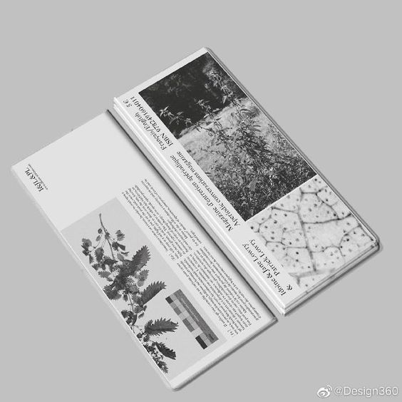
Organize content: Grids help maintain alignment, structure, and cleanliness in designs by organizing various elements such as imagery and typography.
Design balance: Essential for achieving balance, grids contribute to a consistent and even design, whether following symmetrical or asymmetrical layouts.
Design efficiency: Grids speed and enhance the design process by guiding the placement and scaling of elements, speeding up the overall design process.
Pleasing design layout: Margins and gutters within grids help organize designs for a clean and open visual presentation. Following grid rules, such as the rule of thirds, contributes to aesthetically pleasing designs by guiding the placement of key elements.
Breaking the grid for impact: While grids maintain clean designs, intentionally breaking the grid can create unique and eye-catching effects that draw attention to specific elements.
Diagonal layouts: Grid systems are versatile, allowing designers to experiment with different layouts, including diagonal angles, for a modern and experimental look.
Universal applicability: Grids are not limited to specific design mediums; they can be used in various areas of design, from magazine layouts to logos and illustrations.
Müller-Brockmann, Josef. Grid Systems in Graphic Design : a Visual Communication Manual for Graphic Designers, Typographers, and Three Dimensional Designers = Raster Systeme Für Die Visuelle Gestaltung. 4., rev. ed.., 1996. ↩︎
In the world of marketing, the psychology of branding is a fascinating and crucial element that shapes the relationship between consumers and brands. This link between identity and emotion plays a central role in shaping the perceptions and preferences that people develop towards certain brands.
Analyzing the psychology of branding is central to my master’s thesis. The visual identity of a brand, represented by elements such as logo, colors and fonts, is not only an aesthetic feature, but also an expression of the psychological bond between brand and consumer. This bond not only influences the perception of the brand, but can also influence the behavior of consumers and their purchasing decisions.
The Psychology of Branding by Douglas Evan looks at the psychological factors that influence brand choice and examines how our encounters with brands influence our decisions and loyalties. It explores the neural processes associated with brand engagement and offers insights into how the psychology of branding works. The book emphasizes that branding goes beyond products and encompasses everything that evokes personal associations. This has led to branding being widely used in social and health initiatives and becoming a powerful strategy for behavior change. (Vgl. Evans)
During my research, I came across the „Brand Equity Model“ by Kevin Lane Keller. This model offers a comprehensive approach to evaluating the strength of a brand, taking into account different dimensions of the connection between a brand and its consumers.
Salience: At the base of the brand equity pyramid, salience signifies the awareness of your brand’s existence, forming the crucial foundation for building customer brand equity.
Performance and Imagery: The second level encompasses performance, detailing product features, and imagery, addressing how the brand fulfills social and psychological needs.
Judgments and Feelings: Moving up, the third level focuses on judgments, reflecting opinions about the brand, and feelings, encapsulating emotional responses toward the brand.
Resonance: At the pinnacle, resonance represents the ultimate stage where customers evolve into advocates, actively promoting and endorsing the brand to others. (Vgl. Papirfly)
Works Cited:
Evans, Douglas. Psychology of Branding. Hauppauge New York, Nova Publishers, 2013.
Yes, imperfections in graphic design actually can enhance empathy and trust, but how is it done and why is that so important? For example, high-quality design is essential, but embracing imperfections can foster more empathy. Imperfections can also add a human touch to designs, making them more relatable and engaging. Additionally, imperfections can create a sense of authenticity and uniqueness, which can enhance trust and credibility. By embracing imperfections, designers can create designs that are more meaningful, relatable, and impactful, ultimately fostering empathy and trust with their audience and resonate emotionally with users.
Why is empathy so important?
Empathy is crucial in design for several reasons. It is fundamental to human-centered design processes such as design thinking, as it allows designers to truly uncover and understand the latent needs and emotions of the people they are designing for. By empathizing with users, designers can create products, services, and experiences that align with their desires and aspirations, resulting in solutions that truly resonate and add value. Additionally, empathy helps break down assumptions and biases that may hinder the innovation process, fostering emotional connection, driving iterative feedback, inspiring creativity, and leading to the development of sustainable and user-centered solutions.
In the context of design thinking, empathy is considered the starting point for any design project and constitutes phase one of the Design Thinking process. During the empathize phase, the designer spends time getting to know the user and understanding their needs, wants, and motivations, using this empathy to make smart design decisions. Ultimately, empathy is the cornerstone of any successful design project, as the extent to which designers understand and empathize with their users ultimately determines the outcome and user-centricity of the design.
Know your users: The first step to empathize with your users is to know who they are, what they want, and what their needs are.
Involve your users: Involve your users in the design process and seek their feedback and input throughout the design process.
Challenge your assumptions: Challenge your assumptions and biases that may hinder the innovation process, fostering emotional connection, driving iterative feedback, inspiring creativity, and leading to the development of sustainable and user-centered solutions.
Understand the audience: Understand the audience and their unique needs and perspectives, using this empathy to make smart design decisions.
Express emotion through color: Use color to express emotion and create a more empathetic connection with the audience.
Typography for emotional tone: Use typography to create an emotional tone that resonates with the audience.
Use authentic imagery: Use authentic imagery that reflects the audience’s experiences and perspectives.
Storytelling with visuals: Use visuals to tell a story and create a more empathetic connection with the audience.
By incorporating these elements into the design process, designers can create designs and products that users trust and feel confident in, ultimately leading to increased user satisfaction, engagement, and loyalty.
Clear communication: Ensure that the design communicates the intended message effectively and clearly, avoiding ambiguity or confusion.
Visual appeal: Create visually appealing designs that are aesthetically pleasing and engaging, as this can positively influence user perception and trust.
Usability: Design products that are easy to use and navigate, as this can enhance user satisfaction and trust in the product.
Consistency: Maintain consistency in design elements, such as color schemes, typography, and layout, to create a cohesive and trustworthy user experience.
Avoid dark patterns: Design products that avoid manipulative or deceptive design patterns, as this can enhance trust and credibility.
User-centered design: Incorporate user feedback and preferences into the design process, as this can foster trust and engagement.
Imperfections in design can influence empathy by adding a human touch and authenticity to designs that resonate emotionally with users. Imperfections can create a sense of uniqueness and relatability, which can enhance trust and credibility. By embracing imperfections, designers can create designs that are more meaningful, relatable, and impactful, ultimately fostering empathy and trust with their audience. Imperfections can also help break down assumptions and biases that may hinder the innovation process, fostering emotional connection, driving iterative feedback, inspiring creativity, and leading to the development of sustainable and user-centered solutions. Imperfections in design can enhance empathy by creating a more authentic and relatable connection with the audience, fostering emotional connection, and driving iterative feedback.
Here are some examples of imperfect elements that can be used to influence empathy:
Handwritten typography: Handwritten typography can add a personal and human touch to designs, making them more relatable and engaging.
Irregular layouts: Irregular layouts can create a sense of uniqueness and authenticity, which can enhance trust and credibility.
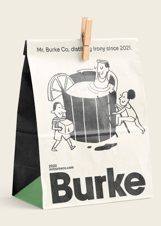
Hand-drawn elements: Hand-drawn elements can add a sense of warmth and personality to designs, making them more relatable and engaging.
Inconsistent color schemes: Inconsistent color schemes can create a sense of authenticity and uniqueness, which can enhance trust and credibility.
Imperfect illustrations: Imperfect illustrations can add a sense of playfulness and creativity to designs, making them more relatable and engaging.