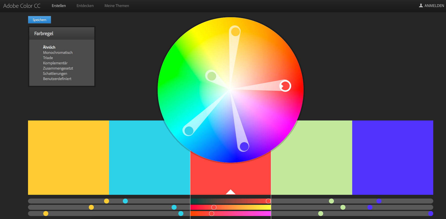
Understanding the fundamentals of color theory prompts the practical application of these principles. Design initiatives and artistic projects commonly commence with the assembly or curation of a harmonious color combination, termed a color scheme.
In scenarios where one or two colors are predetermined based on brand or product considerations, the objective becomes the creation of a 3-5 color palette that resonates seamlessly. This process necessitates a systematic approach, considering that certain color combinations inherently appear more harmonious than others, irrespective of individual preferences.
Several methodologies can be employed:
Contextual Consideration:
Always factor in the context of color perception, acknowledging that colors manifest differently in contrast to various backgrounds. The pairing of green with white differs significantly from its pairing with dark blue or black.
Analogous Color Selection:
Begin with a primary color and select two additional colors positioned adjacently on the color wheel. Extending the palette to include more colors involves stepping outward to the next neighbors of the two outer colors. Analogous palettes are characterized by subdued contrasts and are generally suited for softer, pastel, and low-contrast compositions.
Complementary Color Selection:
Select colors positioned diametrically opposite each other on the color wheel. Adjusting the intensity of these complementary colors can mitigate the high-contrast effect. Exercise caution with this method, as it tends to produce pronounced contrasts. It is often advisable to emphasize one color in the design, utilizing the complementary color as a subtle accent to prevent overwhelming visuals.
Monochromatic Color Scheme:
Utilize various shades or variations of a single hue, incorporating black and/or white. Despite lacking stark color contrasts, monochromatic schemes project cleanliness, uniformity, and harmony. This approach is apt for designs where subtlety and supportiveness take precedence over grabbing attention.
Triadic Color Scheme:
Opt for three colors evenly distributed on the color wheel. These colors are equidistant from each other and can be identified by drawing rays from the center of the circle. Refinement involves considering the ratio during application, such as using a light color for backgrounds and a dark one for prominent elements.
Split-Complementary Contrast:
Choose a dominant color and select two directly adjacent complementary colors. While this scheme offers a nuanced palette compared to the traditional complementary selection, it maintains a rich contrast and may require careful coordination for optimal results. Use this approach judiciously, especially after gaining experience in creating color palettes.
Personal Approach – Beyond Guidelines:
With experience, explore unconventional approaches. While pre-existing color palettes based on established principles are available, don’t hesitate to forge new paths. Initiate with a color of choice and experiment with combinations. Allow time for reflection, fine-tune as necessary, and observe the resonance of palettes. Over time, individuals familiar with this domain develop an intuition for harmonious color selections.

Sources: https://www.kunstplaza.de/fashion-design/farbenlehre-farbtheorie-styleguides-fashion-design/#Tipps_fuer_die_Zusammenstellung_stimmiger_Farbschemata
https://www.formativ.net/blog/webdesign-tipps-farbschema-fuer-professionlle-website-gestaltung/