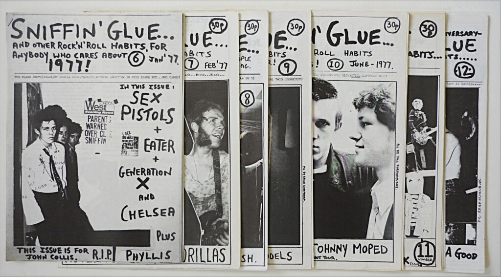
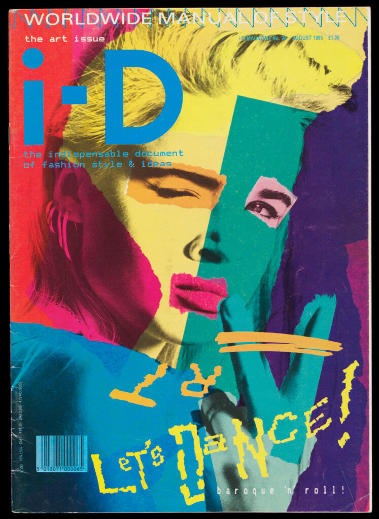
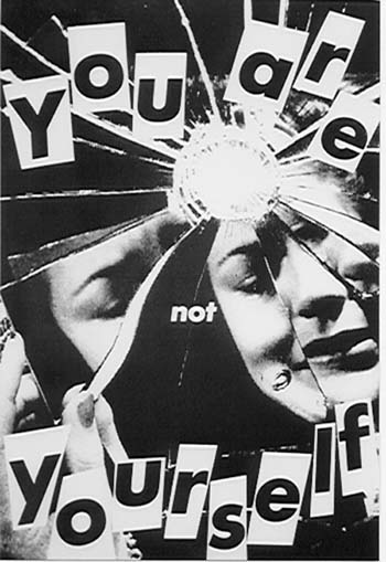
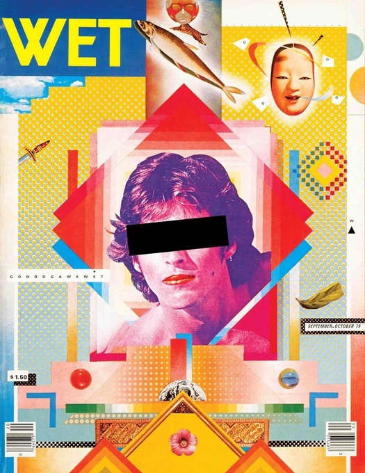
The hand-mad design style was especially popular during the zine movement in the 1960s – 1990s. Because these zines were not driven by a capitalistic approach, they could experiment with new aesthetics freely.
“Sniffin’ Glue(1976–77)is a great example of new aesthetics that would ultimately penetrate a world saturated in modernist design tropes.”1
The methods used by zine producers had to be quite cheap, which also paved the way for a DIY-aesthetic. The results were designs that did not fit the popular media of the time.
The many different aesthetics that zines used inspired art and clothing, and also defined topics of discussion for this generation. In this instance the hand-made design style was a way to boycott formality and celebrate individuality. It criticizes the narrow definition of success in our society. “Replication of aesthetics that defy an adherence to modernist standards of ‘good’ design, art, and writing, makes space for designers today to continue to question conventions of popular culture, as to not slip into patterns that perpetuate exclusivity.” ¹
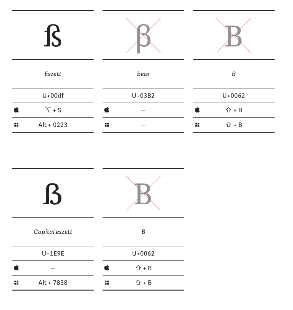
The Eszett, both in lowercase (ß) and uppercase (ẞ), is often confused with the Greek letter Beta (β), particularly in uppercase where it resembles the letter B. The uppercase Eszett is also frequently mistaken for the letter B.
This potential for confusion arises due to the visual similarities between these characters, especially in certain fonts or when they are not clearly displayed. In scientific and academic contexts, where precision is of utmost importance, the differentiation between these characters becomes crucial to avoid misunderstandings and inaccuracies.
It‘s important to note that the Eszett has specific orthographic rules in the German language, while the Greek Beta and the English letter B have different linguistic contexts and applications.
German letter B
This visual similarity can lead to confusion for non-German readers who may not be familiar with the Eszett. The association of the Eszett with the German letter B is sometimes humorously referred to as „German B,“ as it can resemble the English B at first glance.
This confusion is further exacerbated by the different stylistic variations of the Eszett in various fonts. Some font designers may not be acquainted with the specific orthographic rules of the Eszett or may consciously opt for a creative variation. This results in a range of appearances, with some versions closely resembling the letter B. The mix-up between the Eszett (ß) and the German B is rooted in visual similarities and specific stylistic choices in fonts.
Greek letter „β“ (beta)
In scientific writings, precision plays a crucial role, especially when utilizing non-English letters. It is important to carefully distinguish the German letter „ß“ from the Greek letter „β.“ While „ß“ is specific to the German alphabet, „β“ is frequently employed in biomedical research and mathematics.
The risk of misunderstandings arises because both letters look similar but represent different linguistic contexts. „ß“ is used in the German language and follows specific orthographic rules, whereas „β“ is utilized in Greek and disciplines such as biomedical research and mathematics.
A specific issue arises when authors mistakenly use „ß“ for „β“ or vice versa. This can lead to confusion in scientific literature. Authors have the right to request corrections from scientific journals in case of inaccurate representation of their names or other terms.
Overall, this underscores the importance of precise usage of letters and characters in scientific works to avoid errors and misunderstandings, ensuring the quality of scientific communication.
The rules for capitalization have evolved throughout the 20th century. In the German orthography of 1901, the Eszett was replaced in uppercase by the combination of „S“ and „Z,“ resulting, for instance, in „Preußen“ being written as „PREUSZEN“ in all caps. However, over the course of the 20th century, the substitution with „SS“ became increasingly prevalent. This shift is reflected in the spelling rules of the West German Duden. Shortly before the spelling reform of 1996, the use of „SZ“ in uppercase was only allowed in exceptional cases, where substituting it with „SS“ could lead to confusion. For instance, „Masse“ was capitalized as „MASSE,“ but „Maße“ as „MASZE.“
The East German editions of the Duden from 1969 and 1984 mandated differentiation between „SZ“ and „SS“ only in cases of potential misunderstandings. Otherwise, the use of „SS“ was recommended, as seen in examples like „STRASSE“ and „ERDGESCHOSS.“
Historical Family and Street Names – HS, SS, SZ, and ẞ
In the context of historical family and street names, the treatment of specific letters like „HS,“ „SS,“ „SZ,“ and the capital letter „ẞ“ has evolved over time. The substitution of the Eszett with other capital letters, especially in proper names, can lead to potential misunderstandings. The name „WEISS,“ for instance, could be interpreted as both „Weiß“ and „Weiss,“ while the name „LISZT“ could be read as both „Lißt“ and „Liszt.“ A historical example of this is Stefan Großmann, who, in 1911, used the spelling „GROHSMANN“ on his letterhead. Given these diverse approaches, mixed case typesetting has emerged as an additional option where the Eszett is not replaced by other letters.
In mixed case typesetting, the name „Weiß,“ for example, is transformed into „WEIß“ in uppercase. This practice has been employed since the 1980s in the non-machine-readable section of German passports and ID cards, especially when the name is represented in uppercase. Care is taken to ensure a correct reproduction of the „original spelling.“ In the machine-readable section, however, the „ß“ is still replaced by „SS.“ In current German ID cards (as of 2022), the capital ẞ is already utilized in the machine-readable section.
The letters ß and ẞ in an international context
According to the Austrian Passport Authority, a sharp „s“ (ß) is registered as „ß,“ and there are no indications for the use of the capital ẞ. In the case of using ß in the first or last name, an official note in the passport can be provided in German, English, and French, stating that the sharp „s“ (ß) is equivalent to the double „s“ (ss).
The two different spellings of the same name can lead to confusion, especially abroad. Austrian identification documents may include an explanation of German special characters in languages such as German, English, and French, highlighting the equivalence of „ß“ and „ss.“ Additionally, Deutsche Post AG recommends retaining the Eszett when filling out forms in uppercase, a recommendation that was made by the Duden even before the introduction of the capital ẞ.
The use of the letter „ß“ in the German language indeed poses certain challenges, particularly in an international context. The rule that „ß“ is replaced by „ss“ when it is not available in the font aims to ensure readability and facilitate information exchange. This is crucial in regular written communication and when using computers, such as in emails, word processing programs, or booking tools.
However, this practice gives rise to issues, especially with place and family names, as it may lead to incorrect spellings. This becomes particularly apparent when using identification documents internationally. Individuals with „ß“ in their names, as well as those with umlauts, often encounter difficulties in correctly representing their names or experience misspellings.
Another challenge arises when software or fonts used internationally do not support the „ß.“ In such cases, the „ß“ is often automatically replaced by „ss,“ potentially leading to distortions. This issue is relevant not only in digital communication but also in printed materials intended for the international market.
The difficulties associated with the „ß“ highlight the reliance on standardized spelling in international communication within a globalized world. However, this reliance can result in the loss of cultural nuances and complicate the accurate representation of names. Striking a balance between preserving linguistic peculiarities and the necessity for an internationally comprehensible writing system presents an interesting challenge.
In this bog post I would like to focus on an experiment I found concerning different instructional learning methods. The Experiment delves into the realm of motor skill acquisition, specifically focusing on origami paper-folding—a task tied to human movement. The study investigates whether narrated animations outshine their static graphic counterparts in aiding learners through this complex process.
The Task:
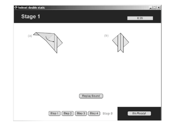
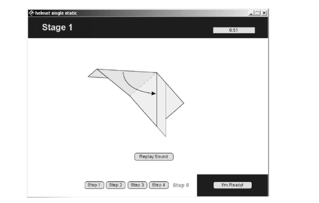
Origami, the ancient art of paper-folding, becomes the center point for this exploration. Traditionally, static diagrams presented the different steps of origami, requiring learners to deduce the transitions between the starting and ending states of each fold. This experiment introduces three instructional formats: narrated animation, single-static, and double-static graphics.
Thirty-two sixth-grade students participated in the study, randomly assigned to one of the three instructional conditions. The Viking Helmet construction, involving 13 steps, served as the chosen origami task. The animated version provided real-time narration for each fold, while the static versions showed single or double static diagrams, mimicking the animation’s start and end states without the dynamic transition.
Methods:
Participants were given the task of folding the Viking Helmet after viewing their assigned instructional format. Each group received narrated explanations with visual information. The hypothesis stated that students exposed to narrated animations would outperform those receiving narrated, static-image-based instructions.
Results:
The group that watched animated instructions did better than the group that saw only pictures. They learned the task faster and spent less time figuring it out. In the test, more students in the animated group could complete the task compared to the groups that saw only pictures.
The results of this Experiment support the idea that animated instructions are better for learning motor skills. Animated instructions, especially when someone is explaining in real-time, help people understand and learn complex tasks faster.
Conclusion:
From the findings of this Experiment, we can see that animated instructions are better than static pictures for learning motor skills. This study suggests that using animated instructions with real-time explanations is a strong way to improve learning outcomes. It sets the stage for more interesting and effective ways of teaching.
After my research on the historical context, I feel the need to define and categorize the term “hand-made design” a bit more. In the beginning I saw it as an aesthetic that is defined by small imperfections and lots of details, for example in texture, that hint towards a production technique that requires human hands. But I want to explore what exactly this entails.
One way of defining it is by focusing on analogue techniques as a requirement for hand-made design. The designer Mark Fox believes that when everyone uses the same digital tools, the results will all look similar. „Design has been homogenized by the mass adoption of the Mac. It’s a powerful and omnipotent machine, but in the end, it is a simulation of the real tools.”1 When using the real tools, the created graphics have character and show evidence of a human hand. Digital programs on the other hand always create the same clean lines, “tricking the designer into thinking that their work is ‘finished’ when it is just ‘polished,.”¹
Letterpress is one example of an analogue tool for graphic design that is experiencing a bit of a comeback. Even though it is more time consuming and labor intense than newer methods, it creates details that can’t be achieved digitally. During the process of letterpress printing there are some constraints. The composition is created by using physical objects, even for the white spaces. And features like weight, shape and color have to be chosen carefully and intentionally. “Rather than stifling creativity, the materials’ physical constraints stimulate it, encouraging problem-solving by using the tools at your disposal.”2
So the difference in using digital or analogue techniques can not only be seen in the aesthetic of the result, but impacts the whole process, and therefore the quality of the design in general, even if you ignore the imperfect aesthetic. The designer is forced to take his or her time and create everything physically.3
Another limiting aspect of digital creation is the problem around accessibility. The files that are saved now, might be outdated in ten years because of possible changes in technology. This also hints towards the fact that all these programs rely on code, which creates clear boundaries as to what a designer can create. And coders become a necessity, that designers rely on. This can narrow the range of results that can come out of a digital creation.¹
There is also the common mix of analogue and digital. For example, the designer Tjitske Oosterholt says that she likes to start out with analogue tools and later manipulate the results digitally to create her designs.4
What the categorization into analogue tools also doesn’t include is graphic tablets. Nowadays hand-drawn sketches can be created on a digital drawing tablet. The programme might clean up the lines a little bit if the designer chooses it, but this still can create hand-made, imperfect human design – even though it has been created digitally. Therefore I think it would be wrong to exclude digital techniques in general from the definition of what hand-made design is.
The shift from a focus on digital precision to an appreciation for imperfections in graphic design has been a gradual and ongoing evolution, influenced by various factors over time. It’s challenging to pinpoint an exact moment or period when this shift occurred, as design trends are often shaped by a combination of cultural, technological, and artistic influences. However, here are some key developments that contributed to this shift:
Late 20th Century Postmodernism:
The late 20th Century Postmodernism played a significant role in the shift from a focus on digital precision to an appreciation for imperfections in graphic design. Postmodernism emerged as a reaction against the strict rules of modernism and embraced eclecticism, experimentation, and a departure from the clean lines and precision associated with modernist design. This movement challenged the rigid rules of modernism and paved the way for a more playful and expressive approach to design. Designers like David Carson and Stefan Sagmeister experimented with typography, blending different styles and breaking conventions. The advent of computers and digital technology in the 1980s revolutionized the field of graphic design, enabling designers to explore new possibilities in visual communication, image manipulation, and multimedia design.
Postmodernism also encouraged designers to question the nature of „art“ and to incorporate kitsch and „bad“ taste for humor, further contributing to the shift towards appreciating imperfections in graphic design. The postmodernist movement played a crucial role in shaping the evolution of graphic design, paving the way for a more diverse and expressive approach to design that embraces imperfections and experimentation.
As digital design tools became more prevalent, designers initially focused on achieving perfect precision, leveraging the capabilities of software for accuracy and consistency. However, as these tools matured, designers started exploring ways to break away from the rigidity of purely digital creations and embrace imperfections and experimentation. The emergence of new design trends and styles that embraced imperfections and experimentation can be traced back to the postmodernist movement, which challenged the rigid rules of modernism and paved the way for a more playful and expressive approach to design. Additionally, the resurgence of grunge design, which embraces imperfection and a raw aesthetic, is another example of the influence of postmodernism on graphic design.
The shift towards appreciating imperfections in graphic design was influenced by a combination of factors, including advancements in digital tools, the postmodernist movement, and a desire for authenticity and experimentation.
The Arts and Crafts Movement, a design and arts movement that emerged in the late 19th century as a reaction to the industrialization and mass production of the era. The 1851 Great Exhibition in London played a pivotal role in its emergence. The movement, led by influential figures such as William Morris, sought to revive traditional craftsmanship and celebrate the beauty of handmade goods. Designers began incorporating imperfections, textures, and handcrafted elements to add a human touch to their creations, partly as a response to the mass-produced, digitally dominated design landscape. The Arts and Crafts movement, which prioritized handmade craft and a love of materials, is an example of the influence of handmade and craft aesthetics on graphic design.
The movement spread to the US, aligning with Progressive Era politics. However, as it failed to adapt to the demands of the 20th century, it declined around the 1920s. Yet, its legacy endured, inspiring later movements like Mingei in Japan and influencing the Bauhaus school. In contemporary graphic design, a resurgence of Arts and Crafts is observed, with designers seeking to reintroduce craftsmanship, personalized touches, and handcrafted aesthetics, drawing inspiration from Medieval art and employing techniques that evoke an old-world, non-digital feel.
The availability of digital tools and software also played a role in this shift, as designers began to explore ways to break away from the rigidity of purely digital creations and embrace imperfections and experimentation. Overall, the growing interest in handmade and craft aesthetics, combined with advancements in digital tools, contributed to the shift towards appreciating imperfections in graphic design.
As consumers and audiences started valuing authenticity and uniqueness, designers sought ways to convey a more genuine and human feel in their work. Imperfections were seen as a means to communicate sincerity and authenticity. This shift towards appreciating imperfections in graphic design was influenced by a combination of factors, including, as mentioned above, the growing interest in handmade and craft aesthetics, the postmodernist movement, and the maturation of digital design tools. As designers began to explore ways to break away from the rigidity of purely digital creations and embrace imperfections and experimentation, they were able to create more authentic and engaging designs that resonated with audiences. The shift towards appreciating imperfections in graphic design was driven by a desire for authenticity and a more human-centered approach to design.
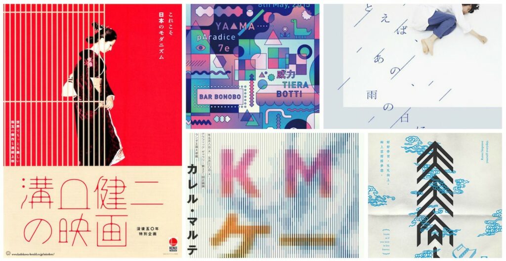
The influence of Japanese aesthetics, particularly the concept of Wabi-Sabi, has played a significant role in the shift from a focus on digital precision to an appreciation for imperfections in graphic design. Wabi-Sabi is a Japanese aesthetic concept that emphasizes the beauty of imperfection, transience, and simplicity (I go more into depth in my blog entry about Wabi-Sabi). This philosophy has influenced designers to incorporate these principles into their work for a more organic and genuine feel.
Japanese graphic design has had a major impact on the field of design, both in Japan and around the world. The bold and innovative designs of Japanese graphic designers have been recognized for their unique characteristics, such as elegant simplicity, harmonious asymmetry, and the use of natural materials. The concept of Wabi-Sabi, which is rooted in Japanese aesthetics and philosophy, has gained popularity and influenced designers to embrace imperfection and transience in their work. The influence of Japanese aesthetics on graphic design can be seen in various design trends and styles, such as the minimalist design trend, which emphasizes simplicity and subtlety.
Additionally, the use of natural materials, such as wood and paper, has become more prevalent in graphic design, reflecting the appreciation for nature and the environment that is deeply ingrained in Japanese culture. The influence of Japanese aesthetics, particularly the concept of Wabi-Sabi, has contributed to the shift towards appreciating imperfections in graphic design.
Besides Wabi-Sabi, there are several other Japanese design principles that have influenced graphic design. Here are some examples:
Kanso: This principle emphasizes simplicity and clarity, with a focus on eliminating unnecessary elements and achieving a sense of balance and harmony.
Ma: This principle refers to the use of negative space to create a sense of balance and harmony in a design
Shibui: This principle emphasizes simplicity, subtlety, and elegance, with a focus on natural materials and organic shapes.
Yugen: This principle refers to the use of suggestion and mystery to create a sense of depth and complexity in a design.
Iki: This principle emphasizes sophistication and refinement, with a focus on understated elegance and attention to detail.
Overall, Japanese design principles have had a significant impact on graphic design, influencing designers to embrace simplicity, natural materials, and a focus on balance and harmony. These principles have contributed to the shift towards appreciating imperfections in graphic design, as designers seek to create more authentic and engaging designs that resonate with audiences.
As designers began to focus more on creating designs that resonated emotionally with users, imperfections were seen as elements that could enhance emotional connections rather than detracting from the design. This shift was influenced by the growing emphasis on user experience and the desire to create designs that were more personal and authentic.
The visual culture on social media platforms has played a significant role in shaping design trends, contributing to the shift towards appreciating imperfections in graphic design. There has been a move away from overly polished and perfect visuals, with a preference for more authentic, relatable content. Designers have adapted to these changing expectations, incorporating imperfections and handcrafted elements to create designs that resonate emotionally with users.
The design industry began recognizing and celebrating diversity, not only in terms of designers but also in design aesthetics. This acknowledgment led to a broader acceptance of different styles, including those that embraced imperfections.
Colors are not just visual elements, but crucial components in the toolbox of successful branding. This blog post is dedicated to the role of colors in a company’s brand identity. In my research, I look at how colors not only create aesthetic impressions, but also contribute significantly to a brand’s identity.
In the context of my master’s topic, it is relevant in that the targeted selection of colors plays a key role in shaping brand identity and the emotional connection with consumers.
Title: Beeinflussen uns Farben wirklich?
The video „Beeinflussen uns Farben wirklich?“ from the YouTube channel „DW Deutsch“ is about the extent to which colors influence us. It also explains what colors are and how they are perceived by the eye via wavelengths. It also explains how colors are created. Birgit Weller, a product designer, deals intensively with colors and their effect. She looks at specific examples from the drugstore (razors, hairspray, shower gel) and explains the effect and purchasing decisions of different genders. Last but not least, the statement „Colors transport image“ is discussed. The effects of the colors red and green are evolutionary. The effect of other colors, on the other hand, is learned by people in the course of their development.
What do colors stand for and why are they an important part of design?
Colors are crucial in design and shape the perception of brands. They convey emotions, shape identities and attract attention. In corporate design, colors, together with other elements such as the logo and typeface, form the basic building blocks of a brand that shape its unmistakable appearance. (Vgl. PAPER PRODUCTS)
Color as an identity carrier using company examples:
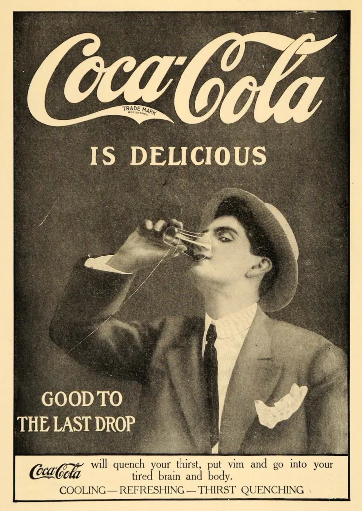
An outstanding example of effective corporate design through color is Coca-Cola, whose red brand color and „Dynamic Ribbon Device“ send clear signals of identity and emotion. Other brands such as Milka, Ferrari and Telekom use characteristic splashes of color for high recognition. Since 1995, companies have been able to protect company colors at the German Patent and Trademark Office in addition to logos and lettering. (Vgl. PAPER PRODUCTS)
Colors in corporate design:
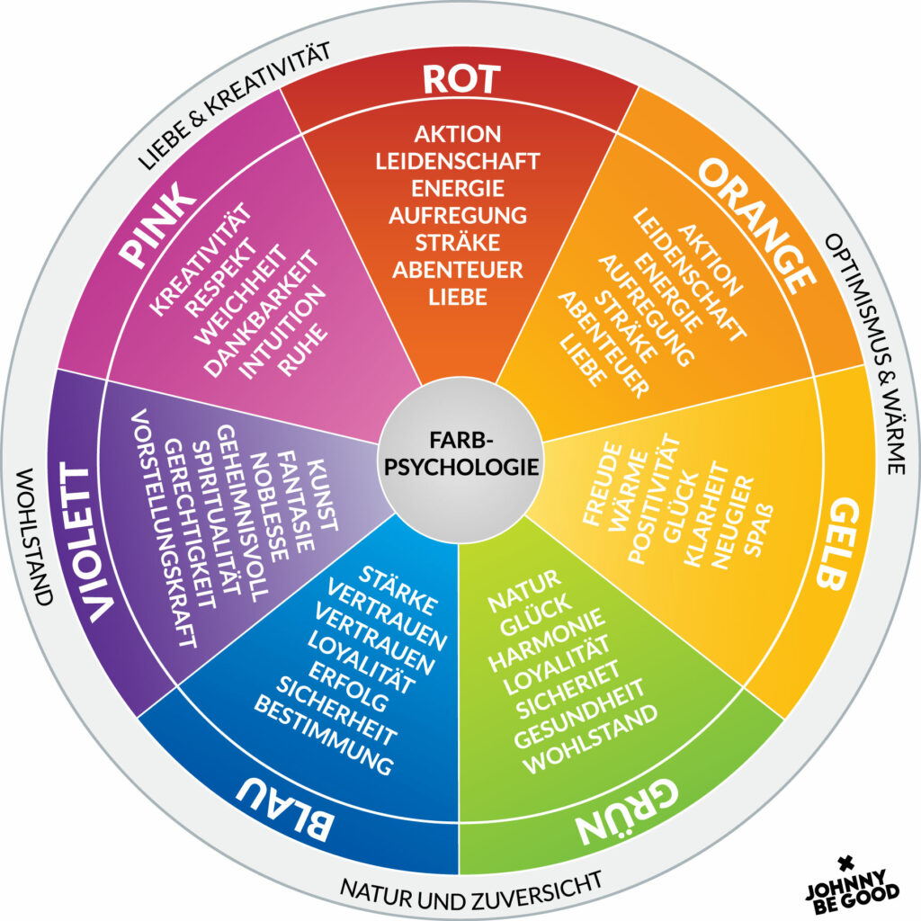
Successful companies protect their corporate colors to maintain uniqueness and a clear identity. Colors in design have a significant impact, from selection to application. The world of color psychology makes it possible to create impressive visual identities for brands or projects. (Vgl. PAPER PRODUCTS)
Colors in the brand identity:
Color choice is critical to brand identity, as a consistent color scheme across different materials creates a strong and recognizable brand. Examples such as the red of Coca-Cola and the blue of Facebook are instantly recognizable and contribute to the perceived brand identity. In addition to brand identity, colors are part of emotional reactions, purchasing decisions, target group appeal and cultural differences. (Vgl. Johnny Be Good)
Works Cited:
Johnny Be Good. “Farbpsychologie – Die Rolle von Farben in Der Markenbildung.” Www.johnnybegood.at, 5 Dec. 2023, johnnybegood.at/farbpsychologie-die-rolle-von-farben-in-der-markenbildung/#:~:text=Markenidentit. Accessed 5 Jan. 2024.
PAPER PRODUCTS. “Farbpsychologie Im Design: Wie Farben Emotionen Und Marken Beeinfluss.” Farbpsychologie Im Design: Die Emotionale Wirkung von Farben Und Ihre Rolle in Der Markenidentität, www.paper-products.de, 1 Oct. 2023, paper-products.de/Farbpsychologie-im-Design-Die-emotionale-Wirkung-von-Farben-und-ihre-Rolle-in-der-Markenidentitaet. Accessed 5 Jan. 2024.
The history of branding spans centuries and has evolved over time from simple trademarks to a complex and profound aspect of our visual culture. The history of branding is a fascinating journey through the evolution of business, society and technology. In this blog post, I will trace the evolution of branding over time.
Analyzing the history of branding helps me gain an understanding of the historical evolution of branding to better understand current practices and predict future developments.
16th century: Beginnings
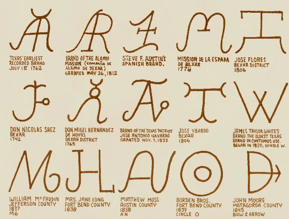
In Old Norse, the word „brandr“ originally meant „burning piece of wood“ and later a torch. In the 16th century, cattle were marked with brands to identify ownership. These brands were simple, unmistakable symbols, comparable to the first product logos. From the very beginning, they were used to make a mark both literally and metaphorically.
In the 18th and 19th centuries, new manufacturing processes enabled mass production, increasing consumer choice. In this competitive environment, trademarks became crucial to stand out. From the 1870s, registered trademarks became increasingly important and the first US Trademark Act was passed in 1881. This was the first time branding was recognized as intellectual property.
1870s to 1920s: The age of inventions
The turn of the 20th century was characterized by technological change and visionary achievements. The Wright brothers‘ flight in 1903 symbolized the creativity and innovation of this period. Companies such as Coca-Cola, Colgate, Ford, Chanel and LEGO, which emerged in this era, were pioneers and trendsetters. Ford was an early seller of gasoline-powered vehicles, while Chanel introduced innovative fashion concepts. Print media played a key role as brands stood out in newspapers and magazines through words, logos and illustrations and advertisements informatively presented the product.
With more efficient production and the need for official product claims came the move towards marketing in listening environments. In the 1920s, radio stations used advertising as a means of promoting companies by using radio jingles and slogans. The first paid radio advertisement appeared in 1922, and by 1930 nearly 90% of US radio stations were broadcasting advertisements, even entire programs were funded by corporations. With the advent of television in 1941, this trend intensified. Companies sponsored programs and created commercials that used visual, audio and musical elements to create a strong connection with viewers. Television allowed brands to reach their customers closer than ever before.
1950s to 1960s: The birth of modern branding
In the post-war era, car culture, the growth of the middle class and suburbs, and the popularity of television changed the culture of production and consumption. Companies used various visible brand perceptions such as billboards, architecture and TV commercials to reach new audiences. Competition forced companies to develop brand management to differentiate themselves from similar products. The decisive step was emotional branding, where marketers created an emotional connection between product and customer by addressing their needs and developing a unique identity. This transformed branding from informative to intimate.
1960s to 1990s: Branding comes of age
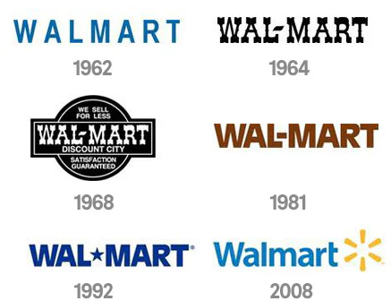
Brands need rebranding over time in order to survive in a growing market. The positive example of the Walmart logo shows the need for a fresh image. Campaign slogans, as with L’Oreal and McDonald’s, can further strengthen well-known brands. Brand evolution has also influenced the retail sector, where companies such as Target have created a more engaging shopping experience through better branding and collaboration with designers, improving the brand image of retailers and companies.
In today’s era of brand overkill, it’s crucial to stand out. The digital age has changed traditional techniques like TV advertising in favor of social media and data-driven marketing. Brands are using apps, vanity URLs and hashtags to increase awareness. Coca-Cola’s #ShareACoke campaign shows how personal relationships and user engagement can create a strong connection with customers. Customer reviews on platforms such as Amazon and Yelp have a significant impact on brand perception and reputation is becoming increasingly important. Brands are increasingly turning to mission branding, such as Starbucks and Warby Parker, to drive customer loyalty. The in-store personal experience, such as free yoga classes at Lululemon, is also a key factor in brand development.
Works Cited for the entire article:
Cantor, Aviva . “Eine Kurze Geschichte Des Brandings.” Www.99designs.de, 2020, 99designs.de/blog/designgeschichte-stroemungen/branding-geschichte/. Accessed 5 Jan. 2024.
In order to contextualize the handmade design trend, I want to look at historic developments in graphic design to get a better understanding of its origin.
For about a century a modernist approach has influenced popular design. Modernism took over between the 1920s and 1960s. It is deliberately rejecting styles of the past like Art Nouveau and Art Deco and instead emphasizing the use of new materials and techniques. It is supposed to reflect modern society through bold colors, simple shapes and modern fonts. Shortly before this movement, Art Nouveau, which used expensive and labor-intense techniques, was popular. “[…] despite the attempt to move away from the artistic heritage, Art Nouveau had certain plastic borrowings from the artistic styles of the previous times in its graphic language.”1
In 1915 the constructivism movement was founded. It focused on construction and science rather than artistic expression and aimed to influence all mass-produced objects. “Art was to be built.”2 The artists used geometric, simplistic shapes that could be created with utilitarian instruments like compasses and rulers, to break down art into its most fundamental parts. The designs were supposed to speak to political concerns of citizens and fulfill the demands of communist culture. “However, in general the society was not ready to accept the radical artistic techniques of theconstructivists.”¹ Art deco, with its opulent and luxurious feel, became a reaction to constructivism.
“In the second half of the 20th century, Functionalism, or as it was called, the ‘internationalstyle’, which consistently professed the ideas of Modernism, became more popular”¹ This style emerged from a need of big companies wanting to create their own corporate styles. “It was thought that the search for a new global style was over, and now everything would be done in one way for a long period.”¹ Whilst the international style has stayed popular for a long time, modern society demands a diversity of styles and is not satisfied with just one.
After modernism, came post-modernism. An ironic approach which referenced modernist styles. “The only thing that Postmodernism requires from the designer is the use of modern technologies.”¹
The emergence of the world wide web in the 1990s further impacted popular design styles. In the beginning a functionalist approach was necessary, due to the graphic restrictions of the web. The design was subordinate to the technology which led to the so-called hyper-functionalism. Later swiss style became popular in web design, as it allowed company-styles to be integrated in a still very functional website design. The “New wave” style contrasts the functional and rational rules of the swiss school of design. Computer technologies opened new expressive capabilities, like new fonts and chaotic compositions that indicate an intentional ignorance to logical design schemes. They enable experimental designs and a “Hi-tech” style. This style is characterized by vector illustration, animation as well as 3D graphics. Theses graphic elements and techniques are still very popular. “To achieve their purpose, they mostly use straight lines and forms; gray, white, black silver-metallic colors; rulers, frames; elements of technical and information graphics (icons, arrows, etc.); they also use non-standard materials (for example, business cards are printed on transparent plastic, etc.) when copying the media carriers.” ¹ The high-tech style produced some more avant-garde designs on the internet during the late 90s. These designs had a maximalist approach of graphics, used cultural codes, montages, chaotic structuring and for example pixelated images to hint towards the technological limitations of the medium. The so-called trash-style reflected a desire to add a human touch. The design style let the viewer see, this design was consciously created by a human.
This historical context shows that modernist ideas in graphic design are staying relevant no matter different tendencies and smaller trends that appear. What I find interesting, is that over the years a human and hand-made style did not seem to be relevant at all. It even appears that a more hand-made artistic approach, and the use of outdated technology, has not been popular ever since modernism started. Even though there was a desire to show human-qualities in the design – especially during the establishment of computers – this was done using mainly new, digital techniques (trash style, new wave). And before the digitalization, it seems like the design was strongly moving towards, perfect looking, clean designs (constructivism, modernism, swiss school of design, …), even though analog techniques may not have allowed an execution without small flaws. The use of modern techniques and technologies seem to have dominated throughout all these developments. This might be why the current trends towards using older techniques in different fields, are hard to explain. Be it in graphic design, photography or even audio – old technology is having a comeback even though its use is more expensive and time-consuming. This trend is not necessarily logical or functional. For example, in the audio-field vinyl has had a significant comeback. After being neglected in the 1990s, its sales are now higher than the newer format of CDs. It is the first recording format to return dominance from near-extintion.3 Since similar tendencies can be seen in photography and design, this might become a significant trend in the future. But its source is hard to define.
In the ever-evolving landscape of technology, Augmented Reality (AR) tools have emerged as powerful facilitators, reshaping our interactions with the physical and digital realms.
Artivive Artivive is an augmented reality (AR) application designed to enrich static artworks, illustrations, or photographs by bringing them to life through smartphone or tablet scanning. Catering primarily to the art world, Artivive enhances traditional printed materials with dynamic and interactive digital content. Its intuitive interface and user-friendly features make it a go-to tool for artists, enabling them to seamlessly merge physical and digital elements, creating captivating and immersive AR-enhanced experiences. (1)
Adobe Aero Adobe Aero is an innovative tool for Augmented Reality (AR) that simplifies the creation of immersive experiences by enabling users to design 3D objects and animations without extensive coding. With an intuitive interface and seamless integration with Adobe Creative Cloud, Aero empowers designers, artists, and creative professionals to bring their visions to life effortlessly. Leveraging real-time object tracking and gesture recognition, Adobe Aero allows users to author interactive AR experiences that respond dynamically to the physical environment. (2)
Other tools Other tools which can be used include Zapwork, Accessar, Onirix, Roar, Augmania, Brio XR. However, most of them are targeted to businesses and have a higher pricing.
Qr codes
QR codes are machine readable printed representation of data for various industry uses. It has now become common in consumer advertising. A consumer with a Smartphone can install an app with a QR code scanner that can read and decode the URL information and redirect the phone’s browser to a company website. After scanning QR codes, users may receive text, add a business card contact to their devices, open a Web hyperlink, or compose an email or text message.
Manage QR codes in InDesign You can now generate and edit high quality independent QR code graphics from within InDesign. The generated QR code is a high-fidelity graphic object that behaves exactly like native vector art in InDesign. (3)
Qr generators online Qr codes can also be generated through many different websites. Most of them offer different pricing options to generate certain amounts of them. These include Beaconstac’s QR Code solution, QR-Code-generator.com, QR Code Monkey, Scanova, Shopify’s QR Code generator. (4)
Customizable website platforms
Website platforms can be the perfect tool to connect a printed product to digital. Through the use of a Qr code or other technologies the two can be connected
CSS-HTML The foundation of web development, CSS and HTML are essential languages for creating custom and visually appealing websites. However, using them can be time-consuming and demanding.
WordPress A highly versatile content management system, WordPress has a user-friendly interface and a vast library of plugins and themes. It caters to a broad spectrum of website needs, from blogs and portfolios to e-commerce sites, making it a popular choice for both beginners and experienced developers. (5)
Squarespace Known for its visually appealing templates and design-centric approach, Squarespace is a platform that caters to creatives and businesses alike. It provides an all-in-one solution with features such as e-commerce capabilities, blogging tools, and domain registration, making it a preferred choice for those seeking a seamless and aesthetically pleasing website-building experience. (6)
Wix Wix is a versatile website builder that combines ease of use with extensive customization options. With its drag-and-drop editor and a wide array of templates and apps, Wix accommodates diverse website needs, from portfolios to online stores, making it a flexible choice for users with varying levels of technical expertise. (7)