#09 Day to Night – Color Grading Allgmein

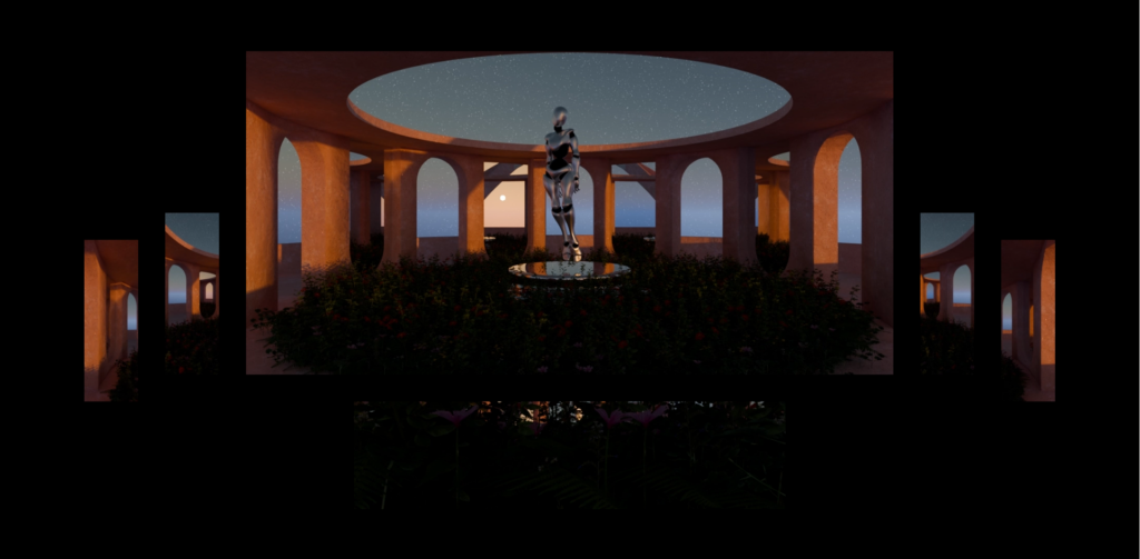
Day to Night Color Grading ist eine Technik, die verwendet wird, um Filmmaterial, das tagsüber aufgenommen wurde, so zu bearbeiten, dass es wie nachts aussieht. Zu diesem Thema habe ich mich bezüglich meines Projektes „Freiluft“ auf die Recherche begeben, was zu beachten ist beim Dreh, wie die Schritte in der Postproduktion sind und vieles mehr. Hier möchte ich wie ein kurzes Guide zusammenfassen über alle wichtigen Aspekte, die zu beachten sind, wenn man Day to Night Color Grading erfolgreich umsetzen möchte.

Belichtung reduzieren
In der Nachbearbeitung wird die Helligkeit verringert, um die Szene dunkler zu machen.

Blaue Töne hinzufügen
Durch Anpassen des Weißabgleichs oder Hinzufügen von blauen Farbfiltern entsteht eine kühle, nächtliche Stimmung.

Kontraste verstärken
Erhöhte Kontraste helfen, Details sichtbar zu machen und eine realistische Nachtszene zu erzeugen.

Schatten und Lichter anpassen
Schatten sollten tiefer und Lichter subtiler gestaltet werden, um die Illusion von Mondlicht zu schaffen.

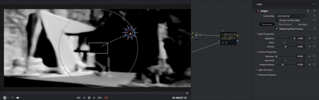
Sichtbare Lampen nach beleuchten
Wenn in einer Szene leuchtende Lampen zu sehen sind, sollten diese bei dem Color Grading extra fokussiert werden, damit das Licht realistisch aussieht. Hierzu gibt es in der DaVinci Resolve Studio Version einen Effekt namens „Relight“, dieser analysiert das Footage und kreiert eine Normal Map dafür, also es sucht wohin 3D sehen und ihre Tiefen sind. Wenn man mithilfe dieses Relight’s ein künstliches Licht einfügt hat es realistische Brechungen und man kann somit Lichter in einen Shoot nachbelichten oder sogar damit eine Mondlicht-Stimmung gestalten.

Normal Map Screenshot
Relight Effekt in DaVinci Resolve

Himmelszenen vermeiden
Grundsätzlich gilt es bei Day to Night Shoots zu beachten, dass der Himmel nicht direkt gefilmt wird. Dennoch, wenn dieser zu sehen ist und gefilmt wird ist dieser stark im Nachhinein zu bearbeiten, damit dieser nicht unrealistisch hell in der Nachtszene erscheint. Diese Korrektur ist gut mit DaVinci Resolve möglich, da mit den Möglichkeiten der Maskierung im Color Grading Bereich hier einiges möglich ist.

Lens Flares meiden!
Das wahrscheinlich wichtigste ist es, Lens Flares zu vermeiden beziehungsweise alle Varianten, wo man die Sonne wirklich erkennt. Da natürlich bei Nachtszenen keine Sonne zu sehen ist oder der Mond nie solche Effekte haben könnte. Lens Flares insbesondere lassen ein Day to Night Color Grading sehr unrealistisch wirken und sind deswegen strengstens zu vermeiden um einen glaubhaften Look zu erzielen.

Lens Flare Beispiel, das bei dem Look nicht funktioniert!

Sonnenwinkel – Uhrzeit des Shoots
Ein anderer Aspekt um einen glaubwürdigen Nacht-Look zu kreieren ist wo die Sonne während des Drehs steht. Besser ist es wenn man keine argen Schatten oder Kontraste hat. Optimal ist es also am späten Nachmittag oder am Abend zu shooten, wo die Sonne nicht mehr in einem so steilen Winkel am Himmel steht.

Iconic Beispiel:

Es gibt viele Beispiele für diese Technik im Film. Eines der wahrscheinlich bekanntesten und auch älteren ist Jaws (1975).

(Quelle: https://www.studiobinder.com/blog/tips_schedule_day_for_night/)

Tutorials:

Bei meiner Recherche habe ich einige gute Tutorials, die unterschiedliche Vorgehensweisen haben, gefunden. Hier einige sehr gute Tutorials zu dem Thema Day to Night Color Grading in DaVinci Resolve:

//19 Qualitative Interview about “Merging Digital and Analogue” tools

I continue my research on the topic of Merging Digital and Analogue with a qualitative interview. In this interview I asked questions about the use of digital and analogue tools to understand if there is an interest from users to merge these two further.

Transcript

Introduction

Hello, I am Laura Galvanetto, a communication design student studying at FH Joanneum.
Today I will interview you on the topic of “Merging Digital and Paper”. This interview is part of my research for my Master Thesis. I will write down your answer, and I could include the interview in my Master Thesis.

Questions, answers, insights

Do you enjoy more using analogue or digital tools?

I use in university mostly digital tools, so when I can I choose she prefers analogue tools.

Observations: friendly and open face expression

Do you enjoy using a mix of the two for helping you in a task? For example, learning something, design something ecc.

Yes, I do. For instance, I use digital tools like youtube and search engines to research, but I enjoy using paper for writing down my findings, as I find analogue note-taking to be faster.

Observations: small pause at the beginning

Do you enjoy using  QR Codes?

Sometimes I do, it depends if they work well. Sometimes it is frustrating when they do not work right away.

Observations: Detailed answer and while she speaks about her frustration also face expression indicates it

Do you know what NFC (Near-field communication) is?

No, I do not know.

Observations: Iooks confused

Would you like digital tools to integrate better in books?

Yes, that would be great for learning. Especially it would be interesting to me to learn languages.

Observations: thinks a bit before talking

Do you have good examples of integration of digital and analogue?
I like to have a calendar in both a digital and analogue format, this mix help me remember what I have to do and in this way I have always my calendar readily accessible.

Observations: Smile, starts talking about her personal experience detailed

Closing

Thank you for your answers and your time. I find your contribution valuable to the advancement of my research.

20/ Plans for the next steps:

Currently, the project lacks a sufficient level of artistic expression. To elevate its artistic quality, it’s essential to delve deeper into experimental and innovative approaches. This aligns with the belief that photography is an art form deserving of respect and thoughtful treatment.

Exploring Artistic and Experimental Approaches:

  1. Study Artistic Movements and Techniques:
    • Research various artistic movements in photography, such as surrealism, abstract photography, and avant-garde techniques. Understanding how these movements pushed boundaries can inspire new ways to approach my work.
  2. Focus on Conceptual Photography:
    • Developing projects that convey strong concepts or narratives. Conceptual photography often requires thinking beyond the literal image to evoke deeper meanings and emotions.
  3. Engage with Contemporary Art Trends:
    • Keeping abreast of current trends in the art world. This could involve following contemporary artists, attending exhibitions, and participating in workshops to gather fresh perspectives and ideas.

The Balance Between Enhancement and Destruction:

It’s important to achieve a delicate balance between enhancing a photograph and overdoing it to the point of destruction. This can be achieved through careful consideration and research.

  1. Understand the Intent:
    • Each enhancement should have a clear purpose that aligns with the overall vision of the project. Random or excessive alterations can detract from the original essence of the photo.
  2. Historical Context:
    • Research the history of photography to understand the evolution of photographic techniques and the philosophical underpinnings of different eras. This can provide insight into how to appropriately apply enhancements.
  3. Technical Mastery:
    • Master the technical aspects of both traditional and modern photographic techniques. This knowledge allows for precise and intentional modifications rather than haphazard changes.
  4. Feedback and Reflection:
    • Regularly seek feedback from peers, mentors, and audiences. Reflecting on this feedback can help identify when enhancements are successful and when they might be veering towards destruction.

Researching the History of Photography:

  1. Chronological Study:
    • Starting with early photographic techniques like daguerreotypes and calotypes, then moving through to modern digital photography.
  2. Technological Advances:
    • Examining how technological advances have shaped photography. This includes the transition from film to digital, the advent of color photography.
  3. Cultural and Social Impact:
    • Investigating how photography has influenced and been influenced by cultural and social changes.

I will have a strong focus on this sentence:

“When the finished product is something other than a computer screen it harkens back to the day when photography was a craft. It’s not just about the image, although the image is the king, it’s about the object itself and that you made that object” – Mark Osterman, Process Historian

19/ Making 3D relief with printed photography

Creating 3D reliefs with printed photography is a project that can be done at home with relatively simple materials. This process involves transforming flat images into three-dimensional artworks by layering different elements of the photo to give a sense of depth and dimension. Here’s how I approached this project using two images with strong subjects: a person and a pair of dogs. I created three distinct layers for each image to enhance the visual effect and make the final piece interactive.

1) Woman Photo

First Layer: The Original Photograph The foundation of the 3D relief is the original photograph of a woman. This layer serves as the backdrop for the entire piece, providing the base image from which other elements will be lifted to create depth.

Second Layer: Silhouette of the Woman The second layer involves cutting out the silhouette of the woman from a duplicate of the original photograph. By raising this silhouette slightly above the base layer, I created the first level of depth.

Third Layer: The Woman’s Glasses To add even more detail and a sense of realism, the third layer focuses on a smaller, specific element of the woman: her glasses. By isolating and elevating the glasses, we create a focal point that draws the viewer’s eye.

2) Dogs Photo

First Layer: The Original Photograph Similar to the first project, the original photograph of the two dogs forms the base layer. This image provides the overall context and scenery for the artwork.

Second Layer: Silhouette of the Two Dogs The second layer in this piece is the silhouette of both dogs. Cutting out their combined shape and putting it above the original photograph starts to give the image depth. This separation emphasizes the subjects, making them stand out from the background.

Third Layer: Silhouette of the Small Dog For the final layer, I chose to isolate the smaller dog and elevate it above the silhouette of both dogs.

Conclusion

Observers can move around the photos, exploring different angles and perspectives. This interactivity invites viewers to engage more deeply with the artwork, as they discover new elements hidden within the layers. This project can enhance the appreciation for photography but also allow you to explore the creative possibilities of three-dimensional art.

I personally believe that this project straddles the line between serious and casual. The 3D relief technique evokes a collage-like aesthetic, which can vary in effectiveness depending on the photograph used. For instance, applying this method to a photo of a woman wearing glasses doesn’t seem to show as interesting results as it does with a photo of dogs. The technique appears to be more suited to still images, where the layers can enhance the subject matter more effectively. Therefore, it’s important to choose the right kind of photo to fully benefit from the 3D relief effect.

18/ Exploring the tactile experience in photography through different paper types

In this project, I delved into the tactile dimensions of photography by experimenting with various paper types. Here, I share my findings and reflections on how different papers contribute to the overall photographic experience.

1. Regular 120g Matte Paper: A Subtle Touch

I began with a standard 120g matte paper, expecting it to provide a basic tactile foundation without overshadowing the image itself. Indeed, this paper proved to be neutral in terms of touch. It creates a smooth, unremarkable surface that doesn’t distract from the photograph. However, its subtlety can be a double-edged sword. On one hand, it ensures that the viewer’s focus remains on the image, but on the other, it lacks a distinctive tactile appeal. This type of paper might be best utilized in combination with other tactile techniques, such as embossing or varnishing, to enhance its sensory impact without overwhelming the photograph.

2. Textured Paper: Front Versus Back

Next, I experimented with a paper that has a texture. Initially, I printed on the textured side, only to find that the ink failed to settle uniformly across the surface. The resulting image showed an inconsistent pattern where the ink skipped over the valleys of the texture. While this effect might appeal to some for its unique, abstract quality, I found that it compromised the integrity of the original photograph.

Conversely, when I printed on the smoother side of the textured paper, leaving the textured side as the back, the results were much more satisfactory. The image retained its clarity and detail, while the reverse side provided an intriguing tactile experience. Interestingly, the texture on the back added an auditory element when handled, producing a gentle, soothing sound which reminded me of wind or waves. This unexpected sensory layer could engage viewers more deeply, inviting them to explore the photograph with both sight and touch (maybe with some instructions).

3. Yellowish Paper: A Shift in Tone and Texture

Finally, I tested a 100g yellowish paper with a lined texture on the back. As anticipated, the yellowish hue imparted a warm, vintage tone to the photographs. This color shift can evoke a sense of nostalgia or timelessness, depending on the subject matter. However, the thinness of the paper presented a drawback; the photographs felt somewhat insubstantial and cheap.

For projects aiming to convey a sense of uniqueness and quality, opting for a heavier paper with a more substantial feel would be advisable. Yet, this paper’s characteristics might be deliberately chosen for projects where a more ephemeral or everyday quality is desired.

Reflections and Future Directions

This exploration underscored the importance of considering both the visual and tactile qualities of paper in photographic projects. Each type of paper offers distinct advantages and challenges, influencing how a photograph is perceived and experienced.

For future projects, I plan to experiment with a wider variety of paper weights and textures. Additionally, exploring the auditory dimensions of paper, as discovered with the textured back paper, opens new opportuinities for engaging viewers.

#10 Findings

For this project, I wanted to explore the usage of plants in Blender and I went into the project thinking that I will be using the GScatter addon. After a bit of working with it, I found out that this addon was way more complicated than just using the built-in features in Blender called Geometry Nodes.

I also wanted to create a day and night cycle animation and I also thought this would be very complicated by using light animation, but then I also found out that Blender has a built-in sun position animation addon, which creates the whole animation with a few settings.

Another thing I learned during this Project was, that the addons used in a Blender File are not saved to the .blend file, but need to be activated again on each PC before rendering. I made the mistake of not activating the addons before rendering and ending up with 18 animations with no day/night cycle. So as a reminder to everyone – Don´t forget to activate your addons!

To conclude, I found out that Blender has a lot of built-in addons and functions, for which I thought I would be using external addons or do it manually.

#09 Animation

I started by using the After Effects template provided to create the animation. To organize the project, I made sub-compositions for each part of the animation. Then, I imported the PNG files needed to build the animations.

Each animation included six different camera renderings. This meant that each main composition contained six sub-compositions, one for each camera angle. After setting up all these elements, I rendered the animation to see how it looked.

When I reviewed the animation, I noticed it was too bright. To correct this, I used Premiere Pro to adjust the colors and make the animation look better. After applying these color corrections, I rendered the final version of the animation.

#08 Rendering

After the final setup of my cameras I went to the next step, which was setting up the right render properties. For the first preview images I rendered the animation with a low number samples (64). With this I could check if everything is set up right for the animation. The render engine I used was Cycles.

Fo the final animation I used 2048 samples. I rendered the animation in PNGs, which would be later be but together in After Effect. For each camera I used different resolutions, for the main one I used 1248x624px, for the side panels 104x312px and for the bottom panel 832x208px. Each rendering had 240 frames.

In total I had to make 18 different renders, for each camera set up one.

#07 Setting Up Cameras

Since I knew the animation was going to be used on a stage, split over six screens, I created six different camera positions for each animation. I made three different animations, therefore I placed 18 different cameras.

The first animation should give an overview over the whole scene. So I set the main camera centered in the front of the scene. The bottom camera I placed at the bottom of the scene close to the plants to set the focus on these. The two left and two right cameras were placed to showcase the arcs of the building, giving depth to the animation.

The second animation was set to see the scene from the top. The main camera in this setting was placed on top of the figure. The bottom camera was placed to showcase the ceiling and plants from above. The outer left and right set the focus on the stairs, and the inner left and right to showcase the ceiling with plants.

The third animation was to show the top view from different close-up positions, to put the plants and pedestal into focus. The main camera was placed facing down on the pedestal to show the sky animation in the mirror texture of the pedestal. The bottom camera was placed facing down on the plants to show the shadow movement between them. The same was done with the two left and two right cameras., the inner ones showing the pedestal and the outer ones showing the plants.

The Future of Analog Art and Design in the Age of AI

In an era where artificial intelligence (AI) is revolutionizing industries and reshaping creative processes, the role of analog art and design methods stands at a critical juncture. As AI becomes increasingly capable of generating art, music, and designs, questions about the value of handmade craftsmanship and the human touch are more pertinent than ever. This shift has sparked discussions about the authenticity of creativity and the future direction of traditional artistic practices.

Amidst the rise of AI-generated content, the allure of analog artistry lies in its human essence. Whether it’s the strokes of a brush on canvas, the intricacies of hand-lettering, or the tactile quality of handcrafted objects, analog methods embody a unique authenticity and emotional connection that technology cannot replicate. These qualities resonate deeply with audiences seeking genuine, meaningful experiences in an increasingly digital world.

There’s a growing sentiment among artists and designers advocating for the preservation of human creativity and craftsmanship in the face of AI’s expanding capabilities. The „anti-AI“ movement highlights concerns about the potential homogenization of creativity and the loss of individual expression in a world dominated by algorithms. It underscores the importance of nurturing and celebrating diverse artistic voices and preserving the intrinsic value of human-made art and design.

Bridging Analog Traditions with Digital Technologies

Rather than viewing AI as a threat, many artists and designers are exploring how digital technologies, such as Augmented Reality (AR), can complement and enhance traditional analog methods. AR, for instance, offers a bridge between physical and digital realms, allowing artists to imbue their handmade creations with interactive, immersive elements. Imagine a hand-painted mural that springs to life with AR animations or a sculpture that tells its own story through virtual overlays.

The convergence of analog traditions and digital innovations presents exciting opportunities for creative exploration. Artists can experiment with blending traditional techniques with AR to create dynamic, multi-dimensional artworks that engage and captivate audiences in novel ways. This fusion not only revitalizes traditional art forms but also expands the possibilities of storytelling and visual communication in the digital age.

As we navigate the evolving landscape of art and design, embracing both analog heritage and digital advancements is key to fostering innovation and preserving artistic integrity. By embracing the human touch in artistry and leveraging digital tools thoughtfully, artists and designers can redefine creativity, elevate craftsmanship, and forge new paths that honor tradition while embracing the future.

The future of analog art and design in the face of AI is not about resistance, but about evolution and integration. It’s about celebrating the unique qualities of handmade craftsmanship while harnessing the potential of digital technologies to enrich and expand creative expression. As we continue to explore these intersections, let’s embrace the journey of discovery and chart a course that honors the past, embraces the present, and shapes the future of artistic innovation.