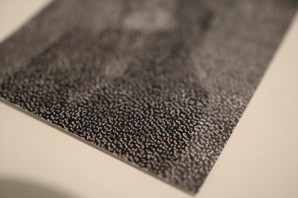
In this project, I delved into the tactile dimensions of photography by experimenting with various paper types. Here, I share my findings and reflections on how different papers contribute to the overall photographic experience.
1. Regular 120g Matte Paper: A Subtle Touch
I began with a standard 120g matte paper, expecting it to provide a basic tactile foundation without overshadowing the image itself. Indeed, this paper proved to be neutral in terms of touch. It creates a smooth, unremarkable surface that doesn’t distract from the photograph. However, its subtlety can be a double-edged sword. On one hand, it ensures that the viewer’s focus remains on the image, but on the other, it lacks a distinctive tactile appeal. This type of paper might be best utilized in combination with other tactile techniques, such as embossing or varnishing, to enhance its sensory impact without overwhelming the photograph.
2. Textured Paper: Front Versus Back
Next, I experimented with a paper that has a texture. Initially, I printed on the textured side, only to find that the ink failed to settle uniformly across the surface. The resulting image showed an inconsistent pattern where the ink skipped over the valleys of the texture. While this effect might appeal to some for its unique, abstract quality, I found that it compromised the integrity of the original photograph.
Conversely, when I printed on the smoother side of the textured paper, leaving the textured side as the back, the results were much more satisfactory. The image retained its clarity and detail, while the reverse side provided an intriguing tactile experience. Interestingly, the texture on the back added an auditory element when handled, producing a gentle, soothing sound which reminded me of wind or waves. This unexpected sensory layer could engage viewers more deeply, inviting them to explore the photograph with both sight and touch (maybe with some instructions).


3. Yellowish Paper: A Shift in Tone and Texture
Finally, I tested a 100g yellowish paper with a lined texture on the back. As anticipated, the yellowish hue imparted a warm, vintage tone to the photographs. This color shift can evoke a sense of nostalgia or timelessness, depending on the subject matter. However, the thinness of the paper presented a drawback; the photographs felt somewhat insubstantial and cheap.
For projects aiming to convey a sense of uniqueness and quality, opting for a heavier paper with a more substantial feel would be advisable. Yet, this paper’s characteristics might be deliberately chosen for projects where a more ephemeral or everyday quality is desired.
Reflections and Future Directions
This exploration underscored the importance of considering both the visual and tactile qualities of paper in photographic projects. Each type of paper offers distinct advantages and challenges, influencing how a photograph is perceived and experienced.
For future projects, I plan to experiment with a wider variety of paper weights and textures. Additionally, exploring the auditory dimensions of paper, as discovered with the textured back paper, opens new opportuinities for engaging viewers.