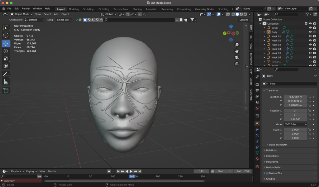
Ein weiterer Versuch, Blender besser zu lernen und zu verstehen, war die Erstellung einer 3D-Maske – also der Prozess vom Import eines Referenzmodells bis zur Fertigstellung der Maske mit Materialien, Beleuchtung, Animation sowie dem Setzen einer oder mehrerer Kameras.
Importieren und Vorbereiten des Referenzmodells
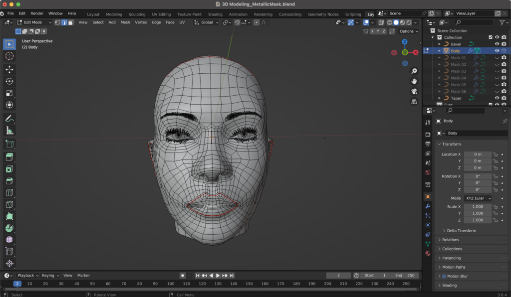
Ich begann mit dem Import eines Referenzmodells. Es gibt verschiedene Seiten, wo man 3D-Modelle downloaden kann, wie zum Beispiel TurboSquid oder Sketchfab. Da ich nur das Gesicht als Referenz brauchte bzw. meine Maske darauf erstellen wollte, habe ich die restlichen Teile des Körpers gelöscht. Im Bearbeitungsmodus (Edit Mode) löschte ich alle Vertices außer den Kopf. Anschließend habe ich das Modell zentriert (Position 0).
Erstellung der Maskenkontur mit Kurven
Um die Maske zu erstellen, habe ich Pfadkurven verwendet. Die Kurven definieren, wo die Maske verlaufen soll (Shift + A/Curve/Path). Im nächsten Schritt habe ich den Mirror-Modifier hinzugefügt, dabei muss man im Bearbeitungsmodus alle Vertices außer einen löschen und anschließend zentrieren, um Symmetrie beim Arbeiten mit der Maske zu generieren. Der Ursprung der Maske soll zwischen den Augen liegen, also habe ich diesen im Bearbeitungsmodus da platziert, wo ich ihn haben wollte. Mit dem Extrusionswerkzeug (E) habe ich die Grundkontur der Maske erstellt. Da ich die Maske an die Kopfform des 3D-Modells anpassen wollte, bin ich in die Sicht von oben gegangen und habe alle Vertices dementsprechend angepasst, um Überschneidungen zu vermeiden.
Verfeinerung der Maskenform
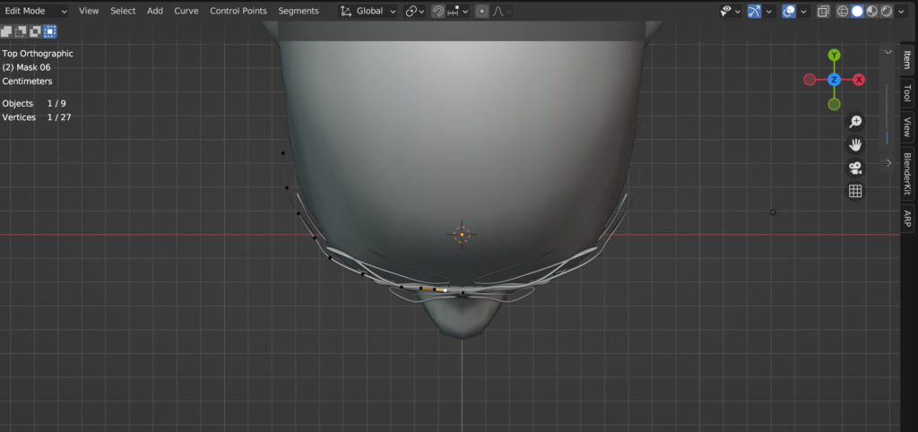
Insgesamt habe ich den Vorgang so oft wiederholt, bis ich meine Maske mit sechs Pfaden hatte: Ich duplizierte den initialen Pfad (Shift + D), passte ihn an und wiederholte den Prozess, um die gesamte Maske zu formen. Um die Kurven zu glätten, habe ich (bei allen Pfaden einzeln) den Spline-Typ auf „Poly“, sowie auf „Bezier“ gesetzt, sowie den Handle-Typ auf „automatisch“ gestellt. Dieser Prozess sorgt dafür, dass die Kurven nicht so hart und kantig, sondern schön glatt sind.
“The rise in disinformation and fakery cemented the idea to do the opposite and lean into the craft of doing things for real.” – Chris Clark
During my free time I stumbled upon an article about how the creative team of the guardian create all their artworks concerning the election by hand, in an imperfect aesthetic. This caught my attention right away, because it fits my topic perfectly. Why would a big newspaper take the time and effort to create handmade graphics?
The creative director of this campaign Chris Clark said: “The main spark of inspiration came from a conversation with a desk editor describing the country as ‘broken’, with nothing fitting or working quite as it should. This in parallel with the rise in disinformation, and fakery either through AI or generative articles really cemented the idea to do the direct opposite and be as honest and transparent in the creative process as we could – to lean into the craft of doing things for real.”
One of the main ideas was to build trust. With all the misinformation and fake news that are spread surrounding elections, it was important for them to create an authentic, trustworthy and approachable atmosphere for the readers.
But by using ripped paper cut outs they also want to visualize a “broken Britain” and how it could be put back together.
They choose to make the graphics by hand instead of faking the look on a computer. Because why fake it if you can make the real thing, and because they were in the privilege of having a good and agile team. The style is influenced by the specific employees and has variations in it. It allows for quick working, that would take much longer on a Mac, the digital design director says. He also mentions that in the beginning it was hard to stop themselves from reworking the results but especially by limiting their time they got much more productive. Now they create up to six artworks a day.
It is not like in digital design, where you usually have a strict style guide, but instead the regular process of it and the methods are what creates consistency. They set up some rules, like using mainly black and white pictures, that they either cut out or rip, but the rest is left open to create the most fitting results for the stories.
When asked how they make the designs look so distinctively handmade, the creative director answered the following: “In not only embracing the imperfections but amplifying them. We’re deliberately not removing any of the damaged paper, worn photocopies or dirty toner, and trying to be as responsive and immediate as possible. We’re often choosing the first composition and giving them very little enhancement from what is captured in the camera. “
This confirms my assumption from last semester, that “handmade” can be a countermovement to new technological developments like AI. With more and more fake images circulation on the internet, and free tools to create these, it makes sense that people feel safer when seeing an analogue image. I found it really interesting that such a big campaign chose the handmade style, but it also confirms the relevance of the topic of handmade design. It’s not only for niche, small businesses to sell on etsy and craft martkets but also for the masses. And yet this campaign also fits right in with my findings about the associations of the handmade look. Craftivism gave handmade visuals a irrevocable connection to politics and morals. This can be seen clearly by this creative campaign of political coverage.
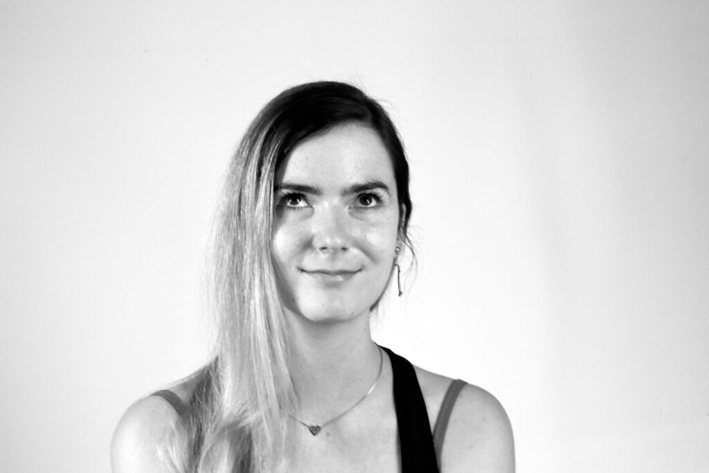
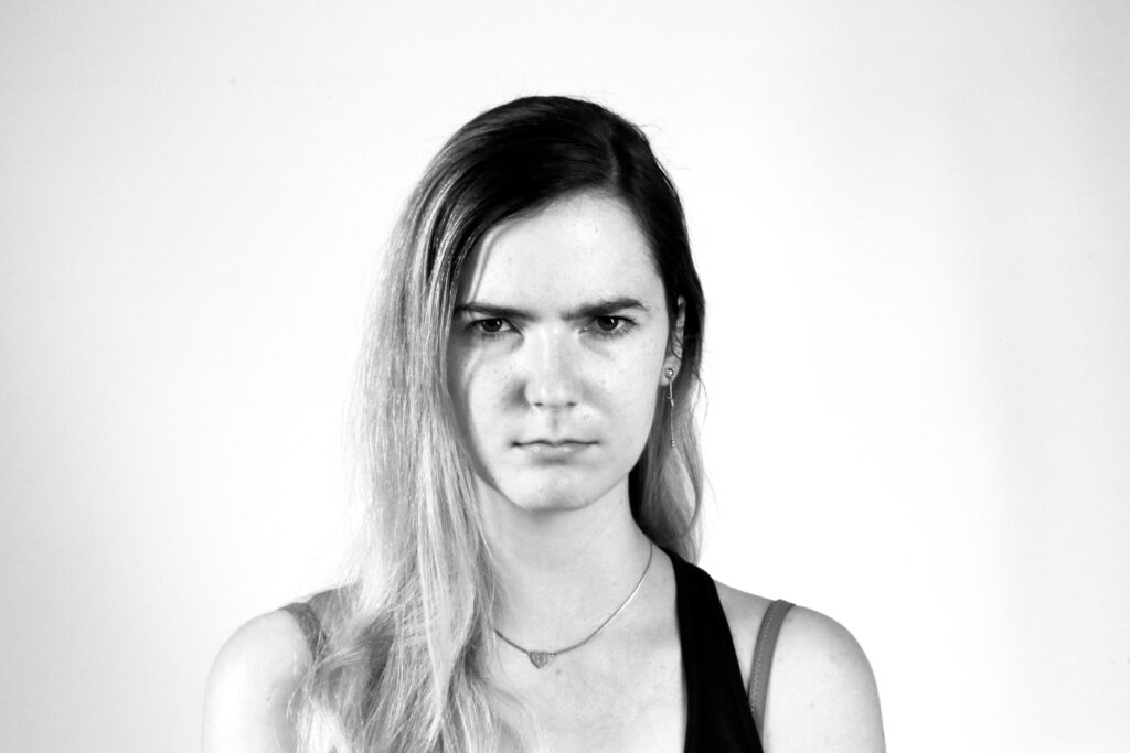
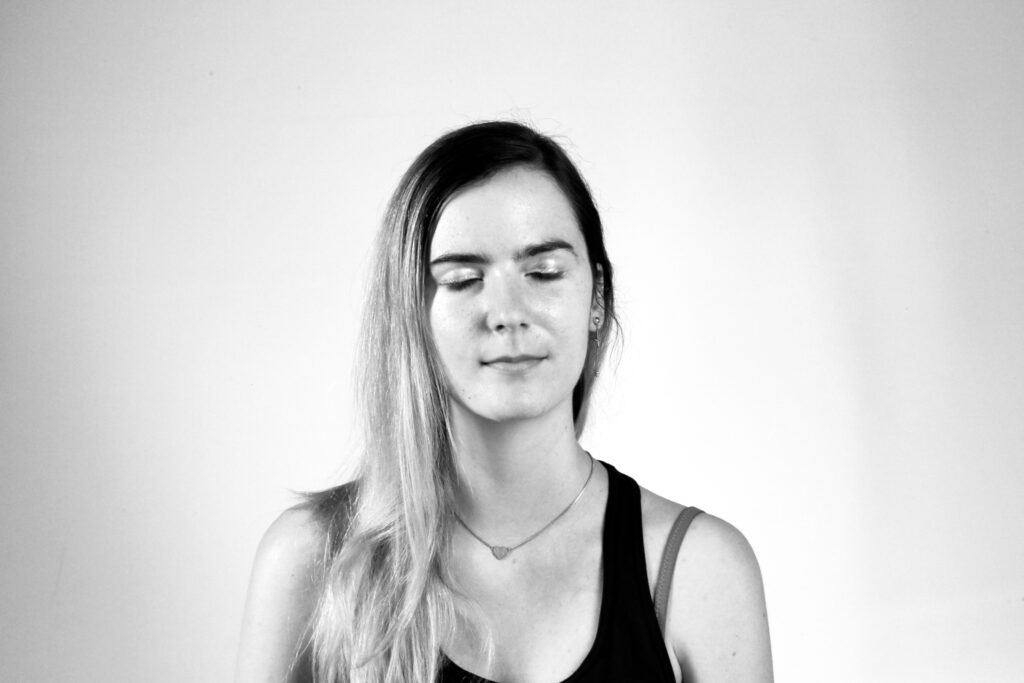
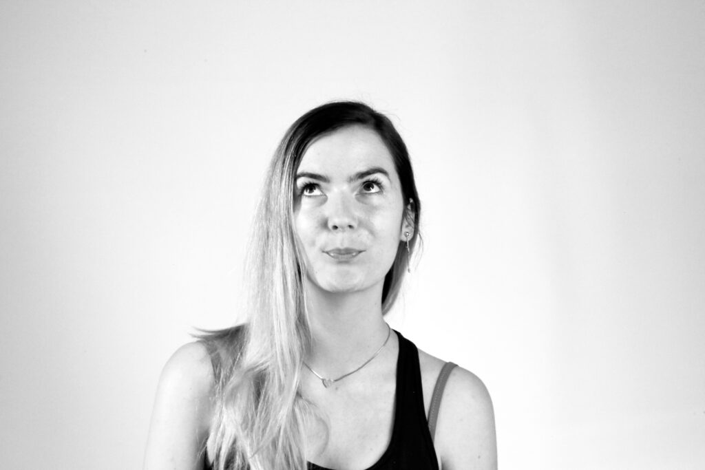
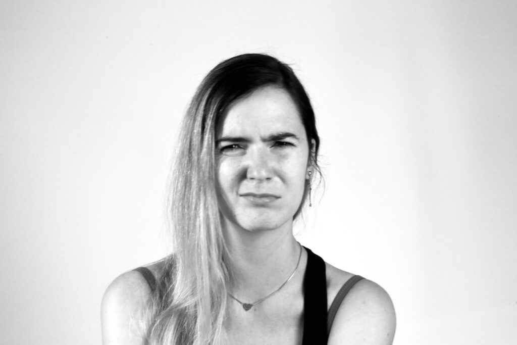
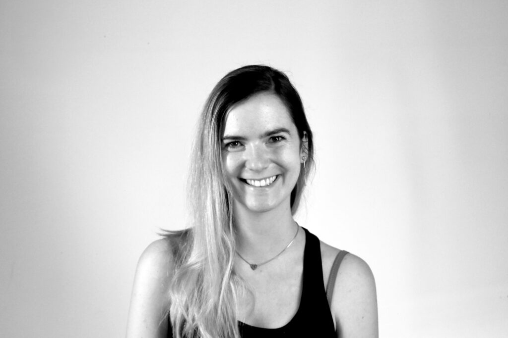
Here are some photographs I have taken of myself, each capturing different emotions. My next step is to present these images to a larger test group. To enhance neutrality and emphasize the facial expressions, the photos are in high-contrast black and white. One approach is to have participants view the images and generate their own adjectives to describe the emotions. Alternatively, I could offer three specific adjectives for them to choose from. To explore the perception of subtle micro-expressions, these adjectives should represent specific subcategories of broader emotions; for instance, terrified, anxious, and frightened could all fall under fear. A third option is to provide a comprehensive list of adjectives from which participants can select one for each photograph. Ultimately, I aim to determine if there are any consistent or common patterns in the adjectives assigned by the test group.
Since the survey revealed that the majority of respondents would prefer a traditional card game, I will likely focus my efforts in that direction. However, the question remains whether the idea of incorporating QR codes or augmented reality (AR) can still be utilized to enhance the experience. For instance, imagine having a QR code on the packaging that customers can scan while in the store. This could provide them with access to the latest promotions, detailed information about the game, or even an augmented reality preview of the game’s features and content.
Such an interactive element could significantly influence their buying decision by giving them a more immersive and informative glimpse into what they are purchasing. It would allow potential buyers to visualize the game’s components and understand its value before making a purchase.
To help me determine the direction I should ultimately pursue, I initiated a survey. Unfortunately, I’ve only received 14 responses so far. However, even with this limited number of responses, the results appear to be quite definitive and provide a clear indication of the preferred direction.
In my previous blog posts, I explored the integration of randomness into design by generating random grids, shapes, and color palettes. Today, I want to share the results of combining these elements into my first experimental poster.
To create the poster, I selected two layout grids and two color palettes from my previous experiments, and used two randomly generated shapes. Here’s a breakdown of the process and the results.
1: Combining color palettes and grids
First, I experimented with applying the color palettes to the chosen grid layouts. This stage was important in understanding how the randomness of the color and the grid structure interacted visually.
2: Integrating shapes
After exploring the color and grid combinations, I further experimented with the first grid and color combination by adding the two randomly generated shapes. This addition brought dynamic visual elements that contributed to the overall theme and composition.
For the final touch, I wanted to incorporate typography and random text. I asked ChatGPT to suggest two random Adobe fonts:
Headline Font: Veneer
Body Text Font: Acumin Pro
The topic I chose for the poster was dance, inspired by the dynamic and fluid character of the shapes, reminding me of dance movements. Here’s the final poster with text added:
Conclusion
The experiment demonstrated that randomness can bring a fresh perspective and unique aesthetic to design. The combination of random grids, colors, and shapes created interesting compositions, while the addition of text using randomly selected fonts added a layer of depth and meaning to the poster. The fluidity and unexpected results of these random elements demonstrated the creative possibilities that can happen when control is loosened and randomness is allowed.
Throughout this semester, I had the opportunity to explore various tools and methods, deepening my understanding of the integration of technology and paper. I conducted an interview and gathered diverse opinions and insights on the topic, which significantly enriched my perspective. I was also able to try out the integration of printed material for learning with digital tools.
Next Steps
Moving forward, I plan to continue this exploration by experimenting with these tools in innovative ways. Here are the key projects I intend to pursue:
Creation of an Enhanced Orientation System: I aim to experiment with NFC to create an improved map system. This will involve exploring ways to enhance traditional maps with digital features, making them more interactive and user-friendly.
Implementation of NFC in Books: I plan to experiment with embedding NFC (Near-Field Communication) technology in books. This could revolutionize the way we interact with printed materials, providing instant access to supplementary digital content.
Community Integration in Books: Another exciting project is to integrate community interaction within books using various platforms and forums. This could facilitate a richer, collaborative learning experience where readers can discuss and share insights in real-time.
Additionally, I am particularly interested in further exploring the integration of digital and analog methods for learning. This hybrid approach has shown great potential and effectiveness, and I believe it needs further investigation
I am excited to continue these experiments and projects during the summer, aiming to find out new possibilities and innovations while merging paper and digital.
Continuing my exploration of randomness in design, I’ll now move on to the next step in my experiment: generating random color palettes. In the previous steps, I delved into creating random grid layouts and experimenting with random shapes. Now I’m going to explore how random colors can affect our design process.
Generating Random Color Palettes
Color can dramatically affect the mood, style and perception of a design. By introducing randomness into color selection, I want to uncover unexpected combinations that can lead to innovative and unique aesthetic results. There are several random color palette generation tools available online, each with its own unique features:
Online Tools for Random Color Generation
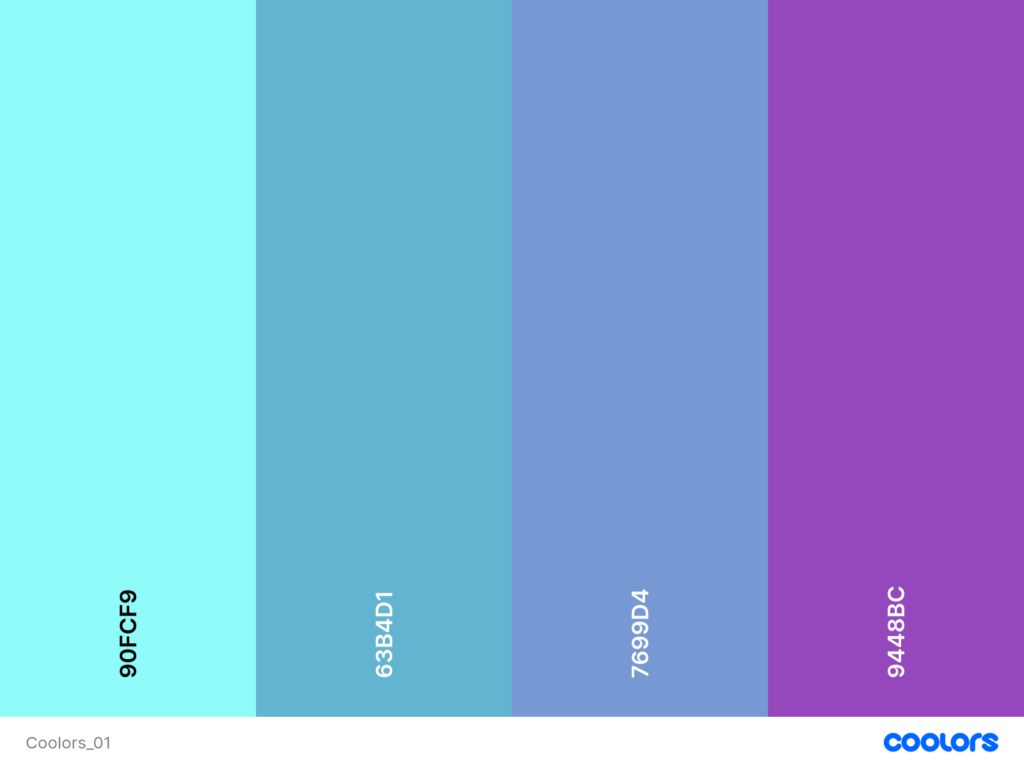
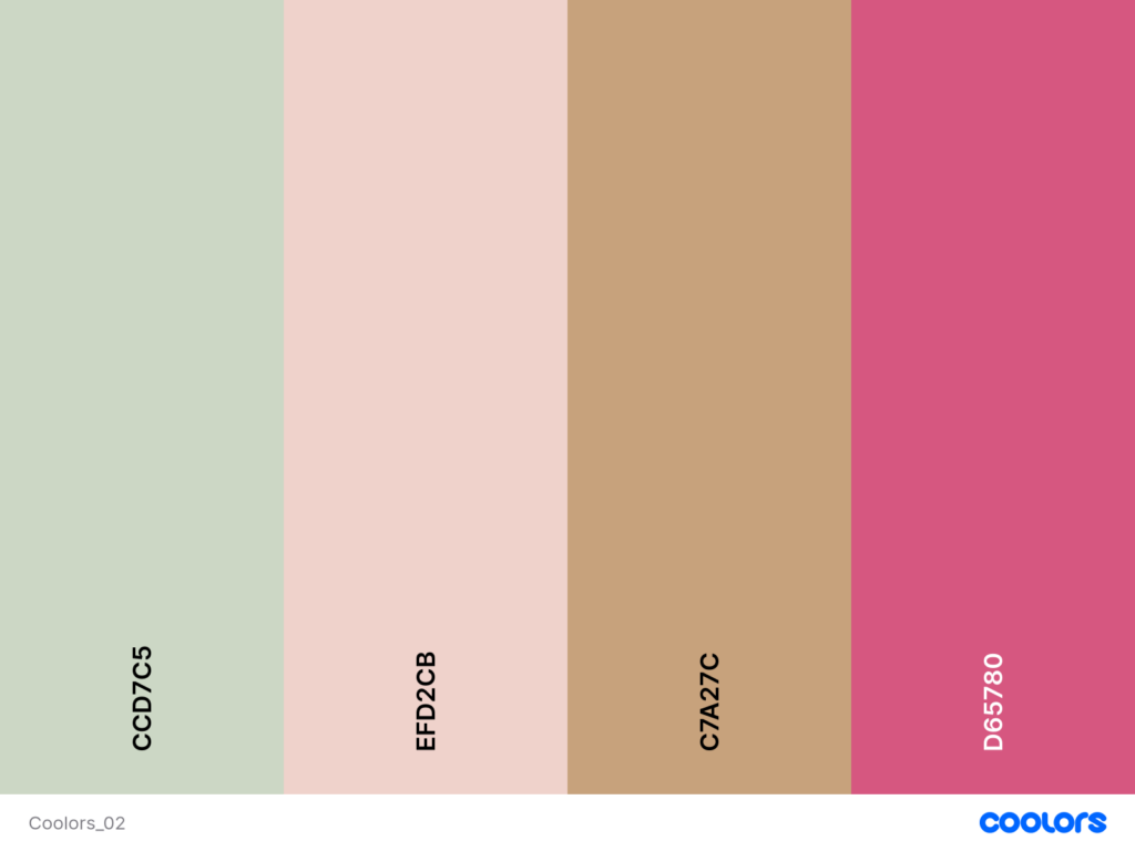
Coolors.co: A versatile tool that lets you generate palettes with a specific number of colors. You can lock colors you like and generate the rest randomly. This flexibility allows for a blend of control and spontaneity.
Colormind.io: An AI-powered palette generator that creates palettes with five colors. It also provides examples of how the palettes can be applied in design, which can be a great source of inspiration.
Perchance.org: This generator produces palettes with five colors, and you can decide how many palettes to generate at once. It’s a straightforward tool for quick experimentation.
Experimentation with ChatGPT
In addition to using these online tools, I also experimented with generating random color palettes using ChatGPT. Here are five color palettes generated for the experiment:
3-Color Palette 1:
#FF5733 (Vivid Orange)
#C70039 (Dark Red)
#900C3F (Wine Red)
3-Color Palette 2:
#28A745 (Green)
#FFC107 (Amber)
#17A2B8 (Teal)
4-Color Palette:
#343A40 (Dark Gray)
#FF6F61 (Coral)
#6C757D (Slate Gray)
#FFE8D6 (Cream)
2-Color Palette:
#1E90FF (Dodger Blue)
#FFD700 (Gold)
5-Color Palette:
#FF4500 (Orange Red)
#32CD32 (Lime Green)
#8A2BE2 (Blue Violet)
#FFDAB9 (Peach Puff)
#8B0000 (Dark Red)
By experimenting with these tools and methods, I can see how randomness in color selection opens up new possibilities for creativity.
BlenderKit ist ein Add-on für Blender, das Benutzer:innen eine umfangreiche Bibliothek von vorgefertigten Materialien, Texturen, Modellen und Assets zur Verfügung stellt. Diese Ressourcen können direkt innerhalb von Blender durchsucht, heruntergeladen und verwendet werden, um den Arbeitsprozess für 3D-Künstler:innen zu erleichtern. BlenderKit ist größtenteils kostenlos nutzbar. Es gibt jedoch auch Premium-Inhalte, die gegen eine Gebühr freigeschaltet werden können.
Integration in Blender:
Nach der Installation und Aktivierung des Plug-Ins erscheint ein spezielles Panel in der Benutzeroberfläche von Blender, das den Zugang zur BlenderKit-Bibliothek ermöglicht. Von dort aus können Benutzer:innen direkt suchen, Vorschauen anzeigen und benötigte Ressourcen in ihre Arbeitsdateien laden.
Materialien und Texturen:
Diese von BlenderKit zur Verfügung gestellten Materialien sind oft bereits texturiert und können mit wenigen Klicks auf Objekte in Ihrer Szene angewendet werden. Sie reichen von einfachen Farb- und Glanzmaterialien bis hin zu komplexen Oberflächeneffekten wie Metallen, Stoffen oder Holzarten.
Modelle und Assets:
Neben Materialien und Texturen bietet BlenderKit auch eine Auswahl an 3D-Modellen und anderen Assets. Diese können zum Beispiel bei Architekturvisualisierungen, Spieleentwicklung oder Animationen verwendet werden. Die Modelle sind in der Regel bereits texturiert und können je nach Bedarf skaliert, positioniert und in Szene gesetzt werden.
Insgesamt ist BlenderKit ein sehr cooles Werkzeug, das den kreativen Prozess in Blender erleichtert und auch bereichert. Es spart vor allem Zeit und Nerven und fördert die Kreativität durch den einfachen Zugang zu einer Vielzahl von Ressourcen.
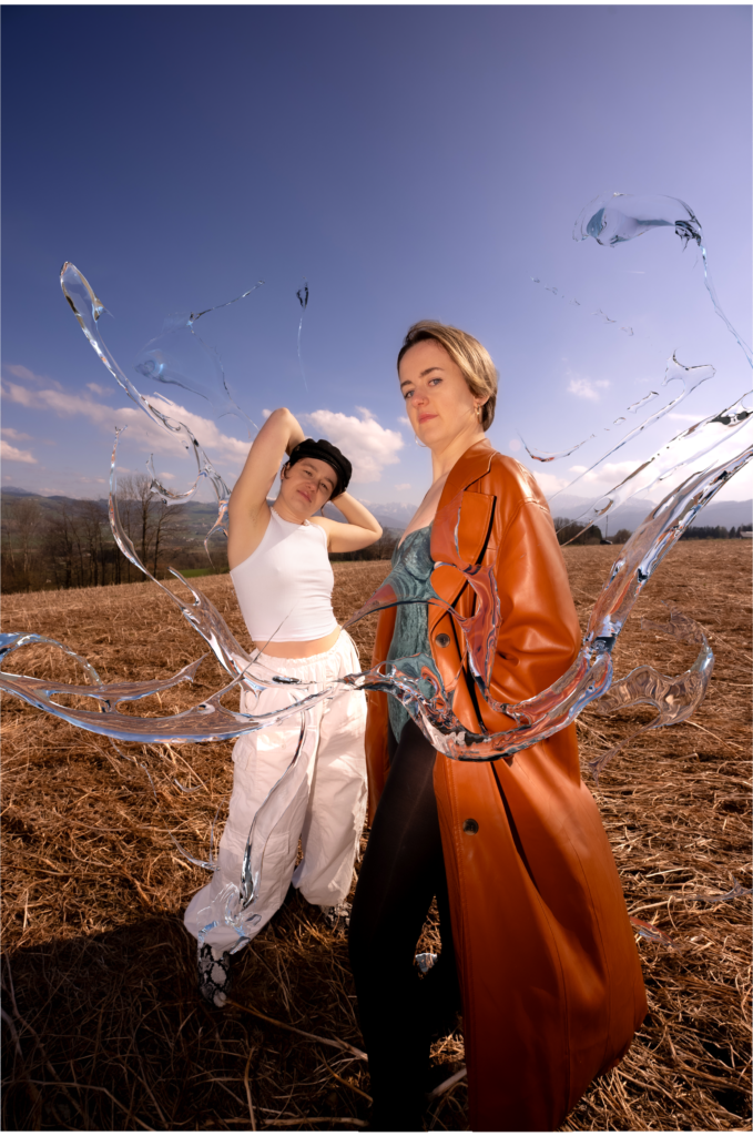
Wie man aus Blogpost #11 bereits erkennen kann, geht es mir vor allem darum, abstrakte 3D-Art in Fotos oder Videos zu integrieren. Dafür habe ich auf meiner Festplatte nach Fotos gesucht, die für diesen Zweck geeignet sind, und bin fündig geworden. Im Folgenden habe ich Schritt-für-Schritt dokumentiert, wie ich zu diesem Ergebnis gekommen bin.
Form in Photoshop:
Zuerst habe ich mit dem Pfad-Werkzeug in Photoshop eine Form gezeichnet. Die fertige Form habe ich anschließend als SVG-Datei exportiert, um die Vektorgrafik in Blender zu importieren und weiter bearbeiten zu können.
Importieren der SVG in Blender:
Im nächsten Schritt habe ich die SVG-Datei in Blender importiert, skaliert und zusammengeführt, damit sie die richtige Größe und Proportion hat. Mit einem Rechtsklick auf die Form habe ich „Set Origin“ und anschließend „Origin to Geometry“ ausgewählt, um den Pivotpunkt der Form zu zentrieren (dabei wird die Form auf die Position (0,0,0) gesetzt). Danach habe ich die Form um 90 Grad auf der X-Achse gedreht.
Extrudieren und Konvertieren in ein Mesh:
Um der Form Tiefe zu verleihen, habe ich sie im Geometriebereich extrudiert. Nachdem die Form die gewünschte Tiefe erreicht hatte, habe ich sie in ein Mesh konvertiert. Dies ermöglicht weitere Bearbeitungen und Verfeinerungen der Form.
Anwenden des Remesh-Modifikators:
Um die Geometrie der Form zu verfeinern, habe ich den Remesh-Modifikator hinzugefügt und angewendet. Der Remesh-Modifikator ist besonders nützlich, um eine saubere und detaillierte Geometrie zu erhalten.
Formen im Sculpt Mode:
Im Sculpt Mode habe ich den Glättungspinsel verwendet, um die Form weiter zu verfeinern. Mit dem Snake Hook-Pinsel konnte ich die Form intuitiv nach Bedarf verformen. Diese Werkzeuge sind praktisch, um organische und fließende Formen zu erstellen.
Hinzufügen von Partikeleffekten:
Um detaillierte Partikeleffekte zu erzielen, habe ich einen weiteren Remesh-Modifikator hinzugefügt.
Glätten und Schattieren:
Um die Form glatt zu schattieren und ihr Aussehen zu verbessern, habe ich „Shade Smooth“ angewendet. Dies sorgt für eine gleichmäßige und weiche Oberfläche, die realistischer wirkt.
Importieren eines Bildes:
Mit dem Add-On „Import Images as Planes“ habe ich das Foto in die Szene importiert. Danach habe ich das Bild skaliert und passend zur Szene positioniert.
Einrichten der Kamera:
Um den Shot zu rahmen habe ich eine Kamera hinzugefügt.
Shader Editor:
Im Shader Editor habe ich die Spiegelung und Rauheit des Bildes entfernt, um ein realistischeres Aussehen zu erzielen.
Hinzufügen einer Umgebungstextur:
In der „World“ habe ich eine Umgebungstextur-Node mit einem HDRI von Polyhaven hinzugefügt. Mithilfe der Mapping- und Texturkoordinaten-Node habe ich die Umgebungstextur angepasst, um das Licht und die Reflexionen in der Szene zu verbessern.
Anwenden von Materialien:
In BlenderKit habe ich nach Glass/Water Materials gesucht und diese auf die Form angewendet und anschließend die Materialien so angepasst, bis ich mit dem Aussehen zufrieden war.
Wechsel zum Cycles-Renderer:
Um realistischere Licht- und Reflexionseffekte zu erzielen, habe ich die Rendering-Engine von Eevee zu Cycles gewechselt. Cycles bietet eine genauere Behandlung von Licht und Materialien, was das Endbild realistischer macht.
Hinzufügen einer Ebene für Reflexionen:
Um die Reflexionen zu verbessern, habe ich eine Ebene am Boden der Szene hinzugefügt. Diese reflektierende Ebene trägt dazu bei, die Gesamttiefe und den Realismus der Szene zu erhöhen.
Rendern des Bildes:
Nach all diesen Anpassungen habe ich das Bild mit den 3D-Objekten gerendert. Der Renderprozess ist der letzte Schritt, bei dem das Bild finalisiert wird und alle Effekte und Materialien zusammenkommen.
Photoshop:
Abschließend habe das gerenderte Bild in Photoshop importiert, sowie auch das Originalfoto. Beide Bilder müssen perfekt übereinander liegen. Anschließend habe ich die zwei Personen im Bild ausgeschnitten und jeweils auf eine eigene Ebene gelegt. Mit dem Radierwerkzeug habe ich die Stellen entfernt, an denen die Objekte sichtbar sein sollen.