19 – Reflecting on the semester

This semester, I continued my exploration of handmade design, building on my previous research. Handmade design remains relevant, resonating with themes of political movements, sustainability, and nostalgia. The choice between handmade and digital design impacts both the consumer’s perception and the designer’s workflow.

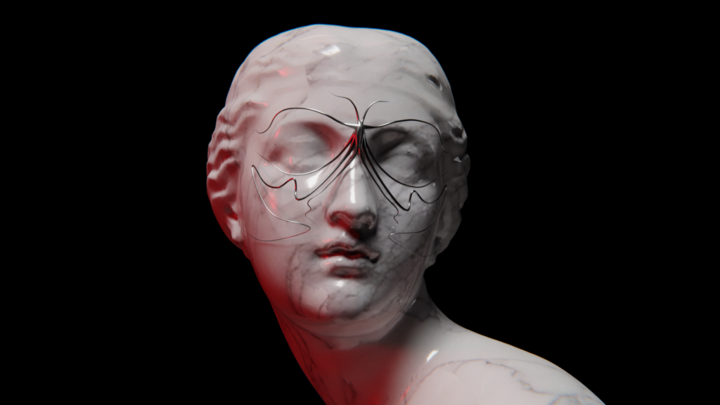
Throughout the semester, I engaged in both digital projects using advanced AI tools and traditional techniques like bookbinding and letterpress printing. Personally, I found the analog process particularly exciting and creatively stimulating, as it allowed for immediate, tangible outcomes.

Reflecting on these experiences, I decided to further explore handmade design from two perspectives: its effects and the process itself. My first experiment, a survey on brand associations, revealed that handmade design aligns strongly with brands emphasizing ethical and political values, though it also evokes feelings of fun and youthfulness. My second experiment examined whether people could distinguish between genuinely handmade designs and digital imitations. The results were mixed, suggesting that the visual cues of handmade aesthetics can be replicated digitally, though the authenticity of true handmade designs may create a stronger impact.

An article about The Guardian’s creative team handcrafting election artwork underscored the relevance of handmade design in contemporary media, emphasizing trust and authenticity in an era of disinformation.

In conclusion, this semester has deepened my appreciation for handmade design. Despite its time-consuming nature, the tangible results and creative satisfaction make it worthwhile. While digital imitations can replicate the look, the authenticity and effort behind true handmade designs offer a unique and genuine impact in an increasingly digital world.

18 – Results of Experiment 2

For my second experiment I wanted to find out if people can spot the difference between handmade designs and digital designs that have an analog look to them. This way I wanted to find out if the effects of the handmade aesthetic require the actual time and effort or if a fake will lead to the same look, and the consumer doesn’t even notice.

In my experiment I showed my participants 6 designs, 3 of which were handmade and 3 of which only have a handmade look added to them. I asked them to tell me which ones are analog in their opinion.

The results varied, and my participants never all had the same opinion. At first, I showed them two collages, one analog and one digital and here the participants agreed the most. 71% correctly assesed the handmade collage and 86% could tell that the other one was made digitally. Even the digital illustration was found out by 71%. It was harder for them to tell the letterpress print was made by hand. Only 43% could tell, so the majority guessed wrong. For photography there seems to be a similar confusion. Out of two pictures, one analog and one digital, both were believed to be made digitally by a majority of 57%.

To conclude the results, it is not that obvious if a design is made analog or digital with a fake analog look. The tendency was correct on only 4 out of 6 designs, and never was it obvious to everyone. Especially with photography and letterpress it seems to be harder to tell. I do think the results could possibly be different if I showed them the works in person, instead of digitally on a screen – because this is where you can really see the difference of analog design.

These results show that the look and the effect of the handmade aesthetic on the consumer are not necessarily dependent on the process of creation. I personally find these results quite unmotivating because it means that the special effort that is put in when making something by hand, cannot always be observed. But at least it tends to be observable.

During my preparation I asked myself if it is that much more efficient to fake the handmade look. Since I got all my “fakes” from tutorials online I noticed that on top of creating the digital work (which can sometimes take quite long too), you then have to put in an extra effort to make it look imperfect. I think here it really depends on the medium. For photography, it is clearly still faster to make it digitally and fake the look, but for example for illustration, I can imagine a designer drawing something by hand quicker than building it on illustrator and then making it appear imperfect afterwards. Therefore, I believe it is a complex question, that can only be answered depending on a specific design. It cannot be said generally if a “fake handmade” design has the same effect as an analog one, and neither can it be said that it is easier and quicker to produce a digital one. Also since the handmade look has associations like „authenticity“, I think it could really backfire to fake the look, because some consumers might still notice.

Episode #9 from the series: New things I learned this semester – Blender Animation Rendering

Rendering an animation with Blender requires careful attention to detail to achieve high-quality results efficiently. Ensuring the computer meets the necessary hardware requirements, including adequate CPU, GPU, and RAM, is the first crucial step. Closing unnecessary programs helps free up system resources for Blender’s intensive tasks. It was not the first time that I rendered an animation in blender but surely one of the memorable ones.

Scene preparation is vital, involving optimization to reduce render times. Simplifying geometry, reducing texture sizes, and using instances instead of duplicates save memory and processing power. Proper lighting setup avoids excessive noise and enhances the animation’s visual appeal. Using appropriate shaders and textures, and avoiding unnecessarily high-resolution textures, is also important.

Render settings must be configured carefully. Selecting the correct resolution, such as 1920×1080 for full HD, and an appropriate frame rate, like 24 frames per second, ensures the animation meets project requirements. Adjusting the number of samples balances image quality and render times, while Blender’s denoising tools help reduce noise with fewer samples.

Choosing the right render engine is another crucial decision. Cycles, known for photorealistic rendering, can be slower, while Eevee, suitable for real-time previews, is faster. Fine-tuning the chosen engine’s settings enhances performance and quality. For this projects I chose the render engine Cycles because I wanted a realistic look to my scene.

Animation setup involves checking all keyframes and ensuring smooth transitions. Baking physics simulations, such as cloth or fluid, before rendering prevents errors. Managing renders efficiently by rendering in smaller batches or using network rendering can save significant time. Rendering to an image sequence allows re-rendering specific frames if issues arise, avoiding the need to start over. I had some issues with setting the camera right – at first I wanted my camera to track my object. When I figured that out, I didn’t like the look of it. My solution was to animate the camera as well.

Organizing work is essential. Regularly saving the project and using version control to track changes prevent loss of progress. Keeping backups of important files and renders provides security against unexpected issues. I had the issue that I had to many tabs open while working in den render view of blender. ZACK BOOM everything was closed and I was sad.

I’m not quite happy with how my tennis ball turned out. The particles spread into the white Ring, the color is a bit of and the general experience was a 3/10. I learned in the past years that sometimes you just have to close a chapter and be happy with how it turned out regardless of the expected result. It’s not perfect and I’m not very satisfied but I hated the project in the end so that was the best I could do. Why I hated the project? While working on the project a film was released named „Challengers“. So now working on this project seemed like I was inspired by that movie – Which I was clearly not. I wanted my project to stand alone – more or less original thought – but with the movie coming out it looked like I was jumping on a hypetrain and there is nothing I hate more than this. Nevertheless I pushed through, but did not gave it my all.

20 // Fazit: Meine Blender-Reise (lol)

Blender ist für mich nach wie vor sehr überwältigend, und oft bin ich einfach nur frustriert, weil Dinge nicht sofort funktionieren oder ich nicht verstehe, wie man bestimmte Ergebnisse erzielt. Dennoch macht es auch ein bisschen Spaß, und ich merke, dass ich mich mit der Zeit im Programm immer wohler fühle. Klar ist, dass ich weiterhin dranbleiben muss, um wirklich ein Verständnis für den gesamten 3D-Raum sowie die Werkzeuge und Möglichkeiten zu entwickeln.

Ich bin auf jeden Fall motiviert, weiter Ideen in Blender umzusetzen und das Programm besser kennenzulernen. In Bezug auf meinen ersten Blogpost kann ich sagen, dass ich Blender zwar (noch) nicht liebe, aber es könnte sich in diese Richtung entwickeln (haha). Mein Fokus wird definitiv darauf liegen, weiterhin 3D-Elemente mit Fotos zu kombinieren und surreale Landschaften zu kreieren – denn am meisten Spaß habe ich, wenn ich abstrakte Dinge erschaffen kann.

Ergebnisse:

17 – Experiment 2

For my second experiment I wanted to find out if it really matters that an artwork is made by hand or if it is enough for it to just have a handmade aesthetic. This idea came to me after I stumbled upon a video of a designer who explained how he fakes a handmade look.

In order to investigate this, I created a quiz with different artworks, some of which are actually handmade or produced in an analog way and some of which are digital creations that have a handmade look added to them. I asked my participants to click on the pictures they believe are handmade/analog.

For the handmade/analog works I chose some that I came across during my research the past two semesters. A collage I wrote about in my las blogpost, a letterpress print I saw at DruckZeug, and an analog picture I took. The digital fakes I all took from online tutorials on faking the analog aesthetic. I chose a collage, an illustration and a photograph, to get a wide variety of different techniques.

I am really interested in the outcome of this survey. Since I have been working on this topic for a while now, I find it a bit easier to tell the difference, but I am not sure how obvious it is to others. To get an even more realistic answer I sent this survey not only to designers but also Students from other fields, that have never produced a design neither digitally nor analog.

Survey:

https://docs.google.com/forms/d/e/1FAIpQLSd33c3Oaq99Fl94Kv90USmyBBjMbVv9NlxL7qs0L-cw2fr9eQ/viewform

sources:

https://www.itsnicethat.com/features/the-guardian-election-editorial-graphic-design-illustration-spotlight-140624

https://www.instagram.com/druckzeug

youtube.com/watch?v=df0HpEn4hmk&t=506s

youtube.com/watch?v=koml2ZNeCqU

https://www.instagram.com/reel/C6q_EaEAWge/?igsh=cHVoanJuenY2ZXpp

19 // 3D Maske – Part 04

Abschließend beschäftige ich mich mit der Beleuchtung und Kamera sowie dem „finalen“ Rendering.

Kamera und Animation

Im nächsten Schritt habe ich eine Kamera erstellt und so positioniert, dass die Statue im Mittelpunkt der Einstellung ist. Um die Kamera immer auf das Objekt zu fokussieren, habe ich ein „Track To“-Constraint eingefügt und ein „Empty“ erstellt und da positioniert, wo ich den Fokus anschließend haben möchte. Als „Target“ im Track To“-Constraint habe ich das „Empty“ ausgewählt. Für die Animation habe ich mich wieder an den Anfang der Timeline gestellt und mit „i“ einen Keyframe bei Location gesetzt. Dann bin ich 250 Frames nach vorne „gesprungen“ und habe die Kamera da positioniert, wo ich sie haben wollte. Anschließend habe ich einen weiteren Keyframe („i“) gesetzt. Um eine sanfte Bewegung zu erzielen, bin ich den Graph Editor gegangen und habe den letzten Keyframe bearbeitet, damit die Bewegung langsamer stoppt. Die Animation der Maske habe ich anschließend auch verschoben, damit sie nicht gleich von Anfang an startet.

Beleuchtung

Weiters habe ich vier Lichter (drei Area Lights und ein Spot Light) hinzugefügt.  Das HDRI habe ich dann wieder gelöscht, da ich ein eigenes Lichtsetting kreieren wollte. Da ich eine etwas dramatischere Lichtstimmung erzeugen wollte, habe ich einen roten Farbakzent mit einem Area Light gesetzt. Das Spotlight habe ich über der Statue positioniert, um diese nochmals in Fokus zu bringen. Weiteres Umgebungslicht habe ich mit den zwei anderen Area Lights erzeugt.

Feinschliff und Rendering

Im Compositing-Arbeitsbereich habe ich noch ein Glanz-Node für Bloom-Effekte sowie ein Linsenverzerrung-Node für mehr Realismus hinzugefügt. Außerdem habe ich in den Kameraeinstellungen noch die Tiefenschärfe (Depth of Field) aktiviert und hier auch wieder als Fokusobjekt das leere Objekt („Empty“) gewählt , so bekommt der Hintergrund eine leichte Unschärfe. Abschließend habe ich die Animation gerendert (250 exr-Dateien), in DaVinci Resolve importiert und abschließend als Video exportiert. 

Nachtrag: Leider ist die Schärfe nicht ganz an der gewünschten Stelle, das muss ich mir nochmal ansehen und ausbessern. Zudem möchte ich noch eine passende(re) Umgebung gestalten, aber bis jetzt ist das die vorläufige finale Version.

18 // 3D Maske – Part 03

In Blogpost #16 und #17 habe ich die Maske erstellt und texturiert. Im nächsten Schritt widme ich mich der Animation der Maske und konzentriere mich auf die Umgebung und den Hintergrund.

Animieren der Maske

Als nächstes habe ich die Maske animiert. Dafür muss man zu den Objektdaten-Eigenschaften und nach Start- und Endmapping suchen. Setzt man den Wert auf null, verschwindet die Linie vollständig. Setzt man ihn auf 1.000 ist der Pfad wieder sichtbar. Um daraus eine Animation zu machen, habe ich Keyframes hinzugefügt. In der Timeline habe ich mich also ganz an den Anfang (Frame 0) gestellt, und den Wert auf null und einen Keyframe (i) gesetzt. Dann bin ich ungefähr 120 Frames in der Timeline nach vorne gesprungen und habe den Wert wieder auf 1 erhöht und anschließend wieder einen Keyframe (i) gesetzt. Diesen Schritt habe ich dann für alle Pfade wiederholt, und so die gesamte Maskenanimation erstellt. Das Timing habe in individuell von jedem Pfad angepasst, damit nicht alle gleichzeitig und mit unterschiedlicher Geschwindigkeit „wachsen“.

Erstellen der Umgebung

Als Umgebung/Hintergrund wollte ich einen „schwarzen“ Raum erschaffen. Dafür habe ich mit Shift + A ein „Plane“ hinzugefügt, an einem Ende extrudiert (L-Form), anschließend mit schwarzer Farbe versehen. Für die Maske habe ich online nach Modellen gesucht und eine Statue heruntergeladen und importiert. Als nächstes habe ich die Maske an die Statue angepasst, so dass sie gut auf das Gesicht passt. Dafür habe ich wieder einen Pfad ausgewählt und im Bearbeitungsmodus die Vertices nach Belieben angepasst. Die Statue habe ich in die Mitte der schwarzen Fläche positioniert.

Materialien

Für das Material der Statue habe ich wieder BlenderKit verwendet. Dafür habe ich nach „Marble“ gesucht und ein für mich passendes Material auf die Statue angewendet. Außerdem habe ich ein Area Light hinzugefügt, damit ich im gerenderten Modus besser sehen kann, wie das Material auf der Statue aussieht.

Books:

Verpackung Marketing : Packvertising

Produktion und Veredelung

Beispiele von diversen Verpackungen

Beispiele Alkoholika und developing Progress

Beispiele

Geschichte der Verpackung

Beispiele

Geschichte der Faltverpackung

#10 „Freiluft“ ColorGrading

Mein Projekt „Freiluft“ ist eine Übung zum Day to Night Color Grading gewesen um dies wirklich das erste Mal zu testen und vielleicht für die Zukunft einen guten Basis Node Tree in DaVinci Resolve für solch ein Grading zu haben. Zusätzlich zur kreativen Farbkorrektur habe ich eine Audio hinzugefügt mit Grillen um den Effekt der Nacht zu verstärken, damit man nicht so viele Vögel wie am Tag hört. Die Sounds vom Dreh selbst habe ich drinnen gelassen, obwohl sie nur mit der Kamera selbst aufgenommen sind, aber ich finde trotzdem es ist ausreichend, besonders da darin nicht der Fokus liegt bei diesem Projekt. Zu Beginn wollte ich nur 2-3 Szenen nehmen, aber schlussendlich habe ich mich doch entschieden viele unterschiedliche Clips zu nehmen und ein „richtiges“ Video daraus zu machen. Das Video besteht hauptsächlich aus Jump-Cuts, was ich so geplant hatte. Um zu zeigen, dass es ist kein normaler Ablauf und es sollte in etwa mehr wie eine Erinnerung wirken, so ist es bewusst etwas unflüssiger und sprunghafter.

Hier ist ein Screenshot aus DaVinci Resolve während des ColorGradings mit meinem (hoffentlich) finalen Node-Tree und zwei Stills im Vergleich mit Tag/Nacht:

Das Anpassen der weiteren Clips war definitiv nicht einfach und es war echt viel mehr Aufwand als ich das erwartet hatte. Letztendlich bin ich mit dem Endprodukt sehr zufrieden, natürlich kann man an einigen Stellen noch etwas verbessern. Prinzipiell aber habe ich immer hohe Erwartungen an mich selbst und bin kaum mit meinem Resultat zufrieden.

Nachtrag: Ich glaube ich würde es sogar noch dunkler machen, nach mehrmals Ansehen… Mach ich wahrscheinlich auch noch. xD

17 // 3D Maske – Part 02

Hinzufügen von Geometrie

Im nächsten Schritt habe ich Bevel- und Taper-Objekte erstellt. Das Taper-Objekt wird verwendet, um die Dicke oder Skalierung eines Pfades entlang seiner Länge zu steuern. Es ermöglicht, dass ein Pfad an einem Ende dicker und am anderen Ende dünner wird. Das Bevel-Objekt wird verwendet, um das Profil oder die Form eines Pfades zu definieren. Dabei können komplexere Querschnittsprofile für den Pfad erstellt werden, was zu detaillierteren Formen führt. Mit Shift + A habe ich einen Kreis sowie einen Pfad hinzugefügt. Den Kreis nannte ich „Bevel“  und den Pfad „Taper“. Anschließend musste ich das Bevel-Objekt zuweisen: Also den Kreis als Bevel-Objekt in den Geometrieeinstellungen des Pfades anwenden. Der Kreis ist nun viel zu groß, also musste ich ihn kleiner skalieren. Um den Kreis besser zu sehen, habe ich ihn neben das Gesicht positioniert. Weiters musste ich das Taper-Objekt anpassen – dieses sagt Blender im Grunde, wo entlang des Pfades – den ich gezeichnet habe – Dicke hinzugefügt werden soll.

Diese Einstellungen habe ich anschließend auf allen Maskenpfaden angewendet, um eine einheitliche Geometrie zu haben.

Materialien anwenden

Für diesen Schritt habe ich die Render-Engine von Evee auf Cycles umgestellt. Da ich für meine Maske einen Metall-Look generieren wollte, habe ich das BlenderKit Add-On verwendet und ein passendes Material ausgesucht und auf die Maske angewendet. Wie bereits in Blogpost #15 erwähnt, ist BlenderKit wie eine Schatzkiste und bietet sehr viele gute und vor allem auch hochwertige Materialien.

Beleuchtung und Feinabstimmung

Für die (vorübergehende) Beleuchtung habe ich ein HDRI von Polyhaven verwendet und im Shader-Editor in der „World“ hinzugefügt und anschließend für die Feinabstimmung nochmals die Vertices der Maske und die Materialeigenschaften angepasst, bis ich mit der Maske zufrieden war.