New Perspective: Topic Recap

The journey of exploring the integration of analogue elements into digital design has been both challenging and enlightening. In the beginning, I found myself fixated on my own narrow view of the subject. I struggled to find new angles for research and felt stuck in a spiral of limited perspectives. However, new insights and a fresh look at the subject have helped to reveal that the topic has potential, and I feel re-energised and motivated to continue with it.

Reevaluating the subject:

Initially, my focus was primarily, even if i wasn’t aware of it, on the aesthetic appeal of adding imperfections to digital designs. I only thought about making designs look „cooler“ by incorporating elements such as textures, hand-drawn details, and other analogue touches. While this approach is logical and probably how it is done in most cases, I realised that I lacked a deeper understanding of the purpose and meaning behind these choices.

New perspectives and insights:

A recent lecture helped me begin to understand this a little better. The concept that textures and analogue elements can provide context to a design project was a new insight. Designs should not exist in a vacuum of perfect mock-ups, but in real-world environments where they interact with their surroundings. By incorporating textures and imperfections, designers can create more contextual and relatable work that resonates with their intended audience.

For example, considering the eventual placement of a print piece in a busy urban environment or a digital design on a rustic website adds a layer of realism and authenticity. These contextual elements bridge the gap between the idealised, clean digital mock-ups and the imperfect, vibrant world in which these designs will actually live. This shift in perspective helped me understand that imperfections are not just about aesthetic variety, but about giving designs more meaning. Imperfections can tell a story, evoke emotion and create a connection between the design and its audience. 

Moving forward:

With this newfound understanding, my approach to exploring and integrating analogue elements into digital design will be more holistic. I plan to explore how textures, hand-drawn elements and other imperfections can be used strategically to provide context and meaning or other effects they might have. This will involve examining real-world applications, case studies where these elements have been successfully used to enhance authenticity and trust, as well as experimenting on my own.

I would also like to explore the psychology behind why imperfections resonate with people. Understanding the emotional impact of these elements can provide deeper insights into how to use them effectively in design projects.

Conclusion:

The journey of re-evaluating my subject has been transformative. By breaking free from my narrow perspective, I discovered the new potential of my topic. Imperfections are not just aesthetic choices, but powerful tools for creating context, meaning and emotional connection. I think that there is a lot more to explore and discover than I thought at the beginning, so I would like to continue with it and see what I can get out of it.

UI/UX neu gedacht – ein experimenteller Ansatz 

Einführung in experimentelles UI/UX Design

Forschungsfrage

Wie können experimentelle Ansätze im UI/UX Design genutzt werden, um digitale Produkte zu revolutionieren?

Definition des Themas

Experimentelles UI/UX Design bezieht sich auf innovative und oft unkonventionelle Ansätze zur Gestaltung von Benutzeroberflächen (UI) und Nutzererfahrungen (UX). Während traditionelles Design auf bewährten Prinzipien und Methoden basiert, die auf Konsistenz und Benutzerfreundlichkeit abzielen, geht experimentelles Design darüber hinaus und erkundet neue Wege, um Nutzer zu überraschen, zu erfreuen und zu engagieren. Es nutzt kreative Techniken, modernste Technologien und mutige Ideen, um einzigartige und oft unerwartete Benutzererlebnisse zu schaffen.

Abgrenzung zu traditionellem UI/UX Design

Traditionelles UI/UX Design konzentriert sich darauf, bewährte Designprinzipien anzuwenden, um eine intuitive und benutzerfreundliche Erfahrung zu gewährleisten. Dies umfasst klare Navigation, konsistente Layouts und die Einhaltung von Designstandards, die über Jahre hinweg entwickelt und verfeinert wurden. Ziel ist es, eine reibungslose und effiziente Interaktion zu ermöglichen.

Experimentelles UI/UX Design hingegen strebt danach, diese Normen zu hinterfragen und zu erweitern. Es stellt den Status quo in Frage und sucht nach neuen Wegen, um Benutzer zu inspirieren und zu begeistern. Dies kann durch den Einsatz von:

  • Interaktive Animationen: Bewegungen und Übergänge, sowie interaktive Elemente innerhalb der Gestaltung
  • Unkonventionelle Navigation: Innovative Möglichkeiten, wie Benutzer durch Inhalte navigieren
  • Personalisierte Erlebnisse: Anpassung der Benutzeroberfläche basierend auf individuellen Präferenzen und Verhaltensweisen
  • Neue Technologien: Einsatz von Augmented Reality (AR), Virtual Reality (VR) und künstlicher Intelligenz (KI) zur Schaffung immersiver Erlebnisse

Ziel

Mein Ziel ist es, die Welt des experimentellen UI/UX Designs zu erkunden und dessen Potenzial aufzuzeigen. Ich werde untersuchen, welche kreativen Ansätze, innovativen Techniken und Methoden zur Verfügung stehen. Durch die Analyse bestehender Projekte, die Entwicklung eines eigenen experimentellen Designs und die Auswertung von Nutzerfeedback möchte ich ein tieferes Verständnis dafür gewinnen, wie experimentelles UI/UX Design die Zukunft der digitalen Interaktion prägen kann.

13 My Own Experience with Illustrated vs. Video Instructions

On my way to find the perfect fold instruction which has a balance between complexity and accessibility for my experiment, I embarked on a personal journey of exploration with both illustrated and animated instructions. I ultimately settled on an instruction of an origami duck for my experiment but before that I did a lot of other origami instructions in video form and in illustrated form. Here’s what I discovered along the way:

Video Instructions: 

Video instructions proved to be a helpful resource, particularly for mastering difficult folds. However I often found myself hitting the pause button repeatedly to catch up or rewind to review a specific step. Additionally the hands of the person demonstrating the folds sometimes hindered my view, making it challenging to follow along accurately. Fortunately, for my experiment, animated instructions will eliminate this issue, as there will be no hands to obstruct the view.

Illustrated Instructions: 

On the other hand, illustrated instructions offered a different set of advantages and challenges. I appreciated the ability to take my time and proceed at my own pace. However I encountered difficulties with more intricate folds, especially when arrows were the only guidance I had.

I also noticed that steps were easier to follow when they were presented side by side, allowing me to see the progression from „before“ to „after.“ When this visual continuity was lacking, I found myself constantly scrolling back and forth between steps to ensure accuracy.

Conclusion:

Reflecting on my experience, I believe that animated origami instructions have the potential to strike a balance between the benefits of video and illustrated instructions. With animated visuals, I can simplify complex folds, segment steps for clarity, and eliminate visual obstructions like hands. As I prepare to launch my experiment, I’m excited to put my insights into practice and explore the effectiveness of animated instructions in motor skill learning.

11 – Recap & choice of topic

Last semester I was intrigued with handmade design and researched many aspects of it. At the end of the semester, I was unsure if I want to continue with this topic, since it was quite hard to find research papers on it. I didn’t get exactly the information that I hoped for through research, but I think the information that I found was very interesting anyways. Now, a few months later I want to reflect on my research about the topic and see if I still feel passionate enough about it to continue with it.

I found out that handmade design is a trend that keeps evolving with the times and finds relevance again and again.

The difference between digital and handmade design for the consumer lies in the impact. Handmade design has connotations to political movements which is why this aesthetic tends to be associated with political revolt, sustainability, and fairness. It also has an obvious effect of nostalgia. All these associations can be used to emphasize a message. This can be used morally or immorally, and therefore is quite an important topic.

But it’s not only about its perceived qualities. For designers, the decision of handmade or digital design determines the whole workflow and process of creation. I read that with the slower analog process designers might be more focused because they can’t rely on the exactness of their computer programs, and therefore create more thought-out designs.  

This semester I think we had both extremes already. In some projects we used a lot of Artificial Intelligence, like Adobe Firefly and only worked digitally, for example in the Greentech project. But we also did a lot of work by hand in other courses. We bound books and created postcards with a letterpress in our print production course. And for example, in my workshop during the international week we got to work with paper and scissors as well as stamps.

Personally, I enjoy both workflows and can see that they each have pros and cons. But the analog process seems especially exciting for me because I get to hold an immediate outcome. Also, most of the time I feel a bit more creative, working with my hands.

Reflecting on this now, I can say that I haven’t lost interest in my topic from last semester, and I can see many points that speak for further continuing with it.

12 // OFFF Barcelona

Through an excursion in my studies, I recently had the pleasure of attending OFFF Barcelona 2024, one of the leading conferences for creativity and design. But among all the captivating talks and innovative ideas, it was the talk by Ragged Edge, a branding agency from London, that reignited my passion for branding.

Ragged Edge describes itself as an agency for people who want to achieve the impossible. Their approach to branding is refreshingly different – away from egos and towards ideas that challenge the status quo and can bring about change. They emphasize that branding is not just about superficiality, but involves profound strategic and creative steps that can bring about change both inside and outside an organization.

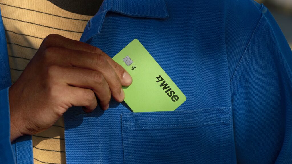
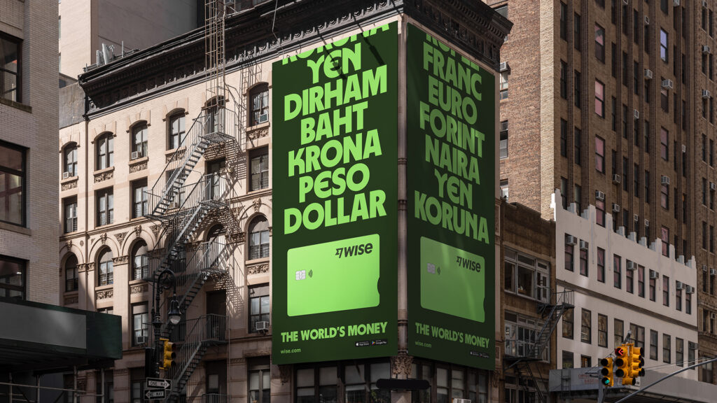
I was particularly intrigued by their project with Wise, a company that aims to revolutionize the global financial system. Wise already has a huge impact on how money moves around the world and is now striving to make this money system accessible to even more people, in even more places. The collaboration with Ragged Edge helped Wise create a standout brand that makes the concept of ‚the world’s money‘ accessible to everyone, regardless of location or financial situation.

Ragged Edge’s talk about their work with Wise was a wake-up call for me. It showed me how branding not only transforms businesses, but can also impact the way people interact with money. This idea of transformation through branding inspired me so much that I decided to continue exploring this topic in my Master’s thesis.

11 // Review and prospects for the 2nd semester

Last semester, I intensively studied the various facets of branding. It became clear that branding is much more than just a visual concept, but a complex combination of psychological and design elements. I was particularly fascinated by how strongly emotions and perceptions can be influenced by colors and typography and how historical developments shape today’s branding strategies.

In the future, I would like to continue studying branding and its impact on target groups. My goal is to understand how targeted branding strategies can influence the perception and behavior of the target group. In doing so, I will take a closer look at the psychological aspects as well as current trends and innovations in branding. I am also particularly interested in interdisciplinary approaches in order to develop a comprehensive understanding of the dynamics of branding and to explore innovative strategies.

This semester I would like to devote myself to experimentation. I therefore plan to conduct three different experiments that fit in with my area of specialization (Communication Design). Through these experiments, I want to explore new approaches and ideas to further deepen my understanding of brand identity design.

At the end of the semester, I intend to test these experiments with my target audience using an online survey to gain insights for my practical master’s thesis. This survey will also help me to concretize the direction for my practical project and ensure that it meets the needs and expectations of my target group.Through this experimental approach, I hope to not only gain practical insights into the application of branding strategies, but also valuable insights into how my target audience responds to different design elements. This will enable me to make informed decisions for my future professional practice in the field of communication design.

Research 16: International Design Week Part 3 – Paper Collages and RISO

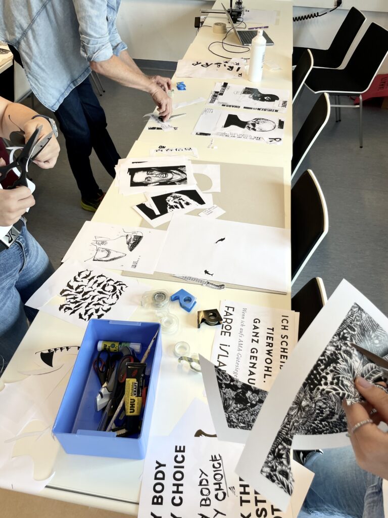
After the digital exploration of the topics, we used paper collaging on the last day. We worked quickly, making rough cutouts and thoughtfully combining them. We were instructed to cut everything beyond just the outline and to think out of the box. The exercise was also for us to work faster on developing ides and connecting visual material with out message without searching for the perfect image on the web for ages.

For the first collage, I created another version of the Faroe Islands topic. The teachers provided printed materials related to our topics, ensuring everyone found something useful. I also printed some of my previous slogans and typographic choices. Initially, I was very detailed and took a long time, but I soon got the hang of it and worked faster.

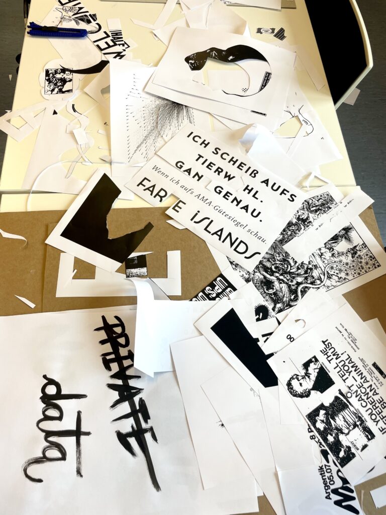
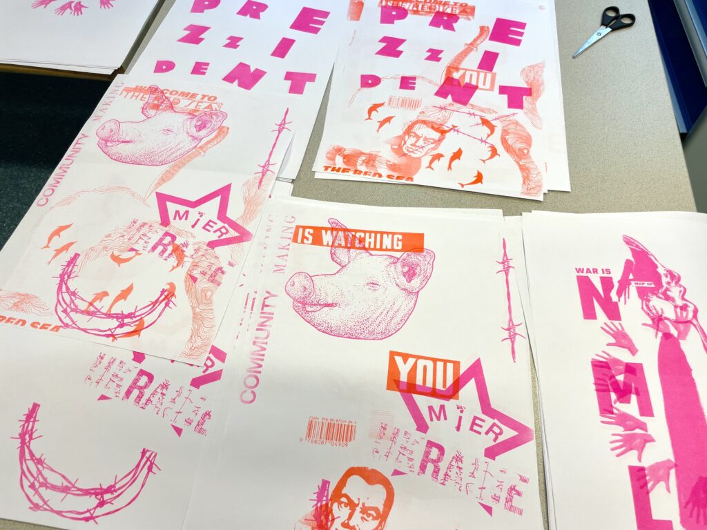
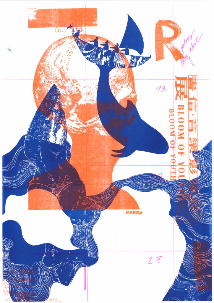
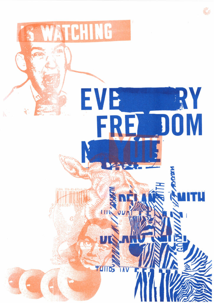
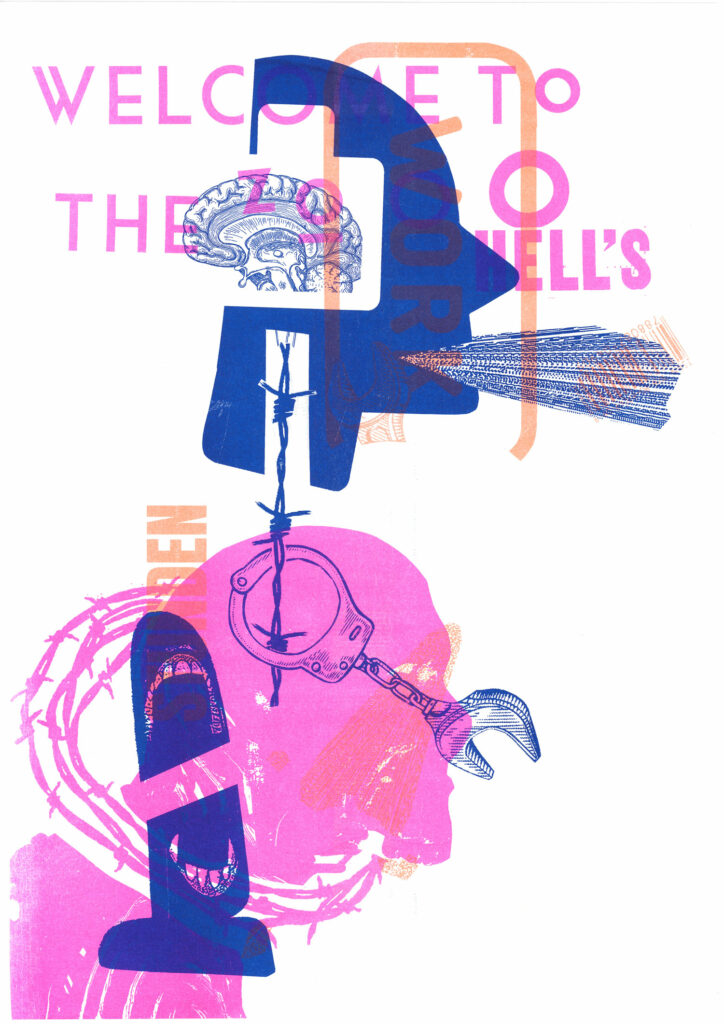
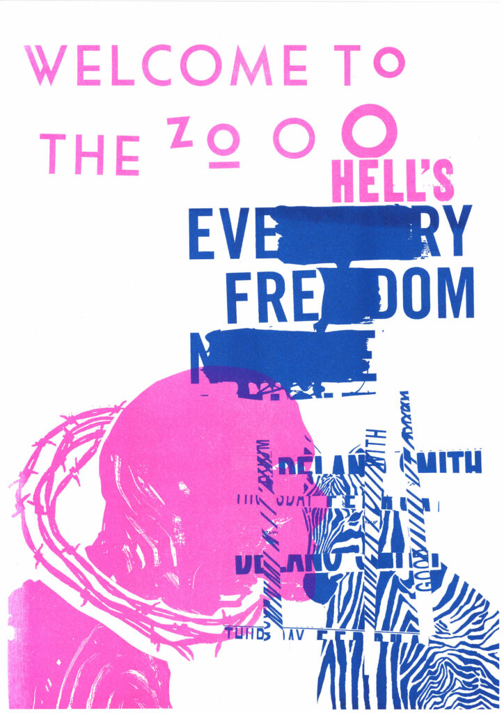
We combined all the black-and-white cutouts and roughly glued them onto white A3 paper. We then used these collages on the RISO. We scanned them directly to make masters and printed many copies of each design. During this process, Lars took some previously printed designs and overprinted them with another student’s design, which was not intended to be combined. This approach yielded very interesting results. Some elements matched well, as all the topics were problematic, and some slogans or images were reusable. In the end, we had one copy of the original design and nearly 200 different posters with various combinations.

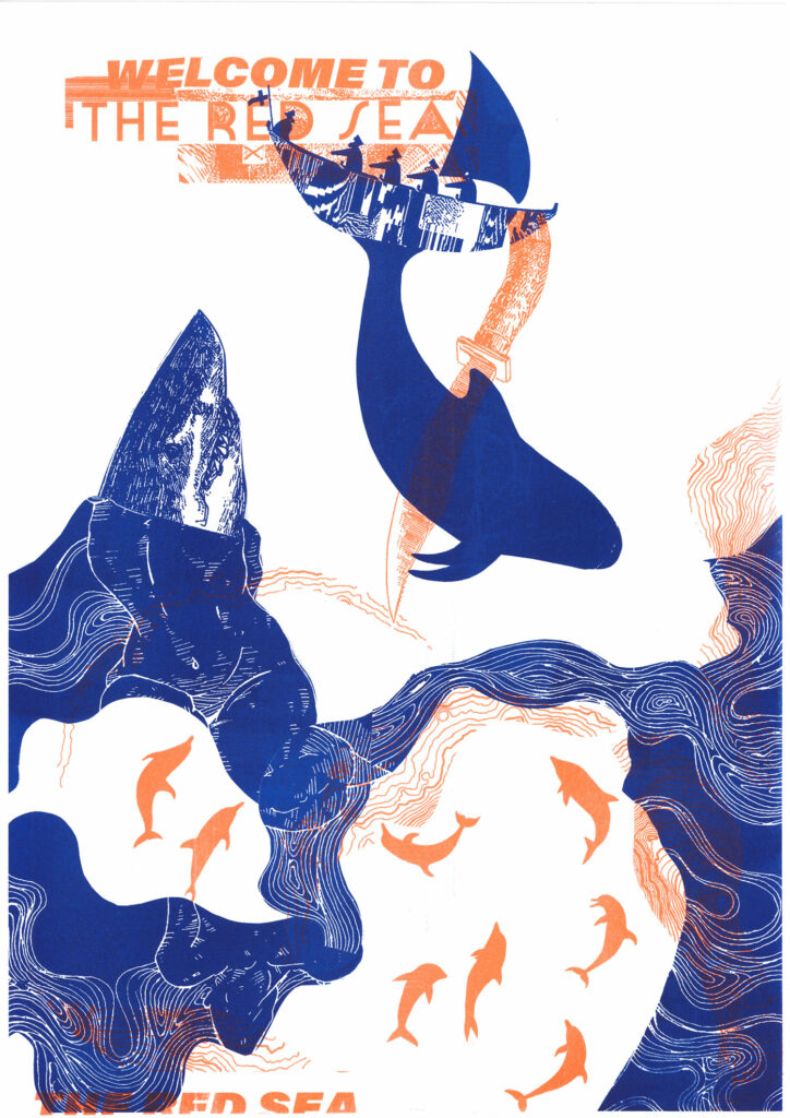
My first work was for the topic of faroe islands and the whale hunting. This collage was an abstract visual showing a whale being stabbed. There are also some versions where it was combined with other designs randomly.

I also made a collage for the pig farm topic and the AMA-Gütesiegel. I used their slogan and created a graphic symbolizing the pain pigs endure, featuring a cut-open pig and a brain functioning as its inner organs. This collage used 2-3 images per layer, unlike the first one, which was built from various cutouts. Unfortunately there was no original left of this design after the whole printing process. But there is a version with the AXI Draw in the end.

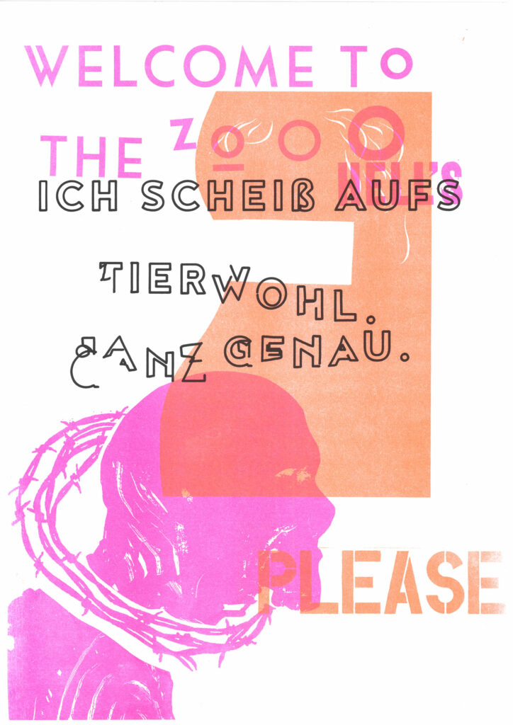
Lastly, I made a collage on the controversy of zoos. I found a fitting slogan and created a symbol combining human faces and barbed wire. On another layer, I used a zebra and cut out stripes from a different pattern to form a cage.

As a final step, we used a tool called the AXI Draw, which can draw on top of printed materials. Some of us used it to rewrite slogans or add details on top of the layered RISO prints. This experimental approach was a refreshing change, allowing us to work more roughly and try new techniques.

This workflow was very inspiring and something new for me as you really have to trust also the process and it is something besides just looking in a screen the whole time. Also the RISO printing makes the end result more haptic and analog than if you just would scan the designs and rework it digital. So you get the overlay from the RISO with little happy accidents and it is way more authentic.

Research 15: International Design Week Part 2 – Digital Posters

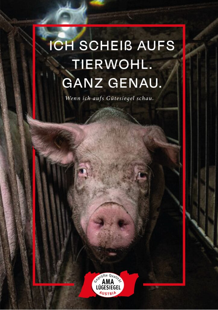
Triggerwarning! If you don´t want to see maybe disturbing images of animals – please do not read this post further because I am using images from pigs which are in horrible conditions.


Concept 1: Pig Farms and Gütesiegel

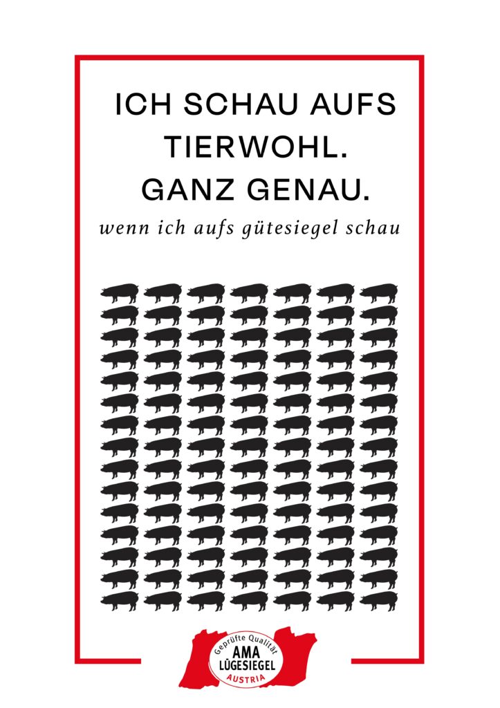
My first design addresses the misleading information consumers receive through various certificates on products, combined with the frequent revelations of poor animal conditions on farms. These farms are often certified under the AMA-Gütesiegel. Despite numerous scandals, AMA claims these issues are beyond their responsibility, which clearly isn’t the case. The AMA-Gütesiegel does not propose better conditions than existing EU regulations; it simply aims to give consumers a false sense of security when buying Austrian meat. Although some farms are suspended from AMA, proper controls would prevent these issues from arising in the first place.

The first approach was to take their seal and rework the typography a litte bit to make it from Gütesiegel to Lügesiegel. Just a small detail thats powerful in its message.

With that I build two different designs for the poster. One is more graphic and the other one uses real life images. To highlight how two faced the campaign of AMA is, I decided to use AMA’s advertisement and rework it. I utilized their graphics, modified the text, and incorporated new images to achieve the desired effect. So here are my two versions for this topic – which the AMA Ad would be the chosen one of this for the presentation.


Concept 2: Whale Hunting on the Faroe Islands

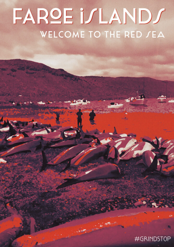
The next topic I explored was whale hunting in the Faroe Islands, a cruel and unnecessary practice today. Pods of whales are chased to the shore with speed boats and brutally slaughtered. Despite no longer relying on whale meal, the practice continues with global buyers and some locals clinging to tradition. In 2023 alone, over 800 whales and dolphins were killed. Organizations like Sea Shepherd are on-site, documenting these events and try to stop it with petitions and more people are against it luckily.

Initially, I planned to create a modern travel poster-style design, but it felt too editorial. But the slogan „Welcome to the red sea“ stayed in my head. I shifted to a 50s-70s style inspired by Cassandre, known for his impressive posters. Due to time constraints, I couldn’t create my own illustrations, so I used Photoshop to edit images to fit this style. After much trial and error, I produced a compelling poster with interesting fonts. Here are my different versions for this topic.

Different approaches to this design style. First i edited the image heavily and then I played with the colors further and typography. On the first glance the blue/green version could look like a pretty image but then you see the details and what the bright red should symbolize.

This workflow showed my how individual the approaches can be to visualize such topics – you can use well known techniques and styles and use their main features to get a strong visual. That´s something that I will definitely be something I will explore further in this case. The next post will be about how I am using the same topics and also some same visual graphics in a completely different style and technique.

Experimenting with Colors #17

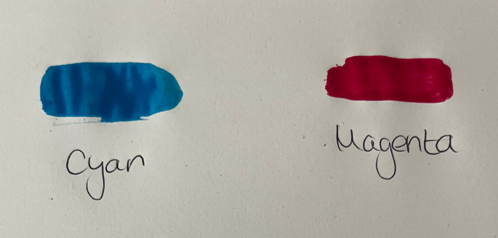
Mixing Cyan and Magenta

Cyan, which is created by mixing blue and green, when combined with magenta, yields shades of red. Initially, the mixture may appear as a cool, bluish-red tone, but as more magenta is added, the color deepens into richer shades of red. Depending on the proportions of cyan and magenta used, the resulting red can range from vibrant and intense to deeper and more burgundy-like. Experimenting with different ratios of cyan and magenta allows for the creation of a diverse range of red hues.

Experimenting with Colors #16

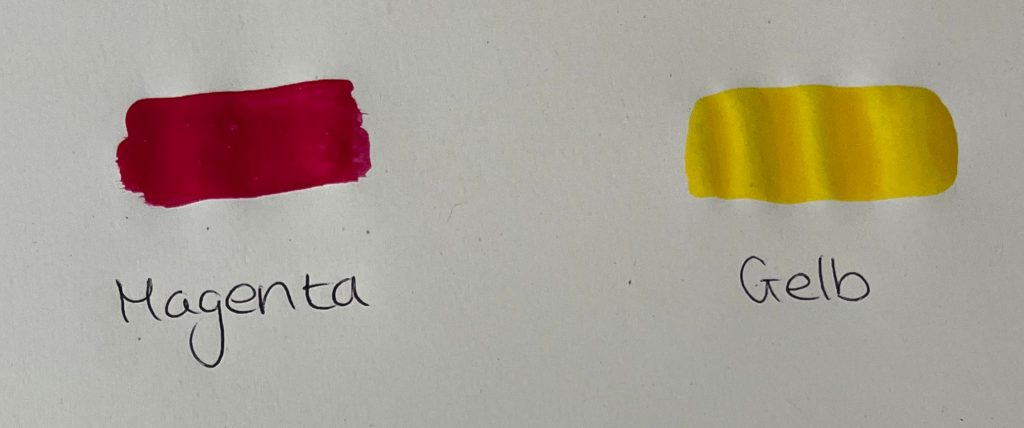
Mixing Magenta and Yellow

Magenta, a color derived from red and blue, when mixed with yellow, produces a vibrant range of red-orange hues. Initially, the combination may result in a vivid reddish-orange tone, but as more yellow is introduced, the color becomes brighter and more reminiscent of tangerines or sunset hues. Adjusting the ratio of magenta to yellow allows for control over the intensity and warmth of the resulting red-orange color.