Experiment 1 / Part 1: Analog Textures in Digital Design – Creating Texture with Everyday Materials

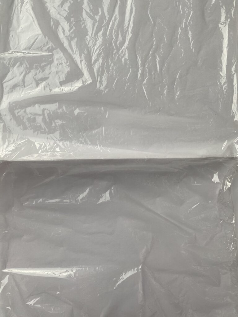
I recently did my first simple experiment, creating textures using everyday materials found in my apartment. Plastic bags, baking paper, and plastic wrap became my tools of choice. This hands-on approach not only allowed me to step away from the screen but also sparked a sense of playfulness and creativity that is sometimes lost in the digital workflow. Here are some insights and reflections from this experiment:

The Simplicity of Creation

It’s really easy and no effort to create effective textures with everyday items. You don’t need any fancy tools or special materials. I used a crumpled plastic bag, folded baking paper, and plastic wrap to create textures that can be used to add depth and character to designs.

The Joy of Experimentation

It’s not just about the end result when you’re creating, it’s also about the process. I think designers can have fun with experiments like this and try new things they might not have considered in a purely digital environment. This experimentation can lead to unexpected discoveries and innovative design solutions you may not have thought of. Even if the textures created are basic, the act of creating them can inspire new ideas and approaches.

Encouraging Resourcefulness

By using materials found at home, we encourage a resourceful mindset. This practice not only reduces our reliance on pre-made digital assets but also encourages a more sustainable approach to design. It challenges us to think creatively about the materials we have on hand and how we can repurpose them into something visually compelling.

A Personal Touch

Analog textures fill designs with a personal touch that is often missing in digital creations. Each piece is unique thanks to the imprint of the designer’s hands. This personal touch helps create a deeper emotional connection between the design and the audience. It also makes the design more memorable and engaging.

14//International Design Week: Connecting Packaging to Digital

During the International Design Week workshop, titled „But Seriously… Following the Call of Beauty… or Celebrating the CounterPARTY?“, we began by exploring the possibilities within graphic design.

As a group of students, we identified various daily life problems that we, as designers, could address. Each of us presented a specific problem, and we decided to focus on the issue of recycling information. I brought in a leaflet from my student dorm that was overwhelming and full of information, highlighting a common issue in student dorms and public spaces. While local residents are typically educated about proper waste disposal, newcomers often find it challenging to learn and follow new guidelines.

We split into two groups to brainstorm solutions. One immediate idea was to design a better flyer to make the recycling process more understandable. However, we soon expanded our thinking beyond traditional graphic design.

We explored various innovative solutions, such as implementing a color-coding system for garbage bags or using colored stickers on packaging to simplify sorting. Ultimately, we decided to focus on integrating packaging with a digital scanning app. This app would connect physical materials with digital information, helping to resolve recycling issues more effectively.

The app would allow users to scan a code on the packaging and receive rewards, thus gamifying the recycling process. This approach not only makes recycling easier but also incentivizes participation, making the process more engaging and rewarding.

While we mainly brainstormed solutions during the workshop without having the time to prototype, the experience sparked important reflections. I began to consider how digital solutions, when implemented correctly, could address real-life problems thanks to unique qualities such as interactivity, gamification, and audio/video integration. These digital features have the potential to create engaging and effective tools that can significantly enhance our daily lives.

Randomness and Chaos – Introduction to the Experiments

In this blog post, I will outline my plan for the design experiments. These experiments will explore the integration of randomness and controlled chaos, with the goal of gaining insight into their impact on creative outcomes. As a result of these experiments, I plan to create a series of posters that reflect the results and show the creative possibilities of these techniques.

Experiment 1: Introducing Random Elements

In this experiment, I will explore the incorporation of random elements into a design project. I will use various methods to generate random components such as random color palettes, textures, and typography. The goal is to see how these unpredictable elements affect the overall aesthetic and conceptual outcome of the design.

Steps

  • Random grid: Creating and using a randomly generated grid to organize the layout.
  • Random shapes: Experimenting with different randomly selected and created shapes, which I want to include in the random grid layout.
  • Random typography: Experimenting with different randomly selected fonts and typographic treatments.
  • Random color palette: Using tools or blind selection to create a color scheme.

Experiment 2: Controlled Chaos

For the second experiment, I will explore the concept of controlled chaos. I will apply certain boundaries to maintain a level of order while allowing for intentional disorder and chaotic elements. This experiment aims to balance structure and unpredictability, and demonstrate how controlled chaos can lead to innovative and engaging designs.

Steps

  • Grid-based chaos: Designing within a grid, but allowing elements to break free of the structure.
  • Generating pattern: Using algorithms to generate controlled chaotic patterns. Using this elements to create different poster layouts – some with more balance and some with more chaos.

Randomness and Chaos – Experimentation in Design

Last semester, in my previous blog entries, I explored the intersection of randomness and order in art and design. I examined how artists such as Jackson Pollock and Sol LeWitt used randomness creatively and discussed the influence of chaos theory on design, emphasizing the balance between predictability and unpredictability. I also explored the use of true and pseudo-randomness in computer-generated art, and the cognitive biases that affect our perception of randomness. I also looked at the role of grid systems and balance in graphic design, and presented examples of controlled chaos by contemporary designers. My exploration concluded with an emphasis on the innovative potential of including randomness and chaos in design.

Building on my previous explorations, I will now focus on hands-on experimentation with randomness and chaos in design. Through specific experiments, I hope to uncover practical insights and explore the boundaries of creative expression.

I plan to do two experiments. The first will focus on randomness and the second will focus on controlled chaos.

My goal with the experiments is to find out if controlled chaos leads to more memorable and impactful designs compared to strictly ordered designs, and to explore how the use of random elements affects the creative process and the designer’s decision-making. I also want to see if there are specific types of projects or design contexts where random elements are particularly effective or ineffective.

13// Exploring Artivive

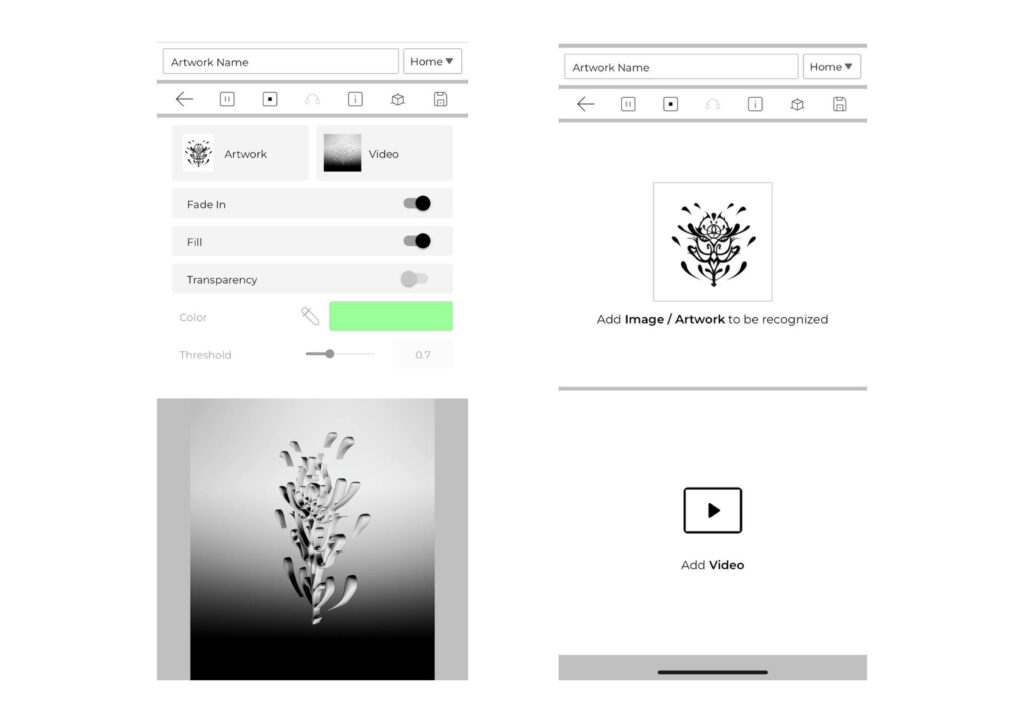
For my second experiment, I decided to try out Artivive, a user-friendly app that brings art to life with augmented reality.

Getting Started

Firstly, I downloaded the Artivive app on my phone. The process was straightforward and intuitive, making it accessible for anyone interested in blending traditional art with digital animation.

Creating the Art

I began by designing a simple 2D symbol. Next, I transformed this symbol into a 3D animated version. Artivive allows you to upload both the static image and the connected animated video. The platform offers various effects to enhance the animation, including transparency, fade-in, fill, color adjustments, and threshold settings.

Viewing the Animation

By scanning the static image with the Artivive app, the animation comes to life. This interactive feature means that anyone with the app can experience the animated version of the artwork simply by scanning the image.

Considerations

The method of using Artivive is remarkably simple, which is a major advantage. However, it does have some limitations.

Pros

  • Beautiful, Easy Results: Artivive allows users to create impressive animations with minimal effort.
  • Interactive Experience: The app enhances the viewer’s experience by adding a dynamic layer to traditional artwork.

Cons

  • App Requirement: The necessity of having the app installed to scan the images may limit accessibility for some users. And there should be an incentive for them to download the app. I think this might work for example in an art show, where multiple artworks require the same app. However, I believe for a poster in the street or some other single project it would be more difficult that people download the app for this purpouse.

12// NFC vs. QR Codes: Example in Budapest’s Transport System

The Budapest transport system has recently (2023) implemented an innovative approach to ticket validation, utilizing both Near Field Communication (NFC) and QR codes. This dual-method system aims to enhance efficiency and user experience.

NFC Technology Implementation

Process and Benefits:

  • Convenient Validation: NFC-stickers are placed on vehicle doors of BKK lines and at station entrances on metro lines. Users validate their tickets or passes by holding their phones 1-3 cm away from the sticker. This proximity triggers an animated image on the device, confirming successful validation.
  • No App Required: One-step validation with NFC does not require logging into the BudapestGO app. Users simply unlock their phones, significantly streamlining the process.
  • Speed: The NFC validation process is approximately 10 seconds faster than QR code scanning, as it eliminates the need to open any apps. This quick and seamless interaction is particularly beneficial during peak hours, reducing congestion at entry points.

Placement of NFC-Stickers:

  • Metro Entrances: Stickers are located on ticket validation machines below the QR code and the paper ticket slot.
  • Trams, Buses, Trolleybuses, and Suburban Trains: Stickers are placed on the side of the vehicles next to the doors, adjacent to the QR code stickers.

QR Code Technology

Process and Benefits:

  • App Integration: Users can still validate their tickets purchased through other digital ticket apps using QR code scanning. This method requires opening the specific app and scanning the code.
  • Compatibility: QR codes provide a reliable alternative for users without NFC-enabled phones, ensuring the validation system remains accessible to all passengers.

Placement of QR Codes:

  • Metro Entrances and Vehicles: QR code stickers are placed alongside NFC stickers on validation machines and vehicle doors, ensuring that both methods are readily available.

Observations and Findings

During my visit to Budapest, I had the opportunity to use this system and realized how convenient it was compared to QR code scanning. It saves multiple seconds because you do not need to open your camera; you can simply hold your phone near the NFC tag. This experience sparked my interest in further exploring this technology.

I discovered that NFC stickers or cards can be easily purchased and configured, which I plan to experiment with in the near future. Some practical uses of NFC stickers include sharing WiFi passwords, facilitating fundraising through flyers, and sharing photos.

11// Using QR Codes: Observations and Reflections

I worked at the Event LENDWIRBEL 2024, I was here tasked with creating a plan for the window design. A key element of this design was the integration of QR codes. These QR codes allowed attendees to directly access information about the events being offered. Qr-Codes were also integrated in printed leaflets.

Observations and Insights

  1. Effectiveness and Accessibility: The QR codes were used, but their effectiveness had certain limitations. Attendees needed to approach the window, carefully read the information, and then scan the codes. From what I have observed, I supposed many people typed directly the name of the event on a browser, instead of using the Qr codes.
  2. Flexibility and Adaptability: One significant advantage of using QR codes was their flexibility. Unlike printed programs, which can become outdated quickly, QR codes could link to dynamic content that could be updated in real time. This was particularly useful for an event like LENDWIRBEL, where the schedule could change daily, or even during the festival itself.

Reflection and Future Considerations

While QR codes provided a flexible and modern solution, their implementation raised some important questions about usability and user experience. I began to ask myself: Is there a better alternative? Can we find a quicker and more intuitive solution?

Potential alternatives I would like to explore next:

  • NFC: Near-field communication could be easier to use instead of QR codes, as they require people only to put the phone closer instead of needing to open an app. I will explore this further.

The Collingridge dilemma

In the current context in which artificial intelligence is gaining ground, the Collingridge dilemma clearly manifests itself. The Collingridge dilemma, also known as the dilemma of control, is a conceptual problem in the ethics of technology, formulated by David Collingridge in his book The Social Control of Technology (1980). It highlights the difficulty of predicting and controlling the consequences of a new technology. In the early stages of development and adoption, technologies are relatively easy to modify, but it is difficult to foresee their long-term consequences. As these technologies consolidate and become pervasive, their negative impacts become more evident, but intervening to modify or regulate them becomes much more complex.

Therefore, talking about ai generated images, in the initial phase developers have some degree of control over the training data and algorithms used. However, fully predicting which stereotypes, biases, or harmful beliefs may be present in training datasets sourced from the internet is tough. This lack of knowledge can lead to a poor understanding of the technology’s potential long-term social and cultural impacts.

Once AI-driven image generation technologies are integrated into the design and visual communication environment, it becomes much harder to intervene to correct biases and mitigate dangerous effects. Artificial Intelligence is becoming an integral part of creative and communicative processes, making it difficult to modify without disrupting essential services or significantly influencing professional practices.

Early regulation is likely to be too restrictive for further development and implementation, while regulation at a more mature stage may be limited in its effectiveness and ability to prevent accidents.

Striking the right regulatory balance is crucial, as early intervention may stifle progress while delayed action risks exacerbating existing issues.

About Texture: Impact of Texture in Graphic Design on Our Emotions and State of Mind

Design is a powerful tool that can evoke a wide range of emotions and influence our state of mind. While color, form, and composition often take the spotlight, texture plays an equally important role in shaping our experiences and perceptions. Most articles about texture in design focus on interior design or product design, but I think texture plays an equally important role in graphic design, not only in print, but increasingly in digital design. So I tried to take the things that were said for those design fields and apply them to graphic design, and to explore how texture in graphic design affects our emotions and state of mind.

The Multisensory Language of Texture:

Texture engages multiple senses, primarily visual and sometimes tactile, adding depth, richness, and character to a design. In graphic design, the use of textures can create contrasting moods. Smooth and glossy textures can give a sleek and modern feel, while rough and tactile textures can evoke warmth and coziness. For example, a website with a rough, grunge texture might even feel more inviting and personal compared to one with clean, smooth lines, depending on the target group of course.

Emotional Responses to Texture:

Textures can trigger emotional responses that significantly impact our state of mind. Soft and smooth textures often generate feelings of calmness and comfort, making them suitable for designs meant to relax or soothe, like wellness apps or meditation websites. Rough textures, on the other hand, can stimulate energy and excitement, making them ideal for designs intended to inspire creativity or social interaction, such as in advertising campaigns or dynamic product branding.

Texture and Cognitive Processing:

The impact of texture on our emotions is closely linked to its influence on cognitive processing. Textures can affect brain chemistry by altering the release of neurotransmitters like dopamine and serotonin, which regulate mood and emotions. Visually stimulating textures can activate the brain’s reward center, generating feelings of pleasure and satisfaction, while soft, soothing textures can promote a sense of calm and relaxation, beneficial for educational or therapeutic design contexts.

Enhancing Ambiance:

Texture plays a significant role in creating ambiance within a design. By carefully selecting and combining textures, designers can establish a visual hierarchy, guiding the viewer’s attention and defining the mood. For instance, incorporating rough and weathered textures can add a sense of history and nostalgia, creating a warm and inviting ambiance. Conversely, smooth and reflective textures can contribute to a contemporary and sophisticated atmosphere, enhancing the overall experience and setting the desired tone for the design.

Texture as a Reflection of Identity and Culture:

Textures in design can communicate identity and cultural significance, reflecting authenticity and the materials or craftsmanship associated with a specific culture or tradition. For example, using textures inspired by natural materials like wood, stone, or woven fibers can create a connection with the environment, promoting a sense of harmony and groundedness. By leveraging textures that resonate with a particular culture or historical period, designers can enrich the narrative of the design and foster a deeper emotional connection with the audience.

In summary, texture in graphic design is a multifaceted element that enhances visual appeal, evokes emotional responses, influences cognitive processing, and creates ambiance. It also serves as a medium for cultural expression and identity. Understanding and utilizing texture effectively can elevate the quality and impact of design, making it more engaging and memorable.

Source:

https://www.linkedin.com/pulse/5-impacts-texture-design-our-emotions-state-mind-neil-norton-design#:~:text=Smooth%20and%20soft%20textures%20often,can%20stimulate%20energy%20and%20excitement

https://openai.com/chatgpt

About Texture: Importance of Texture in Graphic Design

In modern graphic design, texture plays a big role in enhancing visual appeal and creating engaging designs. As companies want to stand out, designers are using different tools to craft smooth and seamless experiences. Texture, an element less common in the early days of design, is now vital for adding depth and interest to digital creations.

Texture as an Element of Design

Texture is the way a surface feels, or the way it’s perceived to feel. It has the power to attract or detract a viewer’s eyes and can be applied to lines, shapes, and forms. There are two types of texture: tactile and visual. Tactile textures are three-dimensional and can be touched—like the bumps and ridges of coarse-grained rough paper. Visual textures, on the other hand, are seen but not felt, such as a photo of said paper. In digital design, where tactile experiences are not possible, we rely on visual textures to create the illusion of depth and realism.

Balance of Design Elements

Graphic design is about balancing various components like texture, colors, patterns, and shapes. Technological advancements, particularly software like Adobe Illustrator, have introduced tools for creating illusionistic textures that simulate real-life tactile experiences.

Benefits of Texture:

Texture draws viewers‘ physical and mental attention, conveying messages and evoking emotions. It adds contrast and visual intrigue, making 2D and 3D graphics appear more realistic. By incorporating texture, designers can highlight features and bring depth to their work.

Two Types of Texture in Design:

Actual Texture: Tangible and felt physically, this type is used in paper-based items like business cards and labels. The quality of the material affects the design’s perceived quality, with textured papers often seen as more premium.

Visual Texture: Created digitally, visual textures mimic real textures through layered graphics. Designers use software to achieve desired effects, making designs appear textured without physical changes.

Conclusion:

Both actual and visual textures are essential in design, adding life and quality to otherwise plain graphics. By using textures effectively, designers can enhance the visual appeal and emotional impact of their work, creating more engaging and memorable designs.

Source: 

https://www.graphicszoo.com/article/importance-of-texture-on-your-graphic-designs#:~:text=A%20texture%20is%20associated%20with,emotions%20to%20your%20target%20clients.

https://www.invisionapp.com/defined/elements-of-design#