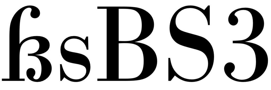
Experimenting with Colors #15

Mixing Red and Yellow

Mixing red and yellow together yields shades of orange. Initially, the mixture may appear as a bright vermilion hue, but as more yellow is added, the color transitions to warmer tones of orange. Depending on the proportions of red and yellow used, the resulting orange can range from vivid and fiery to softer and more subdued. Experimentation with different ratios of red and yellow allows for the creation of a spectrum of orange shades.

Experimenting with Colors #14

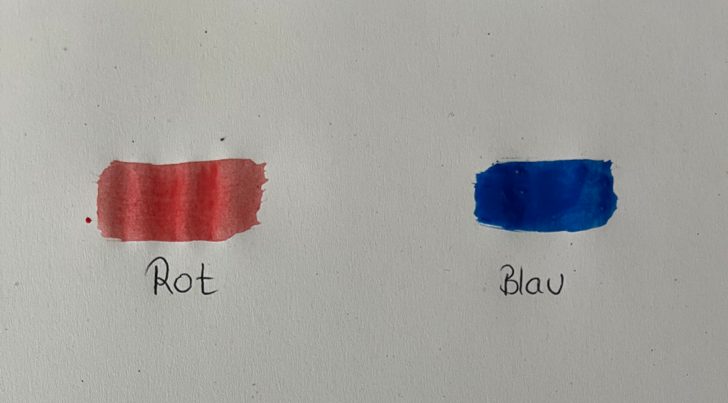
Since I’ve decided to delve deeper into the color red, I’ve conducted a few experiments on color mixing with the color red.

Mixing Red and Blue

When mixing red and blue together, you’ll observe a gradual transition from the original colors to shades of purple. As more blue is added, the resulting color becomes cooler and tends towards violet. Conversely, adding more red will warm up the mixture, producing deeper shades of magenta. Through experimentation with different ratios of red and blue, you can achieve various tones of purple, ranging from vibrant violets to rich magentas.

Research 14: International Design Week Part 1

The last few days, we had the International Design Week, during which we could choose from different workshops covering various topics led by designers from diverse backgrounds. On one hand, I wanted to dive deeper into Blender and expand my skill set, but I was also interested in the last workshop titled “Doubt is not an option,” conducted by Roger Walk and Lars Harmsen. The topic aligned closely with my area of interest, so I felt it would complement my project perfectly. The workshop focused on the loss of trust in media and politics, examining the difficulty in discerning fake news from factual information today. Within the first few minutes of their presentation, I knew it would provide a fresh perspective for my project.

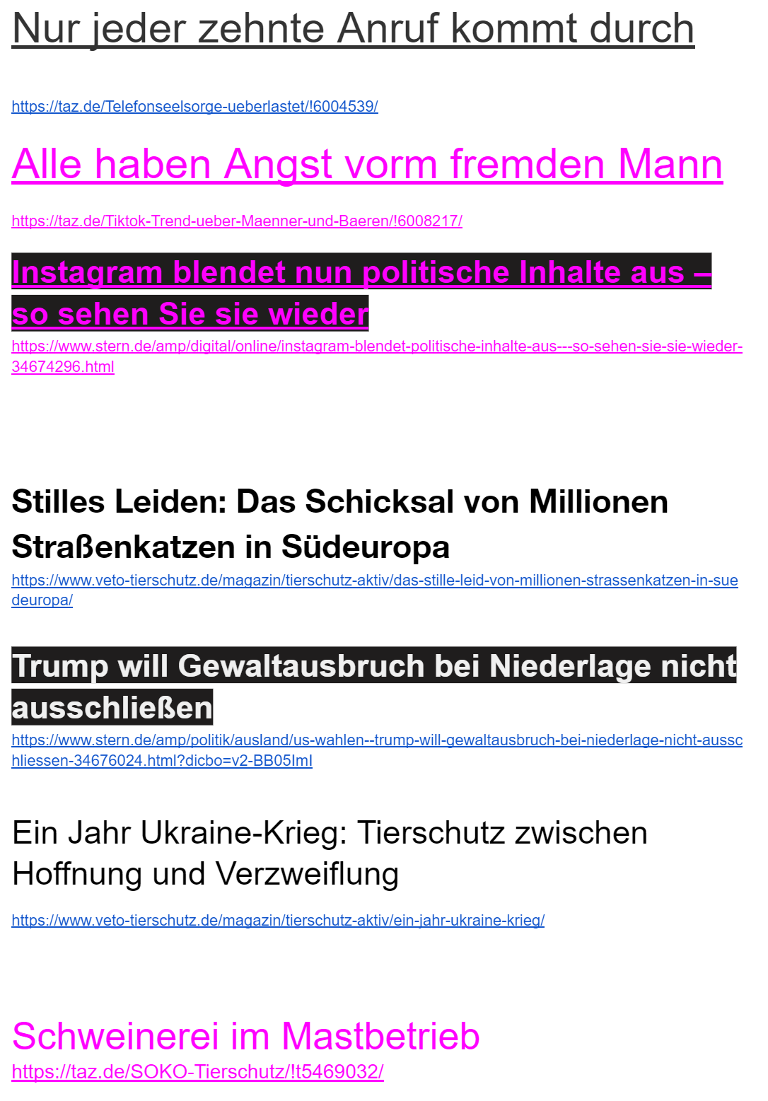
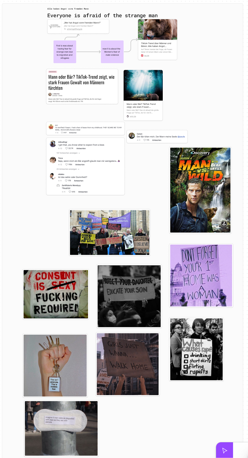
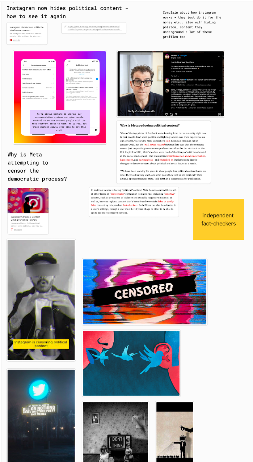
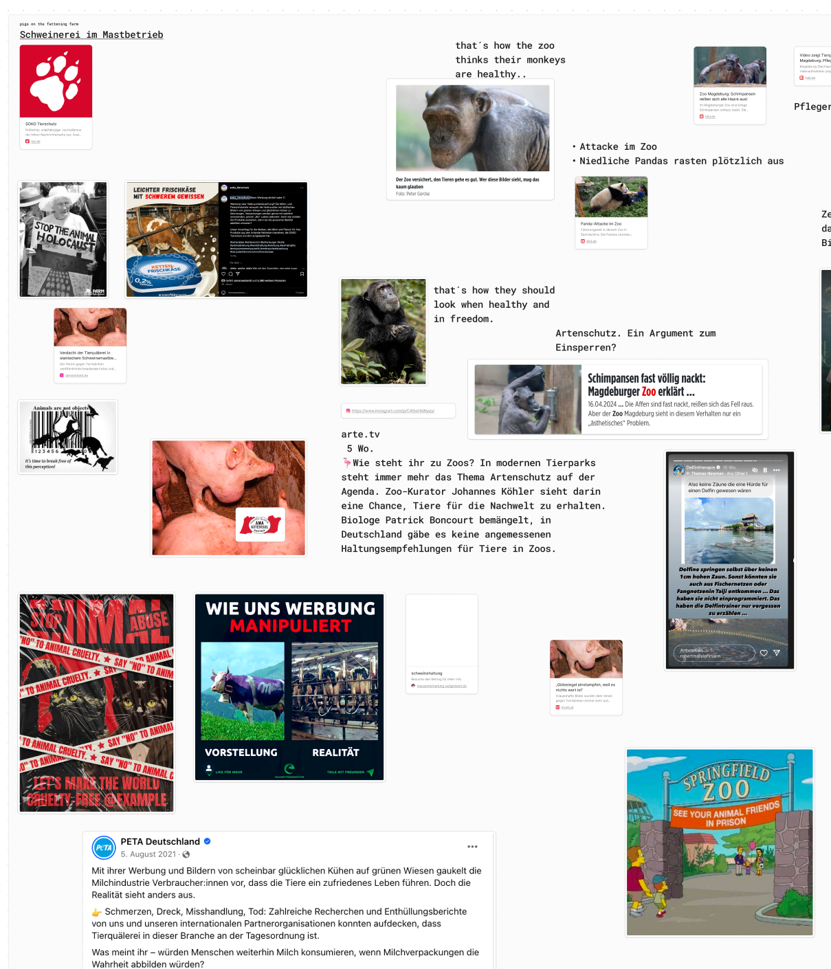
Initially, we examined various works across different fields, ranging from spreading fake news to satirical posters about politicians. We observed a variety of design styles and approaches to visualizing the topic. Following that, we conducted our own research on headlines and current issues to use as inspiration for our designs. During our research, we discovered a range of contemporary and problematic topics rather than strictly focusing on fake news. I explored topics related to animal welfare, Instagram’s efforts to hide political content, and the concerning fact that women fear men more than bears. A strong headline based on these themes would form the foundation for our later poster design.

After a discussion, we delved deeper into the visual representation of our topics. I explored animal welfare through articles from Soko Tierschutz on the conditions of pig farms today. I combined this with the misleading use of the AMA Gütesiegel and other certifications on products, which often suggest a good quality of life for the animals but, in reality, mislead consumers. I began to visualize how I could depict this, perhaps by placing the AMA Gütesiegel on images showcasing the harsh conditions pigs endure or contrasting reality with how it is portrayed. Lars and Roger’s initial slides also introduced various options, such as simple illustrations or manipulating images with processing, which would suit the topic’s style. I also considered the issue of zoos, particularly the controversy surrounding Zoo Magdeburg and its handling of monkeys.

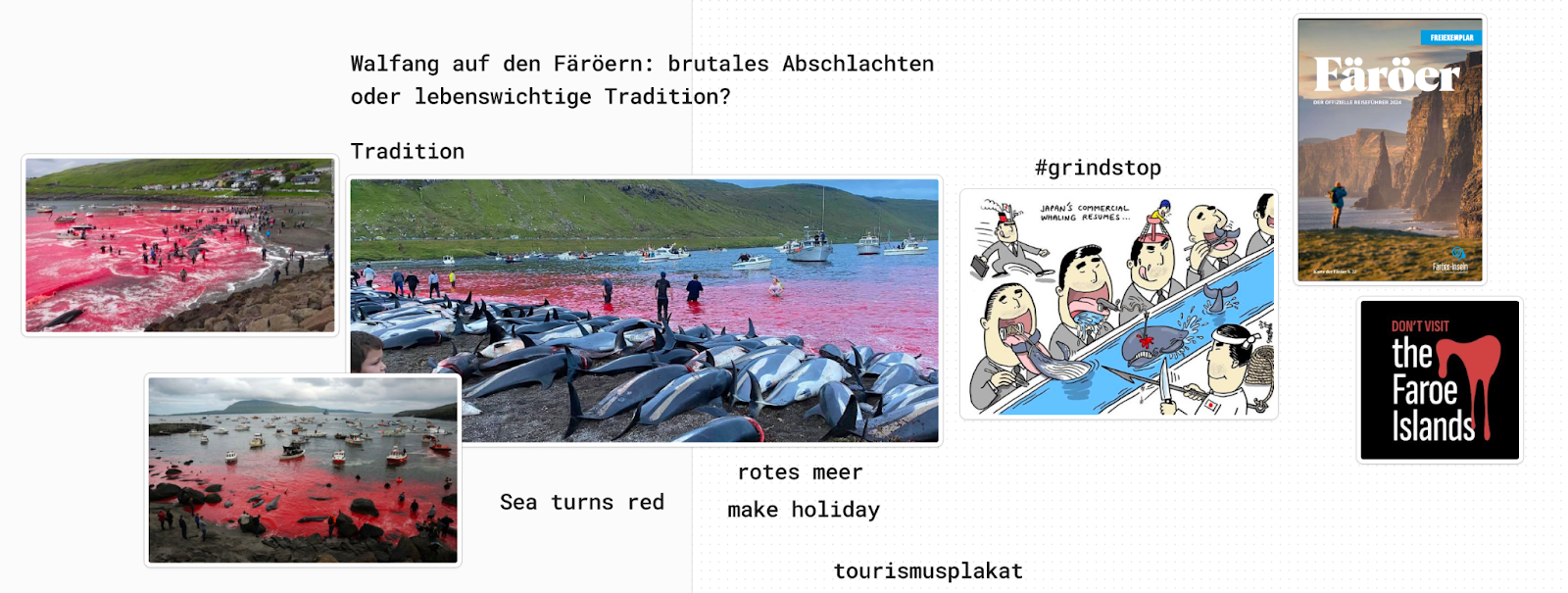
Over the weekend, I decided to focus solely on animal welfare topics, as I felt most confident in that area. Political topics required more in-depth research before creating such controversial posters. I also investigated the issue of whale hunting in the Faroe Islands, which was happening again during that period. This island, southeast of Iceland, historically depended on whale hunting for sustenance and survival; however, today, it has become a brutal practice that results in the mass slaughter of protected whales in Europe. The phrases “Sea turns red” or “Welcome to the red sea” resonated with me. While the picturesque Faroe Islands evoke thoughts of vacation, the reality is far more disturbing due to the bloody whale hunts. Thus, I envisioned creating a tourism-style poster to highlight this disparity.

After the research and topic exploration we started on monday with the first designs and visual concepts digitally. In the following post I will go deeper into this process and show my designs.

In my exploration of further research topics, I delved into a compelling paper titled „Enhancing design thinking approaches to innovation through gamification“

by Rui Patrício, Antonio Carrizo Moreira, and Francesco Zurlo.

This paper sheds light on the relationship between gamification and design thinking in the early stages of the innovation process (ESoIP). Design thinking, known for its applicability in complex and uncertain environments, faces challenges such as lack of structure and goal clarity.

The authors argue that gamification can enrich and complement design thinking practices, making tasks more organized and enhancing employee engagement in innovation. This study offers valuable insights for managers seeking to leverage gamification to enhance traditional design thinking approaches in innovation management.

(Reference: Patrício, R., Moreira, A. C., & Zurlo, F. (Year of publication 2020).


  1. ntroduction

This paper examines the relationship between gamification and design thinking in managing the early stage of the innovation process (ESoIP). Design thinking, known for its effectiveness in promoting innovation, faces challenges in providing structure and clarity during this phase. The study argues that gamification approaches can enhance design thinking by improving organization, coordination, and employee engagement. By conducting case studies in firms like Trivalor, Novartis, and Microsoft, the research demonstrates how gamification tools complement design thinking practices. The paper contributes to both theory and practice by offering insights into how gamification can be leveraged to coordinate stakeholders, enhance task enjoyment and organization, and increase employee engagement with the ESoIP. The paper is structured into six sections, starting with an introduction to the research topic, followed by framing the research, describing the methodology, presenting case study findings, and concluding with avenues for future research and study limitations.


  1. Theoretical background

Design thinking offers a holistic approach to innovation, addressing challenges in the early stage of the innovation process (ESoIP) by combining customer-focused thinking, storytelling, and experimentation. It emphasizes need-finding, idea generation, and testing through tools like ethnographic observations, brainstorming, and rapid prototyping. Firms adopting design thinking foster a flexible, people-centered culture that encourages creativity, collaboration, and learning. However, despite its recognition, there are debates about its efficacy and clarity in theory and practice. Critics highlight limitations such as lack of structure and clarity, hindering effective management of ESoIP.

Gamification involves applying game elements in non-gaming contexts to encourage engagement and motivation toward tasks. It addresses challenges in managing innovation by providing structured, enjoyable experiences that enhance coordination and engagement. Despite some resistance, gamification is increasingly recognized for its potential in corporate environments to improve productivity and creativity. Research on gamification’s role in innovation is growing, highlighting its ability to support ideation, evaluation, and idea development. The synergy between gamification and design thinking offers promising avenues for overcoming design thinking’s limitations in managing the early stage of innovation.


  1. Methodology

The study aims to explore how gamification enhances design thinking practices in the early stage of innovation. Firms were selected based on their proficiency in design thinking and involvement in multidisciplinary teams for idea generation. Through half-day gamification workshops, participants further developed ideas using the ideaChef® tool, integrating game dynamics, mechanics, and components. This modified approach aimed to facilitate idea development in a structured, enjoyable manner. The workshops focused on addressing real business challenges outlined by stakeholders. By integrating gamification into the design thinking process, the study seeks to observe improvements in innovation processes and identify opportunities to enhance or complement design thinking practices.

The data collection process involved semi-structured interviews with key informants immediately after gamification workshops, supplemented by observations, secondary data archives, and group interviews. Triangulation ensured validity and reliability, while interview protocols facilitated transparency and reliability. Thematic analysis of interview data followed a theory-driven coding approach, refining themes into theoretical dimensions. The analysis incorporated voice recordings, precise transcriptions, and additional observations for rigor and replicability. The gamification tool, ideaChef®, facilitated idea development in a structured, enjoyable atmosphere, encouraging participation and risk-taking. Its cooking metaphor and scientific validation made it suitable for converting ideas into viable concepts, addressing real innovation challenges. This comprehensive approach provides rich insights into the relationship between gamification and design thinking practices in the early stage of innovation, offering practical implications for enhancing innovation processes.


  1. Findings

The empirical findings reveal that gamification effectively contributes to achieving innovation goals by enhancing idea development and decision-making processes. Participants across all case study firms reported benefits such as achieving concrete plans, reaching goals in a different and more interesting way, and controlling time more effectively. Gamification provides a structured process that accelerates innovation, enabling faster progress and more comprehensive idea development. It facilitates better communication and collaboration among diverse teams, making innovation processes more inclusive and engaging. Additionally, the relaxed and playful atmosphere created by gamification increases motivation and reduces pressure, fostering greater participation and creativity. However, there are challenges, including the need for a defined challenge and idea beforehand and skepticism from some individuals regarding the seriousness of gamified approaches in corporate settings. Overall, the findings highlight gamification’s potential to enhance design thinking practices in innovation processes, particularly in idea development and decision-making stages.


  1. Discussion

The conceptual model depicts how gamification enhances specific design thinking practices within the ESoIP context. Gamification addresses design thinking’s shortcomings by providing structured processes, offering clarity on goals, and facilitating comprehensive planning. It also aids in specifying needs and requirements, promoting collaborative idea development, and bridging communication gaps. Furthermore, gamification encourages balanced contributions from diverse teams, fostering engagement among internal and external stakeholders. However, challenges persist regarding legitimacy, cognitive obstacles, and vulnerability to leadership changes. Gamification introduces ambiguity and uncertainty, requiring internal buy-in. Some individuals remain skeptical about its effectiveness in critical business processes, while leadership turnover may jeopardize its acceptance. In summary, while gamification enhances many aspects of design thinking, addressing these challenges is essential for its successful implementation.


  1. Conclusions

The study suggests that gamification can enhance design thinking practices, addressing issues like lack of structure and disconnection between thinking and doing. It challenges traditional power dynamics by empowering self-managed teams. However, resistance persists due to skepticism and managerial reluctance to merge work with games. Despite these challenges, gamification shows promise for innovation and idea development. Future research should explore its integration with design thinking in various stages of the innovation process and address limitations. Overall, gamification offers a creative, structured approach to managing innovation processes, with implications for theory and practice in innovation management and design thinking.

13 | Design Constructions For The Uppercase Eszett

4 possible design skeletons

1. Dresden (soft + hard features)
2. Leipzig (soft + soft features) both by Andreas Stötzner
3. Frankfurt (hard + hard features)
4. Berlin (hard + soft features) both by Adam Twardoch

1.  Dresden Skeleton

According to the German type designer Ralph Herrmann the Dresden skeleton is the most common construction. The Dresden design approach is characterized by several distinct features. Notably, it serves as a capitalized form of the lowercase character „ß“ and features a diagonal stroke at the upper right, distinguishing it from the letter „B“. One of its characteristic features is the aperture at the bottom, typically rounded in most designs. This aperture provides balance and legibility to the character. However, variations exist where this part of the character may be drawn with an angle or a serif, adding unique stylistic elements to the design.

Additionally, the diagonal stroke in the upper right part of the „Dresden“ character adds further visual interest and differentiation from similar-looking letters. It contributes to the overall distinctiveness and clarity of the character.

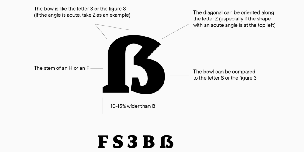
Considering these features, it‘s crucial to ensure that the „Dresden“ character maintains a width that is 10–15% wider than the letter „B“ to achieve optimal balance when used alongside other uppercase letters in text.

When a type designer embarks on creating an extended language set, they typically start with a foundation of basic characters and letters that are already rendered. This allows them to focus on the nuances of specific characters, such as the eszett. Graphically, when drawing an eszett, designers often reference the forms of other letters in the font, such as F, S, Z, B, and even the number 3. This helps maintain consistency in the overall design aesthetic. While it‘s commonly advised that the proportions of the capital ß be wider than those of the letter B by about 10-15%, this isn‘t always a strict rule. Instead, designers prioritize the proportions of the entire font and adjust accordingly. The construction of the eszett combines soft features from the bow of the letter S with hard features from the diagonal of the letter Z and its acute angle at the top right. This blend creates a unique visual identity for the character.

Testing the result involves printing text containing the eszett and examining how it integrates with the overall character set. This allows designers to assess the character‘s width and shape in relation to the rest of the font. Karen Cheng, in „Designing Type,“ suggests making cuts and serifs in the terminals of letters like S, 3, and eszetts identical, but this isn‘t mandatory in typeface creation. For instance, in sans-serif fonts, terminal cuts can be straight rather than curved. Ultimately, creating a cohesive and visually pleasing font involves balancing various design elements while maintaining readability and aesthetic consistency across the character set.

2. Leipzig Skeleton

This Eszett form by Andreas Stötzner exhibits a soft, rounded skeleton reminiscent of the Dresden form, characterized by a smooth transition from stem to bowl, reminiscent of historical round „s“. It combines elements from both the letter forms F and S, offering a unique and visually striking design aspect. Notably, the incorporation of a clearly visible S as the right part of the Capital Sharp S adds to its distinctiveness. While this variant may not be widely utilized, it complements typefaces with a more calligraphic appearance, introducing an intriguing design element without introducing ambiguity issues.

A more recent design approach, stemming from the Leipzig Skeleton, has given rise to the Zehlendorf Skeleton by Martin Wenzel and Jürgen Huber. Departing from the conventional wide and uniform S-curve, this variant opts for a tight, narrow S-curve. This nuanced adjustment creates additional whitespace within the broader character, enhancing its clarity and ensuring a clearer distinction from the letter B. This design strategy underscores the evolution and adaptability of Eszett forms, demonstrating a commitment to both legibility and aesthetic appeal within contemporary typography.

3. Franktfurt Skeleton

This Eszett skeleton by Adam Twardoch closely resembles the Dresden Skeleton. The only difference lies in the clear corner used as the transition from stem to bowl. Many designers think, that such an arc of the Dresden skeleton on the top left doesn’t work well within the Latin uppercase letters. So, to avoid this “lowercase look”, it is suggested to draw the top left of the Capital Sharp S as a corner. Compared to other Eszett options, this Skeleton appears much harder. Composed of the letter combinations F, Z, 3, and B, it lacks both soft curves and S-shapes. Consequently, this angular Eszett option aligns well with geometric typefaces. Moreover, this construction method finds particular favor with serif fonts. Here, an additional serif can be strategically placed at the stem, ensuring that the capital letter maintains proportional harmony with the other uppercase characters.

4. Berlin Skeleton

This design approach by Adam Twardoch builds upon the angular concept of a majuscule eszett once again. In order to seamlessly integrate the Berlin Skeleton into uppercase text, it eschews a rounded transition from stem to bowl in favor of a sharp corner on the top left of the letter. This architectural decision imbues the character with a larger appearance and reduces the likelihood of confusion with a lowercase letter. The design merges elements of the letters F and S, incorporating a more or less pronounced S-curve as well.

By employing this technique, Twardoch achieves a balance between legibility and aesthetic cohesion within uppercase letterforms. The distinct corner at the transition point adds visual weight to the character, making it stand out more prominently within text. Furthermore, the incorporation of both F and S characteristics ensures a harmonious integration of the Berlin Skeleton into various typefaces, contributing to its versatility and applicability across different design contexts.

LINKS:

https://typetype.org/blog/ligatures-in-fonts-creating-eszetts

https://typography.guru/journal/capital-sharp-s-designs

https://typetype.org/blog/ligatures-in-fonts-creating-eszetts

http://cinga.ch/eszett/#top

12 Preparing for my first Experiment: Exploring Origami Instructions

As I transition into the experimentation phase of my research, I’m eager to dive into the world of instructional design with a hands-on approach. My first experiment will focus on comparing illustrated and animated instructions, with origami as the chosen task. Why origami? According to my research, motor skills are easier to learn with animated instructions, thanks to a concept called mirror neurons.

Mirror Neurons

Mirror neurons are special cells in our brains that fire both when we perform an action ourselves and when we see someone else perform the same action. This mirroring effect helps us learn and understand motor skills more effectively, making animated instructions particularly suitable for tasks like origami. Also origami is a simple yet versatile art form that only requires a piece of paper to get started. With its various folds of different difficulties, it offers the perfect canvas for my experiment.

Origami

Before diving into the experiment, I want to take a moment to explore what origami is and its history. Origami is the Japanese art of paper folding, derived from two words: „ori“ meaning folding and „kami“ meaning paper. It dates back to the 17th century and has since evolved into a globally recognized form of artistic expression and education.

Choosing the right fold

Now onto the task of finding suitable instructions for my experiment. I want instructions that strike a balance between complexity and accessibility. They shouldn’t be too simple, as I want to challenge participants and observe potential differences between illustrated and animated instructions. However, they also shouldn’t be overly difficult, as I want participants to be able to complete them with some practice. Additionally they should contain one tricky step to see how participants fare with each type of instruction.

Origami Duck

To ensure the quality of my experiment, I’ve decided to test out several instructions on my own before selecting the final ones. This hands-on approach will help me choose the difficulty level and identify any potential issues or struggles. After some time I settled on an instruction about an origami duck which has the right level of difficulty for beginners.

Ultimately my goal is to design a set of instructions that will provide valuable insights into the effectiveness of illustrated versus animated instruction methods. With my plans in place I’m excited to embark on this journey of experimentation.

Sources:

https://www.psychologicalscience.org/observer/mirror-neurons-how-we-reflect-on-behavior

https://study.com/academy/lesson/history-of-origami.html#:~:text=The art of paper folding was popularized in Japan, but,to decorate temples and shrines.

https://origami.me

sRGB #13

sRGB stands for „Standard Red Green Blue“ and refers to a standardized color space that is widely used in many applications and devices. Originally developed for use in digital displays and web graphics, sRGB is now a widely accepted standard for color representation in various applications and devices.

The sRGB color space defines a limited palette of colors that can typically be displayed and processed by most computer monitors, digital cameras, printers, and web browsers. It was designed to ensure consistent and predictable color reproduction across different devices and to ensure that images and graphics appear similar regardless of where they are viewed.

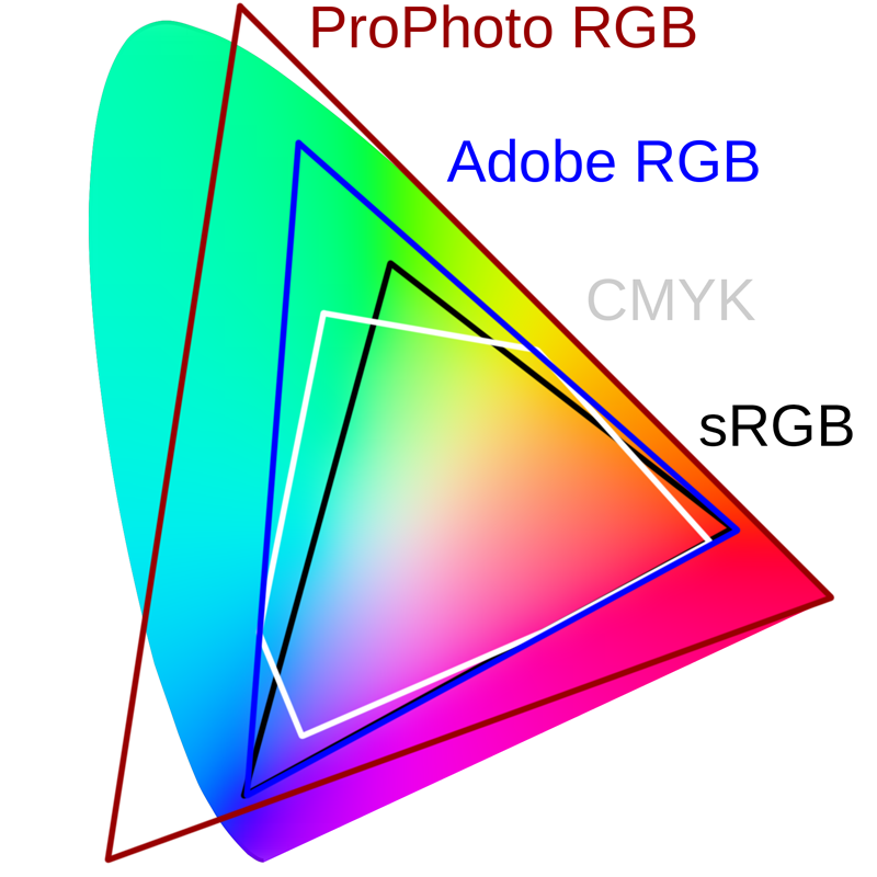
Compared to larger color spaces such as Adobe RGB or DCI-P3, sRGB covers a smaller range of hues. However, it is sufficient for most everyday applications and provides good color accuracy and consistency.

sRGB is often used as the standard color space for displaying content on the web. When creating images or graphics for the web, it is common to save them in the sRGB color space to ensure they are correctly displayed by most web browsers.

It is important to note that color reproduction in sRGB can also depend on the calibration of the screen or printer. Accurate color calibration and profiling of devices are necessary to ensure that colors in the sRGB color space are accurately reproduced.

Source: https://www.prad.de/lexikon/srgb/

Adobe RGB (1998) Color Space Encoding #12

ICC-based color management workflows have become the norm for ensuring consistent color reproduction from screen to print. Many professional workflows center around the Adobe RGB (1998) ICC color profile, initially introduced in Adobe® Photoshop® 5.0 software and now integrated across the Adobe product range.

Each device used for capturing and reproducing graphics — whether it’s a scanner, digital camera, monitor, or printer — possesses distinct capabilities for reproducing color, leading to color discrepancies. In an ICC-based color management system, color profiles are established for each device so that the colors in an image can be adjusted throughout the workflow to compensate for the variations in each supported device. The objective is to maintain the visual integrity of the image as much as possible.

Efficient color management necessitates attaching a color profile to every image or graphic to indicate the „native“ color conditions — also known as the color space — under which the file was created. Adobe applications introduced the concept of a „working“ color space, one not necessarily linked to a specific device but representing the ideal conditions for image reproduction. The Adobe RGB (1998) profile has gained widespread adoption as a working space due to its expansive and balanced color gamut, easily adaptable for reproduction on various devices.

Adobe’s own ICC profile for the Adobe RGB (1998) color space is bundled with all Adobe color-managed software applications, including Adobe Acrobat 5.0 and later, Illustrator 9.0 and later, InDesign, GoLive 6.0 and later, Photoshop 5.0.2 and later, and Photoshop Elements software. With appropriate legal agreements, it is also available for distribution by third-party hardware and software vendors. Learn more about the Adobe RGB (1998) color space encoding used for the Adobe RGB (1998) color space.

Legal note concerning color space naming: Only the Adobe RGB (1998) ICC profile created by Adobe Systems Incorporated can accurately be referred to as „Adobe RGB (1998).“ ICC profiles created by other vendors, even if they adhere to the color image encoding described in the Adobe RGB (1998) color image encoding document, cannot be labeled as „Adobe RGB (1998).“ If vendors opt to create their own profile according to this specification and wish to indicate to their customers that this profile was developed in accordance with Adobe’s specification, an alternate phrasing is required, such as compatible with Adobe RGB (1998)“.

Source: https://www.adobe.com/digitalimag/adobergb.html

Monitor Profiling #11

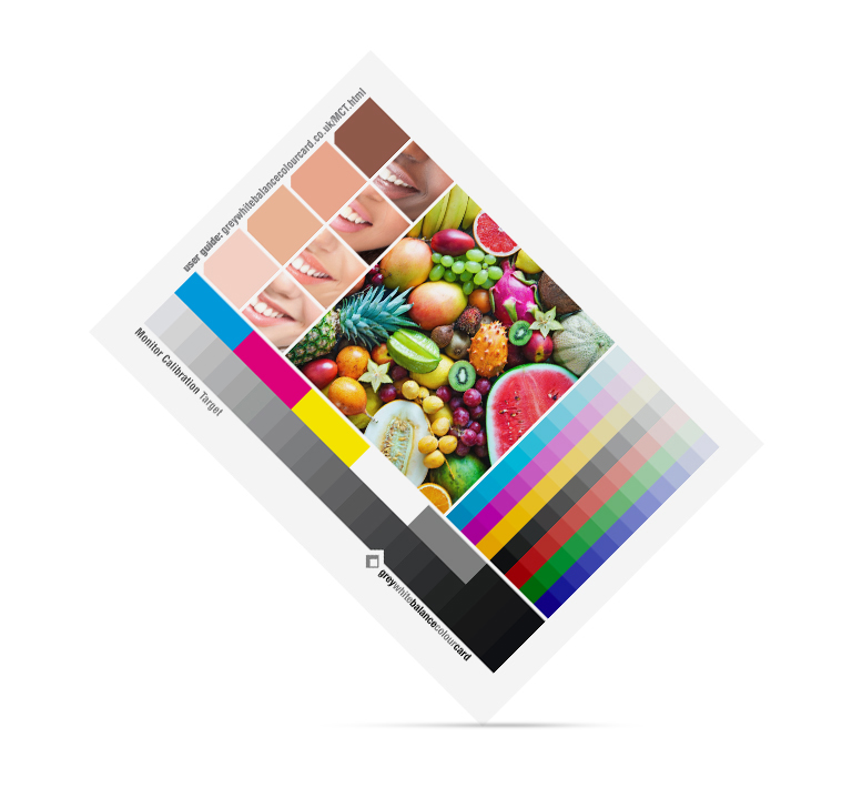
Monitor Calibration Targets

In technical jargon, the term „calibration target“ or „calibration goal“ is frequently used. This refers to the data towards which calibration is performed: white point, brightness, and brightness distribution (gamma). In better calibration software, users can choose these targets themselves; whereas cheaper solutions are fixed to common standards.

For brightness distribution, a gamma of 2.2 or alternatively the so-called sRGB curve (which is very similar to gamma 2.2) is generally recommended. Nothing else makes sense on computers today, even if one prefers to work with a gamma 1.8 color space.

When it comes to calibrated gamma, the primary concern is brightness compatibility with operating system graphics and software that operates without color management (e.g., Office programs). Once color management is in play, gamma is automatically adjusted. While calibrating to the gamma of the preferred working color space (if it deviates from 2.2) may offer minimal quality advantages in monitor display and is still occasionally practiced in professional settings, it generally has more disadvantages on normal computers that are not solely used for image editing.

Overall brightness should harmonize with ambient lighting; meaning, in a brightly lit room, the monitor should shine brighter than in a dimly lit back room, so the eye doesn’t have to adjust excessively when looking at the screen. A standard value for averagely lit rooms ranges from 100 to 140 cd/m², while in poorly lit rooms, 60 to 80 cd/m² may be appropriate, and in some very bright rooms, even 400 cd/m² (the maximum of most monitors) may still be insufficient.

Unfortunately, one often encounters „recommendations“ for a specific brightness level. These should be disregarded. There’s no technically justifiable reason why the monitor, for example, needs to be set brighter or darker for editing print images versus web images. The only thing the monitor brightness should be adjusted to is ambient light. Some calibration devices can measure ambient brightness beforehand, providing a good reference point—assuming this brightness remains relatively constant throughout the day (or at least during planned image editing times).

Ideally, the color temperature should also be matched to the color of the ambient light. However, this is often not possible due to changes in natural daylight and the switch to artificial light in the evenings. In such cases, relying on the adaptability of the eye is preferable. The color temperature of the monitor then becomes a matter of habit. Good calibration software allows users to specify any desired color temperature or maintain the monitor’s native color temperature (which is recommended for budget monitors and notebook displays to minimize losses through color conversions).

The most common standard is D65 (6500 Kelvin), which roughly corresponds to direct sunlight. Alternatively, the slightly warmer standard D50 (5000 K) is also suitable. 5800 K is also popular as a compromise; if no standard light is available, the white point doesn’t need to exactly match a standard. If the monitor has a relatively high native color temperature, one can even calibrate to D75 (7500 Kelvin); initially, it may seem cool, but ultimately, it’s just a matter of habit.

D65 (6500 K) is also the defined white point of sRGB and AdobeRGB—which is practically irrelevant, as the white point of the working color space is merely an invisible conversion intermediate. Therefore, there’s no need, nor particular advantage, to calibrate the monitor to D65 for using sRGB or AdobeRGB. Nevertheless, many calibration programs offer such presets and act as if there’s a sensible connection.

Calibration to the working color space? Another formulation occasionally encountered online is someone stating they have „calibrated their monitor to sRGB.“ This implies working without color management and instead fixing the monitor to a specific working color space. This is also referred to as „color space emulation.“

There are specialized programs that allow for the technical adjustment to fixed working color spaces. In practice, this method is mainly applied to projectors and televisions; further information can be found in home theater forums. The process requires a lot of time and specialized knowledge; moreover, only a few computer monitors have the necessary settings in their menus (e.g., a 6-axis correction).

The color space emulation remains a procedure for special cases (e.g., demanding video editing). Otherwise, calibrating to a predetermined working color space is usually not meaningful, and it’s not even provided for in ICC color management. Doing so would limit the monitor’s color space from the outset, rendering it unusable if a larger working or device color space is required.

Common calibration/profile programs that perform „software calibration“ via the graphics card’s LUT inherently do not support color space emulation; if at all possible, it can only be achieved through hardware calibration (or manually, albeit tediously).

A typical calibration according to ICC color management always focuses on white point, brightness, and brightness distribution/gamma as calibration targets. It leaves the monitor’s color space unchanged in size. Adjusting the monitor and working color space is always the responsibility of the application program and needs to be done repeatedly. Therefore, even after calibration, the monitor cannot inherently display the colors of a file „correctly“; it still requires an ICC monitor profile and an application program with color management function.

Source: https://fotovideotec.de/farbmanagement/18_monitor_kalibrierungsziele.html

12 | Design Constructions For The Lowercase Eszett

Today there are three standard models for the design of the ß character. They are explained at first and are recommendable for most of today’s typefaces. 

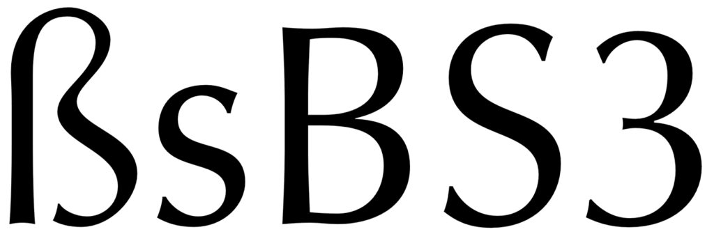
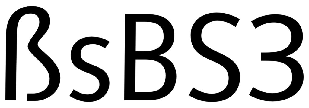
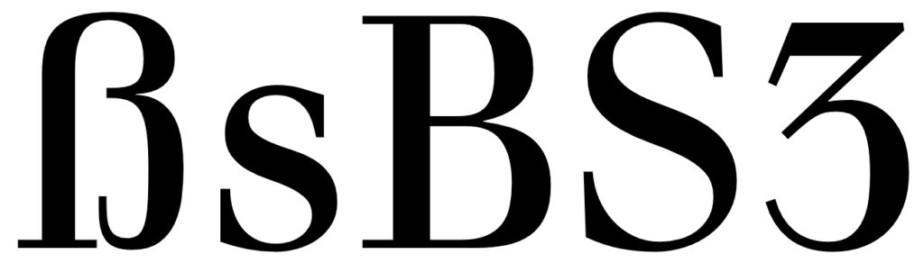
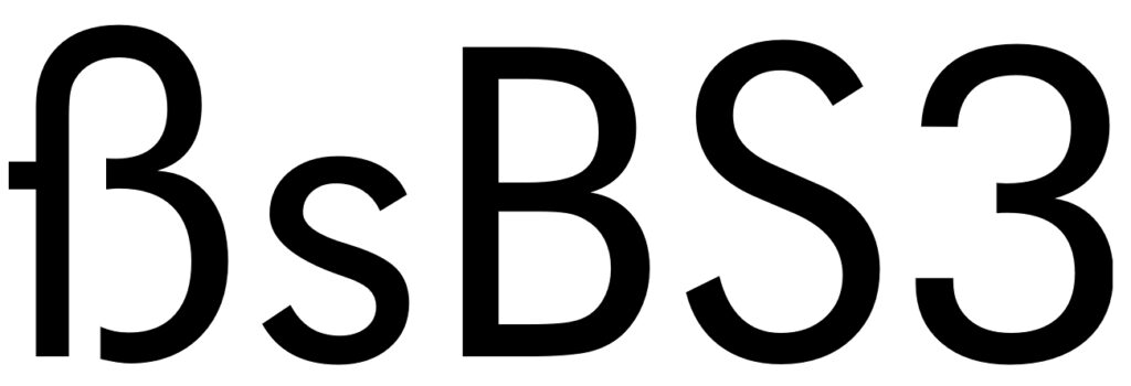
1. The ſs Ligature Design

This design is both very old and rather new at the same time. It was used for centuries across Europe, especially in cursive writing, either as a purely stylistic choice or in accordance with a typesetting practice which avoided a long s as the end of words and therefore displayed a double s (ſſ) as ſs, either visually connected or not. 

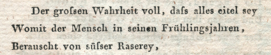
This design, visually resembling the modern German letter ß, is often mistakenly considered its origin. In fact, its use in German texts is a relatively new practice that only became common since the mid-20th century. With the decline of Fraktur‘s influence in typesetting, typical Fraktur ligatures such as ch, ck, tz also disappeared, while understanding of the ß character slowly evolved. In uppercase letters, ß was initially represented as SZ, but later SS became the predominant spelling until the uppercase form of the letter ß was introduced. Without the influence of Fraktur, the German alphabet once again leaned towards designs from the Classical and Renaissance periods, with the historical ſs ligature being a fitting solution for the ß character, both in terms of design and understanding.

The use of this ligature design is the typical choice for so-called humanistic typefaces, i.e., designs rooted in the traditional book typefaces of the Renaissance. Both serif and sans-serif typefaces can employ this design model for the Eszett character.

Designing the ß in this style is rather simple, since it really is just ſ and s connected with an arc. The connection however is mandatory today. While an unconnected design is a historic variation, it won’t be accepted by today’s readers.

The upper counter area is ofter narrower than the lower counter area, as it can be seen in the examples above. But there are also typefaces with a more prominent upper counter area, especially in italic styles. 

The arc and the s shape usually connect as one continuous curve, but there are a few typefaces which stress the different letter parts more clearly by making an abrupt change of direction. This can also work fine. But just to be clear: German readers without a background in typography see the ß as one character. Stressing ſ and s as individual parts of that design is neither expected nor necessarily helpful. Just as a W exposing its origin as ligature of two V is a possibility, but not necessarily helpful.

Typefaces: Optima, Syntax & Utopia

The ſ in its upright version might have a horizontal stroke on the left side and the ß then gets this stroke as well. This is a traditional design feature, but not really required. In my opinion, it only supports the confusion of ſ and f and therefore the horizontal stroke might also be omitted for ſ and ß in modern typefaces. Either way, ſ and ß should always follow the same principles. 

And speaking of the long s: It will usually have a descender in the italic design, but not in the roman version. The same is true for the sharp s.

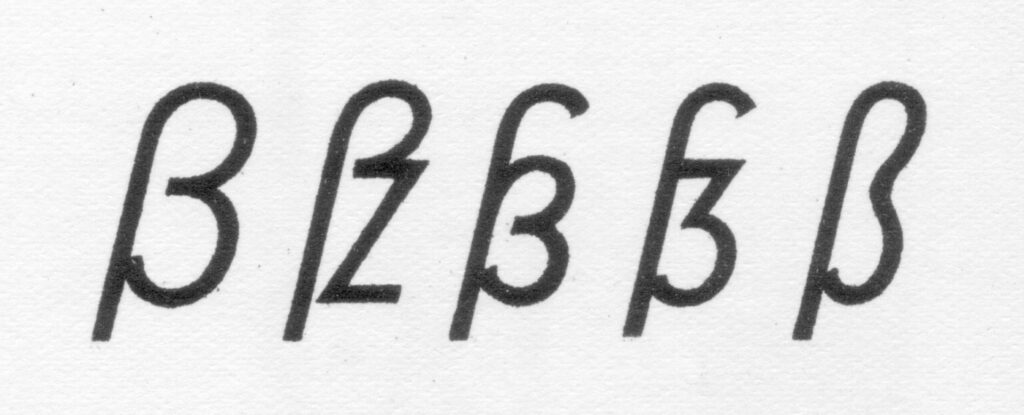
2. The Sulzbach Design

As already mentioned, German was mostly set in blackletter (or written in Kurrent) until the middle of the 20th century and the sharp s as German character was established and mandatory in these type and writing styles. When German was written or set in the roman type style, a counterpart for the blackletter ß wasn’t available for a long time. As a result we can find different alternative spellings until the end of the 19th century. For example: a word like “groß” (big) in blackletter could appear as gross, groſs or grosz in roman typefaces.

Around 1900 an official German orthography was established and a committee of type founders and printers met to define rules regarding the design and use of German characters like ß, ö, ä, ü in upper and lower case. At that time, typesetting and writing German in the roman style had already gained popularity and there was a need to find solutions and regulations regarding the different practices used for blackletter and non-blackletter typesetting. Some differences were kept, some things were unified. The ſ character was kept for blackletter, but dropped for setting German in roman and italic typefaces. The ß on the other was understood as a character of its own, which had become so important, that it was decided to add it to all typefaces, not just blackletter ones as before. All German type foundries should add it to their roman and italic designs. The design proposal that was chosen had similarities with an unusual letter used in the 17th century by the printer Abraham Lichtenthaler in the city of Sulzbach and is therefore now known as “Sulzbacher Form” (Sulzbach design).

Typefaces: Walbaum, Futura & Bodoni

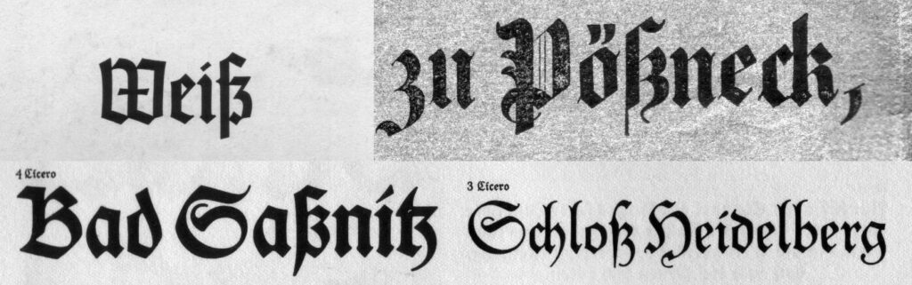
3. Historic Variation: The “Blackletter ß”

With German blackletter and non-blackletter typefaces being used side by side since the end of the 19th century, type designers also started to mix elements of the two.

Blackletter fonts became more simplified and the letter skeletons of the early blackletter fonts became more popular, which were still closer to the design of the roman letter style. And roman typefaces from German foundries started to “look more German” in the first half of the 20th century. The mandatory ligatures of blackletter typesetting were often added to the character set of the roman typefaces and the design of individual letters was also borrowed from blackletter typefaces. A typical case for that is the sharp s character. Many, but not all typefaces used the recommended Sulzbach design. A design as a ligature of a long s with something like a 3 with a flat top resembled the typical look of a blackletter ß and also became a popular choice until the middle of the 20th century.

Because the “blackletter sharp s” in roman typefaces is typical for the first half of the 20th century, its use can still evoke a connection with that time. It appears—as default or stylistic alternative—in a few modern typefaces as well (e.g. FF Kava, Verlag, Metric, DIN Next Slab) and is legible within a word context, but it is not something that works for every font or use case.

Typefaces: Erbar, Technotyp & Bodoni Alternative Glyph

Link: https://typography.guru/journal/german-sharp-s-design/