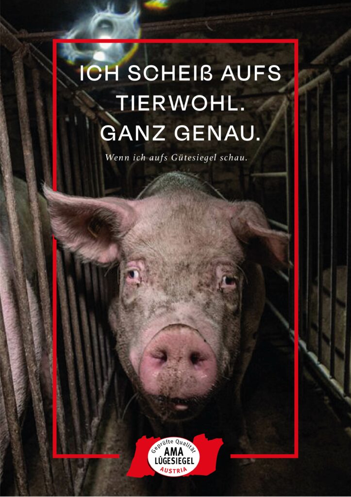
Triggerwarning! If you don´t want to see maybe disturbing images of animals – please do not read this post further because I am using images from pigs which are in horrible conditions.
Concept 1: Pig Farms and Gütesiegel
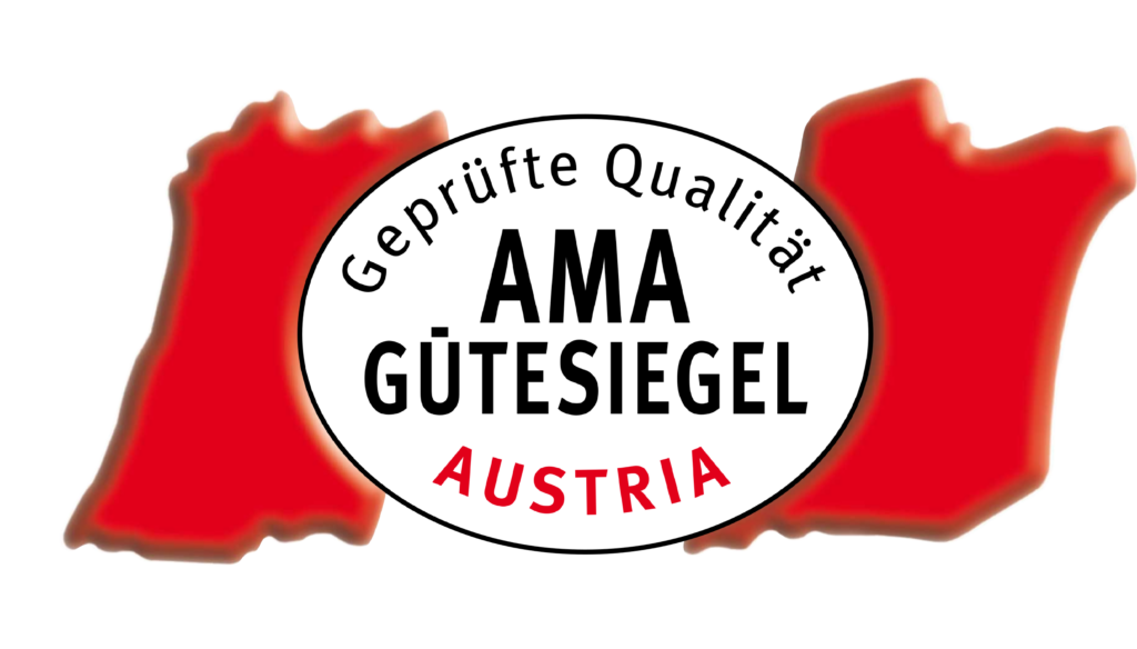
My first design addresses the misleading information consumers receive through various certificates on products, combined with the frequent revelations of poor animal conditions on farms. These farms are often certified under the AMA-Gütesiegel. Despite numerous scandals, AMA claims these issues are beyond their responsibility, which clearly isn’t the case. The AMA-Gütesiegel does not propose better conditions than existing EU regulations; it simply aims to give consumers a false sense of security when buying Austrian meat. Although some farms are suspended from AMA, proper controls would prevent these issues from arising in the first place.
The first approach was to take their seal and rework the typography a litte bit to make it from Gütesiegel to Lügesiegel. Just a small detail thats powerful in its message.


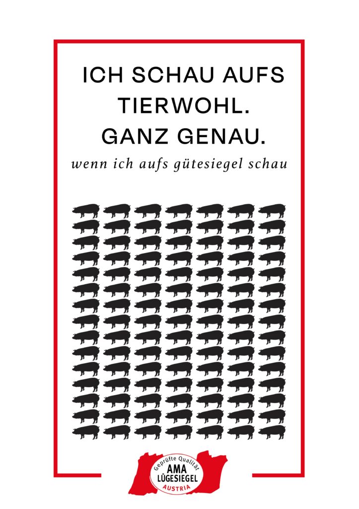
With that I build two different designs for the poster. One is more graphic and the other one uses real life images. To highlight how two faced the campaign of AMA is, I decided to use AMA’s advertisement and rework it. I utilized their graphics, modified the text, and incorporated new images to achieve the desired effect. So here are my two versions for this topic – which the AMA Ad would be the chosen one of this for the presentation.


Concept 2: Whale Hunting on the Faroe Islands
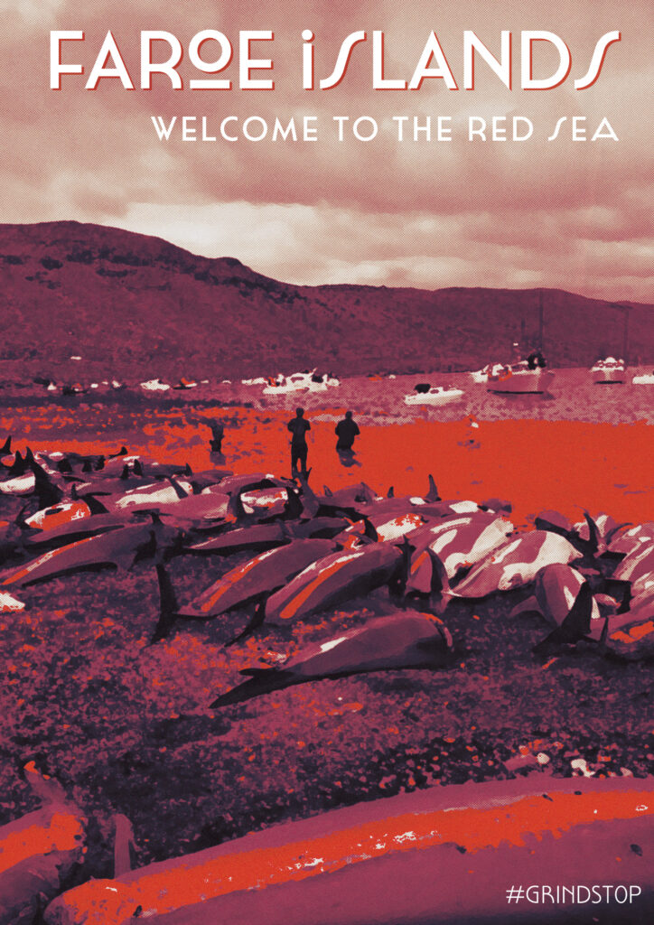
The next topic I explored was whale hunting in the Faroe Islands, a cruel and unnecessary practice today. Pods of whales are chased to the shore with speed boats and brutally slaughtered. Despite no longer relying on whale meal, the practice continues with global buyers and some locals clinging to tradition. In 2023 alone, over 800 whales and dolphins were killed. Organizations like Sea Shepherd are on-site, documenting these events and try to stop it with petitions and more people are against it luckily.
Initially, I planned to create a modern travel poster-style design, but it felt too editorial. But the slogan „Welcome to the red sea“ stayed in my head. I shifted to a 50s-70s style inspired by Cassandre, known for his impressive posters. Due to time constraints, I couldn’t create my own illustrations, so I used Photoshop to edit images to fit this style. After much trial and error, I produced a compelling poster with interesting fonts. Here are my different versions for this topic.


Different approaches to this design style. First i edited the image heavily and then I played with the colors further and typography. On the first glance the blue/green version could look like a pretty image but then you see the details and what the bright red should symbolize.


This workflow showed my how individual the approaches can be to visualize such topics – you can use well known techniques and styles and use their main features to get a strong visual. That´s something that I will definitely be something I will explore further in this case. The next post will be about how I am using the same topics and also some same visual graphics in a completely different style and technique.