Reseach 17: Illustrations for Children

Due to my research and by thinking about my projects and interests I mostly will pivot with my topic in the direction on how to communicate animal welfare to children and a younger target group. In the survey the biggest concerns of the participants were that there are a lot of young people and maybe also very sensitive users on social media which may be disturbed and also harmed by harsh content. We all can see that the younger generation gets more mature and is dulled by all the graphic content on the web. There are also not really good mechanisms to protect younger ones on the web – you just need to click accept on a mask and then instagram will show you the content. 

On the one hand it is important to show the images and to show people the reality but on the other hand it is important to balance it out so you do not harm children – as we are surely not capable of keeping them out of the web until a proper age. Of course there are age limits (13 years old as far as I know) but I myself also did cheat with my age when I was 13 and you did need to be 14 for facebook. Adults and parents are often not aware of how their children navigate through the web. But this in general is a whole nother topic. Maybe I will touch it in another post.

So with this introduction I want to say that I will now get more into how to visualize content for children so that it is understandable and they are more aware about these topics without disturbing them and tarnishing the children’s comfort.

The first person who came to my mind with illustrating for children is Sha’an d’Anthes (FurryLittlePeach) – an artist and illustrator from Australia – who has already published two children books herself and has a very intriguing and remarkable style. Years prior I followed her on social media and followed her process and was then already inspired to create visuals like her.

So now for analyzing her work: For this I also rewatched Videos of hers in connection to this topic.

Her books are: Zoom – a story through the galaxy to explain this to children. And Bandits – a story about friendship and appreciating nature.
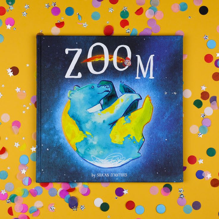
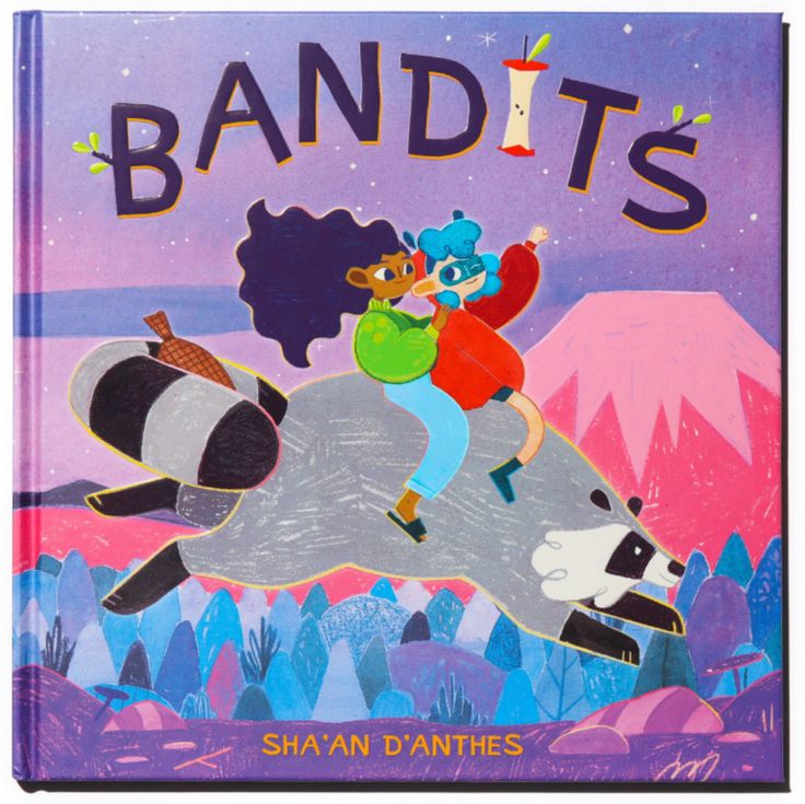
She herself describes it like this: vibrant and joyful pieces that embody a childlike way of looking at the world.

Her colors are mostly vibrant but due to the project and her picture book she adapts the colors to the story. Her work is mostly done with traditional media like watercolor and pencils and then combined and edited afterwards if necessary – depending on the project. Her paintings are done in different layers and also often she uses a wash as a background and then works her way up with darker washes on top.
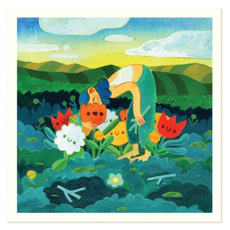
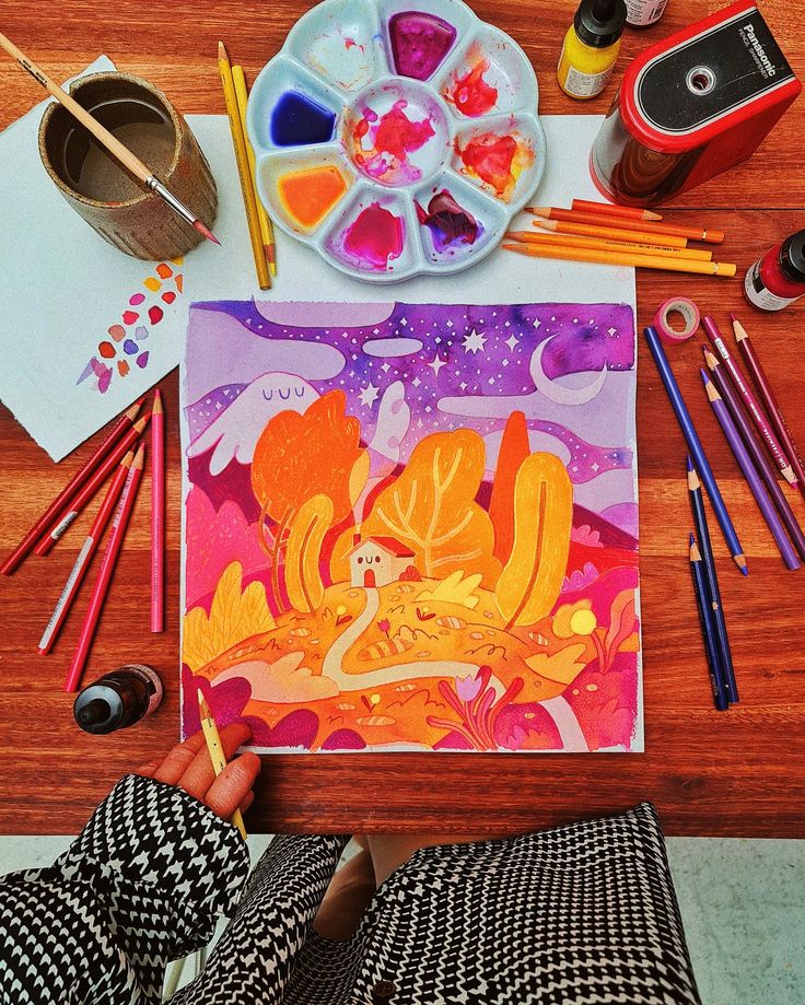
I thinkt her style is very cute and in a way simple but still understandable and with all the textures and rough coloring it gets an authentic look. In the next part I will try to get some answers from experts with childrens (teachers) and see what their opinion is on how to communciate animal welfare and which visuals work for children.

The outcome is not fixed yet but I am thinking it will be one big or more smaller illustrations about specific animal welfare topics in a style which is also suitable for children and then they are presented in maybe a mural or in a book style.
16 | Correction of Glyphs & Experiment

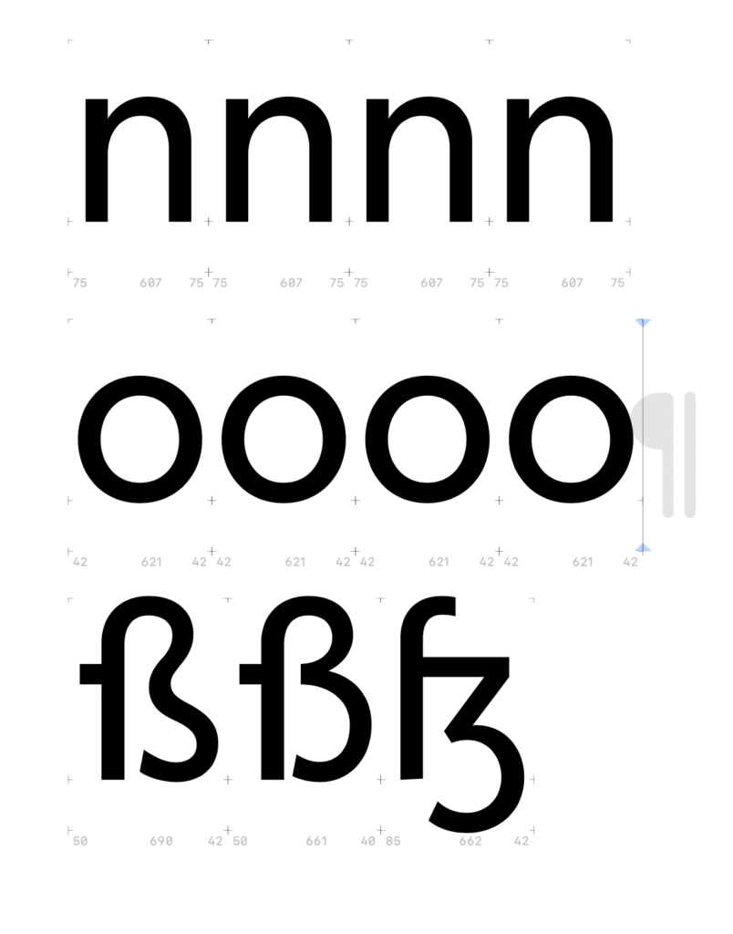
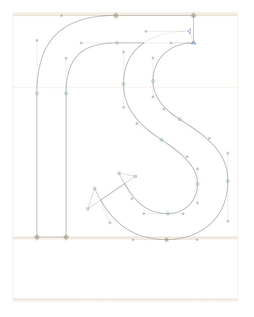
For my Eszett voting experiment, I improved the contrast of the various skeletons and designed the historical lowercase Eszett without a descender, so it better fits the rhythm of the letters.

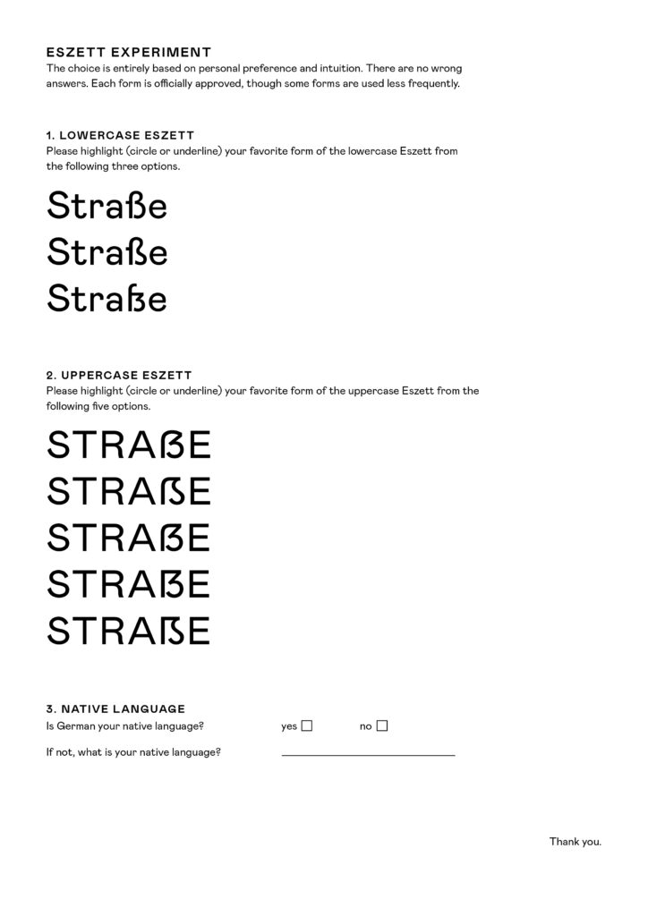
For the voting, I created a sheet where the word „Straße“ is written in both lowercase and uppercase. My participants need to evaluate which Eszett form they personally find the most fitting. The choice is based on personal preference. All Eszett skeletons are recognized, but some are simply less commonly used, making them appear rather unusual.

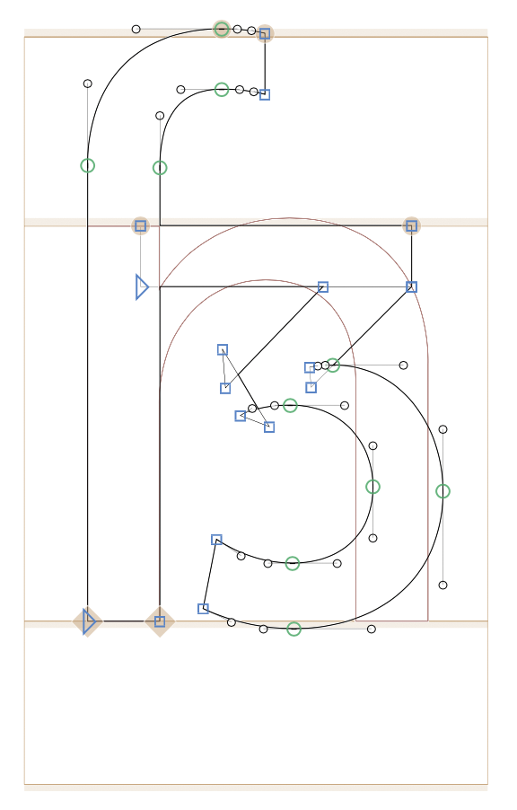
15 | Prep For Experiment: Drawing Different Skeletons The Lowercase Eszett

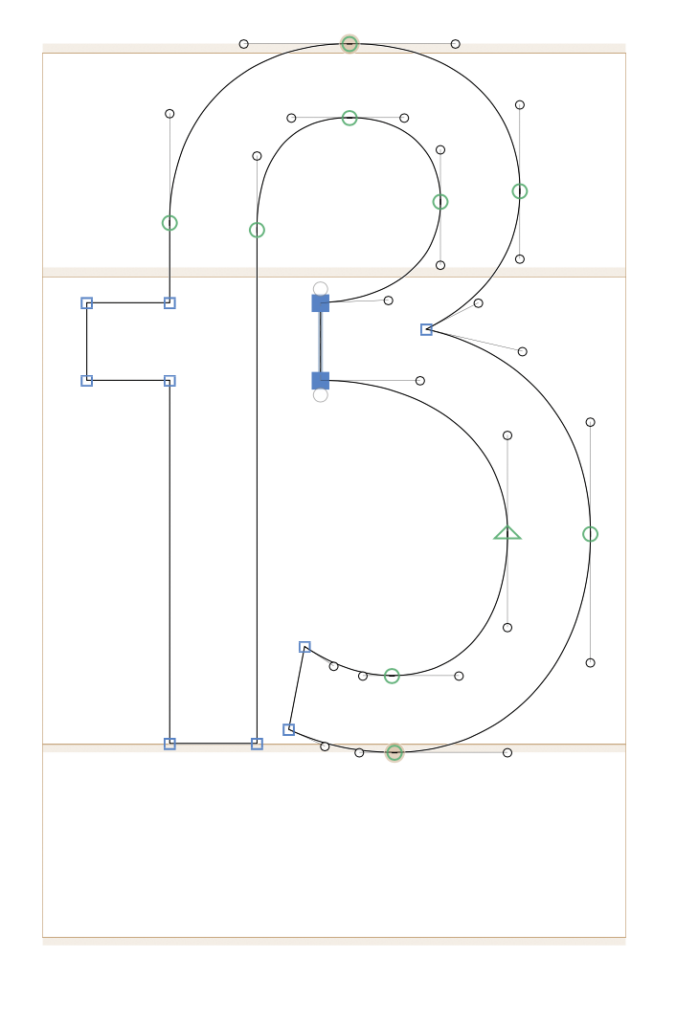
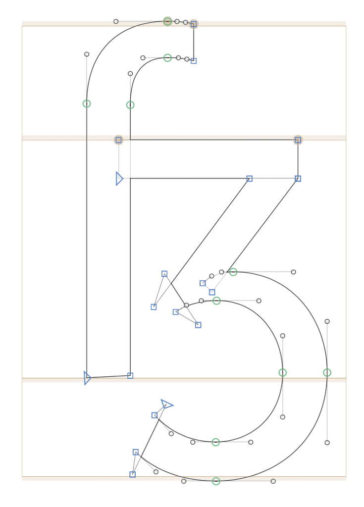
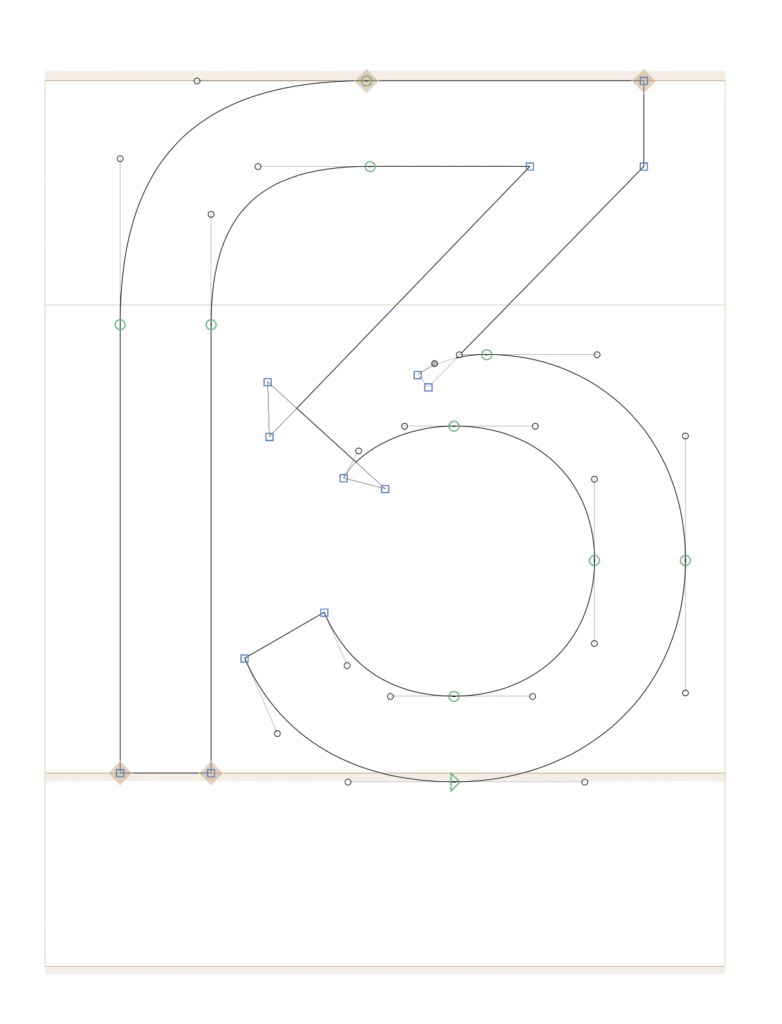
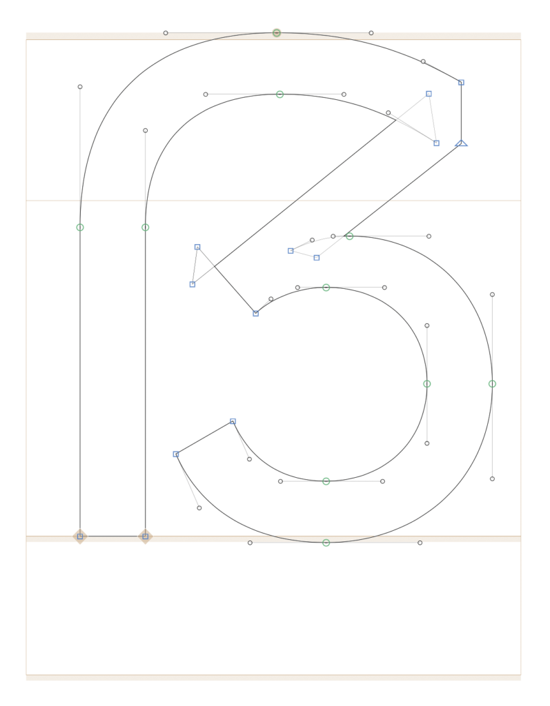
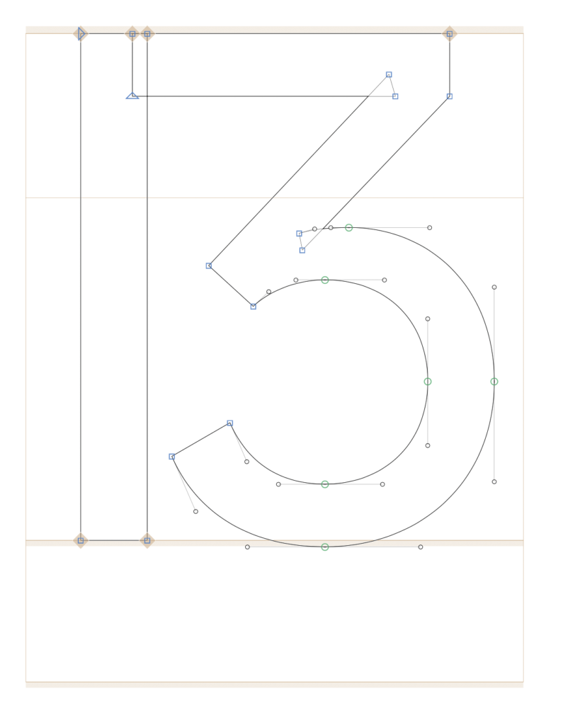
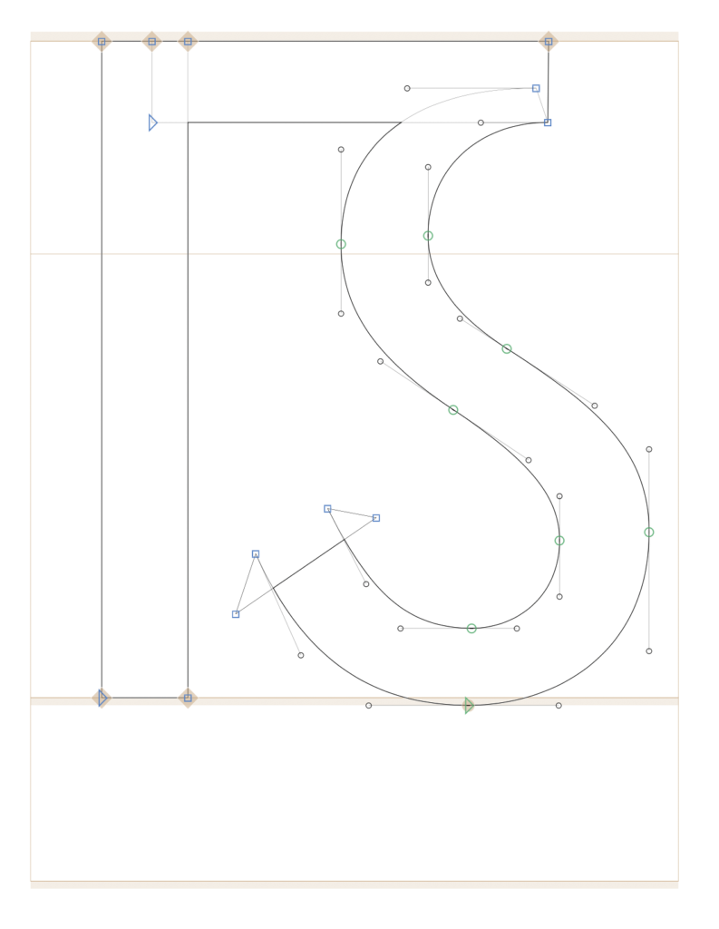
For my experiment, I want to ask participants who are not from the design field about their perception and personal preference regarding Eszett skeletons in both lowercase and uppercase. However, to present street names with the different lowercase Eszett variations, I first had to create them in Glyphs. Adjusted to the proportions of the Mabry typeface, I attempted to design the three Eszett variants. Lowercase letters are generally more challenging to draw as they contain many curves and details. The historical variant was the most difficult skeleton form for me because its proportions are somewhat unusual.

Ligature Design

Sulzbach Design

Historic Blackletter ß

For all three Eszett variants, I used different approaches and combined various letter components.

14 | Prep For Experiment: Drawing Different Skeletons The Uppercase Eszett

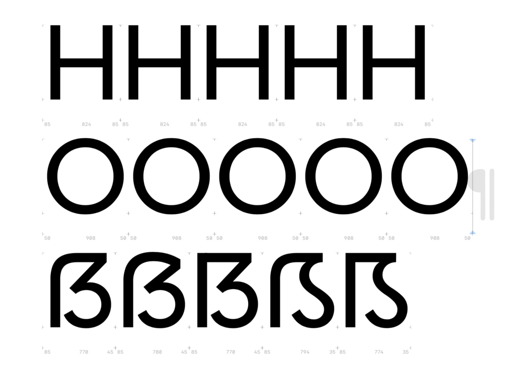
To conduct an experiment on the readability and perception of the sharp S, I need to create the four basic constructions of a typeface. As a starting point, I chose the Mabry typeface from the British type foundry Colophon. I was looking for a classic, dynamic sans-serif typeface with low contrast between thick and thin strokes. For my experiment, I wanted a relatively neutral typeface so that all four basic constructions would suit its design language. Different stylistic periods inherently have different design languages, making some sharp S approaches more or less suitable visually. I wanted to avoid being influenced by a specific design language and instead create neutral sharp S forms. Mabry seemed like the optimal choice as a modern and playful typeface.

First, I adjusted the vertical proportions of the Mabry typeface in Glyphs and then analyzed the stroke contrast of the letters n, o, H, and O to apply these insights to my sharp S variants. After that, I considered several aspects for the design: the width of the letter H, the stroke thickness of the S-curve, and the optical adjustment of the whitespace within the newly designed letter.

Dresden Skeleton (Opt 1: slightly curved)

Dresden Skeleton (Opt 2: completely curved)

Frankfurt Skeleton

Leipzig Skeleton

Berlin Skeleton

Depending on the aesthetics, I adjusted the width of the Eszett variant, making it slightly narrower or wider. For my experiment, I plan to write five street names using the five different Eszett variants. The participants of the experiment will then choose their favorite letter.

Survey

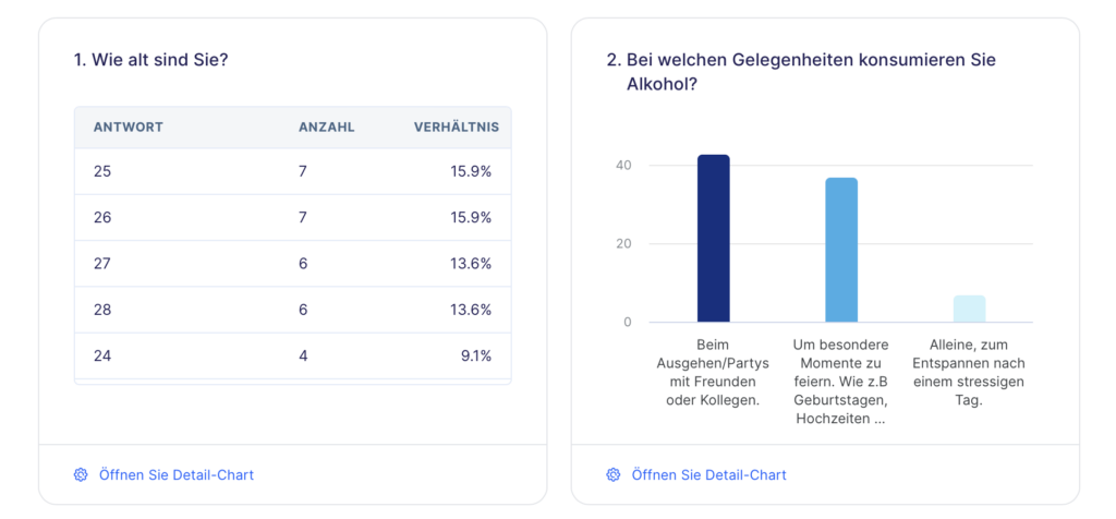
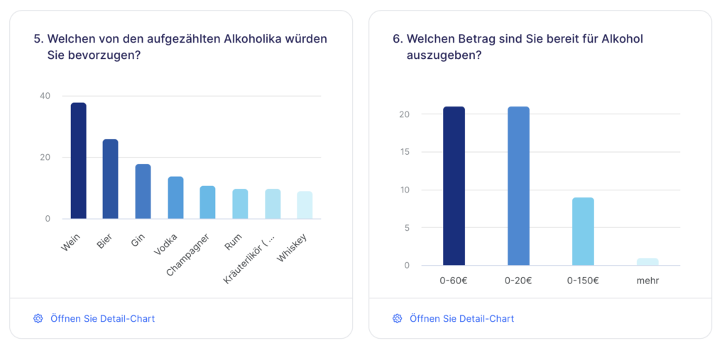
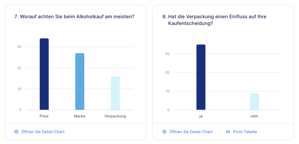
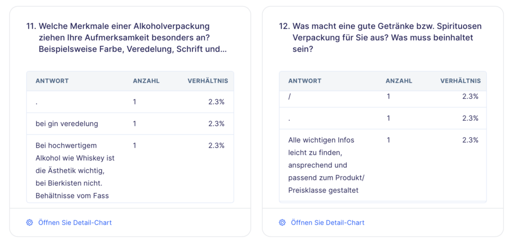
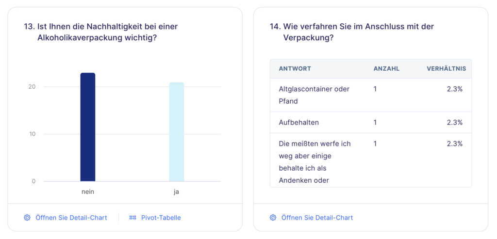
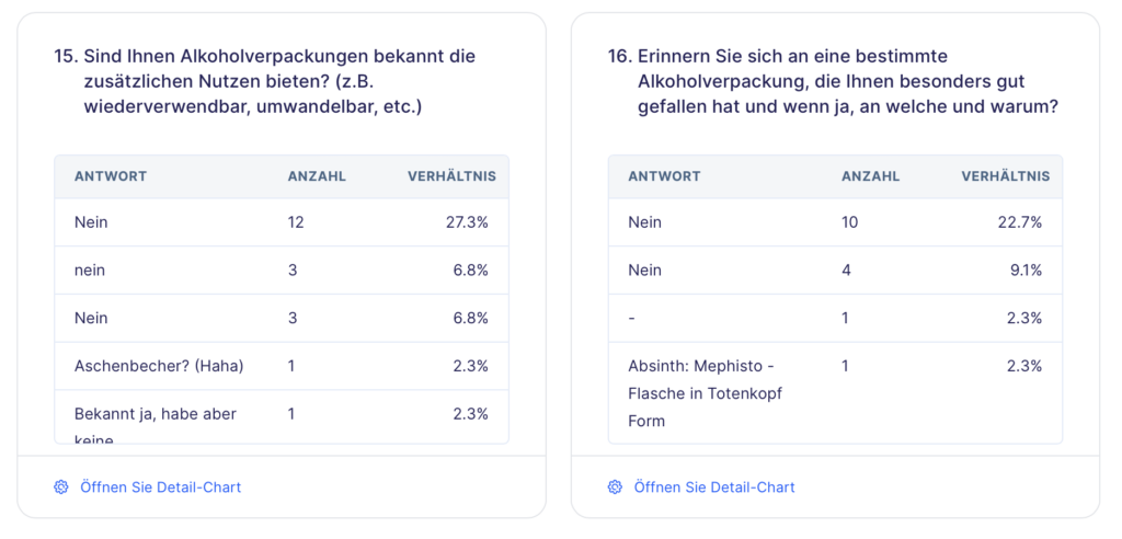
I conducted a survey on alcohol consumption and the impact of packaging design on consumer behavior; please find attached the screenshots. As of May 22, there were 44 participants.

12 – brainstorming ideas for experimentation

For my experiments about the topic of handmade design I firstly want to divide the topic in to two perspectives:

  1. The effects of handcrafted design
  2. The process of handcrafted design

I have concluded that, even though both of these aspects of handmade design are intertwined, this division makes sense. In the end I hope I will get a clearer look on what a designer can get out of this way of designing and what an observer will perceive. Maybe then there could be a way to assess when it makes sense to design in this more time-consuming, less accurate way.

  1. During my brainstorming I had the following ideas for experiments regarding the effects of handmade design:
    • Participants will be asked to evaluate branding for companies or events of different industries. The brandings will all have a similar handmade-look to them, and the key question will be: “When does this style seem authentic and align with the industry in question?” This way I can find out if my theoretic research from last semester can be confirmed in a real scenario. For example, I found out that handmade design has big associations to moral and political causes.
    • Participants (preferably non-designers) will be shown different designs that appear to be handmade. It is their job to evaluate which ones are handmade and which ones were designed with a computer program. With this experiment I want to find out if it is necessary to design something analog in order to get the authentic effects of handmade design, or if a fake handmade-effect is enough.
  2. So far, I came up with one idea for an experiment regarding the process of handcrafted design:
    • I will give designers short little tasks that they should execute once in a digital way and a second time in an analog way. Afterwards I will interview them on their experiments. This way I want to find out if there is a clear tendency which workflow is more enjoyable, which takes longer and with which one they felt more creative.

12/ Planning experiments

1. Examining People’s Interaction with Printed Photos

Objective:
Analyze how people interact with printed photos, focusing on time spent, attention to details, and differences between viewing photos in an album versus holding individual photos.

Methodology:

Preparation:

  • Prepare a photo album and individual photos.
  • Set up an observation space.

Participants:

  • Select participants of different ages.
  • Observe each individually.

Procedure:

Phase 1: Album Interaction

  1. Give the participant the album.
  2. Record time spent, expressions, body language, and comments.

Phase 2: Individual Photos

  1. Give the participant individual photos.
  2. Record time spent, attention to details, and reactions.

Expected Results:

  • More time and focus on individual photos.
  • Stronger emotional reactions to individual photos.

2. Home Experiments with Photographs

1. Sewing Photographs:

  • Materials: Printed photos, needle, thread.
  • Procedure:
    1. Choose a photo and decide where to sew (edges, specific details).
    2. Use a needle and thread to stitch along your chosen pattern.
  • Observation: Note how the thread affects the photo’s appearance and durability.

2. Puncturing Small Holes:

  • Materials: Printed photos, a pin or small needle.
  • Procedure:
    1. Select a photo and plan a design or pattern for the holes.
    2. Carefully puncture small holes in the photo.
  • Observation: Observe the effect of light passing through the holes and the overall aesthetic change.

3. Stapling Photographs:

  • Materials: Printed photos, stapler, staples.
  • Procedure:
    1. Choose photos to staple together or add staples as part of a design.
    2. Staple the photos and ensure they are securely fastened.
  • Observation: Examine the structural integrity and visual impact of the staples on the photos.

13 // Planning the experiments

As I am devoting myself to experimentation this semester, I have decided to carry out a total of three different experiments in the field of communication design. In the following blog posts, I will explain these experiments in more detail and document them with pictures. After the experiment phase, I will test these experiments with my target group in the form of an online survey. This survey should provide me with information about which approach I would like to pursue in the third semester.

Experiment 1: Book from both sides

My first experiment is a book that can be read from both sides. One side is aimed at people who want to conceive and design a branding from scratch. The other side is for people who want to modernize or update existing branding to meet today’s standards and strengthen brand loyalty with their target audience. In addition to descriptive texts, the book contains visualizations and practical tips that can be applied. Interspersed throughout are interviews with branding experts from the scene. I am also considering focusing on Graz and giving tips based on brandings designed in Graz. In addition, the interviews could be limited to the Graz media landscape in order to highlight regional characteristics and expertise.

The aim of this experiment is to create a comprehensive and practice-oriented handbook that helps both beginners and experienced brand developers to develop effective branding strategies.

Experiment 2: Typographic brand identity

I want to develop several typographic identities for a brand that use different fonts, sizes and styles. To do this, I will create examples of the use of typography in different contexts, such as logos, posters, websites and print media.

The aim is to explore how different typographic styles influence the perception and feel of a brand.

Experiment 3: Brand illustration in context

In my third experiment, I want to find out how illustrations look on products in the supermarket compared to photography. For this I will develop an illustrative concept that highlights the different aspects of the brand identity.

My goal here is to understand how illustrations influence brand perception and loyalty in different contexts.

How to prototype for music festivals at home

I have kind of reached my limits as far as further research into guidance systems at music festivals is concerned. Especially as the festival season hasn’t started yet. In the meantime, I asked Chat Gpt what ideas he/she had for creating a prototype for music festivals at home, and this is the outcome so far:

1. Interactive Festival Map App

Concept: Develop a simple interactive map app for smartphones or tablets that provides detailed festival navigation and information.

Steps:

  • Design the Map: Create a detailed map of a hypothetical festival with key areas such as stages, restrooms, food stalls, and emergency exits.
  • Interactive Elements: Add interactive elements like clickable icons that provide additional information (e.g., schedules, artist info).
  • Feedback Mechanism: Include a feature for users to provide feedback or report issues with navigation.

2. Modular Signage System

Concept: Create a modular physical signage system that can be reconfigured to test different layouts and designs.

Steps:

  • Design Signs: Design a set of signs for different festival areas. Use materials like foam board, cardboard, or printed posters.
  • Modular Setup: Set up a modular system where signs can be easily moved and rearranged. This could be done on a wall or a large board.
  • User Testing: Invite friends or family to navigate a simulated festival environment using the signs and gather their feedback on clarity and effectiveness.

3. Wayfinding with QR Codes

Concept: Use QR codes placed around a simulated festival environment that link to web pages with maps, directions, and information.

Steps:

  • Generate QR Codes: Create QR codes that link to different web pages or documents with relevant festival information.
  • Placement and Design: Design physical markers or signs with QR codes that can be placed in strategic locations.
  • Content Creation: Develop web pages or PDF documents with detailed maps, schedules, and other festival information accessible through the QR codes.

4. Interactive Paper Map and Schedule

Concept: Create an interactive paper-based map and schedule booklet that festival-goers can use for navigation and information.

Steps:

  • Design the Map: Create a detailed paper map of a festival layout with key locations clearly marked.
  • Include Schedules: Add schedules, artist information, and other important details in a booklet format.
  • Interactive Elements: Include features like fold-out maps, highlighted routes, or removable tabs for different areas/events.

5. Voice-Guided Navigation System

Concept: Develop a voice-guided navigation system using pre-recorded audio instructions that guide users through a simulated festival layout.

Steps:

  • Create the Layout: Design a simple layout of a festival on paper or in a small physical model.
  • Record Instructions: Record audio instructions for navigating to different locations (e.g., “Turn left at the main stage,” “The restroom is 50 meters ahead”).
  • Interactive Testing: Use a smartphone or audio device to play the instructions as users navigate the layout.

It helped me a lot for now, and I think I will start with a festival area plan. Which I will test with different people, who have to read the map and then answer some questions about it.

New Semester, same topic / guidance systems at music festivals

After completing my first semester of research on guidance systems at music festivals. I have gathered significant insights into the complexities and importance of effective wayfinding systems at large-scale events. This topic initially attracted me due to the critical role that navigation plays in ensuring a positive experience for festival-goers, enhancing safety, and improving overall event management.

Research Outcome After the First Semester
The world of music festivals is experiencing an exciting transformation through innovative technologies and creative thinking. In my initial contribution, I highlighted the significant role of wayfinding systems at music festivals. These invisible guides not only improve visitor orientation but also contribute significantly to the safety, personalization, and eco-friendliness of the event.

Furthermore, I examined the various types of wayfinding systems used at music festivals. Static systems, such as signs and ground markings, form the basic framework, while dynamic systems utilize modern technologies like digital displays, festival apps, and mobile guidance elements. The combination of these systems creates an optimal navigation structure for festival attendees.

In my third contribution, I discussed the concept of „eventization,“ which describes the art of transforming ordinary events into engaging and memorable experiences. This trend not only shapes society in general but also influences the planning of music festivals. Organizers are increasingly focusing on creating comprehensive experiences that go beyond music and engage multiple senses.

The planning of a music festival itself is also highly relevant, emphasizing foundational aspects such as genre selection, weather considerations, and defining the target audience and theme. The actual organization requires careful considerations of location, program design, safety, involvement of service providers, and promotion.

Lastly, I explored trends and developments in festivals. One notable article that caught my attention discussed the partnership between Tomorrowland and Caliverse. This collaboration integrates augmented reality (AR) and virtual reality (VR) into festival experiences to create a dynamic, interactive environment. The Metaverse festival aims for global connectivity, sustainability, revolutionary live performances, and personalized experiences, potentially heralding a new era in the world of music festivals.

Overall, these contributions show that music festivals are evolving into comprehensive experiences that integrate technology, creativity, and the needs of visitors. The future of music festivals promises a fusion of entertainment, innovation, and global connectivity.

For the next blog post I will write about potential prototypes and experiments regarding this topic and how I will proceed.