Okay, I’ve decided that I’m done with my prototype. I’ve added the ‚Add Sibling‘ section, a questionnaire for that page, and how the Dashboard would look when you save those changes. I also created the possible ‚Add Grandparents‘ sections. Now, I’ll give it to some friends and colleagues to get their feedback. The next entry will most likely be about their feedback.
I am also looking forward to your feedback and I hope you don’t mind me having a more open approach with these blogs.
I’m done with the ‚My Profile‘ section. I think? I’ll probably need to add some more questions and options in the dropdown menus, but that is a problem for another day—tomorrow. For now, I’m done with this and with this night!
Good night! (or good morning, I don’t know when will you be reading this)
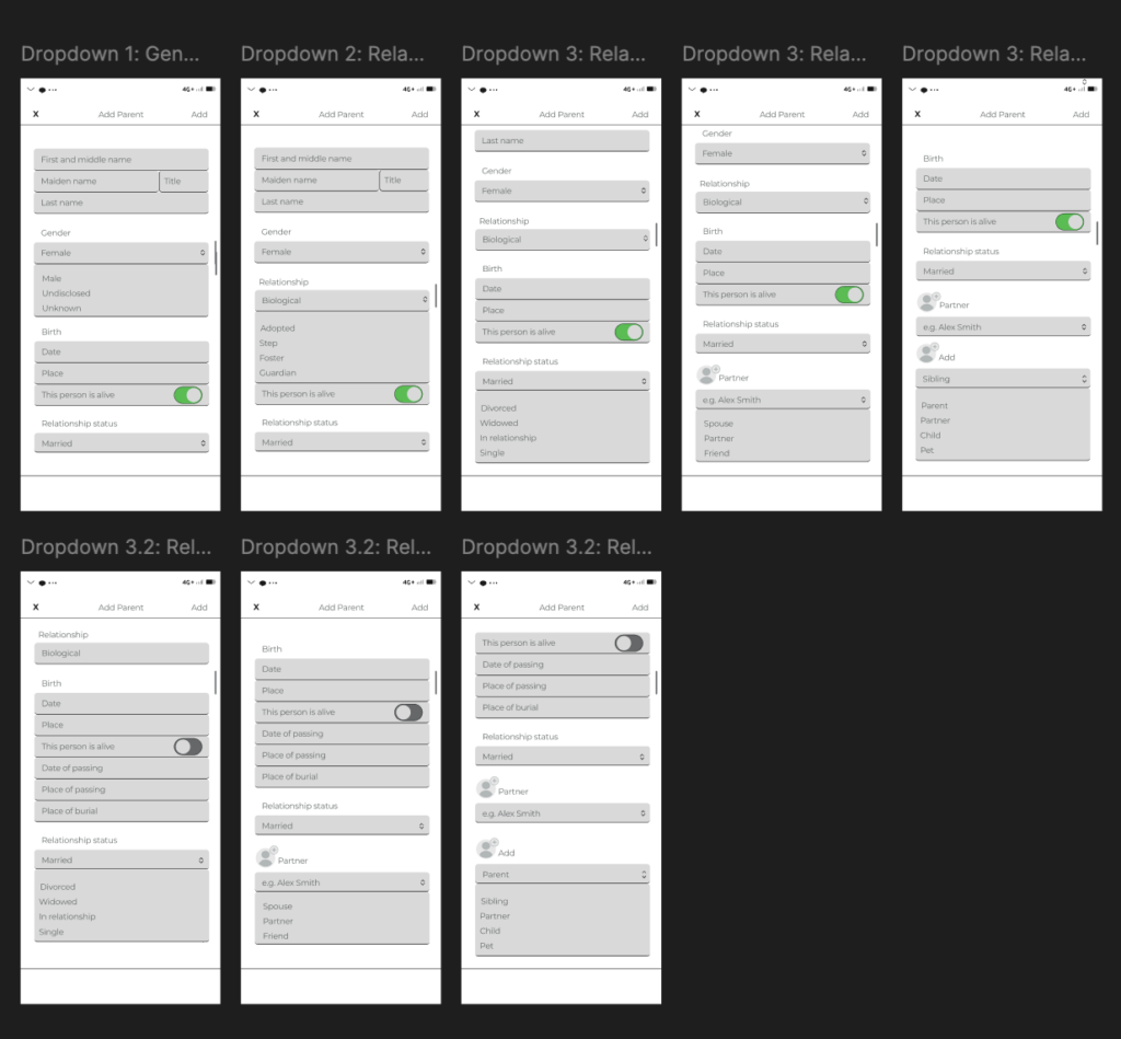
I did the best I could for the dropdown menus for now. You can see the options that the dropdown menus have, but you can’t choose any of the given options yet—I still need to figure out how to do that on my own, of course, because I still refuse to watch any tutorials. Don’t ask me why; I obviously don’t like myself, haha. 🥲
I don’t think I’m finished with this part and the options within the dropdown menus because I think there will be more follow-up questions depending on what option you choose within the dropdown menu—if that makes sense? I hope it does. Before I went too far down the rabbit hole, I remembered that this is supposed to be my *first prototype*, so honestly, what I have from the options is just enough for now. At least for me.
Next, I’ll work on the ‚My Profile‘ section, and maybe ‚Add a Sibling‘ and ‚Add a Grandparent.‘ We’ll see where the night takes us!
I did a few more pages, and maybe like 17 more pages for the drop-down menus. You know how I said that I’m figuring out Figma on my own? Well, let’s just say that Figma really isn’t my friend. After doing all that, I decided I didn’t like any of it, so I deleted it all, lol. When I say that Figma is not being my friend, I mean it—Figma 👏 is 👏 not 👏 my 👏 friend!
Anyways, enough with the negativity. I took a new approach and made a page with a questionnaire to fill out when adding a parent. That type of questionnaire will be present for all family members that you would like to add. Of course, they won’t all be the same, though some questions might be repeated. In addition to this page, I created another one with some additional questions for when a certain family member is, unfortunately, no longer alive.
I will continue with making drop-down menus for these pages. After I’m done with that, I will add the ‚My Profile‘ section as well as the sections for adding siblings and grandparents.
Design Thinking and the Double Diamond are both popular frameworks in the design world. They help solve problems and create innovative solutions, but they do so in slightly different ways. Let’s explore what each framework is, how they are similar, and how they differ.1
What is Design Thinking?
Design Thinking is a human-centered approach to problem-solving and innovation. It includes five phases:
Empathize: Understand the user’s needs through research and observation.
Define: Clearly articulate the problem based on gathered insights.
Ideate: Generate a wide range of ideas and potential solutions.
Prototype: Create simple models of the potential solutions.
Test: Evaluate the prototypes with real users and make improvements based on feedback.
Design Thinking emphasises empathy, creativity, and iterative testing to ensure solutions are user-centered and effective.
What is the Double Diamond?
The Double Diamond framework visualises the design process through two diamonds, each containing two phases:
Discover: Research to understand the problem space broadly.
Define: Narrow down insights to a clear problem statement.
Develop: Generate, prototype, and test multiple solutions.
Deliver: Finalize and implement the best solution.
This framework focuses on divergent (exploring many ideas) and convergent (refining ideas) thinking, ensuring a thorough understanding of the problem and a focused approach to the solution.
Similarities
User-Centered: Both frameworks prioritize understanding the user’s needs and problems.
Iterative Process: Each involves cycles of prototyping and testing to refine solutions.
Phased Approach: They both divide the design process into distinct phases to manage complexity and ensure thorough exploration and refinement of ideas.
Differences
Structure: Design Thinking is typically depicted as a linear process with five steps, while the Double Diamond is shown as two diamonds with four phases, emphasising the divergence and convergence of ideas.
Terminology and Emphasis: Design Thinking focuses on empathy and ideation early on, with specific phases for prototyping and testing. The Double Diamond, on the other hand, splits the process into two main areas—problem space and solution space—each with divergent and convergent phases.
Flexibility vs. Structure: Design Thinking is often seen as more flexible and adaptable to various contexts and problem types. The Double Diamond offers a more structured approach with distinct phases for different types of thinking (divergent and convergent).
Conclusion
Design Thinking and the Double Diamond are powerful tools for solving complex problems and fostering innovation. Design Thinking is ideal for projects that require deep empathy and ideation, while the Double Diamond provides a structured approach to explore and refine solutions thoroughly. Understanding these frameworks and knowing when to use each can significantly enhance the design process, ensuring more effective and user-centered outcomes. For my project, a further consideration and approach would be whether it might be possible to combine both concepts and whether they should be included together to create a flexible and convincing planning tool.
I’m excited to share with you a video demonstration of my adaptation of the classic board game “Mensch ärgere dich nicht.” In this version, I’ve added a unique twist focused on sustainability and environmental education. Below is a video that walks you through the game. Please note that the audio and video quality might not be the best since I didn’t have professional equipment. Also, the video is in German, as the players were German speakers, and this made the most sense for the context. A detailed description of how the game is played can be found in blog post 17.
In the video, you can see how the game incorporates special event fields and sustainability-themed event cards. Children learn more about environmental consciousness and sustainable decisions through various events and questions. The collection of environmental points helps reinforce the idea that sustainable actions are rewarded and crucial for overall victory.
Potential Improvements and Changes
Based on the feedback from my recent user testing, here are some potential additions and changes I might incorporate in the future to improve the game:
Create additional questions with multiple-choice answers (e.g., a, b, c) for questions like „Why is recycling important?“ or „Why is it better to buy local food?“
Incorporate more penalties to add variety, such as skipping a turn in the next round or having to go backwards.
Allow players to use excess environmental points in creative ways.
Integrate energy-saving fields more thoroughly into the gameplay or consider removing or changing them to something else for simplicity.
Separate questions and good/bad news cards, assigning them to different event fields to ensure both types are used effectively.
Creating this game has been a great journey so far, and the feedback from user testing has been very valuable. It’s clear that while the game is already fun and educational, there is room for improvement to make it even more engaging and meaningful. I hope you enjoy watching the video and that it gives you a good sense of how the game works. Remember, I don’t use gender-specific language in the video, but of course all players are included.
At the beginning, I found it difficult to choose a topic and come up with a suitable idea. Eventually, I decided to focus on a new issue in my immediate environment. This led to the idea of a singing aid for choir rehearsals. My final prototype combines the visual preparation of existing technology in a new application area. I enjoyed experimenting and seeing how I could convey my idea without extensive technical know-how while also making it interactively adjustable. Now, I am looking forward to seeing if I receive feedback from my choirmaster and can continue to work on it, or how things will progress in general.
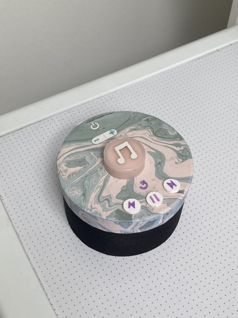
After spending some weeks developing a technical prototype, I started building a visual one as well. The visual prototype represents the size and appearance of my concept, but serves no functionality. It is made of paper, cardboard, plastic, tape and fabric.
I started drawing some sketches of the intended design. In the blog post Concept Definition and Aim from May, I stated what buttons I find important to include. I worked further with these and concluded to implement seven buttons:
Power on/off
Sound up/down
Play melody/record
Replay melody
Return to previous melody
Pause melody
Skip to next melody
I want the design to be clean and understandable, without any unnecessary buttons. But after my user tests, I also understood that buttons such as replay and skip were crucial in order to serve good user experiences.
The lower part of the product is the speaker, and the upper part involve the buttons. The biggest button in the middle is the one that will be used the most. When it is pressed, the random generated melody plays. This is also the button that must be pressed in order to record the sound of the user input. In the next version of my prototype, I will also include a LED ring around that gives instant feedback on the input.
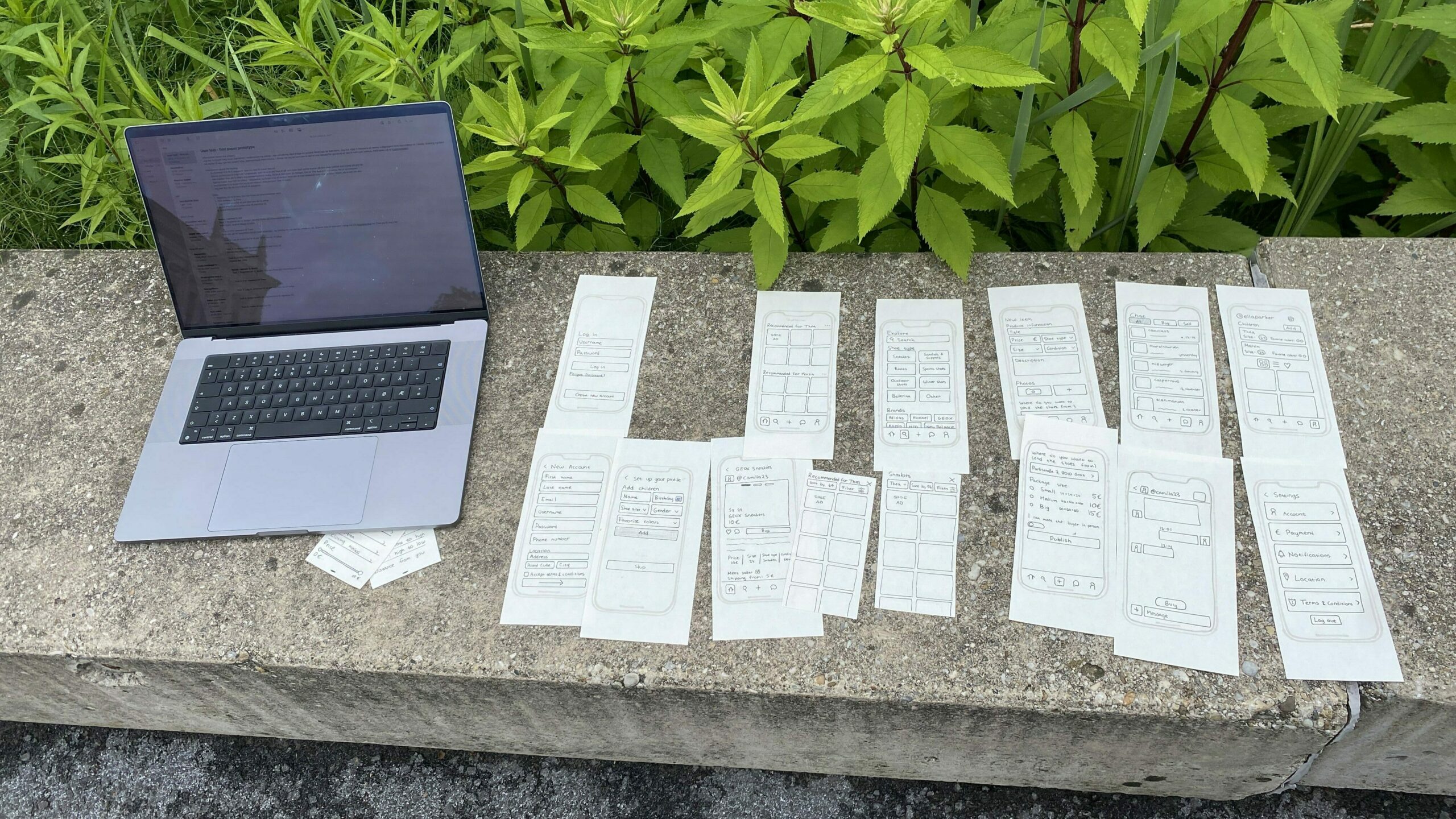
I conducted two user tests with the paper prototypes so that I could get feedback and recommendations before creating a prototype in Figma. The testers first got some brief information about the project before I presented how the test was going to be conducted. The test consisted of five tasks where different features were involved so that I could understand how the different elements are perceived from others.
Here are the three main questions I aimed to answer with this test:
Is the content understandable and intuitive?
How is the interaction of specific elements perceived?
When there are multiple ways to solve a task, which one is preferred?
My setup during the user testing
The two people testing the prototype are females in their twenties. Both of them are tech-savvy and have used second-hand apps before.
The five tasks:
Register a new user (you can make up the information yourself).
Find sneakers for Thea.
Create an ad for a pair of shoes you want to sell.
Change Martin’s shoe size to size 25.
Change your location.
User test 1
Task 1: Went quickly, understood how to add a child.
Task 2: Went straight to a specific ad on the home screen, which happened to be a sneakers ad. Didn’t realize you could click on „recommended for Thea“ to see more options.
Task 3: Went well.
Task 4: Did it via the home screen.
Task 5: Profile page -> then settings.
User test 2
Task 1: Went quickly. Understood ad child. No problems
Task 2: Went to explore, and then sneakers, and saw that it was already set to Thea.
Task 3: Created the ad without problems. Fast
Task 4: Went to profile page and clicked on his shoe size
Task 5: Went to profile page and then settings and clicked on location
Main findings
It is not clear that it is possible to click on the “recommended for Thea” to find a more detailed display. Need to make that section look clickable
Changing the shoe size of a child can be done two ways and both paths were used by the test subjects.
Most tasks were conducted without any problems.
It was slightly challenging to conduct the tests alone. There is a lot to organize when doing tests with paper prototypes and the organizing can sometimes take the focus away from observing the tests. I also wanted to take notes along the way, but it was too challenging to do both that, observe and organize the paper prototypes. Next time I would want to get help from others to take notes and observe.
After the last blog post I had a meeting with Birgit Bachler where we talked about the topic. I presented some of my ideas and got useful feedback. Based on the feedback received and my assessment of the potential and feasibility of each idea, I decided on the concept I wanted to further develop.
THE FINAL IDEA
The final concept I landed on is creating a second-hand app for children’s shoes. There are multiple second-hand apps on the market, but there are none dedicated for children’s shoes. I focus on this user group because children continuously grow, and so their shoe size is constantly changing and there is a rapid change of shoes. There are for that reason a big potential for second-hand children’s shoes. This approach is not only more sustainable, but also cheaper. After discussing the idea with Bachler, we concluded that second-hand children’s shoes might be more acceptable than adult shoes, given the different hygiene concerns associated with used footwear. Another advantage of a second-hand app dedicated to shoes is that it might be easier to find the exact type of shoe that you are looking for, being able to filter on different shoe types.
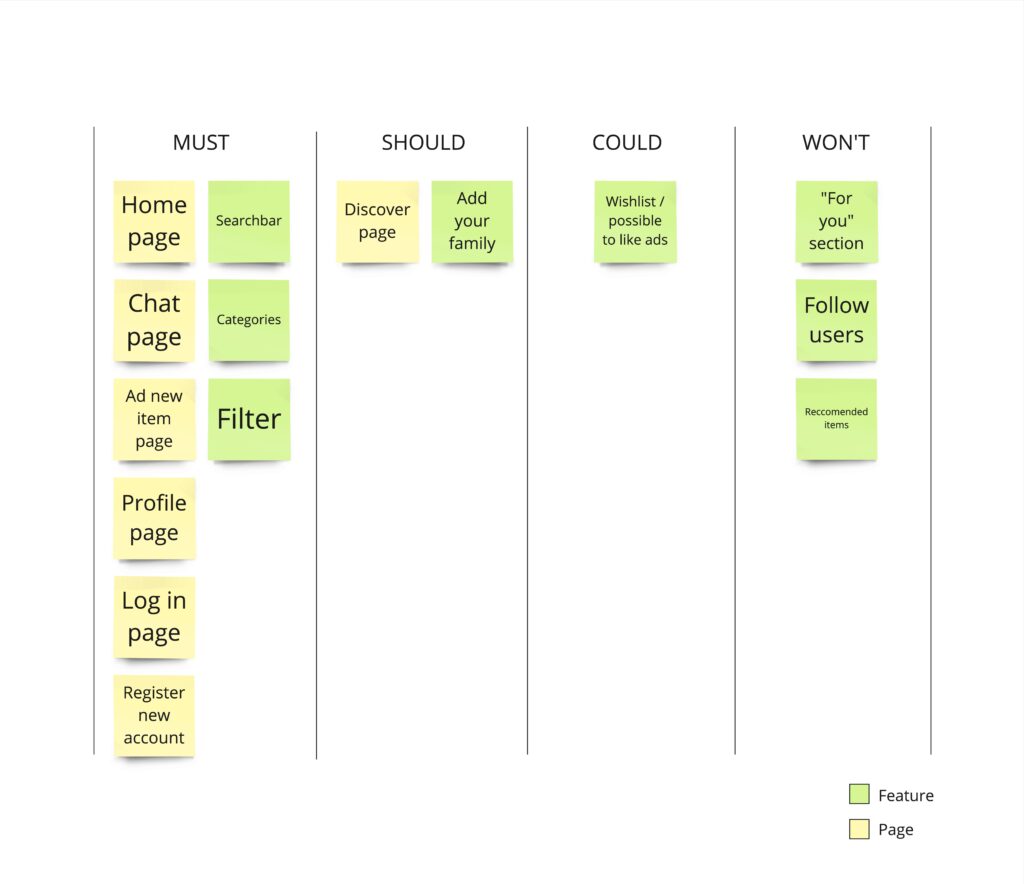
After deciding on the concept, I started thinking about what features this app should contain and I searched for inspiration from other second-hans apps. I created a MoSCoW list to arrange the different features in order to help me decide on what was the most important ones and what I did not need.
PAPER PROTOTYPE
After getting a more defined vision of what the app should contain I started to create paper prototypes. First I quickly sketched the different pages of the app and then I made some more detailed screens. The app is in many ways pretty similar to other second-hand apps, but there are some features that stand out, for example the option to add children to your profile so that you can easily find shoes that matches their size and preferences.
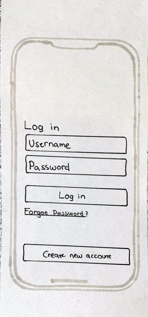
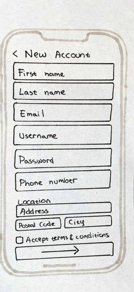
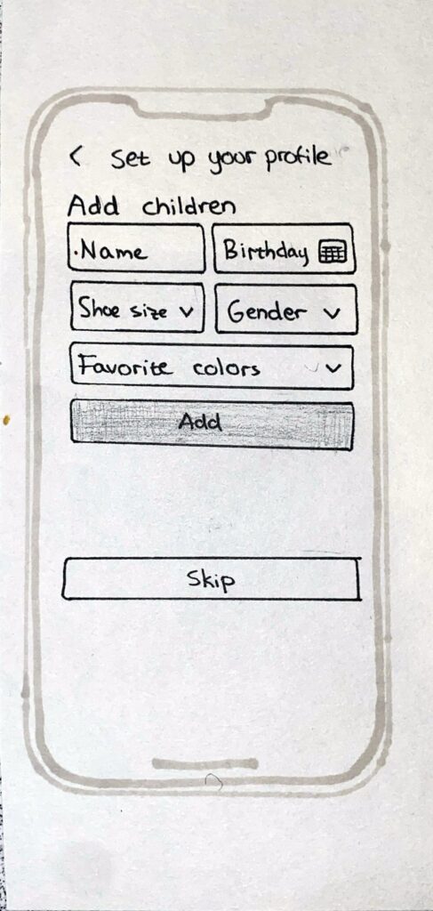
Log in & Create new account
The log in page and the create new account page are pretty straight forward. When creating a new account, the information that are necessary for the app is asked from the user. The user can also add children when setting up their profile so that they can more easily find shoes for them.
Log in pageCreate new accountSet up profile
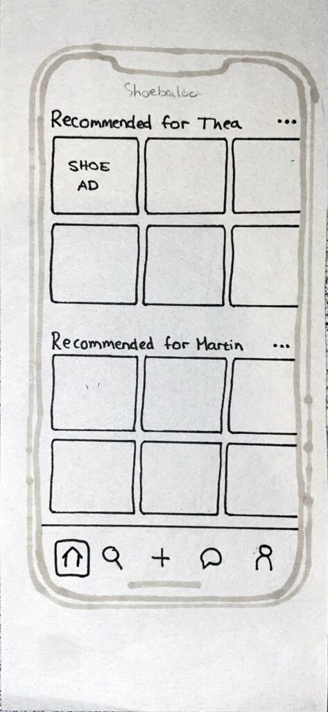
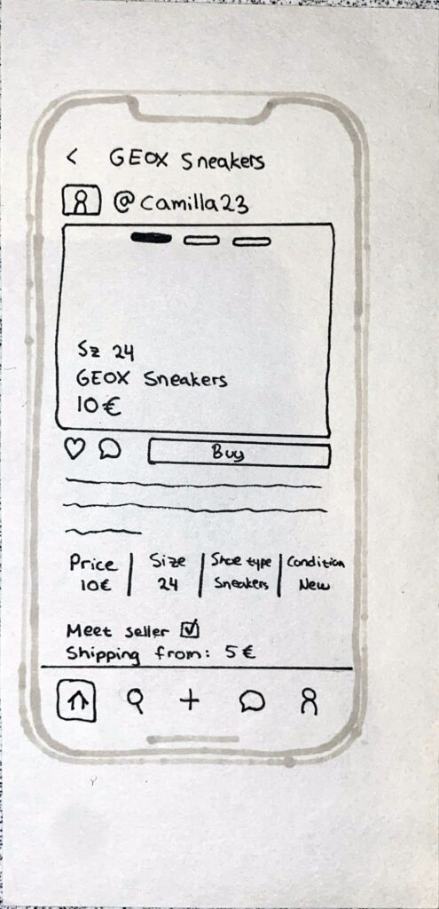
Home page & Ad page
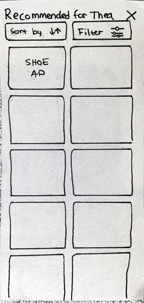
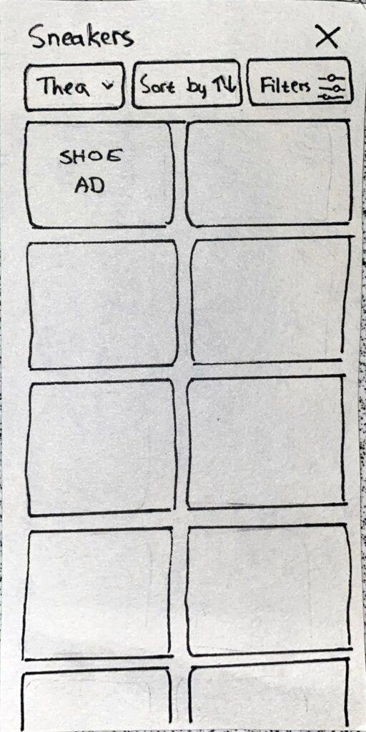
In the home page, shoes recommended for the registered children are displayed. If there are no registered children, the shoes that are displayed will either be shoes recommended based on the previous purchases or shoes that are popular in the app. It is also possible to click on recommended sections for each child in order to get a more detailed view with possibilities to sort and filter (middle picture). When an ad is clicked on, a page with more details about the shoes will be displayed (right picture).
Home pageMore detailed view of reccomended shoes for a spesific childAd page
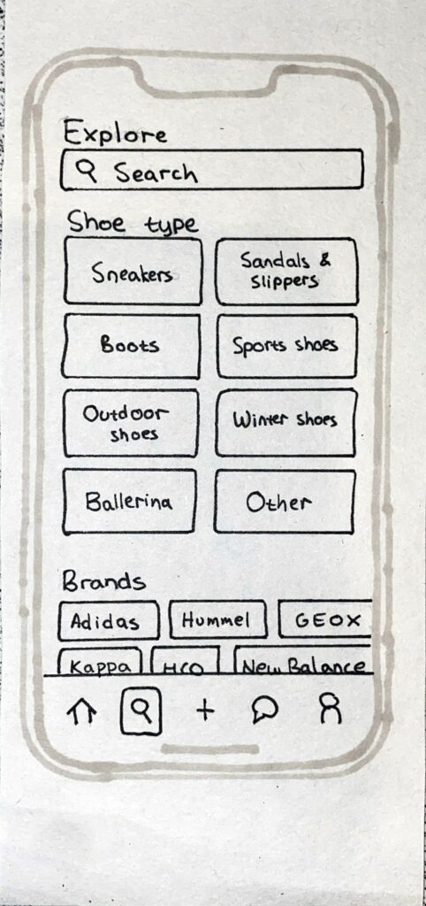
Explore
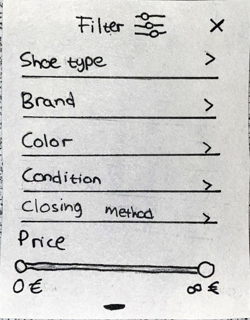
In the explore page, it is possible to search for specific tags, browse shoes based on shoe type and based on shoe brand. When browsing shoes in this section there is an additional filter option where the user can choose which child they are looking for shoes for (second picture from the left).
Explore pageBrowse shoes based on shoe typeSorting possibilitiesFilter possibilities
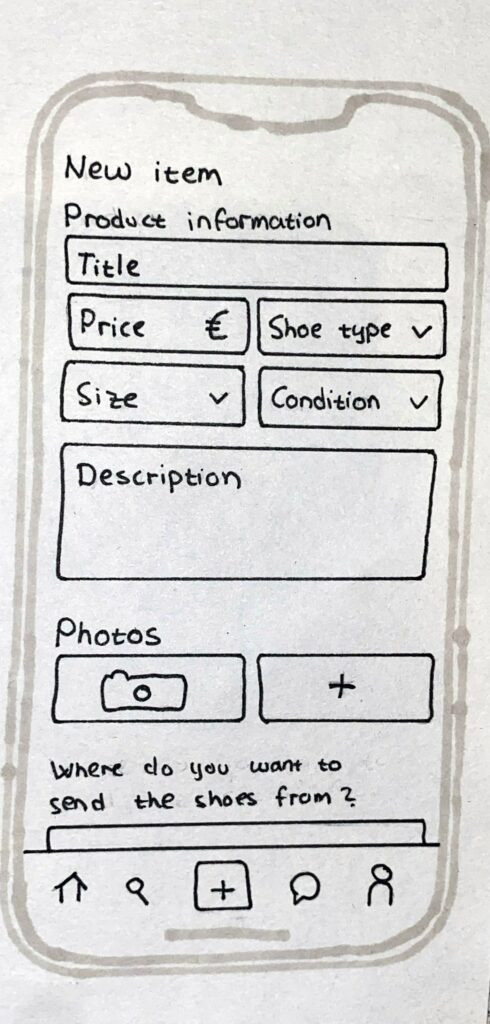
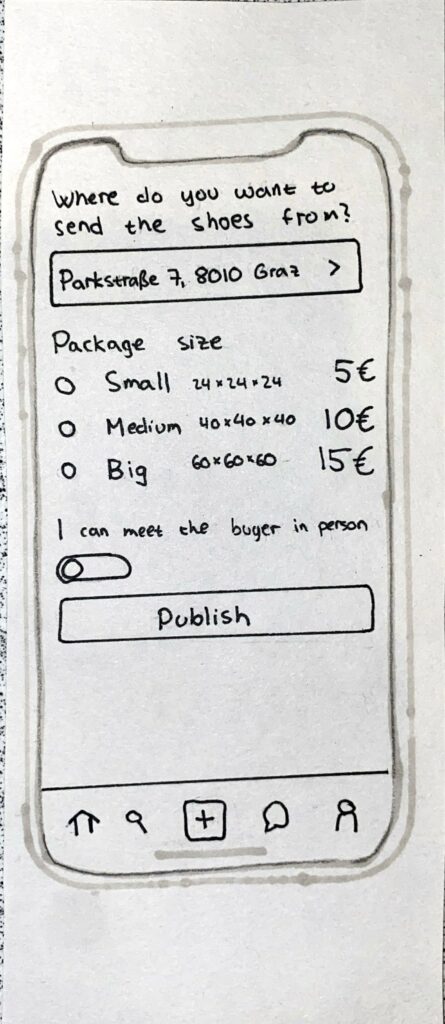
New item
When adding a new shoe for sale, the user must fill out general information about the shoe and add pictures. The user must also decide where to send the shoes from, what package size that is correct and if they are open to meeting the buyer in person or not.
New item 1New item 2
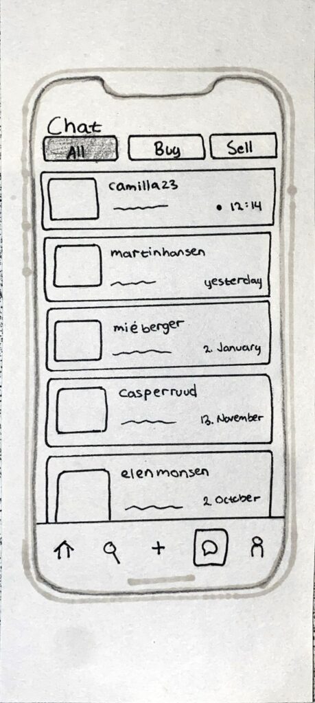
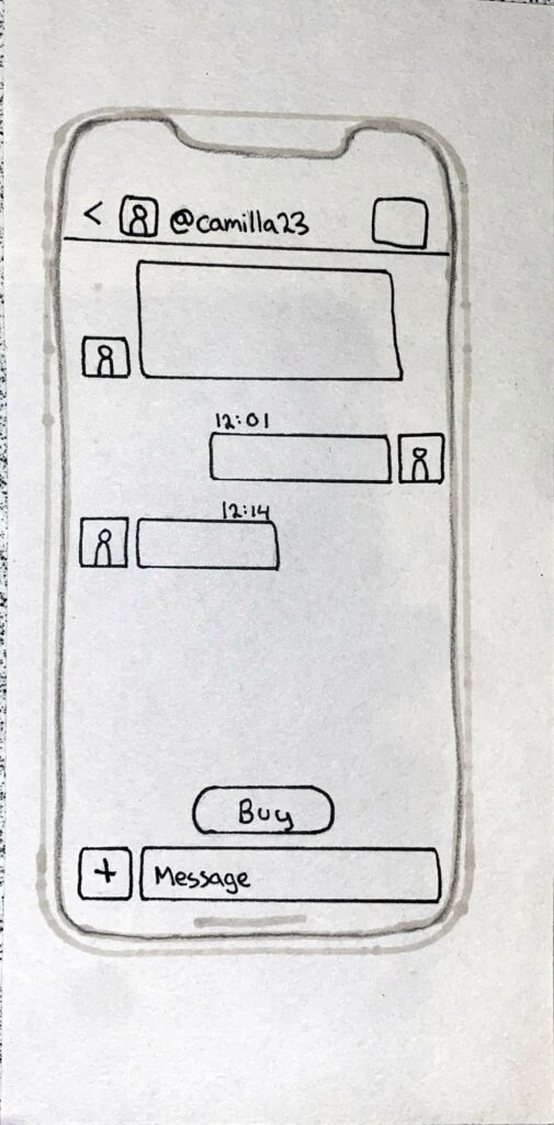
Chat
In the chat page, there is an overview of all the different chats and the user can filter the chats based on if you are buying or selling an item or both.
Chat pageSpecific chat
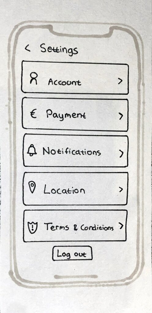
Profile page & Settings
In the profile page there is an overview of the users profile, the children they have added and the shoe ads they have added, but also the shoe ads they have liked. It is possible to change the information about the children by clicking on the frame. The settings page can be reached from the profile page (icon in the upper right corner). In the settings page the user can manage their account and log out.