09 Arts & Crafts

As a reaction to the negative impact of the industrialization, the arts & crafts movement emerged in Britain in the late 19th century. It changed the general importance society placed on the production of goods and reformed design and manufacturing process of everything, including architecture and jewelry. It also gave the decorative arts a higher status. The movement gained momentum and reached its peak around the turn to the 20th century.

There was an awareness the negative impacts of mass-production for at least two decades before changes emerged in the 1860s. There needed to be a reprioritization of values in order to create products with integrity, that didn’t dehumanize workers during manufacturing. The Arts & crafts movement wanted to do this by orientation on a set of ideals.

The movement set out to popularize decorative art. “The Arts and Crafts Exhibition Society mounted its first annual exhibition in 1888, showing examples of work it hoped would help raise both the social and intellectual status of crafts including ceramics, textiles, metalwork and furniture.” One of the defining artists of this movement was William Morris, who became a commercially celebrated designer whose style influenced many artists. His vision was to create beautiful, well-made objects for every day. For this he was inspired by medieval ways of production, that focused on manufacturing on a small-scale. He didn’t oppose the use of machines but disapproved the efficiency-focused splitting of tasks during production. He wanted the working class to enjoy their jobs by being able to creatively construct a product from beginning to end, instead of having to do the same small repetitive tasks day after day. The leading art critic of the time, John Ruskin also argued that isolating the creative process from the manufacturing had social and aesthetic disadvantages. This goes as far as designers creating a total interior. Because many of the arts & crafts leaders trained as architects the common idea emerged, that every object on a room should blend in a harmonious way. Therefore, the designers would work on a huge variety of different design disciplines. Another ideal the movement was striving towards was a rural lifestyle. That’s why many designers moved to the countryside and established new forms of living there. They revived traditions of craftsmanship and improved the economy by giving jobs to locals. When hiring they encouraged even untrained workers to join.
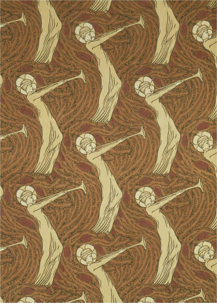
https://www.vam.ac.uk/articles/arts-and-crafts-an-introduction

This movement is a good example of how the handmade style can holistically and authentically work. I think that the arts and crafts movement had a big impact on giving the crafts and hand-made aesthetic an ethical and political connotation, similarly as craftivism, which means craftwashing can also be traced back to this movement.
08 craftwashing

Connecting to craftivism, which I wrote about in my last blogpost, is the topic of craftwashing. After crafting became a political movement in the 2000s, a rapid increase of crafts as part of marketing and consumer goods emerged. “Handmade” was branded as an ethical consumption practice. The term craftwashing is used to describe the phenomenon where the handmade/crafted aesthetic is used to perform political and social engagement whilst ignoring environmental and ethical labour issues in the chain of production.

Big marketing campaigns exploit the political connotations of crafts by channeling the power they hold into the market. This gives consumers the opportunity to obtain the moral value of crafted products whilst also enabling them to perform political activism through showing them off. It capitalizes on the customers wish to do good. It’s the myth that buying craft is a form of progressive political action. Like the term greenwashing, craftwashing indicates to the customer that the product isn’t worsening the environment or current economic system. “By marketing affectively charged handmade objects (or their lookalikes) as solutions to pressing environmental, social and economic injustice issues, craft aesthetics are twinned with notions of individual political agency and morality, while leaving existing power systems largely unquestioned and intact.”

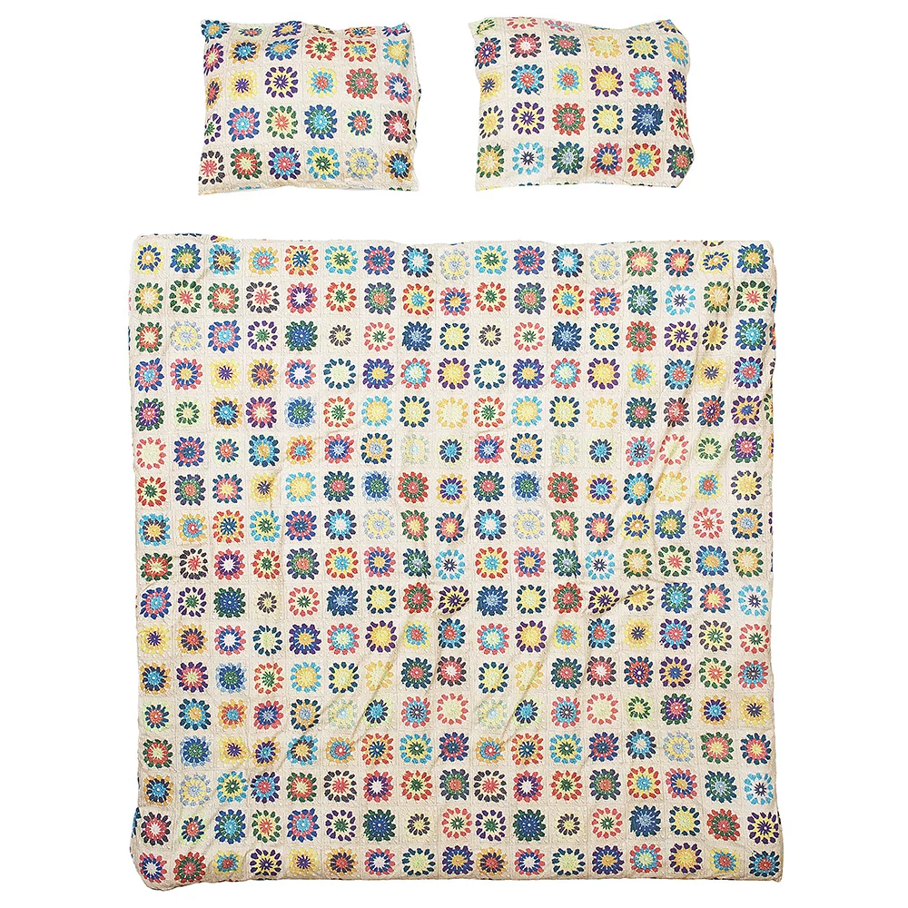
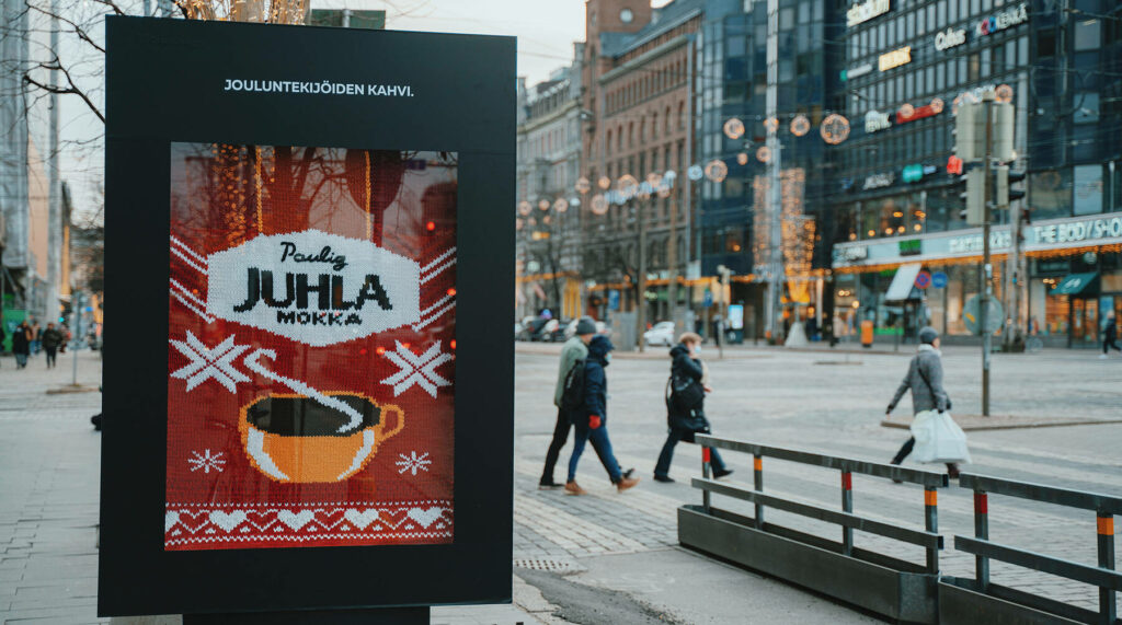
One example of craftwashing is a duvet cover by the brand snurks. They promoted this with the following description: “take one crochet pattern from grandmother’s time, one pile of colorful yarn and a bunch of lovely ladies from the local craft club. Stir in some cookies, tea, and bottles of prosecco and before you know it, you’ve all crocheted the most cheerful looking bedspread.” The product they were selling is a common duvet cover with a high-resolution print of a crocheted blanket printed on it. Similarly to this, knitted textures are featured in advertisements for all different kinds of products like milk, coffee, or smoothies.

https://www.petersofkensington.com.au/home-decor/bedroom/quilt-covers/snurk-granny-quilt-cover-set-queen-size/?s=958682

https://www.adsoftheworld.com/campaigns/the-knitted-coffee-of-christmas-doers

The global companies that use these advertisements are not necessarily aligning their practices with the ethical associations of the craft aesthetic. This can be seen as an exploitation of the once charitable connotations of crafts, whilst encouraging consumerism at the same time. As to indicate buying a product is a solution to economic and social inequalities.

source: https://books.google.at/books?hl=de&lr=&id=XZEFEAAAQBAJ&oi=fnd&pg=PP1&dq=handmade+design+advertising&ots=1i7oF-pop5&sig=fAJHZ39cTCZacJz2u-Att4CtSvM&redir_esc=y#v=onepage&q=handmade%20design%20advertising&f=false

10// Conclusion and next steps

Conclusion
In conclusion, merging digital and paper offers a wide range of possibilities. Each of them has unique qualities and using them together can create something new, which can be more interactive, accessible, can create community and so on.
The next step of this research process is to focus on experimentation. At this stage, the specific direction remains open, and the intention is to explore various possibilities.
 Therefore, I decided with this final post to focus on the first steps I could take in the experimental process.

Exploring Initial Experimentation Ideas

Approach
I believe the chosen approach to experiment should allow for flexibility and adaptation as the experiments progress.  As these ideas take shape, the goal is to remain open to the unexpected, allowing the experimentation process to guide the project’s evolution. Through these initial experiments, a clearer direction may emerge, paving the way for more focused and refined exploration in the subsequent stages of the research.

Experiment with Augmented Reality
As I already researched augmented reality can add motion, videos and audio to paper, by simply scanning it. It would be interesting to initiate a small-scale project using augmented reality tools such as Artivive to explore the potential of augmented reality.

QR Code Exploration
Qr codes are an interesting tool, but often not as engaging as Augmented reality. How could Qr code exploration become more interesting to the viewer? I could conduct experiments with QR codes to uncover innovative ways to make them more engaging and interesting. Moreover, I could consider how QR codes can be utilized beyond conventional applications, perhaps introducing dynamic content or interactive elements.

Tactility and Materials
To enhance the print medium, I believe it would be important to pay attention to the tactile experience by incorporating different materials into the project. A possibility would be the inclusion of interactive elements that engage the sense of touch.

Field of Interest that emerged

Accessibility Enhancement

Another interesting topic would be accessibility. In the experimentational process I could investigate how augmented reality can be leveraged to improve accessibility. This could be done by exploring the integration of additional sensory dimensions, such as audio or video cues, to make content more inclusive for individuals with diverse needs.

Community Building through Print
Another interesting possibility would be developing a project centered around the theme of sharing and community-building, starting from a printed medium. This could be done using QR codes, social media integration, or other digital elements to foster a sense of connection and interaction among readers.

09// Implementing Digital Experiences in Editorial Experiences

Introduction
Implementing digital enhancements in editorial experiences unlocks new possibilities for engagement and interaction. However, connection between editorial and digital poses some challenges. In this post, these difficulties will be explored and possible strategic solutions to integrate digital elements will be presented.

Challenges
Connecting to digital experiences requires actions from the users like scanning a QR code or downloading an app to access augmented reality. However, users should be motivated enough to take action. Many times the instructions are not clear enough, the process is too complicated or the rewards do not seem enough interesting to users.

Possible Solutions

Using Clear Instructions
Clear and concise instructions play an important role in bridging the gap between editorial and digital experiences. Users must be provided with straightforward guidance on how to access digital elements, whether it involves scanning QR codes or downloading specific applications. Employing intuitive language and visual cues ensures a seamless transition from traditional editorial content to the digital realm.

Making Digitally Provided Contents Valuable
To encourage users to actively engage with digital elements, the content presented in the digital realm must offer significant value. Whether through exclusive multimedia content, interactive features, or supplementary information, the digital extension should complement and enrich the editorial experience.

Using Typography, Colors, and Images for Appeal
The visual appeal of digital elements is crucial for capturing user interest. Using typography, colors, and images strategically can enhance the attractiveness of the digital components.
For instance, the partnership of Netflix with cafes for Gilmore Girls pop-ups, shows us how a Qr code can be implemented successfully. The cups featured a Snapcode on cup sleeves for an exclusive Snapchat filter. The Qr code was shaped in a snapchat logo, so the purpose was immediately recognizable and scanning it was attractive to user, as they got something in return for their action.  [1]

Integrating Digital Realm into the Overall Experience
Instead of treating the digital dimension as a separate entity, it should be seamlessly integrated into the overall editorial experience. This ensures that digital elements do not feel like isolated components but rather integral parts of the narrative.

Conducting Research for User Understanding
An important step would be to research about users, understanding user behaviours, needs, and attitudes, to comprehend what to create to better engage the users.[2]
Moreover, iterative testing and optimization of design elements through A/B testing could help identify what resonates most with users, refining the digital experience over time. Lastly, tracking KPIs, including conversion rates, click-through rates, and engagement metrics, can quantifiable insights into the effectiveness of design strategies. [3]

Next Step

  • Define the vison/next steps for the final project

Sources

[1] https://www.adobe.com/express/learn/blog/qr-code-marketing
[2] https://careerfoundry.com/en/blog/ux-design/how-to-conduct-user-experience-research-like-a-professional/
[3] https://www.linkedin.com/advice/0/what-best-kpis-measure-ab-test-skills-marketing-analytics-ck5de

07 craftivism

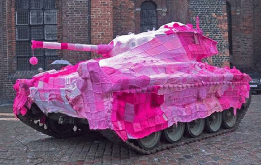
In the late 90s the contemporary craft & craftivism emerged and gained recognition as a political movement. The term craftivism is a blend of the word craft and activism. Cravtivism pieces can be different things like contemporary art pieces, public knit-ins, yarnbombing, ethical fashion, indie craft sales,  or many other things. It is a form of peaceful protest through crafts. “creativity can be a catalyst for change”. One cravtivism project was the Pussyhat project. A group of knitting-activists knittet pink hats to wear during the womans march in Washington after Donald Trump was elected president. The name pussyhats references Trumps comment „you can do anything“ to women – including „grab them by the pussy“. (https://www.bbc.com/news/world-us-canada-38666373)

Nelson Knit-out in the Park

“From 2003-2008, a diverse group of international knit and crochet hobbyists participated in the microRevolt project– the Nike Blanket Petition, a 15-foot wide handmade blanket of the Nike swoosh. Each 4 x 4 inch square creates the Nike logo, acting as a signature for fair labor policies for Nike garment workers. Over the five-year period, „anti-sweatshop“ squares were stitched into the quilt, representing people petitioning from over 30 countries.” (https://post-craft.net/nike_blanket.html)

„craft hard die free“ (https://books.google.at/books?id=XZEFEAAAQBAJ&printsec=frontcover&hl=de#v=onepage&q&f=false)

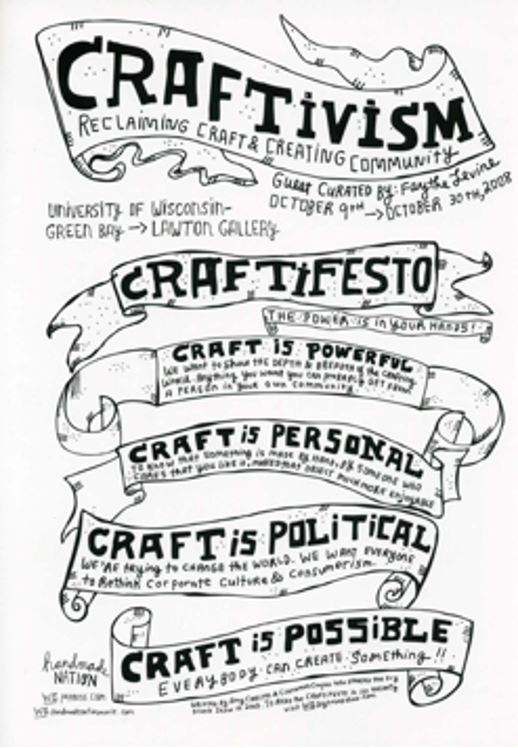
The craftivism movement wants to counter the idea that activism is violent and destructive. In 2003 a craftifesto was created, stating that craft is political. ”We’re trying to change the world. We want everyone to rethink corporate culture and consumerism.” (chrome-extension://efaidnbmnnnibpcajpcglclefindmkaj/http://www.lisasolomon.com/reviews/reviews/craftivism_catalogue.pdf)

Craft was purposefully staged as antagonistic and radical during the 2000s, for example in exhibitions like confrontational clay (2000) and radical lace and subversive knitting (2006). With the increasing visibility of crafts in public spaces, museums and media, the idea of contemporary crafts being a form of political action and democratic participation started spreading in the west. Craft communities positioning themselves with anti-capitalist values also strengthened the associations of self-sufficiency and sustainability with crafts. But it is important to note that craftivism is not necessarily a global movement of many individuals coming together for a common political cause. The values of craft groups range from ultra-conservative to anarchist.

There should be a clear distinction between political and commercial craft projects, but the lines get blurred. For example the north-american indie craft movement became increasingly more commercial. It emerged out of the riot grrl zine scene. The craft scene generally draws from punk and diy-aesthetics. It has grown from local craft groups into massive enterprises like etsy. Marketing turned indie crafts into a mass produced goods.

Now the focus lies more on individualism and self-expression, which turns crafts into a sort of lifestyle-activism. “[It] is used to curate and communicate a politicized sense of individuality through good taste, and craft expresses personal and economic freedom of choice in a broadly disempowering sphere of market capitalism. The marketplace becomes an arena where conscious consumers exercise the power to choose unique objects that reflect their progressive values.” (https://books.google.at/books?id=XZEFEAAAQBAJ&printsec=frontcover&hl=de#v=onepage&q&f=false)

10/ Sustainable printing

Sustainability and environmental concerns stand as pivotal topics influencing strategic business and product development decisions. Environmental sustainability is defined by conditions in which human activities, at both planetary and regional levels, do not disrupt natural cycles beyond the capacity of planetary resilience. Sustainable development encompasses the management of energy and material flows, the integration of clean technology, closed-loop systems, and considerations of quality, economics, and social aspects.

The printing industry significantly contributes to environmental impacts, characterized by energy consumption and environmental pollution resulting from chemical-intensive processes. Recent research has extensively addressed sustainability challenges within the printing sector. Each printing technique employs various chemicals, contingent upon the specific operations involved.

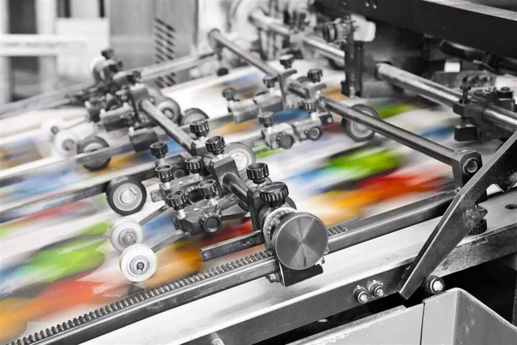
Offset printing, recognized as a chemical-intensive technique, generates diverse types of waste (Euroth & Johansson, 2006).

Key environmental concerns associated with offset printing include the use of non-renewable resources (mineral pigments in paper, mineral oil-based inks and solvents, metal plates, and plastic in equipment), the utilization of toxic or harmful substances (additives in inks and adhesives, biocides in fountain solutions), emissions of volatile organic compounds (VOCs) from various sources (inks mixing, drying, fountain solution, cleaning solutions, and blanket washes), generation of toxic waste (ink and cleaning solvent waste), production of regenerative waste (paper and unacceptable prints), energy consumption (in production equipment, ink drying, and transport), and emissions from transportation (paper supply chain, ink, varnish, delivery of printed matter, and waste transport) (Mirkovic et. al, 2011).

The printing process poses environmental challenges due to its energy and material resource usage. A life cycle assessment revealed that sheet-fed offset printing is the primary contributor to the environmental impact of printed materials, with 52% attributed to printing, 31% to paper, and 17% to ink. This process significantly contributes to acute ecotoxicity. Emissions involve fugitive volatile organic compounds (VOCs), with a consumption of 3 kg/tone product. There is potential to substitute VOC-containing chemicals with alternatives having lower environmental and health impacts. The adoption of UV inks, dried with LED-UV lighting, not only reduces electricity consumption but also contributes to VOC reduction. Paper remains the dominant resource at 48%, with concerns about the impact of forestry on biodiversity, energy consumption in papermaking, and emissions from chemical pulping, deinking, and bleaching. Amid current environmental concerns, attention is turning towards the development of non-wood fibers, like algae, as raw materials for papermaking. Strategies such as alternative fibers, recycling, reforestation programs, and plantation management are being explored to achieve a sustainable fiber supply (Mirković et. al, 2019).

In response to the pressing environmental challenges posed by the printing industry, there is a growing momentum towards adopting sustainable practices and exploring innovative solutions. Companies are increasingly recognizing the need to minimize their ecological footprint and are investing in research and development to enhance the environmental performance of printing processes. This includes the development of eco-friendly inks, the implementation of energy-efficient technologies, and the exploration of alternative materials for printing substrates. Furthermore, industry stakeholders are actively engaging in collaborative efforts to establish industry-wide sustainability standards and certifications. As consumer awareness of environmental issues continues to rise, there is a growing market demand for eco-conscious printing services, prompting businesses to align their practices with principles of sustainability. Through a concerted effort across the printing supply chain, the industry aims to strike a balance between meeting consumer demands and minimizing its impact on the environment.

Sources:

  1. Euroth, M. & Johansson, M. (2006). Environmental data on gravure and offset printing. Acta Graphica, 18(4) 1-10.
  2. Bolanča Mirković, I., Majnarić, I., Mustač, S., & Bolanča, Z. (2011). Printing and environmental sustainability. 38th International Research Conference of IARIGAI – Advances in Printing and Media Technology. Enlund, N., Lovreček, M. (eds.) Darmstadt, 361-368. https://www.bib.irb.hr/ 573521
  3. Bolanča Mirković, I., Medek, G. i Bolanča, Z. (2019). Ecologically Sustainable Printing: Aspects of Printing Materials. Tehnički vjesnik, 26 (3), 662-667. https://doi.org/10.17559/TV-20180620181128

09/ Communicating Photography Content Through Tactile Images

Tactile photographs allow persons to experience photographs beyond pure information, and allows for interactions between persons with visual impairments and sighted persons. However, tactile photographs are always interpretations of photographs, not direct translations, and should just as all tactile images be supplemented with captions. There are several techniques for creating tactile reliefs from photos. One technique for creating an image which is both tactile and visual, and where the original photo remains visible, is to mill the photo’s structures and contours in different layers of transparent plastic material. The plastic is then attached to a printout of the photo, which can be seen through the transparent layers of plastic. Tactile photographs made using the above technique have long lives, are resistant to wear and tear, and are easy to clean. As it is an exclusive technique, you often choose to only interpret a few photos, for example, from a larger exhibition. This means that the selection of photos is very important. The tactile design is uniquely made based on each individual photo, in consultation between the customer and designer. It is important to be clear about the information that is to be highlighted in the image. If possible, the photographer should also be involved in the selection and in the production of captions for the photos.

Furthermore, enabling tactile accessibility for two-dimensional images and photographs involves employing techniques like swell-paper, collage pictures, and tactile photos. Skillful design is crucial in creating tactile images, requiring prior experience with the medium to fully leverage its potential. Clarity about the highlighted information in the image is also paramount. Swell-paper images, a cost-effective and straightforward method, offer tactile representation. Easily produced from a digital original, additional copies can be swiftly printed as needed. Convenient to handle and store, these images typically come in A4 or A3 size, fitting into binders or folders like regular paper. Produced using thermosensible swell-paper in a specialized printer, these images comprise raised lines and raster surfaces, making them easily discernible by touch. In addition to the tactile elements, swell-paper images can incorporate color, although it does not contribute to the raised relief. The versatility of swell-paper images extends beyond aiding individuals with visual impairments, as they can be read both tactually and visually. This technique also serves as an additional information medium for 3D models (Lindbäck, 2020).

Example: Klimt from the 3D printer: „The Kiss“ – tactile relief for visually impaired

On October 12, 2010, the collaborative efforts of the AMBAVis project team and the Belvedere Vienna culminated in an invitation to experience a renowned art piece in an inclusive format. Over the past two years, as part of the EU project, groundbreaking 3D technologies have been developed to enhance the accessibility of museum objects for individuals who are blind or visually impaired. A significant contribution to this endeavor was made by VRVis, which meticulously crafted a tactile relief of Gustav Klimt’s masterpiece, „The Kiss,“ housed at the Belvedere. This iconic artwork is now presented in a groundbreaking, barrier-free version, marking a pivotal moment as it becomes accessible to individuals with visual impairments for the first time. The endeavor reflects a commitment to leveraging technology and innovation to make art and cultural experiences more inclusive and enriching for diverse audiences (Klimt from the 3D printer: „The Kiss“ – tactile relief for visually impaired).

In his exploration of materiality, James Elkins contends that vision is inherently linked with touch, feeling, and the entire range of somatic responses. This perspective aligns with the transformative potential of 3D printing, hailed as heralding a new industrial revolution. Beyond industrial applications, an emerging community utilizes 3D printers for personalized small-scale production at home. Inspired by this focus on the physicality of artwork and our engagement with tactile materials for visually impaired exhibition visitors, we propose the groundwork for a novel multisensory discipline termed „tactile photography.“ This discipline, rooted in stereoscopy and computer-aided conversion of digital images into reliefs, allows for the creation of tangible objects through technologies like 3D printing. While particularly beneficial for visually impaired artists, tactile photography extends beyond the realm of „disability arts“ (Sutherland 2005). We aim to demonstrate how it aligns with a longstanding interest in enhancing photography with depth and physical space, akin to multi-photography, Andrew Davidhazy’s peripheral photography, the Lumière Brothers’ photostereo synthesis, and photo sculpture. Unlike other forms, photo sculpture aims to translate photography into tactile sculptural forms. Originating in 1859 with François Willème, Photosculpture involves capturing simultaneous photographs of a subject from various angles, converting them into a three-dimensional portrait-sculpture. Despite an initial euphoric reception, Photosculpture faced challenges due to its cost and was not widely accepted as an independent art medium. However, recent advancements in body-scanning and 3D printing technologies have led to a resurgence of interest in photo sculpture (Reichinger & Neumuller, 2018).

Sources:

  1. Lindbäck, V. (2020). 8. tactile images. Retrieved from https://www.raa.se/in-english/outreach-and-exhibitions/guide-for-increased-accessibility-through-3d-models/9-tactile-images/)
  2. (N.d.). Retrieved from https://www.vrvis.at/en/news-events/news/klimt-from-the-3d-printer-the-kiss-tactile-relief-for-visually-impaired
  3. Reichinger, A., & Neumuller, M. (2018). Redefining the Photographic Medium. Tactile Photography, 245–251.

Packing Design Basics 2

Layers of Packaging

Understanding the brand’s narrative and its alignment with the product is pivotal in crafting compelling packaging. It allows for a nuanced exploration of the various packaging layers that guide customers from discovering the product to making a purchase.

However, the journey doesn’t end once the product reaches the customer’s hands. Addressing potential issues like product damage during transit underscores the importance of meticulous product preparation and packaging.

Ease of Use

Effective packaging not only captivates attention but also prioritizes user experience. Avoiding cumbersome packaging designs that frustrate customers is crucial. Simplify the opening process and provide clear usage instructions, enhancing user satisfaction and brand perception.

Product Protection

Ensuring the safe arrival of your product is integral to packaging design. Mitigating potential damage requires strategic planning, such as incorporating custom inserts for stability and protection. While cost-effective options like corrugated cardboard inserts offer reliable safeguarding, premium solutions like custom foam inserts offer enhanced protection albeit at a higher cost.

Design

How Color Affects and Reinforces Buying Behavior

Color plays a pivotal role in storytelling through packaging, serving as the initial point of contact with customers. Understanding color psychology empowers brands to evoke desired emotions, influencing purchasing decisions and brand perception.

  • Brand Colors: Leveraging brand-specific colors fosters brand recognition and loyalty, anchoring your product within your brand identity.
  • Dark vs. Light: The choice between dark and light colors sets the tone for brand personality, with dark hues exuding power and light shades evoking tranquility.
  • Bright vs. Pastel: Saturation levels influence mood, with bright colors conveying vibrancy and pastels instilling a sense of calmness.

Setting the Mood with Typography

Typography contributes significantly to brand messaging, shaping the overall brand persona. Selecting appropriate fonts aligns with brand personality, whether aiming for professionalism, casualness, or playfulness.

  • Sans-serif: Modern and clean, sans-serif fonts are ideal for minimalistic packaging designs or when legibility is paramount.
  • Serif: Traditional and reliable, serif fonts lend a sense of establishment and trustworthiness, appealing to certain product categories.
  • Script: Evoke elegance and luxury with script fonts, suitable for high-end products while conveying a touch of sophistication.

How Material Choices Affect Perceived Value

Materials form the foundation of packaging design, impacting perceived product value and brand positioning. Understanding material properties allows for strategic selection aligning with brand identity and product positioning.

  • Kraft: Offering a natural and rustic aesthetic, kraft material appeals to organic brands or those emphasizing simplicity.
  • Matte White: Versatile and sophisticated, matte white material provides a modern canvas for various design elements, balancing aesthetics and budget.
  • Gloss White: Conveying luxury and elegance, gloss white material enhances visual appeal with vivid colors, ideal for premium product lines.

Copy

Clever copywriting complements packaging design, effectively communicating product benefits and brand messaging to consumers. Tailoring copy to evoke specific emotions or address consumer concerns enhances brand resonance and customer engagement.

Illustrations and Imagery

Visual elements like patterns, icons, photography, and illustrations enhance packaging design, enriching storytelling and conveying product features effectively.

  • Patterns: Custom patterns add visual interest, reflecting brand identity beyond mere packaging aesthetics.
  • Icons: Simplify messaging with intuitive icons, offering visual cues for product usage or features.
  • Photography: Showcase product attributes and ideal customer demographics through impactful photography, bridging the gap between product presentation and consumer expectations.
  • Illustrations: Illustrations convey product usage instructions and add whimsical flair to packaging, contributing to a memorable unboxing experience.

Quelle: https://creativemarket.com/blog/the-beginners-guide-to-product-packaging-design

Packaging Design Basics

Glossary of Terms

Dieline: A crucial 2D representation aiding in the design and printing of 3D packaging, ensuring accuracy and alignment.

Spot Colors: Predefined ink colors meticulously selected for printing consistency and cost efficiency, enhancing visual appeal.

CMYK vs. RGB: Understand the distinction between color models for print (CMYK) and digital display (RGB), crucial for achieving desired color outcomes.

Foil: Explore decorative techniques utilizing heat and pressure to transfer intricate images onto packaging, elevating brand aesthetics.

Emboss: Discover the art of adding tactile elements to packaging, such as raised design elements, enhancing tactile engagement.

Caliper/Flute: Delve into the significance of cardboard thickness in packaging design, crucial for product protection and structural integrity.

Primary Packaging: Comprehend the importance of direct packaging containing the product for protection and consumer interaction.

Secondary Packaging: Recognize the role of additional packaging in branding and logistical efficiency, contributing to a cohesive brand experience.

Flexographic Printing: Explore the versatility of printing methods employing plates for simpler color designs, balancing cost and quality.

Lithographic Printing: Uncover the intricacies of printing methods suitable for detailed designs, ensuring premium print quality for packaging.

Digital Printing: Embrace cost-effective printing methods utilizing CMYK ink colors, ideal for dynamic design changes and customization.

Layers of Packaging

Appreciate the multifaceted role of packaging layers in conveying brand stories, ensuring product protection, and enhancing consumer engagement throughout the purchasing journey.

Ease of Use

Prioritize user-friendly packaging to enhance the overall consumer experience, ensuring seamless interaction and usability.

Product Protection

Explore strategies for ensuring product integrity and safety through thoughtful packaging design, mitigating the risk of damage during transit and storage.

Design

Harness the power of color, typography, materials, copy, illustrations, and imagery to create visually captivating packaging designs that resonate with consumers, reinforce brand identity, and communicate brand messaging effectively.

Quelle: https://creativemarket.com/blog/the-beginners-guide-to-product-packaging-design

Leitsysteme für eine gute Experience bei Festival Besuchern

Leitsysteme bei Musikfestivals können die Erfahrung der Gäste verbessern, indem sie die folgenden Aspekte berücksichtigen:

  1. Navigationshilfe: Leitsysteme können die Navigation der Gäste über das Festivalgelände erleichtern, indem sie klare Routen und Informationen über die Verteilung von Veranstaltungen und Dienstleistungen bieten. Dies kann die Wartezeiten für Veranstaltungen und Dienstleistungen reduzieren und die Erfahrung der Gäste verbessern.
  2. Sicherheit: Leitsysteme können die Sicherheit der Gäste gewährleisten, indem sie die Verteilung der Besucher über das Festivalgelände regulieren und Überfüllung und Überbelegung von Bereichen vermeiden. In Notfällen können klare Leitsysteme Menschen schnell und sicher zu Ausgängen führen.
  3. Barrierefreiheit: Leitsysteme können die Barrierefreiheit der Gäste verbessern, indem sie die Zugänglichkeit von Bereichen und Veranstaltungen für Menschen mit Behinderungen gewährleisten. Dies kann die Teilnahme von Menschen mit Behinderungen an Musikfestivals fördern und die Erfahrung der Gäste verbessern.
  4. Kommunikation: Leitsysteme können die Kommunikation zwischen Besuchern, Organisatoren und Sicherheitskräften verbessern, indem sie Informationen über Veranstaltungen, Verkehrsregelungen und Notfallmaßnahmen schnell und effizient verbreiten. Dies kann die Erfahrung der Gäste verbessern, indem sie auf dem neuesten Stand sind und besser informiert sind.
  5. Umweltverantwortung: Leitsysteme können die Umweltverantwortung der Gäste fördern, indem sie die Verwendung von Nachhaltigkeitsmaßnahmen wie recycling-fähigen Materialien und Energieeffizienz fördern. Dies kann die Erfahrung der Gäste verbessern, indem sie sich bewusst sind, dass sie an einer nachhaltigen Veranstaltung teilnehmen.
  6. Technologische Innovationen: Leitsysteme können die Erfahrung der Gäste verbessern, indem sie technologische Innovationen wie Augmented Reality, Geolocation und Smartphone-Apps verwenden, um Besuchern die Navigation und Informationen über das Festivalgelände zu bieten.

Durch die Berücksichtigung dieser Aspekte können Leitsysteme bei Musikfestivals die Erfahrung der Gäste verbessern und die Teilnahme an solchen Veranstaltungen angenehmer und erinnerungswürdiger machen. Als Vorzeige Beispiel wird hier oft das Tomorrowland und Glastonbury verwendet.

Quellen:

Gewusst, wie’s geht: Personenleitsysteme für den modernen Organisator!

https://archiv2023.greeneventshamburg.de/tatenbank/massnahmen-und-exkurse/ https://www.bcsd.de/suchergebnisse/?datei=web_bcsd_brosch_umfrage_2018.pdf