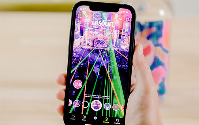
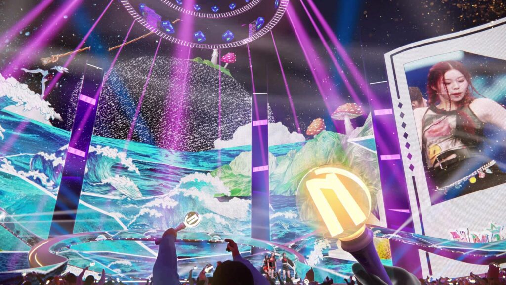
Die Verschmelzung von Augmented Reality (AR) und Musikfestivals kündigt eine Revolution in der Unterhaltungsbranche an. Diese innovative Technologie eröffnet neue kreative Horizonte und verspricht den Besuchern ein einzigartiges Festivalerlebnis. Tomorrowland, das Musikfestival aus Belgien, hat sich mit Caliverse zusammengetan, um die Welt der Festivals zu revolutionieren. Diese Partnerschaft, während der CES 2024 in Las Vegas enthüllt, verspricht angeblich ein neues Kapitel für die Zukunft der virtuellen Unterhaltung. Hier sind die Höhepunkte dieser Zusammenarbeit:
Innovative Technologien: Tomorrowland und Caliverse integrieren modernste Technologien wie Virtual Reality (VR) und Augmented Reality (AR), um eine dynamische und interaktive Umgebung für die Festivalbesucher zu schaffen.
Festivalerlebnisse: Die Partnerschaft zielt darauf ab, mehr als nur eine virtuelle Nachbildung der realen Veranstaltung zu bieten. Die Festivalbesucher werden in eine fesselnde MMO-Umgebung (Massively Multiplayer Online) versetzt, in der Tomorrowlands ikonische Bühnen durch hochmoderne Grafiken zum Leben erweckt werden.
Globale Vernetzung und Inklusivität: Das Metaverse-Festival strebt danach, Menschen aus aller Welt zu verbinden. Teilnehmer können virtuelle Gemeinschaften bilden, Interessensgruppen beitreten und sich mit Gleichgesinnten in einem globalen Netzwerk verbinden.
Nachhaltigkeit: Die Veranstalter setzen sich für Nachhaltigkeit ein, indem sie durch die Durchführung eines Metaverse-Festivals den CO2-Fußabdruck herkömmlicher Veranstaltungen reduzieren und gleichzeitig eine breitere Teilnahme ermöglichen.
Revolutionäre Live-Auftritte: Künstler und DJs werden erwartet, elektrisierende Sets in einer virtuellen Umgebung zu liefern, die die Grenzen digitaler Unterhaltung neu definieren.
Personalisierte Erlebnisse: Dank Caliverse’s Metaverse-Technologie können Teilnehmer ihre Avatare personalisieren, durch virtuelle Umgebungen navigieren und ihre eigene einzigartige Festivalreise gestalten.
Während die genauen Details des Metaverse-Festivals noch ausstehen, versprechen Tomorrowland und Caliverse, die Grenzen dessen zu überschreiten, was im virtuellen Bereich möglich ist. Man kann gespannt bleiben ob das eine neue Ära der Metaverse-Festivals einläuten wird.
Emerging technology, the development of novel printing techniques, and an increased desire to provide materials for individuals with varying needs and abilities have all contributed to an increase in the desire to create tactile representations. It is well-known that sight and touch operate on very separate levels, resulting in significantly different ways of experiencing the world. Sight is a passive, instantaneous perception, while touch is dynamic and sequential (Lopes, 1997).
Touch has lower resolution compared to vision, with receptors spread across the body. Tactile reading in public is limited to hands, often using a single index finger, making vision relatively superior in simultaneously processing layers of information. Apprehending information and recognizing visuals by touch is more slower than it is by sight, demands a higher level of cognitive maturity, and puts a greater strain on a person’s memory. Finally, research into shape identification reveals that it is rare for certain shapes and details (for example, acute, obtuse angles) to be differentiated through touch.
It is crucial to keep in mind that visual impairment is heterogeneous, meaning that different people have different degrees of sight and will experience different stages of vision loss throughout their lives. While some people may have seen a great deal in their lifetime, others may have seen nothing at all. In addition, people’s motivations to touch can vary depending on context and culture (e.g., how much they have been encouraged or discouraged to touch things). As a result, people may have varying levels of experience using touch to explore their surroundings (Strickfaden, & Vildieu, 2014)..
In the journal Lopes argued that pictures aren’t exclusively visual (1997): ”We have made two mistakes. The first lies in defining pictures as essentially visual. The picture-interpretation and drawing skills of congenitally and early blind people show that this mistaken… But if, as I have argued, pictures are not exclusive representations, then this argument topples and there is no reason that pictures‘ aesthetic properties are only visual and must be apprehended by using our eyes. A new possibility opens up before us. Art is in the business of exploring and expanding its own boundaries, and tactile pictures are terra incognita.”
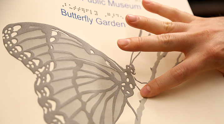
One challenge in communicating through tactile images is the decline in touch sensitivity with age, varying among individuals based on experience and education. Striking a balance is crucial in designing tactile layers – they should be explicit enough to convey details without oversimplifying to the point of diminishing cognitive engagement. Textural elements like cross-hatching, smooth areas, and rough surfaces contribute to contrast within a tactile image, aiding in the differentiation of materials or figures. This contrast is pivotal for comprehension. Establishing a focal point is essential for tactile exploration, achieved by using thicker materials or incorporating high-contrast elements. Unlike vision, where faces or color contrast draw attention, touch is drawn to contrasting tactile elements. The focal point in touch can begin anywhere on the composition, emphasizing the importance of adding contextual information, such as audio, after creating the image.
Individuals‘ ability to recognize tactile elements varies, regardless of sight. Tactile image comprehension depends on the willingness to engage with touch, especially for visually impaired individuals who rely on abstracting concepts. Users must correlate audio or textual descriptions with the tactile experience. Crafting touch-supportive artifacts requires careful consideration for enhanced understanding. While transforming visual artifacts into perfect tactile replicas is impossible, capturing specific attributes in a tactile form can represent key aspects of the original (Strickfaden, & Vildieu, 2014).
When thinking about tactile images, into consideration should be taken the following: first, the success rate for recognizing pictures by touch is much lower than it is for vision. Second, some pictures are more frequently recognized than others. Third, there is also some variation from individual to individual: while some blind people recognized many images others recognized few (Lopes, 1997).
Sources:
Dominic M. M. Lopes. (1997). Art Media and the Sense Modalities: Tactile Pictures. The Philosophical Quarterly (1950-), 47(189), 425–440. http://www.jstor.org/stable/2956276
Strickfaden, & Vildieu. (2014). On the Quest for Better Communication through Tactile Images. The Journal of Aesthetic Education, 48(2), 105. doi:10.5406/jaesteduc.48.2.0105
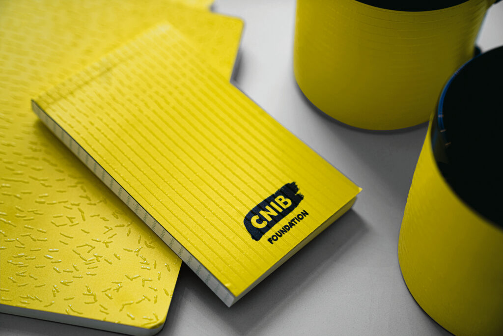
Red dot winner 2021→ Brand Design Relaunch “A Brand You Can Feel”
“A bold, beautiful visual identity is just that: a visual identity. To give deeper meaning to the branding of the CNIB, we challenged ourselves to create a brand that’s as meaningful to someone who is sighted as to someone with sight loss. The result, made in collaboration with the visually impaired community is the first tactile brand identity – a texture that tells the story of the CNIB through touch.” – winners
In the crowded landscape of modern marketing, brands seek to establish connections that transcend the ordinary. Beyond the visual and auditory realms, the integration of tactile experiences becomes a pivotal element in crafting a memorable brand identity. The sense of touch, often overlooked, holds the power to evoke emotions, create lasting impressions, and differentiate a brand in a meaningful way. By incorporating textures, materials, and physical interactions, brands not only engage consumers on a sensory level but also forge a deeper, more emotional connection. Tactile experiences go beyond aesthetics; they tell a story, convey value, and enhance the overall brand narrative. In this multi-sensory approach, brands find a unique avenue for differentiation, leaving an indelible mark in the minds and hearts of consumers.
Red dot winner 2021→ Food Packaging “ALL ABOUT SHEEP”
“The focus of the packaging design for this brand of sheep milk powder was to enable consumers to easily distinguish it from other milk powders, as these products are relatively new on the market in China. This is achieved through a direct visual and tactile reference to the animal. For example, the handles of drawers take the shape of a lamb’s forelock, and the edges of the envelopes are cut into the form of a sheep’s ear. Thus, by cleverly adapting their structure, the boxes become square lambs. The feel of the wool is simulated by embossed characters and patterns.” – winners
Crafting a tactile experience through product packaging is more than just functional; it’s a strategic choice that can elevate a brand’s identity. Beyond mere aesthetics, this approach engages the consumer’s sense of touch, creating a memorable and immersive interaction. The unique form not only stands out on the shelves, setting the product apart, but also communicates a narrative—connecting the consumer to the essence of the product and the brand. Such thoughtful packaging goes beyond containment; it becomes an integral part of the product experience, making a lasting impression on consumers.
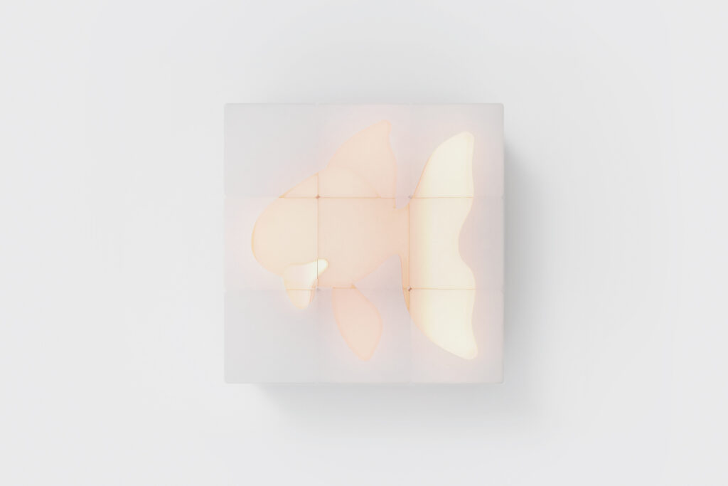
Red dot winner 2023 → Haptic Puzzle
“HAPTIC PUZZLE is a puzzle that encourages the development of children’s sensory integration, especially their sense of touch. It encourages children to explore shapes and cultivate their imagination by relying on their sense of touch and delicate colors. This puzzle provides a foundation for the development of sensory integration and the cultivation of higher senses by developing the sense of touch and imagination in a fun way.” – winners
Encouraging tactile experiences and play in children is vital for their holistic development. Tactile play, which involves exploring various textures and engaging the sense of touch, serves as a foundation for multiple aspects of a child’s growth. Through hands-on interactions, children not only refine their sensory perception but also stimulate cognitive development. Tactile experiences offer opportunities for problem-solving, creativity, and the development of fine motor skills. Graphic design plays a role in this by contributing to the creation of visually and texturally engaging materials that enhance the overall tactile experience for children. Whether it’s designing educational materials, toys, or interactive displays, thoughtful graphic design can amplify the impact of tactile play, making learning more enjoyable and memorable for children.
I was curious about who is currently engaging in the style of handmade design. After some research I found some designers that are currently doing projects using hand-made aesthetics.
Neil Secretario
He is a graphic designer and lettering artist who draws logos, custom letters and type for international companies like Conde Nast, Intercom and GQ Magazine.
Mike Perry
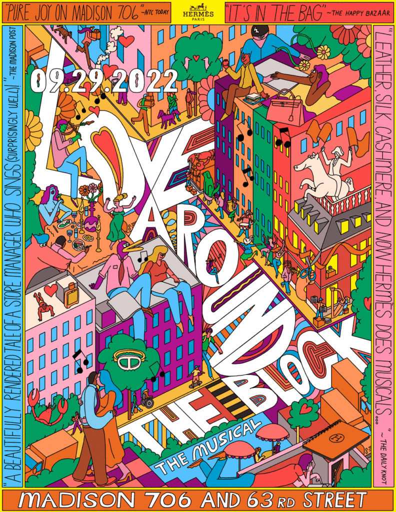
He is a multi-dimensional artist who has won an Emmy for Motion Design. He creates lots of different kind of art, including some graphic design jobs for big companies like Hérmes and he also did some book designs for Livraria Lello.
Lauren Hom
She is a designer and hand-lettering artist, who amongst other things, does hand-lettering with foods to create a special aesthetic that looks very time-consuming and hand-made.
June Digann
She is a designer and illustrator who focuses on traditional and digital mediums. For example she designed limited edition of Toblorone packaging with hand-drawn illustrations on it amongst other things.
Jon Contino
He is a graphic designer and illustrator who is known fpr his handdrawn lettering and vintage-looking designs.
Face Detection: Understanding the Process and Its Impact
Multiple Face Detection in Images
Face recognition systems are emerging as one of the most promising applications in image analysis. As Dwivedi (2018) highlights, the field of image processing has experienced significant advancements in recent years. High-quality face recognition relies on various algorithms that extract, classify, and match facial features. This process also involves similarity or distance measures, where efficient matching can even improve existing feature extraction methods (El-Sayed & Hamed, 2015). However, factors such as pose, facial expression, lighting, orientation, skin color, the presence of glasses or facial hair, and image resolution introduce variability and complexity into face detection (Dwivedi, 2018).
A major breakthrough came with the development of real-time face detection systems, which can detect faces with high accuracy in real time, marking a significant leap in image processing. Face detection is a subset of object detection and represents the first essential step toward successful face recognition. Officially, face detection methods are categorized into four approaches:
Knowledge-Based
Feature-Based
Template Matching
Appearance-Based
How Face Detection Works
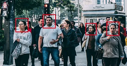
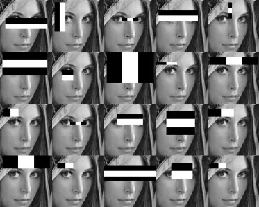
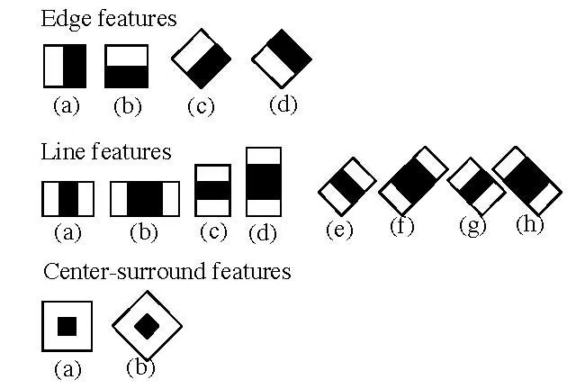
Face detection in systems like OpenCV follows a series of structured steps. First, the image is imported and converted from RGB to grayscale, as grayscale simplifies facial feature detection. Next, image manipulation and segmentation make it easier for classifiers to detect facial shapes. The widely-used Haar-Like Features Algorithm is then applied to locate human faces in the image. This algorithm detects common patterns in human faces, such as darker regions around the eyes and lighter regions around the nose. By focusing on these key features, the algorithm selects and extracts essential components for detecting faces.
Once the region of interest is defined, typically marked by the coordinates x, y, w, h, the face is enclosed in a rectangular box. Additional techniques like smile detection, eye detection, and blink detection can further enhance the accuracy and detail of the detection process.
Potential and Challenges of Face Recognition
On one hand, face recognition offers clear advantages by simplifying various processes. Automatic identification eliminates the need for passwords or manual log-ins, making daily operations more efficient. On the other hand, this convenience introduces risks, such as potential errors and privacy concerns. The possibility of misuse, particularly in sensitive areas like surveillance, highlights the need for careful implementation.
Face recognition can also be an asset in law enforcement, aiding in identifying criminals and improving public safety. However, the dystopian use of such technologies, like the social credit system in China, serves as a stark reminder of the ethical implications. When misused, face detection systems could lead to intrusive surveillance and loss of personal freedom.
Humanization in Design
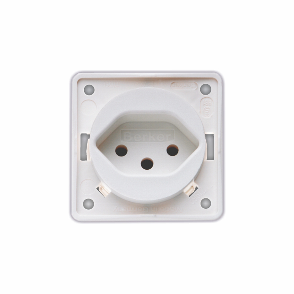
Humanization in design is defined either as the process of making something more suitable and pleasant for people or as making non-human objects appear more human. Designers frequently apply this concept in their work, especially when designing facial features or shapes that evoke human-like qualities.
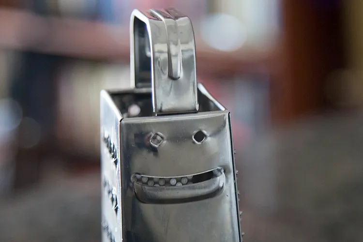
One fascinating phenomenon related to this is pareidolia, the tendency to perceive meaningful images in random or ambiguous visual patterns (Merriam-Webster, 2023). A classic example is the work of Giuseppe Arcimboldo, who created human portraits from collections of fruits and vegetables. Leonardo da Vinci also observed the human tendency to see patterns in randomness.
Vertumnus, Kaiser Rudolf II. 1590.
In modern times, we see pareidolia in everyday products, where people perceive face-like configurations. This perception influences consumer behavior, as the emotional content of these configurations can capture attention and affect purchasing decisions. Research shows that products with configurations resembling emotions like happiness, surprise, or anger capture more attention and encourage product exploration. However, only “happy” designs seem to consistently increase purchase intent (Noble, 2023). Understanding this psychological effect is crucial for designers, as leveraging pareidolia can enhance user experience, foster emotional connections with products, and drive consumer engagement.
“… if you look at any walls spotted with various stains or with a mixture of different kinds of stones, if you are about to invent some scene you will be able to see in it a resemblance to various different landscapes adorned with mountains, rivers, rocks, trees, wide valleys, and various groups of hills.”
El-Sayed, Mohamed, and Hamed Hossam. „Feature Extraction Techniques for Face Recognition.“ Journal of Software Engineering and Applications 8, no. 9 (September 2015). https://www.scirp.org/journal/home?journalid=45.
Noble, Erin. „Face Pareidolia in Products: The Effect of Emotional Content on Attention Capture, Eagerness to Explore, and Likelihood to Purchase.“ Applied Cognitive Psychology 37, no. 4 (July 2023). https://onlinelibrary.wiley.com/doi/10.1002/acp.4105.
Yang, Ming-Hsuan, Kriegman, David J., and Narendra Ahuja. „Detecting Faces in Images: A Survey.“ IEEE Transactions on Pattern Analysis and Machine Intelligence 24, no. 1 (2002): 34–58. https://doi.org/10.1109/34.982883.
A shift from clinical precision of purely digital creations to a celebration of imperfection and handcrafted authenticity is occurring in many fields of design. This transformation goes to the core of graphic design, exploring the integration of analogue elements into digital realms and the resulting implications for authenticity and trust.
Research question: The central research question guiding this exploration was: How does the intentional integration of imperfections and analogue elements into digital designs affect authenticity and trust?
Relevance to Designers: Designers are challenged to bring humanity to the digital workspace. Only focusing on precise digital tools can lead to a loss of the personal touch, uniqueness and character inherent in handmade creations. Recognising this, designers are intentionally adding imperfections – script fonts, textured backgrounds, hand-drawn elements and many more- to create a sense of authenticity and trust.
Examples of the problem: The exclusive use of digital tools often results in designs characterised by perfect lines, right angles and flawless colour fills. But the lack of a personal touch raises the question: Can a design without imperfections truly resonate with an audience? Script fonts, paper textures, brushstrokes – all consciously added to the digital world – serve as examples of how to impart warmth and humanity.
Research methods: The research journey involved an exploration of eight blog posts that dissected various facets of the integration of imperfections. Topics icluded raged from the influence of Japanese aesthetic concepts like Wabi-Sabi to the role of postmodernism, each entry unveiled layers of insight.
Key findings: The research showed that imperfection plays a key role in fostering authenticity and trust in design. Elements such as handcrafted detail, simplicity and an acknowledgement of transience contribute to a deeper connection between the design and its viewer. The combination of digital precision and imperfect, analogue elements can create designs that are not only visually appealing, but also feel more human.
Best practice examples: Wellknown designers such as David Carson, Stefan Sagmeister, Neville Brody and Milton Glaser have demonstrated the value of embracing imperfection in design. Their unconventional approaches challenged traditional norms and paved the way for a more diverse and expressive design language.
Future Outlook: Looking ahead, the future of design lies in a balanced collaboration between human creativity and technological innovation. While upcoming technologies such as AI and VR continue to change the way of design, the integration of imperfect, handmade elements remains a essential component. The outlook includes an embrace of eclecticism, technological integration, sustainable design practices, personalised narratives and collaboration between analogue and digital artists.
Conclusion: In conclusion, the shift from digital precision to an appreciation of imperfection represents a different way of design thinking. Imperfections are not flaws to be removed, but rather tools that designers can use to create designs that feel authentically human. As the field of design continues to develop, the balance between precision and imperfection will shape the visual language. In the future designers may navigate the digital landscape with an bigger awareness of the importance of the human touch, as well as the need to be able to create designs that resonate, connect on a deeper emotional level.
In the realm of consumer products, packaging has long been overlooked as a potential powerhouse for brand engagement. Often discarded as a mere vessel for the product, packaging has now become a canvas for innovation, especially with the integration of Augmented Reality (AR). In this article, we unravel the transformative impact of AR on product packaging, exploring its roles in marketing strategies, customer engagement, and the numerous advantages it brings to businesses.
A Break from Monotony
In a saturated market, where products compete for attention on crowded shelves, traditional packaging often blends into a sea of monotony. Augmented reality packaging emerges as a game-changer, disrupting the ordinary and transforming product packaging into a dynamic interface for customer interaction and storytelling.
AR and Brand Marketing Strategy
Visualizing the Product Augmented reality opens avenues for brands to showcase their products in a visually stunning manner. By incorporating AR markers on products, such as QR codes or URLs, customers can scan and explore products in augmented reality. This provides a unique and immersive experience, allowing customers to visualize how products look and function in real-world scenarios.
Truly Interactive Augmented reality packaging goes beyond traditional engagement methods. Brands can embed AR experiences, including videos, animations, and interactive models, creating a captivating experience for customers. For instance, a stationery company could offer an AR-enabled gaming experience on their products, encouraging repeat purchases and distinguishing the brand from competitors.
Storytelling and Promotion Traditional packaging has limited space for conveying brand values and product information. Augmented reality packaging serves as an extended platform, enabling brands to launch AR experiences or apps that highlight their mission, values, and offer additional information about products. It facilitates cross-promotion, showcasing related products to customers based on their interests and purchases.
Advantages of AR for Packaging
Augmented reality packaging brings several advantages to businesses, revolutionizing customer experiences and marketing strategies:
3D View of Products AR packaging generates interactive 3D representations of products, allowing customers to view them on mobile devices. This enhances understanding and engagement, providing a better grasp of the product’s features and functionality.
Interactive Product Experience AR adds interactivity to product packaging, enabling customers to scan QR codes for immersive experiences such as video games. This not only makes packaging more enjoyable but also serves as a marketing tool, enhancing the product’s appeal.
Customized Shopping AR allows for personalized shopping experiences, with customers scanning product boxes to access tailored product information based on their preferences. This creates a stronger connection between customers and products.
On-demand Demonstrations Engaging product demonstrations can be created using AR, offering customers a more interesting and informative way to learn about a product. This dynamic approach enhances the learning experience and contributes to better retention.
Tracking Customer Behaviors AR packaging can be used to track customer behavior at the point of sale. Brands can analyze how customers interact with the packaging and use this data to enhance design and optimize the effectiveness of AR applications.
Use Cases of Augmented Reality Packaging
Lego: The renowned toy company Lego utilizes augmented reality packaging with an accompanying app. Customers can scan Lego sets to see 3D representations, bringing the products to life in a virtual space.
Coca-Cola: Coca-Cola embraces augmented reality with an app that provides insights into the company’s history and includes interactive games. This innovative approach enhances brand engagement.
Nespresso: Nestle’s Nespresso uses augmented reality packaging to allow users to scan and visualize how brewed coffees will look. It serves as an educational tool, explaining the brewing process to customers.
Carrefour: The French retail company Carrefour employs augmented reality food packaging to enable customers to scan products and access nutritional information and reviews. This enhances customer decision-making.
Engage and Inform with AR Product Packaging
The integration of augmented reality into product packaging marks a revolutionary shift in the way brands engage with customers. From visualizing products in 3D to creating interactive experiences and personalized shopping, AR packaging opens new dimensions for brand communication. The examples provided, along with the myriad advantages, underscore the transformative potential of AR in packaging.
Amrut partnered with Studio Boam, a prestigious Parisian branding agency, to create packaging highlighting the spirit’s Indian roots. The design features a striking King Cobra at its center, surrounded by mystical motifs evoking India’s cultural richness. The label, elegantly simple yet culturally rich, incorporates intricate elements inspired by Indian mythology. Silver hot stamping enhances the duotone palette, while traditional Indian motifs add depth, maintaining an elegant restraint in expression.
Changin’ Packaging Design
Baries Design, headquartered in Düsseldorf, meticulously designs the packaging for Changin‘ to embody a transformative experience. Through carefully curated label illustrations, vibrant color palettes, and typography reminiscent of psychedelic imagery, the packaging serves as a visual narrative, inviting consumers into an immersive journey. The fusion of the words ‚change‘ and ‚gin‘ in the brand name reflects not only the product’s gin-inspired taste but also its overarching philosophy of altering perceptions. The logo font and back label colors are strategically chosen to symbolize the fluidity of perception and mental associations, aligning with Changin’s ethos of embracing change. The intricate design of the bottle, coupled with its compelling visuals, beckons consumers to engage on a deeper level, prompting them to examine and ponder its contents. In a fast-paced world where attention spans are fleeting, Changin’s packaging stands as a testament to the power of thoughtful design, encouraging consumers to pause, reflect, and explore the nuances within.
William Grant & Sons
William Grant & Sons, a distinguished purveyor of premium spirits, has enlisted the expertise of the international creative design agency, threebrand, to introduce its latest offering, the Ghosted Reserves. As part of the esteemed Rare Cask Reserves program, these ‚ghosted vattings‘ grant consumers access to exceptionally rare Scotch whisky stocks sourced from defunct distilleries. tasked threebrand with crafting both label sets and secondary packaging that embody the distinctive narrative of the Ghosted Reserves while exuding a premium and tactile quality. Malcolm Thomson, associate creative director at threebrand, explained that a palette of grey tones was deliberately chosen to evoke the ethereal essence of the vattings, evoking themes of opacity.
FibreForm Caps
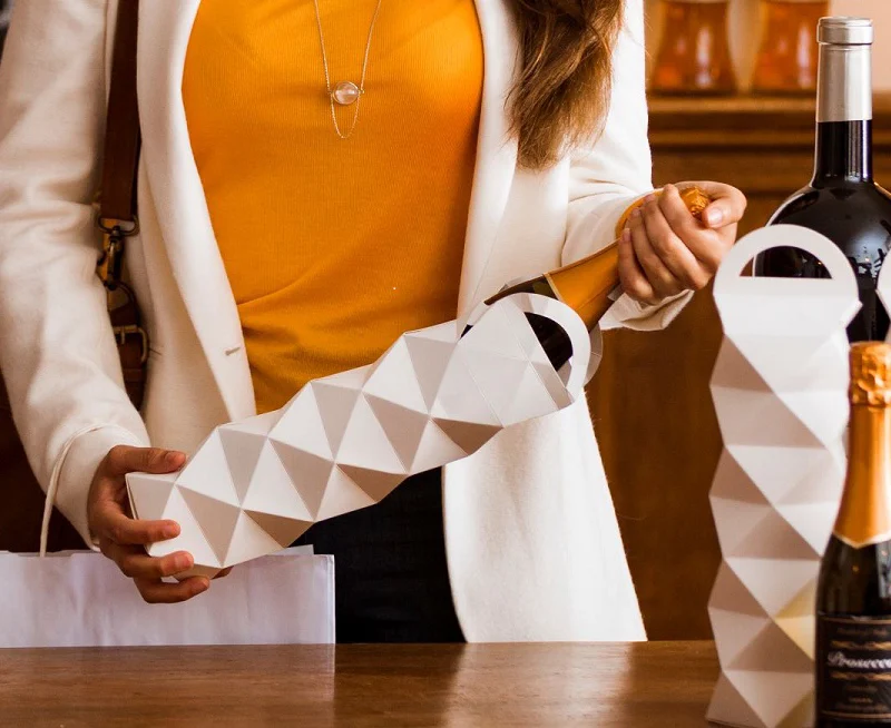
FibreForm Caps by Billerud is a groundbreaking substitute for conventional metal caps utilized in sparkling wine production globally. Despite its eco-friendly composition derived from 100% recyclable and biodegradable primary fiber paper sourced from sustainably managed forests, it matches the aesthetic appeal, embossing, and superior print quality of traditional metal caps.
In the fast-evolving landscape of 21st-century marketing, professionals are consistently exploring novel avenues to captivate audiences. Two technologies that have recently taken center stage are Augmented Reality (AR) and Virtual Reality (VR). As we delve into the exciting realm of AR marketing and question the necessity of AR and VR in marketing, we’ll explore how these technologies are reshaping the marketing landscape and whether they are a boon or a bust for businesses.
The Rise of AR Marketing
What Is Augmented Reality? AR, a form of extended reality, seamlessly blends the digital and physical worlds, bringing the metaverse to users. Unlike its immersive cousin, Virtual Reality (VR), AR often operates subtly, with applications ranging from gaming, like Pokémon GO, to transforming how we shop.
Importance of AR in Marketing AR marketing is a game-changer, turning passive experiences into active engagements. Mimicking the in-person shopping experience, AR enables users to try before they buy, enhancing conversion rates and customer satisfaction. The technology, still in its infancy, holds the promise of making shopping enjoyable and memorable, ultimately boosting brand awareness and loyalty.
AR Gear for Marketing Unlike many metaverse-related technologies, AR marketing doesn’t demand specialized gear. Nearly everyone already possesses an AR-capable device – the smartphone. However, companies like Microsoft and Google are pushing the boundaries, introducing dedicated AR and mixed reality gear to provide more immersive experiences.
Strategies in AR Marketing
Several strategies are shaping the landscape of AR marketing:
Try Before You Buy: Emulating the offline shopping experience, AR allows users to virtually try out products, from clothing to furniture.
Raise Brand Reputation: The immersive nature of AR creates lasting positive emotions, turning satisfied customers into active brand advocates.
Tours & Assistance: Integrating digital assistance into physical locations, AR helps users make informed decisions, from exploring products to virtually experiencing distant places.
AR Marketing Materials: Utilizing AR in traditional marketing materials, such as brochures and business cards, enhances the user experience and blurs the line between analog and digital.
Success Stories in AR Marketing
Several companies are leveraging AR to create unique and engaging experiences:
Snap: The City Painter feature on Snapchat fosters real connections, allowing users to collaboratively create virtual murals in shared spaces.
Home Depot: Project Color enables users to visualize how different paint colors would look in their homes, considering lighting, furniture, and shadows.
Sephora: Utilizing Modiface technology, Sephora’s Virtual Artist App allows users to digitally try on makeup, overcoming the challenges of online cosmetic shopping.
Questioning the Need for AR and VR in Marketing
The Role of VR & AR in Marketing While the first-hand experiences shared earlier highlight the merits of AR in marketing, it’s pertinent to question the necessity of AR and VR. Despite the novelty and excitement surrounding these technologies, marketers must ask themselves whether their innovation is yielding tangible results.
Why Marketers Embrace VR & AR The appeal of VR and AR for marketers lies in their storytelling potential. These technologies offer new and unique ways to engage audiences, provided the campaigns make sense, resonate with the target audience, and align with the promoted brand.
Risks and Considerations The flipside of innovation is risk. Developing VR/AR-based campaigns demands significant time and resources, and success is not guaranteed. Marketers must be cautious not to prioritize promoting the technology over promoting the client’s best interests. The story’s resonance with the audience is crucial, and missteps in context or tone can lead to failure.
The Philosophical Perspective The article takes a philosophical turn, reminding marketers that creativity should never be an end in itself but a means to realize the communicational goals of the client. VR & AR, like any innovative technology, are tools for storytelling and experience-building, valuable only when integrated into a comprehensive digital marketing strategy aligned with the client’s business plan.
Striking a Balance
In conclusion, the dynamic duo of AR and VR holds enormous potential for reshaping the marketing landscape. Whether you’re ready to embark on the AR marketing journey or cautiously evaluating the role of VR and AR in your digital strategy, these technologies are undeniably changing the game. The future of marketing may well be written in the language of augmented and virtual realities, where engaging stories, resonant experiences, and client-centric innovation take center stage.
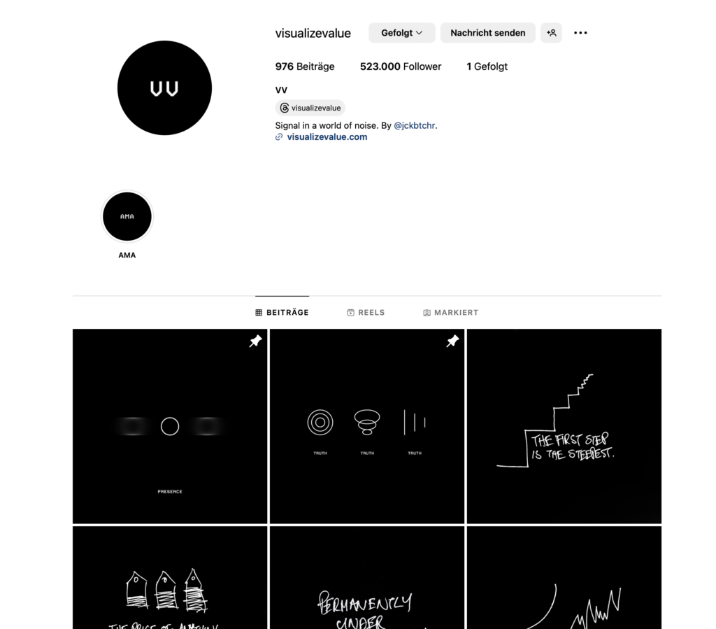
Having assimilated various methods and information pertinent to my thesis, I am eager to conduct an analysis of the Instagram page @visualizevalue. In my view, this platform has adeptly encapsulated wisdom and disseminated it to a global audience in a remarkably refreshing and easily comprehensible manner. My scrutiny will delve into their use of colors, shapes, and typography, with the intention of uncovering the underlying reasons behind their remarkable success.
So first of all who is behind Visualize Value? Visualize Value is a family-owned and operated business, located in Nashville, Tennessee. The founder of the company is called Jack Butcher. Butcher spent a decade working as a creative director for Fortune 100 advertising in New York City, handling multi-billion dollar brands. Despite the excitement, he found this corporate environment to be the antithesis of freedom. In pursuit of a more liberated lifestyle, Jack ventured into entrepreneurship by establishing his own advertising agency, only to discover that it brought even less joy and freedom.
After two years of trial and error, Jack successfully transitioned to highly-specialized consulting and a product business that offered both enjoyment and scalability. The key to this transformation was the concept of „productizing himself.“ This led to the creation of Visualize Value, a project that allowed him to build a network of mentors, establish a $1 million per year product business, and develop a media platform with an audience exceeding 500,000 people.
Reflecting on this journey, Jack admits that he wouldn’t have believed such success was possible just 18 months ago. Now, he dedicates all his time to creating tools and resources that simplify the processes of learning, teaching, building, and selling. Prior to serving people like himself, Jack’s creative efforts were directed toward clients in a different sphere.
Source: Instagram @visualizevalue
Analyzation
Colors They mostly use a black background and the elements or the typography is in white.
Black and white are often considered a highly effective color contrast in design and aesthetics. This classic color combination provides a strong visual impact, clarity, and a sense of simplicity. It is versatile and can be easily incorporated into various design contexts.
In terms of accessibility, black and white can be a good choice because of the high contrast they offer. This high contrast is particularly beneficial for individuals with visual impairments or color vision deficiencies. Black text on a white background, for example, provides a clear and readable visual experience for most people.
However, it’s essential to consider that the effectiveness of color contrast and accessibility can vary depending on the context and the specific needs of the audience. Some individuals may find other color combinations or contrast ratios more suitable for their particular visual requirements.
When designing for accessibility, it’s crucial to adhere to guidelines such as the Web Content Accessibility Guidelines (WCAG), which provide recommendations for creating content that is more inclusive and accessible to a diverse range of users. These guidelines include considerations for color contrast, text legibility, and ensuring that information is perceivable by all users, regardless of their abilities or disabilities.
Visual Elements The Visualize Value Instagram posts consistently employ geometric shapes to convey their messages. Their design language incorporates circles, lines, triangles, graphs, arrows, rectangles, and easily recognizable iconic symbols.
The use of simple design elements, such as geometric shapes and iconic symbols, by Visualize Value can be attributed to several strategic considerations that enhance the effectiveness of their communication. Here’s an argumentation for why simplicity works well for them:
Clarity of Message:
Simple design elements contribute to clarity in communication. Geometric shapes and iconic symbols are universally understood, transcending language and cultural barriers. This simplicity ensures that the message is quickly and easily comprehended by a diverse audience.
Visual Consistency:
Consistency in visual elements creates a cohesive brand identity. By consistently using simple design elements across their content, Visualize Value establishes a recognizable and memorable visual identity. This consistency helps in building brand recall and trust.
Accessibility:
Simple designs are often more accessible to a wider audience. They are visually straightforward and can be easily perceived by individuals with varying levels of visual ability. This aligns with accessibility principles, ensuring that their content is inclusive and reaches a broad spectrum of users.
Scalability:
Simple designs are scalable across different platforms and mediums. Whether viewed on a small mobile screen or a larger desktop monitor, the clarity of geometric shapes and symbols is maintained. This scalability ensures that their content is effective and engaging across various devices.
Focus on Content:
By keeping the design elements simple, Visualize Value directs the viewer’s focus toward the content itself. The emphasis is on the message, ideas, and insights they share, rather than on intricate or distracting visuals. This approach aligns with their goal of delivering valuable content without unnecessary embellishments.
Timelessness:
Simple design tends to be timeless. By avoiding overly complex or trendy elements, Visualize Value ensures that their content remains relevant over time. This is important for a brand that focuses on providing enduring insights and wisdom.
In summary, Visualize Value’s use of simple design elements serves to enhance clarity, establish a strong brand identity, ensure accessibility, facilitate scalability, maintain a focus on content, and achieve a timeless quality in their visual communication. It aligns with their mission of delivering clear and valuable insights to a diverse audience.
Typography Visualize Value employs a font that exudes a techy and somewhat typewriter-inspired aesthetic. Jack Butcher, in a X-post, mentioned their use of the T.26 Carbon font licensed from Adobe Fonts. More recently, they’ve introduced a handwritten font, a departure from their previous style, and, in my personal view, slightly distracting.
Upon closer examination of their page, a notable feature is the use of a relatively small font size. While this choice may pose potential accessibility concerns, it aligns with their overarching philosophy. The decision to employ a subtle and unobtrusive typeface appears intentional, possibly aimed at ensuring that information takes center stage over design aesthetics. This approach reflects a conscious effort to prioritize a seamless learning experience, minimizing potential distractions that could arise from a more prominent or eye-catching typography. However, it’s worth considering alternative strategies to maintain accessibility while preserving the focus on information, such as exploring font options that balance readability with an unobtrusive design.
Optimizing Communication in a World of Limited Attention: Jack’s Approach to Visual Storytelling and Reader Engagement Jack has a penchant for employing visuals to narrate stories, as the title suggests. People naturally excel at internalizing pictures, and in today’s environment of constrained attention spans and an abundance of information, efficiency becomes imperative.
Customers lead busy lives, grappling with an abundance of information within finite time constraints. A substantial portion of individuals who click may not delve into the entire content; they typically click, browse briefly, and swiftly move on.
This is entirely acceptable. Recognizing that readers are essentially customers investing their valuable time, my responsibility is to provide the utmost value in return.
In addressing readers where they are, my task involves identifying the most efficient ways to 1) entertain, 2) engage, and 3) educate. This doesn’t always hinge solely on the use of words; sometimes, the most effective communication is achieved through the integration of visuals and images.
Notes & Observations summed up:
Consistency in Design and Wording: Black background, white font, lots of blank space, simple sayings(Helps the user focus on the content, builds his brand, speeds up his design process)
Common Visuals: Humans are predictable and like things that are pleasingly familiar, with a gentle touch of surprise. (Jack as well plays on common stories and visuals, which makes it easier to learn and remember them)
Clarity & Sharp Design to help teach and explain things to people