Topic introduction: AI generated images bias

The use of AI-generated images is emerging as an innovative and challenging frontier.  AI-generated images refer to visual content that is created using Artificial Intelligence (AI) algorithms and techniques. These images are generated through computational processes rather than being directly captured by a camera or created by human hands. AI-generated images have gained significant attention and traction across various fields, including design and visual communication, due to their ability to produce unique and often highly realistic visual content.

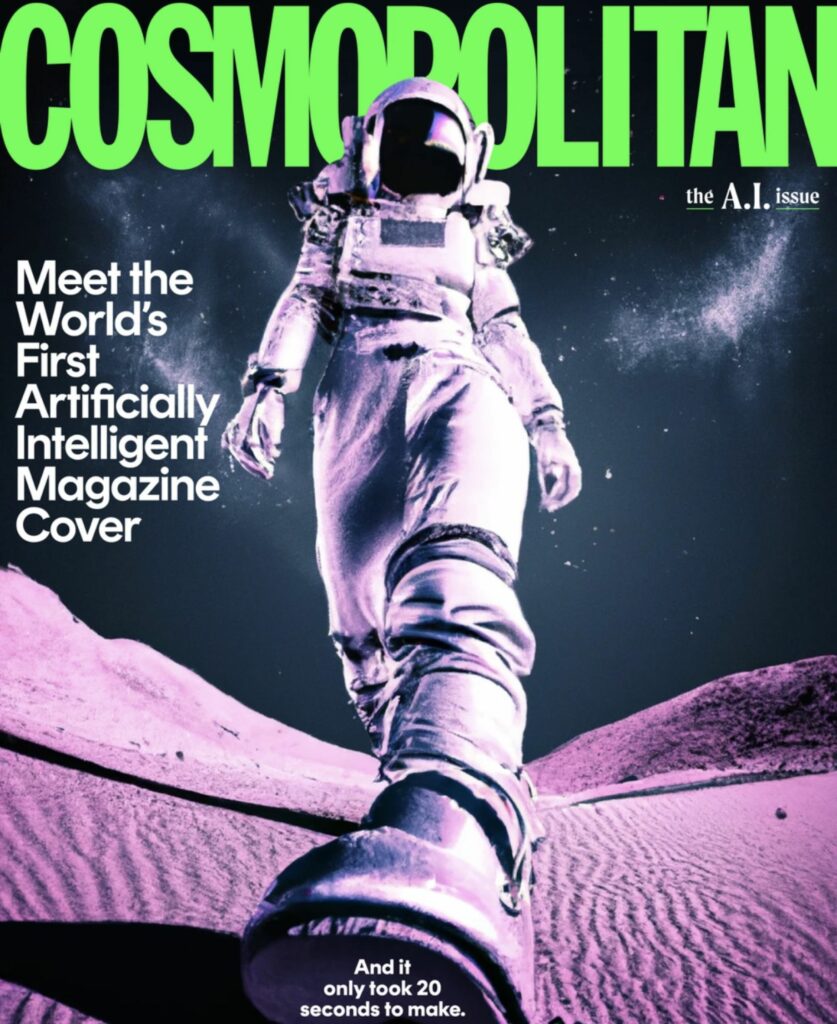
For example, in marketing and advertising, AI-generated images quickly produce campaign visuals. For instance, instead of organizing a photo shoot for a new product, AI can be used to generate high-quality images for promotional materials.  For example, in June 2022, the magazine Cosmopolitan released a cover entirely created by AI.  The editors collaborated with OpenAI, whose revolutionary DALL-E 2 AI created the image, and digital artist, Karen X. Cheng. The cover image was generated in 20 seconds and finalized within 24 hours, involving human interaction to lay out the text and adjust the proportions within the print cover. This marked the first time an AI-generated image was used as the cover of a major magazine, showcasing the potential of AI in the creative industry.

However, despite the many potentials and opportunities offered by this type of technology, there are also some negative aspects emerging. AI image generator apps are trained on an archive of images sourced from the internet, which may contain stereotypes, biases, and harmful beliefs that the algorithm will use to create artwork. This means that discrimination could become prevalent in generated content, raising ethical concerns. 

The focus of my research will be precisely to explore this, as design and visual communication are increasingly adopting AI, and this inevitably leads to cultural/social consequences.

Research 11: Introducing Work for the Experimenting Phase

For the upcoming phase of the research, I’ll be delving deeper into the overarching theme of animal welfare and its communication. My previous research still left some questions unanswered. To kickstart this phase, I’ve designed a survey to gauge public sentiment and engagement regarding animal welfare.

The survey covers a range of topics, including general attitudes towards animal welfare and personal involvement. Additionally, I inquire about participants‘ experiences with advertising related to animal welfare and its emotional impact. With a trigger warning, I present four images depicting various scenarios commonly found in animal welfare advertising or on social media platforms. My goal is to discern participants‘ perceptions of acceptable content and the boundaries therein.

In the following post, I will provide a summary of the survey results.

Moreover, I plan to conduct interviews with members of SOKO Tierschutz to gain insights into their real-world experiences. Additionally, I intend to engage with individuals from Bauernbund to understand the perspectives of farmers. Due to recent campaigns highlighting issues within the industry, many farmers have found themselves unfairly portrayed as animal abusers, despite not being involved. It’s crucial to examine the multifaceted impact of communication strategies surrounding animal welfare on various stakeholders.

For further experimentation and exploration, I am considering conducting eye-tracking experiments and in-person testing of diverse campaign materials. However, the insights gained from the survey will guide the selection of additional experiments. A/B testing with different designs also presents an intriguing option to refine our understanding and inform design decisions for future iterations. Furthermore, I aim to compile a comprehensive collection of visual and verbal materials already in use, supplementing theoretical research on provocative marketing and advertising. Identifying gaps in current animal welfare communication strategies is essential for developing targeted interventions. To see what exactly should be designed – what it needs to communicate the topic in the best and most efficient way. Does it need a new great branding or is it about the distribution of information – what is the most trustbuilding method etc..?

Innovative Packaging Design for Alcohol: An Experiment in Master’s Studies

This semester of study provides me with the opportunity to explore and experiment with various approaches to find a clear direction for my project. In doing so, I’ve focused on three main themes that form the core of my design: Collector’s Item, Interactive Drinking Game, and Social Interaction.

Collector’s Item: A Touch of Exclusivity

The idea of designing alcohol packaging as a collector’s item particularly intrigues me. Here, the aim is to imbue the product with a touch of exclusivity, whether through a special edition, unique shaping, or the use of high-quality materials. The packaging becomes not only a vessel for the alcohol but also a piece of art that captures the attention of collectors and aficionados alike. Such a design not only appeals to the senses but also creates an emotional value that transcends the product itself.

Interactive Drinking Game: More Than Just Packaging

Creating packaging that goes beyond its primary function and transforms into an entertaining drinking game is another fascinating approach. Imagine the packaging box being converted into a board game or various elements being pressed out for a card game. This interactivity not only provides a unique experience for the user but also encourages communal enjoyment during the consumption of alcohol.

Social Interaction: A QR Code for the Next Adventure

The third approach that inspires me is the creation of packaging that stimulates social interaction. Picture a QR code on the packaging leading to an open chat portal where people can gather to celebrate together or meet new individuals. This kind of „blind date“ in the world of alcohol opens up a new dimension of enjoyment by bringing people together and creating unforgettable moments.

Overall, I’m excited about the opportunity to not only create aesthetic values through my alcohol packaging design project but also provide deeper meaning and interaction. This semester will allow me to further explore these approaches and steer my project in a direction that is not only innovative but also offers genuine value to society. I look forward to bringing my ideas to fruition and seeing how they can transform the world of alcohol enjoyment.

Research outcome after the first semester: Leitsysteme bei Musikfestivals

Die Welt der Musikfestivals erfährt eine spannende Transformation durch innovative Technologien und kreatives Denken. In meinen ersten Beitrag wurde die bedeutende Rolle von Leitsystemen auf Musikfestivals hervorgehoben. Diese unsichtbaren Wegweiser verbessern nicht nur die Orientierung der Besucher, sondern tragen auch maßgeblich zur Sicherheit, Personalisierung und Umweltfreundlichkeit der Veranstaltung bei.

Des Weiteren betrachtete ich die verschiedenen Arten von Leitsystemen, die bei Musikfestivals zum Einsatz kommen. Statische Leitsysteme, wie Schilder und Bodenmarkierungen, bilden das Grundgerüst, während dynamische Leitsysteme moderne Technologien wie digitale Anzeigen, Festival-Apps und mobile Leitelemente nutzen. Die Kombination dieser Systeme schafft eine optimale Navigationsstruktur für Festivalbesucher.

Im dritten Beitrag wurde der Begriff „Eventisierung“ diskutiert, der die Kunst beschreibt, gewöhnliche Ereignisse in ansprechende und einprägsame Erlebnisse zu verwandeln. Dieser Trend prägt nicht nur die Gesellschaft im Allgemeinen, sondern beeinflusst auch die Planung von Musikfestivals. Veranstalter setzen vermehrt auf die Schaffung umfassender Erlebnisse, die über die Musik hinausgehen und verschiedene Sinne ansprechen.

Die Planung eines Musikfestivals selbst ist ebenso relevant, die Bedeutung der Grundlagen wie die Auswahl des Genres, die Berücksichtigung des Wetters und die Definition von Zielgruppe und Motto sind die wichtigsten Punkte. Die eigentliche Organisation erfordert sorgfältige Überlegungen zur Location, Programmgestaltung, Sicherheit, Einbindung von Dienstleistern und Promotion.

Zu guter letzt habe ich mich mit Trends und Entwicklungen Festivals beschäftigt Da ist mir unter anderem folgender Artikel hängen geblieben; die Partnerschaft zwischen Tomorrowland und Caliverse. Diese Zusammenarbeit integriert Augmented Reality und Virtual Reality in die Festivalerlebnisse, um eine dynamische, interaktive Umgebung zu schaffen. Das Metaverse-Festival strebt globale Vernetzung, Nachhaltigkeit, revolutionäre Live-Auftritte und personalisierte Erlebnisse an, wodurch es potenziell eine neue Ära in der Welt der Musikfestivals einläuten könnte.

Insgesamt zeigen diese Beiträge, dass Musikfestivals nicht nur Plattformen für Live-Musik sind, sondern sich zu umfassenden Erlebnissen entwickeln, die Technologie, Kreativität und die Bedürfnisse der Besucher integrieren. Die Zukunft der Musikfestivals verspricht eine Verschmelzung von Unterhaltung, Innovation und globaler Vernetzung.

10 // Reflection and outlook

Over the course of my first semester, I experienced an in-depth exploration of various aspects of branding. The initial exploration of basic definitions formed the foundation on which a complex understanding of the multifaceted world of branding developed over time. It became clear that branding is far more than just a visual concept – it is a comprehensive interplay of psychological, historical and design elements.

Delving deeper into the psychology of branding revealed how profound the emotional connection between consumers and brands is. The targeted influencing of emotions through the choice of color was clarified in the further analysis, in particular through the application of color psychology in marketing and branding. Here it became clear that colors are not just aesthetic decisions, but have a decisive influence on the perception and interpretation of a brand.

The historical perspective opened up a view of the evolution of branding, which helped me to better understand its importance and relevance today. Analyzing best practice examples, including giants such as Nike, Starbucks and Coca-Cola, allowed me to extract concrete applications and successful strategies in branding. The effect of fonts on brand communication was examined in depth in a separate study and finally focused on the integration of typography into the overall brand identity.

My question „How does branding play a pivotal role in shaping and influencing the visual identity of brands?“ was illuminated on various levels in the course of this multi-layered examination. It became evident that branding is not just an aesthetic practice, but a strategic decision that permeates and shapes the entire visual appearance of a brand.


Outlook for next semester:

In the coming semester, I intend to intensify my research by conducting a comprehensive survey. The focus will be on capturing current opinions and trends in branding and integrating the findings into my Master’s thesis. The survey will be conducted online in order to reach a broader and more global participant base. 

Some possible questions that could be included in the survey:

  • How much does the visual identity of a brand influence your decision to buy a product or service?
  • To what extent does the appearance of a brand play a role in forming your opinion of its products or services?
  • What colors appeal to you most when it comes to brands, and why?
  • To what extent does the design of a website or packaging influence your perception of and interaction with a brand?
  • What importance do you attach to the font (typography) of a brand?
  • Do you believe that a consistent use of fonts improves the brand experience?
  • How much does the visual consistency of a brand influence your loyalty to that brand?
  • How important is it to you that a brand communicates its brand promise visually?

These questions are intended not only to capture the preferences and opinions of the participants, but also to gain deeper insights into the psychological and emotional connections between consumers and brands. The results of the survey will form an important basis for further research and further enrich my master’s thesis.

10 conclusion & next steps

To conclude what I found out during my research this semester I want to quickly summarize my most important findings and consider future steps for continuation.

I started out by being intrigued with the visual aesthetic of the hand-made style in graphic design. I noticed it in many places and was wondering if it is currently gaining popularity. I found out that on the one hand it does seem to be a current trend, because it can be found in many design-trend-lists. Especially hand-drawn illustration and natural-looking design as well as references to traditional media with visible imperfections were listed. But since I looked into the history as well, I found out it’s a bit more complicated than that. The arts & crafts movement popularized the style over 100 years ago, as a countermovement to the industrialization. Later the hand-made aesthetic was popularized again by the zine movement between the 1960s and 1990s. This paved the way for craftivism and continued to the craftwashing by big corporations.

I also wondered at the beginning of the semester what the reason for creating time-consuming handmade (or handmade looking) designs in times of computer programs and AI could be. What I have found out so far is there can be multiple reasons. It could be a political choice, to actively withdraw from mass-production and consumerist markets. It could also be the opposite: Appealing to a politically conscious customer-base by using this design-style and getting them to purchase a product. Either way kind of implies a counter-movement idea to the unification of visuals. And a return towards nostalgic qualities from simpler times. It’s the human touch that not only leads consumers to believe it to be made more ethically, but also creates a connection to the designer, that feels more personal.

Another question I asked myself was what effects can handmade aesthetics create that computer designs cannot? I found out that due to historic connotations handmade aesthetics have learned associations to them which, depending on the situation, might strengthen the message of the design. I also found out that the cleanliness of computer-made designs might trick the designer into thinking his design is polished and therefore done, whilst analogue techniques aren’t as forgiving and force the designer to focus more intensely. This might lead to more thought-out designs. The finished design tends to also be more intentional with analogue tools, because they require active decision-making for every small detail.

During this research I stumbled over quite a few possible techniques of handmade design. For example: handwriting, woodcutting, embroidery, drawing, letterpress, collaging, stamping, food decorating and knitting.

All in all the research was very interesting but I found it difficult to find scientific and academic writings about this topic, which slowed down my momentum. There are still a few questions I didn’t answer during this time and could possibly focus on in future research. This includes an investigation about which design styles are combinable with handmade design, in order to get aesthetically pleasing and meaningful results. I also didn’t find out how messy designs can get whilst still working and fulfilling their purpose. Maybe an opinion poll on some examples could be helpful for this. As to how this trend can evolve further, I don’t feel qualified to answer. Especially in branding it seems it is a bit reprehensible to use this style unless the company or cause can actually back up the ethical connotations. To conclude, even though I found it really interesting to find out more about this topic, I am not sure I want to continue with it next semester, because of the difficulty of finding sources.

09 // Typography in the brand identity

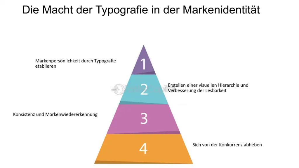
After my last blog post, I came across an exciting website that once again deals explicitly with the power of typography in brand identity. This post therefore serves to supplement the content of the last post entitled „Typography and branding“ and to reiterate important content.


Image source: https://fastercapital.com/de/inhalt/Typografie–Auswahl-der-richtigen-Schriftarten-fuer-Ihre-Markenidentitaet.html

Typography plays a decisive role in shaping brand identity, but often influences the perception of a brand unnoticed. It can convey emotions, create credibility and set a brand apart from the competition. The choice of fonts, styles and sizes makes it possible to establish a clear brand personality. A comparative example illustrates that elegant serif fonts convey a sense of elegance, while rounded sans serif fonts create a more playful appearance.

Additionally, typography plays a crucial role in improving readability and creating a visual hierarchy. Using different font sizes and styles allows designers to clearly communicate information and draw attention. Consistent brand fonts across different touchpoints contribute to brand recognition, resulting in a strong visual identity for well-known brands such as Coca-Cola and Google.

Another aspect is differentiation from the competition. By choosing unique fonts, brands can make a lasting impression and stand out in a crowded market. Chanel is cited as an example, using a custom-designed font that is immediately associated with its luxury positioning.

Overall, the text emphasizes the crucial role of typography in brand identity design. Through the purposeful selection of fonts, brands can communicate their personality, build credibility, improve readability and successfully differentiate themselves in a competitive market.


Works Cited for the entire article:

FasterCapital. “Typografie Auswahl Der Richtigen Schriftarten Für Ihre Markenidentität.” Www.fastercapital.com, 7 Dec. 2023, fastercapital.com/de/inhalt/Typografie–Auswahl-der-richtigen-Schriftarten-fuer-Ihre-Markenidentitaet.html. Accessed 25 Jan. 2024.

08 // Typography and branding

The scope of typography extends far beyond letters and words – it influences the way we perceive brands. This blog post is about the world of typography and how it interacts with branding. For example, you can ask yourself the question: „How do they influence a brand’s identity and what decisive influence do they have on visual perception?“

Analyzing typography in the context of branding is central to my master’s thesis. The choice of typeface is not a trivial decision, but has a significant impact on the personality and character of a brand. An in-depth understanding of typography makes it possible to strategically design the visual identity of a brand and convey a message.


Typography is a crucial visual element that encompasses the art and technique of typeface and text design. It not only serves aesthetic appeal, but also contributes to the legibility and comprehensibility of information. In the context of brand identity, the choice of font plays a decisive role. Famous brands such as Apple, Nike and Coca-Cola have chosen iconic fonts that have contributed significantly to their recognizability.

When choosing the right font for a brand, several factors need to be considered, including the target audience, industry, cultural context and company values. A well-chosen font can help convey a brand’s personality, values and vision. For example, bold fonts exude energy, while soft fonts can convey calm and elegance.

The importance of font combinations is emphasized, as a single font is often not enough to cover all aspects of brand communication. Complementary fonts, hierarchy and function as well as consistency are important principles when combining fonts to create a harmonious visual aesthetic.

Typography must be consistent across different media and platforms, be it in print media, web design, social media or virtual backgrounds. Each medium requires customized typography to ensure optimal readability and consistent brand communication.

Overall, typography plays a crucial role in shaping the visual identity of a brand and influences the first impression as well as the perception by the target group.


Works Cited for the entire article:

“Die Rolle Der Typografie in Der Markenkommunikation.” Www.designmadeingermany.de, 25 Apr. 2023, www.designmadeingermany.de/weblog/typografie/#:~:text=Typografie%20und%20Markenidentit. Accessed 20 Jan. 2024.

07 // Best practice (Nike, Starbucks, Coca-Cola)

The role of branding in shaping and influencing the visual identity of brands is a fascinating field of research that provides deep insight into the mechanisms of brand success. In this blog post, I will highlight the importance of best practice examples in research and then analyze in detail the brands Nike, Starbucks and Coca-Cola. Through an in-depth analysis of their brand identity, I will try to understand why consistent branding is crucial to their success.

Best practice examples play a crucial role in research, especially when it comes to a complex topic like branding. They provide concrete case studies that illustrate successful applications of theories and strategies. In the case of branding, best practice examples provide an in-depth analysis of successful brands that have masterfully crafted their visual identity. The insights from these examples can serve as valuable guidelines for companies looking to develop or optimize their own brand identity.


Image source: https://www.pinterest.com/pin/614389574155275700/

Nike

Nike, as a global sports brand, has created a unique visual identity that embodies power, movement and innovation. The iconic Swoosh logo and the concise slogan „Just Do It“ are recognizable worldwide. The consistency in the use of these elements in all marketing and advertising measures strengthens the brand image. The combination of quality, athleticism and powerful design has made Nike one of the most successful sports brands.

Image source: https://de.wikipedia.org/wiki/Starbucks

Starbucks

Starbucks has created an inviting and cozy atmosphere through its consistent branding. The green logo, accompanied by the characteristic font, radiates consistency. The visual identity is not only reflected in the stores, but also in the packaging of the products. This presentation promotes brand recognition and creates an emotional connection with customers who identify with the Starbucks experience.

Image source: https://de.m.wikipedia.org/wiki/Datei:Coca-Cola_logo.svg

Coca-Cola

Coca-Cola is a master at creating a timeless and universal brand. The red logo and curved typeface are recognized worldwide. The consistent use of these visual elements in conjunction with iconic advertising campaigns has made Coca-Cola a symbol of refreshment and enjoyment. The continued presence of this visual identity reinforces brand loyalty and supports Coca-Cola’s success in the global marketplace.


Why is consistent branding crucial?

The analysis of the Nike, Starbucks and Coca-Cola brands shows that consistent branding is crucial for success. It creates trust, promotes brand recognition and enables clear communication of brand values. The repetition and consistency of visual identity strengthens the emotional bond between brand and consumer, which ultimately leads to long-term customer loyalty. Companies that are able to consistently maintain their visual identity have the opportunity to communicate their brand message more effectively and become firmly anchored in the minds of consumers.

Research 10: Navigating the Intersection of Climate, Animal Welfare, and Advertising: A Personal Journey

In my recent exploration of the complex interplay between climate advocacy, animal welfare, and advertising, I’ve reached a decision to narrow my focus while delving deeper into related and interconnected themes. Thus far, my research has centered around the emotional aspects of advertising, examining provocative techniques, permissible boundaries, and key organizations associated with the subject. Going forward, my aim is to broaden the scope by scrutinizing existing organizations and initiatives, identifying commonalities, and assessing the fulfillment of traditional marketing functions.

Given the vastness of the topic and its personal resonance, maintaining objectivity while avoiding excessive digressions in my posts has proven challenging. The primary focus will revolve around analyzing how messages are communicated visually and how its worded, scrutinizing campaigns, and conducting practical tests. The initial phase involved extensive information gathering, immersing myself in related topics to assess their relevance.

One pivotal question is whether to concentrate within the realm of animal welfare. Industrial animal exploitation in meat and resource production, where animals are systematically exploited and kept under deplorable conditions, exists alongside cases of pet abuse resulting from misinformation or impulsive pet purchases. Exploring the portrayal of animals in advertising and their presence on social media, particularly the indirect promotion or inadvertent endorsement of animal mistreatment by influencers, adds another layer to the discourse.

But for some insights on the topic so far:

There is a lot of misinformation in the industrie as the one survey showed, that people believe in certain wordings and certificates event if in reality it doesn´t mean anything. On the one hand you have such strict rules for food but the companies always find ways to market their products so that the consumer can buy it guiltfree. The Topic is in need of information – it is important to bring the right information to the consumer in the right way. If the reality and cruel images or videos are the right way, or a beautiful scenery of forest we can protect is a question that I couldn´t really answer in this research so far. I saw that there are quite a lot of rules for advertisment especially for kids and about graphic content but there is no real rule for how to communicate animal abuse etc. Emotions are a big part in advertisement – in every aspect as it draws the attention and leaves a greater impact – but you do not want to evoke to bad feelings as people might distance themselves afterwords as it is too much to handle.

Social Media has a great impact on peoples opinion and there it can easily be shown what is the reality. You also have rules but its easier to publish something and people can see than in traditional print adverts. It´s more personal with also gets peoples attention more.

Additionally, I plan to conduct a survey in the next phase, addressing questions that remained unanswered during the initial research. Utilizing images and existing advertisements, I aim to craft practical examples and gain a more nuanced understanding of the subject. While existing opinions and facts have provided some insights, a comprehensive online survey is expected to offer a broader perspective on questions that lack definitive answers. These include gauging emotional responses to specific advertisements and street interactions and exploring the appropriateness of displaying images of abused animals without warning, or whether such visuals may deter people.

Here are sample questions for the survey:

  1. What types of animal welfare advertisements do you recall or have lingering in your mind?
  2. Have you ever been approached on the street regarding animal welfare?
  3. How do images of mistreated animals affect you – do they alter your perspective?
  4. What emotions do you experience?
  5. What would you prefer in the communication strategies of animal welfare organizations?
  6. Do you trust these organizations? What is needed to build trust, such as seals of approval, etc.?

The topic is still very important to me personally and because of that I think it is even more important to look into and maybe find ways to improve the communication about animal rights and how we can ensure a better life on this planet for the future. People need to be informed to take part, they need to have the trust that there are people fighting for the cause and that they can also be a part of it. I am really looking forward to unfold more graphic and visual components of this journey and use my own creativity to create an impact.