For my first design and research unit with Didi, I took into account the feedback from the semester presentation and the comments on the Miro board. An important point I took away from my presentation on „The Typographic Representation of the German ‚Scharfen S’/’Eszett'“ is the direction in which my topic will evolve in the next semester and in my upcoming master’s thesis. In the first semester, I delved deeply into the historical development of this letter, the technical challenges, and readability. Towards the end of the semester, I shed light on various design approaches and constructions.
This semester, I plan to delve deeper into the various basic constructions of ß and ẞ and analyze which letter forms are preferred in sans-serif and serif fonts. The availability of fonts that support both lowercase ß and uppercase ẞ is quite limited, making the search for suitable fonts somewhat challenging. As the focus this semester is on analysis and experiments, I aim to compare the use of ß and ẞ in digital and analog media. It will be particularly interesting to see how ß is treated in headlines set in uppercase, where the double-letter form is often used. I’m very curious to see how much I’ll have to scroll through websites and flip through magazines to find a ẞ.
Furthermore, I plan to conduct a survey on the perception of ß and ẞ among different age groups. Given the controversial basic construction of the uppercase letter, I’m interested in how laypeople would draw this letter or which one they would choose from a selection of different letters.
In the course of my planned experiments and surveys, as well as the insights from the 1st semester, my research question would be as follows: What challenges and opportunities arise from the integration of the uppercase Eszett in typographic practice and contemporary communication?
In the previous semester, I explored the advantages and disadvantages of static and dynamic instructions to optimize user understanding. Animated instructions were found to excel in teaching motor skills, offering users control over the pace of instruction and aiding in step-by-step comprehension. However, they may be less effective for highly complex topics and could lead to cognitive overload if not properly segmented. On the other hand, illustrated instructions shine in conveying detailed information for complex subjects and meet the needs of varied learning preferences. They are preferred in scenarios where physical manuals are necessary.
This semester, I’m shifting towards experimentation. I’ll be conducting small-scale experiments to delve deeper into the effectiveness of both instructional methods. Looking back, my discussions about static versus dynamic instructions gave me lots to think about. I learned about how our brains process information and how visuals can help or hinder that process. Now, it’s time to put some of those ideas to the test.
What is planned?
One idea is to compare illustrated instructions with animated ones. I could see myself for example designing instructions on how to fold origami. I could create both types of instructions and see which one works better. Here I would like to focus on quality research instead of quantitative research because it will be hard to find enough participants to have a significant outcome. So the plan is to find a few people to test these instructions on and maybe have a little interview or questionnaire afterwards to find potential struggle points or if they preferred pictures or animations. These conversations can give me deeper insights into how people interact with instructional materials.
Another idea is to analyze existing experiments about the topic of illustrated vs animated illustration. There is a lot of research out there already and I can learn from what’s been done before. By taking a deeper look into these studies I can pick up some tips to make my own experiments better and maybe compare some outcomes.
In summary, this semester is all about starting to experiment and seeing what works in instructional design. By keeping things simple and focusing on quality, I am sure I will be able to uncover some interesting insights in the field of instructional design.
Bias: A particular tendency, trend, inclination, feeling, or opinion, especially one that is preconceived or unreasoned. (https://www.dictionary.com/browse/bias)
AI bias refers to AI systems that produce biased results that reflect and perpetuate human biases within a society, including historical and current social inequality. Bias can be found in the initial training data, the algorithm, or the predictions the algorithm produces.
In all AI image generators, the quality of the outputs will depend on the quality of the data sets the millions of labeled images that the AI has been trained on. If there are biases in the data set the AI will acquire and replicate those biases. Studies have shown that images used by media outlets, global health organizations and Internet databases such as Wikipedia often have biased representations of gender and race. AI models are being trained on online pictures that are not only biased but that also sometimes contain illegal or problematic imagery, such as photographs of child abuse or non-consensual nudity. They shape what the AI creates.
Several types of bias can be distinguished:
Selection Bias: it occurs when training data doesn’t represent the reality, often due to incomplete or biased sampling.
Confirmation Bias: AI relies too heavily on existing beliefs or trends, reinforcing biases and overlooking new patterns.
Measurement Bias: Collected data systematically differs from actual variables of interest, leading to inaccuracies.
Stereotyping Bias: AI reinforces harmful stereotypes, like facial recognition being less accurate for people of color.
Out-group Homogeneity Bias: AI struggles to distinguish individuals not in the majority group, leading to misclassification, especially for minority groups.
An analysis of more than 5,000 images created with Stable Diffusion found that it takes racial and gender disparities to extremes — worse than those found in the real world.
As these tools proliferate, the biases they reflect aren’t just further perpetuating stereotypes that threaten to stall progress toward greater equality in representation — they could also result in unfair treatment. Take policing, for example. Using biased text-to-image AI to create sketches of suspected offenders could lead to wrongful convictions.
Therefore, this problem really matters because the increasing use of AI to generate images will further exacerbate stereotypes. Many reports, including the 2022 Recommendation on the Ethics of Artificial Intelligence from the United Nations cultural organization UNESCO, highlight bias as a leading concern.
In the following posts I will analyze more in detail specific cases of AI-generated images that contain biases.
After some initial general introductions to how AI-based image generation works, let’s look specifically at how some of the most popular tools work.
1. Midjourney
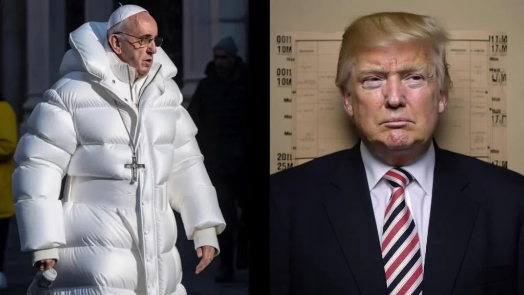
Midjourney can convert natural language prompts into high-quality images. In some cases, images from Midjourney have even deceived experts in photography and other domains.
Examples range from Pope Francis dressed in a puffer jacket to Trump arrested, both went viral.
Midjourney begins its image generation process by collecting a vast amount of data. This data includes various elements such as color palettes, lighting conditions, textures, and shapes. The algorithm analyzes this data to understand the underlying patterns and relationships. Once the data is collected and analyzed, Midjourney employs sophisticated pattern recognition techniques to identify recurring patterns and features. This step is crucial in generating images that are visually appealing and aligned with human preferences.
Midjourney continuously learns from its previous iterations and user feedback. It adapts its image generation process based on the insights gained, resulting in improved image quality and realism over time. This iterative learning process enables Midjourney to stay at the forefront of image generation technology.
The magic of Midjourney lies in its ability to combine all the gathered information, patterns, and learned features to create unique and visually striking images. The algorithmic magic ensures that the generated images are not only aesthetically pleasing but also aligned with the desired objectives of the users.
2. DALL-E
Introduced in 2021 by OpenaAI, it revolutionized the world of generative AI. This software can turn a simple text description into photorealistic images that have never existed before, or also realistically edit and retouch photos.
Based on a simple natural language description, it can fill in or replace part of an image with AI-generated imagery that blends seamlessly with the original.
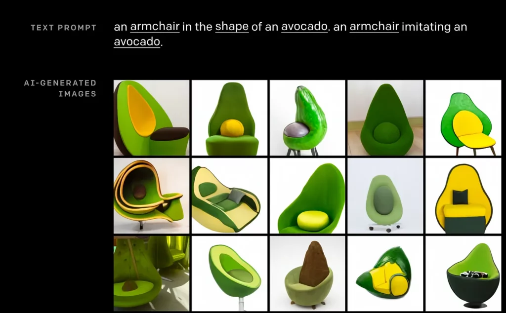
Just like humans can combine the concept of armchair and avocado — and concatenate those concepts into one image, so can DALL-E. In fact, it not only understands individual objects, like koala bears and motorcycles, but learns from relationships between objects.
It can take what it learned from a variety of other labeled images and then apply it to a new image.
DALL-E was created by training a neural network on images and their text descriptions. A text prompt is input into a text encoder that is trained to map the prompt to a representation space. A model called the prior maps the text encoding to a corresponding image encoding that captures the semantic information of the prompt contained in the text encoding. Finally, an image decoder stochastically generates an image which is a visual manifestation of this semantic information.
3. Adobe Firefly
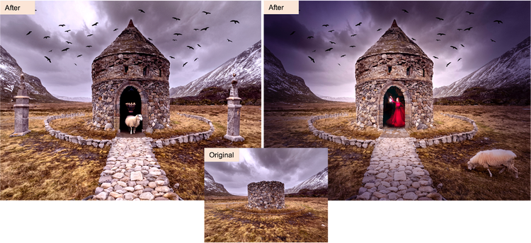
Adobe Firefly generates images from texts. This text generation is currently being used to experiment with features such as Generative Fill in Adobe Photoshop.
Generative Fill doesn’t require a pre-existing image to start working. Users can create images in Photoshop using a text prompt; an image will generate and editing can begin from there. It is a new tool that is definitely changing photo editing.
In conclusion, these tools not only showcase the potential of artificial intelligence to create high-quality, realistic images from textual prompts but also demonstrate their adaptability and continual learning processes. Midjourney’s ability to analyze vast amounts of data and learn from user feedback ensures its ongoing improvement in generating visually appealing images. DALL-E’s innovative approach, utilizing text descriptions to create photorealistic images, opens up new possibilities in image editing and synthesis. Similarly, Adobe Firefly’s integration with Photoshop introduces a novel method of image creation directly from textual prompts, streamlining the creative process for users. As these technologies continue to evolve, they promise to redefine the landscape of image generation and manipulation, offering unprecedented opportunities for creativity and expression in various domains.
So now, onto the survey I conducted regarding the results from my short online questionnaire. It provided me with further insights and raised topics I hadn’t previously considered.
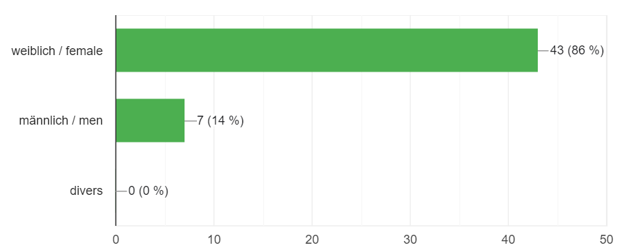
Thus far, 51 people have participated in the survey. It will remain active over time, so I may collect additional results and opinions, although they may not be relevant at present. I had participants from various age groups, but in total, there were 86%, which may also influence the research, as women tend to be more emotional, which is a significant factor in this topic.
Next, I posed some general questions about their feelings regarding animal welfare and their level of involvement in it.
I also inquired about their exposure to disturbing advertisements or approaches on the street and how it affected them.
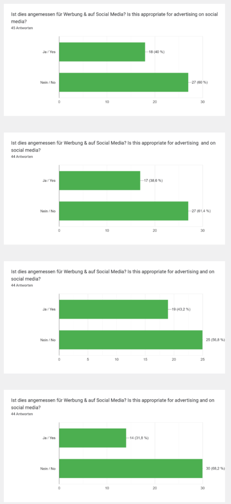
Following a trigger warning, I presented four different images and asked whether they believed these images were appropriate for use on social media for advertising. In response, the majority deemed them inappropriate, and they also articulated their concerns and reasons for their decisions. I won’t include these images here, as I can’t provide a trigger warning as in the survey, but they are available on the survey link.
In summary, after reviewing all the comments:
The primary concern regarding the use of graphic images on social media or in advertising is the potential traumatization of younger people who may encounter them. While there are existing options to conceal such posts, they often fail to reach as many people as other posts, necessitating acceptance of exposure to disturbing content. This could have a negative impact on children.
On the other hand, some individuals mentioned that exposure to such content desensitized them, leading to diminished shock upon subsequent exposure. However, most respondents reported feeling sad, shocked, or ashamed when viewing such content.
Regarding street approaches on these topics, respondents varied in their reactions. Some expressed satisfaction that others were engaged in the issue and had donated, while others found it stressful and disliked being interrupted. It’s essential to consider these responses in different contexts, as they may vary depending on the situation.
Additionally, it was noted that sometimes the content is too brutal and doesn’t accurately reflect the truth. Not all farmers are depicted as negatively as portrayed in these ads, necessitating a more nuanced approach. Some campaigns may go too far and inadvertently harm individuals who are already striving to do their best, but the industry as a whole must undergo change.
To my surprise, only five people declined to participate in the second part after the trigger warning, allowing me to gather numerous responses. For each image, more individuals felt it was unsuitable for social media and advertising.
My main insights from the survey indicate that many people are aware of the issue. It would be beneficial to delve deeper into whether there are correlations between age or education level and their opinions. From a preliminary analysis, I noticed that younger generations and individuals aged 41-49 were more receptive to viewing this type of content online, whereas those aged 31-40 and 50+ were predominantly opposed to it. However, obtaining more responses would be necessary to produce a validated result, yet it remains an intriguing observation.
Maybe it is an option for me to combine my insights now with a possibility to make visuals about animal welfare that communicate the problem but are also suitable for online content and a save internet space. I for my part also think that is is crucial that we protect the youger generation which is already bombed with a lot of too brutal content. If I see a lot of posts about this topic I also have to put my phone away and get very anxious but I can speak for myself and regulate my feelings better than children or teenagers and I also have main development achieved which children still are in the middle of it. The content they see is highly influencial to their character and lifestyle in the future. So on the one hand it is good that they can see the reality but we have to make sure that is not too much for them.
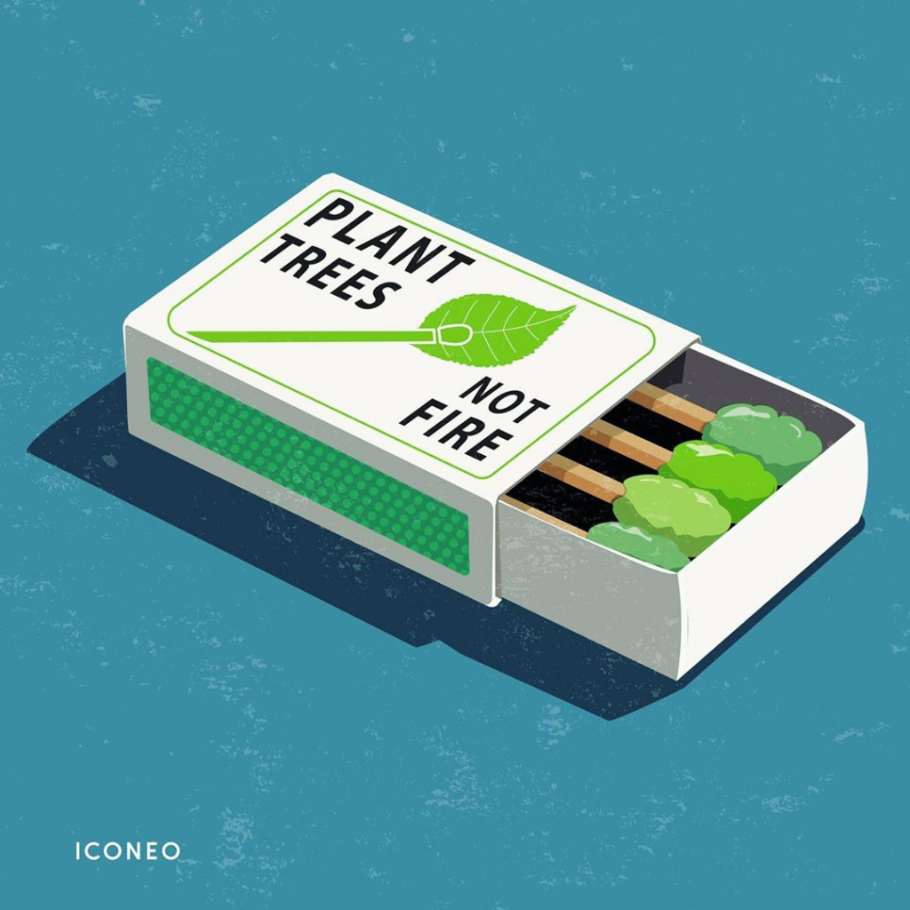
To find a deeper connection between animal welfare and provoking advertisements I wanted to explore the issue of provoking illustrations. We all saw some well thought posters with a ambiguous illustration to make the viewer aware of different problems. Often it is not about the exact style more about the message. And as my previous research showed is that emotions and having to think about ads/artworks lead to more engagement from the viewer. The most difficult part which this kind of work is not the excecution it is more about finding the idea and a great concept to visualize. So in this blog I collect various illustrations from different designers to get an overview what is already out there.
Provoking illustrations with a twist refer to artworks that capture attention by presenting familiar scenes or concepts in unexpected or thought-provoking ways. These illustrations often challenge viewers‘ perceptions, stimulate thoughts or spark an emotional response. They may employ clever visual metaphor, or surreal elements to convey a deeper meanings or societal commentary. Artists who specialize in this style aim to engage viewers on multiple levels, encouraging them to question assumptions and explore new perspectives.
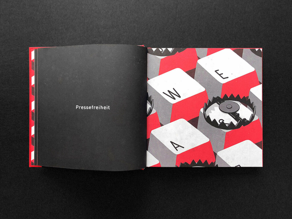
Through my research I found Steffen Kraft who made various illustrations with a twist about climate change, plastic pollution or social behavior.
Steffen KraftSteffen Kraft
Examples, such as those found in „50 Mindshots“ by Maivisto, demonstrate the power of visual storytelling to provoke thought and stimulate dialogue on a wide range of topics. His daily business in illustrating is creating visuals for brands, agencies and magazines in a watercolor style – so he started creating these very minimalistic stylised artworks to reflect on important topics in our society.
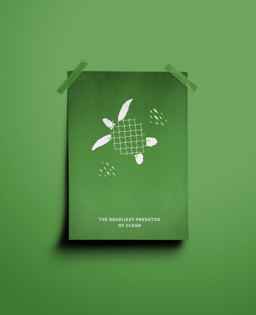
Another way to make such interesting visuals is with using common shapes an objects to build up the illustration. In this example they use a net graphic to visualize the turtle shell – this should symbolize how many turtles and other animals get harmed by all those ghost nets in the ocean and the fishing industry.
Yun-Rung Chu
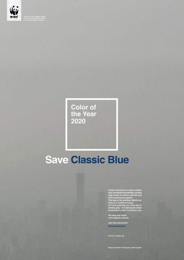
As it is also a strong tool also some companies use it in their ads. On the website adsoftheworld.com you can find a lot of different campaings which also use this tool in their ads. Here shown with WWF who made a switch on the announcement of color of the year from Pantone. It should make people aware of the problem of air pollution and that we all have to do something to save the classic blue.
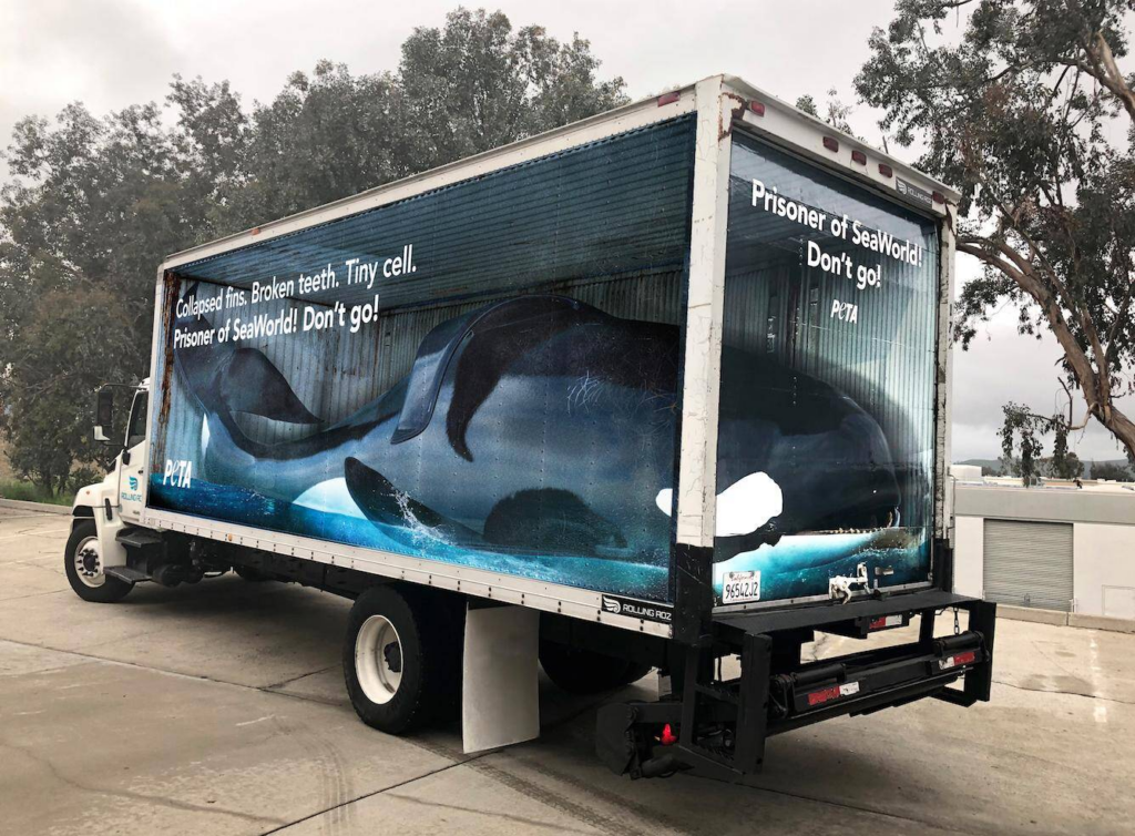
PETA: Boycott SeaWorld‘ was published in United States in March, 2019
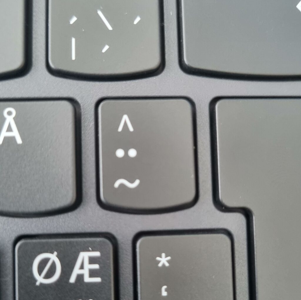
In the first semester of my research, I explored the neurological underpinnings of how humans perceive facial configurations. This phase focused on general facial recognition, establishing a foundational understanding of the processes involved in facial perception. From there, I delved deeper into how humans interpret emotions conveyed through facial expressions. This analysis incorporated key elements such as symmetry, aesthetic traits, and the “child schema” (infant-like facial features), which play a vital role in how we perceive attractiveness and emotional cues in faces.
Expanding Focus: Facial Configurations in Art and Design
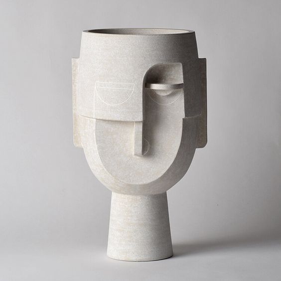
In the subsequent phase, I shifted my focus to the context of graphic design and visual arts. This exploration examined how facial configurations are stylized, utilized, and interpreted within artistic and design contexts. I aimed to understand the impact that specific facial shapes and expressions have on viewers, with an emphasis on the emotional responses these configurations evoke in artistic settings. This cross-disciplinary examination of facial perception from both neurological and aesthetic perspectives allowed me to explore the interplay between cognitive science and visual art.
Next Research Steps: Experimental Design and Surveys
The upcoming phase of my research involves conducting targeted surveys and experiments. The core of this work will be to present observers with a diverse array of images showcasing facial configurations at varying levels of abstraction. This approach aims to investigate two primary aspects:
Recognition Value:
The primary objective is to assess whether observers can consistently recognize abstracted or stylized configurations as representing human faces.
Assignment of Emotions:
I will explore the specific emotions that observers attribute to particular facial configurations. This will reveal patterns in emotional interpretation based on facial structure, expression, and style.
To ensure a comprehensive analysis, I will curate images that exemplify various artistic techniques and degrees of abstraction. These images will serve as a basis for understanding how specific facial configurations and styles influence both cognitive recognition and emotional response.
Through these surveys, I aim to uncover deeper insights into the cognitive mechanisms behind facial recognition and emotion interpretation, which will contribute valuable knowledge to cognitive psychology, visual arts, and user experience design.
Final Research Phase: Real-World Contextualization
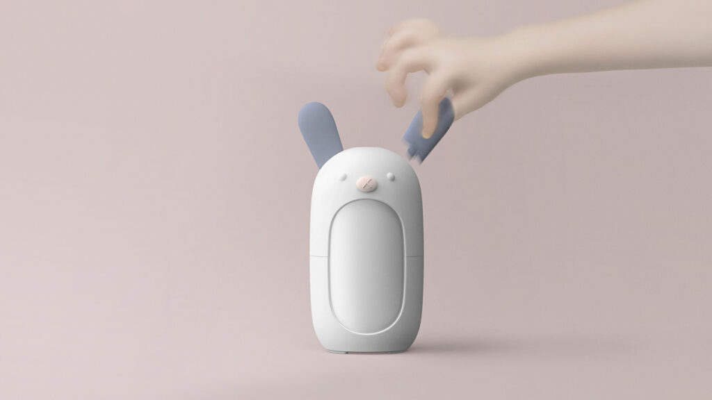
In the culminating phase of my research, I will investigate the practical applications of facial configurations within real-world design contexts. This will involve studying user interactions with products that incorporate facial shapes or configurations, with the goal of understanding how these designs impact user experience. Specifically, I will focus on:
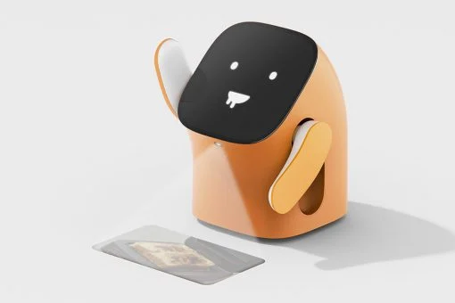
Interaction with Interfaces: Investigating how facial shapes influence the way users engage with the interfaces of everyday devices and products. This includes examining whether facial configurations facilitate more intuitive interactions.
Emotional Impact on Users: Assessing whether specific facial configurations can shape the emotional response users have toward products. I aim to determine if these configurations can positively influence both user experience and emotional connection.
Design Strategies for Pareidolia: Exploring how designers can strategically incorporate pareidolia—the tendency to perceive faces in inanimate objects—to enhance user engagement and satisfaction.
Through this comprehensive approach, I intend to identify how integrating facial configurations into product and interface design can lead to more empathetic and user-centered experiences. By examining these dynamics, this research has the potential to inform more intuitive, emotionally resonant design strategies, ultimately contributing to enhanced user satisfaction and engagement across various domains.
By addressing these questions, I aim to find out how integrating facial shapes into design can enhance user engagement and satisfaction. The insights gained from this research could lead to more empathetic and intuitive design practices, ultimately contributing to improved user experiences in various fields.
Last semester, I learned a lot about tactility in general and why tactile design matters. When researching, I stumbled upon a topic about tactile images. Since I also consider myself a photographer, I think it could be really interesting to try and combine these two topics.
How to combine photography and tactile design?
Nowadays, people look at their photos on digital screens. Rarely, anyone actually prints photos ( maybe for special events like wedding, etc.) and even when they print them, they don’t really interact with them. They store photography in albums or books, seldom touching them. Even me, who likes to capture important events, am not really prone to actually printing my photography. Sometimes it’s really sad that we have all these photos and we forget about them because we don’t really know what to do with them. I remember that when I used to be little, I looked at photos in albums and I was really excited when I had them in my hands. At the same time, I was a little bit afraid that I will ruin them with my fingers because the material wasn’t touch-friendly.
Wouldn’t it be great to have photos which encourage you to touch and explore them? What consequences would that have? Would people be more interested into looking? What about people who are not so passionate about photography – how would their reaction be? What about those who are in fact really passionate? Does adding another dimension to photography “ruin” its purpose? How does adding tactile elements to photography affect its appearance? Does photography appreciation grow with interactive elements?
I have a lot more questions, but for now, I think I wan’t to explore different ways in which I can actually manipulate photos so that they have tactile experience. I want to research how to add interactive dimension to photography using tactile materials.
The goal of my research will be not only to bring back the tactile experience to photography, but to add an extra meaning to it using interesting and experimental tactile elements.
In the upcoming phase of this semester, I will be experimenting to discover art styles, posters, and visual elements that could enhance my work on the chosen topic. This blog post focuses on gathering visuals, typography, and inspiration that resonate with me. In the next entry, I will delve into testing these elements with my content.
As I am really into illustration and simple/swiss graphic design I could work with shapes like that:
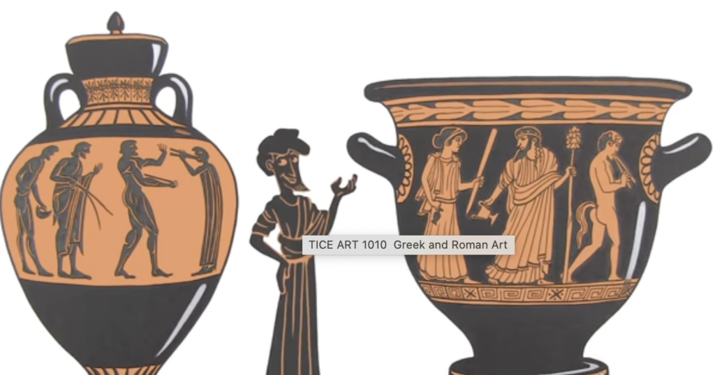
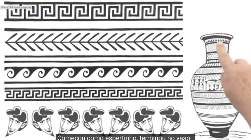
Stoicism is a school of Hellenistic philosophy that flourished in Ancient Greece and Ancient Rome. Therefore another interesting art style would be to work in the the „classical art“ style. Geometric Designs in Greek Art (eg. Geometry repeated Shapes on Pots), black figure- and red figure wear,
Artificial Intelligence image generation techniques use different approaches to create striking and realistic visual works.
GAN
Generative Adversarial Network consist of two competing neural networks: the generator, which acts like a forger that makes fake images and tries to pass them off as real, and the discriminator, which acts like a detective trying to figure out if the generator’s images are real or fake. The generator is asked to create an output of an image that does not exist, which it then tasks the discriminator to figuratively fact-check. The discriminator has been trained on datasets of lots of real images, so it has an idea of what to look out for. When it identifies a fake image, it tells the generator that the generator’s images are real or fake. This process is repeated in a loop until the discriminator can no longer differentiate the generated image from the real thing.
An example is the website This Person Does Not Exist developed in 2018. It produces an image of a random fake face that you can download.
NST
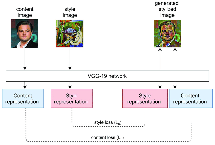
Another method of creating AI-generated images is through Neural Style Transfer. These applications merge the content of one image with the artistic style of another, by utilizing Deep Learning and large datasets.
A Neural Style Transfer works by taking both a Content Image and a Style Image, which are then merged into a generated output. So the resultant image retains the content of the Content Image while adopting the artistic style of the Style Image.
A convolutional neural network, a type of AI that mimics human visual capabilities, is used to extract the features and multiple layers of the content image.
DIFFUSION MODEL
Diffusion Model is used by the most modern image generators applications, such as Stable Diffusion and Midjourney, and it is able to generate high-resolution images. It works by gradually adding Gaussian noise to the original data in the forward diffusion process and then learning to remove the noise in the reverse diffusion process
When we enter a text input into a generative AI app, the software will use Natural Language Processing (NLP) and Machine Learning to understand the prompt. It will then scour a massive library of stock photos and gather images that have relevant text descriptions. Then the AI takes existing images and diffuses the pixels into noise. The AI model is then tasked with rebuilding the original images using the diffused noise blocks, which will result in a new image.