14. Doing more trials to backup my research

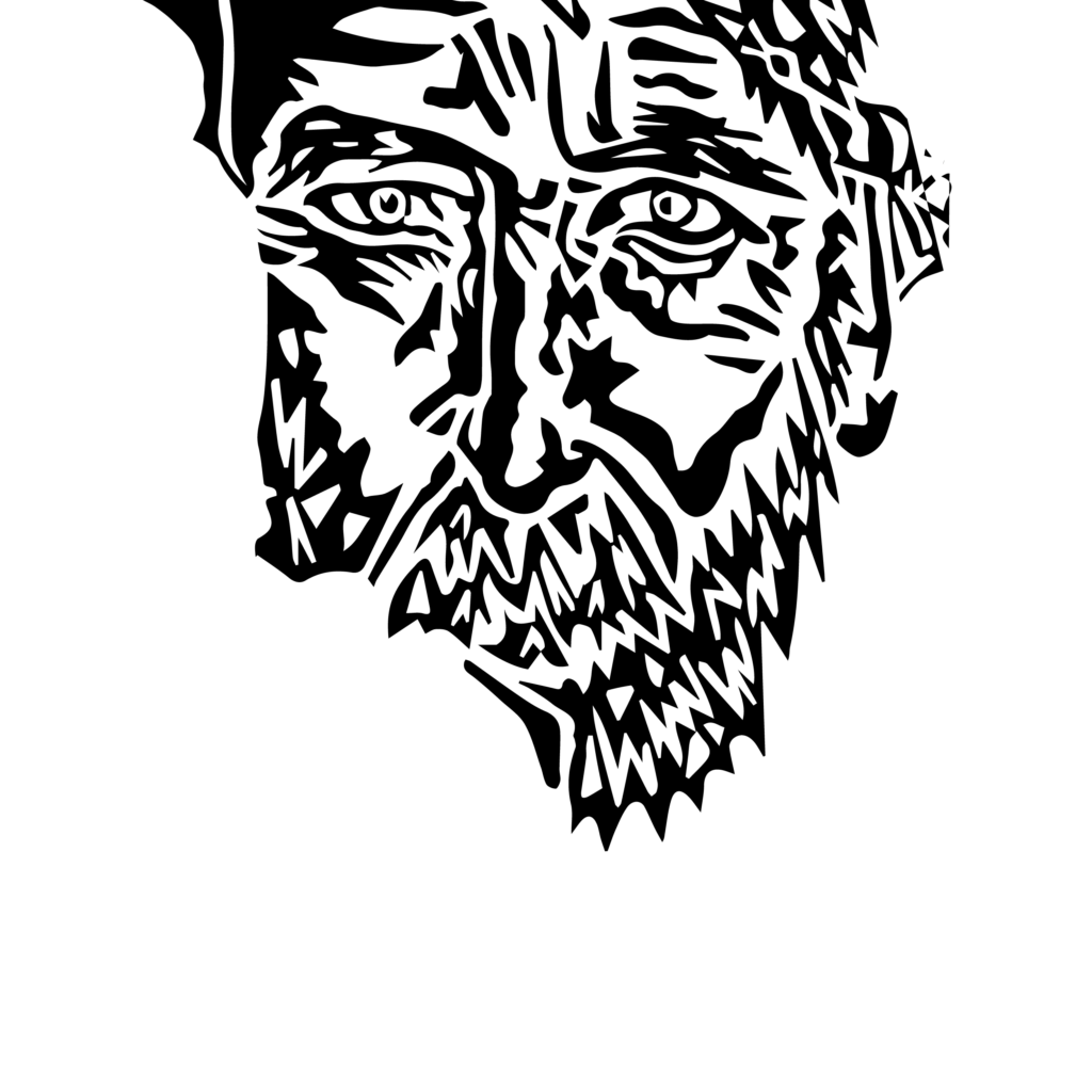
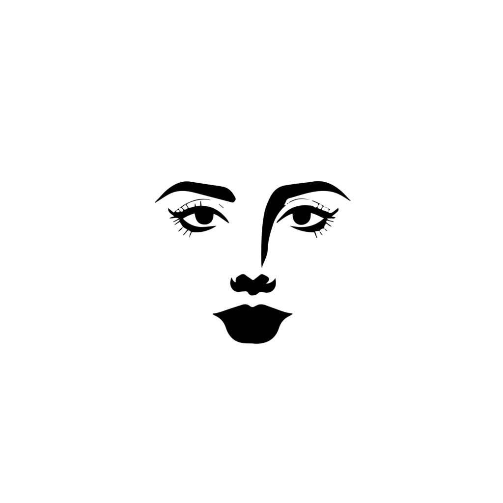
I created many series featuring faces of different people at various ages with distinct looks. Additionally, there are graphical images of animals, such as a dog and a cat. All these images are graphical vector illustrations that have been simplified step by step in Illustrator. There are also more images of faces that I have manually created. Later, I used digital tools to simplify them gradually.

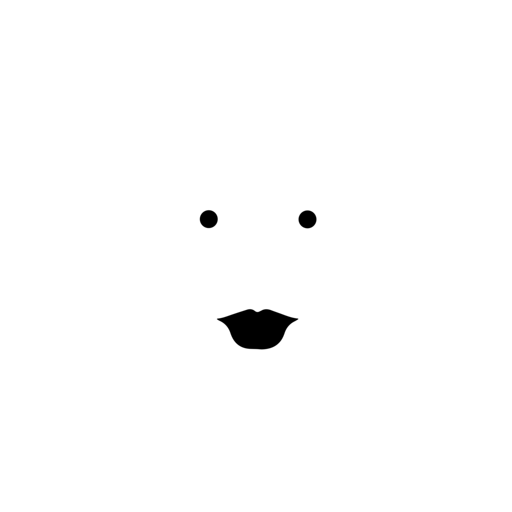
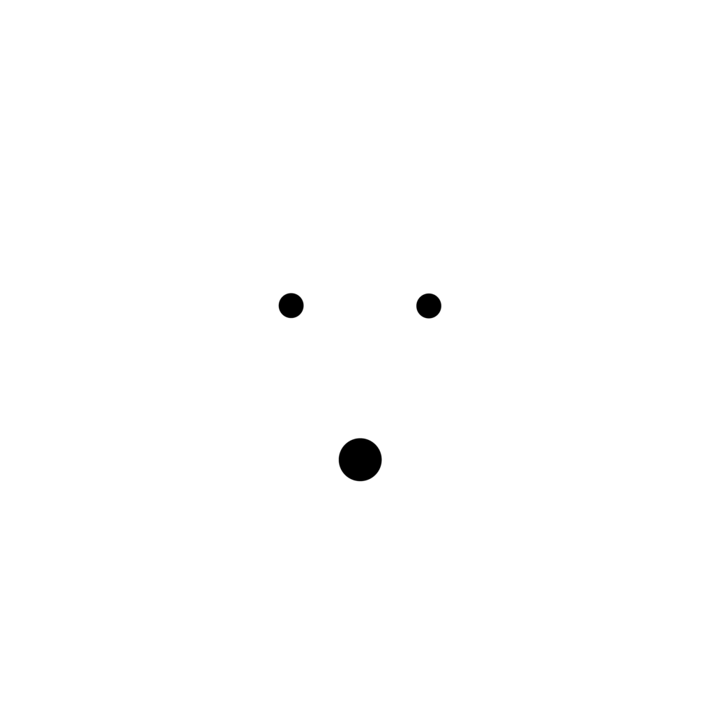
During the summer break, I plan to simplify these images further, until only two dots remain where the eyes used to be. Then, I want to conduct the same experiment again to validate the findings from my previous post. This is my collection of different faces in various stages of abstraction.

Series 01: Middle Aged Man

Series 02: Young Girl

Series 03: Young Boy

Series 04: Cat

Series 05: Dog

Series 06: Dot Art

Series 06: Line Art

Series 07: Print

Series 08: Profile Drawing

It was important to me to create a series that is highly diverse, encompassing a variety of styles and personalities. At the same time, I wanted to maintain a structured approach to the abstraction process, ensuring continuity in the simplification stages. This method will help me systematically explore how different degrees of abstraction affect the perception of faces and personalities, providing valuable insights for my ongoing research.

19 | Experiment: Intuitive Eszett Choice, Part II

In this experiment, I presented the word „STRAẞE“ in uppercase using different forms of the Eszett character. The letterforms I designed were based on the Mabry typeface. Participants were asked to choose their favorite form from the five presented options. There were no wrong choices, as all letterforms are officially recognized. The experiment was solely about personal preference and intuition. I conducted this experiment with individuals who predominantly have a strong design background. In the future, it would be interesting to conduct this experiment with non-designers as well.

Analyse

The majority of respondents in this experiment selected the Leipzig Skeleton as the best visualization of an uppercase Eszett. When combining the votes for both the super soft and soft variants of the Dresden Skeleton, it ties with the Leipzig design. I believe the results were strongly influenced by the fact that my participants were from the design industry, where there is a constant pursuit of new and modern approaches. According to German type designer Ralph Hermann, when typefaces include an uppercase Eszett, the Dresden Skeleton is often the most commonly designed option. This outcome aligns with my expectations, as in the intuitive exercise of drawing a large sharp S, many participants were inspired by the lowercase form, creating a broader and larger variant of the Sulzbach design. I still find it very intriguing that many participants were open to a more modern approach that doesn‘t closely resemble an uppercase B.

18 | Experiment: Intuitive Eszett Choice, Part I

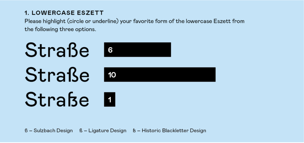
In this experiment, I presented the word „Straße“ using different forms of the Eszett character. The letterforms I designed were based on the Mabry typeface. Participants were asked to choose their favorite form from the three presented options. There were no wrong choices since all letterforms are officially recognized; the experiment was solely about personal preference and intuition. I conducted this experiment with individuals who predominantly have a strong design background. Moving forward, it would be interesting to conduct this experiment with non-designers.

Analyse

The evaluation of this experiment revealed that the majority preferred the ligature design. The Sulzbach design also received many votes but could not surpass the ligature design. This result was quite surprising to me, as I had expected the Sulzbach design to be the clear winner. In a previous experiment where I asked participants to draw a sharp S on a piece of paper, 98% of the responses were in the Sulzbach design, in a handwritten/cursive style. This outcome was clear to me since this design is commonly taught and recommended in schools. Apparently, this conclusion does not apply to printed letters. It seems we have a different perception or understanding for printed typefaces.

Research 18: Another Survey

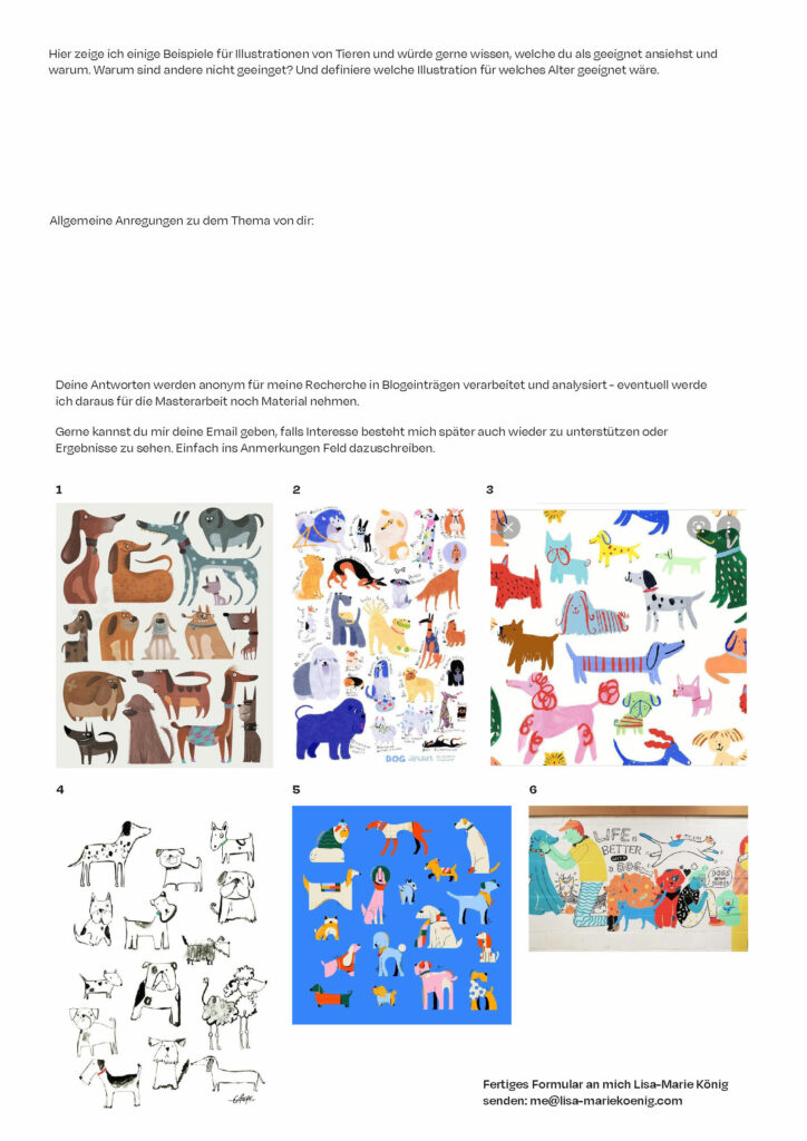
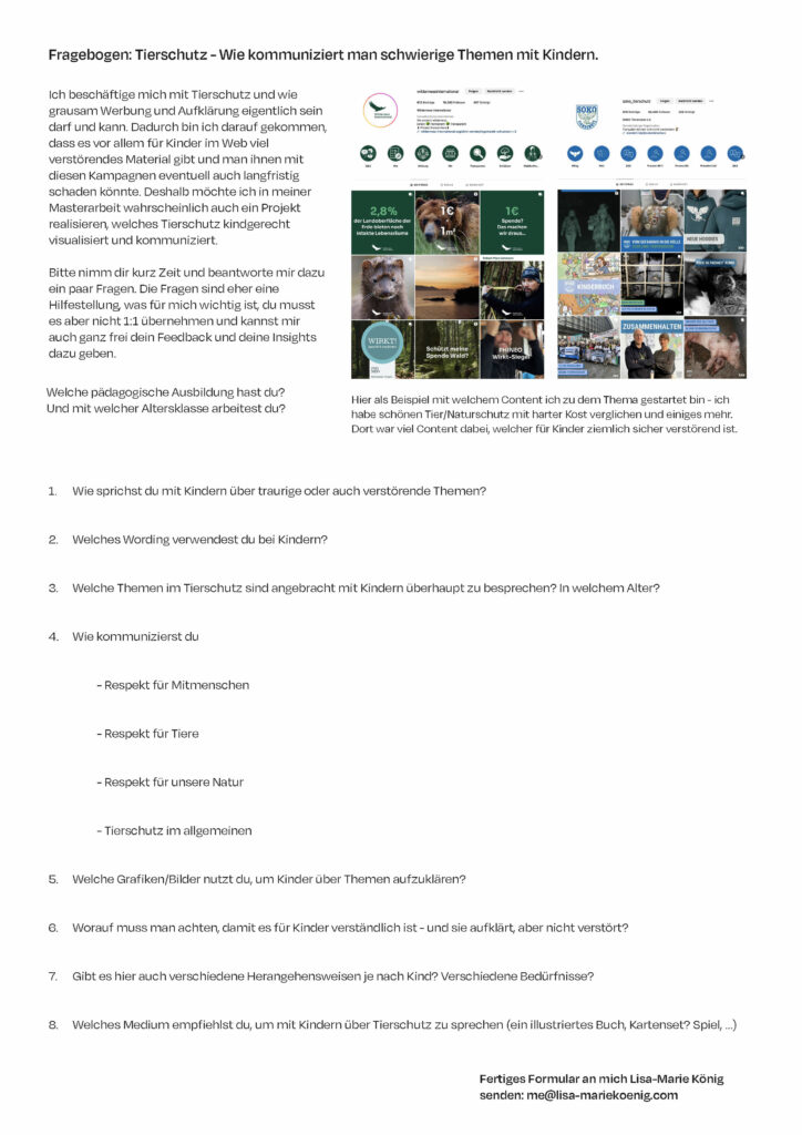
As I progressed further in my topic I wanted to ask some experts on how to communicate with children about animal welfare and in general. To support this, I created a short questionnaire with various questions on how to communicate effectively, whether it is appropriate, and which visual materials should be used. Currently, I am in the process of collecting completed questionnaires and hope to present my findings in the next post.

So here is my questionare:

I did not want to be too specific, as the focused research will take place next semester when I determine which age group or topic I want to concentrate on. For now, I have kept it very open and the questionnaire has been sent to kindergarten teachers as well as teachers of children up to 18 years old. My aim is to gather a broad spectrum of information.

For me, the most interesting part will be learning which visuals teachers would choose and what is understandable for younger children. We must not forget that children’s brains work very differently from adults‘. It is important to be realistic, but there are also many children’s books illustrated in a very abstract way. I need to find my own method of interpreting the topics so they are understandable and useful for children. The end product I am working on will also influence the style and design significantly.

13. Series of Experiments

Exploring the Degree of Abstraction

I have created the following images of a face in twelve different degrees of abstraction. Initially, the facial shapes are very detailed and clearly set within a context, making it immediately recognisable that the depicted person is a young woman. Step by step, I reduced the colours, simplified the shapes, and removed more and more elements. In the end, only two black dots remain where the eyes used to be.

Starting with the last image featuring two dots, I showed the series to a test group of three different people. I asked them if they could recognize what was shown in the image. Two out of the three people recognized a face in the eleventh image with three dots; the third person recognized a face in the tenth image, when the shape of the mouth was already more refined.

Additionally, I asked the test group at which point they were able to recognize the gender of the face and estimate its rough age. One test person said this was possible at the ninth image, the second person at the seventh, and the third at the fifth image, when the context of longer hair surrounding the face was present.

15 – personal experience

The reason why I got back into my topic was, because lately I have been doing more handmade design and found it fun and refreshing in comparison to sitting on the computer all day. In this blogpost I want to report on my personal experience on this topic. For the course ‘print production’ we got to do multiple things by hand. During our lecture at ‘Invinitive Factory’ and ‘Maarble’ for example, we got to bind books. Once we used book bolts, which was super fast and easy. We had to fold the papers by hand, punch holes into them, fold the cover page and then screw in the bolts. It surprised me how quick and easy this technique is, whilst still resulting in a very clean and professional look. If I already had all the utensils at home, I would personally much prefer binding brochures in a small quantity at home, rather than getting it bound by a cheap online service. The other time we bound books was with needle and thread. This took much longer and has a much more distinctive handmade looking result. What stuck out to me was how much fun it was to take the time and get lost in the details. With every stich you could see it coming together, which felt really great.

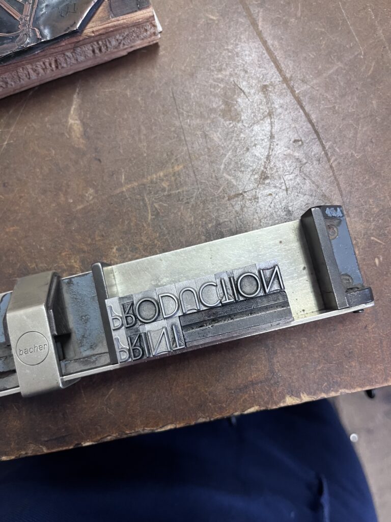
Another time we went to ‘DruckZeug’ to set and print postcards analog. I also went there again privately, to print the cover for a booklet. This, in comparison to book binding can be directly compared to digital designing in my opinion. I thought it was much harder, not only because you have to set the letters inverted, but because you have to use your imagination so much. When you set the words, you can’t yet decide where on the page they will be printed, or in which color. So, the result is much more of a surprise. But when it works out the surprise is so nice, that it really feels like a great accomplishment. Sometimes when designing digitally, the changes are so easy to make, that it never really feels finished and the result often feels more like a compromise because the options are endless. I also enjoyed the different steps of setting and afterwards printing. It makes the task more varied, so that it doesn’t get boring. In general, I believe I designed much more planned than when I open my laptop. I also felt braver in a way, because I couldn’t know what the result will look like anyways, so I just went for my idea and hoped for the best.

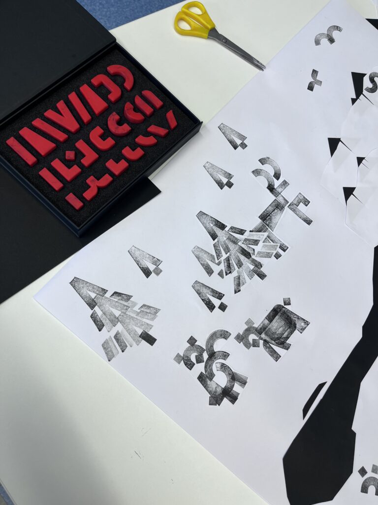
During the international week I was in the workshop of Daniel Utz, where we worked on pictograms. As a warming-up exercise we had to use stamps and cut out paper, to create simple shapes and put them together as scenes. Doing this in an analog way made it much easier to collaborate with others I noticed. Also, I felt keener to experiment and had many ideas of how to create interesting shapes. On the computer I tend to google and get inspiration of how other people did it.  

In general, I had a lot of fun using my hands and analog techniques to design this semester and personally feel the benefits of it. But it has to be said, that these techniques are pretty time consuming and can therefore be considered sort of a luxury. They also require some equipment, some of which is easy to acquire, some of it harder.

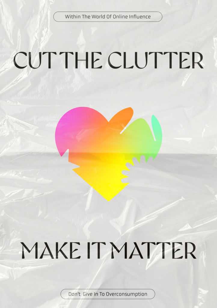
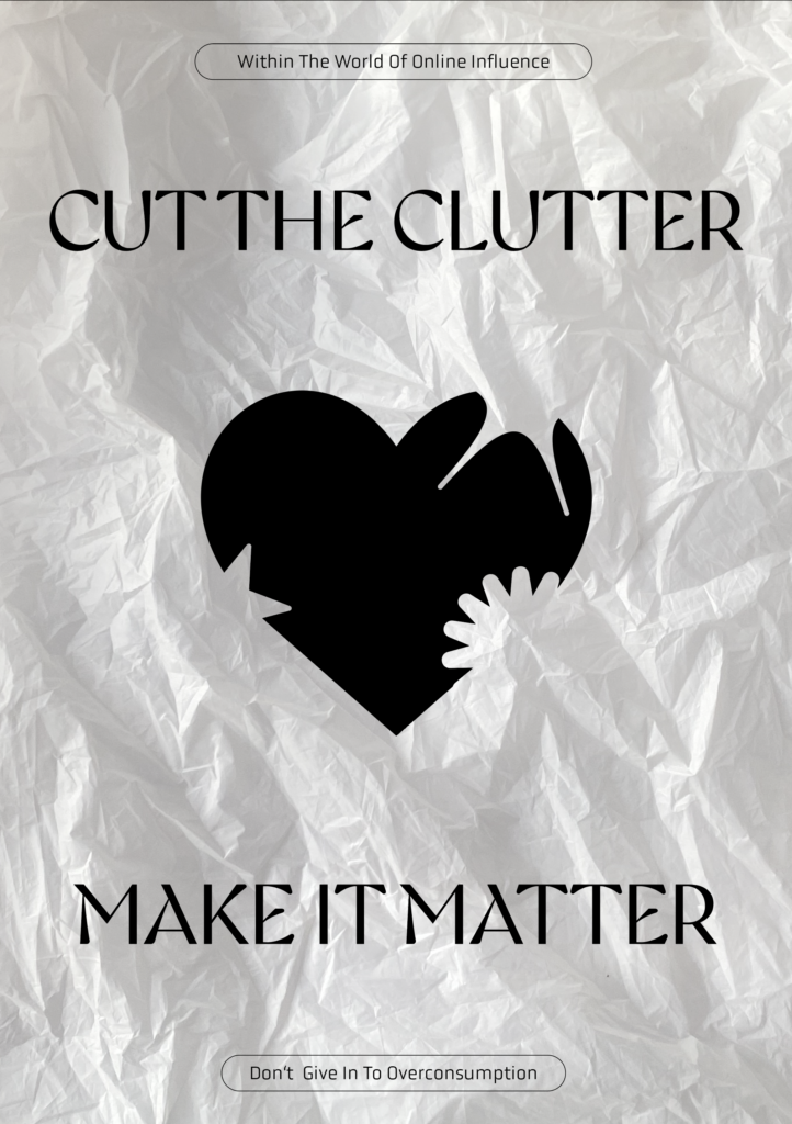
Experiment 1 / Part 2: Incorporating Texture / Imperfections into design

Overlaying Textures with Transparency Settings

One of the most straightforward methods to add texture to your design is by overlaying a picture of any texture and adjusting the transparency settings (e.g., multiply, lighten, darken, overlay). This technique is both easy and quick, making it ideal for achieving a desired look without much effort. Often, these texture images are sourced from the internet, as the reality is that everyday life seldom affords the time, energy, or motivation to create your own textures. Using materials like tin foil, plastic wrap, paper, or cardboard to craft unique textures is an option, but it requires more time and experimentation.

Creating Your Own Textures

While using pre-existing images is convenient, creating your own textures can offer a unique touch. Experiment with various materials to develop custom textures, then photograph or scan them. This approach, although more time-consuming, allows for a personalized and distinctive design element that can’t be found elsewhere. The following pictures are the applied textures that I created in that way, using different materials I found at home.

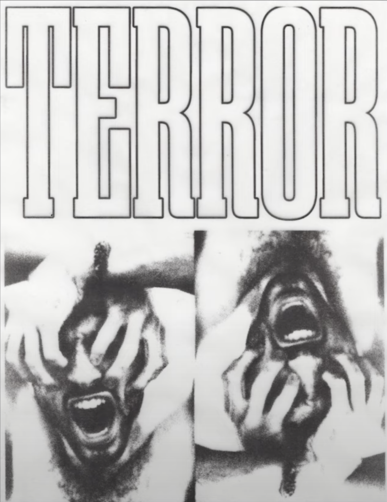
Printing and Photographing

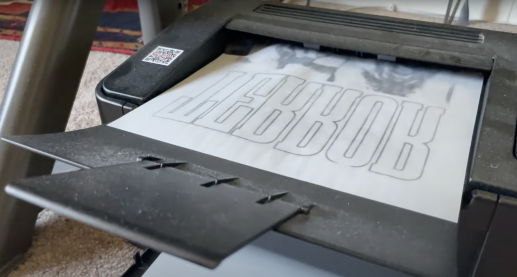
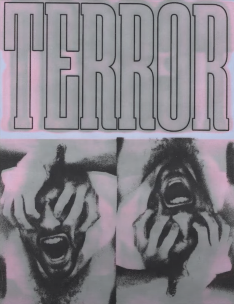
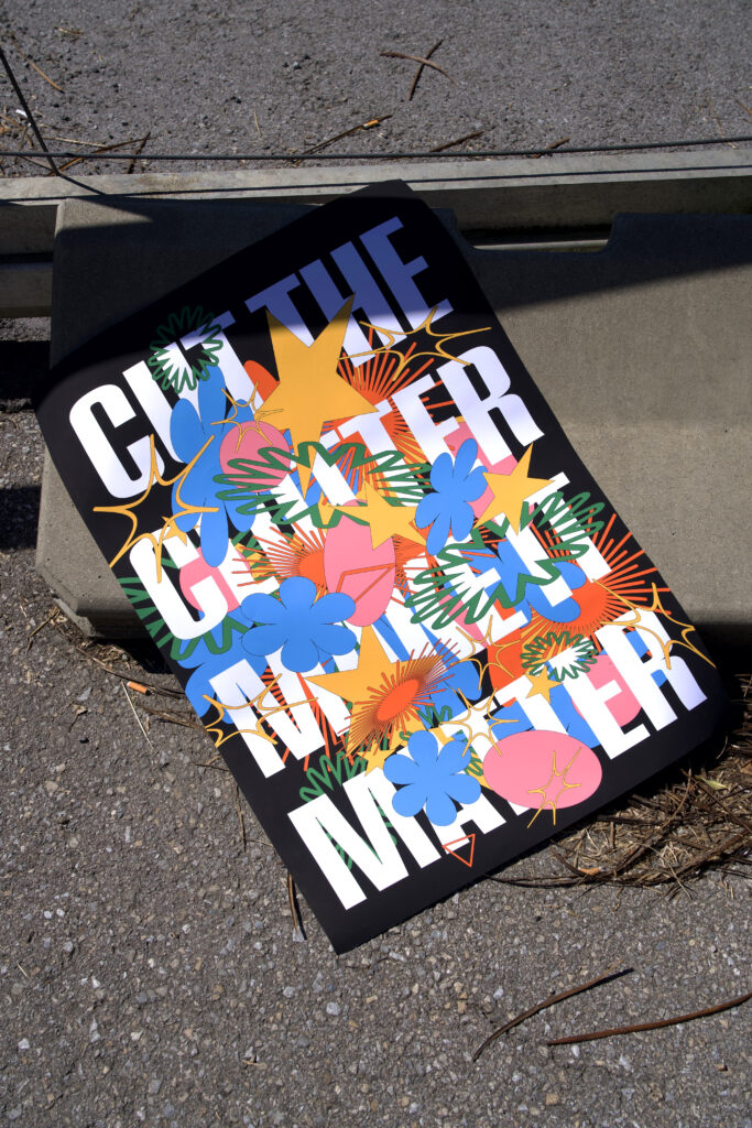
Another creative method involves printing your design and then physically altering the printout. You can fold, tear, crumple, or soak the paper, transforming it in any way you like. Afterward, scan or photograph the result and make any necessary adjustments in Photoshop. For added context, take your printouts outside or to different locations to photograph them, incorporating the surrounding environment into your design.

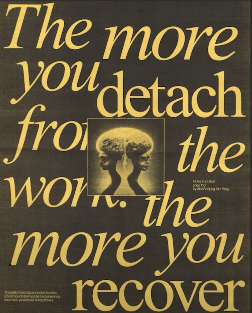
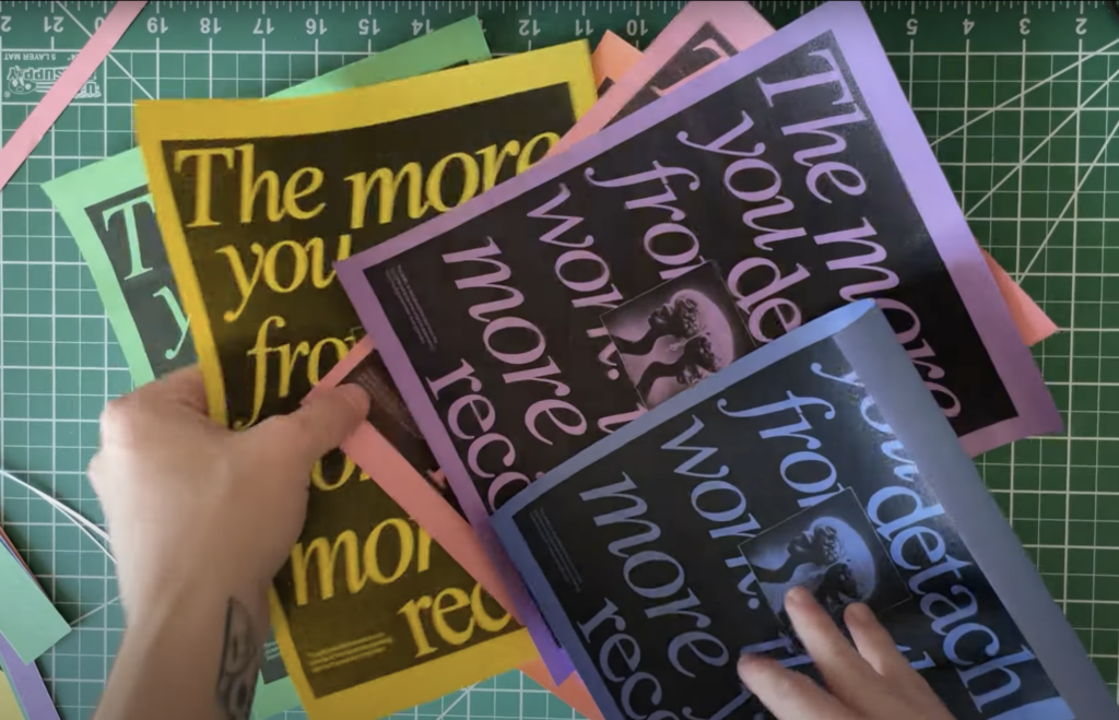
Pictures from „Jesse Nyberg“ on YouTube

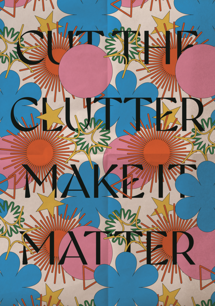
Pictures: Poster I designed for our Lecture Project Work 2 on the topic of overconsumption

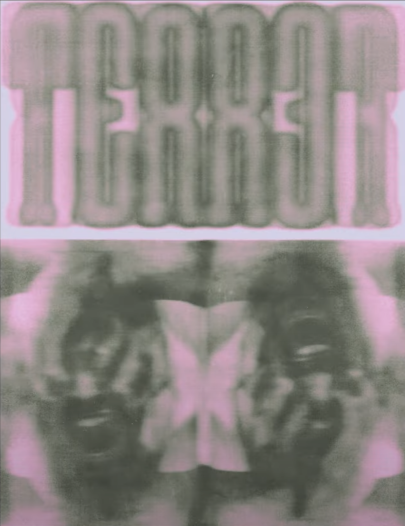
Using Various Papers

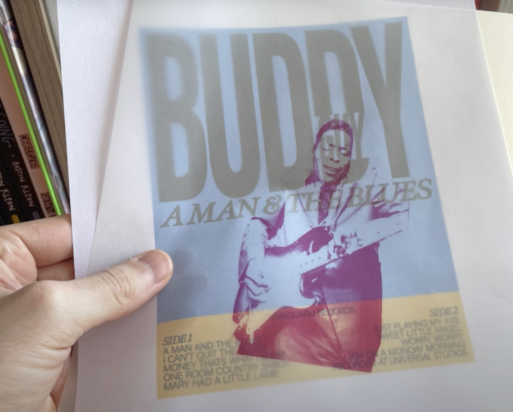
Experimenting with different types of paper can also add interesting textures and effects to your design. Transparent paper, colored paper, thin or thick paper, textured paper, newspaper, and parchment paper are just a few examples. Print your design on these different papers, and then scan or overlay prints. Certain papers may cause the ink to smear or leave fingerprints, creating unique effects. Transparent paper, for instance, can give a frosty look that adds depth and intrigue to your design.

Pictures from „Jesse Nyberg“ on YouTube

By using these techniques, you can incorporate texture and imperfections into your design, adding depth, interest, and a unique touch that enhances the overall aesthetic.

17 | Experiment: Intuitive Typography 

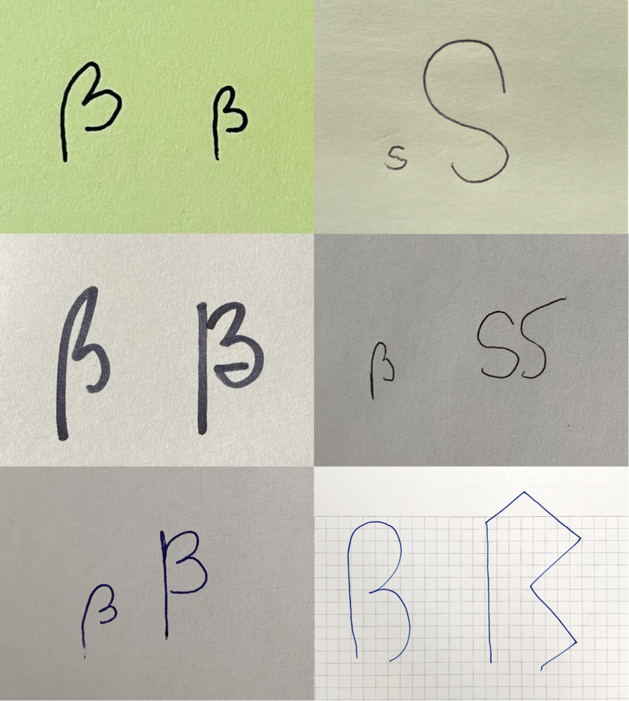
In this experiment, I asked people of different ages and cultural backgrounds, both with and without design experience, to draw a sharp S on a blank sheet of paper. For my participants, it was automatically clear that a sharp S is a lowercase letter. After they drew the letter, I asked them to transform it into an uppercase letter. This task left my participants somewhat perplexed. In 99% of the cases, the response was: „There is no uppercase sharp S, is there?“ Drawing the lowercase letter was done very intuitively and without any hesitation. However, creating the uppercase letter proved to be much more challenging. This is, of course, completely understandable, as people are not confronted with it in everyday life. While attempting to design the uppercase letter, my participants had many questions: How should it look? Doesn‘t an uppercase sharp S turn into a double S? Can I google this? Many were hesitant to draw a letter at all because they feared making a mistake.

Interestingly, many participants included a descender in both the lowercase and uppercase Eszett. This can be attributed to cursive handwriting, where descenders are commonly drawn. In digital typography, a descender is typically found in the italic/cursive version of the sharp S. Standard upright fonts, according to the norm, do not feature a descender for the sharp S.

The most frequently drawn uppercase variant was a modification of the lowercase letter. Many participants simply adapted the Sulzbach design of the lowercase Eszett into an uppercase form. They intentionally drew the letter with two rounded arches, making it wider to emphasize the characteristics of an uppercase letter.

12. Next Steps

Introduction

Exploring human perception of facial configurations is a fascinating endeavor that spans psychology, neuroscience, and the visual arts. Facial recognition and interpretation are central to human interaction, shaping social communication, emotional understanding, and even aesthetic judgments. To investigate these dynamics, I have developed a structured approach for a series of experiments aimed at examining how people perceive variations in facial configurations. These studies are designed to provide insights into the subtleties of facial recognition and to deepen our understanding of how minor changes in facial features and expressions impact perception and emotional response.

Experimental Structure

The following experimental design details how I plan to investigate various aspects of facial perception:

1. Creating Images with Different Levels of Abstraction

To explore the boundaries of facial recognition, I will generate a range of images that vary from highly detailed to highly abstracted representations of faces.

  • Objective: Identify the threshold at which an image loses its recognizability as a face among the test group.
  • Procedure: Test participants will view a sequence of images at different levels of abstraction, and their ability to identify each image as a face will be assessed.

By examining this recognition threshold, I aim to uncover how essential details and forms contribute to the recognition process.

2. Altering Distances Between Facial Features

This set of images will manipulate the spatial relationships between key facial features—specifically, the distances between the eyes, nose, and mouth.

  • Objective: Evaluate how variations in facial feature spacing influence perceptions of attractiveness and friendliness.
  • Procedure: Participants will rate each image based on perceived beauty and friendliness, allowing me to analyze how different arrangements impact social impressions.

These tests will help reveal whether certain spatial configurations are consistently associated with positive traits, which could have implications for both psychology and design.

3. Varying Facial Expressions

To assess emotional perception, I will create images that portray a range of facial expressions.

  • Objective: Determine whether participants interpret the same emotions from each facial expression or if individual interpretations vary significantly.
  • Procedure: Participants will be asked to identify the emotions each face conveys. Discrepancies in interpretation will be analyzed to uncover potential differences in emotional perception.

This experiment will help clarify how universally certain expressions are interpreted and whether subtle nuances in expressions can lead to diverse emotional responses.

Conclusion

These experiments are a vital component of my ongoing research into facial perception. By investigating how different levels of abstraction, feature spacing, and facial expressions affect perception within a test group, I aim to gain a more nuanced understanding of the mechanisms underlying facial recognition and emotional interpretation. The findings from these experiments will not only enhance the credibility of my research but will also offer valuable insights into the complex processes that shape how we perceive and respond to faces. This exploration has the potential to contribute meaningful knowledge to cognitive psychology, visual arts, and human-computer interaction, enhancing our comprehension of the fundamental mechanisms that govern facial perception in our daily lives.

6. AR Marketing Campaigns on a Restricted Budget

Augmented Reality (AR) has proven to be a powerful tool for engaging customers and creating immersive experiences. While larger brands may have substantial budgets to invest in AR technology, smaller brands often face the challenge of launching effective AR campaigns on limited resources. However, with strategic planning and creativity, even brands with restricted budgets can leverage AR to boost their marketing efforts. Here’s how:

  1. Utilize WebAR Solutions What is WebAR? WebAR allows users to access AR experiences directly through their web browsers, eliminating the need for downloading dedicated apps. This approach significantly reduces development costs and lowers the barrier to entry for users.

Why it Works:

Cost-Effective: Developing WebAR experiences is generally cheaper than creating a full-fledged AR app. Easy Access: Users can simply scan a QR code or click a link to access the AR content, increasing the likelihood of engagement.

Implementation Tips:

Choose the Right Platform: Platforms like 8th Wall and ZapWorks offer user-friendly tools to create WebAR experiences.
Optimize for Mobile: Ensure that your WebAR content is optimized for mobile devices, as most users will access it through their smartphones.

  1. Partner with AR Platforms and Agencies Why Partnering Helps: Collaborating with established AR platforms or agencies can provide access to AR technology and expertise without the need for substantial upfront investment.

What to Look for in a Partner:

Experience and Portfolio: Choose a partner with a proven track record of successful AR campaigns. Flexible Pricing Models: Look for agencies that offer flexible pricing models, such as revenue-sharing or pay-per-engagement plans.
Examples of Platforms and Agencies:

Overly App: Offers custom AR solutions and can help design campaigns tailored to your needs.
Blippar: Provides a range of AR services and has experience working with brands of all sizes.

  1. Leverage Social Media AR Filters What are Social Media AR Filters? Platforms like Instagram, Snapchat, and Facebook offer built-in AR tools that allow brands to create custom filters and effects for users to interact with.

Benefits:

Low Cost: Creating AR filters on social media platforms is often free or low-cost.
Wide Reach: Social media platforms have massive user bases, providing an excellent opportunity for viral engagement.

How to Create Engaging Filters:

Align with Your Brand: Ensure that the filters reflect your brand’s identity and message. Interactive and Fun: Design filters that are fun and encourage users to share their experiences with their followers.

Tools to Use:

Spark AR Studio: For creating filters on Facebook and Instagram.
Lens Studio: For developing filters on Snapchat.

  1. Incorporate AR into Existing Marketing Materials How to Integrate AR: Add AR elements to your existing marketing materials, such as brochures, business cards, or product packaging. Users can scan these items with their phones to unlock interactive experiences.

Benefits:

Enhances Engagement: AR can make traditional marketing materials more interactive and engaging.
Affordable: Adding AR elements to existing materials is often more cost-effective than developing standalone AR campaigns.

Tools and Platforms:

Layar: Allows you to add interactive AR content to print materials.
Augment: Offers a platform for creating AR experiences linked to product packaging and marketing collateral.

  1. Create AR-Driven Contests and Campaigns Why Contests Work: Contests and challenges can motivate users to engage with your AR content and share it with their networks, increasing visibility and reach.

Tips for Success:

Clear Instructions: Provide simple, clear instructions on how to participate in the contest. Incentivize Participation: Offer attractive prizes or incentives to encourage participation. Promote on Multiple Channels: Use social media, email newsletters, and your website to promote the contest.

Examples of AR Contest Ideas:

Photo Challenges: Encourage users to take photos or videos using your AR filters and share them with a specific hashtag.
Scavenger Hunts: Create an AR scavenger hunt that guides users to different locations or tasks, with rewards for those who complete the challenge.

  1. Collaborate with Influencers and Local Artists Why Collaborations Matter: Partnering with influencers and local artists can help amplify your AR campaign’s reach and add a unique creative touch.

How to Collaborate Effectively:

Choose Relevant Influencers: Work with influencers whose audience aligns with your target market.
Creative Input: Allow artists to bring their unique style to the AR content, making it more appealing and authentic.

Benefits:

Enhanced Credibility: Influencers can lend credibility and visibility to your campaign.
Community Engagement: Collaborating with local artists can foster community support and interest.

Launching a successful AR marketing campaign on a restricted budget is entirely possible with strategic planning and the right tools. By leveraging WebAR, partnering with AR platforms, utilizing social media filters, integrating AR into existing materials, creating engaging contests, and collaborating with influencers, smaller brands can create impactful and memorable AR experiences. Embrace the creativity and potential of AR to stand out in a competitive market, even with limited resources.