Emily Johnson, a 30-year-old single mother, had just given birth and was navigating the challenging postpartum period. Feeling isolated and unsure about her recovery and newborn care, Emily turned to the internet for guidance. She stumbled upon the website through a recommendation in a parenting forum.
Upon entering the site, Emily was greeted with a dedicated „Postpartum Care“ section, prominently featured among other categories. She clicked on it, eager to find tailored information for new mothers like herself.
In the „Support from Health Insurance“ section, Emily learned about the maternity benefits available to her, such as home visits from a nurse and lactation consulting. Detailed articles explained how to access these benefits and included links to necessary application forms, which she promptly downloaded.
Next, Emily explored the „Care Crash Course“ section, which offered a rich library of videos and articles on newborn care and postpartum recovery. She found invaluable tips on breastfeeding, managing sleep deprivation, and self-care practices to aid her recovery. The crash course gave her the practical knowledge and reassurance she needed during this vulnerable time.
Eager to find products that could assist her, Emily visited the „Helpful Products“ section. She discovered a range of postpartum recovery aids, baby care tools, and apps to help track her baby’s feeding and sleep schedule. She ordered a postpartum support belt and downloaded a highly-rated baby care app.
The homepage featured a banner for the „Self-Care Subscription Box,“ which piqued Emily’s interest. She clicked to learn more about its contents aimed at supporting new mothers. The box promised items like calming teas, recovery guides, and mental health resources. Emily, understanding the importance of self-care, decided to subscribe to the box, anticipating the monthly boost it would provide.
With the comprehensive support and resources found on the website, Emily felt more empowered and supported in her new role as a mother.
Creating a website dedicated to supporting caregivers can be a transformative resource for those facing the challenges of caring for loved ones. The website aims to provide comprehensive information on health insurance benefits, necessary forms, available support, practical caregiving tutorials, helpful products, and self-care resources.
To illustrate how users might interact with the website and find the solutions they need, the next Blogposts will show three detailed scenarios. Each scenario depicts a different caregiving situation and showcases the unique journey of the user as they navigate the site to find the support and information they require.
Scenario 1: Caring for an Elderly Parent
Sarah Thompson, a 45-year-old married woman with two teenage children, recently faced a challenging situation when her elderly mother suffered a stroke. Overwhelmed and uncertain about how to provide the necessary care, Sarah decided to search online for resources. She discovered the website through a Google search for „caring for elderly parents at home.“
Upon landing on the homepage, Sarah was immediately struck by its clean, user-friendly design. The site featured clear categories such as „Support from Health Insurance,“ „Required Forms,“ „Available Support,“ „Care Crash Course,“ „Helpful Products,“ „Finding Care Personnel,“ and „Self-Care.“ She decided to start with „Support from Health Insurance.“
In the „Support from Health Insurance“ section, Sarah found a detailed list of benefits and services covered by her mother’s insurance, including in-home nursing care and rehabilitation services. The site also provided links to relevant insurance policies and a guide on how to apply for these benefits. This was exactly what she needed to feel more secure about her mother’s financial and medical support.
Next, Sarah moved to the „Care Crash Course“ section, where she discovered a wealth of practical information. She watched videos on how to safely wash, dress, and feed her mother, which were tailored to patients recovering from strokes. The step-by-step guides and visual aids gave her the confidence to handle these tasks more effectively.
Curious about tools that could make her caregiving role easier, Sarah explored the „Helpful Products“ section. Here, she found a range of recommended items such as medication management apps, daily planners, and local service directories. She made a note to purchase a few of these items later.
On the homepage, a banner promoting the „Self-Care Subscription Box“ caught her eye. Intrigued, Sarah clicked on it and read about the various supports included in the box—mental health resources, physical wellness products, and self-care tips. Recognizing the importance of taking care of herself to better care for her mother, Sarah decided to subscribe to the box.
With the knowledge, resources, and self-care support she gained from the website, Sarah felt more confident and prepared to take on her caregiving responsibilities.
Introducing „CareCompanion“: A Tailored Selfcare Subscription Box for Caregivers
Caring for a loved one is a noble but demanding responsibility that can often leave caregivers feeling overwhelmed and in need of support themselves. To address these challenges, I am excited to introduce „CareCompanion,“ a specialized selfcare subscription box designed specifically for caregivers.
Vision for the CareCompanion Box
The CareCompanion box is more than just a collection of products; it’s a thoughtful toolkit curated to support caregivers in various caregiving situations and relationships. Here’s a closer look at what the CareCompanion box offers:
Tailored Support for Different Caregiving Situations and Relationships
Caregiving Situations:
Mental health care tools and resources
Physical health care aids and products
Caregiving Relationships:
Support for caring for parents, spouses, siblings, and other family members
Specialized resources for caregivers of adults and children with diverse needs
Palliative Care:
Compassionate support for end-of-life caregiving situations
What’s Inside the CareCompanion Box?
Each CareCompanion box is carefully curated to include:
Selfcare Tools: Items that promote mental and physical well-being, such as relaxation aids, stress relief tools, and mindfulness resources.
Comfort Products: Luxurious items like soothing teas, aromatherapy products, and cozy blankets to provide comfort and relaxation.
Guides and Activity Suggestions: Practical guides on self-care practices, caregiving tips, and suggestions for activities to enhance quality time with the care recipient.
Look and Feel of the CareCompanion Box
The CareCompanion box is designed to be more than a practical resource—it’s a heartfelt gesture of support and appreciation for caregivers. Here’s how it will look and feel:
Warm and Inviting Design: The box will feature calming colors and comforting textures, creating a sense of warmth and reassurance.
Thoughtful Presentation: Each item will be thoughtfully packaged and accompanied by a personalized note expressing gratitude and encouragement.
User-Friendly Experience: Clear instructions and explanations will guide caregivers on how to use each item effectively for maximum benefit.
How Often Will Caregivers Receive a CareCompanion Box?
CareCompanion boxes will be delivered every 2-3 months, ensuring caregivers receive ongoing support and encouragement throughout their caregiving journey.
Next Steps in the Development of CareCompanion
Prototype Development: Creating a prototype box to test the selection of items and packaging.
Feedback and Iteration: Gathering feedback from caregivers to refine the contents and ensure they meet their practical and emotional needs.
Collaborations: Exploring partnerships with experts in caregiving and selfcare to enhance the box’s effectiveness and relevance.
Caring for a family member can be a daunting task, filled with emotional, physical, and administrative challenges. To address these multifaceted needs, I am developing a comprehensive website designed to support family caregivers. This blog post outlines the vision for the website, the key content it will provide, and the next steps in the development process.
Vision for the Caregiving Website
The goal of this website is to serve as a central hub for caregivers, offering essential information, resources, and support to make caregiving more manageable and less stressful. Here’s a detailed look at what the website will offer:
Key Content Areas:
Insurance Benefits:
Detailed information on what caregivers can receive from health insurance.
Guidance on necessary forms and where to find them.
Information on various types of support caregivers are entitled to.
Support Resources:
Comprehensive list of available support services and how to access them.
Information on financial assistance, respite care, and community resources.
Caregiving Crash Course:
Step-by-step guides on how to care for someone in different scenarios (e.g., washing, dressing, feeding).
Video tutorials and written instructions to make learning easy and accessible.
Helpful Products:
Recommendations for apps, planners, and local services that can assist caregivers.
Reviews and links to products that can simplify caregiving tasks.
Finding Professional Care:
Resources to locate qualified caregiving professionals.
Tips on what to look for and questions to ask when hiring help.
Self-Care for Caregivers:
Links to physical and mental exercises to maintain the caregiver’s own well-being.
Information on support groups, counseling services, and wellness programs.
Potential Collaborations:
Explore partnerships with health insurance providers and organizations like the Red Cross to provide up-to-date information and additional resources.
Development Plan and Timeline
Semester Goals:
Figma Prototype:
Develop a prototype of the website using Figma, focusing on both functionality and aesthetics.
Create a user-friendly interface with an intuitive look and feel.
Future To-Do’s:
Consulting Experts:
Engage with professionals from insurance companies, the Red Cross, and caregiving personnel to gather insights and validate content.
Ensure the information is accurate, comprehensive, and up-to-date.
Extensive Research and Benchmarking:
Conduct thorough research on existing caregiving resources and websites.
Benchmark against best practices to ensure the website meets high standards of usability and relevance.
Look and Feel of the Website
The website will be designed to be visually appealing, user-friendly, and comforting. Key design elements will include:
Clean and Intuitive Layout:
A straightforward navigation menu to help users find information quickly.
Organized sections with clear headings and subheadings.
Warm and Inviting Design:
Use of soothing colors and imagery to create a welcoming atmosphere.
Engaging visuals such as icons, illustrations, and photos to enhance understanding and retention of information.
Responsive and Accessible:
Ensure the website is fully responsive, providing an optimal viewing experience on all devices (desktops, tablets, and smartphones).
Incorporate accessibility features to support users with disabilities, such as screen readers and text resizing options.
Conclusion
The caregiving website aims to be a comprehensive resource for family caregivers, providing them with the information, tools, and support they need. By offering a well-organized, visually appealing, and easy-to-use platform, the website will help caregivers navigate their responsibilities more efficiently and maintain their own well-being. The development process will involve creating a detailed prototype, consulting experts, and conducting extensive research to ensure the website is both functional and valuable to its users.
Feedback Session with Birgit Bachler: Summary and Outcomes
During a feedback session with Birgit Bachler, several key points and directions were outlined for the development of my project. The feedback focused on refining the prototype into a more cohesive and user-friendly solution. Here’s a summary of the main outcomes and the envisioned next steps:
Outcome of the Discussion
The prototype will be transformed into a website that consolidates all the crucial information needed for family caregiving. This website will be complemented by a selfcare subscription box specifically designed for those caring for family members.
Detailed Insights:
Website Prototype:
The website will serve as a central repository of vital information for caregivers.
It will be prototyped as a storyboard with three different ideal caregiving scenarios, each representing a unique caregiving situation: caring for a parent, postpartum care, and caring for a sick child.
The storyboard will illustrate how three different personas interact with the product, providing a clear narrative on accessing and utilizing the information and services offered by the website.
Interaction Flow on the Website:
The website will guide users on how to find relevant information efficiently.
It will detail the process of subscribing to the selfcare box, making it straightforward and user-friendly.
Subscription Box:
The contents of the selfcare box will include support items for mental health, aiming to make the first steps towards selfcare more accessible (though not replacing professional therapy).
The box will also contain products that promote physical health and overall well-being.
Additionally, it will include guides, newsletters (featuring updates on self-help groups and new legal regulations), and games or activity suggestions for engaging with the care recipient.
Conclusion
The feedback from Birgit Bachler has provided clear direction for enhancing the project. The integration of a comprehensive informational website with a thoughtfully curated selfcare subscription box aims to provide holistic support for family caregivers. This approach not only addresses the practical aspects of caregiving but also supports the emotional and mental well-being of caregivers.
Throughout my research on the Double Diamond this semester, I have developed an initial paper prototype, which I then translated into a first Miro prototype. I plan to refine and expand the prototypes next semester, with the potential to incorporate it into my Master’s thesis. My prototypes represent a practical, flexible tool that should go beyond theoretical concepts or basic fill-in-the-blank assistance.
Concept and Prototypes
The idea behind my project and prototype is to create a tool that can be easily customised and really used to fit, plan and realise different design projects. Unlike the static representations often seen, such as the templates on Mural as well (where you could only fill in your steps), this tool aims to be truly adaptable in the future and also provide important steps to realise your projects. It will provide guidance on the consequences of skipping essential steps and allow for variable configurations based on project needs. Additionally, this tool will facilitate communication with stakeholders by clearly explaining the importance of certain step.
Modular Design: The tool should consists of modular components (methods and tools) for each phase of the Double Diamond – Discover, Define, Develop, and Deliver. These can be rearranged or removed based on the project’s requirements.
Interactive Elements: Each module includes interactive elements that explain the importance of each step and what might be lost if a step is skipped which can be found on the front and back of the cards. In a later step this also will be included in the digital version.
Guidance and Feedback: The prototype offers real-time feedback and suggestions, helping users understand the implications of their choices and how to optimize their design process.
Tools and Methods for Different Phases: Within the Miro prototype, I’ve also created some first templates that can be used right away to work with – providing tools and methods specific to each phase of the Double Diamond.1
Next Steps and Outlook
Looking ahead to the next semester, my goal is to dive deeper and at the same time broader into the topic of the Double Diamond. There is an abundance of sources and resources that I have yet to explore. This semester allowed me to cover the basics and gain a foundational understanding, but there is much more to be done to develop an effective, fact-based, and functional tool. For the next semester I therefore plan to:
Expand Research: Explore additional sources, academic papers, case studies, industry reports and Miro templates (which I also found while creating my protoype) to gather more insights and refine the tool.
User Testing: Conduct user testing sessions to gather feedback on the prototype and make necessary adjustments.
Develop Digital Version: Transition the paper and Miro prototype to a digital platform (possibly a combination of desktop app and smartphone application), integrating advanced features and ensuring it is user-friendly and accessible.
This semester, my focus has been on enhancing the Double Diamond framework by making it more flexible and adaptable. The next steps involve extensive research and integrating additional methods, combining it with design thinking for practical use. The ultimate goal is to create a digital tool for projects, accessible on both desktop and mobile platforms. This requires thorough research of various tools, evaluating their applications, and determining the best mediums for different stages of the process. While I’ve currently focused on key elements, my aim is to refine and compare tools and techniques to develop a comprehensive, user-friendly system. Future prototypes will incorporate deeper research, advanced features, real-world examples, and project-specific adaptations.
This journey has just begun and I am excited about the potential of this flexible Double Diamond planning and implementation tool. By building on this initial prototype, I hope to create a valuable resource for designers that is both practical and insightful. Ultimately, the tool should seamlessly integrate all components so that it is useful not only for planning, but also for realising projects. It needs to be even more connected and carefully developed with features that add value. In addition, I want to explore the future potential of the Double Diamond framework and its methods and consider what it could and should be as it evolves.2
The content for this prototype was created in collaboration with ChatGPT. ↩︎
In meinem letzten Blogpost habe ich über Character Walk Animations gesprochen, ein wesentlicher Bestandteil der Animation. Heute möchte ich ein weiteres kritisches Element des Animationsprozesses beleuchten: Rigging. Rigging ist das Fundament jeder guten Charakteranimation und ein komplexer, aber lohnenswerter Teil des Motion Designs. In diesem Blogpost werde ich erklären, was Rigging ist, welche Schwierigkeiten es mit sich bringt und welche Herausforderungen ich persönlich dabei gemeistert habe.
Was ist Rigging?
Rigging ist der Prozess, bei dem man ein digitales Skelett für ein Charaktermodell erstellt. Dieses Skelett besteht aus „Bones“ (Knochen) und „Joints“ (Gelenken), die es ermöglichen, das Modell zu bewegen und zu animieren. Durch das Hinzufügen von Steuerungselementen (Controls) können Animatoren den Charakter effizient und realistisch bewegen. Rigging bildet somit die Basis für alle nachfolgenden Animationen, ob es sich um einfache Bewegungen oder komplexe Aktionen handelt.
Die Schwierigkeiten beim Rigging
Komplexität und Präzision
Eines der größten Probleme beim Rigging ist die Komplexität. Jedes Gelenk und jeder Knochen muss präzise platziert werden, damit die Bewegungen des Charakters natürlich wirken. Selbst kleinste Fehler können zu unnatürlichen Bewegungen oder Verzerrungen führen. Es erfordert viel Geduld und Genauigkeit, um ein gutes Rig zu erstellen.
Anatomische Genauigkeit
Ein weiteres Problem ist die anatomische Genauigkeit. Um realistische Bewegungen zu erzielen, muss das Rig die natürlichen Bewegungen des Körpers korrekt nachahmen. Das bedeutet, dass man ein grundlegendes Verständnis der menschlichen Anatomie und der Funktionsweise von Gelenken und Muskeln haben muss.
Weight Painting
Beim Rigging ist es wichtig, das Gewicht der verschiedenen Körperteile richtig zu verteilen, um sicherzustellen, dass die Bewegungen natürlich wirken. Dieser Prozess, bekannt als „Weight Painting“, kann besonders knifflig sein. Eine ungleichmäßige Gewichtsverteilung kann dazu führen, dass Teile des Modells sich unerwartet bewegen oder deformieren.
Was zu beachten ist
Beim Rigging gibt es mehrere wichtige Aspekte zu beachten:
Saubere Geometrie: Es ist wichtig, dass das Charaktermodell eine saubere und einfache Geometrie hat. Dies erleichtert den Rigging-Prozess und minimiert potenzielle Probleme.
Gut platzierte Gelenke: Die Gelenke müssen sorgfältig an den richtigen Stellen platziert werden, um realistische Bewegungen zu ermöglichen. Dies erfordert oft einiges an Trial and Error.
Korrekte Hierarchie: Die Hierarchie der Knochen und Gelenke muss korrekt sein, damit sich die Bewegungen wie erwartet ausführen lassen.
Flexibilität und Kontrolle: Es sollten genug Steuerungselemente eingefügt werden, um eine flexible und einfache Animation zu ermöglichen, ohne den Animator mit zu vielen Kontrollpunkten zu überfordern.
Meine eigenen Herausforderungen und Erfahrungen
Beim Erlernen des Riggings bin ich auf zahlreiche Herausforderungen gestoßen. Einer der größten Stolpersteine war das Platzieren der Gelenke. Anfangs hatte ich Schwierigkeiten, die Gelenke an den richtigen Stellen zu platzieren, was zu unnatürlichen Bewegungen führte. Es dauerte einige Zeit und viele Anpassungen, bis ich die richtige Balance gefunden hatte.
Weight Painting war ebenfalls eine große Herausforderung. Es war schwierig, das Gewicht gleichmäßig zu verteilen, ohne dass Teile des Charakters sich unerwartet bewegten oder deformierten. Es erforderte viel Geduld und Feingefühl, um sicherzustellen, dass alle Bewegungen natürlich aussahen.
Ein weiteres Problem war die Komplexität der Steuerungselemente. Zuerst fügte ich zu viele Controls hinzu, was die Animation unnötig kompliziert machte. Ich musste lernen, wie man ein ausgewogenes System erstellt, das sowohl flexibel als auch einfach zu handhaben ist.
Fazit
Rigging ist ein essenzieller Bestandteil der Charakteranimation und bildet das Fundament für alle nachfolgenden Bewegungen. Es erfordert Präzision, Geduld und ein gutes Verständnis der Anatomie. Trotz der zahlreichen Herausforderungen, die es mit sich bringt, ist es eine lohnende Fähigkeit, die meine Animationen erheblich verbessert hat.
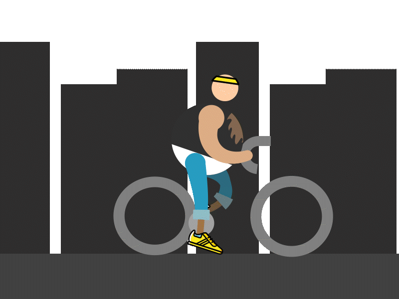
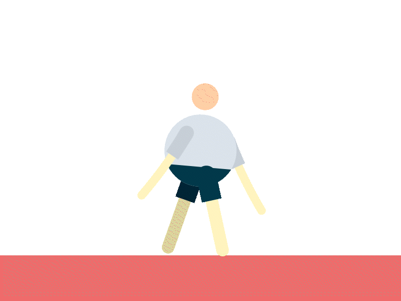
Character Walk Animations sind eine spannende und herausfordernde Disziplin im Bereich des Motion Designs. Eine gut gemachte Walk Cycle Animation kann einem Charakter Leben und Persönlichkeit einhauchen, was entscheidend für das Storytelling und das Engagement des Publikums ist. In diesem Beitrag möchte ich erklären, warum Character Walk Animations so wichtig sind und meine eigenen Herausforderungen und Challenges beschreiben.
Warum sind Character Walk Animations so wichtig?
1. Verleiht dem Charakter Leben
Eine gut animierte Gehbewegung ist mehr als nur eine visuelle Darstellung von Bewegung. Sie kann die Persönlichkeit, Stimmung und Emotionen eines Charakters ausdrücken. Ein stolzer, aufrechter Gang vermittelt Selbstbewusstsein, während ein schlurfender, langsamer Gang Traurigkeit oder Müdigkeit ausdrücken kann. Durch subtile Variationen in der Bewegung können Charaktere vielschichtiger und glaubwürdiger dargestellt werden.
2. Verbessert das Storytelling
Walk Cycles sind oft ein integraler Bestandteil der Handlung. Sie ermöglichen es, eine Geschichte ohne Worte zu erzählen und helfen, die Aufmerksamkeit des Publikums aufrechtzuerhalten. Eine Animation, die die Gehweise eines Charakters präzise und ausdrucksstark darstellt, kann wichtige narrative Informationen vermitteln und die emotionale Verbindung zum Publikum stärken.
3. Steigert die Qualität der Animation
Professionelle Walk Cycles tragen zur Gesamtqualität einer Animation bei. Sie zeigen ein hohes Maß an handwerklichem Können und Aufmerksamkeit zum Detail, was den Gesamteindruck des Projekts verbessert. Eine gut gemachte Walk Animation kann den Unterschied zwischen einer durchschnittlichen und einer herausragenden Animation ausmachen.
Techniken und Schritte zur Erstellung von Walk Cycles
1. Verständnis der Grundlagen
Der erste Schritt zur Erstellung einer Walk Animation besteht darin, die grundlegenden Bewegungsabläufe zu verstehen. Dies umfasst die Positionierung der Füße, das Schwingen der Arme und die Bewegung des gesamten Körpers. Es ist wichtig, die verschiedenen Phasen eines Schritts zu kennen: Kontakt, Abstoß, Hochpunkt und Auftakt.
2. Verwendung von Referenzen
Die Arbeit mit Referenzen hilft dabei ungemein. Videos von echten Menschen, die gehen, oder bestehende Animationen können wertvolle Einblicke in die Details einer natürlichen Gehbewegung bieten. Referenzen helfen dabei, die Bewegung realistischer und überzeugender zu gestalten.
Herausforderungen und Schwierigkeiten
1. Realismus vs. Stil
Eine der größten Herausforderungen bei der Erstellung von Walk Cycles besteht darin, den richtigen Balanceakt zwischen Realismus und stilisierter Animation zu finden. Ein zu realistischer Gang kann langweilig wirken, während ein übertriebener Stil die Glaubwürdigkeit beeinträchtigen kann. Es ist wichtig, den Stil des Charakters und der gesamten Animation zu berücksichtigen und einen Gang zu wählen, der dazu passt.
2. Synchronisation und Timing
Die Synchronisation der Bewegungen und das richtige Timing sind entscheidend für eine natürliche Gehbewegung. Schon kleine Fehler in der zeitlichen Abfolge der Bewegungen können den gesamten Walk Cycle unnatürlich wirken lassen. Hier ist viel Feinarbeit und Geduld gefragt, um sicherzustellen, dass alles perfekt zusammenpasst.
3. Technische Aspekte
Die technischen Aspekte der Animation können ebenfalls Herausforderungen darstellen. Dies umfasst die rigging des Charakters, die Verwendung von Inverse Kinematics (IK) und die Anpassung von Bewegungsbahnen. Fehler im Rigging oder in den Bewegungspfaden können zu unnatürlichen Bewegungen oder Verzerrungen führen, die die Qualität der Animation beeinträchtigen.
Meine eigenen Herausforderungen und Erfahrungen
Beim Erlernen der Character Walk Animations stieß ich auf mehrere Herausforderungen. Das Rigging der Charaktere bereitete mir zunächst große Schwierigkeiten, da die Gelenke oft unnatürlich wirkten. Auch das Timing der Bewegungen war knifflig und erforderte viel Feinabstimmung, um eine flüssige Gehbewegung zu erzielen. Der Übergang zwischen den Gehphasen gestaltete sich oft steif und unnatürlich, was viel Geduld und Übung erforderte. Trotz dieser Schwierigkeiten habe ich durch kontinuierliches Lernen und Experimentieren Fortschritte gemacht.
Fazit
Character Walk Animations sind eine essentielle Fähigkeit im Motion Design, die viel Übung und ein tiefes Verständnis der menschlichen Bewegung erfordert. Trotz der Herausforderungen und Schwierigkeiten, die mit der Erstellung von Walk Cycles verbunden sind, lohnt sich der Aufwand. Eine gut gemachte Walk Animation kann einem Charakter Leben und Persönlichkeit verleihen, das Storytelling verbessern und die Gesamtqualität der Animation erheblich steigern. Wenn Sie bereit sind, sich der Herausforderung zu stellen, werden Sie feststellen, dass Character Walk Animations Ihre Projekte auf ein neues Niveau heben können.
In my last blog post, I showed you the new visuals and features. Today, I conducted user testing to find out how the visualizations are perceived. Even before completing the visualizations, I had concerns that using abstract visuals might not achieve my goal. However, due to time constraints, I had no other choice but to proceed with this approach.
My Assumptions Before User Testing
As mentioned before, while creating the visuals, I noticed that the topic of CO2 emissions is very complex. This is because the human eye cannot see the emissions and, therefore, cannot form a mental image of them. My current approach is to make these emissions more tangible using abstract visualizations, mainly particle systems. However, this abstract approach turned out to be incorrect. I realized that I had over-interpreted the visuals and expected too much from the users. I essentially lost sight of the users and went into the project with overly high expectations. The visuals I created cannot be interpreted correctly without prior knowledge and are therefore ineffective. The abstract representation is not the right way, and I need to return to the basics to create understandable visualizations.
User Testing
I asked a friend from my student dormitory to test the prototypes. The test subject is a 21-year-old male of German origin, studying psychology in his second semester. Before the testing, I introduced him to the topic and the prototype. Then, I asked him to input different values using the controller and interpret them for me. Here’s what came out of it:
Galaxy: The poor state of the galaxy was perceived as good because the representation was smaller than the neutral and positive states. The size played the main role, while the rotation force was in the background. However, the visualization was not meaningful.
Plasmasphere: Out of the three representations, the participant found the plasmasphere the most emotional. The different states were correctly perceived. The movements towards the camera looked threatening, making the participant think, „Oh no, what have I done?!“ The positive state was acceptable, but it would have been perceived as more peaceful without the red elements.
Flowers: Contextually, the flowers were the most appropriate, but the state changes were too extreme. If a solution could be found for this, this approach would probably be the best, even though the plasmasphere was more emotional.
Summary
In summary, the abstract approach to visualizing CO2 emissions was not effective. The user testing revealed that the visuals were often misinterpreted, highlighting the need for more straightforward and basic representations. This feedback is crucial for refining the visualizations to make them more accessible and understandable.