IMPULSE #5: Last Gfü Meetup of the Year

© Institut für Epilepsie

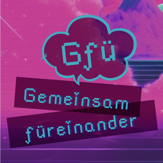
Since I got in contact with the Institut für Epilepsie in Graz to conduct an feedback interview of my prototype earlier this year, I’ve been following their social media and website for any news regarding their institution. This was when I discovered the Gfü group („gemeinsam füreinander“), an initiative and a safe space for young people with and without epilepsy. This group meets once a month to do spare time activities and create community. It is driven by the ideas and impulses of its participants and is free of charge.

On 10th of December I got the opportunity to join one of the last meetings of the year. The Gfü group met at Hauptplatz in Graz to visit and take a walk along Graz‘ Christmas markets. We were a small group which consisted of five people. I met Tanja again, she is a certified epilepsy consultant and part of the team at Institut für Epilepsie. Along with her colleague Regina I got to know her when I had the mentioned feedback interview. Tanja was accompanied by her boyfriend. Two young persons in their twenties joined for the meetup. I was warmly welcomed and got to tell, how Tanja and I got in contact and what I do in the research for my master’s studies. It appeared to be a bit complicated to explain what I do in my research, but I knew to break it down to the core. Tanja’s boyfriend showed interest in my field of study and my topic which led us to have a nice exchange. He, who studied at FH JOANNEUM himself, works in software testing and knew about the importance of usability for digital products. He reflected my topic and its complexity would definitely be worthy of a master’s thesis.

After we went along Herrengasse and crossed Landhaushof, we got to the crossing at Schmiedgasse and Landhausgasse to have hot beverages at one of the Christmas stalls. That’s when I got to know both of the young people – for privacy reasons names and genders are not mentioned in this blog post. They asked me about my field of study and seemed interested as well. In course of the conversation we got to what they do in their lives. Without my asking and without any hesitation, they started talking about their individual forms of epilepsy. Previous to this meetup, it was important to me not to ask people about their disease actively and just have a conversation if people open up to this topic themselves. And this is what happened in the conversation between Tanja, the two young people and me.

The first person was diagnosed with focal seizures which are accompanied with side effects. This limits the person to the amount of visual and auditory stimuli that can be managed to perceive. The person told us that it was initially a plan to study music, but had to abandon the studies when the diagnosis with epilepsy came up. In general focal seizures emerge from just one part of the brain. Symptoms can greatly vary such as intense feelings, loss of sensory like smelling or tasting, change in consciousness, unusual and repetitive behavior. Before a focal seizure affected persons experience an aura, an upcoming feeling that a seizure is about to occur. When a focal seizure is over some people experience headache or muscle pain.

The other person has experienced generalized seizures. It must have been a drunken feeling with a narrowed field of vision and muffled hearing. The person was on their own and and watering plants in the garden when the first seizure occurred. While having a seizure the person picked up the phone, but was not able to speak properly. After this incident the person did not remember anything that has happened. Because of the diagnosis, the person decided not to go abroad for a year. Generally speaking, generalized seizures are originating from both sides of the brain. It can be characterized with loss of consciousness, falls, massive muscle contractions and weakness, staring into empty space and repeated jerking movements.

As I quickly noticed, both persons in their twenties were limited in their life choices due to the fact that they were diagnosed with epilepsy. This contact with people with epilepsy was important to me. This contact with people with epilepsy was important to me. Not only did I get in touch with people with epilepsy, but I also learned something for my own life. The disease with a thousand faces, but rarely visible, is not something you would expect a person standing in front of you to have. Reflecting on this, but not wanting to feel sorry for anyone, makes me realize how fortunate I am for my physical health. Epilepsy can affect one in ten people during their lifetime, but the majority remain unaffected. The fact that there are a lot of other possible diseases a person can have, which comes with a certain probability of being affected, makes us unaffected extremely lucky. It is something we should not take for granted.

Resources

https://www.facebook.com/photo?fbid=995075082664321&set=a.479284970910004
https://www.institut-fuer-epilepsie.at/gfue-gruppe/


https://www.ninds.nih.gov/health-information/disorders/epilepsy-and-seizures

IMPULSE #2 – World Usability Congress – Day 2

On the second day, I particularly liked the lecture by Karen Hawkins called Accessible Design Considerations for Styles, Components, Patterns, and Pages. I liked the design and the way the content was presented, but she also covered all the essentials when designing in the digital world. Accessible design is not just a technical item that we „add“ at the end – it should be the foundation of the design process, ensuring that digital products are accessible to everyone, including people with vision, mobility or cognitive challenges. Below, I’ll share key things I learned from the talk and how I can use them in design.

Karen compared design systems to Lego bricks – they contain reusable components, clear standards, and guides. I especially liked the systems approach – instead of adding accessibility as an afterthought, it’s built into the foundation of the design. However, to be accessible, each layer of the design system must include specific accessibility requirements:

  1. Styles: Colors, typography and grid must be designed with clear contrast and proper hierarchy.
  2. Components: Interactions should support a variety of input methods – keyboard, voice commands, touch gestures.
  3. Patterns: Reading order, navigation, and feedback should be logically laid out.
  4. Page templates: Users should be provided with additional navigation options, such as skip links and orientation elements.
  5. Pages: Content should be simple, clear, and understandable.

One of the first steps in design is choosing colors and typography, but we often forget how crucial they are for accessibility. She said that the minimum contrast for text should be 4.5:1, and for key elements like button 3:1. If we want AAA standard, the contrast should be 7:1. Also, the typography must be large enough, with good spacing between letters and lines. Also very important is avoiding color as the only visual signal – instead, we can use icons, underlining or bold font for emphasized information. Designers often use color to indicate an error (e.g., red text for a form error), but Karen pointed out that not everyone can see red text. The solution is to add icons, text descriptions or animations. Also, she mentioned the components, this part was new to me and because of that very interesting. Components are the building blocks of digital products, so it is important that they support different input methods. For example keyboard interactions – every element must be accessible without a mouse, with clearly defined focus indicators. She also mentioned support for screen readers such as buttons, links and forms. They must have clear descriptions, not just visual labels. The last thing she mentioned about it is the size of the target areas. Clickable elements must be at least 24×24 px (and ideally 44×44 px). Karen also shared an example of a button and its states – normal, hover, focus, inactive – to show how consistency is key.

She talked about how navigation and forms are often problematic points in design, and if we don’t structure them properly, users easily get lost or need too many steps to complete a task. As a solution, we can introduce skip links that allow users to skip repeating elements (like long menus). A clear content hierarchy is also important because screen reader users need a logical reading order, without jumping around. And we must not forget about feedback. When a user fills out a form or clicks on a filter, they need to get a clear answer as to what happened (text message, animation, change colors). Finally, Karen highlighted how the structure of the page and language are key to accessibility. What she mentioned was that headings need to clearly show the structure of the content and that using simple language helps people with cognitive disabilities. For example, instead of complicated instructions, it is better to is to use short, clear sentences.

What have I learned?

Small changes, like better contrast or larger buttons, can make a big difference. I can see how I could apply these principles to my work – whether through better readability of content, clearer navigation elements, or a combination of physical and digital design. I’m very glad I attended this lecture.

IMPULSE #1 – World Usability Congress – Day 1

The World Usability Congress (WUC) was held in Graz from October 15 to 17, 2024, bringing together UX (User Experience) and CX (Customer Experience) experts from around the world. This year’s program highlighted more than 50 speakers from leading global companies such as Facebook, Amazon, IBM, while workshops and lectures covered the latest challenges and innovations in the industry.

First impression

The first impression I had of the entire congress was one of enthusiasm and excellent organization. The space was spacious and large, the workshops and lectures were divided into 4 halls and were held at the same time, so I had to choose which one to go to. The topics of the day were divided into ux strategy, ux research, leadership and masterclass. The content was accompanied by a website where you could find all the information about the schedule and lecturers, which was very useful. I knew that it was of significant benefit to have web support for such large events, but so far I had only encountered it at festivals.

Opening My Eyes to Digital Accessibility

The first impression I had of the entire congress was one of enthusiasm and excellent organization. The space was spacious and large, the workshops and lectures were divided into 4 halls and were held at the same time, so I had to choose which one to go to. The topics of the day were divided into UX strategy, UX research, Leadership and Masterclass. The content was accompanied by a website where you could find all the information about the schedule and lecturers, which was very useful. I knew that it was of significant benefit to have web support for such large events, but so far I had only encountered it at festivals. The first lecture called Incluthon really opened my eyes to what all the problems of the digital devices we use every day still are, but also how important they can be. This was not really a lecture, it was more of a demonstration of sorts. It fell under the topic of UX strategy and was conducted by Stefan Barac, Gerhard Kühne and special guest Claudio Zeni. Claudio Zeni is a person with serious visual disabilities, and he was the main demonstrator of the problem discussed. He showed us his experience of buying train tickets via app, which is minimally adapted to visually impaired people and is much more difficult for them with the set timer for buying tickets. The aim of the lecture was that when designing any service design, especially this type, all people must be taken into account and options that can be dealt with in the design should be considered, especially with the advent of AI, which can significantly help. The presentation was enlightening, not only because of its content but also because of the unexpected problems that occurred during the session itself. Due to technical problems, this presentation did not go quite as planned, with members of the audience gathering nearer the stage to hear and see better. This scenario itself-under less-than-ideal circumstances-is a call for inclusive design that accommodates all users. As someone studying communication design with minimal prior exposure to digital accessibility, this experience inspired me to integrate inclusivity into my work and future research.

Leadership in Design: Lessons from Joe Lanzisero

Another session that deeply resonated with me was a lecture by Joe Lanzisero titled Why We Do What We Do – Loving the User. A former illustrator with Disney, Lanzisero used stories and humor to talk about his career as he merged his experiences of storytelling with user-centered design. He spent a large part of his career working as an illustrator for Disney, where he realized how people connect with characters through vivid and human stories. He also talked about the important aspect of the process, both in illustration and design. You should never stop your process because it always leads you forward. Through the process, we come up with beautiful things, but also the beauty around us can be a great inspiration for the future. One of the important things he emphasized was that details matter, no matter how small they are. Every little detail that we pay attention to and devote our time to has a purposeful effect on the overall picture of the product, which is then ultimately much better and, he said, helps in making products that users can relate to. Also, what he emphasized was that we treat our users as guests. We always want to please our guests, they are not some strangers, they are first and foremost PEOPLE who come to our home, our store or our application and should always feel good, served and satisfied.

Impact

Given that I’m in Graz as an Erasmus student only for the winter semester and my design program at my home University is focused on communication design, I haven’t had too many encounters with inclusivity in digital design. Before WUC, I have never really known what Inclusive and Service Design could be. These sessions not only opened up my point of view but also inspired me regarding what I need to consider when writing and doing my Master Thesis. Accessibility and human-centered design are definitely going to be on my mind while creating an app for the Thesis but also for all the future work.

Links
  1. https://worldusabilitycongress.com/agenda-2024/?agenda=FS9VF8
  2. https://worldusabilitycongress.com/agenda-2024/?agenda=UFKGCU

27 | IMPULSE #6 – Visit of the Center of Scientific Activities (CoSA)

Yesterday, I had the chance to visit the CoSA – Center of Science Activities in Graz, a hub of interactive learning designed to make science and technology engaging for all. Among its many features, one area stood out to me: the CoSA_Energy section. This part of the exhibition focuses on sustainability, energy, and how our daily choices impact the environment. Given my interest in creating a sustainability-focused app, I found this visit incredibly inspiring. Here’s a detailed account of my experience and reflections on how these ideas could be integrated into my project.

The CoSA_Energy area is brilliantly designed to encourage self-exploration. Upon entering, I took a lanyard with a token shaped like a lightbulb—my personalized key to activate the exhibits. At each of the seven interactive stations, covering topics like energy, mobility, clothing, and food, I could absorb information and later test my understanding with a quiz question. My answers were saved to my token, which added a playful, competitive element to the experience.

Each station was not only highly informative but also incredibly engaging. For instance:

  • Food: The Information like videos of street surveys and information was displayed in digital cooking pots, with an emphasis on the carbon footprint of different diets.
  • Shopping: A real shopping cart, extended and enhanced with a digital overlay, allowed me to learn about product sustainability through putting items that were talked about into my shopping cart. In a way it was designed to see different opinions and habits of people in a street survey without them being judged for their decisions, which allowed me to form my own picture of which actions I see critically and in which I possibly recognize myself.
  • Clothing: By scanning price tags of different items, I discovered whether garments were produced sustainably, second-hand or simply overpriced for branding. This activity can be eye-opening to people who don’t put that much thought into their shopping-decisions, as it showed the hidden environmental costs behind fast fashion.
  • Mobility: A bicycle-powered video station showed the different mobility needs of different groups. E.g. cyclists want safer cycle paths and no obstacles like parking cars in their way. Store owners need charging zones and car drivers say public transport is much slower than if they just drive to their workplace etc.

The mix of physical interaction and digital feedback kept me fully engaged, demonstrating how well gamified learning can work.

As I moved through the exhibits, I already thought about how some of these concepts could be adapted to a digital app. The idea of a personalized token, for example, could translate into a digital profile within the app, where users track their progress through challenges. Similarly, the interactive elements, like scanning clothing tags or generating power to reveal insights, could inspire app features that use augmented reality or motion sensors to create immersive experiences.

Additionally, CoSA’s quiz system at the end of each activity provided a great model for reinforcing knowledge while keeping it playful. In my app, I could integrate similar quiz-like rewards that help users retain information while earning points or badges.

What made the CoSA_Energy area so effective was its balance between education and fun. Each exhibit was meticulously designed to make complex topics accessible and interesting. For example, the cooking pots and shopping cart stations added a tangible aspect to abstract ideas like food miles and sustainable consumption. These interactions weren’t just entertaining – they made the information stick.

This approach aligns perfectly with my goal of motivating people to adopt more sustainable habits through an app. By incorporating game mechanics, such as unlocking content or comparing scores with friends, I could replicate CoSA’s ability to make sustainability both personal and engaging.

Visiting CoSA was an inspiring reminder of how powerful gamification can be in driving behavioral change. The exhibition succeeded in taking complex topics and breaking them into fun, bite-sized, interactive experiences.

For my app, I aim to achieve the same balance of education and entertainment. Features like augmented reality challenges, scannable items for instant feedback, and personal progress tracking could motivate users to reflect on their habits while learning how to make more sustainable choices.

The CoSA_Energy area also emphasized the importance of visual and tactile engagement, something I’ll prioritize in my app’s design. Whether through a digital garden that grows as users complete tasks or a sustainability leaderboard, the goal is to create a tool that is not only educational but also genuinely enjoyable to use.

CoSA: https://www.museum-joanneum.at/cosa-graz/spaces

More on Gamification and Game-based learning: https://uwaterloo.ca/centre-for-teaching-excellence/catalogs/tip-sheets/gamification-and-game-based-learning

Gamification in museums: https://pfeffermind.de/museum-gamification/#:~:text=Moderne%20Museen%20verwenden%20Gamification%2C%20um,Ausstellung%20wird%20zu%20einem%20Entdeckungsort.

IMPULSE #3 – Accessibility Cheat Sheet

During the World Usability Congress Graz we listened to a talk from Mari-Ell Mets. She is the head of accessibility at Trinidad Wiseman. Her talk inspired me to write up my own „Accessibility Cheat Sheet“ for web design.

Sadly she talked quite fast and I could only partially keep up. These incomplete notes sparked my interest to have a complete list to refer back to in the future. The final check-list is written in german.

Her talk mentioned the following aspects:

10 accessibility rules to fix 80% of accessibility issues

    • Avoid autoplaying sound, animations or videos
    • Add a „Stop“ button for any moving content
    • Avoid any blinking and flickering at all costs
  1. Contrast colors
    • Text: at least 4,5: 1 regular text, at least 3: 1 big and bold text
    • Use contrasted colours for text and background
    • Use contrasted colours for inputs and clickable icons
    • Avoid adding text on top of images
    • Test with contrast checker (on Chrome, in Figma etc.)
  2. Adapt to user’s settings
  3. Support keyboard
    • Test with Tab Key, Scroll Page and use elements
    • Use native/ semantic html elements as much as possible
    • Avoid sliding, dragging and swiping actions
  4. Make focus visible
    • Don‘t hide the focus style
    • Keep logical focus order
  5. Language
    • specify the lang attribute
    • Change the lang attribute when the language is changed
    • When a part is in a different language also add another lang tag
  6. Info and relationships
    • mark headings as heading tags in correct order
    • Mark tables with table tags, lists with list tags
    • Mark sections (header)
    • Test with screen readers
    • Test with Users that use screan readers
  7. Name, role, value
    • use native/ semantic Elements
    • Research before using ARIA attributes
    • Mark visible states also in code
    • Test with screen reader and voice commands
  8. Text alternatives

Research: How to give feedback on accessibility


This is the final check-list I wrote up after the conference. I had a look at the german Web Content Accessibility Guidelines 2.1 (WCAG 2.1). The attached article in the link list helped me gauge what I missed at the initial talk by Mari-Ell Mets.

Links:

https://www.barrierefreiheit-dienstekonsolidierung.bund.de/Webs/PB/DE/gesetze-und-richtlinien/barrierefreiheitsstaerkungsgesetz/barrierefreiheitsstaerkungsgesetz-node.html

https://www.barrierefreiheit-dienstekonsolidierung.bund.de/Webs/PB/DE/gesetze-und-richtlinien/wcag/wcag-artikel.html

https://www.linkedin.com/pulse/interview-mari-ell-mets-iaap-eu-pakwf

IMPULSE #3: Exploring VR/AR in Industrial Applications through AVL Octoberfest and the TCV VR App Launch

IMPULSE #2: A Journey of Heritage and Design Through Dahomey

The treasures in the film were more than artifacts; they were symbols of a people’s history and pride. Diop’s creative decision to give these objects a voice—allowing them to narrate their journey home—felt deeply symbolic. It was a reminder of how our stories, whether told through artifacts or digital interfaces, have the power to heal, educate, and inspire.

KIZ RoyalKino Graz

https://de.wikipedia.org/wiki/Dahomey_(Film)

IMPULSE #1: Discovering My Path Through the World Usability Congress

At this stage of my studies, I decided to delve into topics that resonate with me and help identify the best subject for my master’s thesis. To achieve this, I sought experiences that could guide me toward discovering my strengths and interests. One such experience was attending the World Usability Congress—a pivotal event that marked my journey of self-discovery and growth.

I chose to participate as a volunteer, a decision driven by my desire to gain a broader perspective on the congress and acquire firsthand experience. As an interaction designer, my primary goal is to create meaningful products for users. However, I often find myself held back by shyness. Volunteering presented an opportunity to push beyond my comfort zone, meet new people, and engage in meaningful conversations. This experience not only helped me grow as a professional but also enriched my understanding of the user experience (UX) field.

On October 15, 2024, I attended my first talk by Catharin Walker Eure from Nike. Her presentation, The Exciting Landscape of Generative AI for User Experience, was an eye-opener. She introduced various AI tools that can significantly enhance UX research and design while cautioning against their misuse. Her insights were invaluable, and I eagerly noted tools for different applications:

  • Education and E-learning UX Research: Userlytics, Learnosity, and sentiment analysis tools like MonkeyLearn.
  • Automotive Industry: Motive AI, Affective, and CarUX.

These tools expanded my perspective on how AI can support and transform the UX design process, encouraging me to explore their potential applications in my future work.

The following day, October 16, 2024, was a turning point in my journey. I attended several talks, but the highlight was a masterclass led by Claudia Bruckschwaiger titled Conceptual Design – The End of Fear for Decisions. The session was advanced, challenging me to think critically about decision-making in design. I learned valuable strategies for conducting user testing in corporate settings and, perhaps more importantly, how to advocate for better design practices within my teams.

Later that evening, I attended the gala dinner—a vibrant event filled with opportunities to network and interact with experts in the field. The gala revealed a new side of me: someone capable of approaching others, asking thoughtful questions, and genuinely listening.

One of the most impactful exchanges I had was with Claudio Zeni and Gerhard Kühne. They introduced me to innovative solutions for people with disabilities, such as virtual reality glasses designed for blind individuals. Until that moment, I hadn’t realized the extent to which technology could empower and transform lives. Listening to their experiences and learning about their work reminded me that in design, there are no limits—only opportunities to make a difference.

While the primary purpose of this exploration was to find a direction for my master’s thesis, the experience transcended that goal. The World Usability Congress became an adventure—a journey of personal and professional growth. I gained not only new knowledge and tools but also a deeper appreciation for what design can achieve.

The conversations, workshops, and exchanges inspired me to think beyond my immediate goals. They reminded me of the broader role of designers in shaping a more inclusive and innovative world. For me, this journey isn’t just about learning; it’s about contributing to the design community and discovering what we can collectively achieve.

The World Usability Congress was more than just an event; it was a catalyst for self-discovery. It helped me identify areas for improvement, such as stepping out of my comfort zone, and introduced me to tools and practices that will guide my future work. Most importantly, it reaffirmed my belief in the limitless potential of design to solve problems and create meaningful experiences.

As I continue this journey, I am excited to explore new horizons, embrace challenges, and contribute to the ever-evolving field of UX design.

Impulse #2

Mismatch by Kat Holmes – How Inclusion Shapes Design


For this blog post, I reflect on Mismatch: How Inclusion Shapes Design, a book by Kat Holmes. Holmes challenges designers to think beyond the „one-size-fits-all“ mindset and consider how exclusion often stems from poorly designed systems. This book gives great insights into how inclusive design not only addresses the needs of marginalized communities but creates better experiences for everyone, which would also be the goal of my future research and work.

Mismatch as the root of exclusion

Holmes defines a „mismatch“ as the gap between a person’s abilities and the design of a product or environment. These mismatches create barriers that exclude individuals from fully participating in society. She argues that exclusion is often unintentional and comes from design decisions that overlook the diversity of human experiences.

Inclusion amplifies innovation

Holmes emphasizes that designing for inclusion doesn’t just solve problems for a small group, it can lead to innovations that improve experiences for everyone.

Start with people, not solutions

Holmes advocates for a human-centered design approach that prioritizes understanding the needs and experiences of users before jumping to solutions. She stresses the importance of involving diverse voices throughout the design process.

Inclusive design is a practice, not a checklist

Holmes warns against treating inclusion as a one-time task. Inclusive design is an ongoing process of identifying mismatches, testing solutions, and iterating based on feedback.

How this book shapes my approach

The author’s emphasis on identifying mismatches resonates deeply with my goal of creating educational tools that truly meet the needs of children with autism. Her framework provides a clear path forward:

  1. Understand the user experience: Conduct interviews and observations to identify where mismatches occur in current tools and approaches.
  2. Collaborate with users: Involve children and their caregivers in the design process to co-create solutions.
  3. Test and iterate: Treat every prototype as an opportunity to learn and improve, making sure that the tools evolve with the needs of the users.
  4. Think beyond disabilities: Consider how inclusive features can benefit all users, creating tools that are universal in their appeal and usability.

Kat Holmes’ Mismatch is a great reminder that exclusion is a design choice—and so is inclusion. By addressing mismatches, we can create products and environments that actually help and empower users.

References:

Holmes, Kat. Mismatch: How Inclusion Shapes Design. United Kingdom: MIT Press, 2018.

Impulse #1

World Usability Congress

Just like last year, the World Usability Congress gave me a lot of really great insights. After my experience last year, I already knew what to expect, which helped me organize the time spent there and focus on the talks that seemed the most important to me, since seeing all of them was not possible. I spent most of my time in the “Accessibility & Inlcusion” room this year, and one talk from the second day left the biggest impression on me, especially because I was listening  with my master thesis topic in mind.
Mari-Ell Mets from Trinidad Wiseman gave a talk titled „Website and Apps for Everybody – Making Accessibility Easy.“ The presentation focused on practical strategies to make digital platforms more inclusive, offering advice for creating user-friendly websites and apps for everyone, including those with special needs. The presentation laid out ten essential rules for improving accessibility, each of which provides valuable guidance for my own work. I summarized the key takeaways and how they connect to my research.

1. Avoid Moving Content

Mets stressed the importance of avoiding autoplaying videos, animations, or sounds, which can overwhelm users. She also recommended providing a „stop“ button for any moving content and eliminating flickering elements entirely.

2. Use Contrasted Colors

Proper color contrast is essential for readability. Mets outlined the recommended contrast ratios: at least 4.5:1 for regular text and 3:1 for larger or bold text. She emphasized avoiding text over images and using tools like contrast checkers to ensure compliance.

3. Adapt to User Settings

Websites and apps should respect a user’s browser or device settings, such as font size or color preferences. Mets encouraged the use of relative font and container sizes to ensure flexibility.

4. Ensure Keyboard Navigation

Accessibility isn’t complete without full keyboard navigation. Mets highlighted the importance of using native elements, avoiding drag-and-drop actions, and carefully managing focus order.

5. Make Focus Visible

It’s crucial for users to see where their keyboard focus is on the page. Mets advised keeping focus styles visible and maintaining a logical focus order throughout the site.

6. Specify Language in Code

To support screen readers and multilingual content, the language of the page must be defined using the lang attribute in the code.

7. Reflect Visual Relationships in Code

Visual structures, such as headings, lists, and tables, must also be coded correctly to make sense to assistive technologies. Mets recommended testing with screen readers to ensure usability.

8. Clearly Define UI Elements

Each user interface element must have a defined name, role, and value in the code. Mets encouraged the use of native elements and careful research before implementing ARIA attributes.

9. Provide Text Alternatives

Mets highlighted the importance of providing text alternatives for informative images and hiding decorative images from assistive technologies.

10. Deliver Clear Error Messages

Error messages should clearly indicate what went wrong and how to fix it. Mets emphasized providing clear labels, marking errors visually, and ensuring screen readers can announce the messages.

Conclusion

Mari-Ell Mets concluded the talk by emphasising that accessible design benefits everyone, not just those with disabilities. For my research, this presentation really showed the importance of accessibility as a foundation for designing educational tools. Incorporating these principles into my work will ensure that the tools I create are inclusive, empowering children with autism to engage confidently with technology.