“ontextC” – Technical Diary 9

What happened so far?

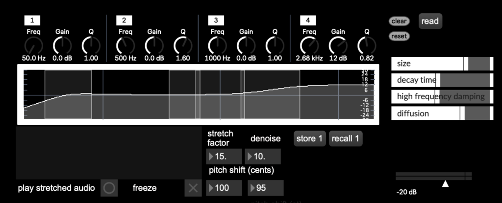
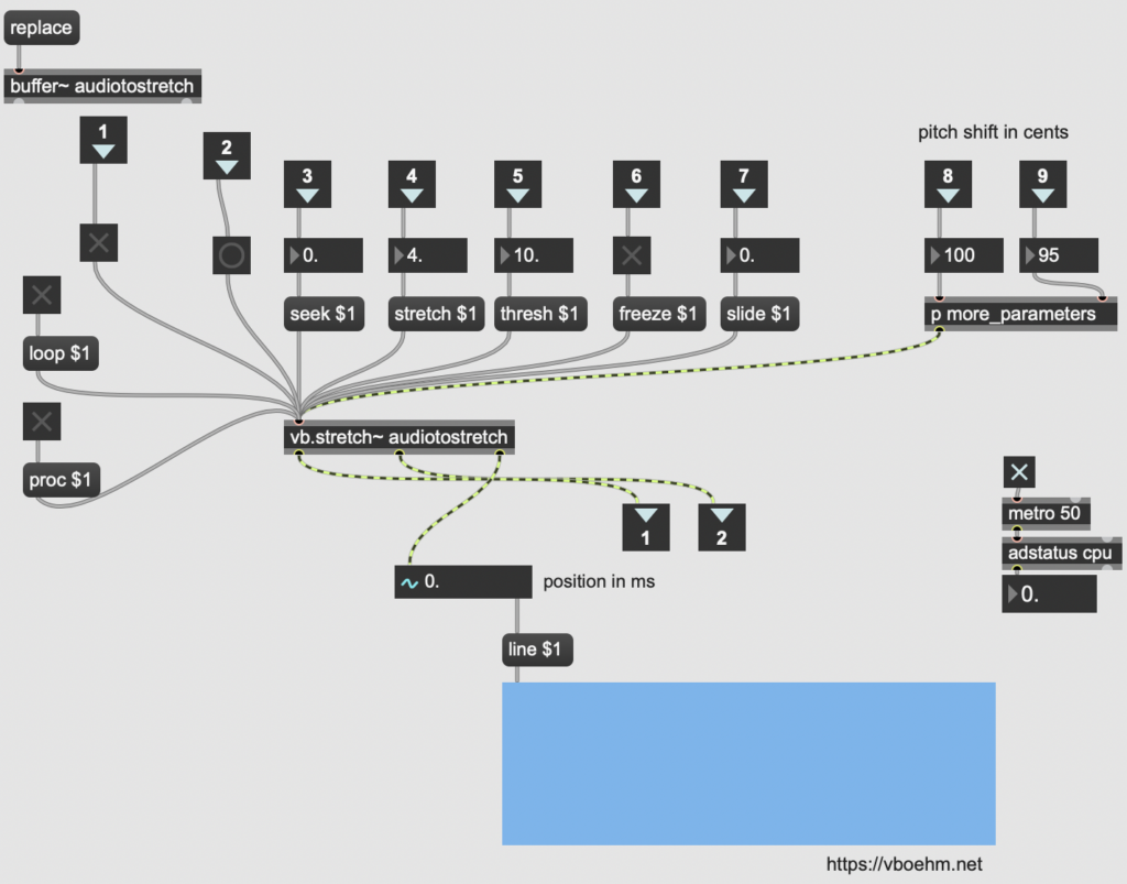
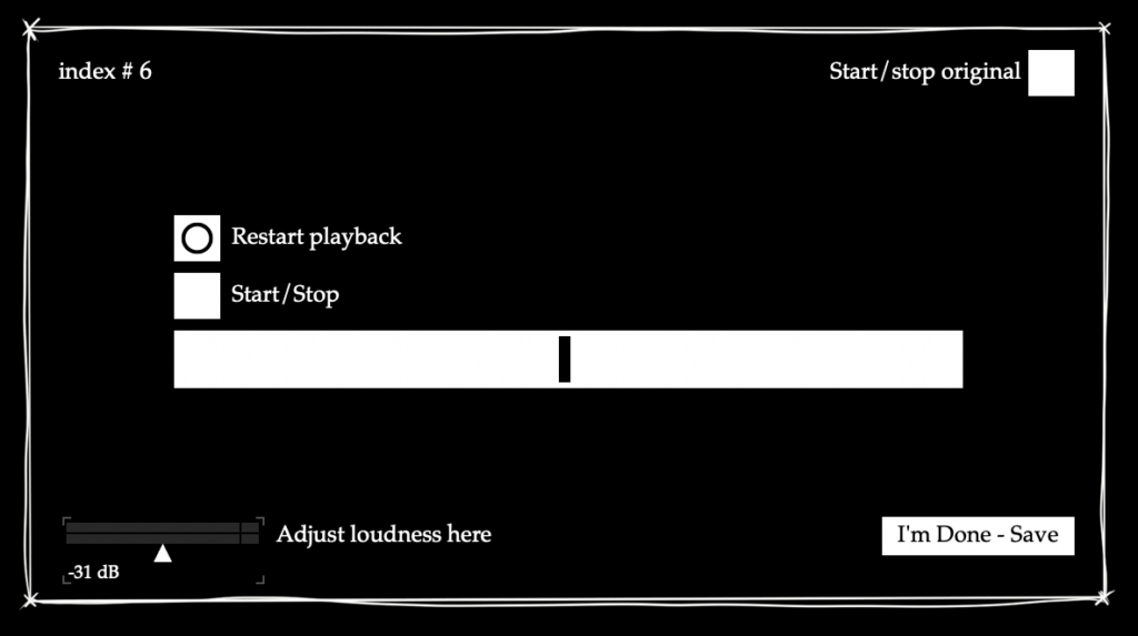
Recently, time spent working on the project was dedicated to figuring out how to best turn it into an exhibit that is both somewhat valuable for the user, as well as for research purposes. I knew that it would be important to keep the interface intuitive, and at the same time not to clutter it with information. Furthermore, a good solution was needed to collect parameter data – after some research and experiments I found that the coll object would work best for my purpose, with its ability to capture an index number and separate data input with commas, allowing me to then export the anonymous results as a CSV file. The save button and volume adjustments were non-negotiable, but I struggled a bit with how to best implement options to play back the source sound as well as the processed sound in a way that made sense just from looking at the interface. Another aspect I considered was that I would need a “phantom” slider for the visible interface for the user, meaning that after the previous person saves it always jumps to a random value, but looks as if the slider is back at the center. Like this, test subjects cannot copy the results from the previous person and really have to rely on their hearing to match the processed audio as closely as possible to the source sound.

Preliminary interface for the exhibition/survey

Ongoing

During a supervisor meeting, we tried think of a way to improve the playback situation – ideally three buttons at the centre of the screen would be enough. One option would be to have the playback of the original sound be gated, so that whenever it stops playing, the processed sound starts automatically. It is definitely something that still needs more thought and a better practical solution.

Results and Reflection

That this part of the project will be shown to the public definitely added a new challenge, because now it is not just about whether the software makes sense to me, but also whether it can be translated to a first-time user with little to no experience. The idea of people using their hearing to adjust the parameter in a sort of audioscope-like manner is very interesting to me though, and I look forward to seeing the results – I wonder how accurate the resolution of the parameter has to be for people to not notice a significant difference anymore, and how much it varies between people.

Objectives for Next Time

  • Finalise exhibit version (software)
  • Figure out physical exhibition setup
  • Write guideline how to set up/turn the exhibit off and on for the showcase supervisors

“ontextC” – Technical Diary 8

What happened so far?

After building a working signal chain with the vb.stretch~ external, I worked on fine-tuning some bugs that I had noticed in the patch, but so far had not been given priority treatment because the signal chain had not been fully functional previously. This included adjusting the filter indexes in the parametric EQ to reflect the features I wanted for my production process (1 – low shelf, high pass, 2 – bell, 3 – bell, 4 – high shelf, low pass), correcting the units and patching in the pitch shift unit to reflect semitone and cent adjustments separately, and implementing a line object on the reverb faders to remove crackling while changing a parameter. Then I started working on the patch in presentation mode to represent only the parts of it which I also wanted accessible during my production process. To do this, I worked with my initial sketch from the first semester, the GUI capabilities within Max and Max4Live for cross referencing the result. I also tried to somewhat make the signal flow (in series) clear through the interface, but it definitely still needs some cleaning up. This necessity was also reflected during my first testing session with a Max4Live export in Ableton Live, but it was good to see that the parameter selection was already working quite well for my production process, as I had hoped. I also managed to set up a simple preset function (but I am hoping to advance that as well with proper dropdown menu presets).

Rudimentary GUI loosely based on my original sketch, using internal Max GUI tools.

Ongoing

Off the basis of this patch, I am starting to plan out the look and feel of the exhibit version, where only one parameter will be adjustable (probably the stretch factor). Considerations for this endeavour are: usability, how playback of the source sound and the processed sound should be triggered, an index number for survey content and a volume adjustment to cater to individual hearing sensitivity.

Results and Reflection

This stage of the process was very exciting! The testing stage made me remember why I had wanted to set out on this process in the first place, and it was very satisfying to hear the first working results playing back through my DAW. Since it was also my first time seriously working on a graphical user interfaces, that came with new challenges and insights, and I look forward to where my GUI research and testing will lead me.  

Objectives for Next Time

  • create mockup for exhibit version
  • figure out an effective play/stop mechanism for alternating between the processed and original sound
  • test GUI and figure out which changes to make in which order (also consider typography, style…)

“ontextC” – Technical Diary 7

What happened so far?

While I managed to get a (very imperfect, but at least audible) signal through my phase vocoder pfft patch, changing the FFT size manually and incrementally while playing the audio was not possible within its framework. I researched options for this, and found that something similar to the block~ object in pure data might help fix this problem, but unfortunately all the equivalents or similar objects I found during my search did not work for this purpose, so I had to look into other options. I briefly considered writing an external, but quickly realized that this would require a whole new toolbox and set of skills, which would not work within the timeframe I had set for myself. But during the time I studied max patches from others I stumbled across a promising option: Volker Böhm’s vb.stretch~, an external which is based on the Paulstretch algorithm and provides the parameters I had wanted to include in my compiled plug-in anyways. I was not entirely sure why I had not stumbled across it earlier during my research, because I had already looked for externals once, but decided to try it out in the context of my patch and came up with sounds results that were so far the most similar to what I was looking (or in this case listening) for.

Exploring the parameter options of the external

Ongoing

With a working patch, now the plan is to fine tune parameters, iron out inconsistencies and get a more refined prototype with a simple GUI working.

Results and Reflection

Honestly, while I was glad to have found a solution with sound results I liked, I initially felt a bit disappointed and discouraged that my intended solution did not work out the way I had wanted it to, since I had already put so many hours into exploring and setting it up. But that is part of an iterative process, and it is a process I have learned a lot from – much more than had I immediately found the external. The current setup allows me to more freely explore and improve other aspects of the patch, and gives me more time to work on usability and actually using and testing the patch in my own productions.

Objectives for Next Time

  • fix EQ inconsistencies and pitch shift units
  • look into and start setting up a (simplified) GUI for testing in the form of a max4live device
  • plan which parameters might be best to explore for the exhibit

IMPULSE #4

Black & White Riso Printing

For the Conception and Creation course this semester, we got an assignment where the final output required was an A4 format, two sheets (8 pages), and it had to be black and white, no shades of gray.

Naturally, I have resolved to create the output with risograph.

We have worked with shapes. First we chose a shape and studied it. We created a concept and created this shape and then we turned it into analog form. Next step was to digitalize the analog form, and keep it black and white only.

I chose a hexagon. Conceptually I framed it as a primordial shape.

The hexagon is a shape that appears and repeats itself often in nature. It is the shape with many natural forms take as its most simplistic building block, and with a single aim – to preserve energy. Hexagon is a stable shape which distributes the weight and pressure evenly. The structure is strong and resistant to distortion.

We can see hexagons in many examples of natural world – in beehives, in bubbles of foamy substances, in basalt pillars. We know hexagon in benzene’s chemical built, the very basis of organic life.

See? A primordial shape.

I shall skip explanation of my analog form, the tests and mishaps and the digitalization, and go straight to the risoprinting.

So, black ink. At 100%? No. We have options, with the risograph.

You can print with graintouch or halftone. And the halftone lpi (lines per inch), you can adjust. Now, 72 lpi is the standard. You can go higher, or lower, and if you go to about 43 lpi, you het this ragged old newspaper look. That is, if you don’t print at 100%, because that really just creates a homogenous black surface area. I needed to achieve a halftone level, where the color does still look black, but the pattern is visible. So not too low, not too high opacity.

So to make the no greyscale black and white less of a bore, I decided to give it a risograph twist and implement the halftone texture at 43 lpi. The tricky part was determining the opacity. Because, as I discovered, the FH risographer doesn’t exactly differentiate between 100% to about 80% opacity.

Or does it?

There is one more thing you can adjust in print settings. The halftone angle. By default it prints at 45 degrees. So, I discovered that no matter the opacity, until I come down to about 70% , I get the same black solid . The jump from 80% to 70% was too strong, and 70% was very grey. Thereafter I decided to test it at different angle.

I set it to 30%. And it made a huge difference. Suddenly the opacity gradation worked.

Which means, in order to not lose their mind, one really need to get to know their riso machine.

Impulse 07 // Project Zanzibar

Project Zanzibar: A Portable and Flexible Tangible Interaction Platform

After refreshing my research on Calm Technology, I wanted to look at Tangible Interfaces for my next blog post, as it is the second component of my soon to be started Master’s thesis. While researching for an impulse like an event or presentation, I found one of the most exciting tangible interface developments I have seen so far. Microsoft’s Project Zanzibar. So I decided to explore and get to know the project instead. This innovative research project presents a flexible, rollable mat that enables seamless interaction between the physical and digital worlds using touch, gestures and tagged objects. It creates what I believe to be a calm, tangible interface without losing the digital benefits of smart products and without being intrusive or demanding.

Project Zanzibar is a tangible interaction platform developed by Microsoft Research. At its core is a flexible mat embedded with a Near Field Communication (NFC) system and capacitive sensing technology. This enables the mat to track touch, recognise gestures and interact with physical objects placed on it. The mat is designed to be portable, with a rollable form factor that makes it easy to transport and use in different contexts. Unlike traditional tabletop interfaces that rely on optical tracking and projection, Zanzibar integrates NFC and capacitive sensing to enable real-time object recognition and manipulation without the constraints of fixed installations. This makes it a promising tool for game design, education and creative storytelling, offering new possibilities for tangible interaction.

The Zanzibar mat identifies and tracks objects using NFC tags, which are simple, low-cost stickers attached to physical objects. These tags store unique identifiers that allow the mat to recognise specific objects and their movements. In addition, the capacitive sensing technology enables multi-touch interactions and hover gestures, enhancing the way users can interact with digital content through physical manipulation. One of the unique features of Zanzibar is its ability to sense object orientation and stacking. By using special NFC tag designs with metallic properties, the mat can detect the rotation of an object. Stacking tags allow Zanzibar to determine the order of stacked objects, making it ideal for applications such as board games or layered data visualisation.

One of the biggest challenges in interaction design is finding ways to physical and digital experiences seamlessly. Zanzibar demonstrates a compelling approach by enabling natural interactions with everyday objects, making digital experiences more intuitive and engaging. By supporting energy harvesting NFC tags, the platform enables more advanced interactions. For example, interactive tags can be used to light up LEDs or trigger small actuators, creating dynamic and responsive tangible objects. These features could be particularly useful in education, where physical engagement improves learning outcomes, or in IoT applications, where physical controls could interact with intelligent environments.

Project Zanzibar has been explored in a number of interactive applications, particularly in the gaming and education sectors. For example, Pirate Toybox is a game where physical toy figures placed on the mat trigger corresponding digital dialogues and actions. The system uses audio feedback to create immersive, screen-free gaming experiences. Another exciting use case is Movie Maker, an application aimed at children aged 5-12. This tool allows children to tell stories by manipulating physical toys and props on the mat, which then control digital avatars on a connected screen. This provides an intuitive way for children to explore storytelling and animation through tangible interactions. Zanzibar has also been tested in Augmented Reality (AR) applications. In AR Tower Defence, the mat is used in combination with a Microsoft HoloLens device to create a hybrid AR gaming experience. Players use tangible objects to control characters and place defences, while viewing digital overlays through the AR headset.

As I will be focusing on tangible interfaces for notification interactions and smart products in my research and master’s thesis on Calm Technology, Project Zanzibar serves as an inspiration for designing more seamless and ambient interactions. The mat’s ability to integrate digital notifications through tangible objects provides a unique opportunity to explore alternative ways of interacting with digital information beyond screens and traditional input methods. This is exactly what I am trying to achieve with the practical part of my master’s thesis. Imagine, for example, a home automation system that uses tangible objects on a Zanzibar-like surface to control lighting, temperature or music in an intuitive, non-intrusive way. It shows that with the technology we already have, we are no longer tied to screen-based and disruptive products, and that is what we should be aiming for to create a future where digitality and reality work in balance, respecting human needs and boundaries once again.

Impulse #6 – Videocall with Martin, digital-liechtenstein.li

Links

digital-liechtenstein.li: https://digital-liechtenstein.li/

“ontextC” – Technical Diary 6

What happened so far?

One thing that I found has helped me quite a lot when building my setup was to study and learn from other plug-in constructions that worked with effects similar to the one I am trying to achieve (there’s lots of them available to download for free) for practice. Of course, you could always just look at the connections and figure out what is going on, but for me personally copying them into a new patch object by object and really having to think about which connection was made why helped significantly improve my general understanding of the Max environment, and how I could best organise my complex, growing patches for my own understanding.

Insight into one of the patches I re-built – here I learned that colouring patcher cables can really be a huge help, especially as patches grow larger and larger. It’s a simple thing really, but it helps!

To get a cross-platform overview of how the problem can be approached, I also looked at some pure data patches and examined what was done differently there.

Here’s a list of the patchers I learned from:

For Future Reference

I found that the block~ object in puredata seemed like a really useful option for working with FFT sizes and especially FFT sizes that are supposed to be changeable through a parameter, so it might be worth looking into a Max equivalent/alternative for this.

Ongoing

I found that if I am to do a version of the patch for the exhibit, I would like to try it with just one or two parameters in order to prevent information overload for the target audience and make the procedure straightforward and easy to understand. I also used my learning experiences to note down GUI designs that I found easy to navigate, and which constructions worked intuitively for me to inform my own GUI once it is time to create that.

Results and Reflection

While studying these patches dedicated to stretching sound, I found a lot of methods and patching ideas to come closer to an extremely time-stretched result – however, I still found that most of the units did sound close enough to what I wanted to achieve for me to adapt them for my prototype, so this will definitely be a priority for the next stage of the project. Nonetheless, this little excursion helped me get to know my preferred Max workflow a lot, helped me to navigate patches made by others better and gave me new perspectives on problem solving and syntax.

Objectives for Next Time

  • look into jitter objects to determine graphical user interface possibilities
  • integrate stretch units into the prototype with working signals
  • research block~ equivalents and alternatives for Max

IMPULSE #1.1

Science of Social Bonding in Family, Friendship & Romantic Love

Introduction  

Dr. Andrew Huberman’s podcast episode on social bonding provides a fascinating look at the science behind human relationships. He explains how our brains and bodies work together to form and maintain bonds, whether with parents, friends, or romantic partners. This episode is packed with information that connects directly to my master’s thesis, which focuses on strengthening family relationships and using design to create tools or spaces that bring people closer.  

Connection to My Master’s Thesis

Dr. Huberman talks about how relationships, from those between parents and children to adult partnerships, rely on brain circuits and chemicals like oxytocin and dopamine. These chemicals help us feel close to others and build trust. For my thesis, this is especially relevant because I’m exploring how design can foster stronger connections within families. Learning how our brains naturally seek and maintain relationships gives me a better understanding of how to create a tool that supports those bonds.  

One idea from the podcast that really stood out is „social homeostasis,“ which is about maintaining balance in our relationships. This concept can be applied to design by creating systems or tools that help families stay connected in healthy ways. For example, technologies like interactive storytelling apps or smart home devices could encourage family members to spend time together and share experiences, bridging generational gaps or strengthening bonds. 

Key Takeaways and Applications

Dr. Huberman emphasizes the importance of physiological synchrony—when people’s heart rates or other body functions align during shared experiences. He mentioned a study where people’s heart rates synced while listening to the same story. This idea could inspire designs for family activities, like digital tools that encourage co-watching or co-listening to stories. Future research might even explore how technologies like haptic feedback or spatial audio could make these shared experiences even more engaging.  

Another important point was about introverts and extroverts. Dr. Huberman explains that introverts often prefer fewer but more meaningful interactions, while extroverts thrive on frequent social engagement. This insight shows that not all family members need the same level of interaction to feel connected. Design solutions could reflect this by creating quiet spaces for introverts to recharge while also offering tools for more active collaboration to suit extroverts.  

The podcast also explores how shared activities, like storytelling or creating something together, strengthen bonds. This gave me ideas for tools that could bring families closer, like apps for collaborative art or music-making. These tools could mimic the bonding effects of shared experiences, helping family members feel more connected.  

Design Ideas for Family Bonding

Dr. Huberman shares practical tips for building stronger relationships, such as creating traditions, doing activities together, and sharing stories. These ideas align perfectly with family-focused design. For example, a digital platform could gamify traditions like sharing family stories or cultural practices, making them more interactive and fun. Similarly, apps that promote shared physical activities, like family fitness challenges, could tap into the bonding effects of doing something together.  

Impact on Design Research

The podcast highlights how flexible and universal our brain’s bonding mechanisms are. This means that design solutions should also be flexible, allowing families to personalize them based on their unique needs. For instance, tools that adapt to each family member’s preferences for social interaction—whether they’re introverted or extroverted—can create more inclusive and effective experiences.  

Dr. Huberman also talks about negative bonds, like trauma bonds, and how they can impact relationships. This is an important reminder that design can play a healing role. Tools like AI-powered apps could help families identify and address emotional issues, creating safe spaces for open communication and support.  

Conclusion

Dr. Huberman’s insights into the science of social bonding have given me a fresh perspective on how to approach my thesis. By understanding the biology behind relationships, I can design tools and systems that not only align with how people naturally connect but also support their emotional and psychological well-being. This podcast has sparked new ideas for creating meaningful designs that help families strengthen their bonds, balance different needs, and heal from conflicts. 


Accompanying Links

1. https://www.hubermanlab.com/episode/science-of-social-bonding-in-family-friendship-and-romantic-love

2. https://www.youtube.com/watch?v=hcuMLQVAgEg

3. https://www.youtube.com/watch?v=gMRph_BvHB4

IMPULS #5 Aktueller Stand

Für die Formulierung meines Exposés habe ich mein Thema weiter konkretisiert und habe mir einen Ansatz erarbeitet, an dem ich mich von nun an orientieren möchte.

Ich möchte mich mit handgemachtem Design im politischen Aktivismus beschäftigen. In einer Welt, die zunehmend von digitalen Medien dominiert wird, erleben handgemachte Designs eine Renaissance. Diese ästhetische Entscheidung geht weit über den bloßen visuellen Effekt hinaus: Sie transportiert Werte wie Authentizität, Ethik und Individualität und signalisiert dem Betrachter, dass hinter der Botschaft ein Mensch steht, der sich mit Hingabe und Überzeugung für ein Anliegen einsetzt. In meiner Masterthesis möchte ich genau diese Dynamik erforschen und mir die Frage stellen, welchen Einfluss handgefertigte grafische Elemente auf die Wirkung politischer Botschaften haben.

Diese gestalterischen Elemente sind in Bewegungen wie dem Craftivism und der Zine-Kultur tief verwurzelt, wo sie eingesetzt werden, um Aufmerksamkeit zu erzeugen und Vertrauen aufzubauen. Doch wie effektiv ist dieser analoge Stil wirklich im Vergleich zu digitalen Designs? Welche gestalterischen Ansätze wecken Reaktionen, und kann ein Design tatsächlich dazu beitragen, das Denken und Handeln der Gesellschaft zu verändern? Diese und ähnliche Fragen möchte ich in meiner wissenschaftlichen Arbeit beantworten.

Mein Forschungsansatz verbindet Theorie und Praxis. Dabei möchte ich mich unter anderem auf die Kommunikationsaxiome von Paul Watzlawick sowie auf das Konzept des „Emotional Design“ von Donald Norman stützen. Beide Ansätze beleuchten, wie Gestaltung unterbewusst Emotionen und Einstellungen beeinflussen kann. In einer umfassenden Analyse untersuche ich die visuelle Sprache handgemachter politischer Medien und kombiniere diese Untersuchung mit einer Studie, in der Teilnehmer*innen die Wirkung verschiedener gestalterischer Stile bewerten.

Die Grundlage meiner Arbeit bilden theoretische und historische Quellen, darunter das Craftivist Manifesto von Betsy Greer und Studien zu erfolgreichen Protestbewegungen. Hinzu kommen zahlreiche Beispiele handgemachter Grafiken, die in meiner Untersuchung als Referenz dienen. Gleichzeitig entwickle ich eigene Kommunikationsmittel, um den Einfluss von analogen und digitalen Designs im politischen Aktivismus zu vergleichen.

Mein Forschungsprojekt umfasst mehrere Phasen: Von der Analyse bestehender Medien und gestalterischer Stile über die Entwicklung von Designprototypen bis hin zur Durchführung einer Studie und der abschließenden Auswertung der Ergebnisse. Ziel ist es, ein fundiertes Verständnis darüber zu erlangen, warum der handgemachte Stil bis heute so wirkungsvoll ist und wie er gezielt für politische Botschaften eingesetzt werden kann.

Ich freue mich auf diesen Prozess und bin gespannt auf die Erkenntnisse, die diese Reise bereithalten wird.

IMPULSE #3

Riso Printing Photos 01

In one of my visits to the RISOGRAD, I looked through materials around and something piqued my interest. Riso printed photos!

I haven’t considered it much before. But here I was, looking at some great stuff. So, I had to try it for myself! Spoiler alert: It worked, but not really.

It just isn’t that simple. It looks simple, but it’s not.

First thing I necessarily got into, is color separation.

Woohoo, heard that before? Color separation, color profiles, yay. Well, I haven’t done much with any of it before, so I had a few things to look up.

First, let’s see what does the chat say about these concepts instead of looking up a proper definition:

A color profile is a standardized set of data that characterizes how colors are represented in different devices, such as cameras, monitors, printers, and presses. It ensures consistent color reproduction across various devices. In printing, the most common color profiles are based on ICC (International Color Consortium) standards.

Color separation is the process of dividing a full-color image into its individual components (usually Cyan, Magenta, Yellow, and Black—CMYK) to prepare it for printing. Each component is printed on a separate plate in traditional printing processes like offset printing.

Right. Riso printing community on the internet is wast, and there are many good sources to reach for, and among those is the many, and more, and lots of free color profiles for riso inks.

Here are links to some of those:

https://en.exploriso.info/exploriso-colour-profiles

https://colorshift.theretherenow.com

After I looked at and read what I could find, I chose a project to execute. This semester we had a photopgrahy course with Martin Osterider, so some photographs needed to be printed. I printed than with FH rtisograph and as such chose to go with black colors and fluo orange accents. I needed appropriate color profile, and the closest I could find was black+bright red. I downloaded it, installed it on my computer, and then went on to apply it to my photographs.

It was not a clean process. Some photos worked better, some worse, depending on the levels of red in them. In some cases, I had to go and tweak the original colors a little before separation. For example turn blue playground toy into a red one, to get it as an accent into my orange separation layer. Photoshop, friends, photoshop.

At other times I did the separation, but only kept it for the accent orange layer, trashed the black layer, and used grayscale original photo as a black layer. It really depends on the specific photo, what worked best for it. And then, the real result I only saw once it was printed. Some pictures were not good for this method at all. Some turn out quite well.

Here are some videos on other color separation methods: