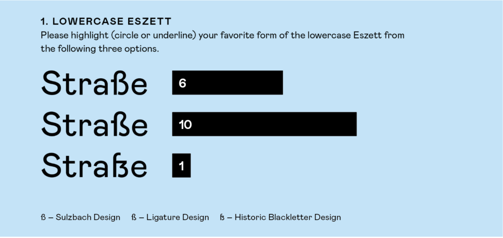
In this experiment, I presented the word „Straße“ using different forms of the Eszett character. The letterforms I designed were based on the Mabry typeface. Participants were asked to choose their favorite form from the three presented options. There were no wrong choices since all letterforms are officially recognized; the experiment was solely about personal preference and intuition. I conducted this experiment with individuals who predominantly have a strong design background. Moving forward, it would be interesting to conduct this experiment with non-designers.

Analyse
The evaluation of this experiment revealed that the majority preferred the ligature design. The Sulzbach design also received many votes but could not surpass the ligature design. This result was quite surprising to me, as I had expected the Sulzbach design to be the clear winner. In a previous experiment where I asked participants to draw a sharp S on a piece of paper, 98% of the responses were in the Sulzbach design, in a handwritten/cursive style. This outcome was clear to me since this design is commonly taught and recommended in schools. Apparently, this conclusion does not apply to printed letters. It seems we have a different perception or understanding for printed typefaces.