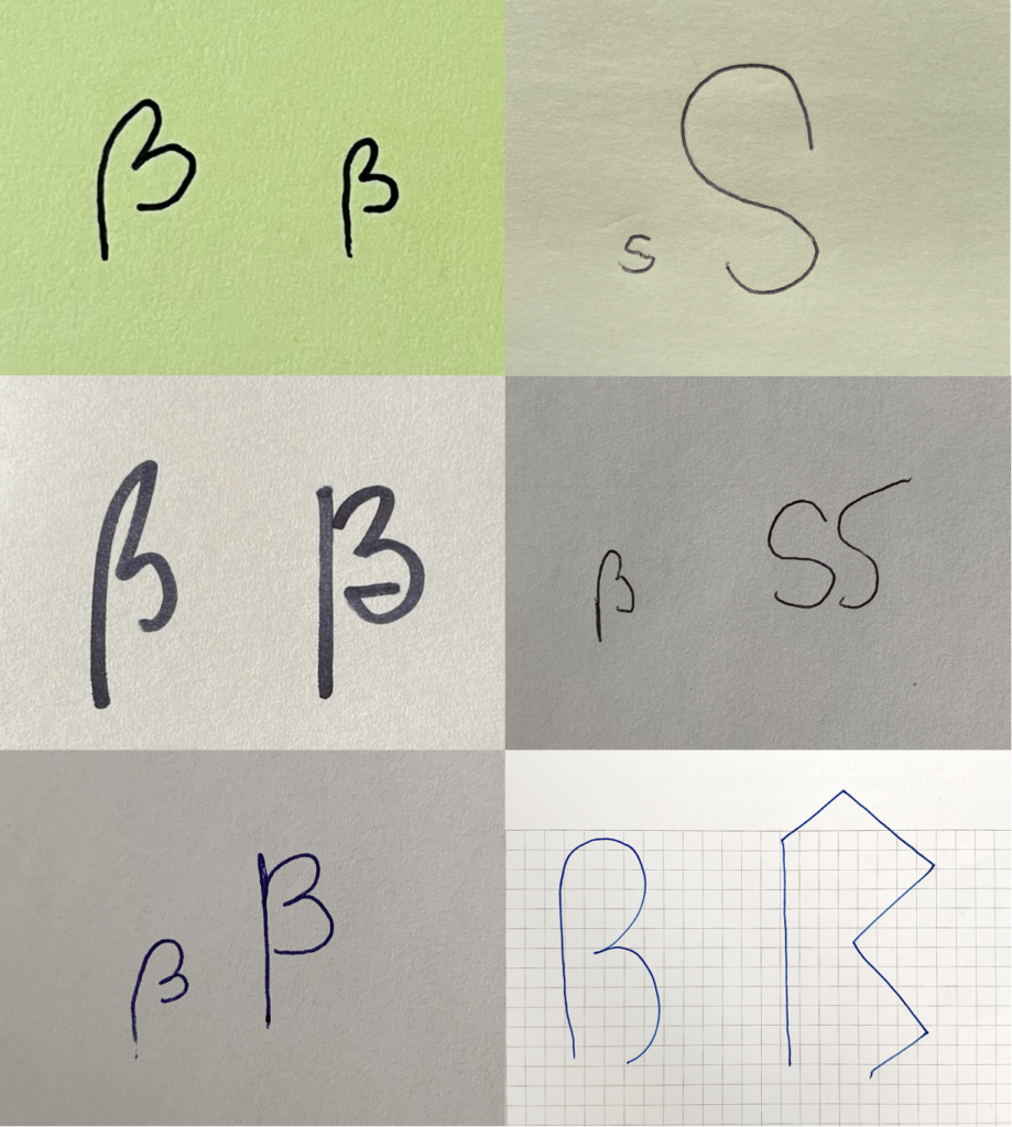
In this experiment, I asked people of different ages and cultural backgrounds, both with and without design experience, to draw a sharp S on a blank sheet of paper. For my participants, it was automatically clear that a sharp S is a lowercase letter. After they drew the letter, I asked them to transform it into an uppercase letter. This task left my participants somewhat perplexed. In 99% of the cases, the response was: „There is no uppercase sharp S, is there?“ Drawing the lowercase letter was done very intuitively and without any hesitation. However, creating the uppercase letter proved to be much more challenging. This is, of course, completely understandable, as people are not confronted with it in everyday life. While attempting to design the uppercase letter, my participants had many questions: How should it look? Doesn‘t an uppercase sharp S turn into a double S? Can I google this? Many were hesitant to draw a letter at all because they feared making a mistake.

Interestingly, many participants included a descender in both the lowercase and uppercase Eszett. This can be attributed to cursive handwriting, where descenders are commonly drawn. In digital typography, a descender is typically found in the italic/cursive version of the sharp S. Standard upright fonts, according to the norm, do not feature a descender for the sharp S.

The most frequently drawn uppercase variant was a modification of the lowercase letter. Many participants simply adapted the Sulzbach design of the lowercase Eszett into an uppercase form. They intentionally drew the letter with two rounded arches, making it wider to emphasize the characteristics of an uppercase letter.