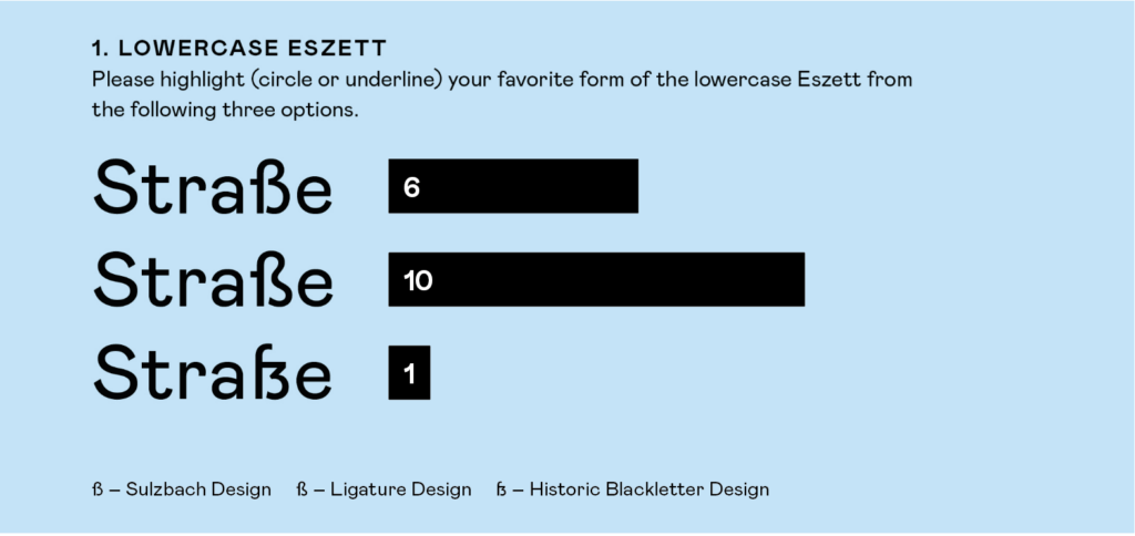
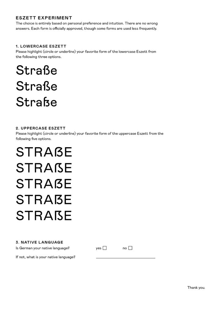
In this experiment, I presented the word „Straße“ using different forms of the Eszett character. The letterforms I designed were based on the Mabry typeface. Participants were asked to choose their favorite form from the three presented options. There were no wrong choices since all letterforms are officially recognized; the experiment was solely about personal preference and intuition. I conducted this experiment with individuals who predominantly have a strong design background. Moving forward, it would be interesting to conduct this experiment with non-designers.
Analyse
The evaluation of this experiment revealed that the majority preferred the ligature design. The Sulzbach design also received many votes but could not surpass the ligature design. This result was quite surprising to me, as I had expected the Sulzbach design to be the clear winner. In a previous experiment where I asked participants to draw a sharp S on a piece of paper, 98% of the responses were in the Sulzbach design, in a handwritten/cursive style. This outcome was clear to me since this design is commonly taught and recommended in schools. Apparently, this conclusion does not apply to printed letters. It seems we have a different perception or understanding for printed typefaces.
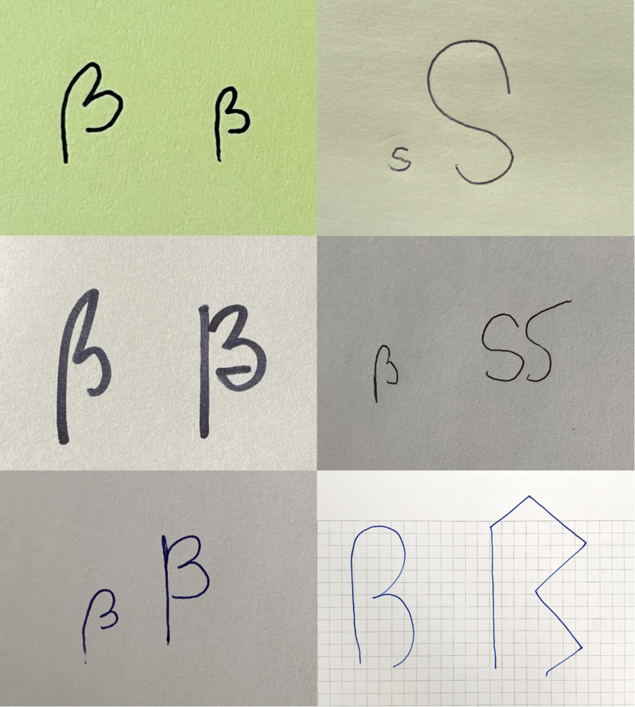
In this experiment, I asked people of different ages and cultural backgrounds, both with and without design experience, to draw a sharp S on a blank sheet of paper. For my participants, it was automatically clear that a sharp S is a lowercase letter. After they drew the letter, I asked them to transform it into an uppercase letter. This task left my participants somewhat perplexed. In 99% of the cases, the response was: „There is no uppercase sharp S, is there?“ Drawing the lowercase letter was done very intuitively and without any hesitation. However, creating the uppercase letter proved to be much more challenging. This is, of course, completely understandable, as people are not confronted with it in everyday life. While attempting to design the uppercase letter, my participants had many questions: How should it look? Doesn‘t an uppercase sharp S turn into a double S? Can I google this? Many were hesitant to draw a letter at all because they feared making a mistake.
Interestingly, many participants included a descender in both the lowercase and uppercase Eszett. This can be attributed to cursive handwriting, where descenders are commonly drawn. In digital typography, a descender is typically found in the italic/cursive version of the sharp S. Standard upright fonts, according to the norm, do not feature a descender for the sharp S.
The most frequently drawn uppercase variant was a modification of the lowercase letter. Many participants simply adapted the Sulzbach design of the lowercase Eszett into an uppercase form. They intentionally drew the letter with two rounded arches, making it wider to emphasize the characteristics of an uppercase letter.
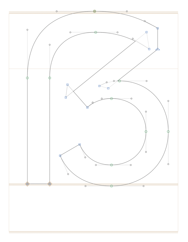
For my Eszett voting experiment, I improved the contrast of the various skeletons and designed the historical lowercase Eszett without a descender, so it better fits the rhythm of the letters.
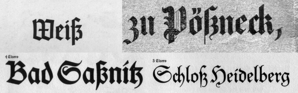
For the voting, I created a sheet where the word „Straße“ is written in both lowercase and uppercase. My participants need to evaluate which Eszett form they personally find the most fitting. The choice is based on personal preference. All Eszett skeletons are recognized, but some are simply less commonly used, making them appear rather unusual.
For my experiment, I want to ask participants who are not from the design field about their perception and personal preference regarding Eszett skeletons in both lowercase and uppercase. However, to present street names with the different lowercase Eszett variations, I first had to create them in Glyphs. Adjusted to the proportions of the Mabry typeface, I attempted to design the three Eszett variants. Lowercase letters are generally more challenging to draw as they contain many curves and details. The historical variant was the most difficult skeleton form for me because its proportions are somewhat unusual.
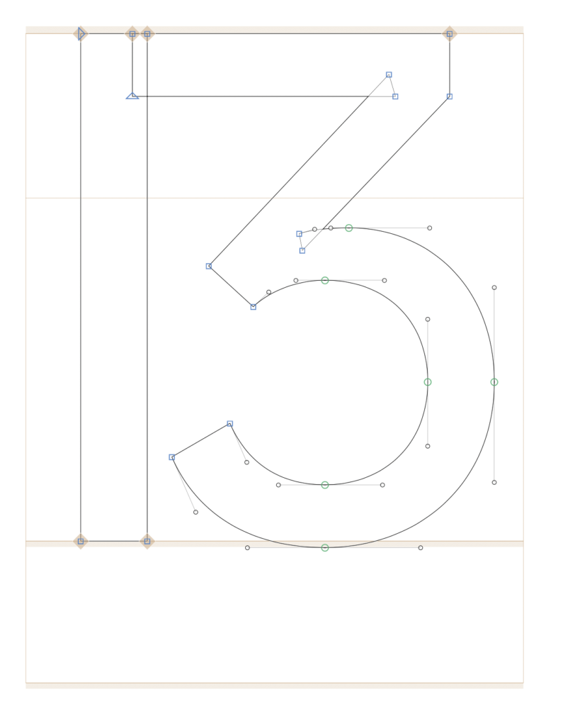
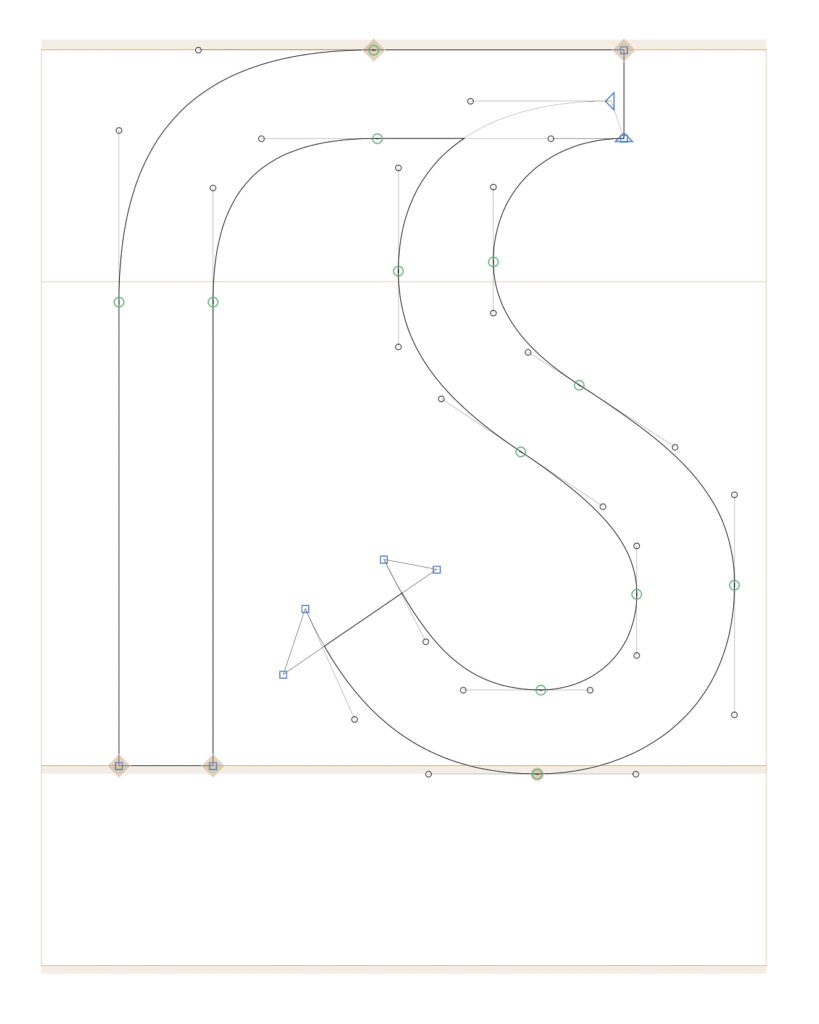
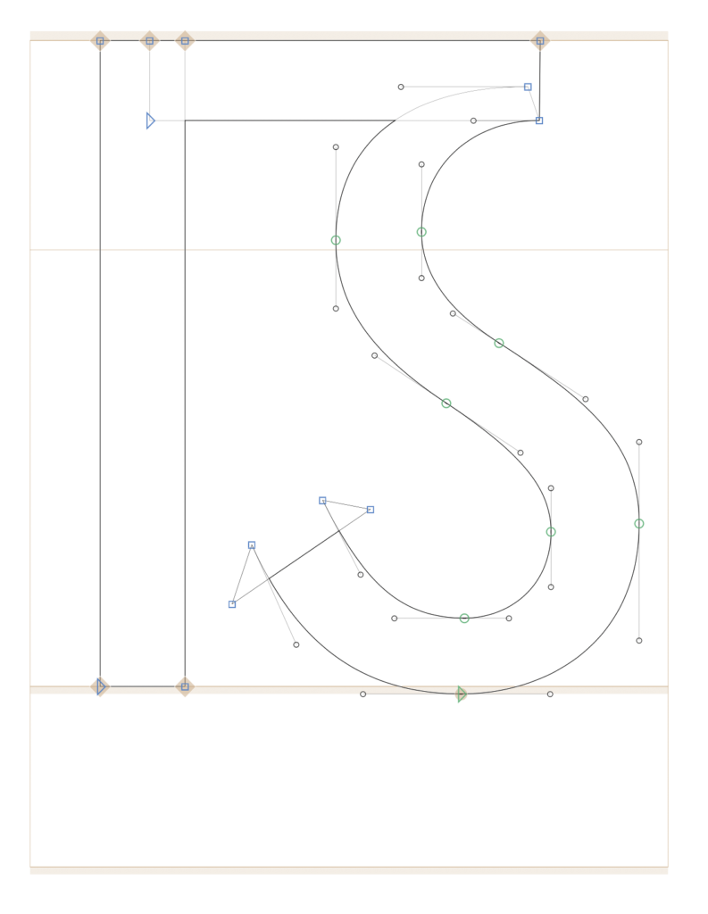
Ligature Design
Sulzbach Design
Historic Blackletter ß
For all three Eszett variants, I used different approaches and combined various letter components.
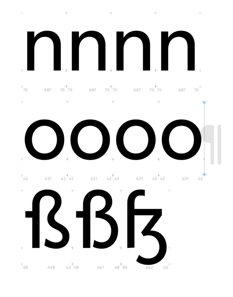
To conduct an experiment on the readability and perception of the sharp S, I need to create the four basic constructions of a typeface. As a starting point, I chose the Mabry typeface from the British type foundry Colophon. I was looking for a classic, dynamic sans-serif typeface with low contrast between thick and thin strokes. For my experiment, I wanted a relatively neutral typeface so that all four basic constructions would suit its design language. Different stylistic periods inherently have different design languages, making some sharp S approaches more or less suitable visually. I wanted to avoid being influenced by a specific design language and instead create neutral sharp S forms. Mabry seemed like the optimal choice as a modern and playful typeface.
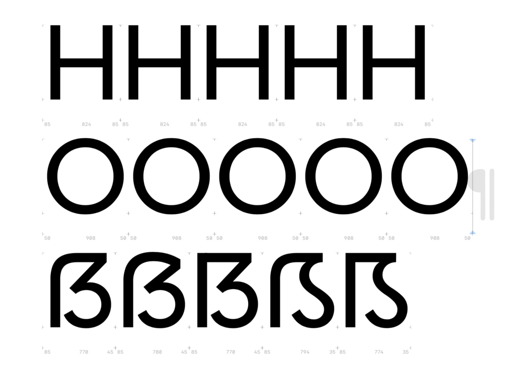
First, I adjusted the vertical proportions of the Mabry typeface in Glyphs and then analyzed the stroke contrast of the letters n, o, H, and O to apply these insights to my sharp S variants. After that, I considered several aspects for the design: the width of the letter H, the stroke thickness of the S-curve, and the optical adjustment of the whitespace within the newly designed letter.
Dresden Skeleton (Opt 1: slightly curved)
Dresden Skeleton (Opt 2: completely curved)
Frankfurt Skeleton
Leipzig Skeleton
Berlin Skeleton
Depending on the aesthetics, I adjusted the width of the Eszett variant, making it slightly narrower or wider. For my experiment, I plan to write five street names using the five different Eszett variants. The participants of the experiment will then choose their favorite letter.
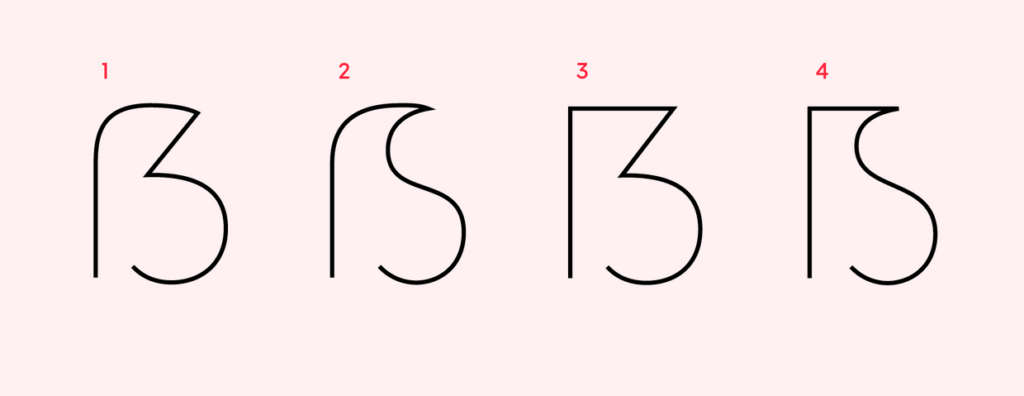
1. Dresden (soft + hard features) 2. Leipzig (soft + soft features) both by Andreas Stötzner 3. Frankfurt (hard + hard features) 4. Berlin (hard + soft features) both by Adam Twardoch
1. Dresden Skeleton
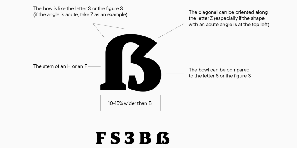
According to the German type designer Ralph Herrmann the Dresden skeleton is the most common construction. The Dresden design approach is characterized by several distinct features. Notably, it serves as a capitalized form of the lowercase character „ß“ and features a diagonal stroke at the upper right, distinguishing it from the letter „B“. One of its characteristic features is the aperture at the bottom, typically rounded in most designs. This aperture provides balance and legibility to the character. However, variations exist where this part of the character may be drawn with an angle or a serif, adding unique stylistic elements to the design.
Additionally, the diagonal stroke in the upper right part of the „Dresden“ character adds further visual interest and differentiation from similar-looking letters. It contributes to the overall distinctiveness and clarity of the character.
Considering these features, it‘s crucial to ensure that the „Dresden“ character maintains a width that is 10–15% wider than the letter „B“ to achieve optimal balance when used alongside other uppercase letters in text.
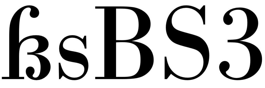
When a type designer embarks on creating an extended language set, they typically start with a foundation of basic characters and letters that are already rendered. This allows them to focus on the nuances of specific characters, such as the eszett. Graphically, when drawing an eszett, designers often reference the forms of other letters in the font, such as F, S, Z, B, and even the number 3. This helps maintain consistency in the overall design aesthetic. While it‘s commonly advised that the proportions of the capital ß be wider than those of the letter B by about 10-15%, this isn‘t always a strict rule. Instead, designers prioritize the proportions of the entire font and adjust accordingly. The construction of the eszett combines soft features from the bow of the letter S with hard features from the diagonal of the letter Z and its acute angle at the top right. This blend creates a unique visual identity for the character.
Testing the result involves printing text containing the eszett and examining how it integrates with the overall character set. This allows designers to assess the character‘s width and shape in relation to the rest of the font. Karen Cheng, in „Designing Type,“ suggests making cuts and serifs in the terminals of letters like S, 3, and eszetts identical, but this isn‘t mandatory in typeface creation. For instance, in sans-serif fonts, terminal cuts can be straight rather than curved. Ultimately, creating a cohesive and visually pleasing font involves balancing various design elements while maintaining readability and aesthetic consistency across the character set.
2. LeipzigSkeleton
This Eszett form by Andreas Stötzner exhibits a soft, rounded skeleton reminiscent of the Dresden form, characterized by a smooth transition from stem to bowl, reminiscent of historical round „s“. It combines elements from both the letter forms F and S, offering a unique and visually striking design aspect. Notably, the incorporation of a clearly visible S as the right part of the Capital Sharp S adds to its distinctiveness. While this variant may not be widely utilized, it complements typefaces with a more calligraphic appearance, introducing an intriguing design element without introducing ambiguity issues.
A more recent design approach, stemming from the Leipzig Skeleton, has given rise to the Zehlendorf Skeleton by Martin Wenzel and Jürgen Huber. Departing from the conventional wide and uniform S-curve, this variant opts for a tight, narrow S-curve. This nuanced adjustment creates additional whitespace within the broader character, enhancing its clarity and ensuring a clearer distinction from the letter B. This design strategy underscores the evolution and adaptability of Eszett forms, demonstrating a commitment to both legibility and aesthetic appeal within contemporary typography.
3. Franktfurt Skeleton
This Eszett skeleton by Adam Twardoch closely resembles the Dresden Skeleton. The only difference lies in the clear corner used as the transition from stem to bowl. Many designers think, that such an arc of the Dresden skeleton on the top left doesn’t work well within the Latin uppercase letters. So, to avoid this “lowercase look”, it is suggested to draw the top left of the Capital Sharp S as a corner. Compared to other Eszett options, this Skeleton appears much harder. Composed of the letter combinations F, Z, 3, and B, it lacks both soft curves and S-shapes. Consequently, this angular Eszett option aligns well with geometric typefaces. Moreover, this construction method finds particular favor with serif fonts. Here, an additional serif can be strategically placed at the stem, ensuring that the capital letter maintains proportional harmony with the other uppercase characters.
4. BerlinSkeleton
This design approach by Adam Twardoch builds upon the angular concept of a majuscule eszett once again. In order to seamlessly integrate the Berlin Skeleton into uppercase text, it eschews a rounded transition from stem to bowl in favor of a sharp corner on the top left of the letter. This architectural decision imbues the character with a larger appearance and reduces the likelihood of confusion with a lowercase letter. The design merges elements of the letters F and S, incorporating a more or less pronounced S-curve as well.
By employing this technique, Twardoch achieves a balance between legibility and aesthetic cohesion within uppercase letterforms. The distinct corner at the transition point adds visual weight to the character, making it stand out more prominently within text. Furthermore, the incorporation of both F and S characteristics ensures a harmonious integration of the Berlin Skeleton into various typefaces, contributing to its versatility and applicability across different design contexts.
Today there are three standard models for the design of the ß character. They are explained at first and are recommendable for most of today’s typefaces.
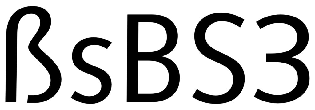
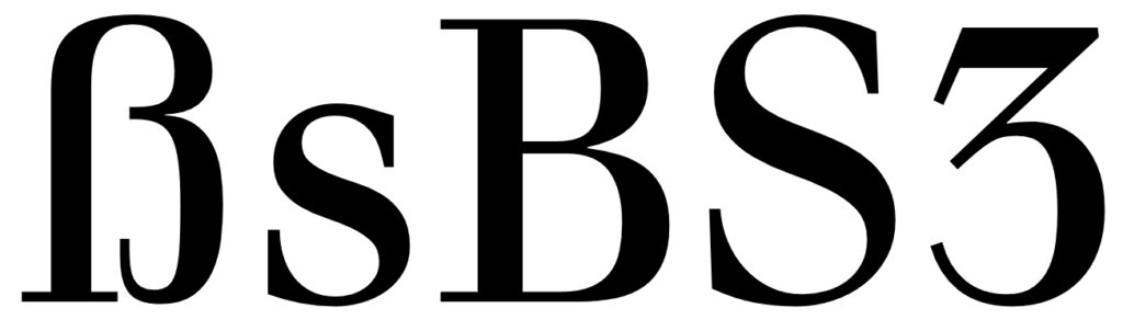
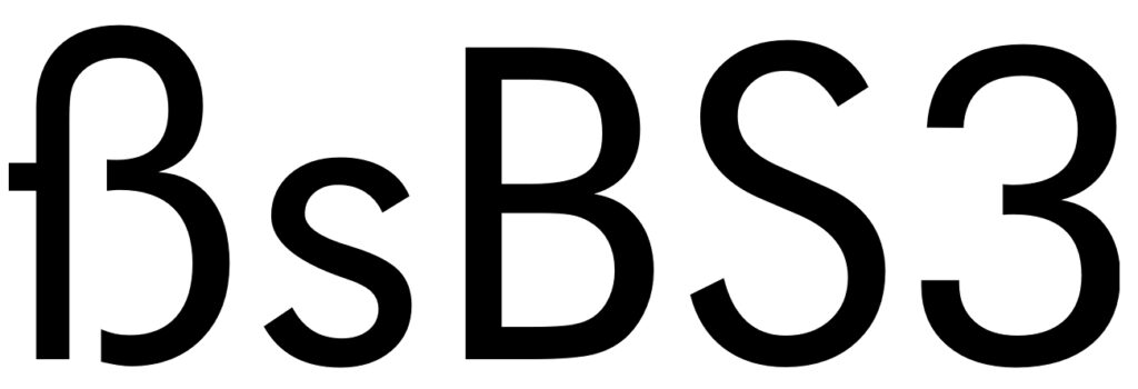
1. The ſs Ligature Design
This design is both very old and rather new at the same time. It was used for centuries across Europe, especially in cursive writing, either as a purely stylistic choice or in accordance with a typesetting practice which avoided a long s as the end of words and therefore displayed a double s (ſſ) as ſs, either visually connected or not.
This design, visually resembling the modern German letter ß, is often mistakenly considered its origin. In fact, its use in German texts is a relatively new practice that only became common since the mid-20th century. With the decline of Fraktur‘s influence in typesetting, typical Fraktur ligatures such as ch, ck, tz also disappeared, while understanding of the ß character slowly evolved. In uppercase letters, ß was initially represented as SZ, but later SS became the predominant spelling until the uppercase form of the letter ß was introduced. Without the influence of Fraktur, the German alphabet once again leaned towards designs from the Classical and Renaissance periods, with the historical ſs ligature being a fitting solution for the ß character, both in terms of design and understanding.
The use of this ligature design is the typical choice for so-called humanistic typefaces, i.e., designs rooted in the traditional book typefaces of the Renaissance. Both serif and sans-serif typefaces can employ this design model for the Eszett character.
Designing the ß in this style is rather simple, since it really is just ſ and s connected with an arc. The connection however is mandatory today. While an unconnected design is a historic variation, it won’t be accepted by today’s readers.
The upper counter area is ofter narrower than the lower counter area, as it can be seen in the examples above. But there are also typefaces with a more prominent upper counter area, especially in italic styles.
The arc and the s shape usually connect as one continuous curve, but there are a few typefaces which stress the different letter parts more clearly by making an abrupt change of direction. This can also work fine. But just to be clear: German readers without a background in typography see the ß as one character. Stressing ſ and s as individual parts of that design is neither expected nor necessarily helpful. Just as a W exposing its origin as ligature of two V is a possibility, but not necessarily helpful.
Typefaces: Optima, Syntax & Utopia
The ſ in its upright version might have a horizontal stroke on the left side and the ß then gets this stroke as well. This is a traditional design feature, but not really required. In my opinion, it only supports the confusion of ſ and f and therefore the horizontal stroke might also be omitted for ſ and ß in modern typefaces. Either way, ſ and ß should always follow the same principles.
And speaking of the long s: It will usually have a descender in the italic design, but not in the roman version. The same is true for the sharp s.
2. The Sulzbach Design
As already mentioned, German was mostly set in blackletter (or written in Kurrent) until the middle of the 20th century and the sharp s as German character was established and mandatory in these type and writing styles. When German was written or set in the roman type style, a counterpart for the blackletter ß wasn’t available for a long time. As a result we can find different alternative spellings until the end of the 19th century. For example: a word like “groß” (big) in blackletter could appear as gross, groſs or grosz in roman typefaces.
Around 1900 an official German orthography was established and a committee of type founders and printers met to define rules regarding the design and use of German characters like ß, ö, ä, ü in upper and lower case. At that time, typesetting and writing German in the roman style had already gained popularity and there was a need to find solutions and regulations regarding the different practices used for blackletter and non-blackletter typesetting. Some differences were kept, some things were unified. The ſ character was kept for blackletter, but dropped for setting German in roman and italic typefaces. The ß on the other was understood as a character of its own, which had become so important, that it was decided to add it to all typefaces, not just blackletter ones as before. All German type foundries should add it to their roman and italic designs. The design proposal that was chosen had similarities with an unusual letter used in the 17th century by the printer Abraham Lichtenthaler in the city of Sulzbach and is therefore now known as “Sulzbacher Form” (Sulzbach design).
Typefaces: Walbaum, Futura & Bodoni
3. Historic Variation: The “Blackletter ß”
With German blackletter and non-blackletter typefaces being used side by side since the end of the 19th century, type designers also started to mix elements of the two.
Blackletter fonts became more simplified and the letter skeletons of the early blackletter fonts became more popular, which were still closer to the design of the roman letter style. And roman typefaces from German foundries started to “look more German” in the first half of the 20th century. The mandatory ligatures of blackletter typesetting were often added to the character set of the roman typefaces and the design of individual letters was also borrowed from blackletter typefaces. A typical case for that is the sharp s character. Many, but not all typefaces used the recommended Sulzbach design. A design as a ligature of a long s with something like a 3 with a flat top resembled the typical look of a blackletter ß and also became a popular choice until the middle of the 20th century.
Because the “blackletter sharp s” in roman typefaces is typical for the first half of the 20th century, its use can still evoke a connection with that time. It appears—as default or stylistic alternative—in a few modern typefaces as well (e.g. FF Kava, Verlag, Metric, DIN Next Slab) and is legible within a word context, but it is not something that works for every font or use case.
Typefaces: Erbar, Technotyp & Bodoni Alternative Glyph
For my first design and research unit with Didi, I took into account the feedback from the semester presentation and the comments on the Miro board. An important point I took away from my presentation on „The Typographic Representation of the German ‚Scharfen S’/’Eszett'“ is the direction in which my topic will evolve in the next semester and in my upcoming master’s thesis. In the first semester, I delved deeply into the historical development of this letter, the technical challenges, and readability. Towards the end of the semester, I shed light on various design approaches and constructions.
This semester, I plan to delve deeper into the various basic constructions of ß and ẞ and analyze which letter forms are preferred in sans-serif and serif fonts. The availability of fonts that support both lowercase ß and uppercase ẞ is quite limited, making the search for suitable fonts somewhat challenging. As the focus this semester is on analysis and experiments, I aim to compare the use of ß and ẞ in digital and analog media. It will be particularly interesting to see how ß is treated in headlines set in uppercase, where the double-letter form is often used. I’m very curious to see how much I’ll have to scroll through websites and flip through magazines to find a ẞ.
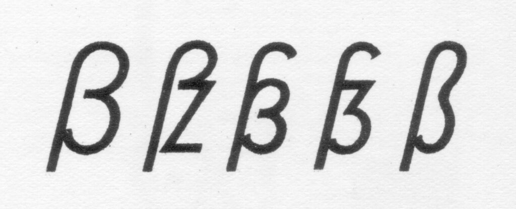
Furthermore, I plan to conduct a survey on the perception of ß and ẞ among different age groups. Given the controversial basic construction of the uppercase letter, I’m interested in how laypeople would draw this letter or which one they would choose from a selection of different letters.
In the course of my planned experiments and surveys, as well as the insights from the 1st semester, my research question would be as follows: What challenges and opportunities arise from the integration of the uppercase Eszett in typographic practice and contemporary communication?
Uppercase Eszett Design Since June 29, 2017, the letter ẞ has become a part of the German orthography. Many type designers warmly welcome this decision and had already incorporated the unofficial character into their font designs even before its official recognition. Now that the character has been formally included in the alphabet, the question of how to design a capital Eszett arises once again. Many designers assume that the ligature for the capital Eszett is exclusively composed of a long „s“ and „z“ (Sulzbacher Form) and tailor their designs for ẞ accordingly. However, the historical origin of the capital Eszett, whether from „s“ and „z,“ from a long „s“ and a round „s,“ or from other combinations, cannot be conclusively answered. Diverse combinations were already in existence in the 7th century.
More relevant than conclusively determining the origin of the ligature is the development of a functional form for this new uppercase letter, focusing on readers in the 21st century. If we place the habits of the reader at the center and aim for a responsible design for use in the 21st century, a derivation of the form from the version with a long „s“ and a round „s“ is clearly preferable. Especially considering international appeal, forms that distinctly incorporate an „s“ shape are convincing.
The development of this new uppercase letter and its stylistic integration into our existing capital alphabet necessitate careful consideration of several key elements. The letter should possess a monumental, uppercase appearance to emphasize its prominence. Simultaneously, it is crucial that it clearly distinguishes itself from other glyphs in the alphabet while maintaining a stylistic connection to ensure overall coherence. Particular attention should be given to its resemblance to the form of the common „ß“ in Antiqua fonts. This not only establishes a visually coherent link but also supports the seamless integration of the new uppercase letter into the overall font style. Additionally, it is essential to incorporate the normal „s“ form into the design for improved identifiability, facilitating a harmonious fit within the existing alphabet. Another significant consideration is the treatment of the left stem as an abstract element. This approach becomes necessary as the familiarity with the long „ſ“ gradually diminishes, and a contemporary, easily recognizable design is sought. By carefully addressing these attributes, a visually appealing and functionally integrated design for the new uppercase letter can be achieved.
When examining the basic structure of Capitalis Monumentalis, which serves as the origin of our contemporary uppercase letters, it becomes apparent that Roman letters are both distinct from each other and, at the same time, exhibit a stylistic coherence. This duality defines their quality and underlies their usage for over 2000 years.
When introducing a new character, it must stand out from all others. In the case of the capital Eszett, the reading habits of readers play a crucial role. A resemblance to the common „ß“ facilitates recognition – reading type designers should align with these habits for optimal legibility.
Four Primary Constructions Typography experts have crafted various forms of the Eszett, resulting in four primary constructions of the uppercase Eszett: „Dresden“ (1) and „Leipzig“ (2) as per Andreas Stötzner, and „Frankfurt“ (3) and „Berlin“ (4) according to Adam Twardoch.
The German typographer Ralph Herrmann has highlighted that the most prevalent construction for the capital form of the Eszett is the number 1 variant. Distinguishing features include the aperture at the bottom and a diagonal in the upper right part. The lower part is frequently rounded, although some Eszett forms may present this section as an angle or with a serif.
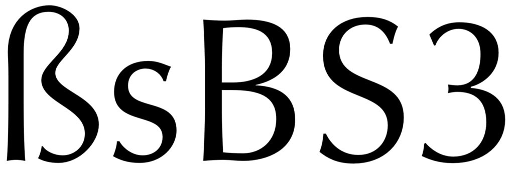
When embarking on the creation of an extended language set, the fundamental set of characters and letters is typically already crafted. Therefore, in the graphic rendering of the Eszett, attention can be directed towards the established forms of the letters F, S, Z, B, and the numeral 3.
The proportions of the uppercase Eszett are generally wider than those of the letter B by approximately 10-15%. Although not a strict requirement, it is more crucial to consider the proportions of the overall font and align the design accordingly.
To assess the outcome, one can print the text containing the Eszett and carefully examine its appearance within the complete set of characters. This aids in understanding how the character‘s shape integrates into the overall aesthetic of the font concerning width and form. According to Karen Cheng in „Designing Type,“ making cuts and serifs in the terminals of S, 3, and Eszetts identical is suggested, but it is not obligatory in typeface creation. For instance, in sans-serif fonts, terminal cuts can be straight.
Unsuccessful examples of the eszett form are usually read as B.
Typographers hold differing opinions on the design of the verbal Eszett. While the Dresden (1) variant is the most commonly used form, many critics argue that it bears too strong a resemblance to the characteristics of the numeral 3. The sharp-edged diagonal consistently harks back to the historical roots of the Sulzbacher Form (ligature of long „s“ + „z“). Instead, there is a preference for adopting the Antiqua approach of long „s“ + „s“ and emphasizing the uppercase S in the uppercase Eszett. For non-native German speakers, associating the Leipzig (2) and Berlin (4) forms with a distinct S-form would be more intuitive.
When designing a lowercase „eszett,“ there are two possible forms: – One is the classic connection of „f“ on the left with the letter „s,“ where the „f“ lacks a crossbar. – The other is the Sulzbacher shape with two semi-ovals on the left, resembling the number 3.
In many typefaces, there is a smooth and continuous connection of the arch of „f“ with the letter „s,“ although some forms exhibit a more noticeable separation between these characters. According to the german typographer Ralf Herrmann, German-speaking readers unfamiliar with typography perceive the „eszett“ as a single letter. Due to this, it is advisable to create a variant with a smooth connection.
Stem Classic typefaces for body text typically maintain an upright style where the stem does not extend below the baseline. This characteristic aids in distinguishing the eszett from the Greek letter beta. However, in italic forms, this rule can be disregarded, as historically, the long s form in italics consistently featured a descender and was indeed long.
Serifs The left serif depicted in the image above is a common feature in many fonts. In modern typography, including this serif is not essential for an eszett, offering the flexibility to omit it to prevent the eszett from resembling an „f.“ However, caution is advised when adding serifs to fonts with a long s. If a serif is incorporated into a long s, it must also be applied to the eszett. This principle works conversely as well: the absence of serifs should be consistent for both characters. It is crucial to prevent confusion between the long s and „f,“ as exemplified below: the long s_t ligature might resemble f_t, but it lacks a serif in both the eszett and the long s characters. Users unfamiliar with historical context could easily misinterpret this ligature for other purposes.
Historical Influence In typefaces with a historical flair, there is the opportunity to explore unique combinations of the long s with „s,“ drawing influence from Fraktur script, which adds a distinctive and unconventional touch to the design.
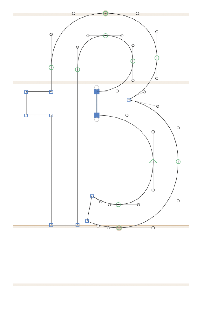
Sulzbach Form The Sulzbach form of the eszett is characterized by an implicit connection between the long s and the letters „s“ or „z,“ forming what may appear to those unfamiliar with German as a capital B due to the presence of two semi-ovals. When crafting this eszett variant, designers can draw inspiration not only from the combination of „f“ and „s“ but also from the numeral 3.
In this form, it‘s essential that the right semi-ovals of the eszett are identical, contributing to the distinct appearance. The horizontal component should not connect to the stem throughout its length, ensuring a visual separation from the uppercase B. The lower semi-oval can conclude with either a serif or a drop, depending on the stylistic choices of the font being created.
When crafting ligatures, including the eszett, it‘s essential to adhere to the overall logic of the font. In instances where a particular form raises uncertainty, it‘s beneficial to test the character within the context of other characters to evaluate visual compatibility. It‘s crucial to keep in mind that all characters within the font should exhibit harmony, ensuring a visually pleasing experience for the reader when perusing the typed text. This harmonious design approach not only enhances the reader‘s enjoyment but also brings satisfaction to the designer working with the font.