18 // Experiment 2.2: Effect of illustration (evaluation)

I interviewed a total of three people. The results for the questions already published in the last post are:

  1. First impression
    Illustration packaging: all three respondents found the design of the packaging with the illustration aesthetically pleasing and modern.
    Photography packaging: this packaging was perceived as familiar and traditional.
  2. Design description
    The illustration packaging was described as stylish, appealing and professional.
    The photographic packaging was described as classic and reliable, although less modern.
  3. Preference
    All three respondents found the illustration packaging nicer.
    Despite this preference, they would rather choose the photographic packaging.
  4. Purchase decision
    The quick recognition value and the familiarity of the packaging with the photography were the main reasons for the purchase decision in favor of this packaging.
  5. Illustration vs. photography
    The illustration packaging evoked feelings of creativity and freshness, while the photography packaging evoked associations of authenticity and trust.
  6. Responsiveness and professionalism
    All three respondents found the illustration appealing and professional.
  7. Clarity and comprehensibility
    Two of the three respondents found the illustration packaging clearer and easier to understand.
    One person found the packaging with the photograph easier to interpret.
  8. Content recognition
    Most respondents found it easy to recognize the content of the product from the photograph, while the illustration was slightly more abstract.


Summary:

All found the illustration aesthetically pleasing, but trusted the photography more because of its recognition value. The illustration evoked feelings of creativity, while the photograph evoked associations of authenticity. Participants found the illustration appealing and professional. The clarity of the packaging was divided, but the photographic packaging was easier to interpret. Most recognized the contents of the product more easily from the photograph. Familiarity and recognition influenced the purchase decision more than aesthetic appeal.

17 // 2.1: Effect of illustration

For my second experiment, I chose a food product from the supermarket. I chose Spar olive oil because in this experiment I wanted to find out how a simple design with illustrations compares to a typical food packaging with photographs.

To do this, I used existing olive oil branding from the internet to create a simpler packaging including an olive illustration.

In a short, personal survey, I would like to find out what effect both types of packaging have and which one is more likely to be chosen.

Questions for a personal conversation:

  1. What is your first impression of the two packages?
  2. How would you describe the design of the packaging (e.g. modern, traditional, appealing, boring)?
  3. Which of the two packagings do you like better? Why?
  4. Which packaging would you be more likely to reach for if you were in the supermarket? Why?
  5. Which packaging appeals to you more: the one with the illustration or the one with the photograph?
  6. Why do you prefer illustrations/photographs on packaging?
  7. What feelings or associations does the packaging with the illustration evoke in you?
  8. Do you find the illustration appealing and professional?
  9. Do you think that the packaging with the illustration is clearer and easier to understand than the packaging with the photograph?
  10. How easy is it for you to recognize the contents of the product from the illustration/photography?

16 // Experiment 1.3: Effect of typography (evaluation)

My survey produced the following results:

General questions about typography

  1. Which logo appeals to you the most?
    The original logo (Sans Serif) was preferred by most participants, which could be due to its clear and modern design.
  2. How professional does each logo variant look?
    Original logo (Sans Serif): Scored an average of 4.5 out of 5. It was rated as the most professional.
    Serif font: Averaged 3.8 out of 5 points. It was perceived as professional but more traditional.
    Rounded Sans Serif: An average of 3.5 out of 5 points. This variant was perceived as friendly and modern, but slightly less professional.
    Handwriting: Average 2.9 out of 5 points. Handwriting was considered the least professional, but personal and inviting.
  3. What emotions does each logo variant evoke in you?
    Original logo (Sans Serif): Trustworthy, modern, professional.
    Serif font: Traditional, elegant, sophisticated.
    Handwriting: Personal, friendly, individual.
    Rounded Sans Serif: Modern, friendly, accessible.

Specific questions about typography

  1. In your opinion, which logo best conveys the brand of an upscale hotel?
    The original logo (Sans Serif) was seen by the majority as the logo that best conveys the brand of an upscale hotel.
  2. Which logo do you find most inviting?
    The rounded Sans Serif was perceived as the most inviting, closely followed by the original logo.
  3. Which logo variant looks the most modern?
    The original logo (Sans Serif) and the rounded sans serif were seen as the most modern variants.
  4. Which logo variant looks the most traditional?
    The serif font was rated as the most traditional variant.

General questions about color

  1. Has your perception of the logo changed with the addition of colors?
    About 70% of participants stated that their perception has not changed.
  2. If so, how did the perception change?
    Those who did notice a change mentioned that the colors made the logo appear more vibrant and inviting.

Specific questions about color

  1. Which color logo appeals to you the most?
    The original logo (Sans Serif) in color was again the most preferred.
  2. How professional does each color logo variation look?
    Original colored logo (Sans Serif): Scored an average of 4.5 out of 5. It was still rated as the most professional.
    Serif font in color: Averaged 3.8 out of 5 points.
    Rounded Sans Serif in color: Average 3.5 out of 5 points.
    Handwriting in color: Average 2.9 out of 5 points.
  3. What emotions does each color logo variant trigger in you?
    The colored logos triggered similar emotions as their black and white counterparts, but an added sense of vibrancy was often mentioned.
  4. In your opinion, which color logo best conveys the brand of an upscale hotel?
    Mostly the original colored logo (Sans Serif).
  5. Which color logo do you find most inviting?
    The rounded Sans Serif in color was perceived as the most inviting, followed by the original logo.
  6. Which logo variant looks the most modern?
    The original colored logo (Sans Serif) and the rounded Sans Serif were seen as the most modern variants.
  7. Which logo variant looks the most traditional?
    The colored serif font was rated as the most traditional variant.


Summary:

The survey shows that the original logo (Sans Serif) performed best in both black and white and in color and was perceived as professional, modern and trustworthy. The use of color did not result in a significant change in perception for most participants. The serif font was perceived as traditional, while the rounded Sans Serif was perceived as inviting and modern. Handwriting scored lowest in terms of professionalism, but was rated as personal and friendly.

15 // Experiment 1.2: Effect of typography

To test my first experiment, I created a short online survey. The respondents were asked the following questions in addition to the images I posted in the last blog post:

General questions about typography

  • Which logo appeals to you the most? (selection)
  • Please rate how professional each logo variant looks. (Scale from 1 to 5, where 1 = not professional and 5 = very professional)
  • What emotions does each logo variant evoke in you? (open question)

Specific questions on typography

  • In your opinion, which logo best conveys the brand of an upscale hotel? (selection)
  • Which logo do you find most inviting? (selection)
  • Which logo variant looks the most modern? (selection)
  • Which logo variant looks the most traditional? (selection)

General questions about color

  • Has the addition of color changed your perception of the logo? (Yes/No)
  • If yes, how has the perception changed? (open question)

Specific questions about the color

  • Which color logo appeals to you the most? (selection)
  • Please rate how professional each color logo variant looks. (Scale from 1 to 5, where 1 = not professional and 5 = very professional)
  • What emotions does each color logo variant trigger in you? (open question)
  • In your opinion, which color logo best conveys the brand of an upscale hotel? (selection)
  • Which color logo seems most inviting to you? (selection)
  • Which logo variant looks the most modern? (selection)
  • Which logo variant looks the most traditional? (selection)

The results will be announced in the next blog post.

14 // Experiment 1.1: Effect of typography

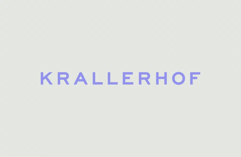
My first experiment deals with the effect of typography in branding. I chose an existing hotel branding for this. As I am inspired by the work of Moodley, an agency from Graz, I looked there for suitable branding and finally found what I was looking for.

I decided on the new branding for the Krallerhof. The Krallerhof has been around since 1956 and Moodley has helped the family hotel to reposition itself on the market with a new brand strategy and a revised corporate identity.

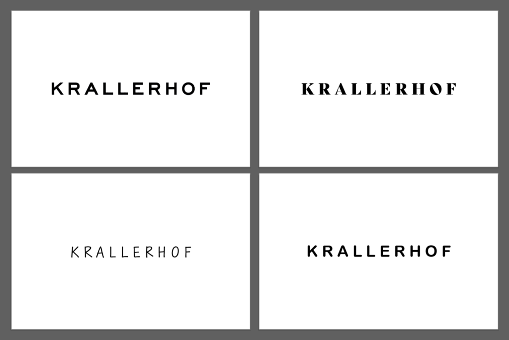
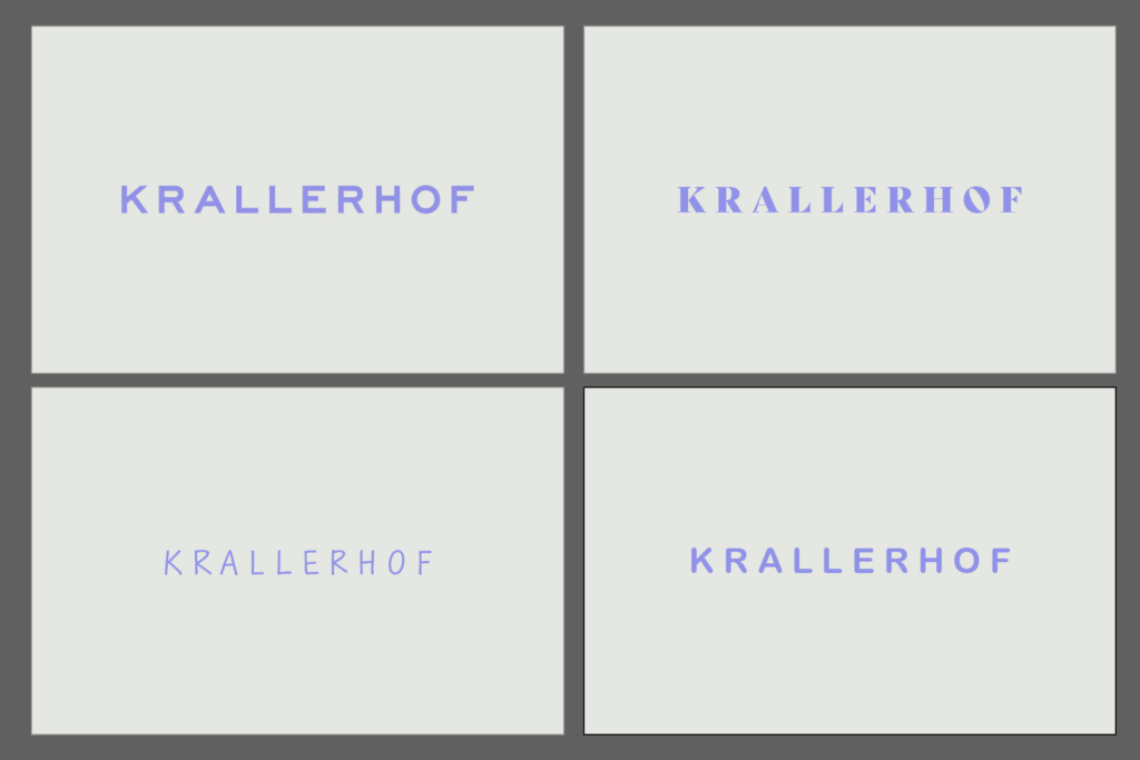
For the experiment, I added three further variants to the existing logo. I made sure to only change the font. No other objects were added. The original logo uses a sans serif font. For the other variants, I therefore opted for a font with serifs, a handwritten font and a rounded sans serif. I made sure that the spacing is similar for all variants and that a logo is not judged differently because of this factor.

In the next step, I present the different variants to a few people and ask them about certain parameters. This is intended to provide conclusions about the perception of a logo and thus about the brand identity without knowledge of the company. In the first step, the interviewees are presented with a black and white variant. In the next step, the variant with the original colors follows in order to determine whether a change in perception occurs.

13 // Planning the experiments

As I am devoting myself to experimentation this semester, I have decided to carry out a total of three different experiments in the field of communication design. In the following blog posts, I will explain these experiments in more detail and document them with pictures. After the experiment phase, I will test these experiments with my target group in the form of an online survey. This survey should provide me with information about which approach I would like to pursue in the third semester.

Experiment 1: Book from both sides

My first experiment is a book that can be read from both sides. One side is aimed at people who want to conceive and design a branding from scratch. The other side is for people who want to modernize or update existing branding to meet today’s standards and strengthen brand loyalty with their target audience. In addition to descriptive texts, the book contains visualizations and practical tips that can be applied. Interspersed throughout are interviews with branding experts from the scene. I am also considering focusing on Graz and giving tips based on brandings designed in Graz. In addition, the interviews could be limited to the Graz media landscape in order to highlight regional characteristics and expertise.

The aim of this experiment is to create a comprehensive and practice-oriented handbook that helps both beginners and experienced brand developers to develop effective branding strategies.

Experiment 2: Typographic brand identity

I want to develop several typographic identities for a brand that use different fonts, sizes and styles. To do this, I will create examples of the use of typography in different contexts, such as logos, posters, websites and print media.

The aim is to explore how different typographic styles influence the perception and feel of a brand.

Experiment 3: Brand illustration in context

In my third experiment, I want to find out how illustrations look on products in the supermarket compared to photography. For this I will develop an illustrative concept that highlights the different aspects of the brand identity.

My goal here is to understand how illustrations influence brand perception and loyalty in different contexts.

12 // OFFF Barcelona

Through an excursion in my studies, I recently had the pleasure of attending OFFF Barcelona 2024, one of the leading conferences for creativity and design. But among all the captivating talks and innovative ideas, it was the talk by Ragged Edge, a branding agency from London, that reignited my passion for branding.

Ragged Edge describes itself as an agency for people who want to achieve the impossible. Their approach to branding is refreshingly different – away from egos and towards ideas that challenge the status quo and can bring about change. They emphasize that branding is not just about superficiality, but involves profound strategic and creative steps that can bring about change both inside and outside an organization.

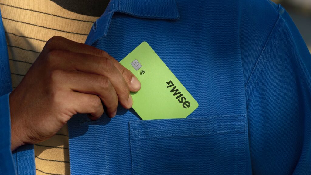
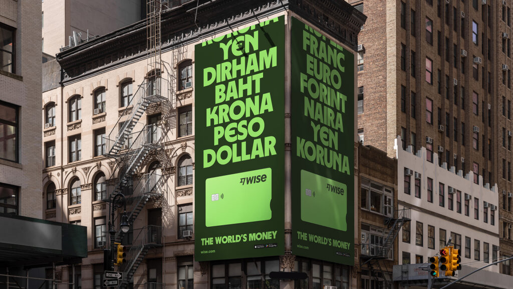
I was particularly intrigued by their project with Wise, a company that aims to revolutionize the global financial system. Wise already has a huge impact on how money moves around the world and is now striving to make this money system accessible to even more people, in even more places. The collaboration with Ragged Edge helped Wise create a standout brand that makes the concept of ‚the world’s money‘ accessible to everyone, regardless of location or financial situation.

Ragged Edge’s talk about their work with Wise was a wake-up call for me. It showed me how branding not only transforms businesses, but can also impact the way people interact with money. This idea of transformation through branding inspired me so much that I decided to continue exploring this topic in my Master’s thesis.

11 // Review and prospects for the 2nd semester

Last semester, I intensively studied the various facets of branding. It became clear that branding is much more than just a visual concept, but a complex combination of psychological and design elements. I was particularly fascinated by how strongly emotions and perceptions can be influenced by colors and typography and how historical developments shape today’s branding strategies.

In the future, I would like to continue studying branding and its impact on target groups. My goal is to understand how targeted branding strategies can influence the perception and behavior of the target group. In doing so, I will take a closer look at the psychological aspects as well as current trends and innovations in branding. I am also particularly interested in interdisciplinary approaches in order to develop a comprehensive understanding of the dynamics of branding and to explore innovative strategies.

This semester I would like to devote myself to experimentation. I therefore plan to conduct three different experiments that fit in with my area of specialization (Communication Design). Through these experiments, I want to explore new approaches and ideas to further deepen my understanding of brand identity design.

At the end of the semester, I intend to test these experiments with my target audience using an online survey to gain insights for my practical master’s thesis. This survey will also help me to concretize the direction for my practical project and ensure that it meets the needs and expectations of my target group.Through this experimental approach, I hope to not only gain practical insights into the application of branding strategies, but also valuable insights into how my target audience responds to different design elements. This will enable me to make informed decisions for my future professional practice in the field of communication design.

10 // Reflection and outlook

Over the course of my first semester, I experienced an in-depth exploration of various aspects of branding. The initial exploration of basic definitions formed the foundation on which a complex understanding of the multifaceted world of branding developed over time. It became clear that branding is far more than just a visual concept – it is a comprehensive interplay of psychological, historical and design elements.

Delving deeper into the psychology of branding revealed how profound the emotional connection between consumers and brands is. The targeted influencing of emotions through the choice of color was clarified in the further analysis, in particular through the application of color psychology in marketing and branding. Here it became clear that colors are not just aesthetic decisions, but have a decisive influence on the perception and interpretation of a brand.

The historical perspective opened up a view of the evolution of branding, which helped me to better understand its importance and relevance today. Analyzing best practice examples, including giants such as Nike, Starbucks and Coca-Cola, allowed me to extract concrete applications and successful strategies in branding. The effect of fonts on brand communication was examined in depth in a separate study and finally focused on the integration of typography into the overall brand identity.

My question „How does branding play a pivotal role in shaping and influencing the visual identity of brands?“ was illuminated on various levels in the course of this multi-layered examination. It became evident that branding is not just an aesthetic practice, but a strategic decision that permeates and shapes the entire visual appearance of a brand.


Outlook for next semester:

In the coming semester, I intend to intensify my research by conducting a comprehensive survey. The focus will be on capturing current opinions and trends in branding and integrating the findings into my Master’s thesis. The survey will be conducted online in order to reach a broader and more global participant base. 

Some possible questions that could be included in the survey:

  • How much does the visual identity of a brand influence your decision to buy a product or service?
  • To what extent does the appearance of a brand play a role in forming your opinion of its products or services?
  • What colors appeal to you most when it comes to brands, and why?
  • To what extent does the design of a website or packaging influence your perception of and interaction with a brand?
  • What importance do you attach to the font (typography) of a brand?
  • Do you believe that a consistent use of fonts improves the brand experience?
  • How much does the visual consistency of a brand influence your loyalty to that brand?
  • How important is it to you that a brand communicates its brand promise visually?

These questions are intended not only to capture the preferences and opinions of the participants, but also to gain deeper insights into the psychological and emotional connections between consumers and brands. The results of the survey will form an important basis for further research and further enrich my master’s thesis.

09 // Typography in the brand identity

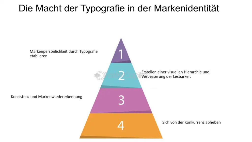
After my last blog post, I came across an exciting website that once again deals explicitly with the power of typography in brand identity. This post therefore serves to supplement the content of the last post entitled „Typography and branding“ and to reiterate important content.


Image source: https://fastercapital.com/de/inhalt/Typografie–Auswahl-der-richtigen-Schriftarten-fuer-Ihre-Markenidentitaet.html

Typography plays a decisive role in shaping brand identity, but often influences the perception of a brand unnoticed. It can convey emotions, create credibility and set a brand apart from the competition. The choice of fonts, styles and sizes makes it possible to establish a clear brand personality. A comparative example illustrates that elegant serif fonts convey a sense of elegance, while rounded sans serif fonts create a more playful appearance.

Additionally, typography plays a crucial role in improving readability and creating a visual hierarchy. Using different font sizes and styles allows designers to clearly communicate information and draw attention. Consistent brand fonts across different touchpoints contribute to brand recognition, resulting in a strong visual identity for well-known brands such as Coca-Cola and Google.

Another aspect is differentiation from the competition. By choosing unique fonts, brands can make a lasting impression and stand out in a crowded market. Chanel is cited as an example, using a custom-designed font that is immediately associated with its luxury positioning.

Overall, the text emphasizes the crucial role of typography in brand identity design. Through the purposeful selection of fonts, brands can communicate their personality, build credibility, improve readability and successfully differentiate themselves in a competitive market.


Works Cited for the entire article:

FasterCapital. “Typografie Auswahl Der Richtigen Schriftarten Für Ihre Markenidentität.” Www.fastercapital.com, 7 Dec. 2023, fastercapital.com/de/inhalt/Typografie–Auswahl-der-richtigen-Schriftarten-fuer-Ihre-Markenidentitaet.html. Accessed 25 Jan. 2024.