Episode #4 from the series: New things I learned this semester – Frame by Frame

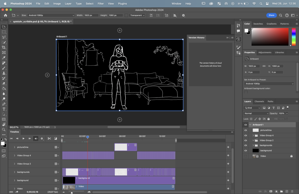
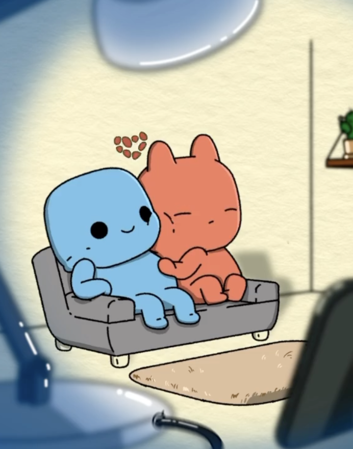
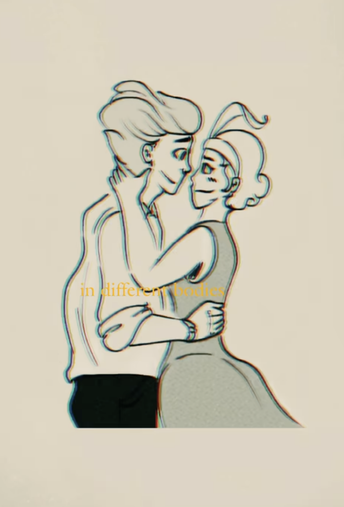
Working on the „Spieluhr“ scribble-style frame-by-frame animation has been an experience, especially using Photoshop and a drawing tablet. My process began with looking for a perfect brush style and how I can logically devide the different parts in the frame to ensure that I don’t work in chaos. Using a reference video was incredibly helpful in this stage, providing a solid foundation for the key actions and transitions.

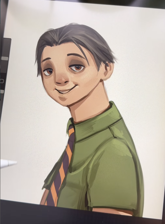
The next step involved establishing keyframes. These pivotal moments captured the essence of each movement, marking the start and end points of actions. Working in Photoshop, I used layers to separate different elements of the animation, which made it easier to manage the complexity. The drawing tablet proved invaluable, offering the precision and fluidity needed for detailed work. At first I was really sceptical because of the drawing tablet but in the end it was really a gamechanger. This setup allowed me to create the inbetweens, or „tweens,“ which were crucial for achieving smooth, continuous motion between keyframes.

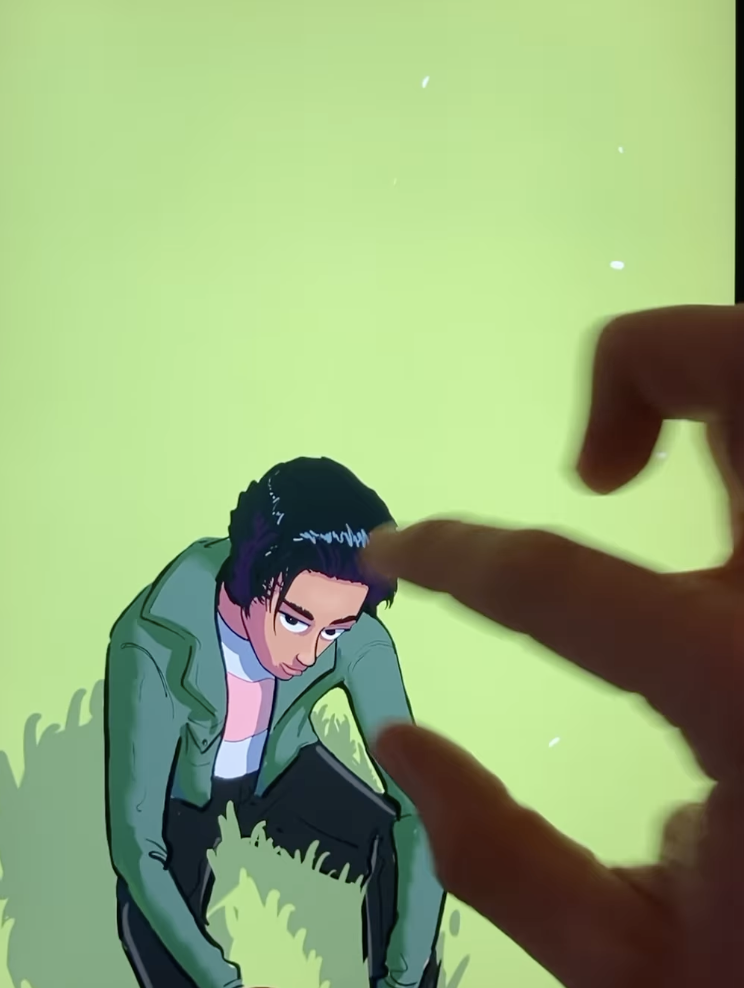
Maintaining consistency throughout the animation was a challenge, but tools like onion skinning in Photoshop made it manageable. By seeing previous and next frames, I could ensure that character proportions, shapes, and the overall scribble style remained uniform. This consistency was key to making the animation look professional and cohesive.

Attention to detail was another critical aspect. Secondary actions, such as subtle movements of hair or clothing, added layers of realism. Follow-through and overlapping action were techniques I applied to make movements more lifelike, ensuring that different parts of the body or objects moved with a natural delay.

Lighting and shadow consistency was crucial, even in a scribble-style animation. Keeping these elements uniform ensured visual coherence, and shadows moved correctly with the objects or characters, adding to the overall realism.

Throughout the process, frequent playback was essential. This allowed me to check for smoothness and coherence, making necessary adjustments along the way. Feedback from peers was invaluable, providing different perspectives and highlighting areas for improvement. Multiple revisions were part of the journey, each one bringing the animation closer to perfection.

Using Photoshop and a drawing tablet made the technical aspects of frame-by-frame animation more manageable. The software’s features, combined with the precision of the tablet, allowed for detailed and nuanced drawings. Synchronizing sound effects and any potential dialogue or background music with the animation added another layer of depth, making the visual experience more immersive.

Overall, working on the „Spieluhr“ scribble-style frame-by-frame animation was a blend of creativity and technical skill. I was happy that I took on that challenge and I may also use this for the practical part of my master thesis.

18 // Experiment 2.2: Effect of illustration (evaluation)

I interviewed a total of three people. The results for the questions already published in the last post are:

  1. First impression
    Illustration packaging: all three respondents found the design of the packaging with the illustration aesthetically pleasing and modern.
    Photography packaging: this packaging was perceived as familiar and traditional.
  2. Design description
    The illustration packaging was described as stylish, appealing and professional.
    The photographic packaging was described as classic and reliable, although less modern.
  3. Preference
    All three respondents found the illustration packaging nicer.
    Despite this preference, they would rather choose the photographic packaging.
  4. Purchase decision
    The quick recognition value and the familiarity of the packaging with the photography were the main reasons for the purchase decision in favor of this packaging.
  5. Illustration vs. photography
    The illustration packaging evoked feelings of creativity and freshness, while the photography packaging evoked associations of authenticity and trust.
  6. Responsiveness and professionalism
    All three respondents found the illustration appealing and professional.
  7. Clarity and comprehensibility
    Two of the three respondents found the illustration packaging clearer and easier to understand.
    One person found the packaging with the photograph easier to interpret.
  8. Content recognition
    Most respondents found it easy to recognize the content of the product from the photograph, while the illustration was slightly more abstract.


Summary:

All found the illustration aesthetically pleasing, but trusted the photography more because of its recognition value. The illustration evoked feelings of creativity, while the photograph evoked associations of authenticity. Participants found the illustration appealing and professional. The clarity of the packaging was divided, but the photographic packaging was easier to interpret. Most recognized the contents of the product more easily from the photograph. Familiarity and recognition influenced the purchase decision more than aesthetic appeal.

17 // 2.1: Effect of illustration

For my second experiment, I chose a food product from the supermarket. I chose Spar olive oil because in this experiment I wanted to find out how a simple design with illustrations compares to a typical food packaging with photographs.

To do this, I used existing olive oil branding from the internet to create a simpler packaging including an olive illustration.

In a short, personal survey, I would like to find out what effect both types of packaging have and which one is more likely to be chosen.

Questions for a personal conversation:

  1. What is your first impression of the two packages?
  2. How would you describe the design of the packaging (e.g. modern, traditional, appealing, boring)?
  3. Which of the two packagings do you like better? Why?
  4. Which packaging would you be more likely to reach for if you were in the supermarket? Why?
  5. Which packaging appeals to you more: the one with the illustration or the one with the photograph?
  6. Why do you prefer illustrations/photographs on packaging?
  7. What feelings or associations does the packaging with the illustration evoke in you?
  8. Do you find the illustration appealing and professional?
  9. Do you think that the packaging with the illustration is clearer and easier to understand than the packaging with the photograph?
  10. How easy is it for you to recognize the contents of the product from the illustration/photography?

SEMESTERPROJEKT – ILLUSTRIEREN FÜR ANIMATION

Als Vorbereitung für die Illustrationen für mein Video habe ich mir auf YouTube ein paar Videos zum Thema Illustrieren für Animation angeschaut. Aus diesen habe ich mir die wichtigesten Punkte zusammengefasst. Ich beziehe mich hier im Speziellen auf den Arbeitsprozess zwischen Adobe Illustrator und Adobe After Effects. Da die Produktionsphase abhängig vom Projekt anders aussieht, halte ich die allgemeine Beschreibung kurz. Da für mein Projekt die Aufbereitung von Charakteren für das Rigging in After Effects essentiell ist, möchte ich mich daraufhin mehr mit diesem Punkt beschäftigen.

Der Arbeitsprozess für das Illustrieren untergeht mehrere wichtige Punkte:

  1. Vorproduktion:
    • Skizzieren: Bevor man sich mit der eigentlichen Illustration beschäftigt, sollte man die Ideen in einer groben Skizze visualisieren. Für den Animationsprozess geschieht das meist in der Phase des Storyboardings. In dieser Phase ist das Austesten von verschiedenen Blickwinkeln und darstellerischen Möglichkeiten essentiell.
    • Referenzmaterial und Moodboards: Ein Hilfsmittel für das Austesten von verschiedenen Perspektiven kann Referenzmaterial sein. Auch hilft die Auseinandersetzung mit Referenzmaterial bei der Bestimmung was für die eigentliche Intention funktioniert und was nicht. Ebenfalls kann ein gutes Moodboard beabsichtigte Stimmungen für Außenstehende visualisieren.
    • Charakter Design: Unter Charakter Design fällt nicht nur die visuelle Erscheinung, sondern auch das mentale Konzept hinter den Figuren. Wenn Figuren nur gut aussehen können sie Dauer eine Verbindung mit dem Publikum aufbauen. Beispielsweise kommen bei kurzgesagt in jedem Video die frechen kurzgesagt Vögel vor. Diese gehören genauso zur Marke, wie der Zeichenstil oder die Sprache.
    • Animatic/ Überlegungen zur Animation: Bevor man sich in die Entwurfsphase begibt, sollte man sich überlegen, was animiert wird und auch auch wie etwas animiert wird. Da kann ein Animatic helfen. Je komplexer die Animation, desto ratsamer ist es diese mittels einer groben frame by frame Animation vor zu skizzieren.
  2. Produktion:
    • Mit all den Überlegungen und Entscheidungen, die in der Vorproduktion entschieden worden sind, geht es in die Entwurfsphase. Im Speziellen ist es wichtig, dass für die Animation jedes der Dinge, dass sich bewegen sollte auf einer neuen Ebene erstellt wird. Die Anzahl der Illustration hängt von der Animation ab.
Rotsehen Animatic

Vorbereitung für Character Rigging

Bei der Vorbereitung für Character Rigging sollte man als Anfänger vor allem darauf schauen, dass die Joints abgerundet sind. Auch sollte man sich, wie im nachfolgenden Bild zusehen ist, Hilfspunkte für die Ankerpunktsetzung erstellen. So kann man bei Beugungen der einzelnen Körperteile keine unerwünschten Ränder oder Artefakte sehen.

Die Größe des Dokumentes ist abhängig wie nah die Figur gezeigt wird. Trotz Vektorgrafiken bei Adobe Illustrator können beim Rigging Prozess mit der Umwandlung zum Formebenen oder dem kontinuierlichen rastern Probleme entstehen.

Jedes sich bewegende Glied sollte auf einer neue Ebene erstellt werden. Ist alles auf einer Ebene sollte man mittels Release to Layers anwenden. Hier werden alle Bestandteile bzw. Gruppen in eine einzelne Ebenen aufgeteilt. Die richtige Benennung der einzelnen Ebenen ist für den weiteren Verlauf sehr hilfreich.

Die gewählte Pose des Charakters kann verschiedene Möglichkeiten für Animationen ermöglichen sowie einschränken. Deshalb ist es wichtig, sich Gedanken für die Pose des Charakters beim Entwerfen zu machen. Auch bei der Gestaltung der einzelnen Körperteile sind solche Überlegung von enormen Wert. Zum Beispiel will man, dass sich der Kopf und der Hals bei Kopfbewegungen bewegen muss der Hals anders aussehen, als wenn man nur den Kopf bewegen will.

Für das Rigging Plugin Duik ist es hilfreich, wenn man den Charakteren ein bisschen eine Pose gibt. So weiß, das Programm in welche Richtung sich die Körperteile bewegen werden.

Don’t try to overcomplicate things. Keep your Designs very simple.

Jake in Motion

Quellen:

Aufbereitung von Illustrationen für After Effects
Charakter Rigging/ Illustrationsvorbereitung fürs Rigging

Inspirational Creators

Instagram as a collection of inspiring people

It is always good to know, who came before you.

Illustration


Cinematography

Stop Motion

motionprocess

actually blender but it looks amazing

Utilising inspiration on Instagram

Inspirational Documentary Creators

»Inspiration can come from anywhere – an image, a comment, something that’s happened to me or someone I know. It’s hard to know exactly.« – Nicholas Sparks

Nowadays we are lucky to sometimes know, where our inspiration comes from. We are looking at content on Instagram, TikTok and co. daily, and if we safe it, we know where it comes from. I have started a variety of lists on Instagram to get inspired. It is an easy, natural process, that will help me in the future. Of course, I can always check the messages, I send to people, mostly consisting of reels, but as long as there is no great way to locate specific videos on Instagram, my method is practical. I have structured my collection into the lists: Master Thesis, Cinematography, Animation, Stop Motion and Inspo [Inspiration in general]. All the fields, I could see myself doing my Master Thesis in at this snapshot in time. I wish I would have started this sooner, because everything before that system is a mess of reels that I saved. From cooking, to vacation, to interior design, over to fashion and plant care – even Marie Kondo couldn’t organise it now. Better late than never to start a working system.

What am I looking for?

For cinematography, I am looking mostly for editing styles, mood, music and cuts. I do get inspired by the way the videos are filmed, but in this area, I am more attuned in already. I have the visual eye, the hands, the vision but I am missing the experience in post production in film.

Animation and Stop Motion is a field, where I have a lot of theoretical knowledge, through constant consumption. My practical skills are in the beginning phases. So, I pretty much put every reel I like, no matter if it is the style, drawing, cuts, composition, idea, everything goes in there. These fields are exciting to me, because I am so new at it, that I enjoy every improvement, like a child learning to take a first step. It is all interesting, and I am proud of myself for just making something move, or being able to draw something on my iPad. Hopefully, I can stay in this stage for a long time, even as my skills progress {hopefully!}.

The Master Thesis List was the one, that started my collection. I suddenly saw many surf videos on Instagram, probably cause I have been saying the word „surfing“ a lot. It is not a full-on conspiracy „our phones listen to us“ {duh} seeing as I have surfed in the past, and went to a surf camp just last year. It is a list of either great female surfers, or surfing documentaries/videos or surfing in general.

The general Inspo List is as it is in the name already, for anything that I find inspiring. It does not have to be study related, it is just something, where I mentally go „ah, nice, never thought about it like that before.“. As I am a collector of random ideas and thoughts since I could walk, I believe that anything can be useful someday. So if you need a random object to fit into something you have broken, knock on my door, you might get lucky.

To answer my own question: I am looking inspiration. In any way or form.

Looking back up the lines of text of this post, I can see my mind wandering from one place to the next, without addressing my chosen title. Therefore, I will give you some names, that I have collected. Names of people, who I believe make great content. Do with that what you will.

Animation:

@evie_kinie

stories are great, relatable, simple drawings (achievable for me), fun, great body language with simple figures

@formplaystudio

style is amazing, mixture of drawing styles, great text and music, interaction with real life, creative, feeling of „everything is possible“

It’s an animation studio, so a variety of creators.

@iam.vs1107

very „right“ drawing style, powerful, feminist, relatable, versatile, 3D and 2D

@littleart_bylinh

showing process, comic style, drawing, great character animation, full of love

*My taste has started at „drawings that look cute“ to animation that tells as story. I just reflected that because I had to look at my list. I also saw, that I put a surf video into the animation list – mistakes are normal.*


I am going to make an extra blog post, showing more inspirational creators. I realised that I have saved still illustrations too, so might be interesting to creators from all specialisations. I believe it is interesting, because I always love to discover new „role models“.

Topic Exploration

Showcasing complex topics with illustrations vs animated illustrations

Illustrations and animations are highly effective tools for communicating complex issues. They provide visual representations of abstract concepts and enhance understanding in a number of ways. Firstly, illustrations and animations provide greater clarity. They visualise ideas and processes that are difficult to explain in words. Secondly, they can help us to concentrate better on the material. Moving images and colorful representations are more appealing and interesting to the human eye. Thirdly, they offer the opportunity to present complex processes step by step.

The main research question could be: when explaining complex topics, is it better to use still pictures or moving animations? Take for example instructions on building furniture – would a picture that doesn’t move be more helpful, or a small animation that shows 1 step of the instruction in motion?

Another question could be to figure out the benefits of both approaches and understand when they each show their strengths.

Motion Graphics in Branding

Motion Graphics play a crucial role in branding and have become an important tool in the visual identity of companies. These animated graphics combine design, animation, and brand strategy to convey messages in an effective and engaging way. An essential aspect of Motion Graphics in branding is their ability to dynamically present the brand’s personality and values. Through smooth animations, stylish transitions, and appealing movements, brands can highlight their unique selling proposition (USP) and innovation.

Questions may arise like what measurable factors contribute to the effectiveness of Motion Graphics in conveying brand personality and values or how does Motion Graphics in Branding influence consumer behavior and brand loyalty?

Readability vs legibility in effective communication

The readability of typography is a fundamental aspect of graphic design and font creation. There are two essential elements to this topic: Legibility and Readability.

Legibility refers to the ability to clearly distinguish letters, characters, and fonts from one another.

Readability, on the other hand, describes the ability to read text fluently and comprehensibly. This includes the arrangement of text blocks, line spacing, paragraph structure, and consideration of context. High readability ensures that readers can effortlessly understand the text, without being hindered by unnecessary obstacles such as overly tight lines or unusual line breaks.

A main research question could be: How do different typographic elements impact the legibility and readability of text, and what role do they play in enhancing effective communication?