08 | Confusing Ambiguities for Non-German Readers

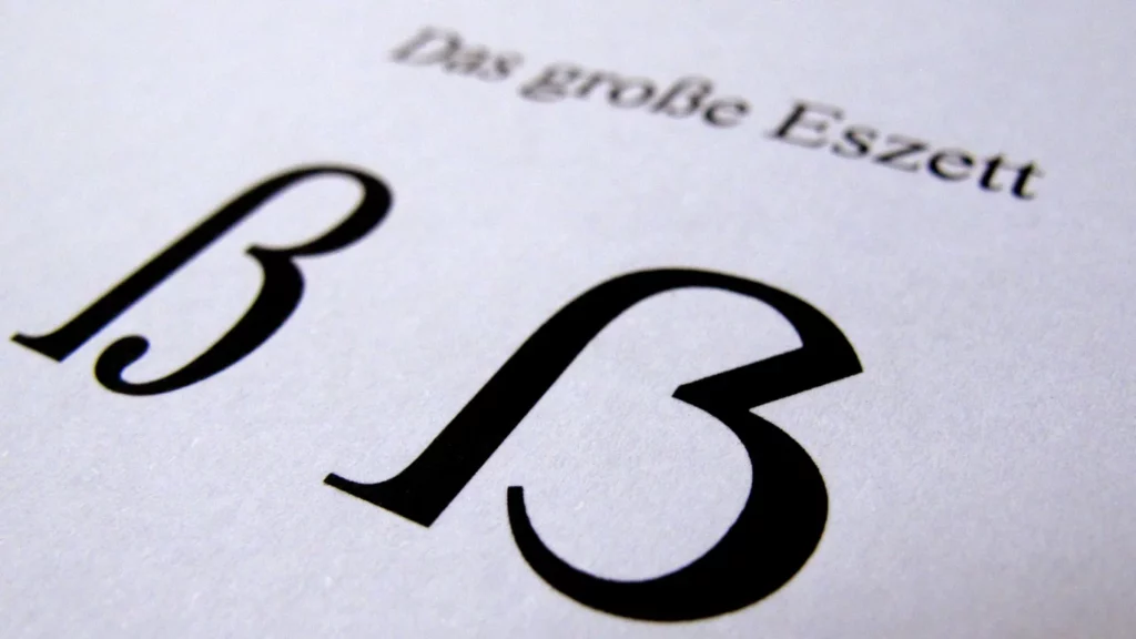
The Eszett, both in lowercase (ß) and uppercase (ẞ), is often confused with the Greek letter Beta (β), particularly in uppercase where it resembles the letter B. The uppercase Eszett is also frequently mistaken for the letter B.

This potential for confusion arises due to the visual similarities between these characters, especially in certain fonts or when they are not clearly displayed. In scientific and academic contexts, where precision is of utmost importance, the differentiation between these characters becomes crucial to avoid misunderstandings and inaccuracies.

It‘s important to note that the Eszett has specific orthographic rules in the German language, while the Greek Beta and the English letter B have different linguistic contexts and applications.
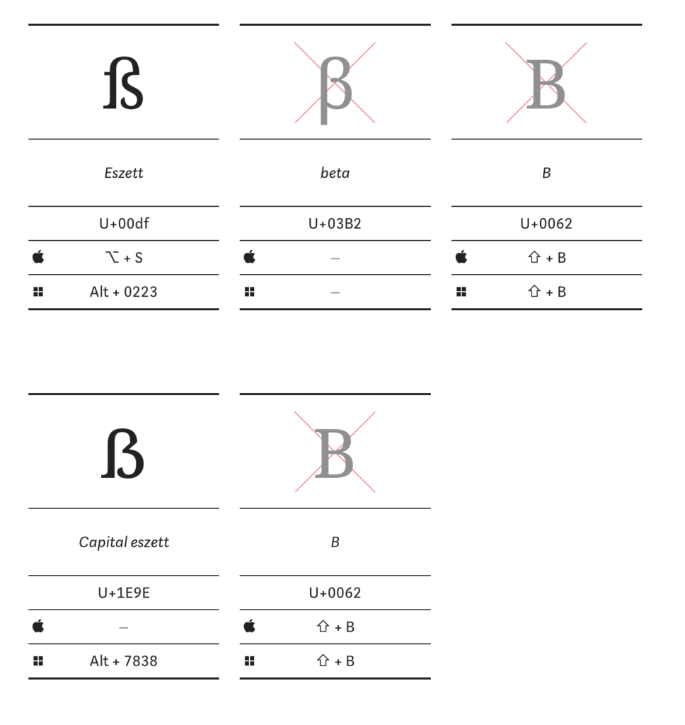
German letter B

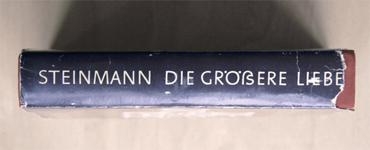
This visual similarity can lead to confusion for non-German readers who may not be familiar with the Eszett. The association of the Eszett with the German letter B is sometimes humorously referred to as „German B,“ as it can resemble the English B at first glance.

This confusion is further exacerbated by the different stylistic variations of the Eszett in various fonts. Some font designers may not be acquainted with the specific orthographic rules of the Eszett or may consciously opt for a creative variation. This results in a range of appearances, with some versions closely resembling the letter B. The mix-up between the Eszett (ß) and the German B is rooted in visual similarities and specific stylistic choices in fonts.

Greek letter „β“ (beta)

In scientific writings, precision plays a crucial role, especially when utilizing non-English letters. It is important to carefully distinguish the German letter „ß“ from the Greek letter „β.“ While „ß“ is specific to the German alphabet, „β“ is frequently employed in biomedical research and mathematics.

The risk of misunderstandings arises because both letters look similar but represent different linguistic contexts. „ß“ is used in the German language and follows specific orthographic rules, whereas „β“ is utilized in Greek and disciplines such as biomedical research and mathematics.

A specific issue arises when authors mistakenly use „ß“ for „β“ or vice versa. This can lead to confusion in scientific literature. Authors have the right to request corrections from scientific journals in case of inaccurate representation of their names or other terms.

Overall, this underscores the importance of precise usage of letters and characters in scientific works to avoid errors and misunderstandings, ensuring the quality of scientific communication.

Links

https://typefacts.com/en/blog/the-german-capital-letter-eszett

https://identum.at/de/2018/08/21/das-scharfe-s-vong-morphologie-und-history-her

07 | Readability and Challenges (in an International Context)

All caps without the capital ẞ

The rules for capitalization have evolved throughout the 20th century. In the German orthography of 1901, the Eszett was replaced in uppercase by the combination of „S“ and „Z,“ resulting, for instance, in „Preußen“ being written as „PREUSZEN“ in all caps. However, over the course of the 20th century, the substitution with „SS“ became increasingly prevalent. This shift is reflected in the spelling rules of the West German Duden. Shortly before the spelling reform of 1996, the use of „SZ“ in uppercase was only allowed in exceptional cases, where substituting it with „SS“ could lead to confusion. For instance, „Masse“ was capitalized as „MASSE,“ but „Maße“ as „MASZE.“

The East German editions of the Duden from 1969 and 1984 mandated differentiation between „SZ“ and „SS“ only in cases of potential misunderstandings. Otherwise, the use of „SS“ was recommended, as seen in examples like „STRASSE“ and „ERDGESCHOSS.“

Historical Family and Street Names – HS, SS, SZ, and ẞ

In the context of historical family and street names, the treatment of specific letters like „HS,“ „SS,“ „SZ,“ and the capital letter „ẞ“ has evolved over time. The substitution of the Eszett with other capital letters, especially in proper names, can lead to potential misunderstandings. The name „WEISS,“ for instance, could be interpreted as both „Weiß“ and „Weiss,“ while the name „LISZT“ could be read as both „Lißt“ and „Liszt.“ A historical example of this is Stefan Großmann, who, in 1911, used the spelling „GROHSMANN“ on his letterhead. Given these diverse approaches, mixed case typesetting has emerged as an additional option where the Eszett is not replaced by other letters.

In mixed case typesetting, the name „Weiß,“ for example, is transformed into „WEIß“ in uppercase. This practice has been employed since the 1980s in the non-machine-readable section of German passports and ID cards, especially when the name is represented in uppercase. Care is taken to ensure a correct reproduction of the „original spelling.“ In the machine-readable section, however, the „ß“ is still replaced by „SS.“ In current German ID cards (as of 2022), the capital ẞ is already utilized in the machine-readable section.

The letters ß and ẞ in an international context

According to the Austrian Passport Authority, a sharp „s“ (ß) is registered as „ß,“ and there are no indications for the use of the capital ẞ. In the case of using ß in the first or last name, an official note in the passport can be provided in German, English, and French, stating that the sharp „s“ (ß) is equivalent to the double „s“ (ss).

The two different spellings of the same name can lead to confusion, especially abroad. Austrian identification documents may include an explanation of German special characters in languages such as German, English, and French, highlighting the equivalence of „ß“ and „ss.“ Additionally, Deutsche Post AG recommends retaining the Eszett when filling out forms in uppercase, a recommendation that was made by the Duden even before the introduction of the capital ẞ.

The use of the letter „ß“ in the German language indeed poses certain challenges, particularly in an international context. The rule that „ß“ is replaced by „ss“ when it is not available in the font aims to ensure readability and facilitate information exchange. This is crucial in regular written communication and when using computers, such as in emails, word processing programs, or booking tools.

However, this practice gives rise to issues, especially with place and family names, as it may lead to incorrect spellings. This becomes particularly apparent when using identification documents internationally. Individuals with „ß“ in their names, as well as those with umlauts, often encounter difficulties in correctly representing their names or experience misspellings.

Another challenge arises when software or fonts used internationally do not support the „ß.“ In such cases, the „ß“ is often automatically replaced by „ss,“ potentially leading to distortions. This issue is relevant not only in digital communication but also in printed materials intended for the international market.

The difficulties associated with the „ß“ highlight the reliance on standardized spelling in international communication within a globalized world. However, this reliance can result in the loss of cultural nuances and complicate the accurate representation of names. Striking a balance between preserving linguistic peculiarities and the necessity for an internationally comprehensible writing system presents an interesting challenge.

Links

https://de.wikipedia.org/wiki/Großes_ß

https://www.oesterreich.gv.at/themen/dokumente_und_recht/reisepass/Seite.020970.html#:~:text=Im%20Zuge%20der%20Neuausstellung%20des,Reisepass%20stellen%2C%20der%20gebührenpflichtig%20ist.

06 | Technical Challenges in the Digital Era

Cumbersome Key Combinations
The placement of the letter „ß“ on German computer keyboards is neither practical nor convenient. It resides at the top of the numeric row, sharing space with dollar and paragraph symbols, patiently waiting to be acknowledged. However, inputting „ß“ on computer keyboards requires a bit of finger acrobatics. When typing uppercase letters on the screen, the Shift key is typically held down while pressing the corresponding letter. However, attempting to type the uppercase „ß“ often results in a large question mark. What seems like a straightforward key combination turns out to be a minor challenge, prompting users to seek alternatives.

Windows Computers:
On Windows computers, typing the uppercase „ß“ involves cumbersome key combinations: Alt Gr, Shift, and the „ß“ key, or for those who prefer complexity, holding down the Alt key and typing 7, 8, 3, and 8 on the numeric keypad. However, this method depends on the selected font supporting the uppercase „ß,“ which is not the case for all fonts.

MacBooks:
For Mac users, there is no specific key combination; they must replace certain character combinations with the uppercase „ẞ“ or copy and paste the glyph from the internet. If you frequently need the uppercase „ẞ,“ you can enable symbol and text replacement in system settings under „Language & Text > Text“ and assign a key combination for the uppercase „ẞ.“ For example, you can set the character string „!!S“ to be replaced by the uppercase „ẞ.“

Smartphones:
Smartphone users can press and hold the „s“ or „S“ key to access a variety of alternative glyphs, including both lowercase and uppercase „ß,“ which can then be selected.

DIN Standard
There is indeed a possibility that the ‚ß‘ could find its place on a different key, similar to the Euro symbol on ‚E‘ or the ‚@‘ on ‚Q‘. This promising solution is outlined in the DIN Standard 2137 titled „Keyboards for Data and Text Input.“ The standard is collaboratively developed by the German Institute for Standardization (DIN), involving representatives from the business sector, research, and user communities. While not mandatory, most companies adhere to this standard. Even the typically independent designers at Apple seldom make fundamental changes to key assignments. In some instances, they might, at most, relocate the ‚@‘ from ‚Q‘ to ‚L‘ or replace the Alt Gr key with the Option key.

DIN Standard 2137 defines three standard keyboard layouts for the German region: T1, T2, and T3. T1 represents the layout of a typical German keyboard, which most people have likely used at some point. T2 and T3 are essentially similar but offer an extended range of special characters, albeit potentially leading to a certain level of complexity.

For the uppercase ‚ß,‘ a T2 keyboard is sufficient, created using Alt Gr and H. Currently, only the manufacturer Cherry from Auerbach in the Upper Palatinate offers such a device in the T2 version, denoted as the Europe keyboard (G85-23100). It covers most European languages based on the Latin alphabet.

Keyboard manufacturers are eagerly anticipating an update to the DIN Standard for keyboard standards. Presently, the Committee for Ergonomics and the Committee for Information Technology and Applications at DIN are jointly working on a solution for the ‚ß‘ problem. However, it is likely to take several more weeks before this solution is finalized. According to recent information, consideration is being given to replacing the degree symbol (°), a small superscript circle, with the uppercase ‚ß.‘ This would mean placing the uppercase ‚ß‘ on the left edge of the numeric row next to ‚1,‘ while the lowercase ‚ß‘ remains on the right edge next to ‚0.‘

Nevertheless, it appears unlikely that an additional key specifically for ‚ß‘ will be added, despite the simultaneous inclusion of keys that are rarely or never used by most users, such as the „Scroll Lock“ key. The decision to forgo a dedicated key could be driven by the desire to limit keyboard complexity and ensure user-friendliness is not compromised by an excessive number of keys.

Links
https://www.sueddeutsche.de/digital/tastaturen-das-grosse-ss-sucht-ein-zuhause-1.3577545#:~:text=Für%20das%20große%20ß%20reicht,dieser%20auch%20als%20Europa%2DTastatur.

https://www.sueddeutsche.de/bildung/rechtschreibung-das-alphabet-bekommt-einen-neuen-buchstaben-1.3566309

05 | Coding Efforts

The Introduction of the Uppercase Eszett in the Unicode Standard
After the initial proposal by Andreas Stötzner was rejected in 2004, the debate on including the uppercase sharp „ß“ continued. In 2005, the Council for German Orthography acknowledged the issue and recognized the need for a solution. However, the Council emphasized that an initiative from the writing community, particularly typographers, was necessary to establish an alternative representation for the uppercase „ß.“

In this context, on April 27, 2007, the German Institute for Standardization (DIN) submitted a renewed proposal for the inclusion of the uppercase Eszett as „LATIN CAPITAL LETTER SHARP S“ to the Unicode Consortium. Germany was represented by members of the DIN-NIA 29.01 (Coded Character Sets) during the relevant session. In the 50th meeting of the International Organization for Standardization (ISO) and the International Electrotechnical Commission (IEC) Working Group from April 23 to 27, 2007, it was finally decided that the uppercase Eszett should be assigned the code point U+1E9E in the Unicode Standard, following this proposal.

The decision was implemented, and on April 4, 2008, the uppercase sharp „ß“ was officially included in Unicode Standard Version 5.1. It was assigned the code point U+1E9E, marking a significant advancement in supporting German orthography and typography.

The inclusion of the uppercase „ß“ in the Unicode Standard greatly facilitated its accurate representation in digital texts and typesetting systems, becoming a crucial element in digital font design for the German language.

Technical Details
Glyphe: ẞ
Unicode: U+1E9E
Unicode-Bezeichnung: LATIN CAPITAL LETTER SHARP S
HTML (dezimal): &-#-7-8-3-8;

Links

https://www.typografie.info/3/wiki.html/v/grosses-eszett/

https://typografie.info/download/versaleszett.pdf

04 | German Alphabet

The German alphabet is the alphabet used for writing the German language. It is employed in Germany, Austria, Switzerland, Liechtenstein, and Luxembourg, as well as in countries with German-speaking minorities such as Belgium (Eupen and Malmedy), Denmark (Northern Schleswig), Italy (South Tyrol), and Poland (Upper Silesia). The German alphabet consists of the 26 basic letters of the Latin alphabet, which are also used in many other languages:

A, B, C, D, E, F, G, H, I, J, K, L, M, N, O, P, Q, R, S, T, U, V, W, X, Y, Z.

In addition to these letters, the German language has three umlauts: Ä, Ö, Ü. These umlauts are considered distinct letters and are often viewed as variations of the letters A, O, and U, respectively, each marked with two dots above. The Eszett (ß) is another characteristic feature of the German alphabet and is used in most of the mentioned countries.

Extension of the German alphabet

The use of the Eszett (ß) outside of Germany and Austria varies depending on the specific linguistic and orthographic conventions of each region.

Belgium (Eupen and Malmedy):
In the German-speaking communities of Eupen and Malmedy in Belgium, the Eszett (ß) is generally used, as the spelling follows German standards. Belgium has both Dutch and French language communities, and the German-speaking community has its own linguistic regulations.

Denmark (Northern Schleswig):
In Northern Schleswig, there is a German minority in Denmark. The use of the Eszett here may depend on personal preference and the linguistic habits of the community. Some individuals may use the Eszett, while others might prefer to write „ss.“

Italy (South Tyrol):
In South Tyrol, there is a German-speaking minority within the predominantly Italian-speaking population. The use of the Eszett may depend on individual preferences and the influence of Italian spelling. In official documents and publications targeting the German-speaking community, the Eszett is likely to be used.

Poland (Upper Silesia):
In Upper Silesia, there is a German-speaking minority. The use of the Eszett can also vary here. Some people might use it in accordance with German spelling rules, while others may be more inclined to use „ss.“

Phonetics of „ß

The pronunciation of the German language refers to the phonetics and phonology of the standard German language. It is not uniform everywhere because German is a pluricentric language with various varieties that largely coincide in their pronunciation. The character ẞ (uppercase) or ß (lowercase) is a letter of the German alphabet. It is referred to as „Eszett,“ sharp S, or Scharf-S, colloquially also known as „double-S,“ „humpback-S,“ „backpack-S,“ „threefold-S,“ or sometimes misleadingly as „ringel-S,“ which usually refers to another S variant.

The ß is used for the phonetic representation of the voiceless s sound [s]. It is the only letter of the Latin script that is exclusively used today for writing German languages and their dialects, such as in the standardized spelling of Standard German and in some spellings of Low German, as well as historically in some Sorbian writings. Additionally, in medieval and early modern texts, ß serves as an abbreviation for the currency Schilling, and „ßo“ represents the counting measure Schock.

Links

https://www.derstandard.at/story/2000060545215/grosses-ss-rechtschreibrat-fuehrt-neuen-buchstaben-ein

https://de.wikipedia.org/wiki/Deutsches_Alphabet

03 | Changes in the Typographic Representation of „ß“ Over Time

Languages which use letters based on the latin alphabet are set in two separate alphabets: uppercase and lowercase. We set text usually either in mixed-case or in uppercase/small cap letters. At any time we can switch between the two without touching the content of the text. This however, is not possible in Austria and Germany where the lowercase alphabet consists of 30 letters (Basic latin + ä, ö, ü, ß), but the uppercase alphabet has just 29 letters (Basic latin + Ä, Ö, Ü). Until the 1940s German was usually set in blackletter and such texts were never set in uppercase, because of the wide and decorated design of these uppercase letters. And since there is also not a single word that starts with an ß (Eszett), there was simply no need to have an uppercase version. The sharp „ß“ traditionally did not have a specific uppercase form. Typically, in uppercase writing, „SS“ was used instead. But this has turned around. Today, we hardly set German text or names in blackletter and the use of uppercase/small caps is still popular for various reasons. So there is an obvious gap in the German alphabet.

A design for a capital Eszett by the font foundry “Schelter & Giesecke”  (1912)

The existence of this gap was acknowledged a long time ago. In 1903 a commission of German, Austrian and Swiss printers and font foundries announced that the letter ß should also be included in any non-blackletter typefaces. A capital version was also discussed but the commission could not agree on one design at this time. So it became common practice to replace the letter ß with SS or SZ in uppercase text. This however was never meant as a real solution to this problem. In 1919 the German Duden explained:

“The use of two letters for one phoneme is just an interims solution, that must be stopped, once a proper letter for the capital ß has been designed.”

The typographic society of that era yearned for a standardization of the capital „ß“, but the topic couldn’t reach a broader audience. Historically, there was no universally accepted uppercase form for the sharp „ß.“ Experiments in this direction were individual efforts by typographers who faced the challenge of translating the characteristic elements of the lowercase „ß“ into larger forms. This often involved the curved arch and round shape of the lowercase „ß.“ However, these experiments were not standardized and did not gain broad acceptance. Each typesetter tended to find their own creative solution, leading to a variety of experimental forms. Some attempted to retain the rounded character of the lowercase „ß,“ while others flattened the arch or made other adjustments.

Capital Eszett on a German orthography book from 1965

A novel using a Capital Eszett, printed in 1971

Creative Experiments by Renowned Typesetters in the 20th Century

Wilhelm Deffke, a renowned German graphic designer, created the „Deutsche Anzeigenschrift“ in the 1920s, a typeface that included an uppercase form for the sharp „ß.“ Deffke aimed to transfer the elegant line work of the lowercase „ß“ to uppercase letters. While his approach showcased creative innovation, this specific form did not gain widespread use. Deffke was known for his modern and experimental designs in the interwar period.

Rudolf Koch, an exceptional calligrapher and type designer, experimented with various forms of the sharp „ß“ in uppercase during the 1920s and 1930s. Koch’s designs demonstrated calligraphic approaches as he sought to translate the aesthetics of the lowercase „ß“ to uppercase. Despite his artistic efforts, his experiments did not achieve broad acceptance.

Paul Renner, the creator of the famous „Futura“ typeface, also attempted to develop an uppercase form for the „ß.“ In some variations of his typeface, elements of the sharp „ß“ were incorporated into uppercase letters. Renner, a pioneer in modern typographic design, was known for his efforts towards a clear and geometric typographic aesthetic.

Eduard Ege, a typesetter, ventured to establish an uppercase form for the „ß“ during the Weimar Republic. However, his efforts remained largely unnoticed and had minimal impact on the typographic practices of his time.

These designers were trailblazers in their quest for a coherent typographic language, attempting to transfer the nuances of the sharp „ß“ to uppercase letters. Although their experiments did not achieve the widespread acceptance they may have hoped for, they nonetheless contributed to the development and diversity of type design.

Links

https://typography.guru/journal/germanys-new-character/

https://www.typografie.info/3/wiki.html/v/grosses-eszett/

02 | Historical Development of the Letter „ß“

Origin of the „ß“

The development of the „Eszett“ (ß) in the German script is historically conditioned and closely linked to changes in the German language and writing. The letter „ß“ has its origins in the Fraktur scripts of the Middle Ages. During the course of the Germanic sound shift, which spanned several centuries, a fusion of the „Long s“ with the letter „z“ took place starting from the 14th century.

This process continued in the Antiqua script in the 15th century. During this time, the „Long s“ merged with the „Round s“ to form what we now know as the „Eszett“ (ß). This development led to the formation of a position-dependent allograph or ligature, indicating the use of the „Sharp s.“ Thus, the „Eszett“ or „Sharp s“ emerged as an independent letter in the German alphabet.

The precise interpretation of the allography, specifically the evolution from „sz“ to „ß“ in Gothic scripts and from „ss“ in Antiqua scripts, remains a subject of scholarly debate. In linguistics, an allograph refers to one of various possible spellings or graphic representations of a specific character. This particularly applies to cases where different spellings represent the same phoneme, expressing the same linguistic sound – for example, „oe“ to „ö“ or „ss“ or „sz“ to „ß.“

The development of the ligature „ß“ (Eszett, Sharp s) based on the „Wilhelm-Klingspor-Schrift“ by Rudolf Koch (1876–1934). On the left are the two „s“ (Long s „ſ“ and Round s „s“) of a Fraktur script. On the right are the ligatures for „tz“ and „ß.“ The prevailing view is that in Fraktur scripts, the ligature „ß“ evolved from „ſz,“ while in Antiqua scripts, it originated from „ſs.“

In Southern Germany and Austria, the symbol „ß“ is predominantly referred to as the „Sharp s,“ while in Central and Northern Germany, it is more commonly known as the „Eszett.“ This phenomenon has led to the hypothesis that, in all likelihood, regions with a traditionally Catholic background (such as Bavaria and Austria) derive the term primarily from the monastic (humanistic) Antiqua tradition. On the other hand, regions with a traditionally Protestant background (such as Schleswig-Holstein or Lower Saxony) may tend to associate the term more with the role of Fraktur in the Reformation, including scripts like Schwabacher and Luther Fraktur.

The spelling reform of 1996 and the correct usage

With the invention of the printing press in the 15th century, the independent letter „ß“ finally emerged. However, this letter was only present in lowercase form since, both then and until today, there were no German words starting with „ß.“ As a result, there seemed to be no need for an uppercase version. Many centuries have passed, and „ß“ continues to be a part of the German language. Nevertheless, using „ß“ is not straightforward, as there are numerous exceptions and rules surrounding its usage.

In older texts, the letter „ß“ is used much more frequently. This tendency is particularly observed in the older generation. This is because a German spelling reform came into effect in 1996, significantly altering the spelling of words with the „s“ sound. Although this reform took place a while ago, older individuals might not have fully adapted to the new spelling for „ß.“ The most noticeable change was that many words that were previously spelled with „ß“ are now written with a double „ss.“ In older texts, you may encounter words like „daß,“ „Kuß,“ or „Abschluß.“

The rules for the letter „ß“ according to the spelling rules of 1996 state that it is used when the vowel (vowel sound) is pronounced long, for example: „Floß“ (raft), „Spaß“ (fun), „Maßstab“ (yardstick). The „ß“ thus lengthens the vowel. Additionally, „ß“ is used after a long umlaut (ä, ö, ü), for example: „Füße“ (feet), „Gefäß“ (vessel), „süß“ (sweet). The „ß“ is also employed when it follows a diphthong (double vowels like eu, ei, au, etc.), for example: „heißen“ (to be called), „Gießkanne“ (watering can), „Schweiß“ (sweat). If a word ends with a diphthong followed by a hard „s,“ it is always spelled with „s“ and never with „ß,“ for instance: „Eis“ (ice), „sneeze,“ „go out.“

Links

https://www.typolexikon.de/eszett-scharfes-s/#Fussnote-12359-2-3


01 | Brief Introduction

The typographic representation of the german sharp S (ß)

As a graphic and type designer, throughout my university career, I’ve repeatedly observed that the sharp S (ß) in the German language and typography represents a fascinating yet often overlooked dimension. I’m particularly intrigued by the historical origins of this phonetic ligature and how it has evolved both in lowercase (minuscule) and uppercase (majuscule) forms over the years. My aim is not only to comprehend the past and present of the ß but also to understand its potential implications for the future of typography in the German-speaking world.

The historical development of the ß is a captivating chapter as it finds its roots in ancient manuscripts and printed works. The changes in its typographic representation over the years, the spelling reform of 1996, and the contentious debates about its abolition are all part of this fascinating heritage.

Another aspect I’m delving into pertains to the technical challenges posed by the digital era. Integrating the uppercase sharp S (ß) into digital fonts, typesetting systems, and commonly used software presents us with unique issues that I intend to explore. This includes investigating the technical standards for the correct uppercase usage of the ß. This leads me to considerations of legibility and the challenges of the uppercase ß in an international context, especially when it comes to names and units, which can lead to misunderstandings.

Lastly, I aim to present design approaches that type designers can employ for the successful integration of the uppercase sharp S into their projects. This includes case studies of typographers who have already successfully utilized the uppercase ß.

Useful Links:

https://www.typolexikon.de/eszett-scharfes-s/

https://www.lucasfonts.com/learn/1E9E

https://finaltype.de/de/themen/versal-scharf-s#historische-betrachtung

https://www.typografie.info/3/wiki.html/v/grosses-eszett/

https://typefacts.com/blog/das-grosse-eszett