Johannes Itten (1888-1967) #5

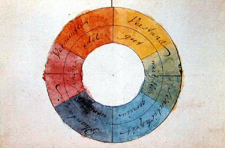
Itten was a Swiss painter and art educator associated with the Zurich School of Concrete Art. In addition to considering the physical-chemical aspects, Itten emphasized psycho-physical perception in his work.

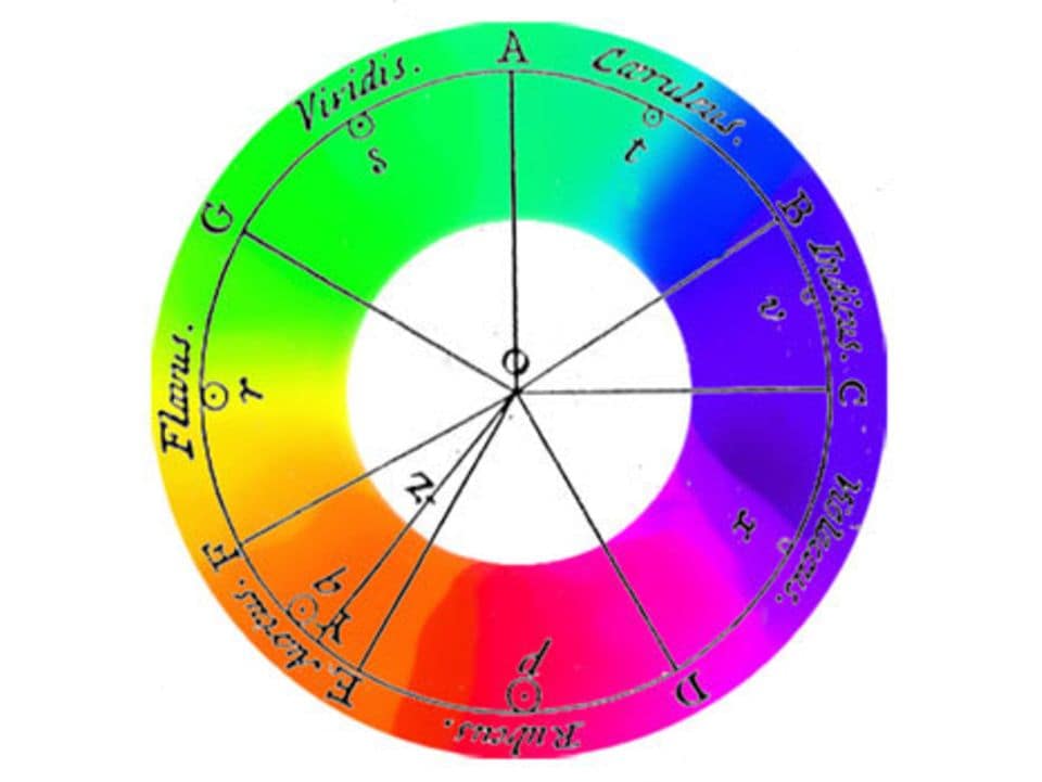
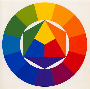
One notable contribution by Itten is his construction of the color wheel:

  1. He starts with an equilateral triangle featuring primary colors (Yellow at the top, Blue bottom left, Red bottom right), with their mixtures (Yellow with Blue = Green, Blue with Red = Violet, Red with Yellow = Orange) forming the vertices of a hexagon.
  2. Outside this hexagon, he draws a circle with twelve equal sectors. Each sector is filled with the colors located at the vertices of the hexagon.
  3. The resulting empty sectors are then filled with tertiary colors, created by mixing a primary color with a secondary color.
    • Yellow and Orange = Yellow-Orange
    • Red and Orange = Red-Orange
    • Red and Violet = Red-Violet
    • Blue and Violet = Blue-Violet
    • Blue and Green = Blue-Green
    • Yellow and Green = Yellow-Green

Johannes Itten’s color wheel represents a systematic and harmonious organization of colors based on both physical and psycho-physical principles.

According to Johannes Itten’s teachings, there are seven different colour contrasts in the world of colour:

Color-in-Itself Contrast

The „Color-in-Itself Contrast“ refers to the impact of pure, highly intense colors of the first order such as Yellow, Red, Blue, White, and Black. Itten emphasizes that the use of mixed colors diminishes the clarity and effectiveness of this type of contrast.

The more mixed colors are involved, the weaker the distinctiveness of the contrast. However, when employed strategically, this type of contrast can achieve strong visual impact and long-range visibility. Specific color intensity can convey signaling or indicative meaning.

Itten states, „The effect occurs when pure colors are used in a colorful composition. White and black can enhance the lively effect.“

For example, a carmine-red spot on a Prussian-blue background and a vermilion-red spot on a yellow background will both be perceived as „Red.“ Initially, we perceive the color itself without differentiating between the specific shades of red.
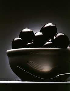
Franz Marc: Horse in landscape, 1910

Light-Dark Contrast

The „Light-Dark Contrast“ is a technique used to evaluate color, encompassing hue, brightness, and saturation. The specific brightness value of a color allows for certain color statements, achieving a spatial effect, or shifting and balancing visual weights. This effect is particularly significant in achieving aerial perspective (sfumato) or in the impact of architectural elements in a landscape.

Compositions built on the Light-Dark Contrast exhibit a noticeable use of a limited color palette with strong tonal variations. Bright tones of objects are embedded in a dark environment, creating a highly sculptural effect. The three-dimensionality is achieved by anchoring the brighter tones and highlights to the foreground, while the darker shadows are tied to the background.

Temperature sensation

The concept of temperature sensation in color may seem absurd at first, but it underscores the interconnectedness of various sensory perceptions. Research indicates that the color tone of workspaces, particularly in the blue-green range, can result in a perceived temperature difference of up to 4 degrees Celsius compared to rooms with a red-orange tint. Participants felt the blue-green room, with an interior temperature of 15 degrees Celsius, as cold, while the same individuals found an orange-red room cold only at 11-12 degrees.

Scientifically, this phenomenon suggests that the color blue-green dampens the impulse of organic circulation, while its counterpart, red-orange, stimulates this activity. In the Western cultural context, it is generally accepted that blue appears cold, while the adjacent group of yellow-orange-red appears warm. However, these classifications are relative, and there can be warm blues and cold reds within their respective color families.

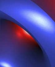
The most significant contrast is achieved with the colors red-orange (warm) and blue-green (cold). Itten notes that all other colors can appear warm or cold depending on their contrast with warmer or colder tones. The Cold-Warm contrast denotes a temperature difference, where a pink spot on an orange or Prussian blue background may appear „cool“ or „warm“ depending on the context.

Complementary Contrast:

Itten emphasizes in his color wheel that complementary colors stand opposite each other. When placed side by side, complementary colors enhance each other’s brightness, while when mixed together, they neutralize to create gray-black.

For Itten, the complementary contrast forms the basis of harmonious design because it establishes a perfect balance in the eye.

Each complementary color pair also possesses its unique characteristic:

Yellow – Violet

shows an extreme light-dark contrast

Red-orange – blue-green

shows the strongest cold-warm contrast

Red – green

of equal brightness and equal light values.

Complementary contrast

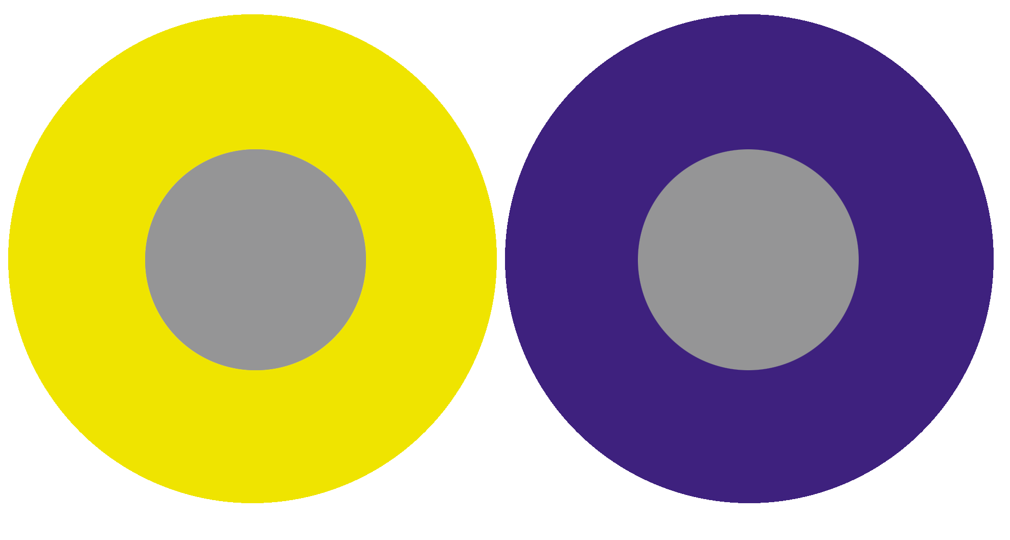
Its effect is based on the complementary contrast, where each pure color physiologically demands its complementary color. If this color is not present, the eye simultaneously generates the complementary color. This fact demonstrates that the fundamental law of colorful harmony inherently includes the fulfillment of the complementary law.

The simultaneously generated color thus arises as a color sensation in the viewer’s eye and is not physically present. Simultaneous effect occurs not only between gray and a pure color but also between pure colors that are not precisely complementary.

„The reality of a color is not always identical to its effect.“

Goethe commented on simultaneous contrast as follows: „The simultaneous contrast makes the color suitable for aesthetic use.“ A significant exception in the realm of simultaneous contrast is the „Bezold Effect,“ according to Matthaei.

Georges Seurat: „Un dimanche apra’s-midi a’  l’Ile de la Grande Jatte”, (1884-1886)

Color quality

The term „color quality“ in Itten’s view refers to the purity and saturation of color. He describes the quality contrast as the opposition between saturated, vibrant colors and dull, muted colors. Prismatic colors, created through the refraction of white light, exhibit the highest saturation and brilliance.
Colors can be muted in four different ways: brightened by white, darkened by black, neutralized by gray, and broken into a dark gray-black by adding the corresponding complementary color.

Color – Non-color Contrast = Intensity Contrast

„It consists of the contrast between vibrant and dull colors. Dimming can occur with black, white, gray, or complementary colors.“ A subdued red appears „brown“ against vermilion red, but on a gray background, it appears „red.“ This contrast occurs as the color purity decreases from a vibrant color to a non-color. A pure red is more intense than a pure green. Mixed colors lose intensity.
The addition of black (dark) and white (light) produces light and dark-muted colors.

August Macke: Fribourg Cathedral in Switzerland, 1914


Quantity Contrast

The Quantity Contrast refers to the size ratio of two or more differently sized color areas, in relation to light value and area size. Goethe has established the following approximate values for light values:

Yellow: Orange: Red: Violet: Blue: Green

behave like: 9: 8: 6: 3: 4: 6 The values for complementary color pairs are: Yellow: Violet = 9: 3 = 3: 1 Orange: Blue = 8: 4 = 2: 1 Red: Green = 6: 6 = 1: 1

If these light values are transformed into harmonious area sizes, the light value numbers must be used reciprocally. The three times stronger yellow must therefore occupy an area three times smaller than the complementary violet.

The Harmonic Area Sizes of primary and secondary colors are as follows:
Yellow: Orange: Red: Violet: Blue: Green

behave like: 3: 4: 6: 9: 8: 6

or: Yellow: Orange = 3: 4 Yellow: Red = 3: 6 Yellow: Violet = 3: 9 Yellow: Blue = 3: 8 Yellow: Red: Blue = 3: 6: 8 Orange: Violet: Green = 3: 9: 6

breaking with white makes the color character colder breaking with black loses the radiant character, colors appear pale and paralyzed breaking with gray neutralizes and dulls the colors. They become lighter or darker, but in any case, dimmer adding the complementary color, the tonal values then lie between the two colors.

Sources:
https://www.encaustic-academie.de/johannes-itten/

Ostwald-Colortheory 1912 #4

Chemist and Nobel laureate Wilhelm Ostwald addressed the „Normalfarbenfrage“ (normal color question) by developing a color order system. This system took the form of a double cone, capturing all body colors as colorful phenomena regardless of their material composition. Ostwald colored this order representatively with 2400 colors in the large version and 680 colors in the small version. Each color, given its specific place in Ostwald’s system, is referred to as a „color norm.“

Ostwald utilized vibrant, though often not lightfast, coal-tar dyes for his system, particularly deeming them suitable for school use. The Munich Academy professor Max Doerner and his group expressed concerns about the quality of painting materials, striving to set quality standards for pigments and dyes. However, this endeavor did not lead to a definitive solution.

Heinrich Trillich’s „Deutsche Farbenbuch,“ published from 1923 onwards, attempted to establish quality standards. In its second volume in 1925, it dedicated a section specifically to artist colors, expressing reservations about Ostwald’s advocacy for initially lightfast coal-tar dyes and the abstract color norm labeling that obscured the material character of the color.

Ostwald actively promoted his color theory through publications, lectures, workshops, and his Unesma publishing house, which distributed books, color atlases, and educational materials. Industries, including Günther Wagner with an official license from Ostwald, adopted his ideas, producing school paint sets. Winsor & Newton and Reeves in England also created school paint sets based on Ostwald’s principles.

Ostwald’s color theory introduced a new color theory, influenced by Ewald Hering, featuring four „primordial colors“: Yellow, Red, Green, and Blue. Hering defined these as psychologically neutral colors, and Ostwald incorporated them into his color circle, though deviations existed from Hering’s psychological primordial colors.

Ostwald actively promoted his color theory in schools, publishing a specially tailored „Farbschule“ (color school) in 1920. The „Kleinchen“ paint set, aligned with his color system, was central to this educational initiative. The set included 12 color pills, with 8 considered „main colors.“ Ostwald, aware of compromises in his color choices, emphasized the need for corrections to achieve the correct Ostwald color circle. Despite his disregard for lightfastness, Ostwald highlighted the distinction between dye and color.

Ostwald’s push into schools had a significant impact, generating extensive public discussions about his color theory in the early 1920s. Both critics and advocates, especially among art educators like R. Dorias, H. Hensinger, Martin Schaller, and Max Bühler, engaged in debates, presentations, and publications promoting or questioning Ostwald’s ideas.

The industry joined the trend, offering numerous school paint sets labeled with Ostwald’s name. Günther Wagner, the authorized distributor, explicitly emphasized the authenticity of its products, facing competition from unauthorized sets with Ostwald labels.

With Ostwald’s influence, the schools transitioned from the traditional three-color theory (Yellow, Red, Blue) to the four-color theory (Yellow, Red, Blue, Green). Ostwald’s compromises in pigment choices to achieve extensive color mixing capabilities required corrections for specific color areas.

Ostwald’s venture into schools left a lasting impact, leading to a shift in color theory education and influencing the production of art supplies in the early 1920s.

Sources:
https://dr-andreas-schwarz.de/schulmalkaesten-farbentheorie-farbwahrnehmung.html

Albers‘ Farbtheorie (20. Jahrhundert)

Josef Albers‘ book, „Interaction of Color,“ delves into the nuances of black and white, exploring them not just in terms of value but also in hue. The text challenges the simplistic view of white being just white and black being merely black, emphasizing that their specificity emerges when juxtaposed with similar forms or other colors.

Albers intricately addresses the conditionality of color, highlighting how it exists in our imagination and can be subject to interpretation. The book questions whether color’s meaning is relative to specific situations and underscores the interactive nature of color. Albers emphasizes that color is not passive; instead, it requires active engagement and purposeful activation through group reasoning.

Transparency emerges as a crucial concept in „Interaction of Color.“ When two colors mix transparently, the result is a new color, distinct from the blend of the original two. Albers stresses the importance of considering color for both its value and saturation, particularly in the context of a specific place. Group perception, according to Albers, can activate colors and imbue them with purpose within a given space.

In the context of societal issues, such as the tragic murder of George Floyd by the Minneapolis Police, Albers’s insights resonate. The book’s emphasis on avoiding negative judgments of color aligns with the call to recognize and confront biases. Albers encourages us to challenge notions of „taste“ and reject the labeling of any color as distasteful or „ugly.“ The overarching goal is to understand that color gains clarity in context, standing next to another color to reveal its value. This understanding extends beyond individual perceptions, fostering collaboration and trust in establishing a consensus that transcends personal limits.

Sources: https://www.artsy.net/article/artsy-editorial-josef-alberss-teachings-color-helped-way-address-social-change

Munsell-Farbsystem (20. Jahrhundert)

Munsell aimed to systematically account for each attribute of color through organized visual steps. He introduced 100 steps for hue, based on five primary and five intermediate colors. Munsell structured his system with ten units of value and an open-scale named „Chroma,“ resembling saturation. The resulting three-dimensional system can be visualized as a color tree. Among various attempts to construct color systems, Munsell’s approach, founded on „perceptual equidistance,“ achieved widespread success.

Initially proposing a subtle color sphere influenced by N. O. Rood’s „Modern Chromatics,“ Munsell later realized its geometric symmetry inadequacy for representing perceived color relationships. His efforts culminated in the 1915 publication of the „Color Atlas,“ presenting a naturally grown order organized around a central vertical gray axis, also known as the „color tree.“

Munsell built his system on a ten-part circle, arranging colors at equal intervals and selecting opposites that mix to produce neutral gray (the Principle of Compensativity). The color tones of hand-painted chips were aligned based on three variables in Munsell’s unique nomenclature: „Hue“ (color tone), „Value“ (brightness index), and „Chroma“ (saturation levels). Each color was characterized by the symbolic H/V/C triplet. Munsell developed the entire system through color wheel mixtures, trusting his eyes‘ judgment.

The vertical Value scale divided the range between Black and White into ten steps, determined using a self-constructed photometer. Munsell calibrated the steps by considering the square root of the measured reflected intensity, deviating from linear changes in reflection. Munsell selected samples of Red (R), Yellow (Y), Green (G), Blue (B), and Purple (P) that appeared equidistant from each other and from a gray of the same value. These became the fundamental hues of his system, supplemented by five mixtures, arranged in a circle around a neutral gray. Chroma values were arbitrarily assigned to all ten main colors and their mixtures, with an open-ended scale reaching values up to 12 or 14, depending on color intensity.

Munsell’s color wheel featured a total of 40 hues, resulting from subdividing the original five hue intervals into 10, 20, and 40 segments, ensuring perceptual equidistance. The unconventional color names are also listed.

A new edition of the „Color Atlas,“ titled „Munsell Book of Color,“ emerged in 1929 after Munsell’s death, and it is the version still in use today. In 1942, the „American Standards“ organization recommended its application for specifying surface colors. The Munsell notation was refined in connection with the „Optical Society of America,“ known as „renotation.“

This material standardization was crucial, allowing the translation of all other color systems into Munsell’s framework using standard physical methods. Modern color researchers express the desire for Munsell to reconstruct his system with contemporary color measurement tools, potentially combining his sensitive color evaluation with valence metrics, a uniquely German term referring to the contribution of a color stimulus to the effect of a mixture. Munsell’s reliance on color wheel mixtures was adjusted to minimize systematic deviations from modern valence metrics.

Sources: https://www.colorsystem.com/?page_id=860

Theory of colours by Leonardo da Vinci and Isaac Newton #3

In the 15th century, during the Renaissance, Leonardo da Vinci attempted to systematize the variety of colors. He based his approach on an arrangement of four „primary colors“: Yellow, Green, Blue, and Red. Da Vinci’s notes on art and painting, exploring color harmony, position him as one of the founders of color theory.

Isaac Newton furthered da Vinci’s theories in the early 18th century. Newton passed white light through a glass prism, discovering that it broke down into colors, similar to a rainbow. These colors, known as spectral colors, formed the basis of his color circle. According to Newton, Red, Green, and Blue are the primary colors, combining to create White. In Newton’s color theory, Black represents the absence of light.

Goethe’s color theory 1800

Goethe’s color theory is based on an elemental, polar opposition of light and dark. He explains colors as boundary phenomena between light and darkness. Yellow lies at the boundary of brightness („first at light“), and blue at the boundary of darkness („first at darkness“). The blue of the sky arises from the ancient Greek concept of turbidity, as atmosphere, through a transparent medium, the air, against the darkness of space. According to Goethe, colors arise from the mixture of light and darkness, in the semi-darkness. However, consistently implementing this idea means that the addition of spectral colors could never result in white light, leading to Goethe’s disagreement with Newton.

Goethe’s color theory starts with only two pure colors. He emphasizes that purple cannot be mixed from other colors. Therefore, he takes yellow, blue, and red as pure paint colors. After observing a color, our eye produces the complementary color (successive contrast), prompting Goethe to represent these color pairs diametrically opposite each other in a circle. He also assumes a progression of colors towards purple, placing purple at the top of the circle. Consequently, green, as the complementary color and counterpart, is at the bottom. Blue is to the left of green, and yellow to the right, which, when mixed, produce green. Yellow-red is between yellow and purple, and blue-red is between blue and purple.

The part of his color circle transitioning from yellow to red is seen by Goethe as the positive side, while the other half towards blue is the negative side. He associates yellow with effect, light, brightness, power, warmth, proximity, and repulsion, and blue with deprivation, shadow, darkness, weakness, cold, distance, and attraction. Goethe’s main intention was to determine the „sensory-moral effect“ of each color „on the sense of sight (…) and through its mediation on the soul.“ He sees color „as conscious contents of sensory qualities,“ emphasizing the psychological impact of colors:

  • Colors on the positive side „are lively, vibrant, and aspiring.“
  • Yellow appears „magnificent and noble, creating a warm and comfortable impression.“
  • Colors on the negative side „contribute to a restless, soft, and yearning sensation,“ and
  • blue „gives us a feeling of cold.“

Goethe’s work had a lasting impact on color theory, although it faced rejection at times, mainly due to the physical aspects that align with a holistic classical-natural scientific worldview, contrasting with Newton’s mathematical-scientific approach. The historical overview of color theory and especially Goethe’s texts on the psychological effects of colors continue to influence thought today. From a contemporary perspective, Goethe’s and Newton’s color theories arise from two incompatible worldviews and must be considered side by side and in historical context.

Sources:
https://lehrerfortbildung-bw.de/st_digital/medienkompetenz/gestaltung-farbe/systeme/goethe/
https://www.derkrammer.at/goethes-farbenlehre-die-theorie-von-der-wirkung-der-farbe/

Chevreul’s law of simultaneous contrasts 1839

Chevreul constructed a 72-part color circle, featuring three primary colors—Red, Yellow, and Blue—along with three primary mixtures—Orange, Green, and Violet, and six additional secondary mixtures. The resulting sectors are divided into five zones, and each radius is segmented into 20 sections, representing various brightness levels. Here, for the first time, we encounter the active role of the brain in color perception, suggesting that colors are, in a sense, actions of the world within our minds.

During Chevreul’s search for a practical color organization for textile production, he delved into the laws of color contrasts. His 72-part color circle defines shades through changes in a color’s intensity towards white (higher intensity) or black (weaker intensity), with ten possible steps according to Chevreul.

Within Chevreul’s color circle, you find three subtractive primary colors (Red, Yellow, and Blue), three secondary colors (primary mixtures Orange, Green, and Violet), and six secondary mixtures. The resulting sectors are grouped into five zones, and each radius is divided into 20 sections, indicating different brightness levels. The notation reflects the proportions of colors; for instance, 9B/1C means 9/10 Black and 1/10 of the corresponding color.

With the hemisphere, Chevreul attempts a physical representation of colors in space. The axis of Black serves as a ray exploring various intensity levels.

Chevreul believed that the multitude of color tones and their harmony could be defined through numerical relationships. His aim was to provide artists using colored materials with a comprehensive tool. Despite the influence of harmony theories, such as „Harmonie d’analogues“ (Harmony of Analogy) and „Harmonie de contraste“ (Harmony of Contrast), Chevreul could not identify a law of color harmony. It simply does not exist.

Sources:
https://www.colorsystem.com/?page_id=792

Color models #2

RGB system (light colors):
In the RGB system, colors are defined by their proportions of red, green and blue. White is created by adding these color values (all to 255), black by zero. With 256 levels per color value, the system enables the definition of over 16 million colors.

CMYK system:
The CMYK system is based on the primary colors cyan, magenta, yellow and black. The color values are between 0% and 100%. No color corresponds to 0%, while 100% represents the maximum amount of color. Black is achieved by mixing 100% CMY or pure black.

HSB system:
In the HSB system, hue, saturation and brightness are defined. The hue lies between 0° and 360° on the color wheel. Saturation describes purity and luminosity (0% for light gray, 100% for saturated colors). Brightness indicates the black opacity, from 0% (black) to 100% (saturated color).

HSL-System:
Ähnlich dem HSB-System definiert das HSL-System Farbton, Sättigung und Farbhelligkeit. Es ist eng mit dem HSB-System verwandt.

Lab system:
Lab colors are device-independent and are defined by luminance, a-component (green to red) and b-component (blue to yellow). White has a luminance of 100, black of 0. The color components range from -128 to 127. A gray is created with both color values = 0.

Pantone system:
Pantone is a professional tool for the printing sector with over 3000 process colors as CMYK combinations. The „Pantone Matching System“ offers 1114 spot colors, which also include brightening and clouding after black.

HKS system:
The HKS system is a standard for spot colors with 120 solid colors, similar to the Pantone Matching System. It uses color fans and color charts for color definition.

RAL system:
RAL colors are marketed by RAL gGmbH under „RAL Classic“ and „RAL Design“. With 1898 shades, it is a standard in construction technology, each color has a four-digit number. The name is derived from the Reichs-Ausschuss für Lieferbedingungen, founded in 1925 to rationalize the German economy.

Sources:
https://br24.com/wp-content/uploads/Br24_Blog_RGBvsCYMK_RGBColours.jpg
http://www.win-seminar.de/adobe/hsb-farbmodell.php
https://wisotop.de/hsv-und-hsl-farbmodell.php
https://www.researchgate.net/publication/329555404_Trends_in_the_development_of_the_colorimetric_systems_after_1830
https://pakfactory.com/blog/what-is-pantone-color-matching-system/
https://www.hein.eu/lexikon/hks-farbtabelle-uebersicht

Design and Research #1

Colour theory and the effect of colours on human perception:

The focus of this topic is on the psychological and emotional effect that different colours have on people. Various colour theories such as those of Goethe or Wassily Kandinsky can be integrated into this context.
The link between colour theory and marketing is another key area. This includes examining how colours are used in advertising and marketing and how different industries use colours to create their brand identity.
A central aspect is the role of colour in products and packaging. The aim here is to understand how the choice of colours influences consumer behaviour and how colours influence consumers‘ purchasing decisions.
The perception of colours and their influence on consumer behaviour are closely linked. Research in this area could include how colours are perceived by consumers and how this perception in turn influences behaviour. Experiments could, for example, investigate the effects of colours on willingness to buy, product evaluations and brand loyalty.
Cultural differences are another important factor. Researchers could investigate how the meaning of colours varies in different cultures and how this influences consumer behaviour.
Neuromarketing offers an exciting perspective to explore the effects of colour on the brain and consumer behaviour. This could include measuring brain responses to coloured advertisements and product images.
The work should also address practical applications and offer recommendations for companies and marketers on how to use colour effectively in their brand strategy and advertising.

The research methods used in the study should be described in a separate section, from experiments and surveys to possible neuromarketing techniques or qualitative research.

Basics of colour theory:
An introduction to the basics of colour theory, including colour wheels, colour contrasts and colour harmonies.

Psychological effects of colour:
Analysis of the psychological and emotional effects of colours on human perception and mood, including research findings and studies on colour psychology ->

Colour design in visual media:
The study of how colours are used in various visual media, such as web design, graphic design and film, to convey messages and create moods

INFLUENCE OF COLOURS

  • COLOUR RED
  • IN CHILDREN’S BOOKS

Origins of colour management: from early printing technology to digitalisation and the role of colour standards such as Pantone:

Examining the origins of colour management from the early days of printing technology to the digital era with a focus on the importance of colour standards such as Pantone.
The development of colour management from the early days of printing technology to the current digital era will be examined. The focus will be on the role of colour standards such as Pantone in this process.
It will also examine historical developments in colour management that have had a far-reaching impact on the printing industry and visual communication. Particular attention will be paid to the innovations and standards that have revolutionised the use of colour. Pantone will be considered as a guideline for uniform colour reproduction and communication.
The work aims to provide an insight into the technologies and processes that have been developed over time to reproduce and manage colour. Historical milestones are highlighted as well as modern digital tools and practices in colour management.