My project focuses on packaging design in the food and beverage industry, specifically regarding alcoholic beverages. The key questions are what factors influence a consumer’s decision to purchase alcohol and how packaging can impact this decision. My concern is that packaging is often discarded or designed without care, lacking added value or real utility. However, what if the packaging itself could become an integral part of the product? What if, through new technologies such as augmented reality (AR), consumers could interact with the bottle or packaging? Alternatively, what if we took a traditional approach and genuinely invested effort in the design of the cardboard packaging?
Q&A
Breadth – Alternative Perspectives:
Consider if alcohol packaging is overly romanticized and if future designs will shift towards minimalism, similar to cigarette packaging. This ties into the marketing aspect.
Depth – Challenges:
The primary challenge is deciding between using augmented reality (AR) technology or traditional, material-focused designs. Additional challenges include unfamiliarity with AR, ensuring sustainability, and addressing the critical nature of advertising alcoholic products without romanticizing them.
Accuracy – Testing Methods:
Use focus groups with limited prior knowledge to test reactions at various stages. Additionally, seek insights and validation from experts like Lipptisch.
Precision – Detailed Exploration:
Provide a detailed comparison of the benefits and drawbacks of AR technology versus traditional material-focused packaging designs.
Relevance – Problem-Solving:
Each approach addresses different aspects of the issue, offering a comprehensive understanding that helps in problem-solving.
Central Idea:
Focus on integrating interactive elements, such as a drinking game, within the packaging.
Vested Interest:
There is a significant interest in how romanticized marketing influences consumer behavior.
AR has been used for several years in the entertainment industry, including sports broadcasts, video games, and mobile games. However, it is gradually being adopted in other industries as well. Many manufacturers are already testing this technology by incorporating it into packaging. Similar to QR codes, AR makes various content visible through the use of VR (virtual reality) glasses and apps.
The possibilities for manufacturers are limitless: creative packaging for young audiences that comes to life with VR glasses, smart apps that show how a hair color will look on a customer, interactive point-of-sale (POS) displays that reveal additional product information, and even virtual tutorials for proper product usage. Shoppers can scan a graphic in-store with their smartphone or tablet to trigger the corresponding content. This allows manufacturers to demonstrate product usage or present it in 3D on the packaging.
This form of POS advertising is particularly popular with the highly coveted Generation X and Generation Z. AR seamlessly blends products with marketing, creating a more immersive and lasting shopping experience.
Advantages of Augmented Reality Packaging:
High visibility in retail (brand experience)
Added value for customers (aiding in purchase decisions)
Better differentiation from competitors
No damage to the packaging (customers can see inside the packaging virtually without opening it)
Targeted information without additional printing (customer and usage instructions can be displayed in visual forms such as 3D holograms, images, audio, videos, etc.)
More creative freedom in packaging design
High entertainment value (e.g., games for children, messages from brand ambassadors, etc.)
High level of personalization (e.g., through personalized apps)
When packaging food, proper labeling of „packaged goods“ is essential, in contrast to „loose goods.“ Labeling requirements are governed by Regulation (EU) No. 1169/2011 (FIC). Generally, this obligation applies to packaged foods, with exceptions for items packaged upon consumer request or pre-packaged for immediate sale, except for allergen information.
Labels must be affixed directly to the packaging or on an attached label, and they must be visible, legible, durable, and easily understandable. A minimum font size of 1.2 mm is required.
Key Labeling Elements:
Name of the food
List of ingredients (including QUID)
Name and address of the producer
Net quantity
Minimum durability or use-by date
Storage conditions
Lot or batch number
Instructions for use (if needed)
Alcohol content (for beverages)
Packaging in a protective atmosphere statement
Nutritional information (with some exceptions)
Allergen information must be highlighted in the ingredients list. For loose goods, allergen information can be given in writing or orally.
Written allergen information can be provided in menus or near the product. Oral information must be provided by a trained staff member, with a notice posted visibly. Online allergen training is available at: www.allergene-schulung.at.
Sample labels reviewed by the Austrian Agency for Health and Food Safety (AGES) are available as templates. These can be tailored to specific recipes and preparations. Sample labels are available at the Chambers of Agriculture and at www.gutesvombauernhof.at.
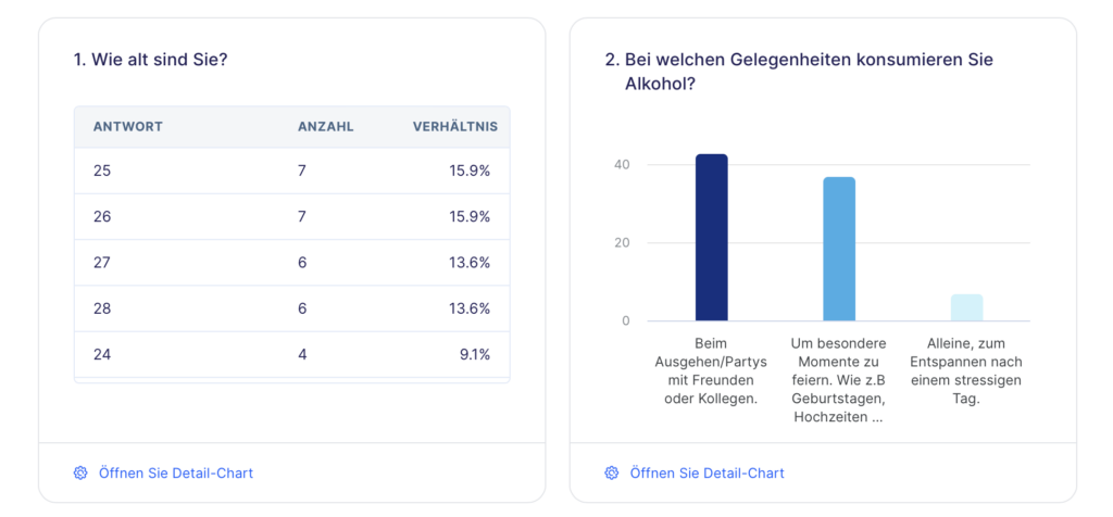
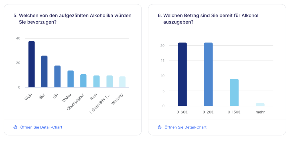
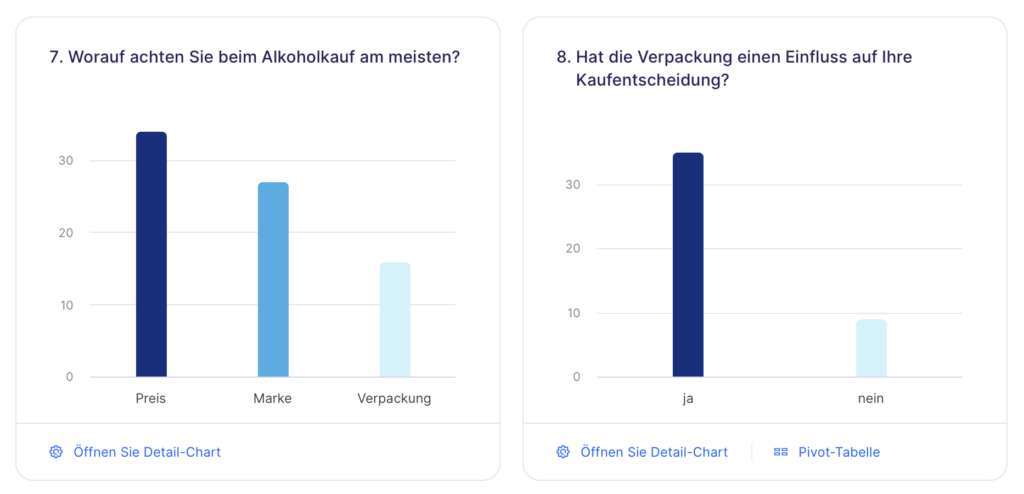
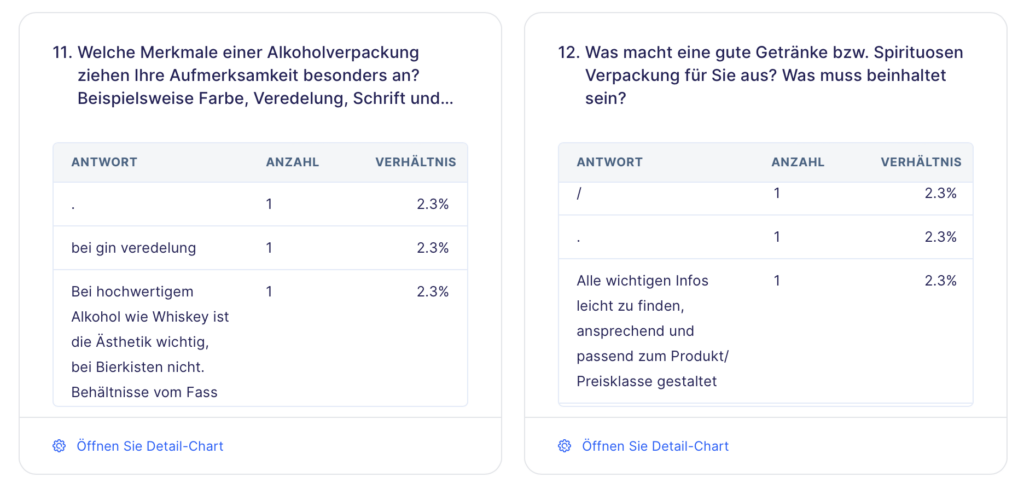
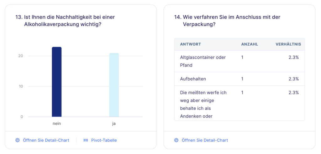
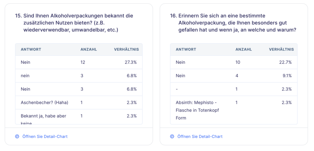
I conducted a survey on alcohol consumption and the impact of packaging design on consumer behavior; please find attached the screenshots. As of May 22, there were 44 participants.
This semester of study provides me with the opportunity to explore and experiment with various approaches to find a clear direction for my project. In doing so, I’ve focused on three main themes that form the core of my design: Collector’s Item, Interactive Drinking Game, and Social Interaction.
Collector’s Item: A Touch of Exclusivity
The idea of designing alcohol packaging as a collector’s item particularly intrigues me. Here, the aim is to imbue the product with a touch of exclusivity, whether through a special edition, unique shaping, or the use of high-quality materials. The packaging becomes not only a vessel for the alcohol but also a piece of art that captures the attention of collectors and aficionados alike. Such a design not only appeals to the senses but also creates an emotional value that transcends the product itself.
Interactive Drinking Game: More Than Just Packaging
Creating packaging that goes beyond its primary function and transforms into an entertaining drinking game is another fascinating approach. Imagine the packaging box being converted into a board game or various elements being pressed out for a card game. This interactivity not only provides a unique experience for the user but also encourages communal enjoyment during the consumption of alcohol.
Social Interaction: A QR Code for the Next Adventure
The third approach that inspires me is the creation of packaging that stimulates social interaction. Picture a QR code on the packaging leading to an open chat portal where people can gather to celebrate together or meet new individuals. This kind of „blind date“ in the world of alcohol opens up a new dimension of enjoyment by bringing people together and creating unforgettable moments.
Overall, I’m excited about the opportunity to not only create aesthetic values through my alcohol packaging design project but also provide deeper meaning and interaction. This semester will allow me to further explore these approaches and steer my project in a direction that is not only innovative but also offers genuine value to society. I look forward to bringing my ideas to fruition and seeing how they can transform the world of alcohol enjoyment.
Understanding the brand’s narrative and its alignment with the product is pivotal in crafting compelling packaging. It allows for a nuanced exploration of the various packaging layers that guide customers from discovering the product to making a purchase.
However, the journey doesn’t end once the product reaches the customer’s hands. Addressing potential issues like product damage during transit underscores the importance of meticulous product preparation and packaging.
Ease of Use
Effective packaging not only captivates attention but also prioritizes user experience. Avoiding cumbersome packaging designs that frustrate customers is crucial. Simplify the opening process and provide clear usage instructions, enhancing user satisfaction and brand perception.
Product Protection
Ensuring the safe arrival of your product is integral to packaging design. Mitigating potential damage requires strategic planning, such as incorporating custom inserts for stability and protection. While cost-effective options like corrugated cardboard inserts offer reliable safeguarding, premium solutions like custom foam inserts offer enhanced protection albeit at a higher cost.
Design
How Color Affects and Reinforces Buying Behavior
Color plays a pivotal role in storytelling through packaging, serving as the initial point of contact with customers. Understanding color psychology empowers brands to evoke desired emotions, influencing purchasing decisions and brand perception.
Brand Colors: Leveraging brand-specific colors fosters brand recognition and loyalty, anchoring your product within your brand identity.
Dark vs. Light: The choice between dark and light colors sets the tone for brand personality, with dark hues exuding power and light shades evoking tranquility.
Bright vs. Pastel: Saturation levels influence mood, with bright colors conveying vibrancy and pastels instilling a sense of calmness.
Setting the Mood with Typography
Typography contributes significantly to brand messaging, shaping the overall brand persona. Selecting appropriate fonts aligns with brand personality, whether aiming for professionalism, casualness, or playfulness.
Sans-serif: Modern and clean, sans-serif fonts are ideal for minimalistic packaging designs or when legibility is paramount.
Serif: Traditional and reliable, serif fonts lend a sense of establishment and trustworthiness, appealing to certain product categories.
Script: Evoke elegance and luxury with script fonts, suitable for high-end products while conveying a touch of sophistication.
How Material Choices Affect Perceived Value
Materials form the foundation of packaging design, impacting perceived product value and brand positioning. Understanding material properties allows for strategic selection aligning with brand identity and product positioning.
Kraft: Offering a natural and rustic aesthetic, kraft material appeals to organic brands or those emphasizing simplicity.
Matte White: Versatile and sophisticated, matte white material provides a modern canvas for various design elements, balancing aesthetics and budget.
Gloss White: Conveying luxury and elegance, gloss white material enhances visual appeal with vivid colors, ideal for premium product lines.
Copy
Clever copywriting complements packaging design, effectively communicating product benefits and brand messaging to consumers. Tailoring copy to evoke specific emotions or address consumer concerns enhances brand resonance and customer engagement.
Illustrations and Imagery
Visual elements like patterns, icons, photography, and illustrations enhance packaging design, enriching storytelling and conveying product features effectively.
Icons: Simplify messaging with intuitive icons, offering visual cues for product usage or features.
Photography: Showcase product attributes and ideal customer demographics through impactful photography, bridging the gap between product presentation and consumer expectations.
Illustrations: Illustrations convey product usage instructions and add whimsical flair to packaging, contributing to a memorable unboxing experience.
Dieline: A crucial 2D representation aiding in the design and printing of 3D packaging, ensuring accuracy and alignment.
Spot Colors: Predefined ink colors meticulously selected for printing consistency and cost efficiency, enhancing visual appeal.
CMYK vs. RGB: Understand the distinction between color models for print (CMYK) and digital display (RGB), crucial for achieving desired color outcomes.
Foil: Explore decorative techniques utilizing heat and pressure to transfer intricate images onto packaging, elevating brand aesthetics.
Emboss: Discover the art of adding tactile elements to packaging, such as raised design elements, enhancing tactile engagement.
Caliper/Flute: Delve into the significance of cardboard thickness in packaging design, crucial for product protection and structural integrity.
Primary Packaging: Comprehend the importance of direct packaging containing the product for protection and consumer interaction.
Secondary Packaging: Recognize the role of additional packaging in branding and logistical efficiency, contributing to a cohesive brand experience.
Flexographic Printing: Explore the versatility of printing methods employing plates for simpler color designs, balancing cost and quality.
Lithographic Printing: Uncover the intricacies of printing methods suitable for detailed designs, ensuring premium print quality for packaging.
Digital Printing: Embrace cost-effective printing methods utilizing CMYK ink colors, ideal for dynamic design changes and customization.
Layers of Packaging
Appreciate the multifaceted role of packaging layers in conveying brand stories, ensuring product protection, and enhancing consumer engagement throughout the purchasing journey.
Ease of Use
Prioritize user-friendly packaging to enhance the overall consumer experience, ensuring seamless interaction and usability.
Product Protection
Explore strategies for ensuring product integrity and safety through thoughtful packaging design, mitigating the risk of damage during transit and storage.
Design
Harness the power of color, typography, materials, copy, illustrations, and imagery to create visually captivating packaging designs that resonate with consumers, reinforce brand identity, and communicate brand messaging effectively.
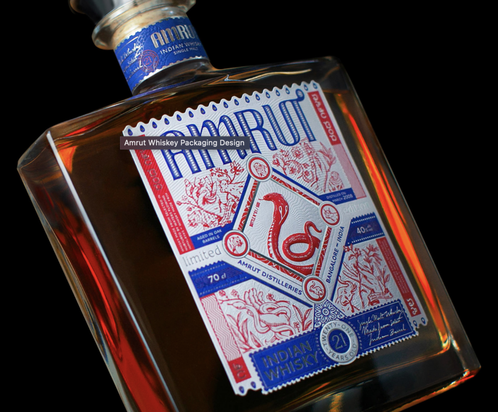
Amrut partnered with Studio Boam, a prestigious Parisian branding agency, to create packaging highlighting the spirit’s Indian roots. The design features a striking King Cobra at its center, surrounded by mystical motifs evoking India’s cultural richness. The label, elegantly simple yet culturally rich, incorporates intricate elements inspired by Indian mythology. Silver hot stamping enhances the duotone palette, while traditional Indian motifs add depth, maintaining an elegant restraint in expression.
Changin’ Packaging Design
Baries Design, headquartered in Düsseldorf, meticulously designs the packaging for Changin‘ to embody a transformative experience. Through carefully curated label illustrations, vibrant color palettes, and typography reminiscent of psychedelic imagery, the packaging serves as a visual narrative, inviting consumers into an immersive journey. The fusion of the words ‚change‘ and ‚gin‘ in the brand name reflects not only the product’s gin-inspired taste but also its overarching philosophy of altering perceptions. The logo font and back label colors are strategically chosen to symbolize the fluidity of perception and mental associations, aligning with Changin’s ethos of embracing change. The intricate design of the bottle, coupled with its compelling visuals, beckons consumers to engage on a deeper level, prompting them to examine and ponder its contents. In a fast-paced world where attention spans are fleeting, Changin’s packaging stands as a testament to the power of thoughtful design, encouraging consumers to pause, reflect, and explore the nuances within.
William Grant & Sons
William Grant & Sons, a distinguished purveyor of premium spirits, has enlisted the expertise of the international creative design agency, threebrand, to introduce its latest offering, the Ghosted Reserves. As part of the esteemed Rare Cask Reserves program, these ‚ghosted vattings‘ grant consumers access to exceptionally rare Scotch whisky stocks sourced from defunct distilleries. tasked threebrand with crafting both label sets and secondary packaging that embody the distinctive narrative of the Ghosted Reserves while exuding a premium and tactile quality. Malcolm Thomson, associate creative director at threebrand, explained that a palette of grey tones was deliberately chosen to evoke the ethereal essence of the vattings, evoking themes of opacity.
FibreForm Caps
FibreForm Caps by Billerud is a groundbreaking substitute for conventional metal caps utilized in sparkling wine production globally. Despite its eco-friendly composition derived from 100% recyclable and biodegradable primary fiber paper sourced from sustainably managed forests, it matches the aesthetic appeal, embossing, and superior print quality of traditional metal caps.
The Luxury Spirit Packaging industry is witnessing unprecedented growth, driven by the surge in craft spirits and changing preferences among millennials. Valued at $154 billion in 2020, the North American spirits market is projected to grow at a 7.7% Compound Annual Growth Rate (CAGR) until 2028, largely attributed to millennials‘ inclination towards premium spirits. Craft spirits, experiencing a 10.4% market growth, have become significant players, with over 2,500 distilleries in the U.S. Local liquor stores now showcase a plethora of craft spirits with vibrant labels, marking a diverse market from mocktails to celebrity-branded spirits. Notable successes include George Clooney’s Casamigos, selling for $1 billion, and Bob Dylan’s Heaven’s Door Spirits.
Essential spirits packaging:
The success of a liquor brand hinges significantly on its spirits packaging, as the modern market seeks not only high-quality products but those that exude luxury and class. Typically, as the price of a spirit rises, particularly in the $30-$40 range, it adopts more specialized packaging to impart a premium feel. Achieving this sense of luxury is often realized through two primary structural designs – folding cartons and rigid set-up boxes. Folding cartons offer versatility, allowing for customized shapes and sizes, providing an ideal canvas for decorative finishes and elements, and ensuring accelerated speed-to-market. In contrast, rigid set-up boxes, crafted from high-quality chipboard, convey luxury and sturdiness, making them suitable for brands requiring structurally sound packaging with an elegant presentation. Such boxes are commonly employed for promotional items and packaging featuring interactive elements. To embody luxury in packaging, adherence to essential practices is crucial, especially during three pivotal phases where the packaging must stand out.
Product Launch:
Launching a product marks its debut to the public, underscoring the critical importance of making a compelling first impression. A standout, on-brand, and luxurious packaging design is indispensable for a successful product launch. It is crucial to define your brand identity before entering the market and seamlessly convey it through your packaging. In the high-end spirit industry, consumers are attracted to heritage and storytelling. Thus, integrating your brand narrative into the packaging fosters a connection with your target audience. Utilize exotic substrates, dramatic effects, and other captivating elements to attract and engage consumers during this pivotal launch phase.
Limited edition:
In limited editions, packaging is pivotal, conveying the uniqueness, story, and value for the premium price. Rabbit Hole’s Founder’s Collection series showcases this approach, featuring sequential numbering, a specialty bottle design, and a linen-textured sash tribute on the rigid box. The packaging, adorned with soft-touch coating, hot foil stamping, and the founder’s signature embossing, exemplifies meticulous attention to detail in limited edition presentation.
Holiday edition:
The holiday season presents an opportune time to elevate your packaging with added luxury. Crafting exclusive value-added packaging that complements the spirit of gift-giving is ideal during this festive time. Complete holiday packaging should embrace festive colors like reds, greens, blues, and golds. The allure of gift-ready packaging, coupled with its convenience for last-minute shoppers, makes it highly appealing to consumers. Holiday and gift-ready packaging often incorporate embossing, foil effects, and special coatings to evoke the holiday ambiance and captivate consumers.
Foils and Metallics:
Foils and metallics are a perfect way to accentuate specific elements of your product, potentially enticing new consumers away from their usual choices. Hot and cold foil stamping, offering an intense metalized look, imparts a luxurious and high-quality feel to your packaging. Alternatively, metallic inks, applied earlier in the printing process, provide a subtler yet unique shine, suitable for finely detailed packaging.
Vintage Packaging:
Vintage and nostalgia-inspired packaging is a prevailing trend shaping the industry, as brands tap into the charm of the past to distinguish themselves. Incorporating simple and traditional elements, like color schemes or old-fashioned fonts, resonates with consumers seeking a nostalgic escape from the technology-driven era. Often presented as limited editions, these vintage designs serve to enhance sales.
Standing out in the packaging industry:
To stand out in the expanding spirits market, a distinctive and innovative packaging approach is essential. Beginning with a creative structural design, options like rigid set-up boxes, premium folding cartons, and promotional packaging set brands apart. Utilizing 3D printing and extensive prototyping enhances the inventiveness of the design. Incorporating unique closures adds an interactive element to the packaging, creating a memorable unboxing experience. Whether aiming for interactivity or a touch of mysticism with concealed features, such closures contribute to a standout spirit packaging.
Special effects:
Specialty effects play a pivotal role in the success of spirits packaging, captivating consumers and positioning the product as a luxury item. Utilizing finishes like metallic inks, hot and cold foil stamping, embossing/debossing, holographic foils, and various coatings enhances the visual appeal. Incorporating exterior effects such as magnetic closures and exotic substrates further elevates packaging, offering a diverse range of textures and finishes.
Color Cosistency:
Color consistency is crucial for brand identity, ensuring that the chosen color remains uniform across different products and promotional items. Rigid boxes are the preferred choice for collections and collector’s items, providing durability and a luxurious presentation. Windows are essential for showcasing the product, exemplified by Jim Beam Black’s packaging that allows a glimpse of the extra-aged bourbon and accompanying whiskey glasses.
Duty-free packaging presents an opportunity for distinction, with exclusive designs catering to last-minute tax-exempt purchases. Themed packaging, whether tied to a movie franchise or seasonal themes, proves effective in standing out in a crowded market. Sustainable packaging aligns with the growing environmental consciousness of consumers, attracting a wider audience through the use of recyclable materials.
Experiential marketing and packaging go hand in hand for spirits, with Casamigos Tequila serving as an exemplary case. Its bold packaging, reflecting the colors of the agave plant, complements the brand’s commitment to delivering the best-tasting and smoothest tequila, exemplifying the cultural experience associated with genuine tequila.
In conclusion, embracing innovative specialty effects, ensuring color consistency, utilizing durable packaging solutions, incorporating windows for product visibility, designing duty-free exclusives, exploring themed packaging, adopting sustainable practices, and integrating experiential elements can collectively elevate spirits packaging, setting brands apart in a competitive market and enhancing the overall consumer experience.
Scientific literature categorizes communities based on their attitude toward alcoholic beverages. Austria falls into a category with a determined drinking culture where many daily life occasions are closely linked to alcohol consumption. Considering the local drinking habits and cultural aspects is essential in choosing packaging for card drinking games to establish an authentic connection.
• Alcohol-Prohibitive Cultures: These include Islamic countries and communities where a general alcohol ban is in place, allowing alcohol only for medicinal purposes.
• Alcohol-Exceptional Cultures: Cultures that permit alcohol consumption only on clearly defined, rare occasions and in limited quantities. The Jewish culture falls into this category.
• Alcohol-Permissive Cultures: These cultures allow alcohol consumption on specific occasions. There is a distinction between cultures where alcohol is a daily beverage, for example, consumed with meals in smaller quantities (such as Spain, Italy, Greece, and France), and cultures where alcohol is primarily consumed on weekends and during festivities, often in larger quantities, as seen in Scandinavia.
• Alcohol-Determined Cultures: In these cultures, many everyday events are closely linked to alcohol consumption, such as birthdays, weddings, baptisms, funerals, corporate events, etc. Moderate drunkenness is accepted within certain limits. Wagner includes Germany, Austria, Switzerland, and the Netherlands in this category.
• Alcohol-Excessive Cultures: These cultures consider alcohol consumption as a norm, and the state of intoxication is viewed as a sign of masculinity, strength, generosity, etc. Predominantly, high-proof alcoholic beverages are consumed. Wagner associates many Slavic countries with this category.
Drinking games have a rich history, dating back to ancient Greece with games like Kottabos. From Renaissance-era drinking ships to modern games like Beer Pong, diverse types of games offer various packaging design possibilities based on their randomness, skill requirements, or truth-or-dare elements.
Card drinking games are consistently popular, requiring minimal accessories. Most card games traditionally come in flip-top packaging.
Examples of card drinking games:
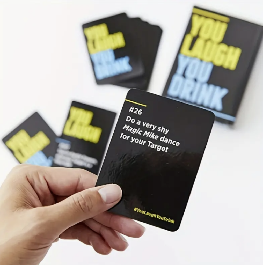
You Laugh You Drink: A game designed for those who struggle to maintain a serious face. The card set features humorous prompts that induce laughter and drinking actions. When it’s your turn, follow the card’s instructions without holding back. Can you keep a straight face when someone performs emotional breakdown dance moves or suddenly engages in parkour around you? The package includes one card set in flip-top packaging.
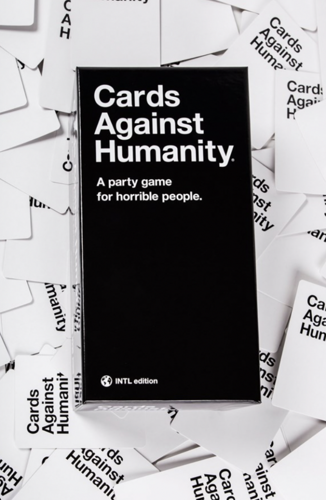
Cards Against Humanity: Each player receives ten white cards. The player who last relieved themselves becomes the „Card Czar“ and starts by drawing a black card, reading its contents. All other players choose the card from their ten that they find most fitting (politically incorrect, inappropriate, gross, offensive, or simply super funny) and submit it covertly to the Card Czar. The Czar reads all selected variations and decides the winner for that round. Simple, right? Even easy to follow when not completely sober. Cards Against Humanity is perfect for a fun evening with friends, family, and/or alcohol.
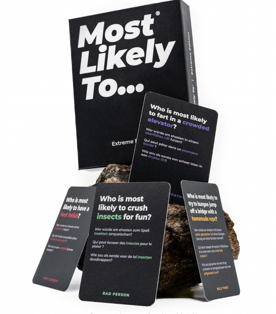
Most Likely To: Featuring 220 funny and outrageous questions, this game is for those who don’t take themselves too seriously. With four card categories—Dirty Secrets, Wild Times, Bad Person, and Cringe—players tap into unspoken truths. The simple rules involve pointing out who in the room is most likely to do or experience what the card describes. From Christmas and birthday parties to New Year’s, graduations, bachelorette parties, and festivals, these cards are a must for any lively event.
Packaging for card drinking games varies, including rectangular boxes, robust metal tins, transparent plastic containers, fabric bags, or cylindrical tubes. Some games combine other items like drinking glasses, dice, or accessories, offering a complete package. The choice of packaging often aligns with the game concept, style, and aesthetic preferences of the target audience. It is crucial that the packaging not only serves its functional purpose but also reflects the theme and character of the card drinking game.