The survey included different age groups, including a young person, a master’s student and an adult aged 50.
Young person:
The person found the idea of a book that can be read from both sides very exciting and innovative. The opinion was that the cover design was modern and appealing, especially the choice of colors and typography stood out. The dual reading option was immediately understood and it was expressed that the book would definitely be bought due to the unusual cover. The section dealing with rebranding was particularly interesting as it was believed that this could be applied to personal projects.
Master’s student:
This person was also enthusiastic about the idea and thought the concept was original and practical. The cover design left a professional impression, particularly liking the clean lines and structured arrangement of the elements. The double reading option was also immediately understood and it was expressed that this would be a book that would definitely be bought, especially because of the unique design. It was suggested that the cover could perhaps be made a little more interactive, possibly with an AR application. In terms of content, the person was more interested in the part dealing with starting a new business, as the plan was to create a startup after graduation.
Adult person:
A person aged 50 also found the idea of a book that could be read from both sides very interesting and creative. The cover design was perceived as attractive and professional, and the clarity and organization were particularly appealing. The dual reading option was understandable, even if there was some skepticism at first. It was expressed that such a book would be considered because of the cover, especially if information on branding was specifically sought. One suggestion for improvement was to perhaps place a short instruction or explanation directly on the cover to make the double reading option even clearer. In terms of content, the person was more interested in the section dealing with rebranding, as they had already had experience with brand management and development in their professional career.
Summary:
To summarize, this experiment not only provided new perspectives on branding, but also demonstrated the importance of thoughtful and appealing design for a product’s first impression and usability. The different age groups provided valuable feedback that will help to further refine the book concept and adapt it to the needs of the target groups.
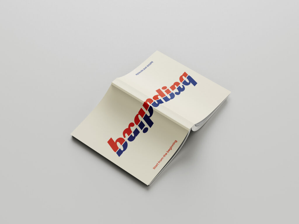
For the third experiment, I have designed a book that can be read from both sides. One side is aimed at people who are starting a new company and want to develop branding from scratch. This part is very conceptual and analytical, especially at the beginning, as values and goals have to be defined first. However, if you read the book from the other side, it is more about how an existing branding can be revised and which aspects are important for successful branding in 2024.
I designed the cover of the book for this experiment. I made sure that the reader quickly understands from the design that this is not an ordinary book, but one that can be read from both sides. The cover is designed in such a way that it conveys the dual reading option at first glance and makes the reader curious to explore the book in both directions.
For my survey, I printed out the cover and folded it around an existing book. In order to better understand the project and be able to empathize with it, I explained the project and its function at the beginning of the survey. In the survey, I wanted to find out how the idea and the design were received by the target group.
I asked the following questions:
What do you think of the idea of a book that can be read from both sides?
What is your first impression of the cover design?
Which elements of the cover particularly catch your eye?
How understandable do you find the double reading option at first glance?
Would you buy such a book based on the cover?
What improvements would you suggest for the cover design?
Which aspects of the book’s content (starting a business vs. rebranding) interest you more and why?
I interviewed a total of three people. The results for the questions already published in the last post are:
First impression Illustration packaging: all three respondents found the design of the packaging with the illustration aesthetically pleasing and modern. Photography packaging: this packaging was perceived as familiar and traditional.
Design description The illustration packaging was described as stylish, appealing and professional. The photographic packaging was described as classic and reliable, although less modern.
Preference All three respondents found the illustration packaging nicer. Despite this preference, they would rather choose the photographic packaging.
Purchase decision The quick recognition value and the familiarity of the packaging with the photography were the main reasons for the purchase decision in favor of this packaging.
Illustration vs. photography The illustration packaging evoked feelings of creativity and freshness, while the photography packaging evoked associations of authenticity and trust.
Responsiveness and professionalism All three respondents found the illustration appealing and professional.
Clarity and comprehensibility Two of the three respondents found the illustration packaging clearer and easier to understand. One person found the packaging with the photograph easier to interpret.
Content recognition Most respondents found it easy to recognize the content of the product from the photograph, while the illustration was slightly more abstract.
Summary:
All found the illustration aesthetically pleasing, but trusted the photography more because of its recognition value. The illustration evoked feelings of creativity, while the photograph evoked associations of authenticity. Participants found the illustration appealing and professional. The clarity of the packaging was divided, but the photographic packaging was easier to interpret. Most recognized the contents of the product more easily from the photograph. Familiarity and recognition influenced the purchase decision more than aesthetic appeal.
For my second experiment, I chose a food product from the supermarket. I chose Spar olive oil because in this experiment I wanted to find out how a simple design with illustrations compares to a typical food packaging with photographs.
To do this, I used existing olive oil branding from the internet to create a simpler packaging including an olive illustration.
In a short, personal survey, I would like to find out what effect both types of packaging have and which one is more likely to be chosen.
Questions for a personal conversation:
What is your first impression of the two packages?
How would you describe the design of the packaging (e.g. modern, traditional, appealing, boring)?
Which of the two packagings do you like better? Why?
Which packaging would you be more likely to reach for if you were in the supermarket? Why?
Which packaging appeals to you more: the one with the illustration or the one with the photograph?
Why do you prefer illustrations/photographs on packaging?
What feelings or associations does the packaging with the illustration evoke in you?
Do you find the illustration appealing and professional?
Do you think that the packaging with the illustration is clearer and easier to understand than the packaging with the photograph?
How easy is it for you to recognize the contents of the product from the illustration/photography?
Which logo appeals to you the most? The original logo (Sans Serif) was preferred by most participants, which could be due to its clear and modern design.
How professional does each logo variant look? Original logo (Sans Serif): Scored an average of 4.5 out of 5. It was rated as the most professional. Serif font: Averaged 3.8 out of 5 points. It was perceived as professional but more traditional. Rounded Sans Serif: An average of 3.5 out of 5 points. This variant was perceived as friendly and modern, but slightly less professional. Handwriting: Average 2.9 out of 5 points. Handwriting was considered the least professional, but personal and inviting.
What emotions does each logo variant evoke in you? Original logo (Sans Serif): Trustworthy, modern, professional. Serif font: Traditional, elegant, sophisticated. Handwriting: Personal, friendly, individual. Rounded Sans Serif: Modern, friendly, accessible.
Specific questions about typography
In your opinion, which logo best conveys the brand of an upscale hotel? The original logo (Sans Serif) was seen by the majority as the logo that best conveys the brand of an upscale hotel.
Which logo do you find most inviting? The rounded Sans Serif was perceived as the most inviting, closely followed by the original logo.
Which logo variant looks the most modern? The original logo (Sans Serif) and the rounded sans serif were seen as the most modern variants.
Which logo variant looks the most traditional? The serif font was rated as the most traditional variant.
General questions about color
Has your perception of the logo changed with the addition of colors? About 70% of participants stated that their perception has not changed.
If so, how did the perception change? Those who did notice a change mentioned that the colors made the logo appear more vibrant and inviting.
Specific questions about color
Which color logo appeals to you the most? The original logo (Sans Serif) in color was again the most preferred.
How professional does each color logo variation look? Original colored logo (Sans Serif): Scored an average of 4.5 out of 5. It was still rated as the most professional. Serif font in color: Averaged 3.8 out of 5 points. Rounded Sans Serif in color: Average 3.5 out of 5 points. Handwriting in color: Average 2.9 out of 5 points.
What emotions does each color logo variant trigger in you? The colored logos triggered similar emotions as their black and white counterparts, but an added sense of vibrancy was often mentioned.
In your opinion, which color logo best conveys the brand of an upscale hotel? Mostly the original colored logo (Sans Serif).
Which color logo do you find most inviting? The rounded Sans Serif in color was perceived as the most inviting, followed by the original logo.
Which logo variant looks the most modern? The original colored logo (Sans Serif) and the rounded Sans Serif were seen as the most modern variants.
Which logo variant looks the most traditional? The colored serif font was rated as the most traditional variant.
Summary:
The survey shows that the original logo (Sans Serif) performed best in both black and white and in color and was perceived as professional, modern and trustworthy. The use of color did not result in a significant change in perception for most participants. The serif font was perceived as traditional, while the rounded Sans Serif was perceived as inviting and modern. Handwriting scored lowest in terms of professionalism, but was rated as personal and friendly.
To test my first experiment, I created a short online survey. The respondents were asked the following questions in addition to the images I posted in the last blog post:
General questions about typography
Which logo appeals to you the most? (selection)
Please rate how professional each logo variant looks. (Scale from 1 to 5, where 1 = not professional and 5 = very professional)
What emotions does each logo variant evoke in you? (open question)
Specific questions on typography
In your opinion, which logo best conveys the brand of an upscale hotel? (selection)
Which logo do you find most inviting? (selection)
Which logo variant looks the most modern? (selection)
Which logo variant looks the most traditional? (selection)
General questions about color
Has the addition of color changed your perception of the logo? (Yes/No)
If yes, how has the perception changed? (open question)
Specific questions about the color
Which color logo appeals to you the most? (selection)
Please rate how professional each color logo variant looks. (Scale from 1 to 5, where 1 = not professional and 5 = very professional)
What emotions does each color logo variant trigger in you? (open question)
In your opinion, which color logo best conveys the brand of an upscale hotel? (selection)
Which color logo seems most inviting to you? (selection)
Which logo variant looks the most modern? (selection)
Which logo variant looks the most traditional? (selection)
The results will be announced in the next blog post.
Over the course of my first semester, I experienced an in-depth exploration of various aspects of branding. The initial exploration of basic definitions formed the foundation on which a complex understanding of the multifaceted world of branding developed over time. It became clear that branding is far more than just a visual concept – it is a comprehensive interplay of psychological, historical and design elements.
Delving deeper into the psychology of branding revealed how profound the emotional connection between consumers and brands is. The targeted influencing of emotions through the choice of color was clarified in the further analysis, in particular through the application of color psychology in marketing and branding. Here it became clear that colors are not just aesthetic decisions, but have a decisive influence on the perception and interpretation of a brand.
The historical perspective opened up a view of the evolution of branding, which helped me to better understand its importance and relevance today. Analyzing best practice examples, including giants such as Nike, Starbucks and Coca-Cola, allowed me to extract concrete applications and successful strategies in branding. The effect of fonts on brand communication was examined in depth in a separate study and finally focused on the integration of typography into the overall brand identity.
My question „How does branding play a pivotal role in shaping and influencing the visual identity of brands?“ was illuminated on various levels in the course of this multi-layered examination. It became evident that branding is not just an aesthetic practice, but a strategic decision that permeates and shapes the entire visual appearance of a brand.
Outlook for next semester:
In the coming semester, I intend to intensify my research by conducting a comprehensive survey. The focus will be on capturing current opinions and trends in branding and integrating the findings into my Master’s thesis. The survey will be conducted online in order to reach a broader and more global participant base.
Some possible questions that could be included in the survey:
How much does the visual identity of a brand influence your decision to buy a product or service?
To what extent does the appearance of a brand play a role in forming your opinion of its products or services?
What colors appeal to you most when it comes to brands, and why?
To what extent does the design of a website or packaging influence your perception of and interaction with a brand?
What importance do you attach to the font (typography) of a brand?
Do you believe that a consistent use of fonts improves the brand experience?
How much does the visual consistency of a brand influence your loyalty to that brand?
How important is it to you that a brand communicates its brand promise visually?
These questions are intended not only to capture the preferences and opinions of the participants, but also to gain deeper insights into the psychological and emotional connections between consumers and brands. The results of the survey will form an important basis for further research and further enrich my master’s thesis.
It is now time to look into the analysis of the responses gathered from the survey conducted a few weeks ago. It’s crucial to note that the dataset comprises only 36 responses, and the participants share a relatively homogeneous background. Here’s a breakdown of key demographic information regarding the survey respondents:
83,3% of the respondents identify as women
94,4% fall within the 18-33 age bracket
77,7% are Norwegian
Since there isn’t a wide variety of backgrounds, it’s difficult to spot trends or make solid conclusions. Still, it’s interesting to think about what we can learn from the answers.
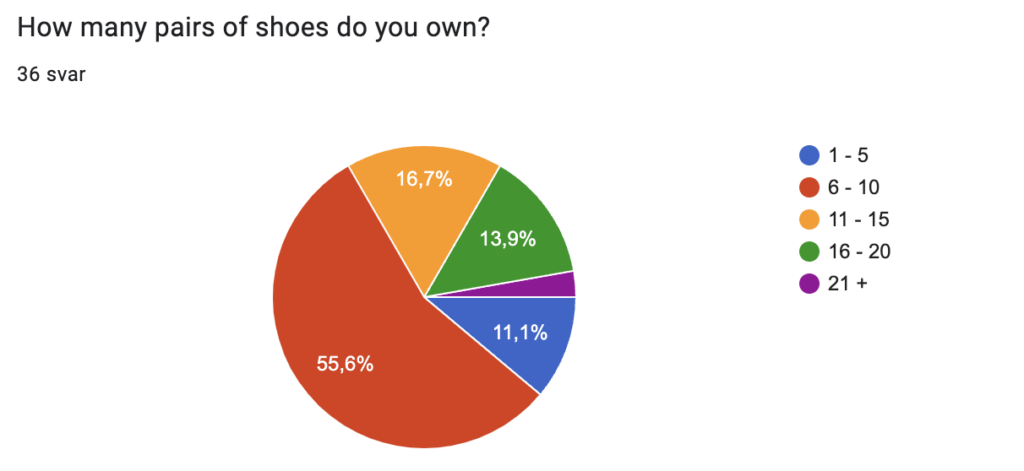
HOW MANY PAIRS OF SHOES DO YOU OWN?
As observed, 55,6% of respondents owns 6-11 pairs of shoes, with an additional 33,4% stating ownership of 11 or more pairs. Combining these numbers, 89% of participants possess 6 pairs of shoes or more. However, understanding the significance of this information requires considering it in combination with responses to the question about what individuals typically do with their worn-out shoes.
The varied outcomes may be due to different practices, such as donating or discarding shoes versus storing them in closets for special occasions. Some dispose of or donate their shoes, while others keep them, either for unexpected needs, as designated „painting shoes,“ or as an extra pair at their cabin. Examining these factors together provides a more nuanced understanding of participants‘ shoe ownership habits.
Another important factor to consider is the influence of sports on the number of shoes an individual owns. Various sports often demand specific footwear, and those who actively participate in multiple sports may own more shoes than others. For instance, in high-impact sports like running, the need for more frequent shoe replacements arises due to accelerated wear and tear.
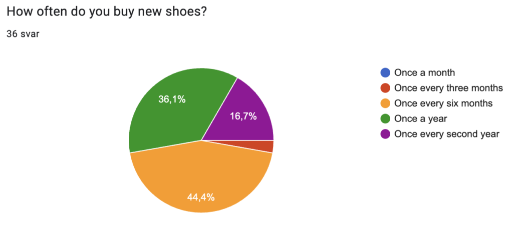
HOW OFTEN DO YOU BUY NEW SHOES?
Almost half of the people (44,4%) get new shoes every six months, which means they buy about 2 pairs each year. On the other hand, 36,1% buy just one pair of shoes annually. When you add up all the responses, 83,3% of the people answered that they buy at least one pair of shoes every year, while 16,7% buy shoes every second year.
WHY DO YOU USUALLY BUY SHOES?
For this question, respondents had seven options to choose from, and they were allowed to select multiple answers. Additionally, there was an option to provide their own response. Below are the available choices and the corresponding number of selections made by the participants:
Need to replace worn out shoes (35 out of 36)
To reward myself (3 out of 36)
Need to find something comfortable (8 out of 36)
Because they were on sale (8 out of 36)
Because of changing season (12 out of 36)
For a special occasion (12 out of 36)
To keep up with the latest trends (3 out of 36)
The most frequently selected response was ‚Need to replace worn-out shoes,‘ chosen by 35 participants.
WHAT DO YOU USUALLY DO WITH YOUR WORN OUT SHOES?
This question allowed open-ended responses, and here are the most common answers:
Discard them in the garbage (25 out of 36)
Donate if they are still in good condition or give them to others (9 out of 36)
Keep them in the closet, possibly disposing of them later (11 out of 36)
A few respondents mentioned keeping shoes for special occasions, festivals, or activities like painting, where getting them dirty doesn’t matter. One person noted they would take the shoes to a cabin for use there.
Many individuals emphasized that their decision depended on the shoes‘ condition. If too worn out, they would be discarded; otherwise, they might be donated, given away, or kept for future use.
WHAT IS/ARE DECISIVE FACTOR/S WHEN SHOE SHOPPING?
In response to this question, participants were presented with five options and had the flexibility to choose multiple answers. They also had the option to provide their own response. The breakdown of choices is as follows:
Price (31 out of 36)
Quality (31 out of 36)
Trendiness (15 out of 36)
Brand (7 out of 36)
Comfort (32 out of 36)
It’s evident that the top three priorities for the respondents are price, quality, and comfort.
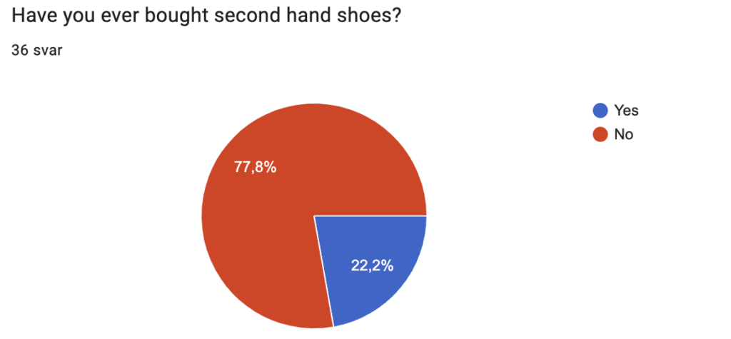
HAVE YOU EVER BOUGHT SECOND HAND SHOES?
77,8% of respondents have not bought second hand shoes before, while 22,2% have bought second hand shoes.
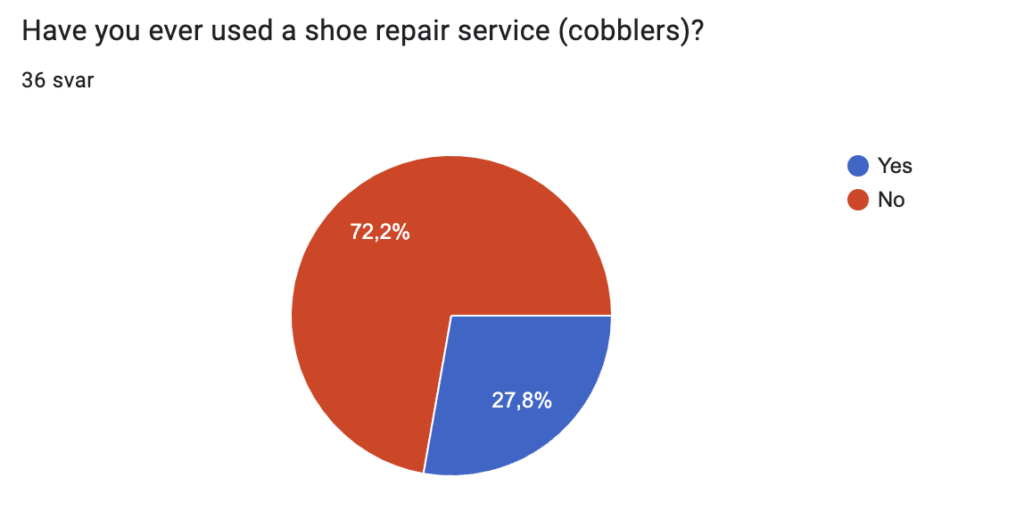
HAVE YOU EVER USED A SHOE REPAIR SERVICE (COBBLERS)?
72,2% percent of respondents have never used a shoe repair service, while 27,8% have used such services. At first glance, it may appear that there’s a potential correlation between those who have purchased second-hand shoes and those who have used a shoe repair service, as the percentages are quite similar. However, upon closer examination of the responses, it becomes apparent that only two respondents have both bought second-hand shoes and used a shoe repair service.
IF YOU HAVE USED A SHOE REPAIR SERVICE: WHAT WAS REPAIRED AND HOW WAS YOUR EXPERIENCE?
This question allowed open-ended responses, and here are the answers:
Fixed the sole (4 replies)
Made a pattern in the sole of winter shoes (1 reply)
Got a pair of dancing shoe fixed (1 reply)
Fixed the leather (1 reply)
Fixed a zipper (1 reply)
Unknown (1 reply)
IF YOU HAVE NEVER USED A SHOE REPAIR SERVICE: WHY NOT?
This question allowed open-ended responses, and here are the answers:
Don’t think they can fix the problem/too worn out shoes (13 replies)
Think it’s expensive/easier and cheaper to buy new shoes (8 replies)
Don’t know about it (3 replies)
Have not got myself to do it (1 reply)
Waiting time was too long (1 reply)
The shoes are not my style anymore (1 reply)
I repair them myself (1 reply)
It seems that one reason individuals may not take use of shoe repair services is a lack of awareness regarding what a shoe repairer can fix and the overall service offered. To benefit from such services, one needs a certain level of understanding about the specific issues with their shoes and whether those are within the scope of a shoe repairer’s expertise.
The number of shoes a person owns may not reveal much about their consumption habits. It’s crucial to consider what individuals do with their worn out shoes – whether they dispose of them or keep them stored in their closet.
A significant majority, 83.3% of respondents, indicated that they purchase at least one pair of shoes every year.
The most common reason for buying shoes is to replace worn out shoes.
The top three priorities for the respondents when shoe shopping are price, quality, and comfort.
There might be a lack of knowledge about what a shoe repairer can fix and the overall service in general
This weeks focus has been to create a survey to gather information about habits and behaviour when it comes to shoe shopping. It has been difficult to conclude or see any tendencies in the secondary research I have read so far. It has also been centered around other cultures where the consumers may have other habits. I would also like to include a part about consumer habits when it comes to cobbler so that I hopefully can understand if this is a service that people actually take use of.
I am currently studying the topic of Sustainability in the Footwear Sector in a course called Design and Research. My current task involves gathering information about consumer behaviour and habits related to footwear. Your insights are crucial for understanding this consumer behaviour.
Completing the survey will only take 2-4 minutes, and your participation would be greatly appreciated.
These questions will help me to gain a better understanding about differences when it comes to social factors like which generation you belong to, gender and which culture you are a part of.
How old are you?
18 – 33
34 – 44
45 – 54
55 +
Gender
Male
Female
Other
Don’t want to answer
Nationality
QUESTIONS ABOUT HABITS
This is the main part where I want to gather the general information about consumer habits like how many pairs of shoes people have, how often and why people buy shoes and what factors are the most important ones when people buy shoes.
How many pairs of shoes do you own?
1 – 5
6 – 10
11 – 15
16 – 20
21 +
How often do you buy new shoes?
More than once a month
Once a month
Once every three months
Once every six months
Once a year
Once every second year
Less than once every second year
Why do you usually buy shoes? (can choose multiple)
Need to replace worn out shoes
To reward myself
Need to find something comfortable
Because they were on sale
Because of changing season
For a special occasion
To keep up with the latest fashion
Other: …
What do you do with your worn out shoes?
What is/are decisive factor/s when shoe shopping? (can choose multiple)
Price
Quality
Trendyness
Brand
Comfort
Have you ever bought second hand shoes?
Yes
No
QUESTIONS ABOUT COBBLERS
This is a small part about cobblers where I want to understand if people actually take use of them or not.
It might be challenging to get enough answers to actually be able to come with a conclusion. I will in the upcoming weeks hand the survey out to people and hopefully get some answers that I can analyse after Christmas.