20 // Experiment 3.2: Book about branding (evaluation)

The survey included different age groups, including a young person, a master’s student and an adult aged 50.

Young person:

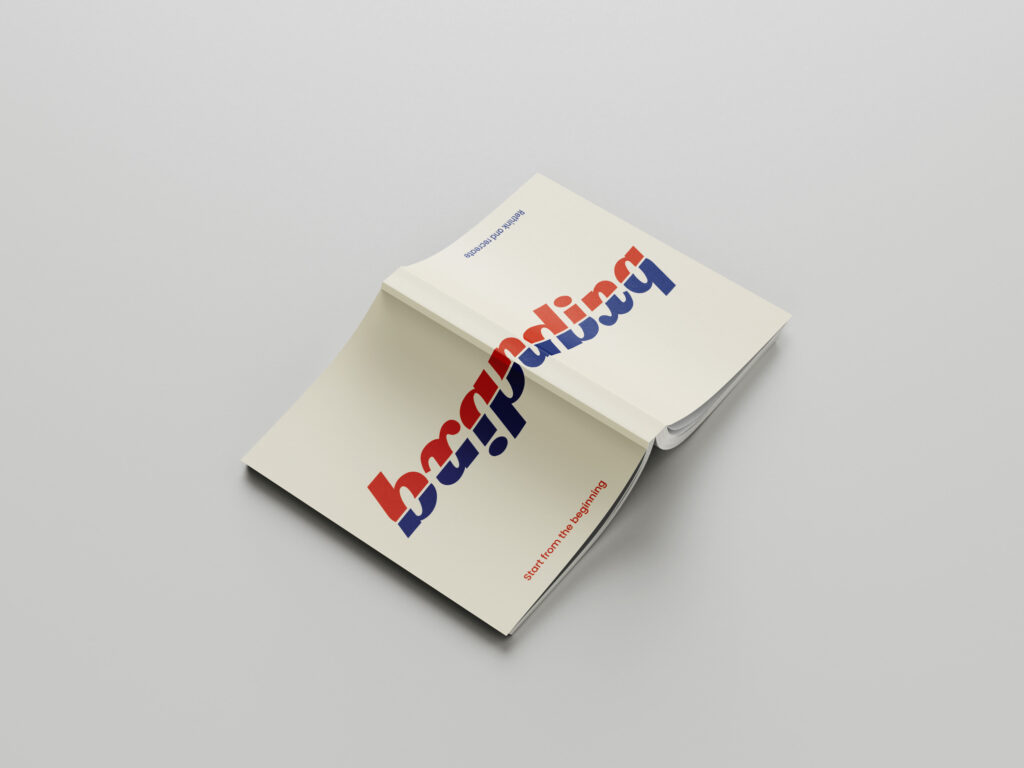
The person found the idea of a book that can be read from both sides very exciting and innovative. The opinion was that the cover design was modern and appealing, especially the choice of colors and typography stood out. The dual reading option was immediately understood and it was expressed that the book would definitely be bought due to the unusual cover. The section dealing with rebranding was particularly interesting as it was believed that this could be applied to personal projects.

Master’s student:

This person was also enthusiastic about the idea and thought the concept was original and practical. The cover design left a professional impression, particularly liking the clean lines and structured arrangement of the elements. The double reading option was also immediately understood and it was expressed that this would be a book that would definitely be bought, especially because of the unique design. It was suggested that the cover could perhaps be made a little more interactive, possibly with an AR application. In terms of content, the person was more interested in the part dealing with starting a new business, as the plan was to create a startup after graduation.

Adult person:

A person aged 50 also found the idea of a book that could be read from both sides very interesting and creative. The cover design was perceived as attractive and professional, and the clarity and organization were particularly appealing. The dual reading option was understandable, even if there was some skepticism at first. It was expressed that such a book would be considered because of the cover, especially if information on branding was specifically sought. One suggestion for improvement was to perhaps place a short instruction or explanation directly on the cover to make the double reading option even clearer. In terms of content, the person was more interested in the section dealing with rebranding, as they had already had experience with brand management and development in their professional career.


Summary:

To summarize, this experiment not only provided new perspectives on branding, but also demonstrated the importance of thoughtful and appealing design for a product’s first impression and usability. The different age groups provided valuable feedback that will help to further refine the book concept and adapt it to the needs of the target groups.

19 // Experiment 3.1: Book about branding

For the third experiment, I have designed a book that can be read from both sides. One side is aimed at people who are starting a new company and want to develop branding from scratch. This part is very conceptual and analytical, especially at the beginning, as values and goals have to be defined first. However, if you read the book from the other side, it is more about how an existing branding can be revised and which aspects are important for successful branding in 2024.

I designed the cover of the book for this experiment. I made sure that the reader quickly understands from the design that this is not an ordinary book, but one that can be read from both sides. The cover is designed in such a way that it conveys the dual reading option at first glance and makes the reader curious to explore the book in both directions.

For my survey, I printed out the cover and folded it around an existing book. In order to better understand the project and be able to empathize with it, I explained the project and its function at the beginning of the survey. In the survey, I wanted to find out how the idea and the design were received by the target group.

I asked the following questions:

  1. What do you think of the idea of a book that can be read from both sides?
  2. What is your first impression of the cover design?
  3. Which elements of the cover particularly catch your eye?
  4. How understandable do you find the double reading option at first glance?
  5. Would you buy such a book based on the cover?
  6. What improvements would you suggest for the cover design?
  7. Which aspects of the book’s content (starting a business vs. rebranding) interest you more and why?

18 // Experiment 2.2: Effect of illustration (evaluation)

I interviewed a total of three people. The results for the questions already published in the last post are:

  1. First impression
    Illustration packaging: all three respondents found the design of the packaging with the illustration aesthetically pleasing and modern.
    Photography packaging: this packaging was perceived as familiar and traditional.
  2. Design description
    The illustration packaging was described as stylish, appealing and professional.
    The photographic packaging was described as classic and reliable, although less modern.
  3. Preference
    All three respondents found the illustration packaging nicer.
    Despite this preference, they would rather choose the photographic packaging.
  4. Purchase decision
    The quick recognition value and the familiarity of the packaging with the photography were the main reasons for the purchase decision in favor of this packaging.
  5. Illustration vs. photography
    The illustration packaging evoked feelings of creativity and freshness, while the photography packaging evoked associations of authenticity and trust.
  6. Responsiveness and professionalism
    All three respondents found the illustration appealing and professional.
  7. Clarity and comprehensibility
    Two of the three respondents found the illustration packaging clearer and easier to understand.
    One person found the packaging with the photograph easier to interpret.
  8. Content recognition
    Most respondents found it easy to recognize the content of the product from the photograph, while the illustration was slightly more abstract.


Summary:

All found the illustration aesthetically pleasing, but trusted the photography more because of its recognition value. The illustration evoked feelings of creativity, while the photograph evoked associations of authenticity. Participants found the illustration appealing and professional. The clarity of the packaging was divided, but the photographic packaging was easier to interpret. Most recognized the contents of the product more easily from the photograph. Familiarity and recognition influenced the purchase decision more than aesthetic appeal.

17 // 2.1: Effect of illustration

For my second experiment, I chose a food product from the supermarket. I chose Spar olive oil because in this experiment I wanted to find out how a simple design with illustrations compares to a typical food packaging with photographs.

To do this, I used existing olive oil branding from the internet to create a simpler packaging including an olive illustration.

In a short, personal survey, I would like to find out what effect both types of packaging have and which one is more likely to be chosen.

Questions for a personal conversation:

  1. What is your first impression of the two packages?
  2. How would you describe the design of the packaging (e.g. modern, traditional, appealing, boring)?
  3. Which of the two packagings do you like better? Why?
  4. Which packaging would you be more likely to reach for if you were in the supermarket? Why?
  5. Which packaging appeals to you more: the one with the illustration or the one with the photograph?
  6. Why do you prefer illustrations/photographs on packaging?
  7. What feelings or associations does the packaging with the illustration evoke in you?
  8. Do you find the illustration appealing and professional?
  9. Do you think that the packaging with the illustration is clearer and easier to understand than the packaging with the photograph?
  10. How easy is it for you to recognize the contents of the product from the illustration/photography?

16 // Experiment 1.3: Effect of typography (evaluation)

My survey produced the following results:

General questions about typography

  1. Which logo appeals to you the most?
    The original logo (Sans Serif) was preferred by most participants, which could be due to its clear and modern design.
  2. How professional does each logo variant look?
    Original logo (Sans Serif): Scored an average of 4.5 out of 5. It was rated as the most professional.
    Serif font: Averaged 3.8 out of 5 points. It was perceived as professional but more traditional.
    Rounded Sans Serif: An average of 3.5 out of 5 points. This variant was perceived as friendly and modern, but slightly less professional.
    Handwriting: Average 2.9 out of 5 points. Handwriting was considered the least professional, but personal and inviting.
  3. What emotions does each logo variant evoke in you?
    Original logo (Sans Serif): Trustworthy, modern, professional.
    Serif font: Traditional, elegant, sophisticated.
    Handwriting: Personal, friendly, individual.
    Rounded Sans Serif: Modern, friendly, accessible.

Specific questions about typography

  1. In your opinion, which logo best conveys the brand of an upscale hotel?
    The original logo (Sans Serif) was seen by the majority as the logo that best conveys the brand of an upscale hotel.
  2. Which logo do you find most inviting?
    The rounded Sans Serif was perceived as the most inviting, closely followed by the original logo.
  3. Which logo variant looks the most modern?
    The original logo (Sans Serif) and the rounded sans serif were seen as the most modern variants.
  4. Which logo variant looks the most traditional?
    The serif font was rated as the most traditional variant.

General questions about color

  1. Has your perception of the logo changed with the addition of colors?
    About 70% of participants stated that their perception has not changed.
  2. If so, how did the perception change?
    Those who did notice a change mentioned that the colors made the logo appear more vibrant and inviting.

Specific questions about color

  1. Which color logo appeals to you the most?
    The original logo (Sans Serif) in color was again the most preferred.
  2. How professional does each color logo variation look?
    Original colored logo (Sans Serif): Scored an average of 4.5 out of 5. It was still rated as the most professional.
    Serif font in color: Averaged 3.8 out of 5 points.
    Rounded Sans Serif in color: Average 3.5 out of 5 points.
    Handwriting in color: Average 2.9 out of 5 points.
  3. What emotions does each color logo variant trigger in you?
    The colored logos triggered similar emotions as their black and white counterparts, but an added sense of vibrancy was often mentioned.
  4. In your opinion, which color logo best conveys the brand of an upscale hotel?
    Mostly the original colored logo (Sans Serif).
  5. Which color logo do you find most inviting?
    The rounded Sans Serif in color was perceived as the most inviting, followed by the original logo.
  6. Which logo variant looks the most modern?
    The original colored logo (Sans Serif) and the rounded Sans Serif were seen as the most modern variants.
  7. Which logo variant looks the most traditional?
    The colored serif font was rated as the most traditional variant.


Summary:

The survey shows that the original logo (Sans Serif) performed best in both black and white and in color and was perceived as professional, modern and trustworthy. The use of color did not result in a significant change in perception for most participants. The serif font was perceived as traditional, while the rounded Sans Serif was perceived as inviting and modern. Handwriting scored lowest in terms of professionalism, but was rated as personal and friendly.

15 // Experiment 1.2: Effect of typography

To test my first experiment, I created a short online survey. The respondents were asked the following questions in addition to the images I posted in the last blog post:

General questions about typography

  • Which logo appeals to you the most? (selection)
  • Please rate how professional each logo variant looks. (Scale from 1 to 5, where 1 = not professional and 5 = very professional)
  • What emotions does each logo variant evoke in you? (open question)

Specific questions on typography

  • In your opinion, which logo best conveys the brand of an upscale hotel? (selection)
  • Which logo do you find most inviting? (selection)
  • Which logo variant looks the most modern? (selection)
  • Which logo variant looks the most traditional? (selection)

General questions about color

  • Has the addition of color changed your perception of the logo? (Yes/No)
  • If yes, how has the perception changed? (open question)

Specific questions about the color

  • Which color logo appeals to you the most? (selection)
  • Please rate how professional each color logo variant looks. (Scale from 1 to 5, where 1 = not professional and 5 = very professional)
  • What emotions does each color logo variant trigger in you? (open question)
  • In your opinion, which color logo best conveys the brand of an upscale hotel? (selection)
  • Which color logo seems most inviting to you? (selection)
  • Which logo variant looks the most modern? (selection)
  • Which logo variant looks the most traditional? (selection)

The results will be announced in the next blog post.

14 // Experiment 1.1: Effect of typography

My first experiment deals with the effect of typography in branding. I chose an existing hotel branding for this. As I am inspired by the work of Moodley, an agency from Graz, I looked there for suitable branding and finally found what I was looking for.

I decided on the new branding for the Krallerhof. The Krallerhof has been around since 1956 and Moodley has helped the family hotel to reposition itself on the market with a new brand strategy and a revised corporate identity.

For the experiment, I added three further variants to the existing logo. I made sure to only change the font. No other objects were added. The original logo uses a sans serif font. For the other variants, I therefore opted for a font with serifs, a handwritten font and a rounded sans serif. I made sure that the spacing is similar for all variants and that a logo is not judged differently because of this factor.

In the next step, I present the different variants to a few people and ask them about certain parameters. This is intended to provide conclusions about the perception of a logo and thus about the brand identity without knowledge of the company. In the first step, the interviewees are presented with a black and white variant. In the next step, the variant with the original colors follows in order to determine whether a change in perception occurs.