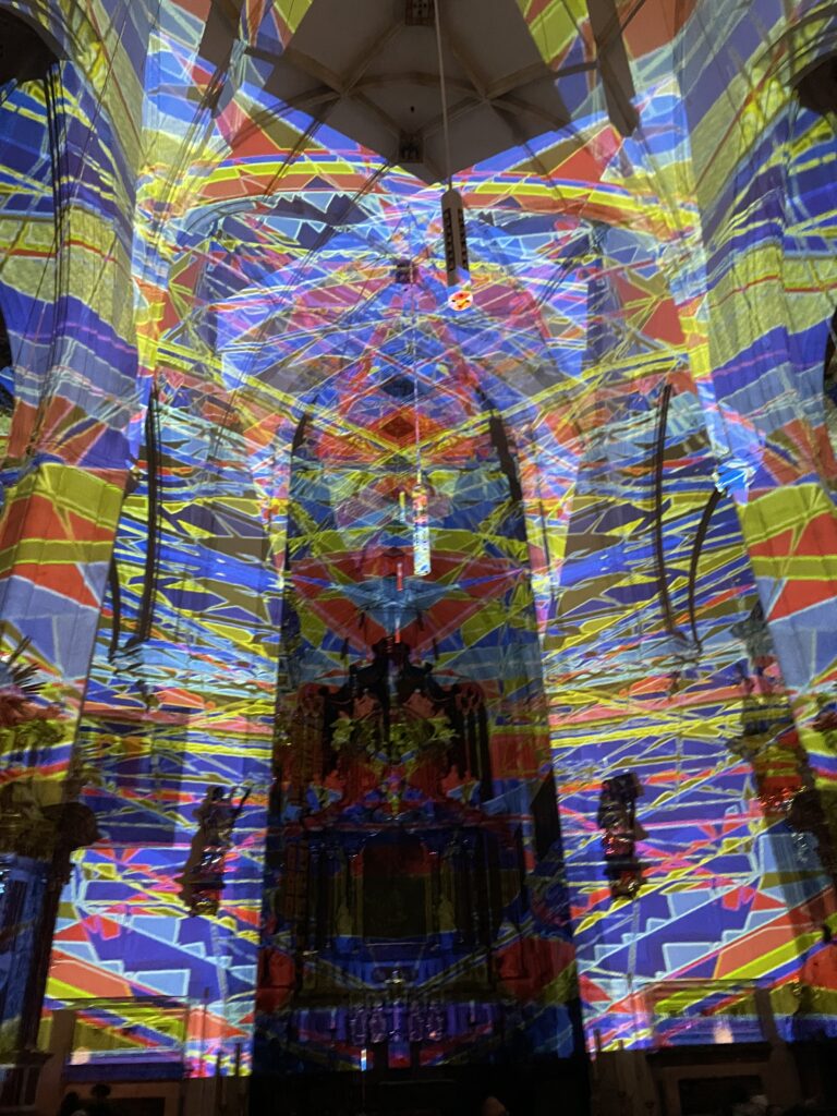
Vor einiger Zeit habe ich mit ein paar Freunden das Klanglicht in Graz besucht. Das Festival ist jedes Jahr eine interessante Mischung aus Licht- und Klanginstallationen, die verschiedene Orte in der Stadt in Szene setzen. Auch dieses Jahr gab es viel zu sehen: Von großflächigen Projektionen bis hin zu eher ruhigen, fast minimalistisch wirkenden Installationen.
Eine Arbeit, die mir besonders in Erinnerung geblieben ist, bestand aus pulsierenden Lichtern, die zusammen mit tiefen Klängen eine dichte Atmosphäre schufen. Andere Installationen waren subtiler, fast schon zurückhaltend, und luden eher dazu ein, genauer hinzusehen und sich auf Details zu konzentrieren.
Während wir durch die Stadt gingen, habe ich mich gefragt, wie solche künstlerischen Arbeiten Emotionen und Gedanken anregen können, oft ohne konkrete Botschaften vorzugeben. Dieser Gedanke hat mich an meine Masterarbeit erinnert, die sich mit typografisch abgestimmten Icons befasst. Im Kern geht es auch dort um die Wirkung von Design auf Wahrnehmung – sei es im Kontext von Lesbarkeit oder Markenkommunikation.
Ein Festival wie Klanglicht zeigt, wie wichtig es ist, verschiedene Elemente wie Licht, Klang und Raum miteinander zu kombinieren, um eine bestimmte Wirkung zu erzielen. Das lässt sich vielleicht auch auf meine Arbeit übertragen: Wie können Schrift und Icons so gestaltet werden, dass sie nicht nur funktional sind, sondern auch eine bestimmte Stimmung oder Botschaft vermitteln?
As an industrial designer now studying interaction design for my next impulse, I finally decided to watch the film Rams (2018), a documentary directed by Gary Hustwit about Dieter Rams, one of the most influential industrial designers of the 20th century. It was an enlightening experience, and it made me think deeply about the philosophy behind good design and how it applies to the digital world I work in today. Dieter Rams is best known for his work at Braun and Vitsœ, where he designed some of the most iconic products of the 20th century, including radios, coffee machines and shelving systems. His creations were not only visually attractive, but also highly functional. What makes the documentary special is its focus on Ram’s design philosophy, rather than just his products. It explores his principles of ‚less but better‘ and how his work relates to wider ideas of sustainability and responsibility in design.
One of the central themes of the documentary is Rams‘ famous „Ten Principles of Good Design“. These principles define what Rams believes makes a design truly great. They emphasise qualities such as innovation, usability, honesty and environmental friendliness. While all ten principles are equally important, a few stood out to me in relation to interaction design and the digital world:
Good design is as little design as possible. In an era of flashy websites and feature-laden apps, this principle is more relevant than ever. Rams believed in stripping away the unnecessary and focusing on what really matters. As an interaction designer, this principle reminds me that simplicity is not about removing features, but about finding clarity. Every element in an interface should have a clear purpose, and anything that distracts from that should be reconsidered.
Good design is unobtrusive. Ram’s products were designed to help the user without calling attention to themselves. His Braun products, for example, were minimalist and elegant, but never screamed for attention. In digital design, this idea can be translated into creating interfaces that are intuitive and easy to use without overwhelming the user. The best designs are often the ones that go unnoticed because they work so well.
Good design is environmentally friendly. Although Rams worked in a time before digital technology, his concern for sustainability is something we need to think about even more urgently today. As designers of digital products, we need to consider the environmental impact of our work – from the energy consumed by servers to the materials used in hardware. Ram’s philosophy encourages us to think beyond the immediate needs of the user and consider the long-term impact of our designs on the planet.
Although Rams worked primarily in industrial design, his principles are incredibly relevant to the field of interaction design. For example, his focus on usability and clarity is very much in line with the concept of user-centred design. Watching the documentary made me think about how I could apply his principles to my own projects, especially as someone who works at the intersection of digital products and physical interfaces. In the documentary, Rams talks about designing for people rather than trends. This approach seems particularly important in today’s world, where design often prioritises novelty over usability. For example, many apps and devices are packed with unnecessary features that make them harder to use rather than easier. Ram’s philosophy reminds us to put the user first and focus on creating designs that truly improve people’s lives. Another key takeaway for me was Rams‘ commitment to designing with honesty. He believed that a product should not pretend to be something it is not. In interaction design, this could mean avoiding deceptive patterns like fake loading screens or manipulative notifications. Instead, we should aim to build trust with users by being transparent and respectful.
Conclusion
As someone who researched Calm Technologies for my Master’s thesis, I was particularly inspired by the idea of unobtrusiveness in Rams‘ work. Calm Technology is about creating systems and interfaces that exist in the background and only demand attention when needed. This concept fits perfectly with Rams‘ belief that good design is quiet and unobtrusive. For example, Rams‘ designs often had a timeless quality. They didn’t rely on trends or gimmicks to stay relevant. In the same way, Calm Technology encourages us to move away from designs that constantly compete for attention. Instead, it asks us to create products that fit seamlessly into users‘ lives, enhancing their experience without overwhelming them.
Reflection
One of the most striking parts of the documentary was when Rams talked about his regrets about contributing to a world of over-consumption. He expressed concern that his designs, while successful, may have encouraged people to buy more than they needed. This reflection is a powerful reminder of the responsibility we have as designers. Whether we create physical products or digital interfaces, our work shapes how people interact with the world. In my mind, Rams (2018) was not just a documentary about a designer, it was a call to action. It challenged me to think more critically about the impact of my designs and to aim for simplicity, honesty and sustainability in everything I create. As I continue my studies and work on my thesis, I hope to carry Rams‘ principles even more with me then before and use them as a guide to create meaningful and responsible designs. I highly recommend watching Rams if you are a designer – or simply someone interested in the role design plays in our lives.
Prototyping is one of the important phases in the design process to make ideas tangible. In one of our courses we were tasked to develop a ProtoPie prototype of one of our projects. We chose to develop our concept from the gamification course this semester.
I really loved this approach to high-fidelity prototyping. In my experience Figma sometimes limits what is feasible to showcase in a prototype. ProtoPie allows me to create realistic prototypes that are similar to a final product. In this research article, I will share how I went about getting started in ProtoPie, how I learned the software and how it differs from Figma.
What is ProtoPie?
ProtoPie is a tool that allows you to create interactive prototypes. The prototypes look, feel and behave like a finished software product, even though it is a no-code tool. Unlike static pages a prototypes can simulate real interactions and verify concepts. Button clicks and screen transitions can be simulated in Figma, but ProtoPie offers to simulate complex interactions like voice commands or tilt interactions, for example. You can use your device’s native sensor systems, such as the camera, microphone or even GPS.
How is ProtoPie different from Figma?
Both ProtoPie and Figma are design tools, but they serve different purposes. Figma is my choice when it comes to designing websites, user interfaces and simple prototyping. I love the collaborative aspect of Figma. In ProtoPie we struggled with collaboration. We had to save multiple versions of a file to “collaborate”. One person worked on one part of the prototype, while the other finished a different section and then we combined them. It was not optimal.
However ProtoPie is the better choice for dynamic high-fidelity prototypes. For example, I could build a password validation that shows different reactions depending on the input.
First project
When we started to get to know the software, we decided to do the ProtoPie 101 crash course. It was a really nice e-learning experience. Everything was easy to understand and the accompanying Figma Files were well prepared. The course starts with the basics, which is perfect if you’ve never worked with ProtoPie or other prototyping software beforehand.
I started by learning the core concepts – such as triggers and reactions. They form the basis for interactions. My first project was to import a design from Figma, create a simple button interaction and test it on my smartphone. The Figma to ProtoPie Plugin worked great. The Smartphone App for displaying prototypes was not as user-friendly but worked great after all. By the end of the lessons, I started to get to a hang of it. Most of the advanced features are self explanatory if you understood the basic concepts.
Working with native sensors
After exploring the basic concepts of triggers and reactions, we viewed the list of supported sensors and inputs. Working with native sensors from devices is where ProtoPie really opened up new possibilities to our projects. It means that you can not only create simple touch interactions, but also prototypes that respond to motion, voice, camera or other device inputs. This was a completely new to me, and it sparked new ideas on what is possible with prototyping for projects in my portfolio.
I loved that I could delve into these functions without knowing how to code. For example, I created a prototype that uses my smartphone’s camera input as part of the interaction. I was introduced to voice commands, allowing me to integrate voice control into a prototype – something that is becoming increasingly important in my opinion. I tested this in a simple example where an app responded to the word “start” and then triggered an animation.
After that we focused back on the project we chose to enhance with this ProtoPie prototype. It is an App that connects people through gamified experiences. We compared different sensors and decided to use the native iPhone compass for our game.
Conclusion
The tool helped us complete our concept and make the gamified experience tangible. The hands-on approach made it easy to learn step-by-step and feel successful early on in the learning curve. I want to continue to learn how to use variables and formulas to create more dynamic interactions. I would like to build prototype in the future that makes use of the “Send and Receive” feature. This way I could connect multiple screens together to create a multi-screen experience. I will keep this in the back of my mind for a future project. By the end of the course, I feel like I have a complete toolset in hand for prototypes.
As a Communication Design student with a keen interest in visual culture, branding, and digital media, I’ve been thinking about writing my Master’s thesis on Taylor Swift. While the subject itself is fascinating, I’m still in the process of figuring out the exact direction and focus for the thesis. Taylor Swift is not only a globally recognized musician but also a powerful brand, whose visual communication and public perception offer a wealth of material to explore within the realm of design.
Why Taylor Swift?
Taylor Swift has evolved from a country singer-songwriter to a global pop icon, and throughout this journey, her visual identity and brand have played a significant role in her success. Her albums, music videos, social media presence, and live performances are all carefully crafted with a strong visual aesthetic. As a designer, I’m particularly interested in how she uses visual media and design to tell her personal story and communicate her artistic evolution.
Swift’s visual identity has transformed over the years, reflecting not only her musical and personal growth but also a strategic brand approach. From the country-pop style of her earlier albums to the more visually rich and symbolically layered music videos of Lover, Folklore, and Midnights, the way she has shifted her aesthetic is a compelling subject for a Master’s thesis in Communication Design.
Possible Directions for the Thesis
Although I haven’t yet decided on the exact focus, there are several intriguing ideas I’m considering for my thesis on Taylor Swift:
The Visual Branding of Taylor Swift Taylor Swift’s rise to global stardom can largely be attributed to her carefully curated visual brand. One possible direction is to analyze her visual transformations over the years and explore how her design and aesthetic choices have supported her musical and personal development. The focus could be on the symbolism and visual codes she employs to convey messages and how they contribute to her brand identity.
The Role of Music Videos and Social Media in Swift’s Design Strategy Another fascinating direction could involve exploring Taylor Swift’s music videos. These are not only artistic works but also strategically crafted marketing tools that strengthen her brand. What’s particularly interesting is how Swift utilizes social media to promote her visual aesthetic and engage with her audience. A study of her digital communication strategy and its impact on her brand perception could make for a great thesis topic.
Taylor Swift as an Example of Storytelling in Communication Design Another possible approach could be to examine how Taylor Swift uses storytelling through visual content. From album artwork to the narratives in her music videos, Swift tells stories that are deeply tied to her personal journey and career. Investigating how communication designers can use visual storytelling to create deeper emotional connections with an audience could be a key element of the thesis.
Taylor Swift and Digital Aesthetics: From Album Covers to Streaming The aesthetic of Taylor Swift’s albums, which exist both in physical formats and digital media, could also be a compelling topic. How does her visual communication adapt in an increasingly digital, streaming-based music industry? This topic could explore how album covers, social media posts, and music videos are optimized for digital formats like Spotify or YouTube while maintaining a consistent visual brand.
Challenges and Considerations
One of the things I’m considering is the balance between academic rigor and creative freedom. Taylor Swift is an incredibly popular figure, and her brand has been widely analyzed, so it’s important to find a new angle that offers a fresh perspective while still engaging with the core principles of Communication Design.
The challenge will be to narrow down a topic that not only highlights Swift’s visual communication and brand strategy but also integrates concrete design principles and techniques. I want to develop a deep understanding of how design and visual communication shape the perception of a global brand like Taylor Swift.
Final Thoughts
Although I haven’t yet decided on the exact direction my thesis will take, I’m confident that Taylor Swift will serve as an incredibly rich and relevant case study for my research in Communication Design. The opportunity to examine the various aspects of her visual branding, storytelling, and digital strategy is an exciting one, and I believe it will help me deepen my knowledge of design and communication in today’s digital age.
I look forward to narrowing down the focus of my thesis in the coming weeks and further developing my ideas. Taylor Swift is not just a musician—she’s a global brand that has had a profound influence on modern design and visual communication, and I’m excited to explore how her approach to branding can inform my research and design practice.
Unlocking the Power of Color: A Review of Palette Perfect for Graphic Designers and Illustrators by Sara Caldes
As a student in the world of graphic design and illustration, I’m always looking for new ways to refine my craft and enhance my visual communication skills. Sara Caldes’ Palette Perfect for Graphic Designers and Illustrators has been an invaluable resource, offering a comprehensive guide to color theory specifically tailored for design professionals. This book not only deepens the understanding of color but also provides practical tools and insights that have proven essential in my own design work.
What is Palette Perfect for Graphic Designers and Illustrators?
Palette Perfect for Graphic Designers and Illustrators is a detailed exploration of how to select, combine, and utilize color in design and illustration. Written by Sara Caldes, a seasoned professional in the field, the book serves as both a textbook and a creative guide for designers and illustrators at all levels. It emphasizes how color choices can influence perception, meaning, and emotion, making it an essential reference for anyone working in visual arts.
What sets this book apart is how it is specifically crafted for graphic designers and illustrators. Caldes focuses on practical applications that are directly relevant to the tools and challenges we face as visual communicators, from digital design to traditional illustration.
Why Palette Perfect Resonates with Design Students
As a student, I often feel the pressure of making the „right“ color choices in my work—choosing a palette that is not only aesthetically pleasing but also appropriate for the message or brand I’m trying to convey. This book has been incredibly helpful in this respect. Caldes guides readers through various methods of color selection, explaining how to harness the emotional power of color, understand color relationships, and use color to build visual harmony.
What I found particularly valuable was the book’s focus on practical application. While theory is important, Caldes ensures that readers are equipped with the tools they need to make color decisions with confidence. This hands-on approach has been extremely beneficial in helping me overcome some of the challenges I face as a student, especially when working on more complex design projects.
Key Takeaways:
Color Theory Applied to Design: Caldes explains the foundations of color theory, but she goes beyond the basics by focusing on its application in graphic design and illustration. She discusses color psychology, the significance of hue, saturation, and value, and how to balance color harmony to create designs that are both visually appealing and communicative.
Practical Color Palettes and Combinations: One of the standout features of this book is the curated color palettes and combinations presented throughout. The book is filled with real-world examples, showcasing how various combinations can be applied to different design styles, whether for branding, web design, or illustration. This has been invaluable for my own design work, providing inspiration and guidance for selecting the right colors.
Color for Visual Impact: Caldes places a strong emphasis on how to use color to make an impact. Whether it’s creating contrast, guiding the viewer’s eye, or evoking specific emotions, the book demonstrates how color can play a pivotal role in a design’s success. The section on creating color schemes for different moods or messages is particularly useful for both students and professionals looking to refine their skills.
Color in Digital and Traditional Media: As someone who works across both digital and traditional mediums, I appreciated how Caldes bridges the gap between the two. The book offers insights into how to work with color in software like Adobe Illustrator, as well as tips for traditional illustration techniques. This dual approach makes it a comprehensive guide for anyone working in the visual arts.
Practical Exercises: At the end of each chapter, Caldes provides exercises to put the concepts into practice. These exercises helped me push my creative boundaries, whether it was creating a color palette for a brand identity or experimenting with color in an illustration. It’s a great way to reinforce what you learn and keep experimenting with new techniques.
Final Thoughts
Palette Perfect for Graphic Designers and Illustrators by Sara Caldes is a must-read for any design student looking to take their color skills to the next level. The book provides a perfect balance of theory and practical advice, making it both informative and inspiring. It has not only expanded my understanding of color but also given me the tools to use it intentionally and creatively in my own projects.
For anyone in the design field—whether you’re just starting out or are looking to enhance your color knowledge—this book is an invaluable resource. It’s practical, accessible, and filled with real-world applications that are essential for success in the visual arts.
After reading Palette Perfect, I feel more confident in my ability to create compelling, visually striking designs, and I can’t wait to dive into the next project with the colorful insights I’ve gained!
Exploring the World of Color: A Review of Palette Perfect Vol. 1 by Lauren Wager
In the world of art and design, color is more than just a tool—it’s a language of its own. Lauren Wager’s Palette Perfect Vol. 1 takes readers on an inspiring journey through the intricate interplay of hues and shades, offering a deep dive into the process of selecting and pairing colors in a way that elevates any project. As a student of design, this book provided not only valuable insights but also sparked new ideas for my own creative endeavors.
What is Palette Perfect Vol. 1?
Released as the first volume in a series, Palette Perfect Vol. 1 serves as both a practical guide and an inspiring sourcebook for anyone interested in the art of color theory. Wager, a talented designer with years of experience, expertly breaks down the complexities of color choices in design and art, offering a step-by-step approach that makes even the most abstract ideas accessible.
The book is divided into several sections, each focusing on a different aspect of color theory, from the emotional impact of certain tones to the psychology behind how colors interact with one another. Wager’s approach is both approachable and educational, making it ideal for both beginners and more advanced practitioners of design.
Why Palette Perfect Vol. 1 Resonates with Students
For students like me, who are constantly juggling the demands of creativity and technical understanding, Wager’s book is a great resource. One of the standout aspects is how Wager not only explains the theoretical aspects of color but also provides practical applications. The inclusion of real-world examples and case studies—spanning various fields like interior design, graphic design, and branding—helps to demonstrate how color can influence mood, perception, and behavior.
What I found particularly helpful was how the book encouraged me to experiment with color combinations. Each chapter offers exercises that challenge readers to step out of their comfort zones and try new palettes, pushing the boundaries of their creativity. As someone who has always been cautious with color selection, Palette Perfect Vol. 1 gave me the confidence to be more bold and imaginative in my own work.
Key Takeaways:
Understanding Color Theory: Wager does an excellent job of explaining color theory in a simple and engaging way. Concepts such as complementary colors, triadic schemes, and the role of light and shadow are clearly outlined, helping readers grasp essential principles.
Color as an Emotional Tool: One of the most eye-opening aspects of the book was learning about how colors can evoke emotions. Wager explores how different tones can create specific atmospheres, making it a valuable guide not just for designers but for anyone involved in visual storytelling.
Practical Exercises: The exercises and color challenges throughout the book are not only fun but also educational. They help to put theory into practice, giving students the opportunity to apply what they’ve learned in real-time.
Inspiration for Personal Projects: As a design student, finding inspiration can sometimes be a challenge. Palette Perfect Vol. 1 serves as a great tool for brainstorming new ideas and revitalizing my design projects. Whether it’s picking colors for a logo or deciding on the color scheme for a portfolio, this book has offered me endless possibilities.
Final Thoughts
Lauren Wager’s Palette Perfect Vol. 1 is an essential read for anyone interested in understanding and mastering the art of color. The book’s accessible language and practical tips make it a perfect resource for students, whether you are just starting out in design or are looking to refine your existing skills. Wager’s passion for color is evident on every page, and it’s contagious—this book will inspire you to view the world through a more colorful lens.
For me, Palette Perfect Vol. 1 has been more than just a textbook—it’s been a source of creativity, guidance, and inspiration.
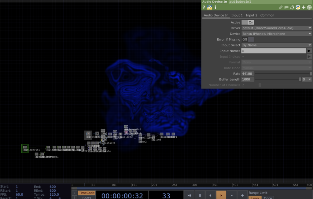
For my sixth Impulse, I wanted to try something online. I was hoping to join a free TouchDesigner workshop, but I couldn’t find one that worked with my schedule. Instead, I decided to follow a tutorial to help me with the voice interaction I’m working on for my thesis.
I chose the Abstract Speech Visualisation tutorial by Bileam Tschepe (Elekktronaut). His explanations were easy to follow, and the way he set up the audio interaction was really inspiring. He broke everything down step by step, which made it much easier to understand, especially for someone like me who’s still learning.
I then followed the tutorial and recreated the patch in TouchDesigner. I played around with some of the parameters and experimented with the settings to see how small changes could affect the visuals. It was interesting to see how different audio inputs created various effects, and I had fun testing different combinations. Below is a recording of my experiment with the patch.
What I Learned
Audio Analysis in TouchDesigner – The tutorial showed how to break down audio into frequencies and amplitudes. This was very useful for understanding how sound can control visual elements.
Creating Dynamic Visuals: I learned how to use particle systems and shapes to make visuals that respond directly to sound.
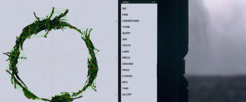
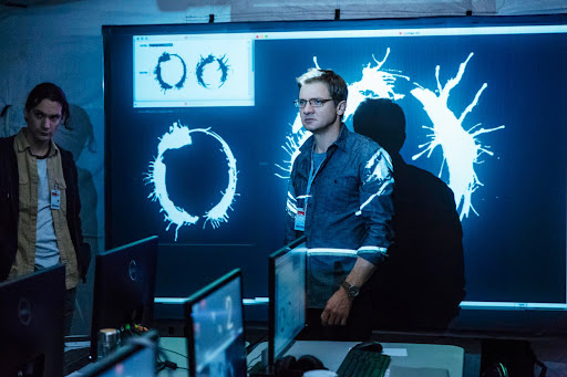
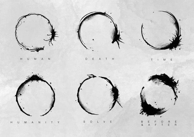
Visualizing a language in a new way, like the Heptapod logograms, can make us question our usual way of thinking about communication.
Conclusion
So this tutorial helped me to practice TouchDesigner to create visuals that react to voice and sound better. Also, it is very important for my thesis, as I’m trying to visualize the unique characteristics of different languages.
Since my thesis is about how languages can „look,“ I thought it would be a good idea to rewatch the movie Arrival. I saw it a few years ago, but now I wanted to focus on its connection to language and visualization. Even though the movie is about aliens, it has a deeper message about how language works and how it can change the way we think and understand the world.
What is Arrival about?
The movie is about a linguist named Louise Banks, who is asked to help communicate with aliens that have arrived on Earth. These aliens, called Heptapods, have a unique way of writing and speaking. Louise’s job is to figure out their language so humans can understand what they want. But the story is not just about aliens—it’s also about how learning a new language can affect your mind and even the way you see time.
Attention spoiler alert🚨 One of the most memorable scenes for me was when Louise communicates with the Heptapods by touching the screen. Their written language is shown as circular symbols called logograms. These symbols are not written in a straight line like most human languages. Instead, they are designed to show the full meaning all at once, without following a specific order which is very interesting.
Idea of a nonlinear language really made me think about how I could visualize the sounds and meanings of different languages in my thesis. I also learned the term „logogram,“ which I guess, I didn’t know before. Now I want to research more about how other writing systems work, especially ones that are very different from the alphabets we use every day.
What I Learned
The term logogram refers to symbols that represent a word or concept.
Language can shape how we think and even how we experience time, which connects to the Sapir-Whorf Hypothesis.
Visualizing a language in a new way, like the Heptapod logograms, can make us question our usual way of thinking about communication.
Conclusion
Overall, I really enjoyed watching Arrival again with an observation eye through language. Also it was visually appealing! I would recommend this movie if you are interested in science-fictions and aliens as well 🙂
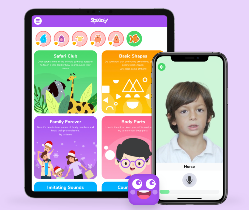
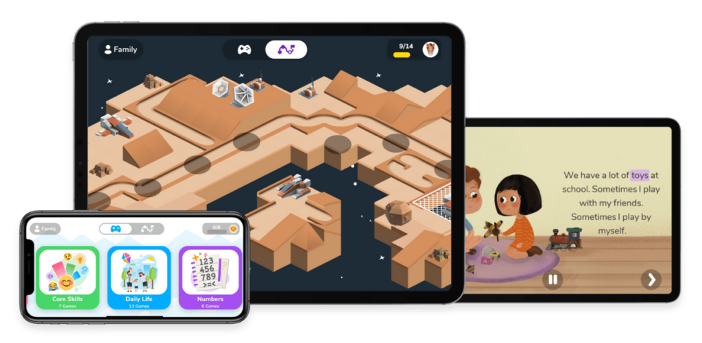
As part of my research on inclusive educational tools, I spent time exploring Otsimo, a learning app designed specifically for children with autism and other special educational needs. Since I’m focusing on how digital and physical tools can support individualized learning, I wanted to see how this app approaches engagement, accessibility, and adaptability for neurodivergent learners.
Otsimo is structured as a gamified learning platform, offering interactive activities in fields like language, math, emotions, and daily life skills. The interface is colorful, simple, and distraction-free, which is crucial for children who may struggle with sensory overload. Right from the start, I noticed how the app focuses on clear instructions, minimal animations, and a predictable layout, making it easier for children with ASD to use.
What stood out to me was how customizable the experience is. Parents and teachers can adjust difficulty levels, track progress, and modify settings to match a child’s learning pace. This aligns with what I’ve learned in my research, that flexibility is key when designing educational tools for children with autism. Each child learns differently, and having the ability to adapt the tool to their strengths and challenges is a big advantage.
One of the aspects I loved about Otsimo is how it integrates multi-sensory learning. The app uses:
Visual prompts to help children recognize objects, letters, and emotions.
Audio feedback to reinforce correct answers and provide gentle guidance.
Touch-based interactions that allow children to drag, match, and draw as part of the learning process.
Another feature I found really valuable is the AAC (Augmentative and Alternative Communication) tool included in Otsimo. Many children with autism experience challenges with verbal communication, and this feature allows them to express needs and emotions through symbols and text-to-speech options. It made me think about how digital tools can bridge the communication gap, especially for non-verbal children or those who struggle with social interactions.
In my expert interviews, one of the main issues educators mentioned was the lack of individualized support in classrooms. This kind of AAC tool could be extremely helpful for children in inclusive settings, allowing them to communicate more easily with teachers and peers.
Exploring Otsimo reinforced some key ideas for my thesis:
Personalization Matters – Every child with autism has different learning needs, and tools should be adaptable.
Gamification Works – Learning feels more natural when it’s engaging and interactive.
Multi-Sensory Design is Key – Combining visuals, sounds, and touch-based interactions makes education more accessible.
Technology Can Support Social Skills – Digital tools like AAC devices help children communicate and navigate social situations.
While Otsimo is a great tool, I also started thinking about how physical tools could complement digital learning. For example, could an app like this be paired with tactile learning materials or scent-based elements to make it even more immersive? This is one of the questions I want to explore further in my work.
Trying out Otsimo was a really valuable experience. It showed me how well-designed digital tools can support individualized learning, and it gave me ideas on how I can integrate similar principles into my own research. I still believe that physical interaction is just as important as digital engagement, but Otsimo is a great example of how technology can help make education more inclusive, structured, and engaging for children with ASD.
I’m excited to continue exploring both digital and physical learning tools and finding ways to combine the best aspects of both. This experience definitely gave me new inspiration for my thesis and future design projects!
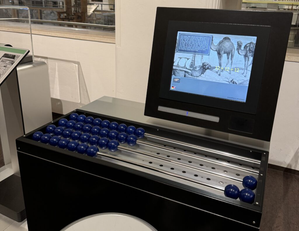
On November 30th, Mert and I visited the Technisches Museum Wien. There were several exhibitions, and luckily, we found some that fit our thesis topics. I was especially interested in how they designed the different exhibitions with different themes using interactive screens and installations. Even though some of them looked old, they were still inspiring!
One artwork that stood out to me was from the Musical Instruments exhibition. It showcased creativity, craftsmanship, experimentation, tradition, and the unique sounds of different instruments. The exhibit had a microphone hanging from the ceiling that captured the sound of the instruments and turned it into visuals. This was a great example of real-time data visualization, which really caught my attention.
Another inspiring part was the Media Worlds exhibition, which explored the history of media and its impact on society. It covered everything from early communication tools like the post and telegraph to modern inventions like computers and the internet. I had the chance to closely examine how interfaces and ways of interaction have evolved over time. There were also some interactive games, which I really enjoyed.
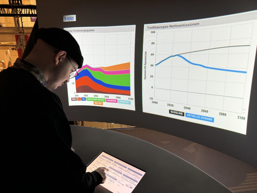
Also, the Energiewende exhibition and some others had very good examples of data visualization, even though they were not interactive. These examples showed how complex data could be made easier to understand through simple, effective visual representations. It was a reminder of how powerful data visualization is in communicating ideas and information clearly and effectively.
What I Learned
The visit to the Technisches Museum Wien gave me some inspos into interactive design and data visualization. I thought again how combining sound and visuals can create an engaging, real-time experience, and how effective data visualization can make complex information more accessible. The exhibitions helped me to have an idea about how I can apply these concepts to my thesis.
Conclusion
Overall, the museum visit was very fun with Mert! We spent almost 4 hour there, it was tiring yet so interesting!! Luckily, we got inspired about our future thesis!


